Neutral Sans Workhorse

Slightly Surreal + Helina
Lets Slightly Surreal own the focal silhouette while handling secondary copy, sizing and subheads cleanly.
Inspect Helina specimenDisclosure: MakerFileHub may earn a commission from qualifying purchases via paid links on this page. How our links work.
1968 Fillmore-inspired geometric psychedelic sans (Full charset)
Slightly Surreal is a complete geometric-psychedelic display font (uppercase, lowercase, 0–9 & full symbols) blending 1960s mod curves with crisp modern spacing.
Paid link
Get this fontProject & layout blueprintsAt-a-glance maker compatibility
Sturdy stroke walls and open counters weed cleanly on adhesive vinyl, HTV apparel film, and cut cardstock.
Visual anatomy & craft review
Slightly Surreal is a geometric psychedelic display in full case with numerals and symbols, whose bowls are deliberately top-heavy or bottom-heavy and whose stems carry bifurcated notches, so a word reads as a 1968 Fillmore poster rather than a modern geometric. The modulation is the design, which means the face needs size for the imbalance to read as intentional, and the numbers let it set a date. It needs roughly 28 mm for the notches to hold, and it is best in one bright ink on a deep ground or two colours on a pale one.
60s-Fillmore · Geometric-mod · Full-glyphs
Two-font hierarchy recipes
Tested contrast partners — pairing Slightly Surreal with grounded secondary typography.
Slightly Surreal + Helina
Lets Slightly Surreal own the focal silhouette while handling secondary copy, sizing and subheads cleanly.
Inspect Helina specimen
Slightly Surreal + Things
Grounds bold display lettering with classic typographic authority on posters, badges and apparel.
Inspect Things specimenPractical applications
Concrete hierarchy, scale and production guidance tailored to Slightly Surreal’s stroke geometry.
Psychedelic geometric lettering reads as a Fillmore bill, which is what a retrospective feature wants. The letterforms carry the era without a photograph, and the numerals let a date sit in the same voice as the acts at 60 mm.
Hierarchy & layout recipe
Opener 420 x 297 mm, headline 120 mm, lineup 14/20 pt, 15 mm margins. Poster A2, word 280 mm, date 40 mm, 30 mm margins and 20 mm trim. Sleeve 312 x 312 mm, word 200 mm, credits 7 pt.
Pre-production check
A date set at 40 mm in the display face mixes bifurcated digits with the act names and the poster reads as noisy. Set the date in a companion sans, and keep the display face for names above 60 mm.
Mod-geometric letters read as a shop that sells reissues, which is what a record store is. The heavy forms hold at 150 mm on a window and 60 mm on a tote, and the notches give the name character without an illustration.
Hierarchy & layout recipe
Sign 900 x 400 mm, word 160 mm, 60 mm margins and 25 mm frame clearance. Tote print 300 x 300 mm, word 70 mm, 60 mm margins. Label 60 x 40 mm, word 9 mm, 3 mm die margin.
Pre-production check
A 60 mm tote print on canvas fills the 1 mm notch and the word reads as a plain geometric. Keep the notch at 2 mm for canvas, and check one sewn tote before the order.
Psychedelic geometry reads as a summer festival brand, which is what a small event wants without a designer. The colours and the imbalance carry at 300 mm, and the numerals keep the dates in the same style on the programme.
Hierarchy & layout recipe
Poster A2, word 300 mm, dates 34 mm, lineup 22/28 pt, 30 mm margins. Banner 2400 x 800 mm, word 380 mm, 150 mm margins with eyelets every 500 mm. Programme A5, cover 50 mm, acts 8/11 pt.
Pre-production check
A stage banner is printed on mesh and a two-colour geometric word shows the perforations through the fill. Print the word on a solid vinyl panel and sew it on, and check one hung panel in daylight.
Technical & licence verification
Confirm included OTF/TTF/WOFF formats, full glyph tables and licence coverage on the live store page before batch production.
Closest visual alternatives
Matched across letterform anatomy, stroke behaviour and craft applications.
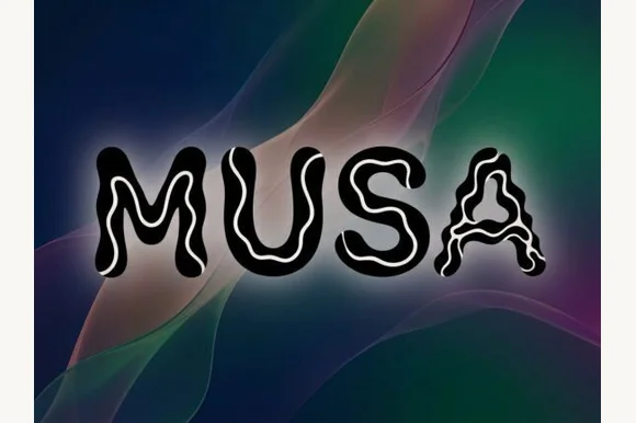
Rounded marker display with a squiggle inline
Musa is a rounded hand-drawn display in heavy black caps, each stroke carrying a thin white squiggle inline that wanders along its length, with a soft glow lifting the word off an abstract gradient ground.
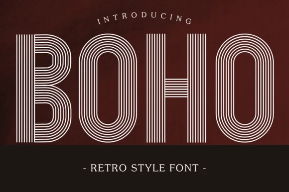
7-line concentric 1970s disco & roller-rink multiline sans
Boho (by Eystore) is a nostalgic 1970s multiline geometric display font built from seven crisp concentric parallel stripes.
Ideas for this font
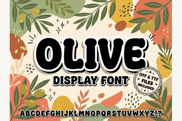
Chunky organic botanical-retro block sans (OTF & TTF)
Olive is a stout, softly rounded organic display sans with gently tapered stems and warm 1970s Mediterranean market charm (OTF & TTF).
Ideas for this font
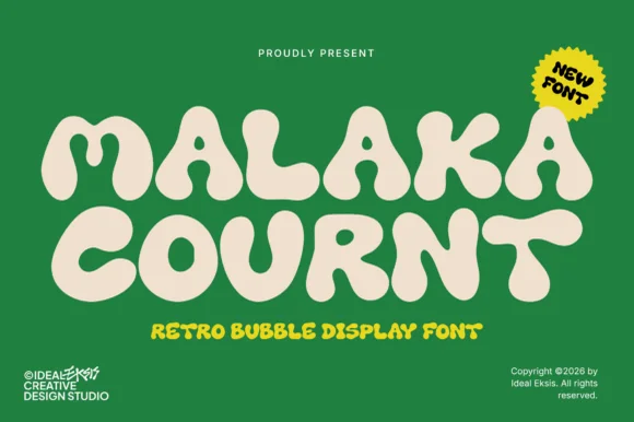
Ultra-heavy groovy pillow-bubble retro display
Malaka Cournt is an ultra-bold retro bubble display font sculpting wide, squishy 1970s letterforms with compressed teardrop counters.
Ideas for this font
Same independent foundry
Allow optional Google Analytics to measure visits and catalogue actions. Your search words and notes are not included. Privacy & storage