 #1 · Best Overall
Disclosure: MakerFileHub may earn a commission from qualifying purchases via paid links on this page. How our links work.
Dotted print, cursive tracing & stroke order
16 Best Dotted Tracing & Classroom Fonts
A tracing worksheet needs three things a normal handwriting font does not provide: a dotted or dashed version of the same letter, a guide line the child can follow, and consistent letter sizing so rows do not wobble. Abcd Ref Tracing Lined and Abcd Ref Dashed Arrows Numbers ship those variants as a set, Aurelian adds a cursive dotted path with stroke order, and Sweetbell and Ainsley cover the finished worksheet header.
Quick verdict
Abcd Ref Tracing Lined is the most complete worksheet set with dotted and ruled variants, Abcd Cursive Dotted Arrows adds stroke-order numbers, and Sweetbell is the best header face for a finished page. Ainsley keeps the tone playful without losing legibility.
Quick answer
Top 3 dotted tracing & worksheet picks right now.
Short on time? Start with our three highest-rated dotted tracing & worksheet standouts before scrolling the full breakdown.
#1 · Best Overall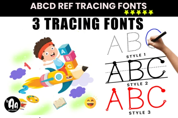 #2 · Runner-Up Pick
 #3 · Editor's Choice
Abcd Ref Dashed Arrows Numbers
Dashed block-print & number tracing font with circled stroke-order arrows!
Get fontPaid link
Read review ↓How we tested & selected these 16 fonts
We kept 16 of 458 candidates that actually include a dotted or dashed weight, not just a handwriting style. Scored on letter-shape consistency between solid and dotted versions, guide-line alignment, and how the font prints on a school laser printer at 12 to 18 pt.
Side-by-side summary
Top 5 dotted tracing & worksheet picks at a glance.
Compare specimens, OpenType/PUA traits and primary project roles side by side.
| Rank & Font | Style & File Specs | Best Project Fit | Store Listing |
|---|---|---|---|
| HandwrittenTactile | Cursive handwriting practice sheet & name-tracing mat | Get fontPaid link | |
| HandwrittenEducational | Custom student name-tracing worksheet or KDP penmanship workbook | Get fontPaid link | |
| HandwrittenCircled-step-numbers | Personalized 'Write My Name' dry-erase mat & alphabet book | Get fontPaid link | |
| HandwrittenStroke-order-cursive | Custom student-name cursive tracing sheet & laminated dry-erase mat | Get fontPaid link | |
| HandwrittenClean-dotted | Clean arrow-free preschool tracing sheet & name-practice pad | Get fontPaid link |
Clean Sans & Handwritten Print
13 fonts#1 · Best OverallAurelian
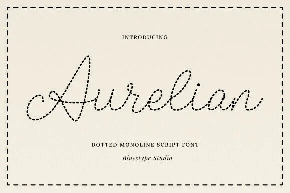
Aurelian is a graceful monoline cursive script constructed entirely from evenly spaced round dots along smooth connected pen paths.
Aurelian is a monoline cursive tracing script drawn entirely from evenly spaced round dots along smooth connected pen paths, so a line reads as a dotted guide rather than as solid handwriting. The dots must stay separated to read as dots, which means the face needs size and a print resolution that does not merge them, and the connected paths keep it cursive. It needs roughly 20 mm for the dots to separate, and it is best in one dark ink on warm ivory or kraft.
Recommended project & layout
Cursive handwriting practice sheet & name-tracing mat — Print student names at 60–84 pt on laminated dry-erase mats with baseline rules underneath.
Before you cut or print
Use strictly for print, worksheets, laser dot-scoring, or embroidery guide transfers—never blade-cut dozens of loose vinyl dots.
Best paired with
Get fontPaid link
#2 · Runner-Up PickAbcd Ref Tracing Lined
Abcd Ref Tracing Lined offers three purpose-built handwriting practice styles, dotted, lined and start-dot, for teachers, homeschoolers and KDP creators, where students trace dashed outlines along primary penmanship rules or follow starting dots typed directly in a word processor.
Each style carries a different guide, the ruling mimics classroom paper, the start dots mark entry points and the letters stay simple enough to copy. That division of labour is the character: one file teaches the shape and another teaches the line, which is why the pack targets worksheets rather than display work. Test each style in your own software, keep the dashed stroke at 1 mm, and run a teacher review before any practice sheet goes to print. The ruling is the fragile part on a copier: the dashed guides fade before the letters do, so a practice sheet printed at the default 600 dpi comes back with the letters and no lines. Print at 1200 dpi on 90 gsm paper, and keep the guide stroke at 1 mm.
Recommended project & layout
Custom student name-tracing worksheet or KDP penmanship workbook — Type each child's name at 48–72pt on landscape worksheets and laminate for dry-erase reuse.
Before you cut or print
Purpose-built for printed worksheets, KDP interiors and dry-erase mats — not vinyl cutting.
Best paired with
Get fontPaid link
#3 · Editor's ChoiceAbcd Ref Dashed Arrows Numbers
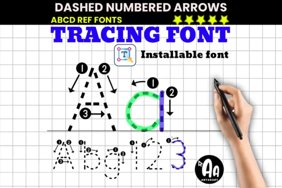
Abcd Ref Dashed Arrows Numbers teaches exact print letter & numeral formation using dashed strokes paired with circled step numbers ('①', '②') and arrows!
Abcd Ref Dashed Arrows Numbers is a dashed block-print tracing font in which every stroke is drawn as a broken outline, with circled arrows at the start of each stroke showing direction and order. The dashed skeleton and the arrows are instructional, so the face is meant to be printed large enough for a pencil to follow. It needs roughly 40 mm for the dashes and the arrows to stay distinct, and it is best in one light grey outline on white so a child's pencil reads over it.
Recommended project & layout
Personalized 'Write My Name' dry-erase mat & alphabet book — Set large 120 pt hero 'A a' exemplars at the top of each worksheet above 60 pt practice rows.
Before you cut or print
Designed strictly for printed worksheets, laminated dry-erase mats, and iPad tracing—never blade-cut on vinyl!
Best paired with
Get fontPaid link
 #4 · Top Maker Utility
Abcd Cursive Dotted Arrows
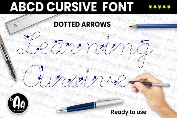
Abcd Cursive Dotted Arrows is a dedicated teacher worksheet font building dotted cursive letters complete with numbered directional stroke-order arrows ('1→', '2→')!
Abcd Cursive Dotted Arrows is a handwriting-worksheet font: a dotted cursive skeleton with small numbered circles and arrows at the start of every stroke, showing direction and order for a pencil to follow. The dots and arrows are instructional, so the face only works large enough for a child to trace, and the arrows are the finest element. It needs roughly 36 mm for the dotted outline and the arrow to read, and it is best in one light grey on white so the pencil reads over it, and never in a solid colour.
Recommended project & layout
Custom student-name cursive tracing sheet & laminated dry-erase mat — Type student names at 60–96 pt across lined landscape pages, print on cardstock, and laminate for dry-erase markers!
Before you cut or print
Strictly a printable / tablet GoodNotes worksheet font—NEVER blade-cut tiny tracing dots and micro-arrows on vinyl!
Best paired with
Get fontPaid link
 #5 · Standout Silhouette
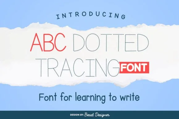
Abc Dotted Tracing
Abc Dotted Tracing is a clean, uncluttered dotted geometric print font (arrow-free!) built for distraction-free early-childhood writing sheets.
Abc Dotted Tracing is a clean minimalist dotted print handwriting-and-tracing sans: each stroke is drawn as a line of round dots rather than a solid line, with a simple print skeleton, generous spacing and open counters so a child can trace between the dots. The dot pitch is the design and it collapses when the face is scaled down. It needs roughly 26 mm for the dot pitch to read as separable dots, and it is best as one soft ink on white paper, or a single light grey on a worksheet where the trace stays quiet under a pencil.
Recommended project & layout
Clean arrow-free preschool tracing sheet & name-practice pad — Put 1 solid reference word on the left followed by 3 gray/black Abc Dotted Tracing copies across the row.
Before you cut or print
Pure printable PDF, KDP workbook, and GoodNotes iPad font—never send fine tracing dots to a vinyl cutting blade!
Best paired with
Get fontPaid link
 #6
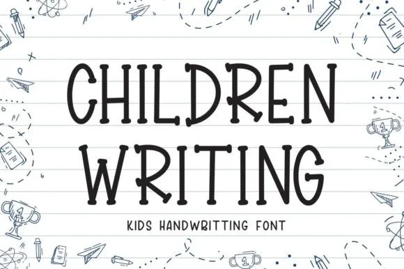
Children Writing
Children Writing is a tidy, cheerful uppercase/print handwritten font with soft marker-dot terminals built for school and kid crafts.
Children Writing is a tidy upright print alphabet with rounded marker-bead terminals, even spacing and a deliberately simple skeleton, drawn to look like the best handwriting on a classroom wall rather than a teacher's script. Because each letter is a straightforward closed or open shape with generous counters, the face reads at 8 mm on a sight-word card and at 60 mm on a bulletin board without changing character, and it prints cleanly from a school copier. Lowercase and uppercase differ in proportion rather than ornament, so setting a proper name does not look like shouting.
Recommended project & layout
Primary-grade bulletin board, sight-word card & binder — Stack 2 centered uppercase lines at 48–88 pt across ruled notebook-paper backgrounds.
Before you cut or print
Uniform medium-bold strokes with zero touching letters cut and weed fast on Cricut cardstock and vinyl down to 0.6 in!
Best paired with
Get fontPaid link
 #7
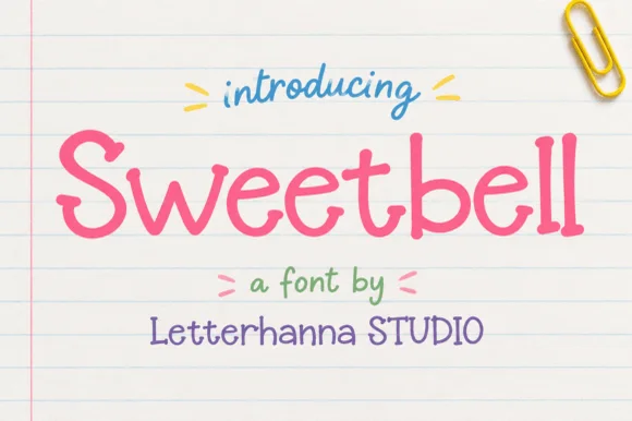
Sweetbell
Sweetbell is a neat upright print in which the letters stand apart, the strokes stay even and the counters stay generous, so a word reads as careful handwriting rather than as a printed face.
The capital S reverses through two even curves and the w follows with three shallow valleys, then the letters settle into a regular rhythm: the e loops back through a wide counter, the double l keeps two plain stems and the b closes a round bowl against a thick stem. Nothing is connected, nothing is slanted and the weight is a consistent medium with rounded terminals, which is what makes the face read as something written with a good pen at a sensible pace. The x-height is tall, so at 12 pt it behaves like a rounded sans and stays legible on a price card. The ruled paper ground, the paper clip, the small arrows and the three caption lines are presentation; the lettering is the word.
Recommended project & layout
Classroom worksheet header, kids' snack packaging or sticker sheet — Use in Mixed Case for friendly headers, labels and short body callouts.
Before you cut or print
Disconnected clean letters cut and weed effortlessly on vinyl at small sizes.
Best paired with
Get fontPaid link
 #8
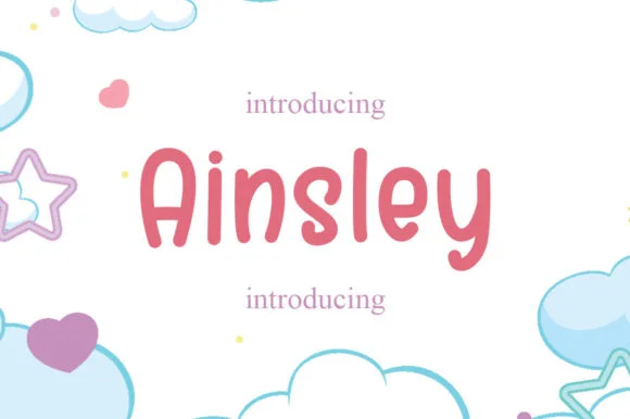
Ainsley
Ainsley is a solid marker-weight print in which the strokes keep an even thickness, the corners round off and the counters stay open, so a name reads as lettering written with a felt tip and then cleaned up for cutting.
The A carries a rounded apex over a wide base, the i dots a solid square-ish block, the n turns two even arches and the s closes a smooth spine, all at a single marker weight with no taper and no chalk texture. The evenness is the character: nothing frays, which is why the sample sets a name inside a circle badge and a supply label beside it. The face weeds cleanly from three quarters of an inch of cap height on adhesive vinyl and holds from 18 pt in print. The soft pastel ground, the pencil and the small caption lines are presentation; the solid dark name and labels are the face.
Recommended project & layout
Teacher tumbler, student cubby vinyl label or pencil pouch — Set in cheerful coral, mint or mustard paired with simple star accents.
Before you cut or print
100% vinyl-ready — thick solid strokes and open counters weed in seconds.
Best paired with
Get fontPaid link
 #9
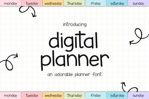
Digital Planner
Digital Planner mimics neat felt-tip handwriting, keeping a medium upright weight that stays crisp on tablet planner tabs, sticker sheets, flashcards and teacher slides rather than turning wiry at small size.
The strokes hold one medium weight, the letters stand upright without much slant, the bowls stay round and the ascenders remain modest. That even marker weight is the character: the writing looks like a careful hand on a page but survives a screen, which is why the sample lists small-format uses. Those uses come from the source rather than a test, so proof the actual characters at 12 pt and check the punctuation you need before trusting it with a full planner entry.
Recommended project & layout
IPad planner weekday tabs, sticker pack or classroom slide deck — Pair lowercase tab labels with soft pastel pill backgrounds.
Before you cut or print
Clean disconnected print letters cut neatly on vinyl supply labels too.
Best paired with
Get fontPaid link
 #10
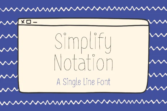
Simplify Notation
Simplify Notation is a single-line sans in which every letter is drawn as one even hairline with open joins, so a word reads as a wireframe sketch rather than as printed type.
The S keeps a shallow spine, the i carries a floating dot, the m turns two even shoulders, the p drops a hairline stem, the l rises as a plain line and the y splays two hairlines, all at one unchanging weight with joins left slightly open. The single line is the character: there is no thick stroke anywhere, which is why the sample sets a two-word title inside a drawn window frame with no other decoration. Because the line is very fine, the face needs 30 pt upward and a smooth ground, and it disappears at caption sizes. The blue ground, the drawn browser window, the wavy borders and the caption beneath are presentation; the hairline words are the face.
Recommended project & layout
Pen-drawn label set or greeting card body text — Pair beneath a flourished calligraphy headline to handle dates, addresses and body lines.
Before you cut or print
Use Draw/Pen toolpath rather than Cut.
Best paired with
Get fontPaid link
 #11
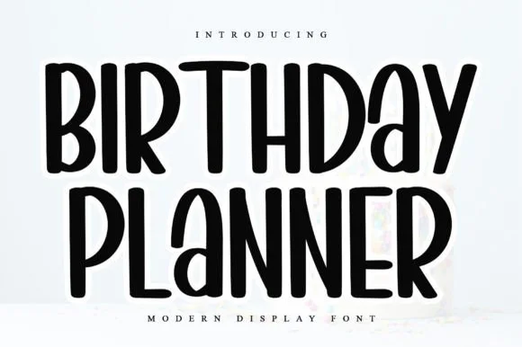
Birthday Planner
Birthday Planner is a tidy, tall hand-lettered marker display font with softly rounded stem tips and friendly vertical rhythm.
Birthday Planner is a tall rounded marker all-caps planner face: narrow upright caps with fully rounded ends, an even medium stroke, wide even spacing and a height that fits a single line inside a planner box. The rounded ends are the only warmth and the caps keep a label shouty but readable. It needs roughly 20 mm for the rounded end and the counter to read, and it is best in one bright ink on white paper, or a single dark colour on pastel card.
Recommended project & layout
Kids' party itinerary sign, milestone chalkboard & invite — Stack centered uppercase headers at 36–54 pt and use smaller 18 pt lines for time-slot bullet items.
Before you cut or print
Smooth, even marker strokes with zero thin serifs weed quickly and cleanly on Cricut vinyl, HTV, and acrylic signs down to 0.6 in.
Best paired with
Get fontPaid link
 #12
School Bold
School Bold shows heavy upright sans capitals with rounded corners and tall oval counters: the C opening stays broad and the B closes two small rounded bowls, while the cover adds a white edge and a deep offset shadow.
The stems stay thick and upright, the corners round off, the counters stretch into tall ovals and the C keeps a wide mouth while the B presses two small bowls together. The rounded weight is the character: the row reads as friendly signage rather than a technical sans, which is why the sample pairs it with an edge and an offset shadow. Because the counters are small, keep 28 pt before they hold, and treat the white edge and shadow as layout effects rather than font features.
Recommended project & layout
A classroom project board — Put the title on a plain top band and leave pupils a large separate project area.
Before you cut or print
Check the B counters and O spacing at the board viewing distance.
Best paired with
Get fontPaid link
 #13
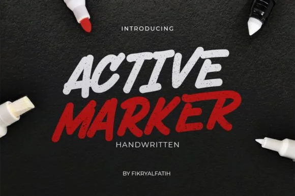
Active Marker
Active Marker captures brisk, slanted broad-tip marker lettering with organic stroke tapers and natural double-letter ligatures.
Active Marker is a slanted chisel-tip whiteboard and chalkboard marker sans: even strokes with a visible chisel angle, blunt ends that read as a marker turned in the hand, a firm slant and open counters that stay clean on a board. The chisel angle is the design and it flattens when the face is reduced. It needs roughly 20 mm for the chisel angle and the blunt end to read, and it is best in one dry-erase or chalk ink on a board, or a single dense ink on uncoated stock where the chisel edge prints as a step.
Recommended project & layout
Coffee-shop daily specials board & deli menu header — Highlight section headers ('ESPRESSO', 'FRESH BAKED') in bold white or red at 36–54 pt above clean tabular price columns.
Before you cut or print
Sturdy solid strokes cut smoothly on chalk-style matte vinyl at 0.8 in and taller with minimal weeding fuss.
Best paired with
Get fontPaid link
Display & Decorative Headlines
3 fonts #14
Bouncy Block Deluxe
Bouncy Block Deluxe is a thick, solid-filled bubble display font with pillowy rounded terminals, playful tilt, and tiny counter pinholes.
Bouncy Block Deluxe is a heavy rounded chunky bubble display: fat even-width letters with fully rounded corners, tight counters that almost close and a baseline that lifts a few letters so the word looks stacked and bouncing. It is a signage face, so it wants size and a single flat colour rather than fine detail. The counters are the finest element and they plug as soon as the face is reduced or cut in vinyl. It needs roughly 30 mm for the counter and the corner radius to read, and it is best as one flat ink on a light ground.
Recommended project & layout
Back-to-school tote, water-bottle sticker & kids' tee — Stack 2 or 3 short punchy words ('STAY COOL', 'DREAM BIG') at tight 0.88 line-height inside a contoured die-cut sticker shape.
Before you cut or print
When weeding small decals under 1 inch, use a fine pin pen solely to pop out the tiny teardrop counters inside 'B', 'o', 'a', and 'e'.
Best paired with
Get fontPaid link
 #15
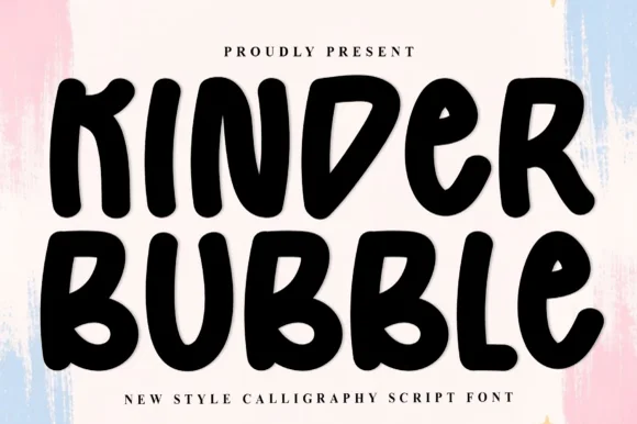
Kinder Bubble
Kinder Bubble is a bold, solid-black hand-drawn block display font with soft organic edges and playful mixed-case letterforms.
Kinder Bubble is a heavy hand-cut playroom block display: fat squared letters with visible scissor-cut edges, slightly mismatched heights and blunt corners, drawn to look as if cut from coloured card and pinned to a playroom wall. The cut edges are the design and they silt when the face is reduced. It needs roughly 26 mm for the cut edge and the height mismatch to read, and it is best as a one-colour vinyl or paper cut on a light ground, or one ink print where the cut edge reads as a shadow.
Recommended project & layout
Daycare cubby nameplates, teacher shirts & backpack tags — Center a child's name or grade level in 1.5–2.5 in solid letters, pairing classroom room numbers in the same bold face.
Before you cut or print
Weeds cleanly on both permanent vinyl and puff HTV; just watch the compact double counters inside 'B' below 0.8 inches.
Best paired with
Get fontPaid link
 #16
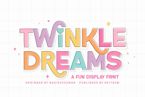
Twinkle Dreams
Twinkle Dreams combines firm block capitals with a heart-shaped dot above the i and curling extensions on selected letters, where the R and K tails swing below the main rows, each letter takes a pastel fill with a fine dark edge and the whole block sits on a faint grid.
The bodies stay blocky and even, the edges stay fine, the fills change per letter and two letters drop long tails under the baseline. That heart dot is the character: a plain display face gains one playful substitution, which is why the sample keeps a short title. The grid and the sparkles are cover treatment. Keep 40 pt so the fine edges stay separate from the fills, verify the heart form in your file and check the swinging tails against the line beneath.
Recommended project & layout
A wish-themed party invitation — Keep the phrase large with clear room below any R tail; place details in plain text.
Before you cut or print
Check the actual letters and do not assume a heart appears in words without i.
Best paired with
Get fontPaid link
Practical buyer checklist
Frequently asked questions.
Key cutting, printing and pairing answers before choosing a dotted tracing & worksheet typeface.
Are these fonts licensed for classroom and TPT use?
Most listings allow personal and small-business use, but classroom distribution, school-wide licences and resale of editable files sit in different tiers. Read the licence text in the download and buy the extended tier before uploading worksheets to a shared drive.
What paper weight keeps dotted letters visible when printed?
Use at least 80 gsm and set the dotted strokes to full black, not grey. On thin copier paper the dots bleed and close up, which turns a tracing letter into a solid ghost of itself.
How do I add stroke-order arrows to a dotted font?
Either use an alphabet that ships numbered arrows, or overlay arrow shapes manually on the first row only. Adding arrows to every letter crowds the page, so most worksheets show instruction on the exemplar and leave the rest clear.
Should the cursive version be introduced before or after print?
Educational practice varies, but the fonts work either way. Keep one handwriting model per worksheet: a dotted print font paired with a cursive one on the same page teaches two different letter forms in the same lesson.
Keep exploring
Related collections & guides.
Explore adjacent maker roundups or check our practical pre-production checklists.
01 / Occasions & Milestones
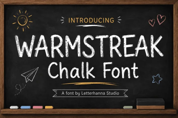
Classroom & school
32 curated fonts · Previews & pairings
02 / Branding & Print
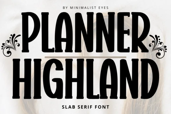
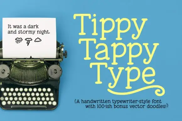
Chalkboard, slate & bistro
15 curated fonts · Previews & pairings
03 / Branding & Print
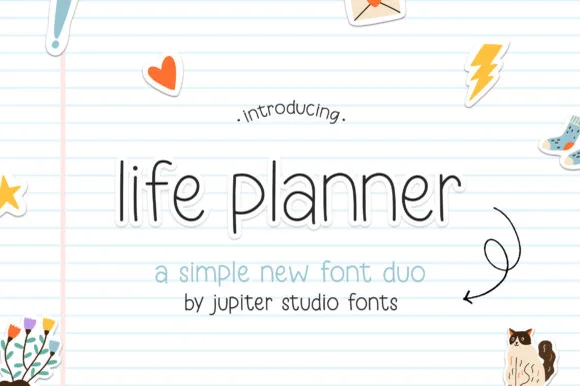
Digital planner & GoodNotes
19 curated fonts · Previews & pairings
04 / Branding & Print
Children's books & fairytale
26 curated fonts · Previews & pairings
Guides: Invitation font checklist · Vinyl & cutting checklist · How to pair script & sans fonts