 #1 · Best Overall
Disclosure: MakerFileHub may earn a commission from qualifying purchases via paid links on this page. How our links work.
Dripping horror, ooze & pumpkin counters
31 Best Halloween Fonts for Crafts & Signs
Halloween lettering splits into two useful camps: horror display, where the dripping or melting edge is the point, and illustrated alphabets, where a pumpkin or cat sits inside the counter. Magic Witch and Blood Horror cover the melting and dripping extremes, Ghostly Vibe and Midnight Meow build the illustrations into the glyphs, and Spooky Halloween and Boo Pumpkin fill the playful family-friendly side.
Quick verdict
Midnight Meow is the best illustrated alphabet for family crafts, Blood Horror is the strongest dripping display for a porch sign, and Magic Witch handles the groovy slime look. Ghostly Vibe is the pick when silhouettes have to read at a distance.
Quick answer
Top 3 Halloween picks right now.
Short on time? Start with our three highest-rated Halloween standouts before scrolling the full breakdown.
#1 · Best Overall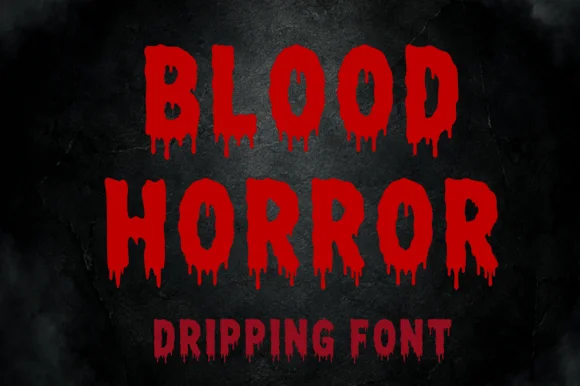 #2 · Runner-Up Pick
Blood Horror
Dripping horror capitals with ragged edges and hanging tails
Get fontPaid link
Read review ↓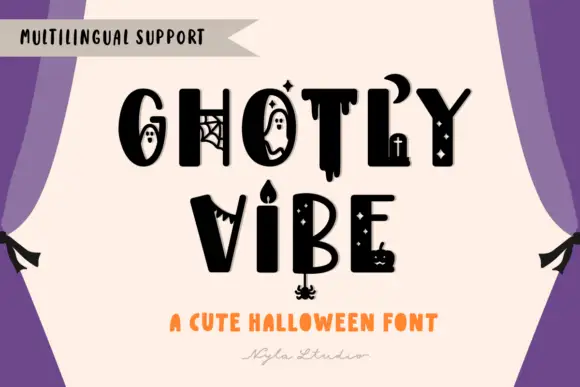 #3 · Editor's Choice
Ghostly Vibe
Mixed heavy capitals with distinct ghosts, webs, drips, crescent and candle details
Get fontPaid link
Read review ↓How we tested & selected these 31 fonts
We kept 31 of 321 candidates that keep their horror detail inside the letterform. judged on silhouette clarity at 3 inches, whether drips or counters become separate islands, and how much of the word survives when printed in one colour.
Side-by-side summary
Top 5 Halloween picks at a glance.
Compare specimens, OpenType/PUA traits and primary project roles side by side.
| Rank & Font | Style & File Specs | Best Project Fit | Store Listing |
|---|---|---|---|
| DisplaySpooky | Trick-or-treat tote bag, spooky tumbler or kids' party tee | Get fontPaid link | |
| DisplayFile formats | Halloween party banner, haunted-house sign or spooky tumbler | Get fontPaid link | |
| DecorativeLanguage support · File formats | A ghost-theatre ticket heading | Get fontPaid link | |
| DecorativeAlternates & swashes · Language support | Black-cat Halloween sweatshirt, boo-basket tag & sticker | Get fontPaid link | |
| Decorative200-plus-glyphs | Halloween carnival poster, DTF party hoodie & boo-basket | Get fontPaid link |
Display & Decorative Headlines
20 fonts#1 · Best OverallMagic Witch
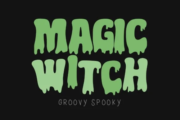
Magic Witch is a groovy display in which chunky seventies capitals soften into rounded drips that hang from the baseline, so a short phrase reads as friendly spooky lettering rather than gore.
The M spreads two soft arches, the a closes a round bowl, the g drops a thick tail and every letter sends one or two rounded droplets below the baseline at different lengths. The rounded melt is the character: the drips are drawn as smooth drops rather than pointed runs, which is why the sample suits a kids' party. Because the drops hang low, a layout needs 14 mm of clearance under the line from 30 pt, and the face weeds cleanly from three quarters of an inch of cap height. The orange ground, the small bats and the caption are presentation; the melting letters are the face.
Recommended project & layout
Trick-or-treat tote bag, spooky tumbler or kids' party tee — Pair lime green, purple or orange vinyl over black shirts or tumblers.
Before you cut or print
Rounded drip bulbs weed well at 1.5"+ letter height on HTV and vinyl.
Best paired with
Get fontPaid link
#2 · Runner-Up PickBlood Horror
Blood Horror is a dripping horror capital alphabet in which the strokes stay chunky, the bottoms melt into hanging tails and the edges stay ragged, so a word reads as something painted in a hurry on a wall.
The B holds two fat bowls, the L runs its foot into a drip, the O closes a rough ring, the D hangs two tails, the H keeps a low bar and the R turns a ragged leg, all at a heavy display weight with irregular contours and drips of different lengths below the baseline. The drips are the character: they fall under the word, so the face needs room below and cannot be set tight against another line. Because the shapes are solid, the face holds from 30 pt and prints in one colour, and the ragged edge reads as paint rather than as damage. The dark wall, the fogged edges and the small line beneath are presentation; the red dripping words are the face.
Recommended project & layout
Halloween party banner, haunted-house sign or spooky tumbler — Set in glossy red vinyl or crimson sublimation ink over matte black.
Before you cut or print
Rounded drip tips can be cut on vinyl at 2"+ height or sublimated at any size.
Best paired with
Get fontPaid link
#3 · Editor's ChoiceGhostly Vibe
Ghostly Vibe is a cute Halloween display face in which the caps carry little scenes inside them: a ghost in the counter of the O, a spider web in the G, a dripping stroke under the T, and a candelabra between two words.
GHOSTLY over VIBE fills the card in solid black on a cream panel, and the letters are drawn by hand with thick uneven strokes, so the word looks written rather than constructed. Several letters hold a drawn figure: the O contains a ghost with a surprised face, the G has a web across its aperture, the T drips at the foot, the B holds a small candle and the E carries a tiny pumpkin. Between the two rows a candelabra with a lit flame stands on its own, and a row of small stars and dots runs through the composition. A banner at the upper left advertises language support, and two lines at the foot name the style. It is a cute seasonal face rather than a horror one, and it works at moderate sizes, though the figures inside the letters need about 28 pt before they read.
Recommended project & layout
A ghost-theatre ticket heading — Set the confirmed name on a cream ticket face with seat, time and venue in a separate plain purple band.
Before you cut or print
Verify ghost and candle forms and keep ticket data undecorated.
Best paired with
Get fontPaid link
 #4 · Top Maker Utility
Midnight Meow
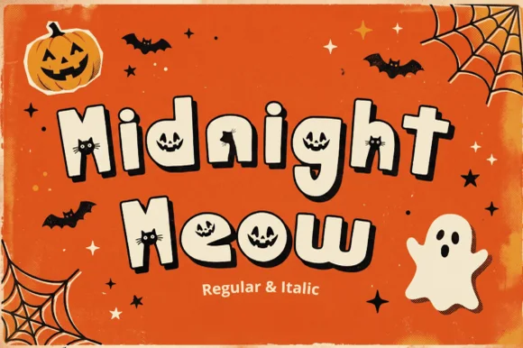
Midnight Meow is an adorable chunky Halloween display duo ('Regular & Italic') hiding carved jack-o'-lantern faces and peeking black-cat ears right inside the letter counters!
Midnight Meow is a Halloween novelty alphabet in which the counters hide jack-o'-lantern faces and a black cat peeks over the top of certain letters, with a regular and an italic cut. The cat's ears and the cut eyes are the finest elements, and the faces sit inside the bowls, so the counters must stay open. It needs roughly 34 mm for the face and the peeking cat to read, and it is best in one warm orange and one black on white, or two inks on a dark ground where the eyes stay as paper.
Recommended project & layout
Black-cat Halloween sweatshirt, boo-basket tag & sticker — Stack 2 mixed-case words at 68–135 pt in cream + black outline over pumpkin orange, lilac, or midnight black.
Before you cut or print
Shines in DTF shirts, Print-Then-Cut stickers, and sublimation tumblers—or cut large 2-inch+ vinyl decals so tiny cat/pumpkin eyes weed cleanly!
Best paired with
Get fontPaid link
 #5 · Standout Silhouette
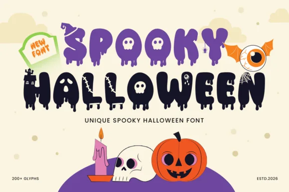
Spooky Halloween
Spooky Halloween (by Umitype) is a loaded 200+ glyph Halloween display font crowning melting slime letters with witch hats, haunted castles, skulls & eyeballs!
Spooky Halloween is a large horror alphabet in which letters melt: stems sag into drips, the counters stretch into ooze and small witch hats and castle silhouettes replace dots and terminals across a set of more than two hundred glyphs. The drips extend below the baseline, so the word box grows downward and needs clearance underneath. It needs roughly 34 mm for the drips and the ornament glyphs to read, and it is best in acid green or blood red on black, with the drips kept as a single flat colour.
Recommended project & layout
Halloween carnival poster, DTF party hoodie & boo-basket — Stack 2 uppercase words at 68–140 pt in royal purple and midnight black over cream or orange.
Before you cut or print
Intricate castle windows, drips, and monster counters are made for DTF shirts, Print-Then-Cut stickers, sublimation, and flat posters!
Best paired with
Get fontPaid link
 #6
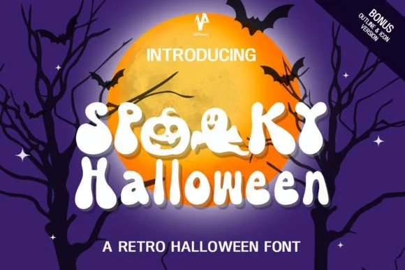
Spooky Halloween
Spooky Halloween (by NPNaay) is a 1970s groovy display pack hiding cute ghosts & jack-o'-lanterns inside letter bowls—PLUS a Bonus Outline & Icon version!
Spooky Halloween is a nineteen-seventies groovy novelty in which the counters hold ghost and jack-o'-lantern shapes: fat rounded letters with a soft outline, a wobbling baseline and a bonus outline cut plus a small icon set. The counter figures are the design and close first when the face shrinks, and the icons repeat the same wobble. It needs roughly 32 mm for the ghost and the outline to read, and it is best in one warm orange on white, or two inks on a dark ground where the outline prints as paper.
Recommended project & layout
Retro 70s 'SPOOKY VIBES' sweatshirt, glass can & sticker — Set row 1 in ALL-CAPS (to trigger the pumpkin & ghost 'OO' counters!) above smooth groovy lowercase on row 2.
Before you cut or print
Smooth groovy outer curves cut on 1.5 in+ HTV/vinyl (use tweezers for pumpkin eyes!) and shine on DTF & Libbey glass wraps!
Best paired with
Get fontPaid link
 #7
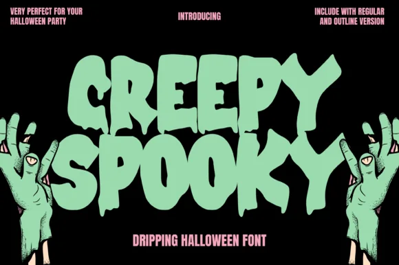
Creepy Spooky
Creepy Spooky is a bold B-movie slime-dripping display font shipping with BOTH Regular and Outline versions for layered monster graphics!
Creepy Spooky is a heavy block display drawn with long slime drips hanging from the baseline, and it ships in two versions, a filled Regular and an Outline, so a designer can layer one over the other for a two-colour effect. The capitals are wide and chunky, which keeps the word readable even when the drips are long, and the outline version has enough separation to hold a second ink. The drips are part of the anatomy rather than an add-on, so the face needs vertical room below the baseline; cropping close will sever them and make the word look damaged rather than gooey.
Recommended project & layout
Zombie-run 5K shirt, haunted-trail sign & slime-jar label — Stack 2 massive uppercase words (76–150 pt) in toxic slime-green over matte black.
Before you cut or print
Thick, rounded slime drips on the Regular version actually cut cleanly on 1.5 in+ glow-in-the-dark HTV & Oracal 651!
Best paired with
Get fontPaid link
 #8
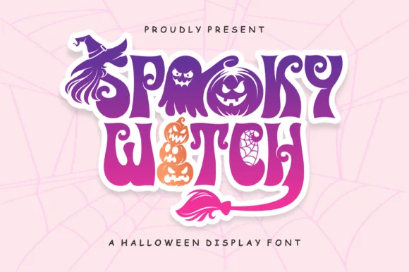
Spooky Witch
Spooky Witch weaves witch hats, stacked jack-o'-lanterns, cobwebs, and flying broomsticks directly into flamboyant Halloween capitals!
Spooky Witch is an illustrated Halloween alphabet in which letters are built from witch hats, stacked pumpkins and broomsticks: each cap carries a drawn hat with a bent tip, the stems become a pumpkin stack and a broom replaces a terminal, all on a set of illustrated coloured layers. The illustration is the letter, so a word grows tall with the hat and wide with the broom. It needs roughly 36 mm for the hat tip and the pumpkin ribs to read, and it is best as a four-colour process print on white, or a two-colour build on orange stock where the outline holds the shape.
Recommended project & layout
'WITCHES NIGHT OUT' wine tumbler, sticker & party shirt — Stack 2 uppercase words tight inside one 0.16 in white sticker cloud and color the pumpkin/broom details orange & purple!
Before you cut or print
Intricate cobweb counters and stacked pumpkin grins shine brightest in Print-Then-Cut stickers, DTF shirts, and sublimation wraps!
Best paired with
Get fontPaid link
 #9
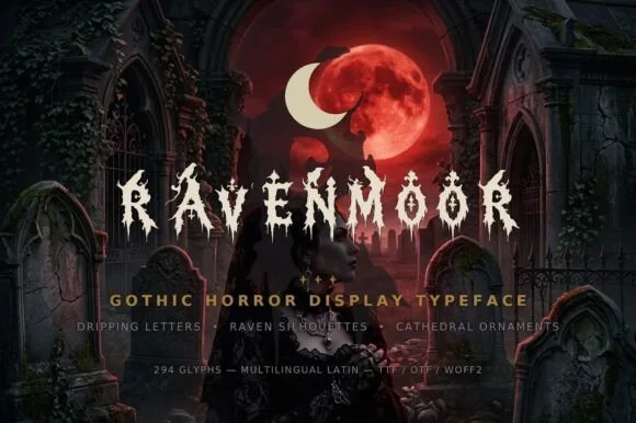
Ravenmoor
Ravenmoor is a gothic horror display in bone white on a crimson moonlit graveyard: jagged stems, drips falling from every baseline, points that extend into long spikes, with a tracked subtitle and a specification line beneath in small caps.
The word is set once, wide, and each letter is drawn with a broken silhouette: the stems carry spikes, the joins carry thorns, and the drips fall from the baseline at irregular lengths, which turns the words into an image of the scene behind them. Because the drips and spikes are structural, the face needs a large size and a dark ground, and the specimen supplies both with a graveyard scene under a red moon. The tracked subtitle and the specification line beneath sit in small caps with ornaments between them, which is how this kind of product lists its features, and the type there stays calm so the display keeps the weight. The palette is bone on crimson, and the ornament set mentioned in the copy is not shown, which is honest enough for a sheet this size.
Recommended project & layout
Haunted-manor invite, gothic candle label & Poe book jacket — Center all-caps titles at 54–96 pt in bone-white or crimson over dark graveyard/moonlit art, tracked at +15.
Before you cut or print
Tiny perched ravens and fine drip tips require print, web (WOFF2 included!), or DTF—do not weed small cut vinyl.
Best paired with
Get fontPaid link
 #10
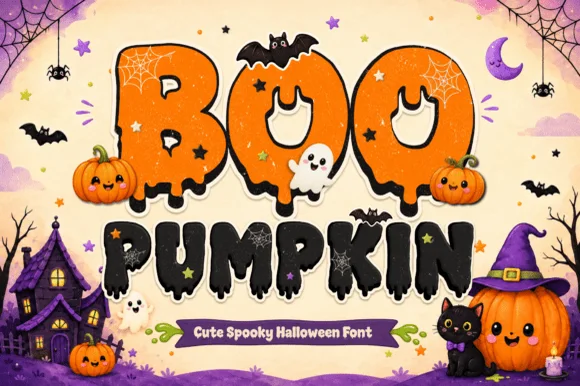
Boo Pumpkin
Boo Pumpkin is a playful-spooky Halloween display font carving jack-o'-lantern eyes, vampire fangs, and slime drips directly into chunky bubble letters!
Boo Pumpkin is a playfully spooky Halloween bubble display with melting stems, jack-o'-lantern eyes, vampire fangs and slime drips cut into the letters, so a word reads as a cartoon monster rather than a horror poster. The facial details live inside the counters, which means the face needs size for them to read, and the drips extend below the baseline. It needs roughly 30 mm for the eyes and fangs to hold, and it is best in orange and black on cream or in one ink on a dark ground.
Recommended project & layout
Kids' trunk-or-treat banner, boo-basket tag & party shirt — Color row one pumpkin-orange (with black outline) and row two midnight-black at 68–135 pt.
Before you cut or print
Detailed melting drips and fanged eye cutouts are ideal for DTF shirts, Print-Then-Cut stickers, and sublimation trick-or-treat totes!
Best paired with
Get fontPaid link
 #11
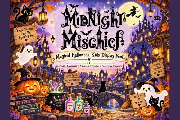
Midnight Mischief
Midnight Mischief is an enchanted children's Halloween display font curling fairy-tale serif stems with hanging spiders, stars, and moons! (Full charset + elements).
Midnight Mischief is a whimsical storybook Halloween display whose serif stems curl into spirals and trail hanging spiders, stars and moons, so a word reads as a page from a friendly children's spell book rather than a horror poster. The decorations sit outside the letter body, which extends the artwork box, and the curls need size to read as deliberate shapes. It needs roughly 30 mm for the spiders and stars to hold, and it is best in black on a lantern-warm ground or in one ink on kraft.
Recommended project & layout
Children's Halloween picture book, party invite & treat bag — Stack 2 mixed-case words at 56–105 pt over warm golden parchment ribbons amidst pumpkins and stars.
Before you cut or print
Dangling spider threads and fine spiral curls shine in book printing, invitations, sublimation, and Print-Then-Cut stickers!
Best paired with
Get fontPaid link
 #12
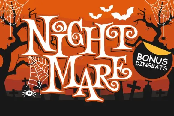
Night Mare
Night Mare is an angular decorative serif in which the letters stay uneven, the feet come to points and the terminals coil inward in tight spirals, so a stacked title reads as gothic horror lettering rather than a clean historical blackletter.
The G and E curl their terminals inward, the T stretches a long bar over neighbouring letters, the feet sharpen to points and the letter heights shift by design. The coiled terminal is the character: it puts the fright in the letterform instead of in added artwork, which is why the sample stacks a tall uneven title. Because the spirals are small, the face wants 36 pt before they resolve, and the points thin out in vinyl under three quarters of an inch of cap height. The extra characters are PUA-encoded, so any swash must be accessed deliberately.
Recommended project & layout
A haunted-story evening poster — Stack two short words above a clean time-and-location block, leaving the long top bars clear.
Before you cut or print
Confirm required characters and any bonus ornaments before layout approval.
Best paired with
Get fontPaid link
 #13
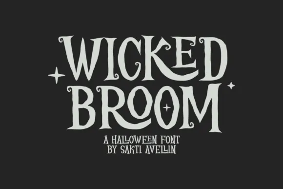
Wicked Broom
Wicked Broom shows tall narrow serif capitals with irregular pointed ends and tiny spiral terminals, where the R leg curls broadly beneath its neighbour and the O stays a long oval rather than rounding out.
The caps compress tall, the ends taper to points, small spirals finish several strokes and one leg sweeps under the following letter. The spiral terminal is the character: it gives a narrow cap row a gothic flourish without a picture, which is why the sample keeps to a short seasonal name. Because the spirals are the thinnest part, keep 30 pt as the floor, and keep 20 mm of clearance below where a leg curls past the baseline. The spirals are the thinnest strokes: they snap in foil and close below about 30 pt, and a leg that sweeps under the next letter needs 20 mm of clearance below the baseline.
Recommended project & layout
A story-night poster — Stack two title lines on a plain dark panel above clear event details.
Before you cut or print
Check the R and K curls against adjacent letters.
Best paired with
Get fontPaid link
 #14
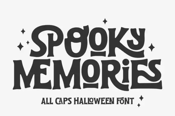
Spooky Memories
Spooky Memories is a capital alphabet in which the stems flare at the ends, some crossbars detach from their letters and the heights shift, so a word reads as lettering drawn by hand for a folk tale.
The S swells at both ends and finishes in a flare, the p holds a small bowl with a detached bar, the k splays into two flared arms and the y drops a hooked tail, all at a heavy even weight with terminals that widen rather than taper. The detachment is the character: the crossbar of the t and the bar of the e float a millimetre clear of the stem, which is what keeps the face from reading as a plain display serif and gives it a hand-cut look at 40 pt. Heights vary by a few millimetres, so it belongs on headings rather than on aligned lists. The white ground, the dark grey ink, the sparkles and the two caption lines are presentation; the display face is the two words.
Recommended project & layout
A Halloween photo-book cover — Stack two short lines above a plain year line, leaving the under-bars extra vertical room.
Before you cut or print
Confirm how the detached O bars and curled K are produced.
Best paired with
Get fontPaid link
 #15
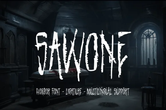
Sawone
Sawone is a tall, jagged horror display font drawn with dry Procreate brush strokes, splintered vertical drips, and nervous angular tension.
Sawone is a splintered dry-brush horror display: heavy strokes drawn with a split brush so each stem ends in ragged splinters, a slashed counter here and there, and a hard abrasion along the edges that reads as a blade scar. The splinters are the design and they vanish as soon as the face is reversed or printed small. It needs roughly 30 mm for the splinter and the abrasion to read, and it is best in one dark ink on white, or a single blood red on a matte black ground where the splinters print in reverse.
Recommended project & layout
Escape-room poster, haunted-house ticket & horror podcast — Track uppercase titles slightly open (+20) in stark bone-white centered over dark teal or charcoal photography.
Before you cut or print
Micro-textured brush streaks inside the stems call for print, digital banners, or DTF transfers rather than vinyl blade weeding.
Best paired with
Get fontPaid link
 #16
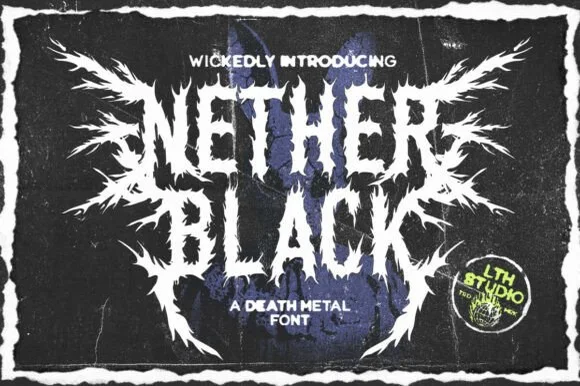
Nether Black
Nether Black is a ferocious death-metal display typeface erupting with symmetrical thorn spikes and splintered outer wings.
Nether Black is a jagged symmetrical death-metal thorn display: dense blackletter-derived stems with spikes thrown from every arm, mirrored ornaments along the vertical axis and a solid inner field that makes each word read as a barbed plate. It is a scene face, so it belongs on a record sleeve and a club flyer rather than on a product label. The spikes are the finest element and they fill into a solid edge when the face is reduced or screened. It needs roughly 40 mm for the spikes and the stems to read, and it is best one white ink on a black ground or the reverse.
Recommended project & layout
Haunted-attraction merch hoodie & horror gig poster — Stack two short 4-to-6-letter words centered on a black garment back, using the winged outer alternates only on the first and last letters.
Before you cut or print
Skip cut-and-weed vinyl on the razor-fine thorn tips—use DTF transfers, screen printing, or high-resolution poster print instead.
Best paired with
Get fontPaid link
 #17
Blade Gothic
Blade Gothic is a blackletter display in which the strokes break into sharp angles, the serifs fracture and the vertical rhythm stays clean, so a title reads as medieval lettering that still resolves at headline scale.
The B stacks two angular bows, the l raises a straight shaft, the a keeps an open counter inside a fractured bowl and the t crosses with a flat bar, all at a heavy weight with crisp cuts at every junction. The retained counters are the character: unlike extreme metal faces the letters stay readable, which is why the sample stacks two rows on a dark ground. Because the cuts are thin, the face wants 30 pt before the fractures print cleanly, and it works best as a short headline rather than a paragraph. The dark field and the small caption are presentation; the sharp blackletter rows are the face.
Recommended project & layout
Haunted attraction poster or dark-fantasy title — Use Title Case for titles and pair with clean uppercase sans for dates and venue lines.
Before you cut or print
Pointed serif tips cut cleanly at 2+ inches on vinyl signs and print sharply on dark posters.
Best paired with
Get fontPaid link
 #18
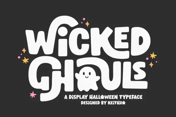
Wicked Ghouls
Wicked Ghouls builds heavy softly rounded capitals and then lets one counter become a ghost, with oversized strokes sweeping away from the word.
The letters are fat and nearly rectangular, with flat tops, tight sidebearings and rounded corners rather than true curves. Inside the O a small ghost shape is drawn as negative space, so that character is an illustrated glyph and will not appear in a plain setting of the alphabet. Long tail strokes escape from the outer letters and travel well beyond the cap height, which is what gives the headline its poster energy; those sweeps need horizontal space that a centred lockup will not provide. The stars and the tracked subtitle belong to the cover layout. Weight is uniform throughout, so the face stays consistent when printed in one flat colour.
Recommended project & layout
A friendly party poster — Reserve a separate area for any licensed illustration.
Before you cut or print
Do not assume the ghost is included.
Best paired with
Get fontPaid link
 #19
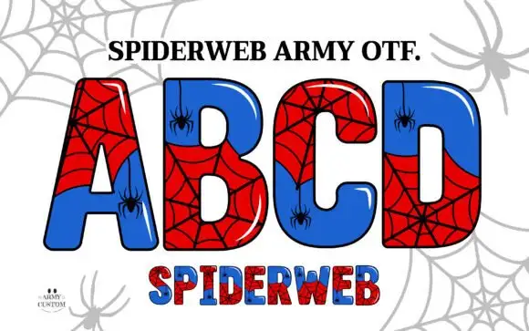
Spiderweb Army
Spiderweb Army draws fat comic capitals, splits each letter into two colour fields and covers the halves with drawn spiderwebs, then hangs a small spider from a thread inside the counters.
The alphabet fills the card in red and blue, every letter glossed with a white highlight and edged in a thick outline, and the webs are drawn across both fields so the join reads as a broken pane. Small spiders dangle into the counters from the top of each glyph, and a separate small word sits below in the same build at a smaller size. A web pattern spreads across the pale background. The face is a colour font with dense interior detail, so it holds as a comic shape at poster size and shows the webs only when it is printed large, and single-colour setting loses the split entirely.
Recommended project & layout
A spider-themed activity header — Set the title on a white upper strip with plain black activity instructions in a separate lower panel.
Before you cut or print
Check actual colour support and clear any project-specific rights independently.
Best paired with
Get fontPaid link
 #20
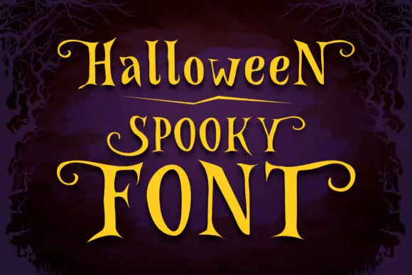
Halloween Spooky
Halloween Spooky shows tall high-contrast letters with pointed serif tips and long curling terminals, and the enlarged F and T extend horizontally across the lowest word of the composition.
The bodies stay narrow and tall, the serif tips sharpen to points, the terminals curl away and two letters spread their bars wide across the row below. The lateral curl is the character: the title reaches sideways from a narrow centre, which is why the sample sets yellow lettering on a dark woodland scene. Because the curls need lateral space even when the strokes are narrow, keep 24 mm at each end and 20 mm between rows from 28 pt.
Recommended project & layout
A lantern-walk event poster — Place the heading in an uncluttered central band and put route details below in plain type.
Before you cut or print
Proof thin strokes and leave side margins for curled terminals.
Best paired with
Get fontPaid link
Scripts & Calligraphy
4 fonts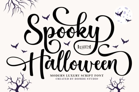 #21
Spooky Halloween
Spooky Halloween is a medium-bold bouncy calligraphy script (clean solid strokes without gore) featuring coiled spiral swash loops.
Spooky Halloween is a bouncy calligraphy script with a tall spiralled S, looped k and y stems and curved swash terminals, drawn in a medium weight with clean solid strokes and no gore. The bounce gives a short greeting movement, and the spiral terminals extend past the word, so the layout needs outer margin. It needs roughly 18 mm for the spirals to read as drawn loops rather than blots, and it is at its best in one dark ink on a misty or warm-neutral ground.
Recommended project & layout
Cute 'Spooky Season' sweatshirt, trick-or-treat tote & mug — Stack 2 title-case words at 6–9 inches wide on sand or orange crewnecks flanked by tiny bat silhouettes.
Before you cut or print
Weld all overlapping cursive joins ('o-o-k-y', 'a-l-l-o-w-e-e-n') before sending to your vinyl cutter.
Best paired with
Get fontPaid link
 #22
Spooky
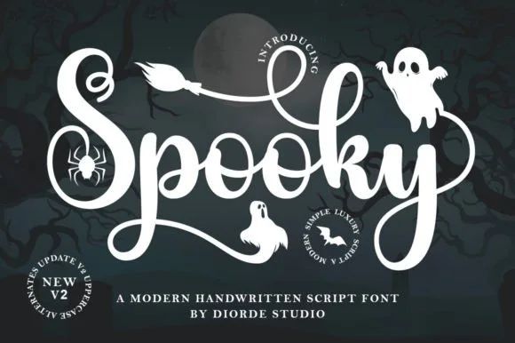
Spooky is a thick, lively Halloween handwritten script with sweeping overhead S-swashes and sturdy, cutter-friendly loops.
Spooky is a playful bouncy Halloween script with PUA swashes: a connected brush-marker script with a jumpy baseline, small spiked terminals and a large swash set that runs off the first and last letters. The bounce grows the word vertically and the PUA swashes need the alternate keystrokes to appear at all. It needs roughly 26 mm for the spike and the bounce to read, and it is best in one warm orange or purple on white, or a single bone ink on black where the spikes stay visible.
Recommended project & layout
Kids' Halloween bucket decal, ghost tumbler & party shirt — Center 1 big bouncy word ('Spooky', 'Boo Crew', 'Treats') at 4–8 inches wide in white or neon green HTV.
Before you cut or print
Weld overlapping lowercase connectors before cutting HTV or glossy Oracal 651; weeds fast down to 0.75 in.
Best paired with
Get fontPaid link
 #23
Wicked Brush
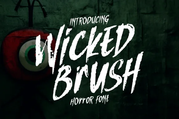
Wicked Brush is a rough brush script in which the strokes tear at the edges, the letters lean forward and the joins break, so a two-word title reads as something scrawled on a wall in a hurry.
The W drags two dry strokes into a point, the i keeps a light dash, the c opens a ragged crescent, the k breaks two diagonals and the d drops a torn bowl, all at a brush weight with inconsistent edges and a hard forward slant. The dryness is the character: the brush runs out of paint mid-stroke, which is why the sample sets two words at large size over a dark ground. Because the edges are ragged, the face needs 40 pt before the texture reads as a brush and not as a bad print, and it prints best in one light colour on a dark ground. The green wall, the painted eye, the dripping mark and the small caps above and below are presentation; the white brush words are the face.
Recommended project & layout
Haunted trail poster, thriller cover or Halloween party flyer — Angle headlines 8–10 degrees upward in stark white or blood red over black.
Before you cut or print
Ragged dry-brush edges are built for print, DTF and digital posters — not blade vinyl.
Best paired with
Get fontPaid link
 #24
Lovely
Lovely sets a fine signature script in a single dark weight over a pale city photograph, where a wide entry curve opens low at the left, the letters rise into tall slender loops through the middle and a large descending y plus an extended closing sweep make the lower right part of the footprint.
The stroke stays thin and even, the loops stay tall, the entry runs wide and the exit sweeps out. That asymmetry is the character: the word is wider at the right than the left, which is why the sample sits on a generous square field rather than a strip. The building behind it is scenery, not part of the type. Keep 26 pt as the floor, allow 25 mm of clear space at the right for the exit sweep and check the y loop against any line placed beneath.
Recommended project & layout
A quiet wedding invitation heading — Use a single script heading above the names. Keep a clear band beneath its lowest strokes, then set the venue and time in plain text.
Before you cut or print
Print at invitation size and check contrast on the chosen paper. Do not use the fine script for the address or RSVP instructions.
Best paired with
Get fontPaid link
Matched Font Duos & Packs
5 fonts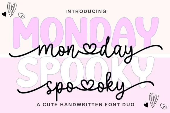 #25
Monday Spooky Script
Monday Spooky Script is a two-font 'Pasteloween' duo pairing a chunky rounded uppercase bubble display with a heart-connected monoline script.
Monday Spooky Script is a duo of a pastel spooky-cute bubble sans and a heart-connected script: the sans is a soft rounded block for titles, while the script runs an even stroke where the joins swell into small hearts between the letters. The pair reads as cute rather than frightening, and the heart joins close first when the face shrinks. The sans needs roughly 28 mm and the script 22 mm for their detail to read, and both work in two pastels on white.
Recommended project & layout
'Pasteloween' glass-can wrap, pink ghost hoodie & sticker — Set the uppercase display font at 72 pt in pastel lilac or blush pink, and overlay the black heart-connected script across its waist.
Before you cut or print
Weld all touching cursive and heart-connector joins on the script layer before cutting vinyl or HTV.
Best paired with
Get fontPaid link
 #26
Halloween Wish
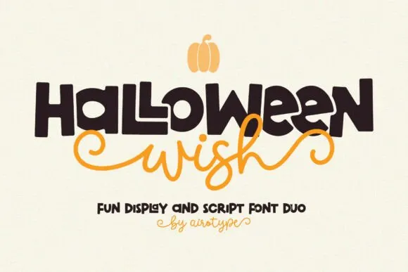
Halloween Wish pairs a big hand-drawn block word with a curly script that stretches beside it, so a short line gains a strong silhouette without losing the friendly spooky tone.
The display cut keeps thick uneven edges and a bold outline, the script curls its capitals and sends terminals past the word, and the two members sit at very different scales. The scale contrast is the character: one member shouts and the other whispers, which is why the pair suits a few words rather than a paragraph. Set the blocks at 48 pt and the script at 30 pt with 16 mm between them, and keep the script's stretch inside the trim.
Recommended project & layout
A Halloween birthday card — Place a chunky birthday heading above the name in script. Leave the script’s final curl a clear right margin, then put the personal dedication inside.
Before you cut or print
Check the full name and birthday message together; the script’s final stroke may need extra room.
Best paired with
Get fontPaid link
 #27
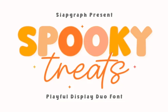
Spooky Treats
Spooky Treats pairs a chunky rounded block alphabet with a loose monoline script, so one design can carry a heavy lettered word and a light handwritten second line.
The block half is built from fat rounded strokes: the S reverses through two soft curves, the P holds a wide bowl, the K splays from a single stem and the Y ends in a shallow fork, with fully rounded corners and no contrast anywhere. The script half is a loose monoline with tall narrow loops, a light even stroke and letters that lean slightly back, which gives the pair its contrast in weight rather than in style. Used together they reproduce the look of a printed poster: one word shouting in blocks, the second whispering in pen. Counters in the blocks stay open at 20 pt, which makes the pair usable on a card as well as a banner. The cream ground, the orange inks, the small sparkles and the two tracked captions are presentation; the duo is the two words.
Recommended project & layout
Personalized trick-or-treat bucket, boo-basket tag or October tee — Alternate pumpkin orange and charcoal across the block caps above welded cursive.
Before you cut or print
Both fonts are smooth and vinyl-friendly — weld the script layer before cutting.
Best paired with
Get fontPaid link
 #28
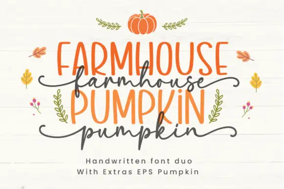
Farmhouse Pumpkin
Farmhouse Pumpkin is a two-cut family in which tall irregular marker capitals sit above a wavy script line, so a two-line design reads as a hand-painted autumn sign rather than as typeset text.
The caps build an F with uneven arms, an A with a low bar, an M with wandering stems and a P with a soft bowl, all at a marker weight with irregular heights; the script cut waves a connected line with a hooked p. The pairing is the character: the caps are upright and slightly crooked and the script is loose, which is why the sample alternates the two cuts line by line. The caps hold at 30 pt and the script at 26 pt, and both print in one flat colour each. The white boards, the pumpkins, the leaves and the small sprigs are presentation; the orange caps and dark script are the family.
Recommended project & layout
An autumn produce-stall sign — Keep the capital produce name above the script word rather than overlapping them; set prices and opening times in plain type below.
Before you cut or print
Check the supplied pair and confirm any pumpkin artwork separately.
Best paired with
Get fontPaid link
 #29
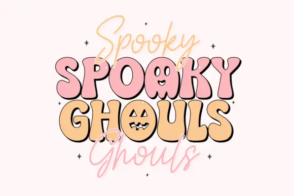
Spooky Ghouls Duo
Spooky Ghouls Duo pairs fat rounded Halloween capitals on a bouncing baseline with a hairline casual script above and below them, and turns two counters into faces.
Each capital keeps a small wedge serif at the corners and a soft inner shadow, so the shapes read plump rather than novelty-thin. Two counters are drawn as faces, a pumpkin with cut eyes inside one O and a ghost in another letter, which means those characters are illustration rather than neutral shapes. The capitals do not sit level: every word rises and dips by roughly a tenth of its cap height, producing the hand-cut sticker feel. The companion script is a thin, high-waisted marker with a slight right lean and short entry strokes. Stars scattered between the words are cover decoration, not glyphs.
Recommended project & layout
A friendly costume-party invitation — Keep the venue beyond the script descenders.
Before you cut or print
Confirm whether the ghost and pumpkin forms are included.
Best paired with
Get fontPaid link
Serifs & Slab Serifs
2 fonts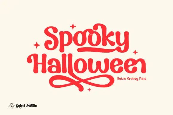 #30
Spooky Halloween
Spooky Halloween uses soft heavy serif shapes rather than sharp or dripping forms, set in red on cream, with a rounded underline that runs under the first word, crossed loops sweeping beneath the second and four small four-point stars placed around the block.
The strokes stay soft and thick, the serifs round off, the joins close and the tails curl into loops. Those underlines are the character: the season reads through shape and curve rather than bats or drips, which is why the sample keeps the block alone on a plain ground. The underline may come from a swash or from a decorative glyph, so check what your file carries before promising it, keep 38 pt and leave 26 mm beneath the lower word for the crossed loops.
Recommended project & layout
A friendly party invitation — Leave an open band below the title for the long loops.
Before you cut or print
Confirm that the needed swashes can be entered.
Best paired with
Get fontPaid link
 #31
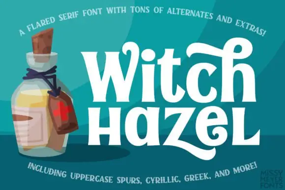
Witch Hazel
Witch Hazel shows substantial white serif letters on teal beside an illustrated bottle, where the strokes flare before each serif, the bowls stay round, a tall h curls across the top and a broad z sweeps into a long low tail.
The stems carry a real weight, the flares widen just under the serifs, the counters close round and two letters leave the baseline: the curled h and the long z tail. The flare is the character, since it gives a plain word a witchy edge without adding ornament. Source notes also list PUA extras, ligatures, stylistic alternates and a bold cut, so check which of those the file actually carries before promising a swash, and keep 30 pt as the floor so the thin flares survive print.
Recommended project & layout
A magical story-event heading — Use wide margins around the h and lower tails.
Before you cut or print
Verify exact swashes and keep event details plain.
Best paired with
Get fontPaid link
Practical buyer checklist
Frequently asked questions.
Key cutting, printing and pairing answers before choosing a Halloween typeface.
Which Halloween fonts can be cut from vinyl?
Blocks and bubble faces with attached detail, cut at 2 inches or more. Dripping and ooze designs carry loose elements that will not survive weeding, so print those instead of cutting them.
How do I keep a Halloween design from looking childish?
Limit the palette, choose one horror element per layout, and set the supporting text in a plain condensed sans. Restraint is what separates a designed piece from a party-supply print.
Are illustrated Halloween alphabets hard to typeset?
Yes if you need every letter to carry an illustration. Most sets alternate decorated and plain glyphs, so check which letters are plain before building a word, and avoid setting long phrases in the illustrated version.
What size works for a Halloween porch sign?
Lettering from 4 to 6 inches on an 18 inch wide board. Below 3 inches the drip and ooze detail disappears, and the sign reads as a grey rectangle from the street.
Keep exploring
Related collections & guides.
Explore adjacent maker roundups or check our practical pre-production checklists.
01 / Type Styles
Heavy metal, spiked & horror display
17 curated fonts · Previews & pairings
02 / Holidays & Seasons
Autumn
26 curated fonts · Previews & pairings
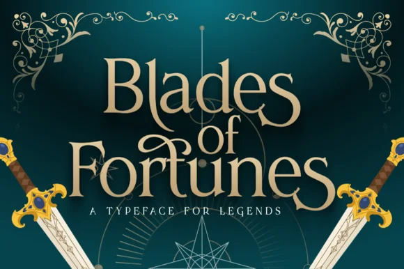
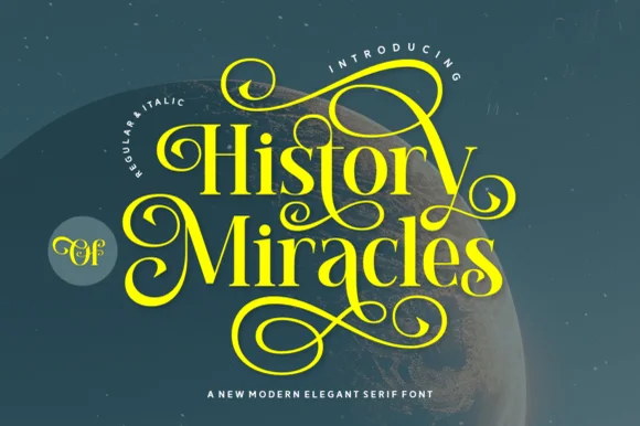
03 / Branding & Print
Romantasy, medieval & book covers
21 curated fonts · Previews & pairings
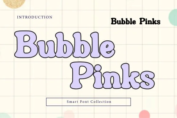
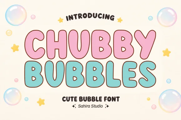

04 / Cricut & Craft
Sublimation, sticker & Print-Then-Cut
29 curated fonts · Previews & pairings
Guides: Invitation font checklist · Vinyl & cutting checklist · How to pair script & sans fonts