Neutral Sans Workhorse

Wavytion + Nyxar
Lets Wavytion own the focal silhouette while handling secondary copy, sizing and subheads cleanly.
Inspect Nyxar specimenDisclosure: MakerFileHub may earn a commission from qualifying purchases via paid links on this page. How our links work.
Waved condensed display
Wavytion is a waved display in white over a photograph of a portable record player: very tall narrow forms whose stems bend into broad alternating waves, so the word reads as a ribbon, with a second line in a softer wave beneath and small notes in the corners.
Paid link
Get this fontProject & layout blueprintsAt-a-glance maker compatibility
Sturdy stroke walls and open counters weed cleanly on adhesive vinyl, HTV apparel film, and cut cardstock.
Visual anatomy & craft review
The word fills the centre of the plate and the drawing is a condensed face whose stems are bent into repeated waves, which turns a line of text into a graphic ribbon. That construction sets a large size floor and makes the face unsuitable for anything but a short word, because the wave pattern compounds across letters and the counters close when the letters shrink. The plate sets a second, smaller line in a gentler wave beneath, which usefully shows that the effect can be dialled down. The record player behind it is staging that names the retro register, and the corner notes carry the year, the formats and the language support. Because the letters are decorative and linked, the face suits a poster, a sleeve and a cover line rather than a heading in running text.
Display, wavy, condensed, retro
Two-font hierarchy recipes
Tested contrast partners — pairing Wavytion with grounded secondary typography.
Wavytion + Nyxar
Lets Wavytion own the focal silhouette while handling secondary copy, sizing and subheads cleanly.
Inspect Nyxar specimen
Wavytion + Majestic Letters
Grounds bold display lettering with classic typographic authority on posters, badges and apparel.
Inspect Majestic Letters specimenPractical applications
Concrete hierarchy, scale and production guidance tailored to Wavytion’s stroke geometry.
A waved ribbon reads as a record sleeve title, and the tall forms hold across a poster at club distance. The ribbon reads as a sleeve at poster size.
Hierarchy & layout recipe
A2 poster: the night at 110 mm cap height, the date in a 24 mm sans, and the venue at 12 mm. Keep 30 mm margins and print one colour on a dark stock. Leave 30 mm under the date for the venue.
Pre-production check
Check the A2 at five metres, where the waves can blur into a pattern; keep 4 mm between stems. Confirm the 12 mm venue reads at two metres and that the ribbon stays even.
A waved display turns a title into an image, and the single colour prints cleanly on a sleeve with a photograph behind it.
Hierarchy & layout recipe
Set the title at 90 mm cap height across 190 mm, the artist in a 10 pt sans, and the catalogue number at 7 pt. Print one ink on a coated stock and keep 20 mm margins.
Pre-production check
Check the title at 90 mm, where a wave can collide with the letter beside it; add tracking. Confirm the 7 pt catalogue number survives lamination and that the title clears the trim.
A waved mark gives a shop a sign that reads as a groove, and the tall forms fit a narrow fascia. A groove reads before a shop name does.
Hierarchy & layout recipe
Cut 700 by 300 mm vinyl: the shop at 100 mm cap height, the hours in a 20 mm sans, and a 4 mm contour. Keep 22 mm margins and keep the wave stem above 6 mm.
Pre-production check
Check the cut at 100 mm, where a 4 mm stem can tear on weeding; widen it to 6 mm. Confirm the 20 mm hours read at two metres and that the wave clears the frame.
Technical & licence verification
Confirm included OTF/TTF/WOFF formats, full glyph tables and licence coverage on the live store page before batch production.
Closest visual alternatives
Matched across letterform anatomy, stroke behaviour and craft applications.
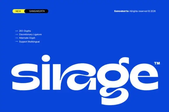
Wide display lowercase with flowing joints
Sirage is a wide display in white on a saturated blue: lowercase with a flowing a construction that sweeps through the bowl, an extended double-bowl g, thick even strokes and round terminals, set as one large word with a small badge at the top left and a list of features beside it.
Ideas for this font
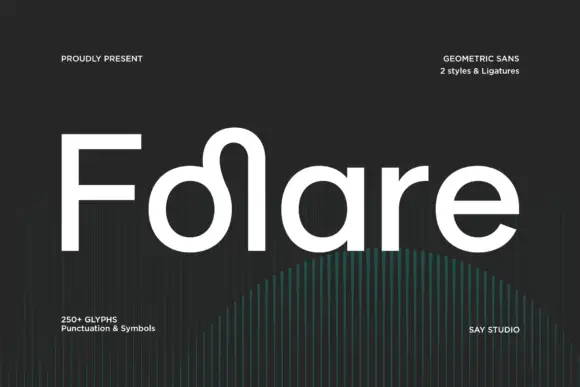
Rounded mixed case with a looped rise between the o bowl and tall l stem
Folare is a geometric sans in which the lowercase l loops over the preceding letter, the counters are near perfect circles, and every terminal is cut flat on the horizontal.
Ideas for this font
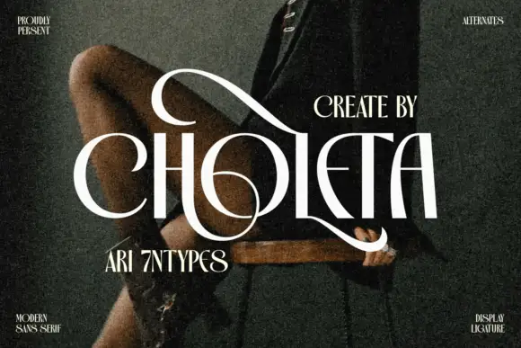
Contrasting capitals woven through a large upper loop and low circular sweep
Choleta builds tall white capitals and then lets thin strokes cross through them, so the counters open into slashes and the whole line reads as one sculpted ligature rather than six separate letters.
Ideas for this font
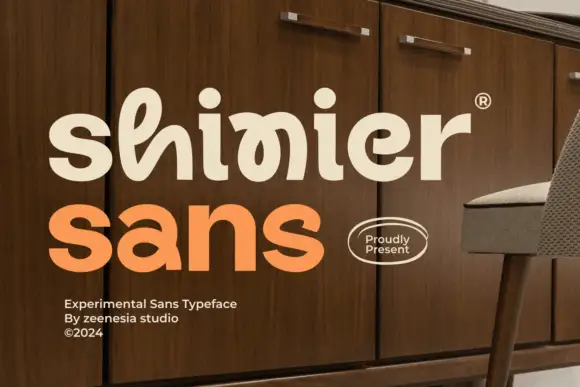
Experimental looped display
Shinier is an experimental display in cream and orange on a walnut cabinet: rounded mixed case in which tall loops are threaded through the letters, an interlocked final n and r, and a registered mark at the shoulder, with a plain sans caption at the foot.
Ideas for this font
Same independent foundry
Allow optional Google Analytics to measure visits and catalogue actions. Your search words and notes are not included. Privacy & storage