Practical typography checklists
Maker font guides
before you cut or print.
Three working checklists: invitation hierarchy, blade-ready vinyl, and two-font pairings that hold together after the first draft.
Every profile on this site ends with the same question in a different costume: will this face survive the job? A script that looks flawless in a 1,200-pixel specimen can lose its entry swash inside an A7 margin, and a display face with beautiful texture can turn into confetti the moment a 45-degree blade meets it. These three guides collect the checks we run most often, in the order we run them.
They are written from the catalogue itself. We read 4,091 preserved creator previews and the records behind them — style family, tag list, alternate and PUA flags — and we grouped the recurring failure modes into three workflows: stationery, craft cutting, and pairing. Each guide names real profiles so you can open a specimen and see the thing being described rather than take our word for it.
What these checklists are not
They are not machine settings. We do not own your cutter, your heat press or your press operator's paper stock, and we are not going to invent a blade depth for a machine we have not run. What we can do is tell you which letterform decisions cause trouble, which file questions to ask before you buy, and where a strong-looking font turns fragile. The rest of the answer belongs to your test cut, your proof print and your licence terms.
The three checklists
Pick the workflow you are standing in.
Stationery, machine cutting, or the pairing decision that comes before either. Each page opens with the checks and ends with real profiles.


Choosing fonts for invitations
Build a reading order, test your own names and numerals at 10pt, and leave margin for the tails that a trimmer will find.
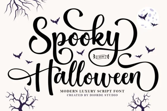
Vinyl & craft cutting font checklist
Weld overlapping connectors, measure the thinnest stroke, count the islands inside a grunge texture, and know when a pen needs a single-line path.
How to pair script & sans fonts
Give the decorative voice one short line of work, then choose the supporting face by x-height and stroke weight rather than by mood.
Visual specimen examples
Representative typefaces across all three workflows.
Real specimens showing invitation calligraphy, cut-ready display strokes and one paired set drawn to work together.
How to use them together
A wedding suite usually needs all three. The invitation guide decides the hierarchy; the pairing guide decides who carries the couple's names and who carries the address block; the cutting guide takes over the moment the same artwork becomes a vinyl table number or a foil-quilled place card. Read them in that order and the second and third passes get shorter, because the decisions you made in the first one stop being open questions.
If you already know the workflow and want options rather than rules, the fastest route is a roundup: wedding fonts and bridal calligraphy for stationery, cut-friendly vinyl faces and single-line pen fonts for machines, font duos when a foundry has already matched the pair. Structural browsing lives in script, sans serif and slab serif archives, and the A–Z directory covers the remaining 26 letter buckets.
New to the catalogue? The editorial method explains what a Maker scorecard measures and what it deliberately does not.