 #1 · Best Overall
Heartbeat Monogram
EKG pulse-line & geometric heart nurse/medical monogram
Get fontPaid link
Read review ↓Disclosure: MakerFileHub may earn a commission from qualifying purchases via paid links on this page. How our links work.
EKG monograms, stethoscope detail & scrub-friendly lettering
Medical appreciation design runs on a handful of motifs: the EKG pulse line, the stethoscope loop, the scrub pocket and the badge reel. Heartbeat Monogram and Love Heart Monogram build the pulse line into the letterform, Doctor and Nurse use medical instruments as glyph detail, and Lucky Nurse and Nurse Monogram cover the feminine and monogram registers. Humble Teacher and Chalky Teacher add the classroom counterpart.
Quick verdict
Heartbeat Monogram is the strongest for a badge reel or tumbler, Nurse Monogram covers the illustrated monogram case, and Lucky Nurse suits a soft serif design. Humble Teacher is the pick for the classroom version of the same gift.
Quick answer
Short on time? Start with our three highest-rated nurse, medical & teacher appreciation standouts before scrolling the full breakdown.
#1 · Best OverallEKG pulse-line & geometric heart nurse/medical monogram
 #2 · Runner-Up Pick
 #3 · Editor's Choice
We kept 21 of 345 candidates after testing each on a simulated badge reel and a 20 oz tumbler. Weighted whether the pulse line is fused to the letter, legibility at 1 inch, and how the illustrated detail survives a single colour.
Side-by-side summary
Compare specimens, OpenType/PUA traits and primary project roles side by side.
| Rank & Font | Style & File Specs | Best Project Fit | Store Listing |
|---|---|---|---|
| DecorativeHealthcare | Nurse/doctor stethoscope tag, scrub-pocket HTV & tumbler | Get fontPaid link | |
| DecorativeCompassionate | Nurse Week badge reel, RN clipboard decal & tote bag | Get fontPaid link | |
| DecorativeClinical-playful | School-nurse door sign, health-fair poster & Pre-med tee | Get fontPaid link | |
| DecorativeMedical | Nurse Week sublimation tumbler, badge reel & scrub tote | Get fontPaid link | |
| Slab SerifAlternates & swashes | Minimalist RN tumbler, embroidered scrub jacket & badge | Get fontPaid link |
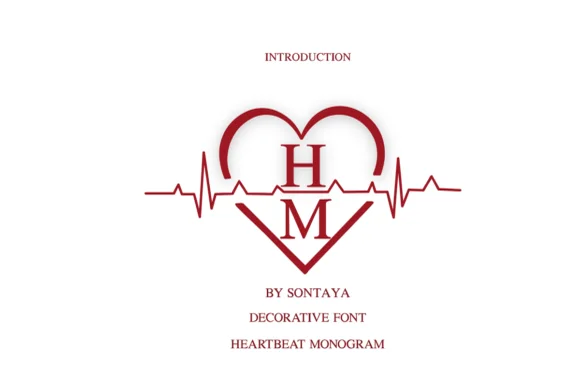
#1 · Best OverallHeartbeat Monogram frames classic serif initials inside crisp heart outlines bisected horizontally by a sharp EKG cardiogram pulse line.
Heartbeat Monogram is a decorative mark rather than a text face: serif initials sit inside a symmetrical heart outline that is crossed horizontally by a sharp EKG pulse line, so the mark reads as a medical badge with the heart as a frame. The pulse line and the initials must not collide, which means the mark needs size and a clean counter around the letters. It needs roughly 30 mm across for the pulse peaks to read, and it is best in one medical crimson on white or a single ink on scrub fabric.
Nurse/doctor stethoscope tag, scrub-pocket HTV & tumbler — Cut a 3-to-4-inch monogram in crimson, rose gold, or white permanent vinyl for 30 oz healthcare shift tumblers.
Solid vector ribbons weed reliably at 2.5 inches+ tall—take care around the sharp EKG spike points with tweezers.
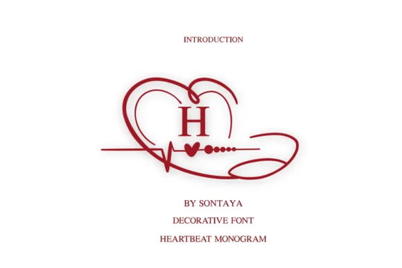
#2 · Runner-Up PickLove Heart Monogram wraps classic serif initials in a sweeping heart-and-EKG ribbon that loops around like a medical stethoscope.
Love Heart Monogram is a healthcare monogram in which a stethoscope tube draws the loop of a heart, the chest piece closes the bowl and a small EKG trace runs through the middle as a flat line with one spike. The construction is locked, so the mark scales as one piece, and the EKG spike is the finest element. It needs roughly 26 mm for the spike and the tubing to read, and it is best in one ink on white and pale blue, or a single deep colour on a badge holder.
Nurse Week badge reel, RN clipboard decal & tote bag — Center 1 monogram glyph at 3–4.5 inches wide in berry red or metallic gold above the nurse's full name.
Fine tapered curves and tiny pulse dots shine in sublimation, print, laser engraving, and 3 in+ vinyl decals.
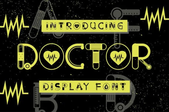
#3 · Editor's ChoiceDoctor is a clever medical novelty display font constructing bold geometric capitals out of stethoscopes, bandages, EKG pulses, and syringes.
Doctor is a novelty display that builds geometric capitals out of medical equipment, with stethoscope tubing forming curves, bandage strips across the D and T, EKG traces inside the O counters and syringe forms in the stems, so a word reads as an illustrated alphabet rather than a text face. The illustration is inside the letters, which means the face needs size for the equipment to read, and it works best in flat colours with a clean keyline. It needs roughly 34 mm for the illustrations to hold, and it is best in surgical green and white on a dark ground or in one ink on a pale one.
School-nurse door sign, health-fair poster & Pre-med tee — Set 1 focal uppercase word ('DOCTOR', 'NURSE', 'CLINIC') big at 60–110 pt over dark navy or clean scrub-blue.
Fine interior medical linework is built for Print-Then-Cut stickers, DTF shirts, sublimation mugs, and posters—not small cut vinyl.
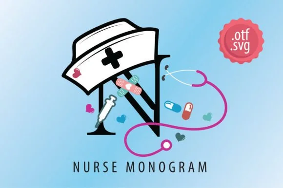 #4 · Top Maker Utility
Nurse Monogram is an illustrated color decorative alphabet wrapping bold initials in nurse caps, stethoscopes, syringes, bandages, and pills.
Nurse Monogram is a full-colour illustrated medical monogram alphabet in which each initial is drawn inside clinical objects: a stethoscope curling around the letter, a small heart-rate trace under the base and a set of scrub-blue and cream colour layers, delivered as font and as SVG. The illustration is the letter, so the trace and the tubing are the finest elements and close first. It needs roughly 34 mm for the trace and the tubing to read, and it is best as a four-colour process print on white, or a two-colour build on navy where the outline holds the shape.
Nurse Week sublimation tumbler, badge reel & scrub tote — Place a single 3.5-to-5-inch illustrated initial above the nurse's full name set in a clean tracked sans serif.
Designed for full-color sublimation, DTF transfers, and Print-Then-Cut stickers rather than single-color cut vinyl.
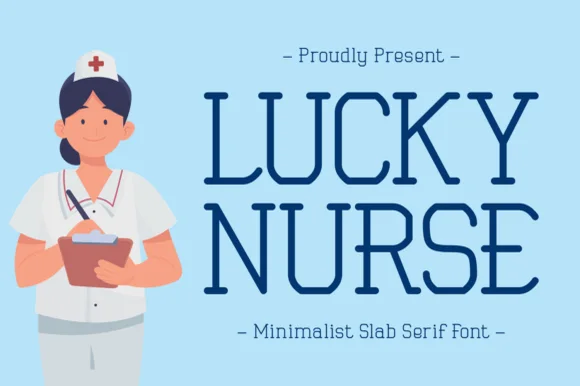 #5 · Standout Silhouette
Lucky Nurse is a slender, minimalist uppercase slab serif accented with delicate curled hooks on diagonals and R/K legs.
Lucky Nurse is a dainty monoline slab serif in which the slab feet curl into small swash legs and the ascenders finish in a light loop rather than a straight stem. The monoline keeps the weight even, so the face stays legible at small sizes on a badge, and the curls are the smallest detail that closes first. It needs roughly 20 mm for the curled legs to read, and it is best in one ink on white and pale blue, or a single soft colour on a badge holder.
Minimalist RN tumbler, embroidered scrub jacket & badge — Stack 2 uppercase words at 42–68 pt with +12 tracking in navy, scrubs-teal, or rose gold.
Clean solid single-line vectors cut nicely on 1 in+ tumbler vinyl and laser-engrave crisply onto insulated Yeti/Stanley cups!
 #6
Nurse is a decorative silhouette face in black and white over a photograph of a nurse holding a red heart: each capital is a solid block with a medical figure cut out of it — a nurse with a stethoscope, a wheelchair, a heartbeat, a caduceus — with a white keyline around every letter.
The two words are stacked and the face is a picture alphabet: the counters and the negative space inside each letter are drawn as figures rather than as shapes, so the word reads as a set of icons at a glance and as letterforms at a second look. The white keyline is what keeps the black blocks separate against a photograph, and it is part of the design rather than a workaround. Because the figures carry the meaning, the face is a display cut for a specific subject, and the plate sets it large enough that each silhouette is recognisable. The red heart in the photograph repeats the only warm colour in the image, and the teal scrubs give the black something to sit against.
Hospital-unit banner, Nurse Week poster & sublimation mug — Set 1 or 2 short words ('NURSE', 'CARE', 'HERO') big at 72–130 pt wrapped in a white sticker contour.
Miniature nurse and caduceus cutouts require Print-Then-Cut stickers, sublimation mugs, or DTF shirts—too intricate for small vinyl weeding.
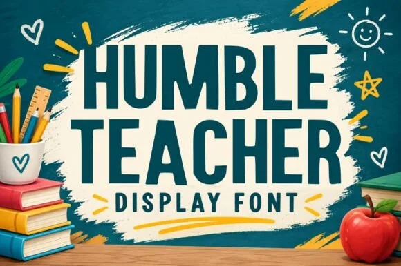 #7
Humble Teacher is a tall, chunky hand-cut uppercase display typeface built for across-the-classroom bulletin boards, totes, and school apparel.
Humble Teacher is a tall hand-cut classroom poster and bulletin-board display: narrow upright letters with visible scissor-cut edges, slightly mismatched heights and blunt corners, drawn to look as if cut from coloured paper and pinned up. The cut edges are the design and they silt when the face is reduced. It needs roughly 24 mm for the cut edge and the height mismatch to read, and it is best as a one-colour vinyl or paper cut on a light ground, or one ink print where the cut edge reads as a shadow.
Classroom bulletin-board header, teacher tote & lanyard tag — Cut 3-to-4-inch cardstock letters in alternating bright primary or pastel colors for bulletin-board headers.
Zero thin lines or fragile serifs—one of the fastest, cleanest fonts to cut on cardstock, HTV, and permanent mug vinyl.
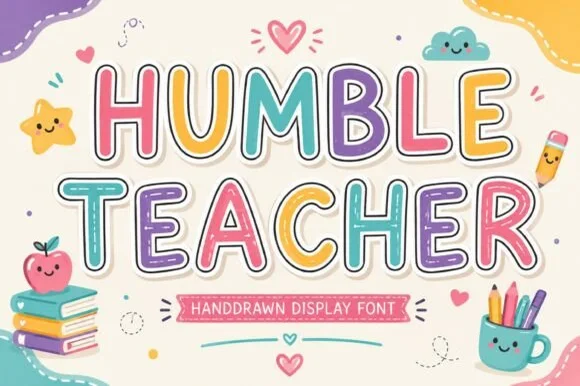 #8
Humble Teacher (by 29Graphic) is a cute, rounded hand-drawn classroom display font shown with double sticker-outline framing and wide open bowls.
Humble Teacher is a rounded classroom display whose upright caps sit inside a double sticker outline, with wide open bowls and a hand-drawn softness, so a word reads as a cut-out classroom sign rather than as printed type. The double outline is part of the glyph, which means the face needs size for both rings to register, and the open bowls keep it legible at 20 mm. It needs roughly 26 mm for the double ring to read, and it is best in pastel fills on cream or in one ink on a pale ground.
Elementary teacher shirt, bulletin-board title & folder — Color individual letters in soft pastel pink, sky blue, lemon, lavender, and mint over cream backgrounds.
Great for Print-Then-Cut stickers, DTF teacher tees, and classroom posters; solid core cuts cleanly on HTV.
 #9
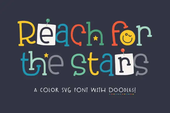
Reach for the Stars shows thin mixed-case letters in many colours on a dark navy field, where two letters sit on white pinned notes, a rounded o holds a smile, small stars tuck beside the strokes and the rows stay deliberately uneven on a typed lattice.
The strokes stay thin and even, the colours change per letter, the heights drift and two letters are replaced by pinned paper. Those pinned notes are the character, because the sample reads as a pinned-up message board rather than a designed headline. The cover also labels the face a colour SVG font with doodles, which matters before any print is planned, since colour glyphs need a pipeline that supports them. Check that your output survives a PDF or a cutting machine, keep 40 pt and do not rely on the smile in a single-colour job.
A classroom goal-board title — Place Reach for the stars on a plain navy header above a grid of separate white goal cards; keep the goal instructions in solid plain text.
Check colour-font support and the actual motif glyphs in the intended application.
 #10
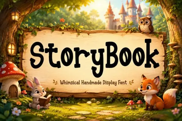
Storybook is a mixed-case display in which the letters stand upright with gently pointed serif ends, the heights shift slightly and the o counters narrow into leaf shapes, so a title reads as hand-carved lettering for a children's tale.
The S turns a soft spine with pointed terminals, the o pinches its counter into a leaf, the y drops a short rounded descent and the capitals sit only a little above the lowercase, so a word stays even in tone. The pointed soft serif is the character: it suggests a carved edge without any distress, which is why the sample sets one title on a wooden sign. Because the points are soft, the face holds from 26 pt and cuts from three quarters of an inch of cap height; the uneven heights mean a long line reads best at 30 pt and above. The woodland characters and the castle behind the sign are artwork; the cream lettered title is the face.
An original children’s story cover — Set two title rows in a calm panel above original artwork.
Check unusual o counters and avoid implying supplied character art.
 #11
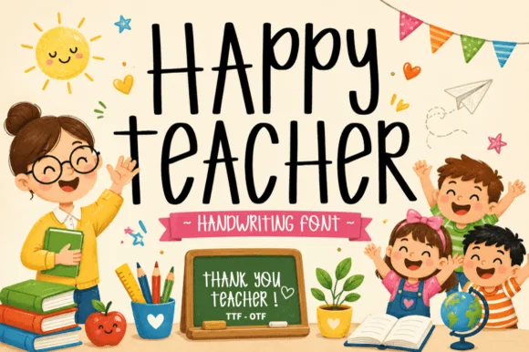
Happy Teacher is a tall, upbeat handwritten marker font mixing lively uppercase and lowercase forms for warm classroom signage and gifts.
Happy Teacher is a tall bouncy classroom marker print: disconnected capitals with a heavy even stroke, a baseline that lifts and dips across the word and blunt square terminals. The bounce grows the word vertically, and the blunt ends are what keeps the letters legible on a wall. It needs roughly 24 mm for the bounce and the blunt end to read, and it is best in one bright ink on white, or a single dark colour on pastel card where the blunt ends stay solid.
Teacher clipboard vinyl, classroom welcome door & tote — Mix an all-caps first word ('HAPPY', 'MRS.') over a bouncy lowercase second line ('teacher', 'grade 2') accented by stars.
Zero thin hairlines or overlapping cursive loops—weeds in seconds on Oracal 651 and HTV down to 0.6 inches!
 #12
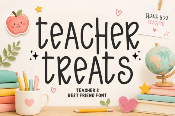
Teacher Treats is a tall, whimsical hand-drawn marker font featuring gently curled ascenders and airy, disconnected mixed-case print.
Teacher Treats is a playful classroom marker print with curved letters: each character bows slightly, the baseline arcs across the word and the terminals finish in a small hook rather than a blunt cut. The curve grows the word vertically and the hook is the smallest detail. It needs roughly 24 mm for the hook and the bow to read, and it is best in one bright ink on white and cream, or a single dark colour on pastel card where the hooks stay open.
Snack-cart bin label, teacher lounge jar & treat topper — Stack 2 lowercase words centered at 48–84 pt with tight 0.95 leading and tiny star accents on both sides.
Smooth, even marker strokes cut cleanly on Cricut vinyl, HTV, and sticker stock down to 0.65 inches.
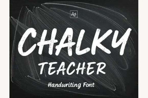 #13
Chalky Teacher is an authentic blackboard handwritten font streaked internally with realistic dry-chalk grain across bold slanted strokes.
Chalky Teacher is a slanted brush alphabet with dry-chalk grain baked into the strokes, so the interior of each letter breaks into fibrous streaks instead of presenting a flat colour. The letters are bold and a little irregular in height, which reproduces the way a board is written quickly during a lesson, and the slant gives the line momentum. Because the texture is internal, the face needs a reasonable size to read as chalk rather than noise, and it is the wrong choice for a small label where the grain fills the counters; it belongs on boards, posters and large photo props.
'First Day of Kindergarten' photo-prop board & classroom poster — Stack bold uppercase headers (72 pt) over smaller mixed-case teacher/grade lines (36 pt) on dark slate textures.
Internal chalk-dust streaks require Print-Then-Cut, posters, sublimation, or DTF—never attempt to blade-weed vinyl!
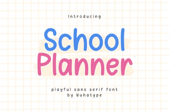 #14
School Planner is actually a plump, cheerful rounded marker print font (NOT a thin hairline sans despite seller copy!) built for readable notes & labels!
School Planner is a plump rounded felt-tip marker sans for classrooms and planners: a fat even stroke with soft rounded ends, open counters, a level baseline and a friendly width that stays readable in a small box. The rounding keeps the face warm and closes the counters when it shrinks. It needs roughly 22 mm for the rounded end and the counter to read, and it is best in one bright ink on white, or a single dark colour on pastel paper where the rounded ends stay open.
Teacher digital slide header, binder spine & cubby decal — Stack 2 mixed-case words at 56–110 pt in bright marker blue and pink over grid or white backgrounds.
Sturdy rounded strokes cut and weed in seconds on Cricut Oracal 651, HTV, and sticker labels down to 0.55 inches!
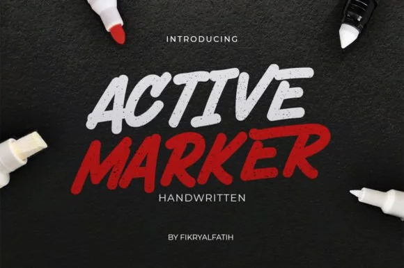 #15
Active Marker captures brisk, slanted broad-tip marker lettering with organic stroke tapers and natural double-letter ligatures.
Active Marker is a slanted chisel-tip whiteboard and chalkboard marker sans: even strokes with a visible chisel angle, blunt ends that read as a marker turned in the hand, a firm slant and open counters that stay clean on a board. The chisel angle is the design and it flattens when the face is reduced. It needs roughly 20 mm for the chisel angle and the blunt end to read, and it is best in one dry-erase or chalk ink on a board, or a single dense ink on uncoated stock where the chisel edge prints as a step.
Coffee-shop daily specials board & deli menu header — Highlight section headers ('ESPRESSO', 'FRESH BAKED') in bold white or red at 36–54 pt above clean tabular price columns.
Sturdy solid strokes cut smoothly on chalk-style matte vinyl at 0.8 in and taller with minimal weeding fuss.
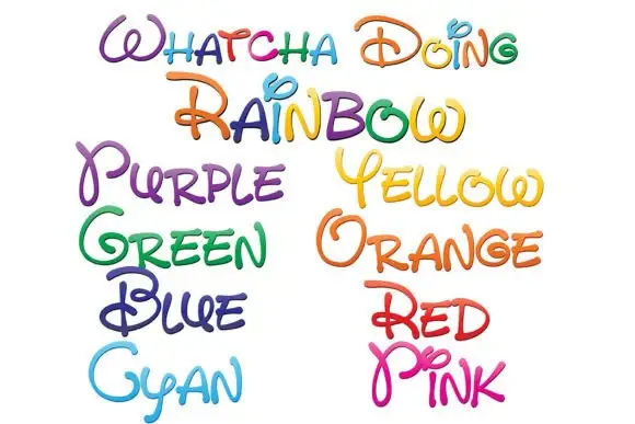 #16
Whatcha Doing is a playful curled script in which each letter carries a decorative loop or tail, and the sample sets the set's name plus a colour word in each of eight colour variants.
WHATCHA DOING runs across the top in mixed colours, and each letter is a single-stroke script with exaggerated loops — an O that spirals into a ball, a D with a curl on its tail, a G with a hooked descender — drawn with a slight thickness variation and no fill. Below, the colour names are set in the same construction one per colour: Purple, Yellow, Green, Orange, Blue, Red, Cyan, Pink. The point of the sample is the palette: the same face appears in eight inks, which is how a hand-lettered alphabet is actually sold, and each colour keeps the lightness needed for a script to stay legible. The face is for names, quotes and labels, and it needs generous spacing because the loops of neighbouring letters will otherwise tangle.
An art-room welcome header — Put the phrase in a single broad row on white above a plain materials checklist in black.
Verify the colour workflow and readability of the new capitals in the intended application.
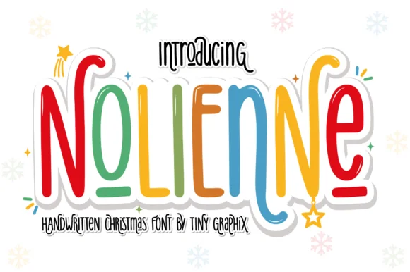 #17
Nolienne is a tall, whimsical handwritten display font mixing slender rainbow-marker stems with playful spiral terminals (and zero locked-in holiday clipart!).
Nolienne is a tall whimsical handwritten display that mixes slender marker stems with playful spiral terminals and an alternating rainbow palette, and it ships with no locked-in holiday clip art, so the same face works in December and in June. The spirals sit at the ends of stems, which grows the artwork box above and below the word, and the slender strokes need size before they hold in print. It needs roughly 24 mm for the spirals to read as deliberate curls, and it is best in one colour on white or in alternating brights on cream.
Kids' Santa-letter header, elf pajama shirt & gift sticker — Color letters in alternating cherry red, pine green, gold, and icy blue inside a 0.14 in white sticker offset.
Uniform, smooth monoline marker strokes cut and weed cleanly on Cricut HTV, Oracal 651, and Print-Then-Cut stickers down to 0.7 in!
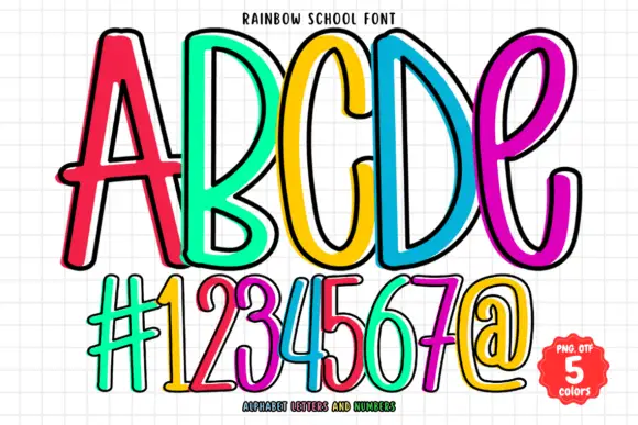 #18
Rainbow School draws tall thin caps as coloured outlines rather than solid shapes: a bright stroke with a white keyline inside it, set in five colours across a gridded notebook ground.
ABCDE fills the upper half of the card in red, green, yellow, blue and magenta, and each letter is drawn as a single thick outline with a white line running just inside it, so the shapes look like coloured gel pens. The strokes are narrow and tall with a slight slant, and the five letters lean against each other as though written along a ruled line. Underneath, a row of numerals and symbols repeats the treatment at the same size, which shows that the set covers more than the alphabet. The ground is squared exercise paper in pale grey, and a badge at the lower right states the count of colours and the formats. Because the letters are outlines, the face prints in one colour per letter, and it can be used on a colour printer with the white keyline kept as paper.
A classroom questions wall — Set the heading in one high row over a white pinboard; put pupil questions on separate plain cards underneath.
Check the complete phrase and colour selection in the intended editor.
 #19
Lovely sets a fine signature script in a single dark weight over a pale city photograph, where a wide entry curve opens low at the left, the letters rise into tall slender loops through the middle and a large descending y plus an extended closing sweep make the lower right part of the footprint.
The stroke stays thin and even, the loops stay tall, the entry runs wide and the exit sweeps out. That asymmetry is the character: the word is wider at the right than the left, which is why the sample sits on a generous square field rather than a strip. The building behind it is scenery, not part of the type. Keep 26 pt as the floor, allow 25 mm of clear space at the right for the exit sweep and check the y loop against any line placed beneath.
A quiet wedding invitation heading — Use a single script heading above the names. Keep a clear band beneath its lowest strokes, then set the venue and time in plain text.
Print at invitation size and check contrast on the chosen paper. Do not use the fine script for the address or RSVP instructions.
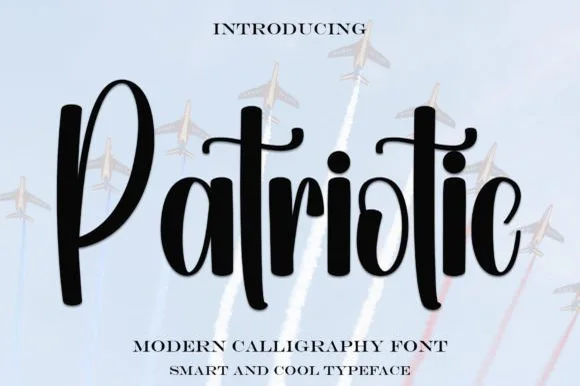 #20
Patriotic is a sturdy, upright modern calligraphy brush script with bold downstrokes, rounded loops, and a sweeping t-crossbar.
Patriotic is a bold upright brush-calligraphy script with a connected crossbar: thick flat-edged strokes drawn nearly vertical, joins that stay open under the letter bodies and a crossbar that runs across the whole word in one sweep as a banner line. It reads as a hand-painted sign rather than a formal script, and the crossbar is what holds the row together. The crossbar is the finest element and it breaks into separate tittles as soon as the face is reduced. It needs roughly 32 mm for the stroke and the crossbar to read, and it is best as one flat ink on white or red board.
4th of July family picnic shirt & insulated tumbler — Set a single focal script word at 3.5–5 inches wide at a slight 5-degree tilt, paired with bold block-sans dates or town names below.
Always weld overlapping brush connectors in Cricut or Silhouette before sending to the mat so letters cut as one solid piece.
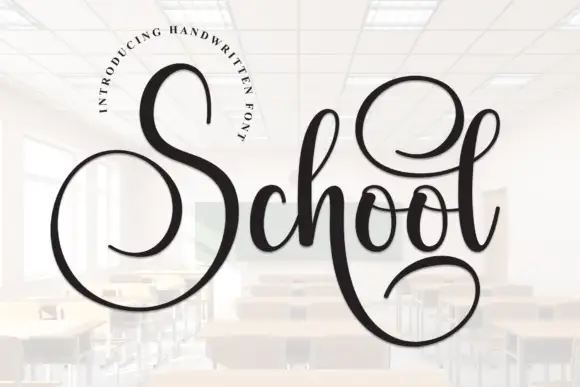 #21
School is a connected script in which a huge capital S opens a wide circle, the l lifts a high loop, the lowercase joins between them and a deep returning stroke drops below the baseline from the h.
The S closes a large circular shape, the l rises into a tall loop, the connectors run light between letters and the h sends a deep return stroke back under the word. The circular swash is the character: it holds the whole word inside one gesture, which is why the sample sets a single line. Because the return stroke travels, the layout needs 20 mm of clearance beneath from 28 pt, and the loop wants the tallest part of the panel. The classroom photograph in the sample is background artwork; the script line is the face.
A guest-book title — Centre the title above a plain date, leaving the entire lower loop clear.
Confirm available swashes for the actual opening letter.
Practical buyer checklist
Key cutting, printing and pairing answers before choosing a nurse, medical & teacher appreciation typeface.
Between 3 and 4 inches tall on a 20 oz tumbler, with the monogram in the centre. Anything over 4.5 inches runs into the taper and the artwork distorts when applied.
At 1.5 inches, only simple monograms survive. Fine EKG lines and stethoscope detail become loose strips, so use printed inserts for badge reels and keep cut vinyl for the tumbler-sized design.
Most include a full alphabet, so BSN, RN and similar credentials type normally. Check that the letter spacing in a monogram set will not merge a short credential into an unreadable cluster.
A classroom-positive lettering set with a chalkboard or school theme, using the same layout as the medical version. Consistency across appreciation gifts helps a small shop sell both without redesigning anything.
Keep exploring
Explore adjacent maker roundups or check our practical pre-production checklists.
16 curated fonts · Previews & pairings
32 curated fonts · Previews & pairings
29 curated fonts · Previews & pairings
25 curated fonts · Previews & pairings
Guides: Invitation font checklist · Vinyl & cutting checklist · How to pair script & sans fonts
Allow optional Google Analytics to measure visits and catalogue actions. Your search words and notes are not included. Privacy & storage