 #1 · Best Overall
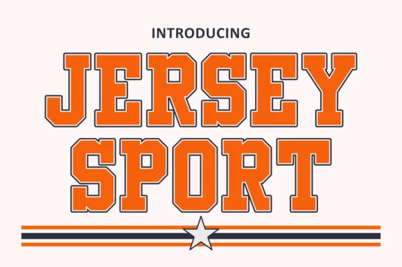
Jersey Sport
Outlined collegiate sports slab with a flat fill and a thin keyline
Get fontPaid link
Read review ↓Disclosure: MakerFileHub may earn a commission from qualifying purchases via paid links on this page. How our links work.
Class-of numerals, jersey slabs & senior merch
Graduation design is a layout formula more than a typeface choice: a big arched class year, a school or name beneath, and often a small mascot. Jersey Sport and Abc Sport carry the collegiate outlined treatments, Varsity Chicago and Mascot College keep the solid condensed look, and Varsity Spirit and University Pride add the double-outline variants used on senior hoodies. Champion Jersey handles extra-condensed numbers.
Quick verdict
Jersey Sport is the most complete senior shirt set, Varsity Chicago is the strongest solid for hoodies, and Champion Jersey works where the class year must be very tall. University Pride covers the double-outline variant.
Quick answer
Short on time? Start with our three highest-rated graduation & senior class standouts before scrolling the full breakdown.
#1 · Best OverallOutlined collegiate sports slab with a flat fill and a thin keyline
 #2 · Runner-Up Pick
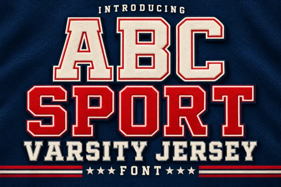
Layered varsity jersey capitals with fill, keyline and offset shadow
 #3 · Editor's Choice
Chunky baseball varsity capitals with stepped notched corners
We kept 18 of 353 candidates after testing numerals at 10 inches, since a graduation design is mostly digits. Weighted the visibility of 0, 2 and 4 in an arch, whether outlines align at large sizes, and how the face behaves on both cotton and fleece.
Side-by-side summary
Compare specimens, OpenType/PUA traits and primary project roles side by side.
| Rank & Font | Style & File Specs | Best Project Fit | Store Listing |
|---|---|---|---|
| Slab SerifClassic | Booster club decal, senior jersey tee or water bottle | Get fontPaid link | |
| DisplayAthletic | Varsity team shirt, gym banner or sports award | Get fontPaid link | |
| DisplayChunky | Vintage baseball tee, pennant or sports bar sign | Get fontPaid link | |
| Slab SerifVery condensed collegiate slabs | A college society banner | Get fontPaid link | |
| DisplayFile formats | A school-spirit event poster | Get fontPaid link |
#1 · Best OverallJersey Sport is a collegiate slab alphabet drawn as an outline with a flat fill inside it, so a word reads as a printed athletic front where the keyline does the work and the fill carries the colour.
The J carries a full hook, the E holds three even arms, the R keeps a squared bowl and a straight leg and the Y forks high, all at a heavy weight with unbracketed slabs and a keyline that follows the contour at a even distance. That construction is the practical part: the keyline can be printed as one screen and the fill as another, which is how a two-colour athletic print is built at 60 mm. Because the letters are solid and equally weighted, two words stack with minimal leading. The white ground, the orange and navy inks, the rules and the star are presentation; the slab face is the two words.
Booster club decal, senior jersey tee or water bottle — Pair arched team names with bold athletic numerals below.
Verify outline channel thickness at your target HTV or sticker size.
#2 · Runner-Up PickABC Sport is a layered varsity capital alphabet in which each letter carries a fill, a narrow keyline and an offset shadow, so a name reads as the appliqué on a college jersey.
The A pinches a pointed apex with a flat bar, the B closes two slab bowls, the C cuts an octagonal crescent, the S holds a stepped spine and the P turns a square bowl, all at a heavy slab weight with clipped corners and a second outline offset down and right. The three layers are the character: the sample builds each word from fill, keyline and shadow so one name carries a team colour without any artwork. Because the layers are separate, each one has to be a clean vector, and the shadow must be offset consistently or the word looks broken. The navy fabric, the stars, the rules and the letter-spaced lines are presentation; the layered jersey words are the face.
Varsity team shirt, gym banner or sports award — Set in school colours on dark athletic mesh or fleece backgrounds.
Cut at 2+ inches height on HTV so the thin inline border weeds cleanly.
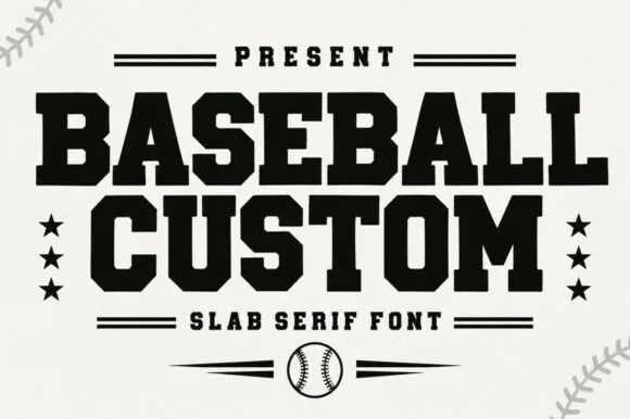
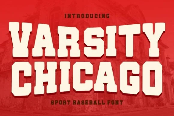
#3 · Editor's ChoiceVarsity Chicago is a chunky baseball capital alphabet in which the stems are wide, the corners step in and out, and the fit is tight, so a two-word title reads as a stitched team name on a jersey.
The V cuts two thick diagonals into a flat base, the A holds a low bar, the R turns a stepped leg, the S notches its spine, the I carries wide serifs and the T spreads a heavy arm, all at a single heavy weight with stepped corners and flat terminals. The stepped corner is the character: it looks like a cut felt letter rather than a drawn one, which is why the sample sets two stacked words edge to edge. Because the shapes are solid and open, the face holds from 30 pt upward and cuts well in vinyl or felt; it needs tracking rather than kerning. The red ground, the faded brick photograph and the small lines above and below are presentation; the cream varsity words are the face.
Vintage baseball tee, pennant or sports bar sign — Set stacked all-caps in cream on crimson, navy or forest green shirts.
Smooth solid vector edges cut cleanly on HTV, vinyl and felt pennants.
 #4 · Top Maker Utility
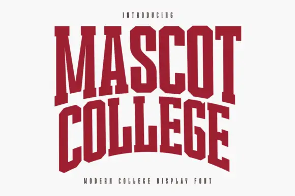
Mascot College is a very condensed collegiate slab in which the stems run tall, the slabs are flat and thin and the counters close to slits, so a long name fits one line on a narrow format.
The M splays from a narrow vertex, the A carries a low crossbar, the S reverses through tight curves and the O closes an oval counter, all at a heavy weight with thinner slabs than a standard collegiate face. That thinness is the character: the feet read as cuts rather than blocks, which keeps the face from filling the counters at 40 mm on a garment. The extreme condensation is what makes it practical for long team names on a jersey, where a wider face would wrap. Because the counters are narrow, the practical floor is 30 pt on print. The white ground, the dark red ink, the small caption are presentation; the slab face is the two words.
A college society banner — Use a straight title above a plain meeting-time panel instead of forcing the cover arch.
Proof the narrow O and A counters from the expected viewing distance.
 #5 · Standout Silhouette
Varsity Spirit is a layered varsity capital alphabet in which each letter carries an inline stroke, a keyline and a set of matching numerals, so a team name reads as the appliqué on a college jacket.
The V cuts two thick diagonals with an inline running between them, the S holds a stepped spine, the A pinches a flat apex, the R turns a notched leg and the numerals carry the same inline and keyline, all at a heavy slab weight with square serifs. The inline is the character: it divides each stroke into two bands, which is why the sample sets a stacked word above a full numeral line. Because the inline is narrow, the face needs 40 pt before it stays open, and each layer has to be a clean vector for a vinyl or embroidery cut. The white timber ground, the format strip and the small badge are presentation; the black and white layered words are the face.
A school-spirit event poster — Put a broad title over a separate plain schedule and keep the inner lines away from background patterns.
Check every required numeral and letter rather than assuming the sample alphabet is complete.
 #6
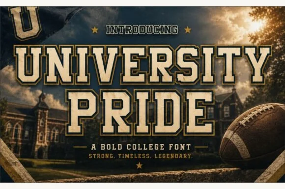
University Pride is a commanding collegiate varsity slab serif featuring chamfered block stems framed by a crisp outer contour line.
University Pride is a double-outlined collegiate stadium varsity slab: extended block letters with a hard keyline inside a second keyline, thick unbracketed slabs and a small inward notch on the terminals that reads as a stadium banner. The double outline doubles the footprint and the inner line closes first. It needs roughly 32 mm for the second keyline and the notch to read, and it is best in two flat inks on jersey and banner mesh, or three inks where paper forms the second line.
Alumni sweatshirt, homecoming banner & varsity jacket — Set school or department names across a 10-inch chest arch above flanked star dividers and graduation years.
Because every letter carries a thin outer border gap, cut HTV at 1.4 inches tall or larger, or use DTF/screen print for smaller crest text.
 #7
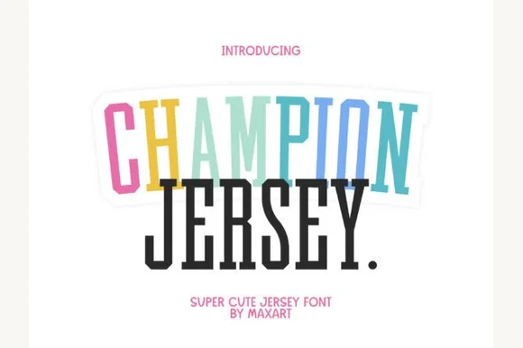
Champion Jersey is a tall, slim extra-condensed varsity slab serif packing long team names, Taylor-era tour titles, and slogans into narrow spaces.
Champion Jersey is a tall extra-condensed athletic slab with heavy squared serifs, deep notches on the crossbars and proportions pulled vertically so a long name fits one line on a shirt back. The slabs are thick enough to cut and to print, and the condensed stance is what makes it a jersey face rather than a poster face. It needs roughly 20 mm for the notches to stay open and 60 mm for a shirt back, and it is best in two athletic colours on white or in one ink on a pastel ground.
Long-surname jersey back, cheer bow, tumbler & tote — Stack 2 tall uppercase lines at 68–135 pt—try pastel offset shadows behind row one for cute spirit-wear flair!
100% crisp, straight-line solid shapes cut and weed fast on Cricut HTV and Oracal 651 down to 0.75 inches tall!
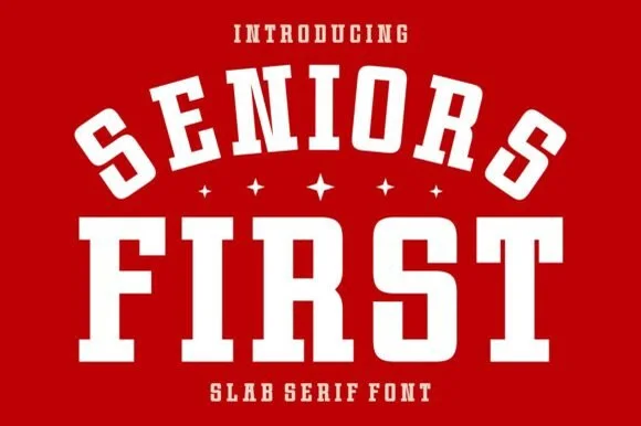 #8
Seniors First is a solid, single-layer collegiate block slab serif with stout rectangular feet, chamfered bowls, and punchy athletic balance.
Seniors First is a chunky varsity block athletic slab serif: extended block letters with thick unbracketed slabs, a small notch cut into the terminals and an even weight that reads as a stadium jersey number. The wide blocks fill a banner and the notch closes when the face is reduced. It needs roughly 30 mm for the notch and the slab to read, and it is best in two flat inks on jersey and felt, or one ink on banner mesh at gate distance.
Class-of-2027 hoodie, senior yard banner & car-window decal — Arch the top word at a 20% curve over small four-point stars and anchor the second word straight underneath.
Cuts cleanly at almost any craft scale from 0.5-inch cap badges up to 11-inch jersey backs.
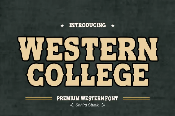 #9
Western College fuses stout collegiate varsity block slabs with pointed frontier waist spurs for Texas/Montana campus and rodeo gear.
Western College is a hybrid display that fuses stout collegiate varsity slabs with pointed frontier waist spurs and a heavy drop outline, so a word reads as a college team wearing a rodeo badge. The double structure is dense, which means the face needs size to keep the outline and the spur separate, and the wide stance fills a panel with a short name. It needs roughly 30 mm for the spur and outline to read, and it is best in sand tan inside black on slate or two athletic colours on white.
College rodeo-team hoodie, FFA jacket & tailgate banner — Stack 2 centered uppercase lines at 60–115 pt in sand/gold inside a 0.08 in black outline on forest green or maroon.
100% smooth, solid single-layer shapes cut and layer fast on Cricut HTV, twill patches, and Oracal 651 down to 0.7 in!
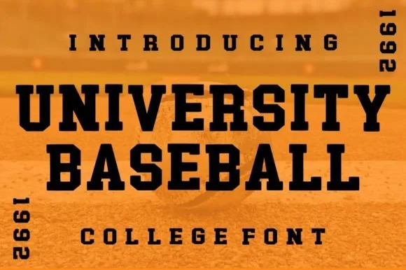 #10
University Baseball is a wide, ultra-sturdy collegiate slab serif with thick bracketed blocks and zero-nonsense varsity punch.
University Baseball is a wide heavy collegiate championship slab serif: extended block letters with thick unbracketed slabs, a low crossbar on the A, a uniform weight that nearly fills the letter and a small inward notch on some terminals. The width makes a word long, and the near-solid weight closes the counters early. It needs roughly 30 mm for the slab and the notch to read, and it is best in one dark ink on cream and heather grey, or a two-colour build where the slab edge carries a highlight.
College chest sweatshirt, varsity felt pennant & mug — Stack 2 centered uppercase lines at 56–100 pt flanked vertically by 4-digit founding/class years ('1992', '2027').
100% clean solid vectors weed in seconds on puff HTV, flock vinyl, and stencils down to 0.65 inches!
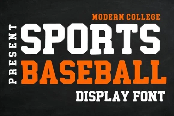 #11
Sports Baseball is a clean, solid modern collegiate slab serif with crisp 45-degree chamfered corners and zero grunge.
Sports Baseball is a clean collegiate slab with 45-degree chamfered corners, no distress and generous open counters, so it reads as modern athletic branding rather than a vintage revival. The chamfer keeps the letters sharp at large sizes and stops the slabs from looking blunt on a matte ground, and the even weight lets a name and a number sit together without a second face. It needs roughly 20 mm for the chamfers to read, and it is at its best in one bright colour on a dark garment.
Cricut HTV team shirt, helmet number & stadium sign — Stack white row one over orange row two, flanked on the left by vertical rotated text ('PRESENT' / '2026').
Cuts cleanly down to 0.55 inches on athletic HTV, permanent vinyl, and cardstock banners!
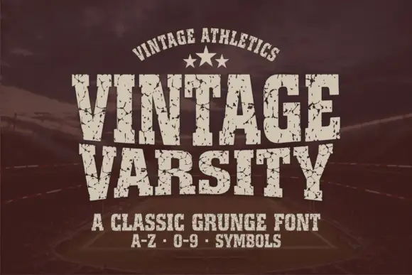 #12
Vintage Varsity is a condensed athletic capital alphabet with heavy flat slabs and a cracked wear texture, so a short word reads as a printed team jersey from decades ago.
The letters are narrow and tall: the V closes to a sharp point, the A keeps a low bar, the R carries a straight leg and the S reverses through flat terminals, with slabs at every stem and no bracketing. The wear is drawn into the letterforms rather than applied as an effect: cracks run through the slabs and a few counters show chipped edges, which is what gives the face its printed-jersey look. Weight is heavy and uniform, the fit is tight enough that a long team name holds a single line, and because the texture is coarse the face needs a decent size to stay legible. The dark ground, the cream ink, the star rule and the two small caption lines are presentation; the typeface is the two words.
A reunion match poster — Keep dates and scores in a clean companion face.
Inspect cracks in the narrowest strokes.
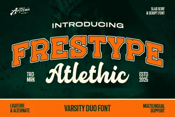 #13
Frestype Atlethic Duo pairs orange slab capitals with a cream connected script, where the slab row arches and carries a fine edge and the script below joins roundly, opens a broad sweeping A and flows loosely through a final c.
The slabs stay heavy with a thin outline, the arch lifts the upper row, the script joins broadly and two letters stretch beyond the rest. The contest between an outlined slab and a thick script is the character: one row reads as a jersey, the other as a signature, which is why the cover splits them across two lines. The listing name and the specimen spelling differ, so keep the saved identity and do not rewrite it; the ligature and multilingual captions are source claims rather than demonstrated coverage.
A club fundraiser invitation — Arc CAMPUS over a straight Social script line on a dark green invitation, with all practical details in a plain cream block below.
Verify both faces, the exact script joins and whether the proposed capitals are supplied.
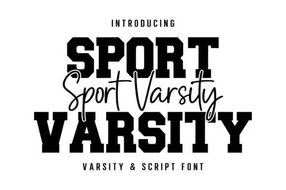 #14
Sport Varsity pairs heavy clipped-corner slab capitals with a much thinner flowing script, where the block O has a tall angular counter and the script crosses the centre with long t bars, a deep y loop and a sweeping entry stroke from the left.
The caps stay square and heavy, the corners clip at an angle, the script stays fine and crosses the block row, and two strokes sweep far outside the word. That crossing is the character: the script is placed on the join between the two cap rows rather than under them, which is why the sample stacks three rows. Keep 48 pt for the caps and 22 pt for the script, leave 20 mm for the entry sweep and check the y loop against your bottom margin before locking the stack.
A school-team fundraiser poster — Keep the large title in two lines and place a script accent in a separate gap, not over essential counters.
Check which styles are included and whether the fine script prints clearly.
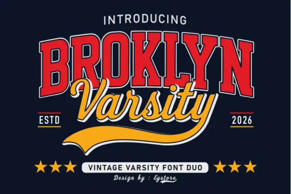 #15
Broklyn Varsity pairs tall collegiate slab capitals drawn with an inline outline against a sweeping script that sits between them and drops a heavy sport tail below the baseline.
The caps half is nested: a red face with a white inline and a dark edge, every letter narrow and tall, the B and the R carrying small bowls high on long stems and the Y ending in a sharp fork. That nesting is what gives the word its vintage athletic look at a distance. The script half is a bold slanted hand with rounded tails, set across the middle of the caps so the two halves overlap, and it finishes with a broad sport tail that sweeps out to the right beneath both words. The pairing works because the caps supply height and the script supplies motion. The navy ground, the stars, the ESTD and year markers and the small credits are presentation; the duo is the two words.
A varsity-club event header — Keep the block title above the script line and leave the underline a clear bottom margin.
Verify both supplied styles and whether the long y underline is accessible.
 #16
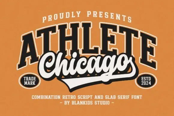
Chicago Athlete pairs a tall arched slab word with a thick flowing script below, where the script carries round loops and a long terminal that forms the lower edge of a badge.
The slabs stay tall and arched, the script thickens and flows, the loops close round and the final stroke flattens out to close the shape at the bottom. That shared edge is the character: the two members read as one badge rather than two lines, which is why the cover binds them with cream borders and shadows. The overlap is a designed lockup and not an automatic alignment, so build the arch and the edge yourself and check that any two words will actually meet that way.
A neighbourhood club identity study — Keep the slab row above the script and allow the lower tail to define the badge edge.
Verify both supplied styles and confirm any club or location naming rights.
 #17
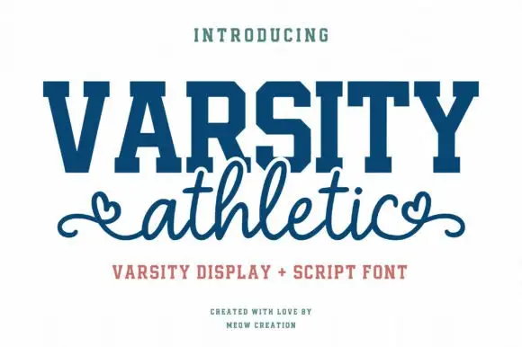
Varsity Athletic pairs a solid collegiate slab capital alphabet with a looping script whose ends curl into small hearts, so a two-line design can carry both a team voice and a friendly one.
The caps half is heavy and squared: the V and the A meet in sharp vertices, the R carries a straight leg, the S keeps its curves and the T holds a wide flat bar, with unbracketed slabs at every stem and a tight fit across the word. The script half is light and looping, with tall ascenders and a heart worked into the entry and exit strokes at both ends, which softens the pairing considerably. Together they cover the two registers a school or club design usually needs: a name that reads at distance and a subtitle that feels personal. The blue ink, the cream ground and the three small caption lines are presentation; the duo is the two words.
A school athletics event title — Keep the block line above a separate script line with clear space around both end curls.
Confirm the specific terminal flourishes and the two included styles.
 #18
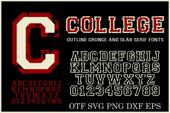
College Grunge is a powerhouse 2-font + cut-file varsity pack pairing a rough distressed slab WITH a crisp double-outline collegiate slab in OTF, SVG, PNG, DXF & EPS!
College Grunge is a two-font collegiate pack of a distressed varsity slab and a clean double-outline cut, with vector and raster files for cutting: the distressed cut carries chipped edges and uneven ink, while the clean cut has a second keyline inside the first. The pair lets one shirt show a worn name and a crisp second line, and the clean cut is the weaker element at small sizes. The distressed slab needs roughly 30 mm and the double outline 34 mm for their detail to read.
Cricut varsity hoodie, senior banner & letterman decal — Layer the clean Outline font in white HTV around solid athletic crimson or navy—or print the Grunge fill on vintage tees!
Use the CLEAN Outline style + included SVG/DXF files for fast Cricut/Silhouette vinyl cutting; use the Grunge style for DTF & print!
Practical buyer checklist
Key cutting, printing and pairing answers before choosing a graduation & senior class typeface.
Between 8 and 10 inches tall for the numerals and 10 to 12 inches wide for the full arch on an adult shirt. Youth sizes drop to 6 to 7 inches, otherwise the design wraps uncomfortably around the chest.
Yes, with the curve tool, but it curves the whole text box rather than individual letters. For a proper jersey arch, apply a gentle arc of 10 to 15 degrees, then check that the outer letters remain vertical rather than tilting outward.
Most collegiate sets include 0 to 9, which is exactly why they work here. Verify the numeral widths match, since an uneven 2 or 7 breaks the arch and is the most common flaw in a senior shirt design.
The outline layer shifts during the second press. Press the base, let it cool completely, then align the top layer with the garment laid flat. On fleece, add a cover sheet so the loops do not pull the film out of register.
Keep exploring
Explore adjacent maker roundups or check our practical pre-production checklists.
25 curated fonts · Previews & pairings
32 curated fonts · Previews & pairings
33 curated fonts · Previews & pairings
36 curated fonts · Previews & pairings
Guides: Invitation font checklist · Vinyl & cutting checklist · How to pair script & sans fonts
Allow optional Google Analytics to measure visits and catalogue actions. Your search words and notes are not included. Privacy & storage