Neutral Sans Workhorse

Theodore and Scarlett + Saltriver Grotesk
Lets Theodore and Scarlett own the focal silhouette while handling secondary copy, sizing and subheads cleanly.
Inspect Saltriver Grotesk specimenDisclosure: MakerFileHub may earn a commission from qualifying purchases via paid links on this page. How our links work.
Fat geometric ligature display with nested letters
Theodore and Scarlett is a display ligature face in deep red on cream: fat geometric letters where small letters nest inside the counters of large ones, the two words interlocking so the block reads as one shape with two lines inside it.
Paid link
Get this fontProject & layout blueprintsAt-a-glance maker compatibility
Sturdy stroke walls and open counters weed cleanly on adhesive vinyl, HTV apparel film, and cut cardstock.
Visual anatomy & craft review
The page shows a display face built for pairing letters rather than setting sentences: the capital letters are fat geometric blocks with flat tops, round bowls and no contrast, and the lowercase letters are drawn small enough to sit inside the counters of the capitals, so a second line can nest into the first and the two words interlock. In the sample the nesting produces an ampersand-sized gap where the two names meet, and the eye reads the whole block as one mark rather than as two lines of type. That construction is what the face is sold for: it makes a pair of names into a logo, and it only works when the pairing is designed rather than typed. The palette is a single deep red on cream, and the page carries two small capital lines above and below the block. Theodore and Scarlett is a display face for wedding marks, logos, packaging and apparel, and it needs two short names and a great deal of care in setting.
Geometric, nested, playful
Two-font hierarchy recipes
Tested contrast partners — pairing Theodore and Scarlett with grounded secondary typography.
Theodore and Scarlett + Saltriver Grotesk
Lets Theodore and Scarlett own the focal silhouette while handling secondary copy, sizing and subheads cleanly.
Inspect Saltriver Grotesk specimen
Theodore and Scarlett + The Simple Editorial
Grounds bold display lettering with classic typographic authority on posters, badges and apparel.
Inspect The Simple Editorial specimenPractical applications
Concrete hierarchy, scale and production guidance tailored to Theodore and Scarlett’s stroke geometry.
A nested ligature block makes a cover out of two words, and the single colour keeps the construction readable at thumbnail size.
Hierarchy & layout recipe
Print a 210 by 280 mm cover: set the block 170 mm wide, keep 26 mm of clear ground beneath before the credits at 9 pt, and hold 20 mm of margin on all four sides.
Pre-production check
Nested letters can close up at small sizes; proof one cover at the final size and check the gaps.
A nested pair gives a two-name studio a mark that is a monogram rather than a wordmark, and one colour keeps it cheap to print.
Hierarchy & layout recipe
Print a 60 by 40 mm stamp: set the block 50 mm wide, keep 5 mm of clear ground on all four sides, and hold the mark 10 mm clear above the address line.
Pre-production check
A nested block in a rubber stamp can fill; cut one stamp and press it before ordering the set.
A nested pair names two performers in one block, which is exactly the situation a duet poster is, and the shape does the layout work.
Hierarchy & layout recipe
Print an A3 poster at 297 by 420 mm: set the block 240 mm wide, keep 30 mm of clear ground beneath before the date at 20 pt, and hold 24 mm of margin on all four sides.
Pre-production check
Two long names may not nest; test the real pair before the artwork is finalised and adjust the sizes.
Technical & licence verification
Confirm included OTF/TTF/WOFF formats, full glyph tables and licence coverage on the live store page before batch production.
Closest visual alternatives
Matched across letterform anatomy, stroke behaviour and craft applications.

Inflated graffiti letters with hanging drips
Mila is an inflated graffiti display face in black on a dark wall: fat rounded letters with a glossy highlight, a neon green and pink outline, and paint drips hanging from the bottom of each stroke, with a crown splat and a spray can at the edges.
Ideas for this font
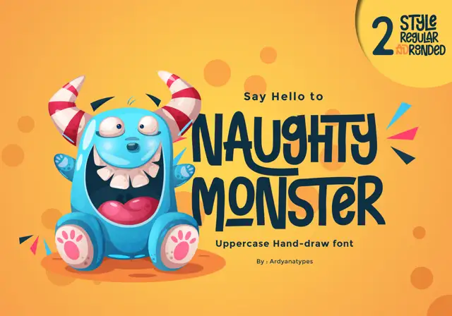
Tall eccentric cartoon capitals
Naughty Monster stretches cartoon letterforms into tall narrow capitals whose cross-strokes run out past their neighbouring letters and whose tops refuse to line up.
Ideas for this font
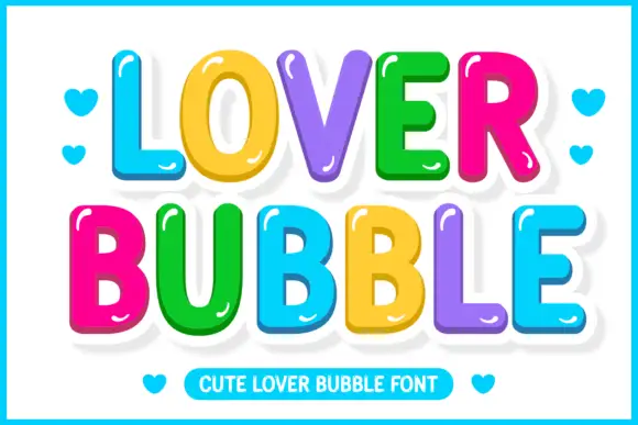
Glossy multicolour bubble display
Lover Bubble is a glossy multicolour bubble display on white: fat rounded caps and lowercase in six colours, each letter carrying a white outline and a small highlight, a bouncy baseline, hearts in the margins and a ruled caption strip at the foot.
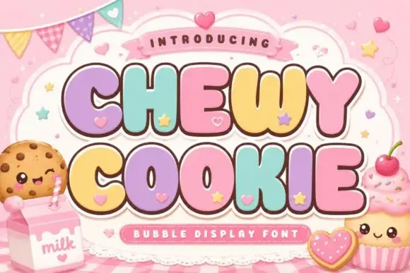
Squat bubble capitals packed tightly with heart accents between letters
Chewy Cookie is a squat bubble capital alphabet packed so tightly that the letters touch, with small hearts scattered into the gaps and a soft outline around the whole phrase.
Ideas for this font
Same independent foundry
Allow optional Google Analytics to measure visits and catalogue actions. Your search words and notes are not included. Privacy & storage



