 #1 · Best Overall
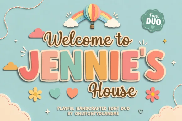
Jennies House
Playful duo pairing outlined chunky caps with a monoline script
Get fontPaid link
Read review ↓Disclosure: MakerFileHub may earn a commission from qualifying purchases via paid links on this page. How our links work.
Soft monoline duos & round nursery lettering
Nursery lettering is read at close range, in soft light, often on a wood round above a cot. Jennies House and Marshmallow Duo pair a rounded block with a monoline script, Hello Sunshine Mama and Lemonhoney Duo keep the duo formula but warmer, and Happy Kiddo, Starry Stroller and Silent Woman supply the plump bubble display. Wild Daisy Duo adds the bohemian nursery register.
Quick verdict
Jennies House is the most reliable nursery duo, Happy Kiddo is the best bubble display for a milestone blanket, and Marshmallow Duo handles tall narrow name signs. Wild Daisy Duo suits a boho nursery.
Quick answer
Short on time? Start with our three highest-rated baby shower & nursery signs standouts before scrolling the full breakdown.
#1 · Best OverallPlayful duo pairing outlined chunky caps with a monoline script
 #2 · Runner-Up Pick
 #3 · Editor's Choice
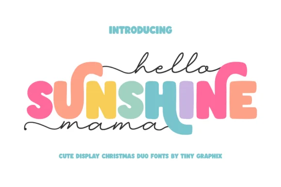
Chunky rounded caps in mixed colours with a fine monoline script above and below
We kept 24 of 462 candidates that read clearly against pastel backgrounds. Weighted stroke contrast against low-contrast palettes, how the duo scales from a 1 inch milestone blanket to a 20 inch wood round, and whether the heart details stay optional.
Side-by-side summary
Compare specimens, OpenType/PUA traits and primary project roles side by side.
| Rank & Font | Style & File Specs | Best Project Fit | Store Listing |
|---|---|---|---|
| DisplayWhimsical | Nursery door plaque, baby shower welcome sign or kids' room print | Get fontPaid link | |
| DuoPUA encoded · Ligatures | Hot-cocoa bar jar labels & party favor tags | Get fontPaid link | |
| DuoCheerful | Mother's Day sweatshirt, tote or tumbler | Get fontPaid link | |
| DuoLigatures · Alternates & swashes | A preserve-label hierarchy | Get fontPaid link | |
| DuoDaisy-dot-i | 'Wildflower' nursery sign, toddler boho tee & Easter tag | Get fontPaid link |
#1 · Best OverallJennie's House is a two-cut family in which chunky pastel capitals wear a heavy outline and a monoline script writes a second line, so a short phrase reads as stacked paper stickers.
The J hooks a wide foot, the E stacks three short arms, the N keeps two fat stems, the I stands as a plain bar and the S holds a soft spine, all at a chunky weight with rounded corners and a thick contour; the script cut draws a connected line with a tall loop on the W and a hooked h. The layering is the character: the outlined caps sit behind the script in the sample, which gives depth without a shadow effect. Both cuts hold from 26 pt upward and cut cleanly in card. The blue ground, the hot-air balloon, the clouds, the flowers and the small badges are presentation; the outlined caps and brown script are the family.
Nursery door plaque, baby shower welcome sign or kids' room print — Set the child's name in large coral/sage block caps framed by smaller script lines.
Both fonts use smooth vector shapes that cut cleanly on vinyl and wood/acrylic.
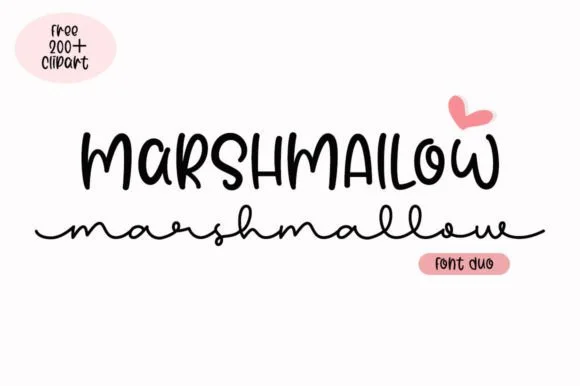
#2 · Runner-Up PickMarshmallow Duo matches a quirky condensed uppercase marker sans with a low, wide-looped monoline script.
Marshmallow Duo pairs a tall narrow marker sans with a wide monoline cursive: the sans is a squeezed felt-tip block with soft ends for a stacked headline, while the cursive is a broad even stroke with open bowls that stays legible at small sizes. The pair is built for a two-line title where the narrow cut holds the top row and the wide cut holds the second. The marker edge is the finest element and it softens first under a coarse screen. The sans needs roughly 24 mm and the cursive 26 mm for their detail to read.
Hot-cocoa bar jar labels & party favor tags — Stack the ingredient title in 1.1 in marker caps on top and run a short flavor note in the wide monoline script across the base.
On matte sticker paper, print-then-cut with a 0.08 in white offset contour rather than weeding the thin lowercase connectors individually.
#3 · Editor's ChoiceHello Sunshine Mama pairs chunky rounded caps that can each take a different colour with a fine monoline script that runs above and below the caps in long flat strokes.
The cap half is heavy and soft: the S swells through two fat curves, the U holds a deep bowl, the N keeps one thick diagonal and the E carries three even arms, all rounded and even in weight. Because each letter is a separate shape of equal weight, the sample fills them in different colours, which is how the pair is meant to be used on children's pieces. The script half is a light monoline with flat entry and exit strokes that extend well past the caps on both sides, and that sweep is what holds the composition together. Contrast comes from weight, not from style, so the two layers never fight. The white ground, the pink script, the pastel fills and the two caption lines are presentation; the duo is the lettering.
Mother's Day sweatshirt, tote or tumbler — Set the middle keyword in rainbow/earth-tone caps and sandwich with lowercase tailed script.
Thicken the thin monoline script slightly (0.02" offset) if cutting small adhesive vinyl decals.
 #4 · Top Maker Utility
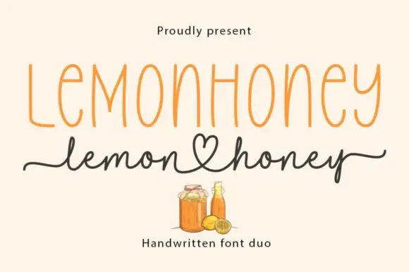
Lemonhoney Duo pairs a tall narrow printed capital line with a handwritten script whose tail curls into a heart, so one label carries a structured name and a warm signed line beneath it.
The printed half is a tall condensed face with even strokes, no serifs and wide spacing, set in mixed case where the capitals lift above the lowercase and the spacing holds the line together across a wide format. The script half is a light handwritten monoline with open loops, and its distinguishing gesture is a heart-shaped loop that forms where the tail of one word meets the start of the next. That loop is what makes the pair feel designed rather than assembled. The printed line holds at 10 pt on a narrow label, and the script supplies the personal register at 16 pt, so the two can share a jar label without crowding. The cream ground, the orange and brown inks, the jar and bottle illustrations and the caption are presentation; the duo is the two lines.
A preserve-label hierarchy — Put a printed product name above a script range line with factual ingredients below, no organic claim.
Verify ingredients, member files and heart alternate.
 #5 · Standout Silhouette
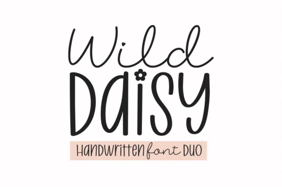
Wild Daisy Duo pairs a breezy monoline cursive script with a tall quirky bohemian display font that tops lowercase 'i' with a 5-petal daisy flower!
Wild Daisy Duo is a duo of an airy monoline script and a daisy-dotted bohemian handwritten display: the script runs an even light stroke with wide loops and joined letters, while the display is a casual print face whose i dots are small drawn daisies and whose stems carry a light wobble. The daisies are the finest element and close first, and the monoline is the weaker element in print. The script needs roughly 24 mm and the display 20 mm for their detail to read.
'Wildflower' nursery sign, toddler boho tee & Easter tag — Stack airy Wild Daisy Script (68 pt) above large mixed-case Display (96 pt) over a blush pill banner.
Display stems cut fast at 0.75 in+ (color the daisy 'i' dot gold/pink for extra pop!); Weld the thinner Script and cut at 1.2 in+!
 #6
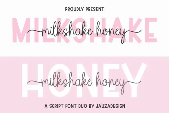
Milkshakehoney pairs a crisp, wide-stance uppercase sans-serif with a tall, narrow-looped monoline cursive accented by straight side tails.
Milkshakehoney pairs a clean geometric uppercase sans with a tall-looped monoline script: the sans is a wide, even-width capital set for signage and labels, while the script is a thin monoline with high loops that rise well above the x-height and joins that stay open. The pair gives one card a printed voice and a hand-written line and works from a single ink. The monoline hairline is the finest element and it breaks first. The sans needs roughly 20 mm and the script 30 mm for their detail to read.
Bridesmaid proposal box lid & satin robe chest print — Track the uppercase sans role title ('BRIDESMAID') wide in pale pink or gold behind the recipient's cursive first name.
Size HTV chest names at 4 inches wide or larger so the tall narrow 'k' and 'h' loops weed cleanly without stretching.
 #7
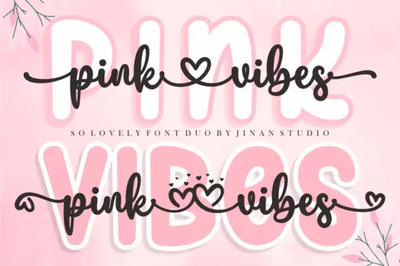
Pink Vibes Duo pairs two fat rounded capital rows, drawn in white with a soft pink glow, with a small dark connected script that runs across them, and in the lower sample the script joins the words with heart shapes instead of a plain connector stroke.
The caps stay broad and inflated, the script stays thin and dark, the contrast between the two weights carries the pair and the hearts sit where a ligature would normally go. The upper sample sets the script over the caps without hearts, the lower inserts one heart between the words and a second heart cluster on the final s, so the decorative join is an option rather than the default. Branches in the corners are cover artwork. Check which connector glyphs your file carries before planning the heart link, keep 30 pt for the script strokes and set the caps in one colour so the pink glow does not come from the type.
A two-level greeting — Keep capitals above script rather than overlapping; leave heart tails in open space.
Check connector variants and actual duo contents.
 #8
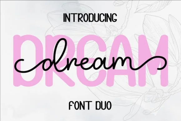
Dream Duo combines a plump, soft-cornered uppercase sans-serif with a fluid monoline script that threads cleanly across wide titles.
Dream Duo pairs a chunky pastel rounded sans with a smooth monoline cursive: the sans is a fat even-width block with fully rounded corners and tight spacing for headlines, while the cursive is a soft even stroke with open loops and a gentle slant. The pair is built for a soft palette, so it loses its character when printed in a single harsh black. The monoline hairline is the finest element and it breaks first. The sans needs roughly 26 mm and the cursive 28 mm for their detail to read.
Nursery wall name sign & sweet-sixteen acrylic backdrop — Scale the background sans to 3.5 inches tall in soft pastel and center the dark monoline script across the middle 60% height.
Weld all cursive joins before cutting vinyl, and use Cricut's Slice or a 0.07 in offset knockout if avoiding two-layer vinyl overlap.
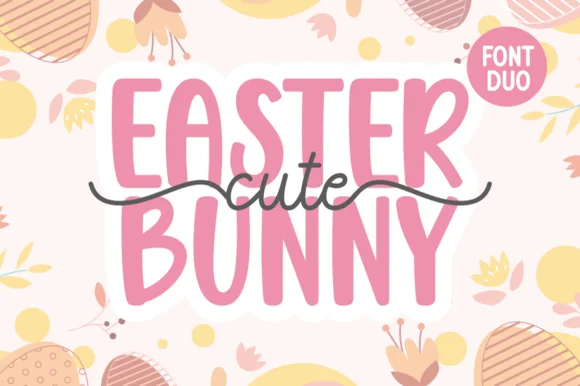 #9
Cute Easter Bunny combines a tall, chunky hand-cut uppercase sans with a sweet monoline cursive accented by long side tails.
Cute Easter Bunny is a playful pair of a tall pastel sans with a tailed monoline script: the sans is a soft narrow block whose counters stay open, while the script finishes every word with a small bunny tail that lifts off the baseline. The pair is built for a soft spring palette, so it loses its charm in a single harsh ink. The tail is the finest element and it closes into a dot once the face is reduced. The sans needs roughly 22 mm and the script 26 mm for their detail to read.
Personalized Easter basket tag & egg-hunt tote — Place two stacked uppercase words in pastel vinyl and overlay the dark tailed script across the seam between rows.
Use Print-Then-Cut with an offset white sticker border for multi-color tags, or layer smooth HTV pressing the chunky sans base first.
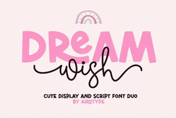 #10
Dream Wish contrasts chunky uneven capitals in a flat pink with a fine black looping script line beneath, where the script w begins in a long entry tail and the h finishes in a high sweeping exit that lifts above the cap height of the lower word.
The caps stay blocky and slightly uneven, the script stays thin and continuous, the entry and exit tails run long and the two rows overlap lightly. That overlap is the character: the script sits close enough to touch the caps, which is why the sample keeps both rows centred with nothing else competing. A rainbow arc above is cover artwork. Keep 46 pt for the caps and 20 pt for the script, leave 16 mm of clear ground between the rows and check the exit tail against your right margin.
A birthday wish-card heading — Place a heavy first word over a short script line, keeping the personal note inside the card.
Confirm members and actual tail joins.
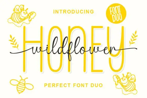 #11
Wild Flower Honey Duo shows very tall rounded sans-like letters behind a fine connected script line, where the script f descends below its low body, long tails extend to both sides and small bees decorate the cover around the two rows.
The cap row rises tall and round, the script stays fine and low, the tails reach wide and one descender drops below the line. That scale gap is the character: a quiet written line sits in front of a tall wall of letters, which is why the sample stacks them tightly. The bees are cover decoration, so plan the tails inside your margin, keep 20 mm between the rows and hold the script at 20 pt so the joins do not close.
A honey-range label hierarchy — Place the two members on separate lines rather than overlaying them; weight and batch details go in plain type below.
Check member names and small script joins on the actual label.
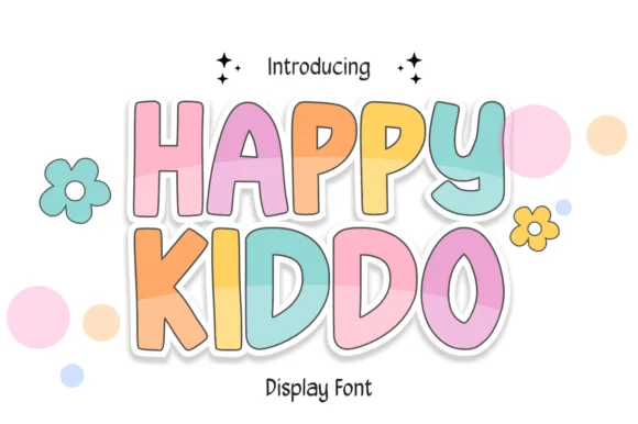 #12
Happy Kiddo is a rounded, bouncy kids' display font featuring plump uppercase letters with crisp cartoon outlines and wide friendly counters.
Happy Kiddo is a soft-outlined pastel nursery and kids bubble display: fat rounded letters with a thick soft outline, a pale fill and a small heart or star tucked into one counter, drawn so the whole word looks like a fabric appliqué. The outline doubles the footprint and the tucked shape closes first when the face is reduced. It needs roughly 30 mm for the tucked shape and the outline to read, and it is best in two pastel inks on white, or one ink plus paper where the outline prints as a soft edge.
Pastel 1st-birthday welcome board, highchair banner & favor — Color individual letters in alternating pastel tones inside Canva or Illustrator and wrap in a 0.12 in white Print-Then-Cut border.
Clean, solid vector contours cut and weed smoothly on HTV, glossy cup vinyl, and cardstock down to 0.75 inches.
 #13
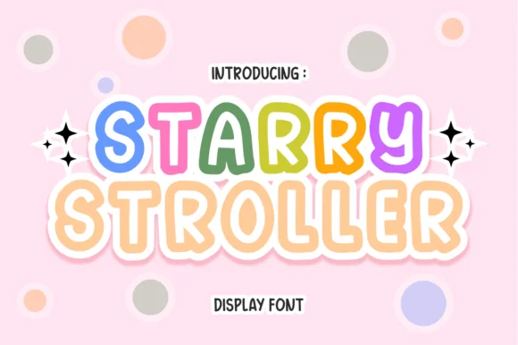
Starry Stroller is a cute, bubbly nursery display font tracing plump rounded capitals with a cheerful parallel inner/outer outline.
Starry Stroller is a bubbly nursery display whose plump rounded capitals carry a parallel inner and outer outline with a solid pastel core between them, so a word reads as a soft vinyl sticker rather than as a printed letter. The two outlines are concentric, which means the face needs size for both to register, and the pastel core can be printed or left to the paper. It needs roughly 30 mm for the double outline to read, and it is best in pastel cores on blush or white with a crisp inner gap.
Baby-shower banner, nursery name print & stroller tag — Color each letter of the baby's name in rotating rainbow pastels at 64–120 pt flanked by sparkle stars.
Shines in Print-Then-Cut stickers, nursery art prints, sublimation, and DTF onesies; scale above 1.8 in if weeding thin vinyl rings.
 #14
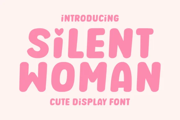
Silent Woman is a sweet, chubby rounded bubble display font featuring an adorable heart-shaped top notch on lowercase 'i'!
Silent Woman is a soft chubby bubble sans with a heart-notched lowercase i: very round letters, a plump even weight, tight counters and a small heart cut out of the dot on the i instead of a circle. The heart notch is the design and it closes into a dot as soon as the face is reduced. It needs roughly 26 mm for the heart notch and the round bowl to read, and it is best in two soft inks on white, or one ink plus paper where the heart reads as a knockout.
Galentine crewneck, self-care glass can & sticker pack — Stack 2 centered words at 64–120 pt in puff pink, cherry red, or cream HTV.
GENIUS CRAFTER PERK: The heart on 'i' is carved directly into the top of the stem—zero tiny floating 'i' dots to weed or transfer!!
 #15
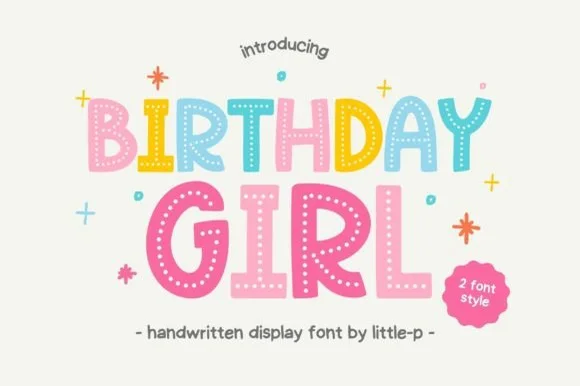
Birthday Girl is a cheerful 2-style kids' display font decorating chunky hand-cut letters with sweet interior polka-dot rows!
Birthday Girl is a two-style kids' display whose chunky hand-cut letters carry neat vertical trails of white polka dots down every stem, so a word reads as a decorated paper cut-out rather than as printed type. The dots are interior and regular, which means the face needs size for them to read as dots, and the hand-cut contour gives every letter its own wobble. It needs roughly 26 mm for the dot rows to hold, and it is best in pastel coral or mint on cream or in one ink on kraft.
Birthday-girl shirt, pastel party invite & cupcake topper — Color each letter in alternating coral, yellow, mint, blue, and pink at 64–120 pt surrounded by tiny confetti stars.
Use Print-Then-Cut, sublimation, or DTF for the dotted style—or switch to the companion solid style for fast Cricut HTV weeding!
 #16
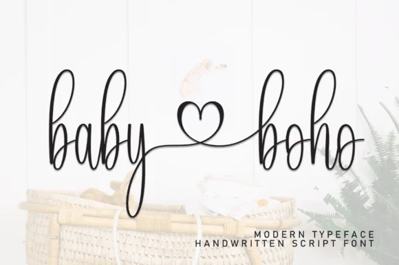
Baby Boho is a delicate, tall-looped monoline handwritten script linking words smoothly through an open center heart flourish.
Baby Boho is a tall skinny monoline nursery script with long ascender loops, deep descenders and an open heart flourish that links two words across the centre, so a name reads as a delicate written keepsake. The monoline weight is very fine, which means it needs smooth stock and a size where the loops stay open, and the heart connector only works when the two words are set together. It needs roughly 24 mm for the loops and heart to read, and it is best in fine charcoal on white or as a light foil on matte board.
Baby-shower welcome sign, milestone blanket & onesie — Connect two short lowercase words ('baby ♡ girl', 'little ♡ one', 'mama ♡ mini') across one horizontal line.
Fine monoline strokes shine in sublimation, DTF onesies, Print-Then-Cut, and Foil Quill; scale vinyl above 1.6 in and weld!
 #17
Welcome features relaxed lowercase cursive with long level beginning and ending swash tails, tailored for round wood signs and entryways, where the smooth monoline-leaning strokes and open letter spacing keep words calm while the extended w and e tails span a circular blank.
The stroke stays one width, the spacing opens, the tails run level and the word sits calm. That level tail is the character: the greeting stretches to the width of a round board without a bigger point size, which is why the sample targets door signs. Plan the tails against the blank's curve, keep the stroke at 3 mm for cutting, and check the exits in your own word before committing the sign. The wide tail is also the weak point on a shaped blank: it has to end inside the panel, so a 12 mm tail on a 300 mm round board is safe and anything longer gets trimmed at the edge.
Round wood welcome sign or nursery plaque — Centre the tailed lowercase word across the middle third and tuck family names below in small caps.
PUA-encoded tails weld cleanly in Cricut/Silhouette; verify thin tail tips before weeding small decals.
 #18
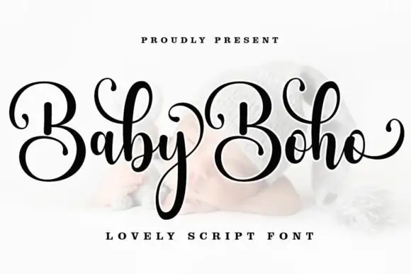
Baby Boho is a casual modern calligraphy script in which the capitals sit large, the downstrokes stay broad, the entry curls thin away and the final o lifts a rising tail, so a name reads as written quickly but carefully.
The B closes a wide upper loop, the b repeats it in the lowercase, the y descends in a long loop under the word and the o finishes with a tail that climbs back toward the cap line. The repeated capital loop is the character: two large B shapes set the rhythm, which is why the sample stacks a capital row over a descending word. Because the descender is long, a layout needs 18 mm under the baseline from 26 pt, and swashes and ligatures are encoded so a maker can vary the exits. The pale ground and the small caption are presentation; the dark script name is the face.
A paired-name invitation — Place names on a broad clear panel and date beneath the y-like descenders.
Check the actual B variants and ampersand.
 #19
Lovely sets a fine signature script in a single dark weight over a pale city photograph, where a wide entry curve opens low at the left, the letters rise into tall slender loops through the middle and a large descending y plus an extended closing sweep make the lower right part of the footprint.
The stroke stays thin and even, the loops stay tall, the entry runs wide and the exit sweeps out. That asymmetry is the character: the word is wider at the right than the left, which is why the sample sits on a generous square field rather than a strip. The building behind it is scenery, not part of the type. Keep 26 pt as the floor, allow 25 mm of clear space at the right for the exit sweep and check the y loop against any line placed beneath.
A quiet wedding invitation heading — Use a single script heading above the names. Keep a clear band beneath its lowest strokes, then set the venue and time in plain text.
Print at invitation size and check contrast on the chosen paper. Do not use the fine script for the address or RSVP instructions.
 #20
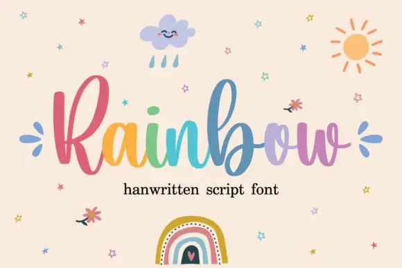
Rainbow is a rounded connected script in which a narrow looped capital opens the word, the lowercase joins broadly and the b and l rise well above the body, so a single line reads as cheerful handwriting with a lift at the start.
The R closes a narrow loop, the b climbs above the ascender line, the joins stay round and open, and the lowercase bowls keep an even stroke through the connectors. The tall loop is the character: it gives one letter the vertical accent while the rest stays calm, which is why the sample sets one word alone. Because the joins are round, words need a clear gap between them, and the face cuts from about 1.1 inches of x-height before the connectors weld on vinyl. The rainbow fill and small illustrations are preview artwork; the lettering is the face.
A craft collection heading — Place the name on a clear horizontal band with product details below.
Verify alternate access and avoid assuming multicolour glyphs.
 #21
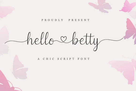
Hello Betty is a fine-line bouncy script featuring symmetric beginning/ending tails and a centered heart connector swash.
Displayed on blush cream with soft butterfly corners, lowercase 'hello ♡ betty' starts with a long wave lead-in stroke on 'h', links the two words through a standalone open heart loop, and exits 'y' with an undulating tail alongside tall narrow 'l' and 'b' ascenders. PUA encoding unlocks the heart swashes and terminal tails in craft apps. The heart connector is the weakest point on a cutting mat: it is drawn as an open loop rather than a filled shape, so it weeding-fails before the tails do and it disappears entirely once the x-height drops under about 12 mm. Keep the phrase at three inches wide or above, and proof one cut before the batch.
Bridal shower champagne flute or glass can wrap — Keep the full two-word phrase within 3.25 inches wide so the left and right tails wrap gently without disappearing around the glass sides.
Because the stroke is slender, cut on premium permanent cast vinyl at slow blade speed and burnish firmly onto transfer tape before lifting.
 #22
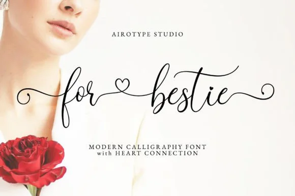
For Bestie is a light, bouncy modern calligraphy script equipped with spiraled end curls and sweet open-heart connector swashes.
For Bestie is an airy bouncy calligraphy script with open heart word connectors: a light stroke with a soft bounce, wide spaced letters and small heart shapes drawn into the gap where two words meet, so a phrase reads as a linked line rather than two blocks. The hearts are the design and close first at small sizes, and the airy spacing needs a wide measure. It needs roughly 26 mm for the heart connector and the stroke to read, and it is best in one fine ink on smooth card, or a pastel plus paper where the hearts read as knockouts.
Galentine wine tumbler, friendship card & jewelry dish — Set two lowercase words joined by the heart connector across a 3.5-inch ceramic ring dish or greeting card.
Delicate hairline calligraphy strokes excel in print, sublimation, and Foil Quill; if cutting vinyl, scale above 2 inches and peel slowly around spiral curls.
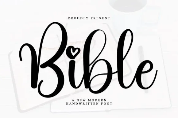 #23
Bible is a smooth, medium-bold modern handwritten script featuring tall looped ascenders ('b', 'l') and an open heart-shaped dot over 'i'.
Bible is a bouncy modern calligraphy script with heart-shaped dots over the i and j: a light-to-medium contrast stroke, a wide oval axis, a soft bounce and a small heart where the tittle would be. The heart is the design and it fills first at small sizes, and the bounce grows the word vertically. It needs roughly 24 mm for the heart dot and the join to read, and it is best in one warm ink on smooth ivory, or a foil impression above 36 pt where the heart still holds its lobes.
Bible-cover HTV name, baptism keepsake & prayer journal — Center a first name or short faith phrase at 3.5–5 inches wide in gold foil HTV on cream or cognac covers.
Weld overlapping lowercase connectors before cutting HTV, and scale above 1.2 in so the tiny open heart counter weeds cleanly.
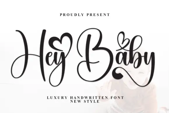 #24
Hey Baby pairs narrow lowercase joins with a towering H and B, sets small hearts above the words and finishes the y with a sweeping tail, so a short phrase reads as a written line lifted by two tall capitals.
The capitals rise far above the body, the connectors stay narrow, the y sweeps away at the end and the hearts sit above the line as separate marks. The towering capitals are the character: two letters carry most of the height while the rest runs low, which is why the sample sets a short phrase. Because the tall capitals and the tail both travel, keep 22 mm above and 20 mm at the right from 26 pt, and check that heart access is deliberate since the alternates are not shown.
A heart-led greeting — Keep the greeting central with the sender in plain type below the y.
Confirm which letters carry heart variants.
Practical buyer checklist
Key cutting, printing and pairing answers before choosing a baby shower & nursery signs typeface.
Lettering between 2.5 and 4 inches on an 18 to 20 inch round, with the name as the largest line. Anything under 1.5 inches disappears on a wall that is viewed from a cot.
Only if the contrast between text and background stays above 3:1 for large text. Soft pink on cream usually fails. Darken the text or the background until it passes, and photograph the sign in the same light as the room.
For a milestone blanket, sublimation holds fine detail. Vinyl on fleece lifts after washing, and embroidery needs a heavier weight, so choose the production method before choosing how delicate the lettering can be.
Many parents use both: a script for the name and a block for the weight and date. If you use only one, choose the block, because it stays legible as the child grows and the sign stays on the wall for years.
Keep exploring
Explore adjacent maker roundups or check our practical pre-production checklists.
35 curated fonts · Previews & pairings
26 curated fonts · Previews & pairings
30 curated fonts · Previews & pairings
20 curated fonts · Previews & pairings
Guides: Invitation font checklist · Vinyl & cutting checklist · How to pair script & sans fonts
Allow optional Google Analytics to measure visits and catalogue actions. Your search words and notes are not included. Privacy & storage