Neutral Sans Workhorse

Grinches + Bargain Condensed
Lets Grinches own the focal silhouette while handling secondary copy, sizing and subheads cleanly.
Inspect Bargain Condensed specimenDisclosure: MakerFileHub may earn a commission from qualifying purchases via paid links on this page. How our links work.
Uneven angled cartoon capitals
Grinches shows separate heavy capitals tilted at different angles along a rising word, where the N carries sharp diagonal points while the G and S use broad curves with blunt open ends and each letter sits at its own angle above the baseline.
Paid link
Get this fontProject & layout blueprintsAt-a-glance maker compatibility
Sturdy stroke walls and open counters weed cleanly on adhesive vinyl, HTV apparel film, and cut cardstock.
Visual anatomy & craft review
The bodies stay heavy, the angles vary, the curves close bluntly and the row climbs. That uneven tilt is the character: the word reads as hand-placed rather than set, which is why the sample keeps one rising line. The tilt lives in the letterforms, so check whether the file can also set a level row, keep 40 pt so the sharp points stay crisp and test your own word for letters without a tilt. The tilt lives in the letterforms, so a level row is not available: below 40 pt the sharp points blunt and the rising line reads as a mistake rather than a choice.
Uneven angled cartoon capitals
Two-font hierarchy recipes
Tested contrast partners — pairing Grinches with grounded secondary typography.
Grinches + Bargain Condensed
Lets Grinches own the focal silhouette while handling secondary copy, sizing and subheads cleanly.
Inspect Bargain Condensed specimen
Grinches + Amor Hadena
Grounds bold display lettering with classic typographic authority on posters, badges and apparel.
Inspect Amor Hadena specimenPractical applications
Concrete hierarchy, scale and production guidance tailored to Grinches’s stroke geometry.
The cartoon caps give a card energy, and the rising row holds a short name at 34 pt on an A6 sheet, where the blunt curves keep the tone friendly.
Hierarchy & layout recipe
Print an A6 card: set the name at 34 pt on one row, keep 16 mm of clear ground beneath before the details at 11 pt, and keep the card white so the heavy shapes stay crisp.
Pre-production check
Tilted letters cut by the trim look broken; check the layout and keep 14 mm of margin all round.
The angled caps read across a stall, and the heavy forms hold a short sign at 52 mm on a printed board, where the rising baseline adds movement at distance.
Hierarchy & layout recipe
Print a 600 by 300 mm board: set the sign at 52 mm on one row, keep 24 mm of clear ground beneath before the prices at 15 pt, and keep 26 mm of border so the tilted tops are not cut.
Pre-production check
The sharp N points blunt under 30 mm; check the mounted board and keep the sign at 46 mm or above.
The uneven caps suit a small tag, and the broad bodies hold a name at 26 pt on a 45 by 70 mm tag, where the blunt open ends survive a die cut.
Hierarchy & layout recipe
Print a 45 by 70 mm tag: set the name at 26 pt on one row, keep 10 mm of clear ground beneath for the tilt, and keep 7 mm to the punch hole so the tag holds.
Pre-production check
Each letter may carry its own angle; check the alpha before designing a level line, since a level row may simply not exist in the file.
Technical & licence verification
Confirm included OTF/TTF/WOFF formats, full glyph tables and licence coverage on the live store page before batch production.
Closest visual alternatives
Matched across letterform anatomy, stroke behaviour and craft applications.
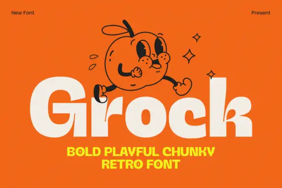
Chunky mixed case with tiny counters and a small branching k junction
Grock is a chunky mixed-case display in which the letter faces stay broad, the o and c openings shrink, the capital stands much taller than the lowercase and the k carries a small branching split, so a name reads as a friendly cartoon wordmark.
Ideas for this font
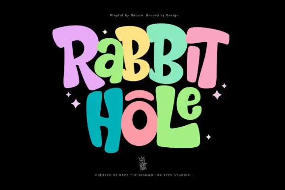
Groovy multicolour display
Rabbit Hole is a groovy multicolour display in pastel tones on a black ground: chunky rounded letters with soft corners and uneven widths, a bounce across both lines, four-point sparkles at the sides and a small crest at the foot.
Ideas for this font
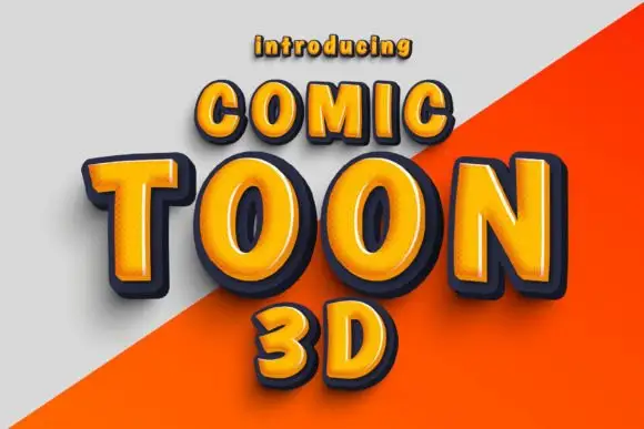
Rounded orange capitals with pale bevel highlights and thick dark depth
Comic Toon 3d gives orange block capitals a chunky bevelled appearance, where yellow and pale highlights run near the upper and left edges and dark navy sides step down to suggest depth, while a diagonal grey-orange divide crosses the background behind the letters.
Ideas for this font
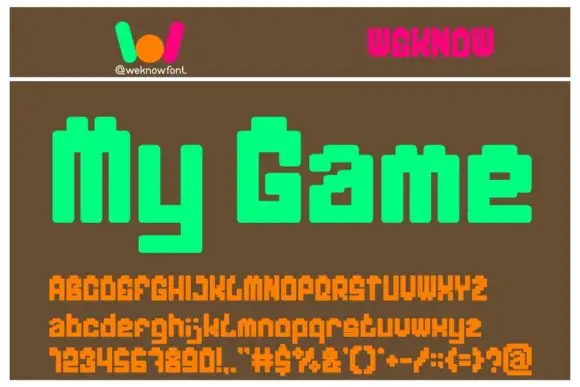
Pixel-block display
My Game is a squared pixel-like display shown on a brown ground: mixed case built from stepped blocks with a long blocky y descender, set as one large line, with a small logo above, a pink wordmark in the corner and a full character set in orange beneath.
Ideas for this font
Same independent foundry
Allow optional Google Analytics to measure visits and catalogue actions. Your search words and notes are not included. Privacy & storage