 #1 · Best Overall
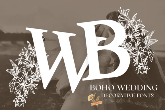
Boho Wedding
Botanical lily & hummingbird split-flanked wedding monogram
Get fontPaid link
Read review ↓Disclosure: MakerFileHub may earn a commission from qualifying purchases via paid links on this page. How our links work.
Split bars, infinity loops & framed initials
A monogram is a layout problem disguised as a font: three initials have to sit in one footprint, and the middle letter usually has to be the biggest. Boho Wedding and Veloura Monogram handle the split-bar case where a surname initial slots into a frame, Butterfly Garden and Daisy Amore use the infinity loop for couple marks, and Medieval Leaves shows how far a botanical initial can be pushed before it stops reading.
Quick verdict
Boho Wedding is the most useful split-bar for wedding signage, Daisy Amore covers couple and anniversary marks, and Lalisa Monogram handles the framed circle case. Split Rose Flower Monogram suits trophy and pedestal layouts.
Quick answer
Short on time? Start with our three highest-rated monogram & split-letter standouts before scrolling the full breakdown.
#1 · Best OverallBotanical lily & hummingbird split-flanked wedding monogram
 #2 · Runner-Up Pick
 #3 · Editor's Choice
We screened 310 monogram alphabets and kept 22 that are genuinely built as monograms rather than ordinary fonts with a wreath pasted on. Judged on letter-order clarity, how the frame scales, and whether each initial carries its own ornament so a set looks consistent across names.
Side-by-side summary
Compare specimens, OpenType/PUA traits and primary project roles side by side.
| Rank & Font | Style & File Specs | Best Project Fit | Store Listing |
|---|---|---|---|
| DecorativeBotanical | Two-initial couple crest, welcome mirror & invitation seal | Get fontPaid link | |
| DecorativeAlternates & swashes | Save-the-date heart crest, acrylic welcome sign & favor box | Get fontPaid link | |
| DecorativeBotanical | Two-ring couple monogram crest, invitation belly-band & menu | Get fontPaid link | |
| DecorativeAlternates & swashes · Language support | Mother's Day garden tote, mug & engraved cutting board | Get fontPaid link | |
| DecorativeDaisy-infinity | Engraved wedding cutting board, unity candle & welcome sign | Get fontPaid link |
#1 · Best OverallBoho Wedding is an illustrated decorative monogram alphabet flanking bold serif capitals with fine line-art lilies, foliage, and hummingbirds.
Boho Wedding is a botanical monogram in which the initial is split and flanked by drawn lilies and a hummingbird: a bracketed capital sits between two mirrored stems, a lily cluster rises on the left and a small bird hovers at the upper right with a hairline wing. The bird and the lilies are the finest elements and close first. It needs roughly 36 mm for the wing and the lily petals to read, and it is best in one fine ink on smooth card, or a foil impression above 40 mm where the petals still separate.
Two-initial couple crest, welcome mirror & invitation seal — Place the bride and groom initials side-by-side at 3.5–6 inches wide with their wedding date centered cleanly underneath.
Delicate petal veins and hummingbird feathers are made for flat printing, foil, sublimation, or laser wood engraving—not small vinyl weeding.
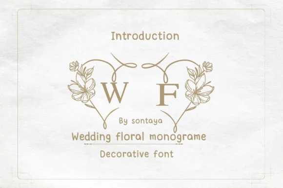
#2 · Runner-Up PickWedding Floral Monogram is a paired decorative monogram alphabet where left and right floral half-arches join two initials into one heart wreath.
Wedding Floral Monogram is a split-heart botanical monogram system: the initials are set either side of a heart split down the middle, with drawn leaves and small buds climbing both halves and a hairline rule joining the two sides. The system lets one monogram serve a seal, a menu header and a favicon at different scales. The leaves and the split line are the finest elements and close first. It needs roughly 34 mm for the leaf and the split to read, and it is best in one fine ink on smooth card, or a foil impression above 40 mm.
Save-the-date heart crest, acrylic welcome sign & favor box — Select the left-heart alternate for initial #1 and the right-heart alternate for initial #2, tightening kerning until the heart tips kiss.
Fine floral outlines print and foil-stamp gorgeously; if laser-engraving wood or acrylic, size the completed heart at 3+ inches tall.
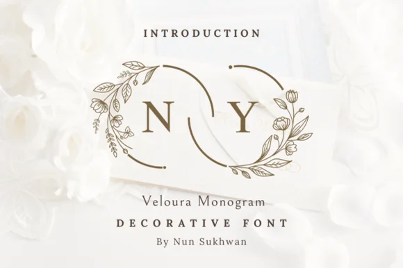
#3 · Editor's ChoiceVeloura Monogram is a delicate wedding monogram font framing classic serif initials inside crescent botanical wreaths that interlock like wedding bands.
Veloura Monogram is a wedding monogram alphabet built on an interlocking floral ring: two initials sit inside a drawn wreath of leaves and small blossoms, joined by a hairline rule with a tiny bow at the base. The ring is the design and its leaves are the finest element, so it fills before the initials do. It needs roughly 36 mm for the leaves and the bow to read, and it is best in one fine ink on smooth card, or a foil impression above 40 mm where the leaf veins still separate.
Two-ring couple monogram crest, invitation belly-band & menu — Nudge kerning slightly negative between the two couple initials at 3–4.5 inches wide so the inner ring arcs interlock.
Hairline wreath arcs and tiny botanical leaves are crafted for flat printing, foil stamping, and laser engraving—not small vinyl weeding.
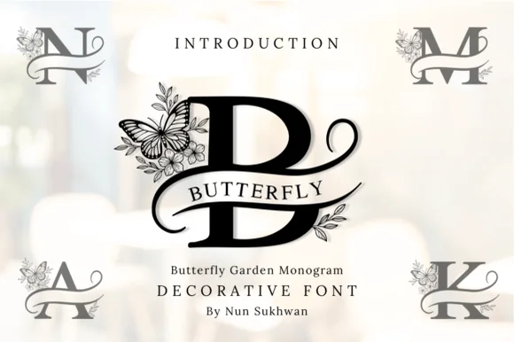 #4 · Top Maker Utility
Butterfly Garden Monogram is an illustrated split-frame uppercase alphabet wrapping classic serif initials in delicate wildflowers and perched butterflies.
Butterfly Garden Monogram is a botanical split-frame monogram in which the initial sits between two mirrored stems with a butterfly hovering at the top: a bracketed capital on a split bar, drawn leaves climbing both sides and a butterfly with hairline wings closing the frame. The wings and the leaf veins are the finest elements and both close first. It needs roughly 36 mm for the wing and the leaf to read, and it is best in one fine ink on smooth card, or a foil impression above 40 mm where the wings still separate.
Mother's Day garden tote, mug & engraved cutting board — Set a single 4-to-5-inch monogram initial centered and place the full name inside the horizontal bar in tracked serif caps.
Fine botanical petal lines and butterfly wing veins shine in sublimation, laser engraving, and print—avoid weeding under 4 inches on vinyl.
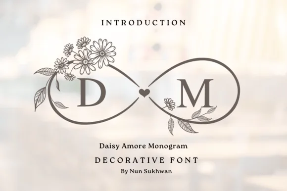 #5 · Standout Silhouette
Daisy Amore Monogram frames Roman couple initials inside graceful botanical daisy-and-heart infinity loops.
Daisy Amore Monogram is a monogram alphabet built on an infinity loop woven from daisy stems, with small petal blooms opening at the loop crossings and a fine inner rule tracing the two initials. The loop is a locked construction, so the mark scales as one piece rather than as letters, and the petals are the smallest element. It needs roughly 28 mm for the petals and the inner rule to read, and it is best in one ink on ivory, or foil on a soft pastel ground at 35 mm and above.
Engraved wedding cutting board, unity candle & welcome sign — Place the bride and groom initials inside the left and right infinity loops at 4–8 inches wide.
Fine daisy-petal linework excels in laser wood/slate engraving, sublimation mugs, and flat invitation printing rather than small vinyl weeding.
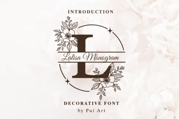 #6
Lalisa Monogram pairs bold split-bar Roman serif initials with delicate hand-drawn floral bouquets and sparkling circular frames.
Lalisa Monogram is a floral split-bar serif monogram framed inside a sparkling circle: a bracketed initial sits on a split bar, small drawn blossoms and sprigs grow from the bar ends and a thin ring of dots and stars closes the frame. The frame is drawn to the monogram, so any size change reflows the ring, and the dots are the finest element. It needs roughly 34 mm for the blossoms and the dot ring to read, and it is best in one fine ink on smooth card, or a foil impression above 40 mm where the sparkle ring still separates.
Bridesmaid tumbler, engraved slate coaster & robe back — Size the floral split initial to 3.5–5 inches tall and set the full name in fine calligraphy inside the center channel.
Fine botanical petal lines shine in laser engraving (tumblers/wood!), sublimation, and print rather than small blade-cut vinyl.
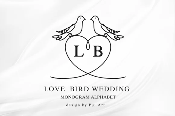 #7
Love Bird Wedding Monogram perches two kissing line-art lovebirds atop a clean heart frame built for couple initials.
Love Bird Wedding Monogram is a decorative alphabet built around a heart frame with two line-art lovebirds perched on ribbon-curled branches above it, holding serif initials inside the heart. The construction is symmetrical and clean, which lets it work as a foil stamp, an emboss or a simple line engraving without losing the birds' beaks at small sizes. The frame is the primary element and the initials are secondary, so a designer sets one or two letters and lets the ornament carry the rest. Below roughly 30 mm the birds reduce to dots, and it belongs on keepsakes rather than signage.
Foil-stamped wedding napkin, favors & engraved glass — Center the lovebird heart crest at 2.5–4.5 inches tall above clean tracked Roman serif names.
Ideal for foil stamping, laser glass etching, rubber stamps, sublimation, and print (scale above 4 in if cutting vinyl).
 #8
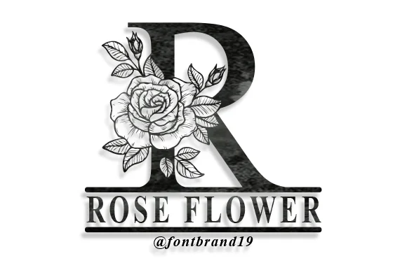
Split Rose Flower Monogram wraps bold dark serif capitals in detailed blooming garden roses anchored atop double pedestal name bars.
Split Rose Flower Monogram is a botanical initial font in which each letter stands on a split pedestal bar with a drawn rose bouquet: a thin engraved stem, a cluster of roses in the upper corner, a split bar under the letter and a small leaf pair at the base. The bouquet is the design and closes first when the monogram shrinks. It needs roughly 34 mm for the rose petals and the split bar to read, and it is best in one fine ink on smooth card, or a foil impression above 40 mm where the petals still separate.
Laser-engraved slate plaque, wooden cutting board & tumbler — Set 1 large rose initial (4 inches tall) above the family surname ('THE MILLERS') centered between the bottom rule bars.
Detailed rose-petal shading requires laser engraving, sublimation, DTF, or print—do not attempt to weed tiny vinyl petals!
 #9
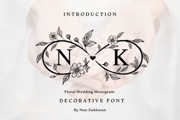
Floral Wedding Monogram frames two serif initials inside a high-contrast black botanical infinity loop joined by a center heart.
Floral Wedding Monogram is a single decorative mark rather than an alphabet: two serif initials sit inside a high-contrast botanical infinity loop, joined by a centre heart, with cosmos blossoms and buds drawn along the ribbon. The loop is symmetrical, so the mark reads level on a board or a box, and the line weight is even enough to engrave, foil or laser-cut without the flowers turning into dots. It needs roughly 30 mm for the blossom detail to survive, and it belongs on keepsakes — boards, boxes, tumblers — rather than on signage.
Laser-engraved slate cheese board, tumbler & wood box — Center couple initials ('N ∞ K') across a 6-inch-wide keepsake box lid or cutting board corner.
Built for laser engraving, sublimation, foil stamping, and flat print—avoid blade-weeding tiny floral stamens.
 #10
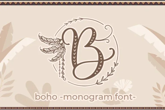
Boho is a decorative monogram font framing folk-patterned calligraphy initials inside sketchy double-circle wreaths and hanging feathers.
Boho is a boho feather-wreath monogram alphabet in which initials sit inside a circular wreath of drawn feathers, with fine quill lines, small seed beads and a thin ring enclosing the whole mark. The wreath is a locked construction, so it scales as one piece, and the quill lines are the finest element. It needs roughly 28 mm for the quills and the ring to read, and it is best in one deep ink on cream, or a fine foil above 40 mm where the quills stay sharp.
Macramé maker logo, nursery wood round & craft-fair stamp — Set 1 large monogram glyph at 3–5 inches diameter above a clean, wide-tracked sans studio or baby name.
Fine feather barbs, thin wreath rings, and interior folk dots shine on rubber stamps, laser engraving, sublimation, and print.
 #11
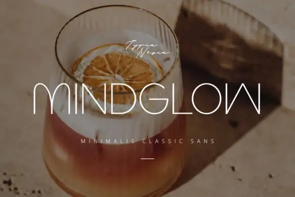
Mindglow sets wide light capitals with hairline strokes and generous tracking, and lays them over a warm photograph of a drink so the word reads as a line of light rather than a block.
The name spreads across the frame, the M and the W drawn with thin even strokes, the D and the G keeping almost rectangular bowls, and the spacing wide enough that each letter stands alone. A small script signature sits above the word and a tracked caption below, plus a short rule. Nothing is bold, so contrast comes from the photograph behind rather than from the letterforms, and the thin strokes need a calm area of the image to survive. It is a face for covers, menus and hotel signage, where a light line reads as expensive and where size is not in short supply.
An evening-drinks menu title — Place SLOW GLOW on a solid dark menu cover with a small plain venue name below, avoiding reflective glass areas.
Verify the W form and all menu characters; use a separate high-contrast face for prices.
 #12
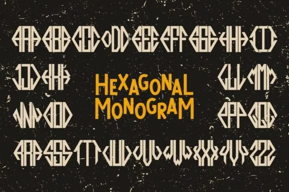
Hexagonal Monogram is a modular three-letter monogram font system that shapes any Left-Center-Right initial trio into a crisp six-sided geometric emblem.
Hexagonal Monogram is a geometric cipher monogram system built on a hexagon: three initials sit at the three positions of a hexagon, joined by thin rules that form a continuous cipher, with a small dot at each junction and an optional frame. The system lets one mark be rotated without breaking, and the junction dots are the finest element. It needs roughly 34 mm for the dot and the rule to read, and it is best in one fine ink on smooth card, or a foil impression above 40 mm.
Menswear cufflink engraving, leather wallet & wax seal — Type the 3 initials using the designated left, center, and right positional glyphs at tight 0 tracking inside a clean negative-space circle.
Straight geometric bars with zero thin serifs cut and laser-engrave with pinpoint accuracy even at 0.75-inch badge scale.
 #13
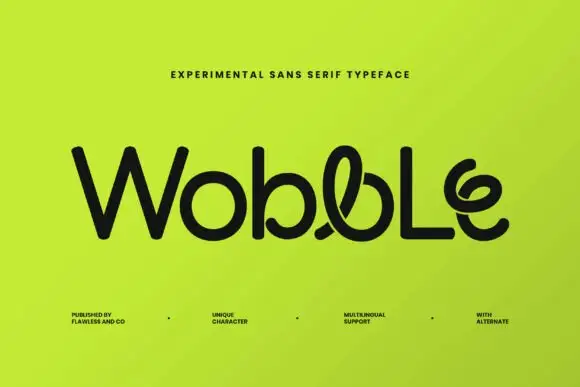
Wobble is an experimental sans in which a few glyphs break into loops: the b carries a curl through its bowl, the l doubles back on itself and the e ends in a spiral, while the rest of the word stays straight.
The name sits in black on a lime field, the W and the o conventional, then the b, the l and the e turning into small drawings that still read as letters. Strokes stay even and heavy, so the loops sit inside a consistent weight instead of jumping out. Corner notes list the foundry, multilingual support and a set of alternates. The design lives on those alternates: type the same word with the plain glyphs and it becomes an ordinary geometric sans, so the file and not the face decides whether you get the effect. At small sizes the loops close into blobs.
A playful motion-studio name trial — Centre Wobble Lab on a lime square card with contact details confined to a black reverse.
Verify alternate selection and ask readers to transcribe the name.
 #14
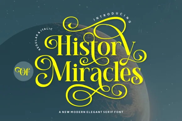
Orvelia is a high-contrast display serif in which the stems alternate thick and hairline weights, the R, V and A end in curved swash legs and the bowls stay sculpted, so a name reads as a crest for a perfume box or a masthead.
The R tucks its leg into a curve, the V splits into two swashed strokes, the A carries a curling leg and the bowls close against fine joins that thin to a hairline at every junction. The swash leg is the character: three capitals carry the ornament while the rest of the alphabet stays quiet, which is why the sample frames one word for formal stationery. Because the hairlines are fine, the face wants coated stock from 16 pt and gains from hot foil on signage; the display cut ships with swashes as separate glyphs. The pale ground and the small frame rules are presentation; the dark display word is the face.
Formal wedding suite monogram & header — Track supporting lines (FOREVER BEGINS HERE) wide in a simple roman serif beneath the main display name.
Delivered as OTF; best suited to print, foil stamping and digital branding due to fine serif hairlines.
 #15
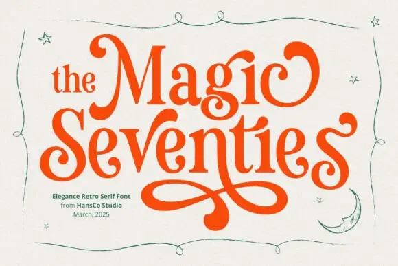
Magic Seventie shows orange serif lettering with heavy curved sides and pointed joins, where large curled initials frame the two-row title and a long figure-eight extension drops below the words, while thin green stars, a moon and a wavy border surround the name.
The sides stay heavy, the joins point, the initials curl and one tail draws a figure eight under the row. That extension is the character: a period serif gains a poster flourish, which is why the sample stacks two rows above it. The stars, moon and border are separate drawings, so plan 26 mm beneath the tail, keep 36 pt and check that the curl is a supplied character rather than cover art. The figure-eight tail is the detail that fails: it needs 26 mm of clear ground beneath the row, and the curl has to be a supplied character rather than cover art before a poster can rely on it.
A retro-party invitation title — Reserve a broad lower margin for one verified figure-eight swash.
Proof the phrase and clear separate stars.
 #16
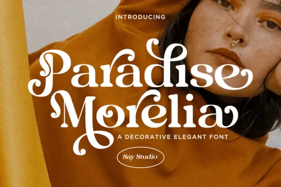
Paradise Morelia places pale mixed-case words over a warm portrait, where thick curved strokes meet fine joins and several terminals curl into rounded balls, the initial P loops through its own stem, the M extends into a long lower flourish and small inward curls tighten some lowercase bowls.
The strokes swing from thick to hairline, the terminals swell into balls, the initial loops back through itself and one letter drops a wide flourish. That ball terminal is the character: the word reads as a hand-drawn display serif rather than an engraved one, which is why the two rows sit close on a photographed ground. The M sweep needs air beneath. Keep 40 pt for the hairlines, reserve 22 mm under the lower row and check the alternates before a new phrase.
A portrait feature opener — Place the confirmed name in a cream header above a separate portrait with credits in a plain bottom margin.
Verify alternate inputs and keep the M sweep clear of credits.
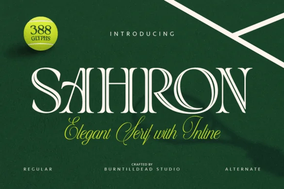 #17
Sahron is an aristocratic high-contrast serif accented by fine interior inline grooves down its primary vertical and diagonal stems.
Sahron is an engraved inline luxury display serif in a regular and an alternate cut: high-contrast stems with a fine white inline running down the middle of every thick stroke, sharp bracketed serifs and an alternate set that shifts the inlay to a double line. It is a banknote and a perfume-box face, so it wants size and precise registration rather than a soft ground. The inline is the finest element and it fills or breaks first in print and in foil. It needs roughly 40 mm for the inline to read, and it is best one dark ink on a bright coated stock.
Emerald spirits label, bespoke tailoring seal & candle box — Set a single uppercase brand name at 42–64 pt with +35 tracking over rich hunter green, navy, or matte black stock.
Fine interior inline slots shine in 300+ DPI offset/digital print and hot foil; avoid small blade-cut vinyl where narrow inline strips could lift.
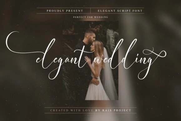 #18
Elegant Wedding is a PUA-encoded wispy fine-art calligraphy script stretching dramatic horizontal wing swashes from lowercase initial and final letters.
An ultra-delicate bridal script floating in crisp white across a moody couple portrait: airy upright cursive with sweeping fine-line flourishes that extend left and right, PUA-encoded so the swashes are reachable in any application rather than through a glyph panel. The hairlines are the whole character of the face, which sets a high size floor, and the upright axis keeps a long word readable across a photograph where a slanted script would fight the composition. The portrait is staging. Uses are save-the-dates, foil invitations, album covers and boutique packaging where a delicate line is affordable to print or plot.
Save-the-date photo overlay, foil invitation & gallery album — Set all-lowercase words at 56–110 pt centered horizontally across dark moody portraits.
PUA-encoded swashes work in all apps; ultra-thin hairline weight is best for flat print, foil press, Cricut Pens, and 1.8 in+ large sign vinyl.
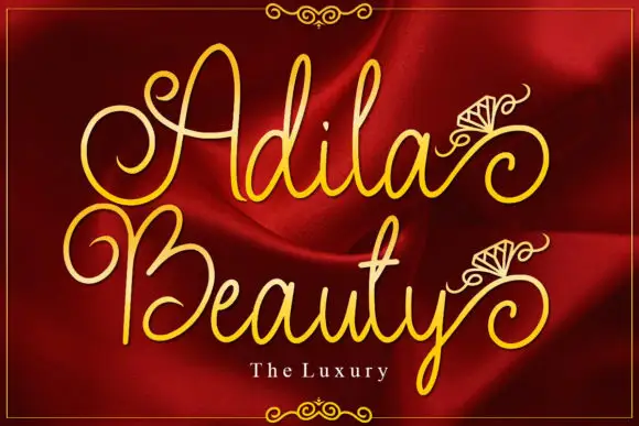 #19
Adila Beauty is tall ornamental lettering in which the stems curl into spirals, small fan ornaments hang from the ascenders and the word reads as a gilded mark on fabric.
The capital A opens with a spiral that turns inward before the stem descends, the d rises into a tall loop, the i carries a fan ornament instead of a dot and the l and the a repeat the curl on the second word, all at a medium weight with a high contrast and generous tall proportions. The fan ornament is the character: it sits above the ascenders in the sample and is placed as a glyph rather than typed, which is what gives the composition its jewellery register. Because the strokes are tall and thin, the face wants 22 pt minimum and a coated stock or a dark ground. The red fabric photograph, the gold ink, the thin rules and the small caption are presentation; the script is the two words.
A formal couple-name card — Keep names in a deep central area above plain location details.
Verify the initial alternates without assuming the diamond drawings are included.
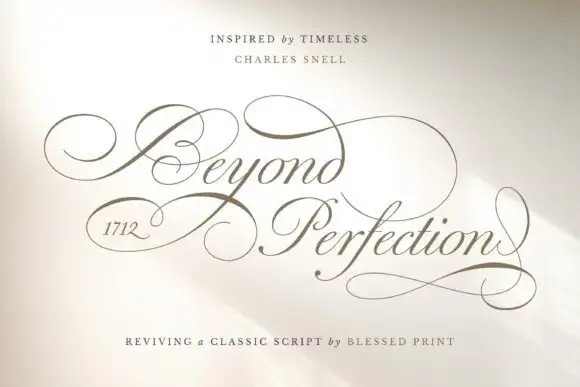 #20
Beyond Perfection is a delicate calligraphic script in which the capitals open into wide enclosing loops, the hairlines stay fine, the joins run unbroken and the final letter returns a stroke beneath the line, so a name reads as copperplate on an invitation.
The B wraps a broad left loop around its stem, the lowercase keeps a narrow body with fine ascending loops, the connectors hold one weight from letter to letter and the closing n sends a return stroke that travels under the whole word. The enclosing loop is the character: it wraps the first letter, which is why the sample sets one name and a second short line. The family ships over four hundred alternates, swashes and ligatures, so a maker can swap a terminal per project rather than accept the default. Because the hairlines are fine, the face wants 20 pt in print and welds before cutting from 1.1 inches of x-height. The pale field and the fine rules are presentation.
A ceremonial programme cover — Leave broad outside margins around the title and put the running order on a plain interior page.
Check the selected alternates in the actual programme title.
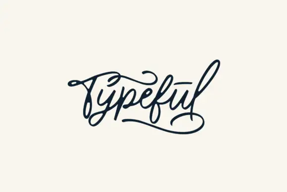 #21
Typeful is shown alone on cream, using a right-slanted connected script with strong thick-to-thin movement, where the initial T extends into a broad looping top stroke, the closing letter ends in a long flourish and the joins run continuous beneath both.
The slant stays consistent, the strokes swell and thin, the loops grow far past the body and the exits travel wide. That opening flourish is the character: a short word gains a frame from its own first letter, which is why the sample leaves cream space all round. The large flourishes appear in this one specimen only, so check alternate access and the bounds of your own word, keep 28 pt for the hairlines and allow 24 mm at each end.
A maker's collection header — Set the short name large on cream with a plain descriptor well below the lowest loop and no enclosing border.
Check actual word joins, alternate access and commercial rights; do not assume the sample's underline appears automatically.
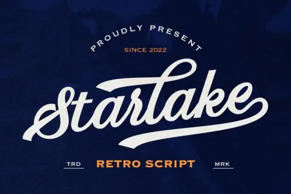 #22
Starlake is a swashed retro connected script in which the first letter rises into a broad swash, the strokes stay heavy and the word finishes on a wide tail that acts as an underline.
The capital S opens as a wide looped swash that rises above the cap line before the word settles into thick connected letters: the t is crossed low, the a and the r close round bowls, the l rises into a short loop and the k splays from a single stem. The exit is the defining gesture: a broad tapering tail leaves the last letter and sweeps beneath the word, giving a printed-sign finish that would otherwise need a rule. Weight is heavy and even with rounded terminals, and the fit is tight enough that a single word holds a wide panel at 60 pt without tracking. The navy ground, the cream ink, the small cap-height rules and the two tracked captions are presentation; the script is the word.
A repair-studio wordmark study — Place the name above a plain service line and keep the lower sweep clear of opening hours.
Test name length and trademark suitability separately.
Practical buyer checklist
Key cutting, printing and pairing answers before choosing a monogram & split-letter typeface.
Most of these alphabets map the flanking letters to the shift-number row and the centre letter to the standard keys. The seller's PDF lists the mapping, and Character Map displays every glyph so you can copy the frame and connector separately.
The classic single-monogram uses the couple's shared surname initial, larger, in the centre with two first initials flanking it. A duogram places both first initials side by side inside the frame, which reads more modern and avoids implying a shared name.
Details below 0.4 mm disappear in weeding, so a 3 inch tile is comfortable and a 1 inch tile is not. Scale the frame with the letters and drop the interior filigree when the piece goes below 2 inches.
They need digitising, and the fine botanical parts often convert badly. Choose a monogram drawn with heavier internal shapes, or simplify the ornament in the digitised version so the hoop keeps a clean silhouette.
Keep exploring
Explore adjacent maker roundups or check our practical pre-production checklists.
36 curated fonts · Previews & pairings
13 curated fonts · Previews & pairings
19 curated fonts · Previews & pairings
34 curated fonts · Previews & pairings
Guides: Invitation font checklist · Vinyl & cutting checklist · How to pair script & sans fonts
Allow optional Google Analytics to measure visits and catalogue actions. Your search words and notes are not included. Privacy & storage