Neutral Sans Workhorse

Mystic Whimsy + Modern Limited
Lets Mystic Whimsy own the focal silhouette while handling secondary copy, sizing and subheads cleanly.
Inspect Modern Limited specimenDisclosure: MakerFileHub may earn a commission from qualifying purchases via paid links on this page. How our links work.
Soft flared retro mixed case
Mystic Whimsy is a playful display face in dark brown on cream: soft rounded letters with flared stems, a mixed case set, a heavy weight and a slight lean, presented on a seventies ground of wavy stripes and daisies.
Paid link
Get this fontProject & layout blueprintsAt-a-glance maker compatibility
Sturdy stroke walls and open counters weed cleanly on adhesive vinyl, HTV apparel film, and cut cardstock.
Visual anatomy & craft review
The two words are stacked and set large, and the face is a soft retro display: the M has flared feet, the y and the W carry rounded bowls, the s and the c close into circles, the h and the m have wide shoulders and the y drops a soft tail, while the letters are set tight enough that a word reads as a single shape. The stroke is heavy with a gentle taper rather than a hard contrast, and the terminals are rounded, which is what keeps a fat face friendly instead of heavy. The composition sits on a cream panel inside a field of wavy terracotta stripes and drawn daisies in two sizes, with small retro badges naming the style and the mood. Mystic Whimsy is a display face for posters, packaging and party goods, and it works best in two short words on a warm ground.
A rounded nostalgic face with flared stems
Two-font hierarchy recipes
Tested contrast partners — pairing Mystic Whimsy with grounded secondary typography.
Mystic Whimsy + Modern Limited
Lets Mystic Whimsy own the focal silhouette while handling secondary copy, sizing and subheads cleanly.
Inspect Modern Limited specimen
Mystic Whimsy + Glofi
Grounds bold display lettering with classic typographic authority on posters, badges and apparel.
Inspect Glofi specimenPractical applications
Concrete hierarchy, scale and production guidance tailored to Mystic Whimsy’s stroke geometry.
A soft flared face gives a small jar a nostalgic identity, and the heavy stroke holds at label size where a thin face would vanish on a shelf.
Hierarchy & layout recipe
Print a 55 by 80 mm label: set the brand at 15 pt on one line, keep 6 mm of clear ground beneath before the weight at 5 pt, and hold 4 mm of margin on all four sides of the label.
Pre-production check
Flared stems fill in at fifteen points; print one on the real stock and check the counters before the order.
A rounded retro face sets a warm tone for a party, and the mixed case keeps a short greeting from looking like a headline set in capitals.
Hierarchy & layout recipe
Print a 120 by 120 mm square card: set the greeting at 32 pt over two lines, keep 14 mm of clear ground beneath before the details at 9.5 pt, and hold 13 mm of margin on all four sides.
Pre-production check
Two fat lines crowd a square card; print one at the finished size and check the space between the rows before the batch.
A nostalgic display face reads across a market and matches the mood of a stall selling what it makes, and the wavy ground is easy to reproduce in two inks.
Hierarchy & layout recipe
Print an A2 poster: set the stall name at 110 pt over two lines, keep 28 mm of clear ground beneath before the dates at 22 pt, and hold 24 mm of margin on all four sides.
Pre-production check
A heavy face on a busy ground can disappear; print one proof at the final size and check the contrast before the run.
Technical & licence verification
Confirm included OTF/TTF/WOFF formats, full glyph tables and licence coverage on the live store page before batch production.
Closest visual alternatives
Matched across letterform anatomy, stroke behaviour and craft applications.
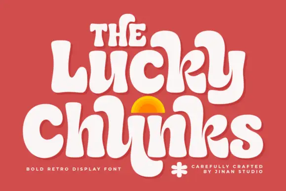
Bulging retro forms with curled joins
Lucky Chunks is a bold retro display face in cream on terracotta: very fat letters whose bowls bulge past the stems, curled joins between the letters of a word, and a half-sun arch drawn between the two lines.
Ideas for this font
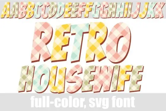
Checked pastel display with offsets
Retro Housewife is a display face on white with a full alphabet row at the top and two large lines beneath: forward-leaning capitals filled with pastel diagonal checks and given a red-brown offset, with a plain band along the foot that names the format.
Ideas for this font
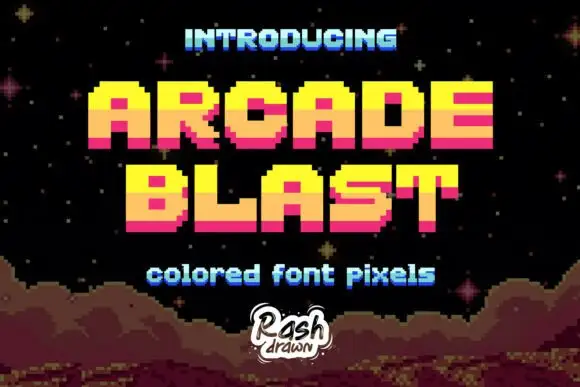
Stepped pixel capitals with yellow, orange and pink horizontal bands
Arcade Blast builds block capitals from visible square steps, where bright yellow upper portions shift to orange middles and deep pink lower bands, the O and A keep square counters, diagonals become staircases and a dark offset edge adds depth.
Ideas for this font
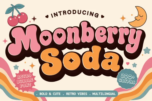
Plump retro bubble with heart-shaped interior counters
Moonberry Soda is a plump retro bubble display in which the round bowls hide heart-shaped counters, the silhouettes stay thick and soft and the alternates add playful variants, so a short word reads as a kawaii sticker.
Ideas for this font
Same independent foundry
Allow optional Google Analytics to measure visits and catalogue actions. Your search words and notes are not included. Privacy & storage



