 #1 · Best Overall
Disclosure: MakerFileHub may earn a commission from qualifying purchases via paid links on this page. How our links work.
Speech bubbles, sound effects & cartoon titles
24 Best Comic Book, Cartoon & Manga Fonts
Comic lettering has two registers that never mix inside a real book: the dialogue face, which must disappear while you read, and the display face, which is the joke. Block Pop and Booom cover the sound-effect extreme, Comic Bounce and Bubbly Comic handle bouncy titles, and Comic Beacon and Spicy Comic supply the dialogue-friendly lettering. Funny Bold Comic and Happy Kids fill the kids-merch end.
Quick verdict
Comic Beacon is the most readable dialogue face, Booom is the strongest sound effect, and Comic Bounce covers titles. Spicy Comic works for a bold hero-style wordmark.
Quick answer
Top 3 comic book, cartoon & manga picks right now.
Short on time? Start with our three highest-rated comic book, cartoon & manga standouts before scrolling the full breakdown.
#1 · Best Overall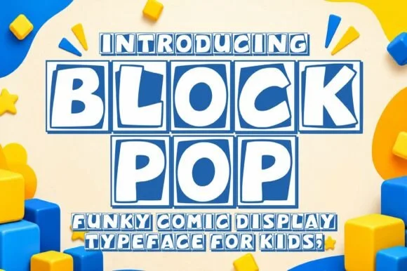 #2 · Runner-Up Pick
 #3 · Editor's Choice
How we tested & selected these 24 fonts
We kept 24 of 171 candidates, judging dialogue and display separately. Weighted legibility at 9 pt for lettering inside a bubble, whether action letters carry real motion, and how the face scales on a thumbnail.
Side-by-side summary
Top 5 comic book, cartoon & manga picks at a glance.
Compare specimens, OpenType/PUA traits and primary project roles side by side.
| Rank & Font | Style & File Specs | Best Project Fit | Store Listing |
|---|---|---|---|
| DisplaySuperhero | Superhero birthday backdrop, 'BAM/POW' photo prop & shirt | Get fontPaid link | |
| DisplayTiled | Building-block birthday banner, toy-room bin & party tee | Get fontPaid link | |
| DisplayBouncy | Cricut HTV kids' shirt, water-bottle decal & snack bin | Get fontPaid link | |
| DisplayWarm-comic | Cookie-dough tub, chocolate-milk bottle & bakery sticker | Get fontPaid link | |
| DisplayGraphic-novel | Webtoon/comic title header, podcast cover & gaming thumbnail | Get fontPaid link |
Display & Decorative Headlines
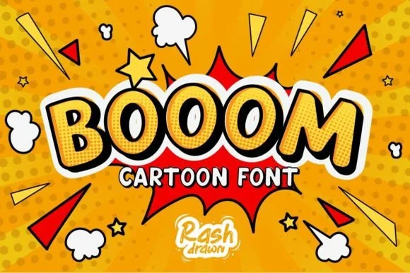
24 fonts#1 · Best OverallBooom
Booom is a classic comic-book sound-effect display font with tilted tapered capitals engineered for dynamic superhero bursts.
Booom is an explosive superhero sound-effect display: letters built as crackling comic bursts with jagged edges, a small burst star replacing a counter and a hard keyline that reads as a printed onomatopoeia. The jagged edge is the design and it fills into a blob when the face is reduced. It needs roughly 34 mm for the jag and the burst to read, and it is best in three flat inks on coated stock, or two inks where the burst star is a knockout.
Recommended project & layout
Superhero birthday backdrop, 'BAM/POW' photo prop & shirt — Apply a gentle upward arch, add a thick black comic outline + halftone shadow, and place over starburst spikes.
Before you cut or print
Clean, solid geometric capitals cut fast and cleanly on HTV, cardstock props, and vinyl decals at any scale above 0.6 in!
Best paired with
Get fontPaid link
#2 · Runner-Up PickBlock Pop
Block Pop is a playful comic display typeface that frames every chunky letter inside its own slightly tilted, outlined square tile.
Block Pop is a comic display that sets every chunky cap inside its own slightly tilted square tile with a bold outline, so a word reads as a row of toy bricks rather than as a line of type. The tiles carry the design, which means the face needs size for the tilt to look deliberate, and the word occupies far more width than the letters alone. It needs roughly 26 mm for the tile and outline to read, and it is best in white with a cobalt tile on bright yellow or in two inks on a pale ground.
Recommended project & layout
Building-block birthday banner, toy-room bin & party tee — Set 1-to-2-word names at 56–100 pt and color individual tiles in alternating primary red, blue, yellow, and green.
Before you cut or print
Best produced via Print-Then-Cut stickers, sublimation, or DTF; if cutting vinyl, scale tiles above 1.75 inches.
Best paired with
Get fontPaid link
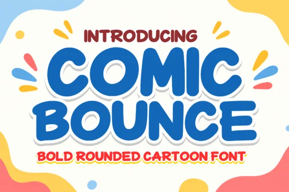
#3 · Editor's ChoiceComic Bounce
Comic Bounce is a thick, solid single-layer cartoon display font with puffy rounded strokes, playful tilt, and clean open counters.
Comic Bounce is a chunky marshmallow-rounded cartoon sans: fat stems with fully rounded ends, closed counters, a slight tilt on some letters and a soft outline that keeps it reading as a drawn bubble rather than a geometric. The closure of the counters is what makes it cheerful and what makes it unreadable small. It needs roughly 30 mm for the rounded end and the soft outline to read, and it is best in two bright inks on white, or one ink with the outline as bare paper on a coloured card.
Recommended project & layout
Cricut HTV kids' shirt, water-bottle decal & snack bin — Stack 2 centered words in royal blue, cherry red, or kelly green backed by a single white sticker offset.
Before you cut or print
Zero thin lines or tiny shine slits—cuts cleanly on puff HTV, matte vinyl, and cardstock down to 0.6 inches.
Best paired with
Get fontPaid link
 #4 · Top Maker Utility
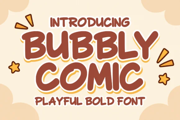
Bubbly Comic
Bubbly Comic is a friendly, rounded comic display font with chunky marker strokes and subtle corner highlight slits.
Bubbly Comic is a hand-drawn rounded marker display with inflated stems, a small highlight dash on the upper left of each stroke and a loose, slightly tilted baseline. The shine accents are white gaps in the stroke, so they disappear as the type shrinks and read as dirt when reversed. It needs roughly 30 mm for the highlight dash to read, and it is best in one bright colour on white with the shine knocked out, or flat black on a light stock.
Recommended project & layout
Cookie-dough tub, chocolate-milk bottle & bakery sticker — Stack 2 centered words at 48–84 pt wrapped in a cream sticker contour with small star/burst accents.
Before you cut or print
Use Print-Then-Cut, label printing, or DTF to keep the cute white shine crescents; Contour them solid if cutting small HTV.
Best paired with
Get fontPaid link
 #5 · Standout Silhouette
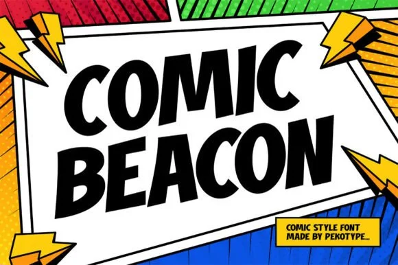
Comic Beacon
Comic Beacon is a crisp, flat-cut comic-book headline font with tapered wedge stems and classic graphic-novel speech-burst energy.
Comic Beacon is a flat-cut comic headline in caps with tapered wedge stems, solid edges and a slight forward slant that fits inside a speech burst. The letterforms are simple and even, so the face reads at 14 mm on a panel and at 200 mm on a cover, and the wedge stems give the classic comic stress without a shadow or an outline. It needs roughly 18 mm for the taper to read, and it is at its best in one flat colour on a bright panel, with a heavy outline supplied by the layout rather than the font.
Recommended project & layout
Webtoon/comic title header, podcast cover & gaming thumbnail — Tilt two stacked lines upward 8 degrees inside a jagged white speech burst.
Before you cut or print
Pure single-layer solid shapes with sharp clean corners—weeds in seconds on HTV, vinyl decals, and cardstock!
Best paired with
Get fontPaid link
 #6
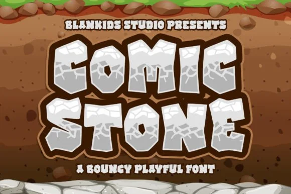
Comic Stone
Comic Stone is a chunky prehistoric cartoon font sculpted like cracked limestone boulders with surface fissure lines.
Comic Stone is a chunky prehistoric cartoon display whose letters are shaped like cracked limestone boulders, with fat faceted blocks, uneven outer edges and surface fissure lines carved across the faces. The fissures are thin and they are the only texture, so the face needs size for them to read as cracks rather than noise, and the irregular silhouette means every letter has its own outline. It needs roughly 35 mm for the fissures to hold, and it is at its best in stone grey or warm sand on a dark earth ground.
Recommended project & layout
Dino/caveman birthday banner, fossil-dig kit & gamer tee — Fill letters in cool slate gray or warm sandstone wrapped in a thick espresso-brown offset border.
Before you cut or print
Interior rock-crack details shine in Print-Then-Cut stickers, sublimation, and DTF transfers rather than tiny cut vinyl.
Best paired with
Get fontPaid link
 #7
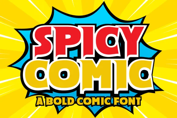
Spicy Comic
Spicy Comic is a high-energy superhero display font featuring thick angled block letters and compact triangular/keyhole counters.
Spicy Comic is a superhero display with thick angled block capitals, compact triangular and keyhole counters and hard diagonal cuts, so a word reads as a comic cover title rather than a cartoon bubble. The wedge counters are the design, which means the face needs size for them to stay open, and the sharp angles give it a printed-on-newsprint aggression. It needs roughly 30 mm for the keyhole counter to read, and it is best in red and gold on yellow, or one flat ink on newsprint grey.
Recommended project & layout
Hot-sauce bottle, taco-truck menu & spicy-snack pouch — Color row one fiery red and row two bright habanero yellow wrapped in a unified black comic border.
Before you cut or print
Solid single-layer base glyphs cut cleanly on HTV, food-truck vinyl, and sticker stock down to 0.7 inches.
Best paired with
Get fontPaid link
 #8
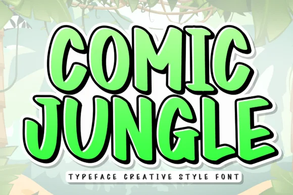
Comic Jungle
Comic Jungle is a tall, lively cartoon display font with slightly organic hand-inked stems and playful vertical bounce.
Comic Jungle is a tall bouncy comic display: condensed letters with a rounded bounce, an uneven baseline and thick stems that swell slightly at the waist. The bounce lifts and drops letters out of the line, so a word needs vertical slack above and below. It needs roughly 28 mm for the bounce and the swollen waist to read, and it is best in two bright inks on white or one ink on kraft where the tall forms stay bold.
Recommended project & layout
'Wild One' safari birthday backdrop, zoo shirt & favor box — Fill letters with bright leaf green, sunshine yellow, or tiger orange inside a dark cartoon outline.
Before you cut or print
Clean, smooth strokes cut easily on HTV, cardstock banners, and cup vinyl down to 0.7 inches.
Best paired with
Get fontPaid link
 #9
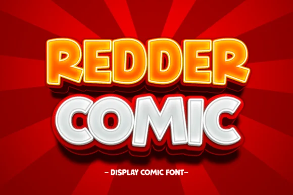
Redder Comic
Redder Comic is a cheerful, plump rounded comic display font with friendly wide bowls and smooth cartoon balance.
Redder Comic is a rounded candy-pop comic display with fat even strokes, a soft outer contour and small counters, so a word reads as a sweet wrapper rather than a caption. The even weight keeps it legible in a single colour at 20 mm on a label, and the roundness gives it a friendly, unaggressive tone that suits food and children's work. It needs roughly 22 mm for the counters to stay open, and it is best in a warm candy colour on cream or in white on a saturated ground.
Recommended project & layout
Popcorn bucket, arcade prize sign & candy-store sticker — Set 2 centered lines in bright yellow/orange and crisp white over bold red backgrounds.
Before you cut or print
Broad solid strokes and generous open 'O/D/R' counters cut and weed super cleanly on puff HTV and glossy vinyl!
Best paired with
Get fontPaid link
 #10
Comic Pop
Comic Pop is a very heavy comic display in which the letters balloon into rounded bubbles, the counters shrink to small circles and the i sits under a detached dot, so a short shout reads as a hand-lettered sound effect.
The m builds two soft humps under a wide shoulder, the P closes a broad circular bowl, the O stays almost solid and the i floats a large dot above the x-height. The tiny counters are the character: they keep a heavy letter from closing completely, which is why the sample sets a two-word phrase with wide air around it. Because the counters are small, the face wants 34 pt before they stay open and it weeds cleanly from three quarters of an inch of cap height; the lowercase holds best in short bursts rather than sentences. The pale ground, the halftone dots and the small caption are presentation; the black bubble letters are the face.
Recommended project & layout
A comic-party welcome card — Centre two words on a plain panel and keep the date outside the letter mass.
Before you cut or print
Check the small P and O counters at the intended card size.
Best paired with
Get fontPaid link
 #11
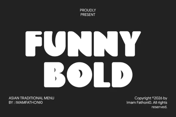
Funny Bold Comic
Funny Bold Comic is a thick, marshmallow-heavy comic block font with tiny keyhole counters and bouncy cartoon geometry.
Funny Bold Comic is an ultra-chunky soft-cut comic block display: fat squared letters with rounded corners, a small inner bevel on the left of each stem that reads as a lit edge and a hard offset block shadow. The bevel is the design and it fills into a solid face when the letter shrinks, and the shadow doubles the footprint. It needs roughly 30 mm for the bevel and the shadow to read, and it is best in two flat inks on white, or one ink plus paper where the bevel prints as a lighter edge.
Recommended project & layout
Ramen or boba shop menu, street-food box & skate sticker — Stack short 4-to-6-letter words in two centered rows with tight 0.92 leading.
Before you cut or print
Outer silhouettes cut fast on puff HTV and sticker vinyl; watch the tiny slit counters inside 'B', 'O', and 'D' if cutting below 1 inch.
Best paired with
Get fontPaid link
 #12
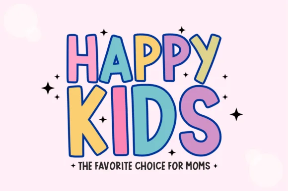
Happy Kids
Happy Kids is a bold, comic-outlined children's display font with oversized playful capitals and energetic baseline tilt.
Happy Kids is a chunky comic-outlined kids display with dancing baselines: fat rounded letters, a thick keyline with a white gap behind the fill, and letters that hop above and below the line so a word looks like it is moving. The hop grows the word vertically and the gap closes first when the face shrinks. It needs roughly 30 mm for the keyline and the hop to read, and it is best in three flat inks on white, or two inks where the gap is the paper itself.
Recommended project & layout
Toddler birthday tee, bounce-house sign & party cup — Set a smaller introductory word at 55% scale directly above a giant 4-letter focal word ('KIDS', 'FOUR', 'COOL').
Before you cut or print
Great for DTF transfers, sublimation, and Print-Then-Cut stickers; for single-color HTV, cut at 1.1 in+ so the comic outline weeds cleanly.
Best paired with
Get fontPaid link
 #13
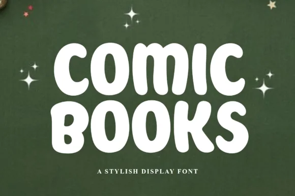
Comic Books
Comic Books is a plump, marshmallow-soft all-caps display font with gently irregular hand-inked contours and wide open bowls.
Comic Books is a soft chubby hand-lettered comic block display: rounded squared letters with a slightly wobbly baseline, an uneven pen edge and a small inner highlight on the left of each stem that reads as ink sitting on paper. The wobble is the design and it disappears when the face is reversed or printed very small. It needs roughly 26 mm for the wobble and the highlight to read, and it is best in two flat inks on white, or one ink plus paper where the highlight prints as a knockout.
Recommended project & layout
Reading-log binder cover, comic-club tee & kid bookmark — Stack two short words centered at 0.92 line-height and tuck small star or speech-bubble accents around the corners.
Before you cut or print
Zero sharp corners and wide circular 'O' holes make this an easy beginner cut on HTV, permanent vinyl, and cardstock.
Best paired with
Get fontPaid link
 #14
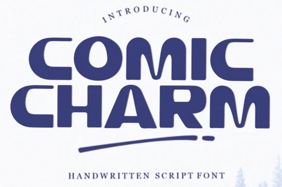
Comic Charm
Comic Charm is a wide, smooth rounded display font featuring curved C-bowls, hooked R/A legs, and approachable mid-century charm.
Comic Charm is a wide retro-modern rounded display with tucked crossbars: extended letters with fully rounded corners, crossbars on the A and H that tuck under the adjacent stroke rather than sitting flush and a soft even weight that reads as a mid-century sign. The tucked crossbars are the design and they close first when the face is reduced. It needs roughly 26 mm for the tuck and the round corner to read, and it is best in two flat inks on cream, or one ink plus paper where the tuck prints as a gap.
Recommended project & layout
Board-game box logo, ice-cream tub & kids' book cover — Stack two centered words tight and underline with a rounded pill rule and exclamation dot as shown on the specimen.
Before you cut or print
Broad smooth curves and generous open counters cut cleanly on vinyl, HTV, and cardstock down to 0.65 inches.
Best paired with
Get fontPaid link
 #15
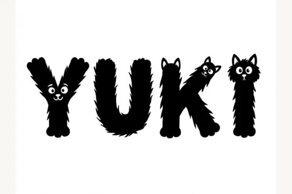
Yuki
Yuki is an adorable illustrated pet novelty font sculpting fuzzy black-furred letters complete with peeking cat faces, ears, and furry paws.
Yuki is an illustrated animal alphabet built from a fluffy black cat and furry paws: each letter is formed by a plump cat silhouette or paw, with drawn fur edges, ear shapes on the caps and a small tail that curls off a terminal, delivered as layered colour artwork. The fur edge is the finest element and closes first at small sizes. It needs roughly 36 mm for the fur and the ear to read, and it is best as a flat two-colour print on white, or a one-colour silhouette where the fur becomes a cut path.
Recommended project & layout
Kitty-cat birthday banner, pet-adoption sign & kids' tee — Set short 3-to-6-letter pet or child names big (64–120 pt) in black on white, pink, or lavender backgrounds.
Before you cut or print
Hundreds of tiny shaggy fur spikes along every edge + tiny cat eyes mean you MUST use print, sublimation, or DTF—never weed cut vinyl!
Best paired with
Get fontPaid link
 #16
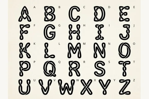
Kale
Kale is a bouncy, wavy-contoured cartoon bubble display font with glossy interior shine highlights across all 26 capitals.
Kale is a wiggly liquid-jelly cartoon bubble alphabet: each letter is a rounded blob that wobbles along its length, with a soft inner highlight, a thin outer outline and joins that stretch between neighbouring characters. The wobble grows the word in both directions, and the outline closes first when the face is small. It needs roughly 30 mm for the wobble and the outline to read, and it is best in two bright translucent-looking inks on white, or one ink plus a knocked-out highlight on coloured card.
Recommended project & layout
Pool-party invite, slime-kit label & popsicle stand sign — Set short uppercase words at 48–84 pt in bright aqua, lime, or watermelon pink over crisp white.
Before you cut or print
Interior shine cutouts make Print-Then-Cut, sublimation, and DTF far easier than blade-weeding tiny vinyl highlight slivers.
Best paired with
Get fontPaid link
 #17
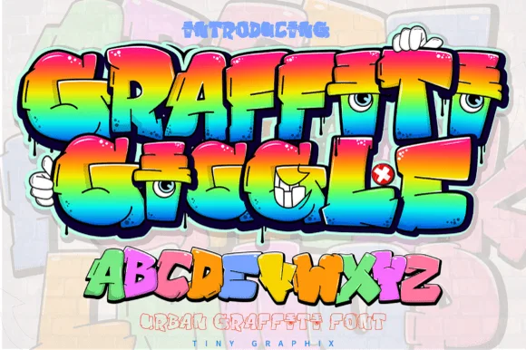
Graffiti Giggle
Graffiti Giggle is a playful cartoon street-graffiti font featuring chunky overlapping bubble letters and cheeky character-eye details.
Graffiti Giggle is a cartoon character-eye bubble graffiti display: fat interlocking throw-up letters with a hard keyline, cartoon eyes set inside one or two counters that look out at the reader, and a small drip running off the baseline. The eyes are the design and they turn into two dots as soon as the face shrinks. It needs roughly 32 mm for the eye and the keyline to read, and it is best as a two-colour flat print on coated stock, or one vinyl colour where the eyes are redrawn as knockouts.
Recommended project & layout
Kids' art-party banner, custom skate tee & goodie bag — Color individual letters in alternating lime, cyan, yellow, and magenta inside Canva or Illustrator before Print-Then-Cut.
Before you cut or print
Use Print-Then-Cut or DTF transfers when preserving fine cartoon eye details; on cut vinyl, scale letters above 2 inches.
Best paired with
Get fontPaid link
 #18
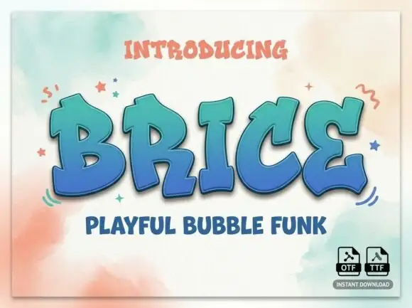
Brice
Brice is a playful bubble funk display face: fat rounded letters with a wide white inline, a heavy coloured contour and a soft shadow offset below, so a word looks moulded from plastic.
BRICE fills the middle of the card in a blue-to-teal gradient with a thick white inline running through every stroke, a dark contour around the outside and a soft grey shadow beneath the whole word. The letters are fat and rounded with short stems and wide bowls, and the inline follows the shape rather than cutting across it, which keeps the word readable while making it look inflated. Two small captions frame the design: one at the top introduces the face and one below names the style, both in a rough hand-lettered caps face in a warm coral. A few drawn stars and squiggles sit around the word. The design is a fun display cut for posters, party print, stickers and packaging, and it needs a large size: at small sizes the inline closes and the shadow merges with the letters.
Recommended project & layout
A bold party cover title — Set BRICE diagonally across a plain pale-blue invitation front with a separate horizontal date strip below.
Before you cut or print
Confirm the outline method and check the B counter without relying on the shadow.
Best paired with
Get fontPaid link
 #19
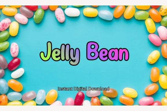
Jelly Bean
Jelly Bean is a cheerful, candy-rounded cartoon display font with bouncy mixed-case letters built for bright multi-color fills (OTF & TTF).
Jelly Bean is a comic-outlined candy display of fat rounded bean shapes: each letter is a plump oval with a thin black contour, a small white specular highlight and a slight squidge that tilts some characters out of line. The outline makes the face read as a sticker and the highlight is what closes first when the word shrinks. It needs roughly 28 mm for the contour and the highlight to read, and it is best in two candy inks on white, or one ink plus the knocked-out highlight on coloured card.
Recommended project & layout
Easter jelly-bean jar tag, treat bag & classroom card — Set 1–2 mixed-case words at 64–130 pt, coloring each letter in lime, mint, lilac, and magenta inside a black outline.
Before you cut or print
Clean, rounded solid vectors cut and weed fast on Cricut Oracal 651, HTV, and Print-Then-Cut stickers down to 0.6 in!
Best paired with
Get fontPaid link
 #20
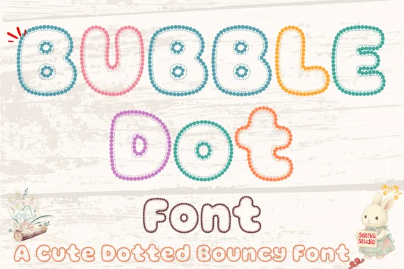
Bubble Dot
Bubble Dot traces plump, bouncy cartoon bubble letters entirely out of tiny pearl-bead rings with cozy hollow centers (OTF & TTF)!
Bubble Dot is a bouncy bubble display whose letters are drawn entirely as chains of tiny pearl beads forming hollow outlines, so a word reads as beaded jewellery rather than as filled type. The chain must stay continuous for the letter to exist, which means the face needs size for individual beads to read and it cannot be used where a bead ring would close. It needs roughly 32 mm for the beads to resolve, and it is best in pastel bead colours on white or in one metallic on a soft ground.
Recommended project & layout
Easter nursery print, coloring-page name & bracelet card — Stack 2 bouncy words at 64–125 pt, coloring each letter's bead chain in soft teal, yellow, coral, and lavender.
Before you cut or print
Tiny individual bead rings are made for printables, Print-Then-Cut stickers, sublimation, and DTF—do NOT weed on vinyl!
Best paired with
Get fontPaid link
 #21
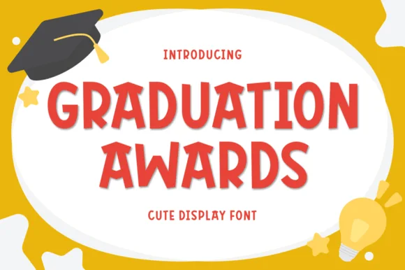
Graduation Awards
Graduation Awards is a sunny, bouncy cut-paper display sans (NOT a slab serif!) built for Pre-K/Kindergarten awards, stickers, and kid celebrations (Multilingual)!
Graduation Awards is a bouncy rounded display sans with chunky capitals, a clipped cut-paper rhythm and slightly varied cap heights, drawn in a bright weight whose joins are simple enough for a cutting machine. Because each letter is a closed shape with generous counters, it reads at sticker scale and at banner scale without changing character, and the multilingual support lets the same award design serve bilingual classrooms. It is emphatically a celebration face: warm, loud and short-phrase only, and it needs roughly 14 mm before the bounce starts to look cramped.
Recommended project & layout
Kindergarten 'SUPER READER' award, moving-up banner & tee — Stack 2 centered uppercase lines at 64–125 pt in cherry red, royal blue, or gold on white certificates.
Before you cut or print
Thick, smooth rounded shapes cut and weed in 4 seconds on Cricut cardstock, HTV, and Oracal 651 down to 0.55 inches!
Best paired with
Get fontPaid link
 #22
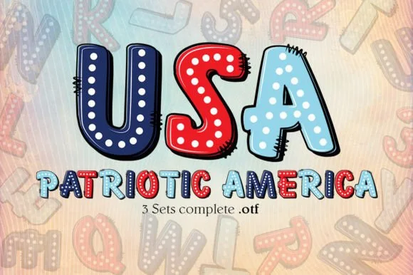
Patriotic America
Patriotic America is a playful 3-set pop-art OTF collection featuring chunky comic-stitched bubble letters decorated with stars and red-white-and-blue fills!
Patriotic America ships as three OTF sets of pop-art comic bubbles: a solid colour build, a stitched outline build and a decorated build with stars, so the family is designed to be layered rather than set once. The bubbles are chunky with black comic outlines and stitched dashes, which means the outline version needs the solid behind it or the stitches float, and the layered sandwich has to be registered precisely. It needs roughly 30 mm for the stitching to read, and it is at its best in red, navy and cream on white.
Recommended project & layout
4th of July kids' sticker, sublimation popsicle holder & tee — Set 'USA' huge (110 pt) above 'PATRIOTIC' (48 pt) on white or kraft-pastel sublimation blanks.
Before you cut or print
NOTE: OpenType-SVG color fonts render in full color inside Photoshop, Illustrator, and Procreate (export PNG for Cricut Print-Then-Cut!)—not for single-layer vinyl cutting.
Best paired with
Get fontPaid link
 #23
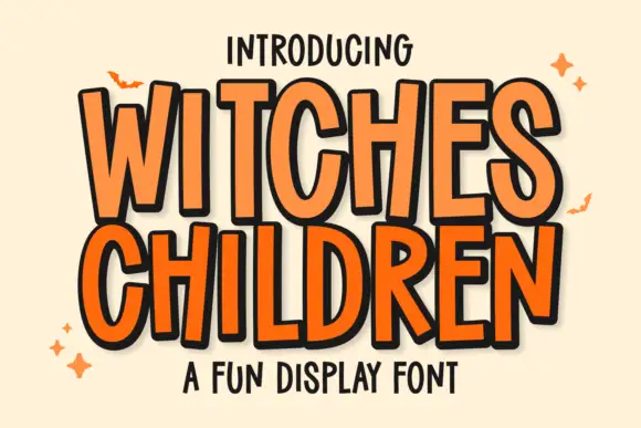
Witches Children
Witches Children shows tall narrow capitals with rounded curves and slightly leaning stems, where the W opens a deep narrow middle, the C and D use long oval bowls and the R stays compact beside them.
The letters stay narrow and tall, the widths vary, the stems lean a few degrees and the bowls stretch into ovals. That uneven set is the character: the word reads as hand-lettered comic titling rather than a drawn display face, which is why the sample keeps a short title with a seasonal flavour. Because the heights vary, leave room for the tallest letter and the widest W, and keep 34 pt before the narrow bowls pinch shut. The narrow bowls pinch shut first: at 24 pt the o and the e close into slits and the word reads as a picket fence. Keep the title at 34 pt and above, allow room for the tallest letter, and set long words in two rows rather than tracking them tight.
Recommended project & layout
A children’s spooky-story poster — Use two roomy title lines above a plain age-and-time panel with no bats over the lettering.
Before you cut or print
Check the W interior and narrow D counter in print.
Best paired with
Get fontPaid link
 #24
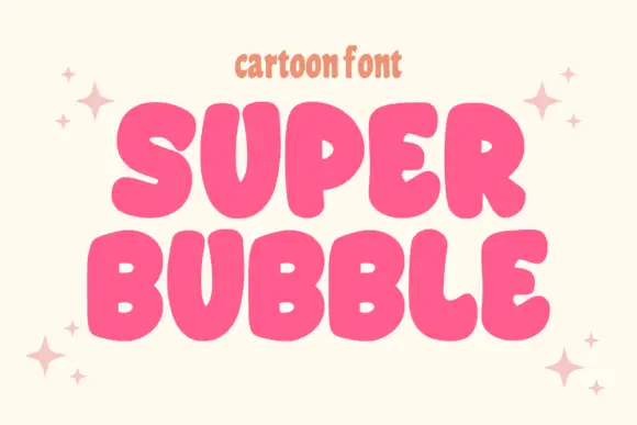
Super Bubble
Super Bubble is a heavy rounded cartoon display in which the capitals inflate, the counters shrink to small openings and the widths vary, so two stacked words read as gently over-full balloons.
The S swells through a fat spine, the O closes a small ring inside a broad shoulder, the B stacks two plump bowls and the stems push against their neighbours, with soft contours and no serifs anywhere. The inflation is the character: the letters look pressed outward, which is why the sample sets two rows with air around them. Because the counters are small, the face wants 34 pt before they stay open and it cuts cleanly from three quarters of an inch of cap height. The pale ground, the shadow behind the words and the small caption are presentation; the dark bubble capitals are the face.
Recommended project & layout
A bold birthday front — Use two lines with a generous outer margin.
Before you cut or print
Check the small counters at card size.
Best paired with
Get fontPaid link
Practical buyer checklist
Frequently asked questions.
Key cutting, printing and pairing answers before choosing a comic book, cartoon & manga typeface.
What makes a good comic dialogue font?
Even stroke weight, open counters and a slightly informal rhythm, so the lettering reads quickly without drawing attention. Faces with strong texture or heavy distortion belong in titles and sound effects, not in speech bubbles.
Can comic fonts be cut for kids' shirts?
Bold comic and bubble faces cut well at 2 inches or more. Sound-effect lettering with speed lines and specks usually needs printing, since the thin streaks become loose islands on a mat.
How large should lettering be inside a speech bubble?
About 9 pt in print at standard comic page size, with 12 to 14 pt for emphasis. In webtoons, judge by the rendered pixel size on a phone rather than by points, since the panel scales with the screen.
Do comic fonts include the punctuation that action lettering needs?
Most include exclamation marks and dashes, which is where the energy lives. Check for the specific marks your style uses, such as double exclamations or question-exclamation combinations, since some sets omit them.
Keep exploring
Related collections & guides.
Explore adjacent maker roundups or check our practical pre-production checklists.
01 / Branding & Print
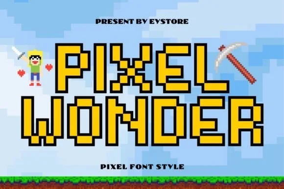
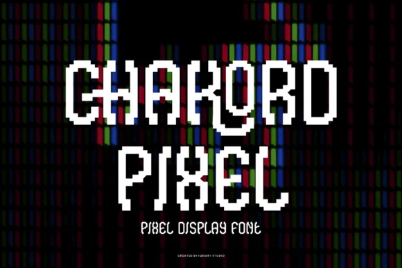
YouTube thumbnails, podcasts & gaming
24 curated fonts · Previews & pairings
02 / Type Styles
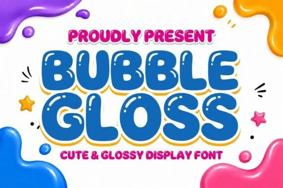
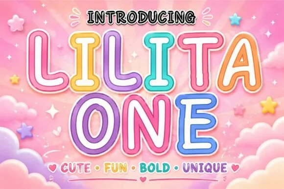
Bubble & puffy 3D lettering
30 curated fonts · Previews & pairings
03 / Occasions & Milestones
Kids party, playroom & bulletin boards
29 curated fonts · Previews & pairings

04 / Type Styles
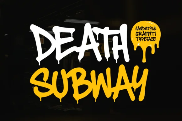
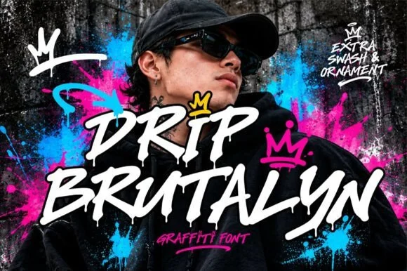
Graffiti, throw-up & street tag
18 curated fonts · Previews & pairings
Guides: Invitation font checklist · Vinyl & cutting checklist · How to pair script & sans fonts