Editorial Serif Anchor

Simple Alphabet + The Bilstein Editorial
Anchors Simple Alphabet's fluid strokes with crisp Roman proportions on wedding suites, headers and packaging.
Inspect The Bilstein Editorial specimenDisclosure: MakerFileHub may earn a commission from qualifying purchases via paid links on this page. How our links work.
Tall narrow letters left unjoined
Simple Alphabet is a tall narrow display face in black on a pale photograph of loose lettering blocks: monoline letters with rounded ends, open counters and wide spacing, set unjoined so each letter stands on its own.
Paid link
Get this fontProject & layout blueprintsAt-a-glance maker compatibility
Weld or Unite overlapping script joins into one continuous vector path before sending to the blade.
Visual anatomy & craft review
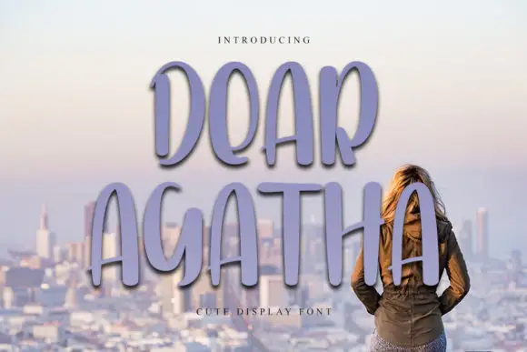
Two words are stacked and set large, and the face is a tall narrow display: the ascenders of the S and the l run well above the x-height, the bowls of the b and the p stay small and open, the A is a narrow triangle with a short bar, and the t carries a flat top with almost no crossbar to spare. Nothing joins, so the letters stand apart at their own spacing, and the small counters keep the shapes reading at a distance even though the strokes are thin and even. The stroke is monoline with soft rounded ends, closer to a marker than a pen, and the baseline is steady while the letters vary slightly in width, which stops the line from looking mechanical. The ground is a pale photograph of scattered lettering blocks seen out of focus, and two tracked lines of small capitals name the style. Simple Alphabet is a display face for posters, packaging and editorial headlines, and it needs short words on a wide measure.
Tall, narrow, marker-drawn
Two-font hierarchy recipes
Tested contrast partners — pairing Simple Alphabet with grounded secondary typography.
Simple Alphabet + The Bilstein Editorial
Anchors Simple Alphabet's fluid strokes with crisp Roman proportions on wedding suites, headers and packaging.
Inspect The Bilstein Editorial specimen
Simple Alphabet + Inkora
Keeps small-scale dates, URLs, nutrition facts and care instructions crisp and legible below script titles.
Inspect Inkora specimenPractical applications
Concrete hierarchy, scale and production guidance tailored to Simple Alphabet’s stroke geometry.
Tall narrow letters fit a long word into a narrow column, and the unjoined forms stay readable at cover size without the ligatures a connected script would need.
Hierarchy & layout recipe
Print a 210 by 297 mm cover: set the headline at 90 pt over three lines, keep 30 mm of clear ground beneath before the coverlines at 10 pt, and hold 20 mm of margin on all three open sides.
Pre-production check
Narrow letters with thin strokes can look light beside a heavy photograph; proof the cover and check the weight of the type against the image.
A tall narrow face makes room for a long brand name on a slim bottle, and the marker stroke suits a drink sold on being made by hand.
Hierarchy & layout recipe
Print a 55 by 90 mm label: set the brand at 16 pt on one line, keep 6 mm of clear ground beneath before the flavour at 5.5 pt, and hold 4 mm of margin on all four sides of the label.
Pre-production check
At sixteen points the small counters of the b and the p can fill on a flexo press; print one label on the real stock and check before the order.
A marker-drawn face reads as friendly rather than institutional, which is what a sign-up poster for a library session needs at a doorway distance.
Hierarchy & layout recipe
Print a 420 by 594 mm poster: set the title at 120 pt over two lines, keep 45 mm of clear ground beneath before the time and place at 18 pt, and hold 30 mm of margin on all four sides.
Pre-production check
A tall face set at a hundred and twenty points can crowd the top edge; proof one sheet and check the ascender clearance before the run.
Technical & licence verification
Confirm included OTF/TTF/WOFF formats, full glyph tables and licence coverage on the live store page before batch production.
Closest visual alternatives
Matched across letterform anatomy, stroke behaviour and craft applications.

Bouncing tail script with long entry and exit swashes
Farmhouse is a bouncing tail script in which the letters sit at different heights, the strokes swell on the downstroke and long swashes enter and leave the word, so a name reads as hand lettering on a painted board.
Ideas for this font
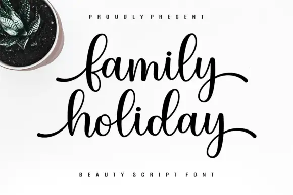
Fine script with long horizontal entry and exit strokes on a level baseline
Family Holiday is a fine script whose words begin and end with long horizontal strokes, so two stacked lines read as a pair of calm, level bars rather than a sloped signature.
Ideas for this font
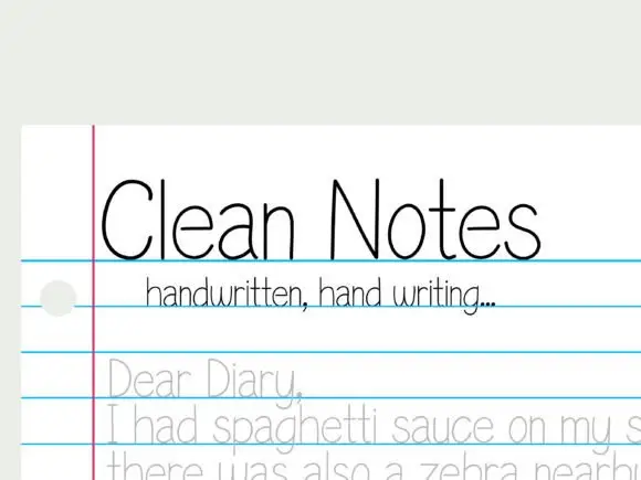
Very thin upright unjoined note handwriting
Clean Notes shows tall thin unjoined letters with a broad C and narrow upright n forms, where smaller diary lines sit on photographed notebook rules and the page hole belongs to the photo rather than the type.
Ideas for this font
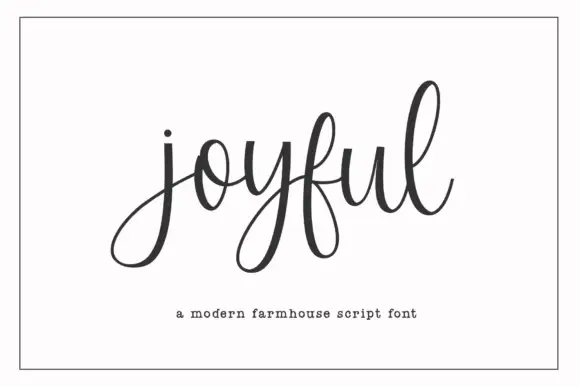
Modern farmhouse script with open descenders and long exit tails
Joyful Script is a modern farmhouse script with light even strokes, wide open descenders and long exit tails, drawn so a single word sits evenly across a wide card.
Ideas for this font
Same independent foundry
Allow optional Google Analytics to measure visits and catalogue actions. Your search words and notes are not included. Privacy & storage