Neutral Sans Workhorse

Pokenom + Lemon Milk Pro FTR
Lets Pokenom own the focal silhouette while handling secondary copy, sizing and subheads cleanly.
Inspect Lemon Milk Pro FTR specimenDisclosure: MakerFileHub may earn a commission from qualifying purchases via paid links on this page. How our links work.
Bouncing pointed display
Pokenom is a bouncing irregular display shown in yellow on a blue gradient: mixed case with pointed capitals, curled small bowls, uneven stroke widths and letters that rise and fall, with a heavy blue outline and a soft shadow around the whole word.
Paid link
Get this fontProject & layout blueprintsAt-a-glance maker compatibility
Sturdy stroke walls and open counters weed cleanly on adhesive vinyl, HTV apparel film, and cut cardstock.
Visual anatomy & craft review
The plate is one word at the centre of a graded ground, and the devices are all in the drawing: the letters bounce, the capitals are pointed, the small bowls curl and a heavy outline plus a shadow make the word read as a sticker. That construction sets a large size floor, because the curls and the outline close first, and the graded blue is staging that keeps the yellow bright. There is no other copy on the sheet, so the buyer judges the shape alone. Because the letters are irregular and outlined, the face suits a game title, a card and a shirt for a young audience, and the bounce means a layout should not depend on a baseline.
Display, playful, bouncing, cartoon
Two-font hierarchy recipes
Tested contrast partners — pairing Pokenom with grounded secondary typography.
Pokenom + Lemon Milk Pro FTR
Lets Pokenom own the focal silhouette while handling secondary copy, sizing and subheads cleanly.
Inspect Lemon Milk Pro FTR specimen
Pokenom + The Bilstein Editorial
Grounds bold display lettering with classic typographic authority on posters, badges and apparel.
Inspect The Bilstein Editorial specimenPractical applications
Concrete hierarchy, scale and production guidance tailored to Pokenom’s stroke geometry.
A bouncing display names a party in a cartoon voice, and the outline keeps the word readable on a coloured card. The outline sells the voice.
Hierarchy & layout recipe
A6 card: the greeting at 30 pt, the details in a 10 pt sans, and the date at 9 pt. Keep 15 mm margins, print three colours on a white card and leave 12 mm at the foot for the address line.
Pre-production check
Check the 30 pt greeting at home-print resolution, where a curl can close; keep it above 1.2 mm. Confirm the details keep a 4.5:1 contrast and that the card folds flat.
A bouncing display prints as costume kit, and the heavy outline reads on a light shirt where a plain face would look flat.
Hierarchy & layout recipe
Print a 240 mm chest graphic: the slogan at 55 mm cap height, the year at 26 mm, and three inks on a light shirt. Keep the narrowest curl at 4 mm and place the graphic 80 mm below the collar.
Pre-production check
Check the screen at actual mesh, where a 4 mm curl can fill; widen it to 5 mm. Wash-test one shirt and confirm the outline stays even after five cycles.
A cartoon display stops a child on a corridor board, and the bounce gives a short line movement. The bounce stops a child.
Hierarchy & layout recipe
A3 poster: the fair at 70 mm cap height, the times in a 20 mm sans, and the gate at 12 mm. Keep 25 mm margins and print three colours on a light stock.
Pre-production check
Check the A3 at three metres, where a curl can close; keep it above 4 mm. Confirm the 12 mm gate reads at two metres and that the poster sits at child height.
Technical & licence verification
Confirm included OTF/TTF/WOFF formats, full glyph tables and licence coverage on the live store page before batch production.
Closest visual alternatives
Matched across letterform anatomy, stroke behaviour and craft applications.
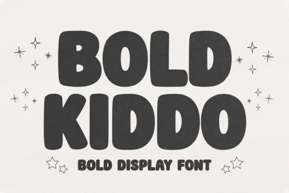
Heavy rounded sans capitals with a hand-drawn bounce
Bold Kiddo is a heavy rounded sans in capitals, drawn with a slight hand-cut bounce and squeezed so tightly that the two words read as one solid block of letters.
Ideas for this font
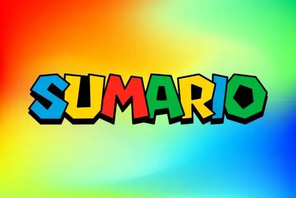
Polygonal heavy display
Sumario is a heavy angular display on a bright gradient: capitals built from polygonal shapes with counters cut as hexagons and trapezoids, each letter in a different saturated colour with a bold black offset edge, set as one word and nothing else on the sheet.
Ideas for this font
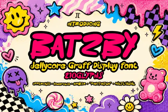
Slanted heavy graffiti-like capitals with blunt hooked strokes and an irregular baseline
Batzby places a hot-pink uppercase word inside a heavy black outline, where wide curved B bowls contrast with a sharp A apex and a long rising Y arm, several stroke ends curl into blunt hooks and the Z sweeps low across the baseline.
Ideas for this font
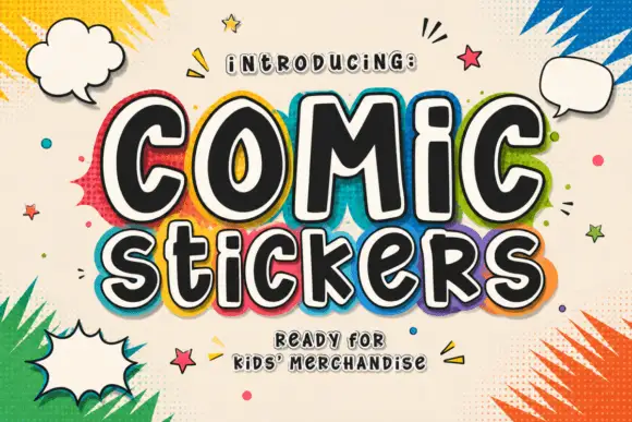
Soft irregular mixed-case lettering with thick faces and layered sticker-like edging
Comic Stickers combines tall COMiC forms with a lower mixed-case Stickers line, where rounded black faces with uneven widths and softly bent terminals are separated from bright offset borders by pale edging.
Ideas for this font
Same independent foundry
Allow optional Google Analytics to measure visits and catalogue actions. Your search words and notes are not included. Privacy & storage