 #1 · Best Overall
Disclosure: MakerFileHub may earn a commission from qualifying purchases via paid links on this page. How our links work.
Tall skinny sans & bouncy farmhouse script
27 Modern Farmhouse & Wood Sign Fonts
The farmhouse look is a formula: a tall, narrow, slightly imperfect sans for the word that must fit a narrow board, and a bouncy script for the word that carries feeling. Holiday Farmhouse and Sticky Planner ship that pair as one download, Rustic Pantry pushes it toward the kitchen, and Beautiful Wildflower Duo drops the script to a fine lowercase.
Quick verdict
Holiday Farmhouse is the most complete duo in the set, Sticky Planner fits narrow vertical boards, and Rustic Pantry works best for kitchen and pantry signs. Beautiful Wildflower Duo is the choice when the script should whisper rather than shout.
Quick answer
Top 3 modern farmhouse & wood signs picks right now.
Short on time? Start with our three highest-rated modern farmhouse & wood signs standouts before scrolling the full breakdown.
#1 · Best Overall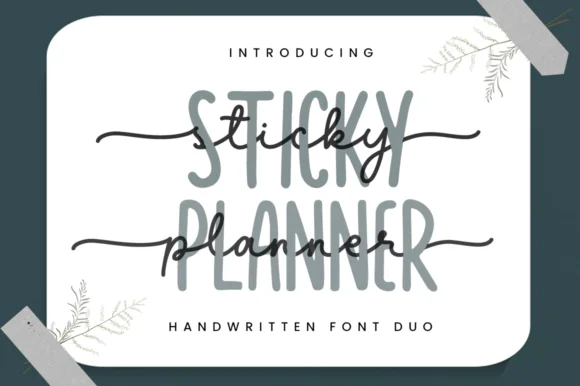 #2 · Runner-Up Pick
 #3 · Editor's Choice
Country Kitchen
Narrow upright capitals paired with a looped connected kitchen script
Get fontPaid link
Read review ↓How we tested & selected these 27 fonts
We reviewed 216 paid fonts and kept 27 that either ship a documented duo or pair convincingly on their own. Emphasis on cap height ratios, how the tall sans holds at 6 inch sign scale, and whether the script's bounce survives being enlarged for a porch board.
Side-by-side summary
Top 5 modern farmhouse & wood signs picks at a glance.
Compare specimens, OpenType/PUA traits and primary project roles side by side.
| Rank & Font | Style & File Specs | Best Project Fit | Store Listing |
|---|---|---|---|
| DuoCozy | Farmhouse wood sign, tiered-tray plaque or kitchen towel | Get fontPaid link | |
| DuoAlternates & swashes | Custom notepad header, teacher gift tag or binder cover | Get fontPaid link | |
| DuoPUA encoded · Alternates & swashes | A farm-kitchen menu header | Get fontPaid link | |
| DuoPUA encoded · Alternates & swashes | Glass pantry canister decal, spice-jar set & kitchen sign | Get fontPaid link | |
| DuoAlternates & swashes | A garden ceremony programme cover | Get fontPaid link |
Matched Font Duos & Packs
12 fonts#1 · Best OverallHoliday Farmhouse
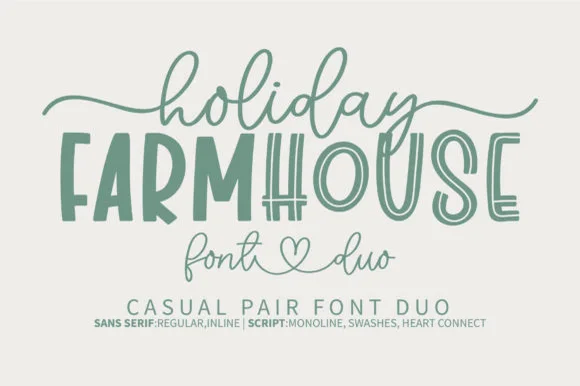
Holiday Farmhouse pairs a tall hand-drawn inline farmhouse sans with an airy heart-connected monoline script, so a rustic sign can carry a structured capital line above a soft written phrase.
The sans cut stays tall with an inline channel running down each stem, the script stays monoline and light and its connectors meet at a small heart, and the two differ enough in weight to read as separate voices. The inline channel is the character: it lets the capital line look painted with a liner brush, which is why the sample suits tiered tray decor. Because the inline is narrow, keep 30 pt before it closes, and keep 18 mm at the end of the script for the heart join.
Recommended project & layout
Farmhouse wood sign, tiered-tray plaque or kitchen towel — Centre the tall all-caps noun and drape the monoline script lightly above and below.
Before you cut or print
Use the Regular (solid) sans file for small vinyl decals; save the Inline version for signs 3"+ tall.
Best paired with
Get fontPaid link
#2 · Runner-Up PickSticky Planner
Sticky Planner pairs a tall narrow organiser sans with a horizontal-tailed script and encodes the extra characters, so a planner cover can stack two matched weights into one header without hunting for a second face.
The sans cut stays narrow and upright with even stems, the script runs a light body with a tail that extends horizontally and carries a small heart at the end, and the two share a similar x-height when stacked. The matched pair is the character: one line organises and the other signs off, which is why the sample layers them on stationery. Because the script tail travels, keep 18 mm at the right from 24 pt, and check the encoded alternates before relying on the heart.
Recommended project & layout
Custom notepad header, teacher gift tag or binder cover — Set the tall sans in muted grey/sage and layer dark script slightly offset.
Before you cut or print
PUA encoded; weld cursive joins if cutting vinyl binder decals.
Best paired with
Get fontPaid link
#3 · Editor's ChoiceCountry Kitchen
Country Kitchen is a two-cut duo in which narrow upright capitals set the plain line and a darker connected script carries the warm one, so a kitchen sign can separate a heading from a phrase without a third family.
The capital cut stands narrow and unjoined with even strokes and tight counters, while the script cut connects through tall k and h loops and long low entry and exit strokes at a heavier weight. The contrast in join is the character: one member is printed, one is written, which is why the sample pairs a thin cap line with a dark script beneath it. Set the caps at 16 pt and the script at 22 pt for a balanced pair, and weld the script before cutting from 1.1 inches of x-height. The photographed interior, the boards and the props are presentation; the lettered sign is the duo.
Recommended project & layout
A farm-kitchen menu header — Place the capitals above the script with a clear gap, then start dishes and prices in plain type below both tails.
Before you cut or print
Check the actual pair and leave menu details undecorated.
Best paired with
Get fontPaid link
 #4 · Top Maker Utility
Rustic Pantry
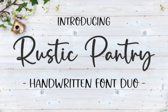
Rustic Pantry is a coordinated farmhouse font duo pairing a lively bouncy cursive script with a tall, narrow hand-drawn uppercase sans.
Rustic Pantry is a duo of a bouncy farmhouse brush script and a tall skinny marker sans: the script runs a loaded stroke with small flicks, a rising baseline and joined letters, while the sans is narrow with blunt marker ends for prices and lists. The two voices share one palette, so a jar label can carry a name and a list in the same hand. The script's bounce grows the word vertically and the marker sans stacks a long line in a narrow label. The script needs roughly 22 mm and the sans 18 mm for their detail to read.
Recommended project & layout
Glass pantry canister decal, spice-jar set & kitchen sign — Center the script word at 2–3.5 inches wide above a 0.5-inch tracked skinny sans descriptor line.
Before you cut or print
Weld all touching cursive connectors before cutting Oracal 651 permanent jar vinyl; medium stroke weight weeds cleanly.
Best paired with
Get fontPaid link
 #5 · Standout Silhouette
Beautiful Wildflower Duo
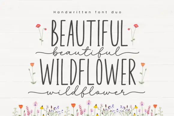
Beautiful Wildflower Duo is a two-cut pair in which very narrow upright capitals set the plain line and a fine lowercase script runs beneath with long outer strokes, so a card can hold two registers in one soft tone.
The capital cut compresses to narrow stems with even terminals, while the script cut keeps a light body, long entries at the first letter and a long exit at the last, with swashes encoded for variation. The width contrast is the character: a narrow cap row answers a loose script, which is why the sample stacks them with floral artwork around. Set the caps at 34 pt and the script at 28 pt, and keep 16 mm between the rows so the outer strokes do not touch. The flower illustrations are separate artwork rather than font accessories; the two lettered rows are the duo.
Recommended project & layout
A garden ceremony programme cover — Use the upright capitals for the programme title and one short script line below. Move the date and location into a plain bottom block rather than a third decorative style.
Before you cut or print
Confirm both styles and the actual phrase in the current listing; floral artwork is not assumed included.
Best paired with
Get fontPaid link
 #6
Farmhouse Market
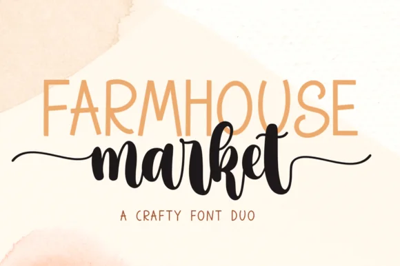
Farmhouse Market teams a tall, organic uppercase sans with a bold, bouncy brush script finished by sweeping side tails.
Farmhouse Market pairs a condensed hand-drawn sans with a thick brush-pen script: the sans is a narrow uneven block with a wobbling stem for signs and price cards, while the script is a heavy brush stroke with dry ends and a visible pen turn at each join. The pair is built for a market stall, so it wants kraft paper and one dark ink rather than a coated ground. The dry brush ends are the finest element and they silt first. The sans needs roughly 22 mm and the script 30 mm for their detail to read.
Recommended project & layout
Farmers-market canvas tote & produce crate stencil — Span the uppercase sans across the top width of the script's core letters, letting the script's left and right tails extend 1 inch wider on each side.
Before you cut or print
Weld all brush script letters into a single compound path before cutting HTV, and double-check the small upper loop inside 'e' and 'k'.
Best paired with
Get fontPaid link
 #7
The Sunny Field
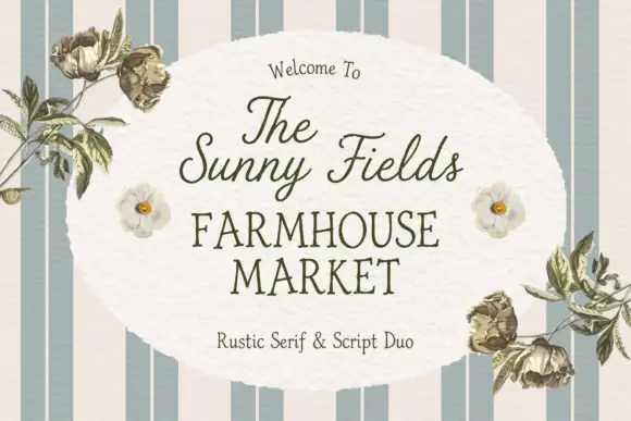
The Sunny Field pairs a rustic serif in spaced capitals with a light script above it, so a market sign can carry a soft welcome line and a firm name beneath.
The serif half is a modest text roman with slightly uneven serifs and a moderate contrast, set in spaced capitals so four words fill a wide plate without crowding. The script half is a light connected hand with tall loops and a gentle slant, and in the sample it carries the welcome line and the upper label while the serif carries the market name. Because both halves are light, the pair reads as printed stationery rather than as a signboard, which is the register a farm shop or a market stall wants. The serif holds at small sizes, and the script supplies the personal note. The striped ground, the botanical line drawings, the soft oval panel and the small caption are presentation; the duo is the lettering.
Recommended project & layout
A farmers-market welcome sign — Place the script name above the larger serif MARKET line, then keep opening hours in plain type below; move flowers to the corners.
Before you cut or print
Confirm the exact supplied pair and proof from viewing distance.
Best paired with
Get fontPaid link
 #8
Hello September Duo
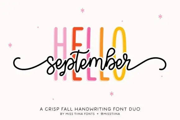
Hello September Duo shows very tall narrow sans capitals behind a small connected script line, where the script carries looped b and t ascenders and long curled side tails and the cover names it as a fall pairing.
The caps rise tall and narrow, the script stays compact underneath, the ascenders loop and the tails curl out past the phrase. That scale gap is the character: a quiet cap wall supports a small written line, which is why the sample stacks them tightly. The cover is an explicit seasonal pairing rather than a test of the members together, so set your own phrase, keep 20 mm between the rows and check that the tails clear the capitals above.
Recommended project & layout
An autumn workshop invitation — Set HELLO above the script phrase rather than crossing the members; add plain date/place below.
Before you cut or print
Verify the script swashes and keep the tall caps from crowding them.
Best paired with
Get fontPaid link
 #9
Farmhouse Breakfast Duo
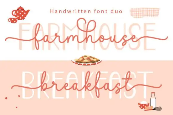
Farmhouse Breakfast Duo sets a long-tailed handwritten script across a faint tall printed word, so the same phrase reads twice in the sample — once as a pen line and once as a ghosted block behind it.
The printed half is a tall condensed face with thin strokes and wide spacing, set very light so it reads as a background texture rather than as text. The script half is a handwritten monoline with wide open loops, a long entry flourish on the f and a tail on the last letter that runs past the word, which is what gives the sample its horizontal sweep. Because the script stroke is thin and the printed line is lighter still, the pair works as a layered pattern where one line carries the message and the other carries the shape. Ends taper and rise slightly, so the script never looks ruled. The cream and blush ground, the teapot, the gingham, the pie and the small caption are presentation; the duo is the two layers.
Recommended project & layout
A breakfast-box name panel — Set script above a short upright category line instead of overlaying the members; keep ingredients in a plain bottom block.
Before you cut or print
Proof light strokes and confirm the chosen member's numerals.
Best paired with
Get fontPaid link
 #10
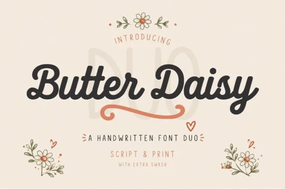
Butter Daisy
Butter Daisy is a warm cottagecore font duo pairing a thick, rounded monoline brush script (with extra swashes) and a tall narrow print font.
Butter Daisy is a duo of a chunky retro-cottage script and a tall narrow print, with a swash set: the script is a fat loaded stroke with soft curled entries, and the print is a narrow hand face with blunt ends for the supporting lines. The pairing gives a card one hand-made voice and one legible one, and the swashes widen the script word. The script needs roughly 24 mm and the print 18 mm for their detail to read.
Recommended project & layout
Sourdough bakery bag, wildflower tote & cottage mug — Set the brand name in chunky Butter Daisy Script (64 pt), add the terracotta underline swash, and stack tall print below.
Before you cut or print
Plump uniform script weight cuts and weeds like a dream on Cricut HTV and permanent vinyl down to 0.8 in—weld script joins!
Best paired with
Get fontPaid link
 #11
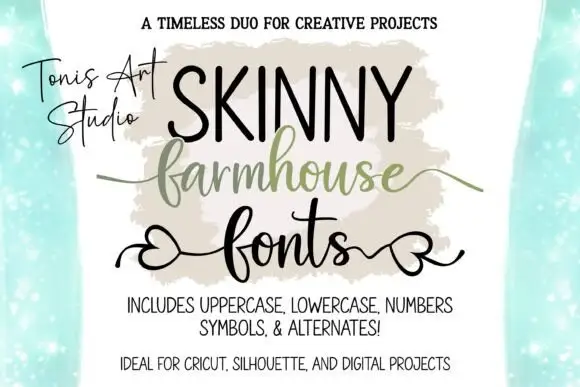
Farmhouse Script & Skinny Farmhouse
Farmhouse Script and Skinny Farmhouse pair a very narrow tall capital alphabet with a heart-tailed script, so a sign can carry a slim headline and a softer second line in one hand.
The caps half is extremely narrow: the F and the S keep tall thin stems, the K splays two arms from a single point and the Y ends in a narrow fork, with tight spacing that lets a long word fit a narrow panel. The script half is a loose connected hand with wide arches, a high entry and an exit that finishes in a small heart worked into the tail, which softens the pairing considerably. Used together, the caps give height and the script gives warmth, and both share a light weight, so the two lines never fight for attention. The letter coverage is broad enough for names and short phrases rather than for body text. The teal ground, the painted swash behind the word and the three caption lines are presentation; the duo is the lettering.
Recommended project & layout
A handmade shop-name pairing — Set the script name above a separate uppercase descriptor and plain contact details below.
Before you cut or print
Confirm both members and heart-tail access.
Best paired with
Get fontPaid link
 #12
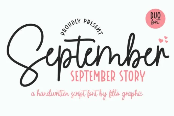
September Story
September Story is a sweet handwritten font duo pairing a thick, looped monoline cord script (with swash alternates) and a tall narrow uppercase sans!
September Story is a duo of a bouncy monoline cord script and a tall skinny farmhouse sans, both with alternates: the script carries a light even stroke with joined letters and a soft bounce, and the sans is narrow with blunt terminals for the information. The pairing lets a card use two voices from one family, and the script's bounce grows the word vertically. The script needs roughly 22 mm and the sans 18 mm for their detail to read.
Recommended project & layout
Teacher planner cover, back-to-school shirt & classroom bin — Tuck a row of tall uppercase Sans (36 pt) snugly into the pocket beneath the hero Script word (88 pt)!
Before you cut or print
Weld overlapping cursive joins on the Script—cuts and weeds smoothly on Oracal 651 and HTV down to 0.85 inches!
Best paired with
Get fontPaid link
Clean Sans & Handwritten Print
10 fonts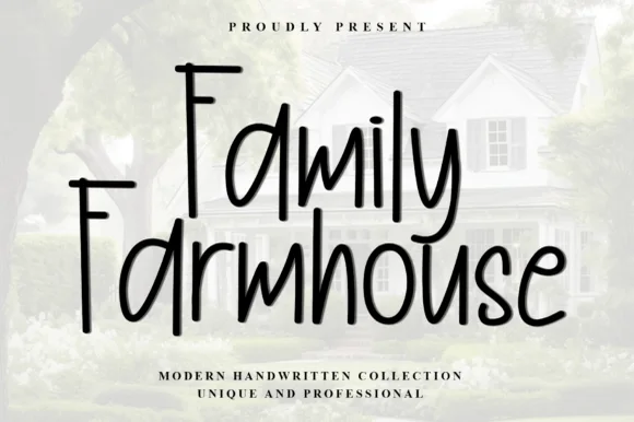 #13
Family Farmhouse Font
Family Farmhouse Font is a tall, warm handwritten marker font (upright print-script hybrid, not formal copperplate) with long overhanging F-bars.
Family Farmhouse is an upright print-script hybrid drawn with a warm marker, with towering wide-topped F capitals, long overhanging F-bars and tall l and h stems against a modest x-height. It is not a copperplate: the strokes are even and disconnected in places, which keeps a phrase readable at 12 mm on a card. The overhanging bars extend the artwork to the left, so the layout must reserve margin, and the face needs roughly 18 mm for the tall stems to feel deliberate rather than stretched.
Recommended project & layout
Porch welcome board, family-name wall sign & kitchen mug — Stack 2 title-case words centered at 56–100 pt above wide-tracked serif subcopy ('MODERN HANDWRITTEN').
Before you cut or print
Smooth uniform marker weight cuts cleanly down to 0.75 inches on Oracal 651, Oramask stencils, and HTV—weld touching letters!
Best paired with
Get fontPaid link
 #14
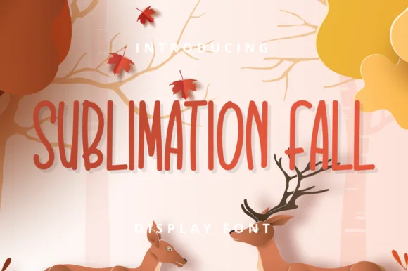
Sublimation Fall
Sublimation Fall is a tall, slender farmhouse handwritten print font (zero leaves attached—usable all year!) channeling classic pottery-mug minimalism.
Sublimation Fall is a tall skinny farmhouse handwritten print sans: narrow upright stems with a light hand-made wobble, small lift gaps at the joins, blunt pen ends and a level baseline that keeps a long list readable. The skinny stroke is the weakest element in print and the wobble is what makes it read as written. It needs roughly 20 mm for the wobble and the lift gap to read, and it is best in one warm ink on kraft and cream, or a single dark colour where the thin stroke still carries.
Recommended project & layout
'PUMPKIN SPICE' ceramic mug, fall tiered-tray sign & towel — Set 2 tall uppercase words at 64–120 pt with +6 tracking in burnt sienna, espresso, or matte black.
Before you cut or print
Standard solid vector font—cuts and weeds in seconds on Cricut Oracal 651, HTV, and Cricut Pens as well as sublimation mugs!
Best paired with
Get fontPaid link
 #15
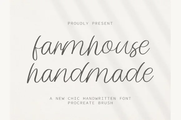
Farmhouse Handmade
Farmhouse Handmade is a breezy, light-stroke handwritten cursive with tall open ascender loops and relaxed baseline bounce.
Farmhouse Handmade is an airy tall-looped monoline handwritten script: a fine even stroke, very high ascenders that loop twice, wide spacing and long tapered descenders that drop below the baseline. The airy spacing needs a wide measure and the descenders close the line below, so stacked text needs extra leading. It needs roughly 26 mm for the double loop and the fine stroke to read, and it is best in one warm ink on smooth or uncoated stock, or a single dark colour where the thin stroke still carries.
Recommended project & layout
Handmade linen care tag & craft-booth price card — Pair lowercase two-word product titles at 22 pt on unbleached cotton paper with tiny all-caps sans weight and scent notes underneath.
Before you cut or print
Because every stroke is fine monoline, favor flat printing, rubber stamps, or Cricut fine-point pen drawing over small adhesive vinyl cuts.
Best paired with
Get fontPaid link
 #16
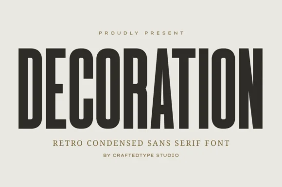
Decoration
Decoration is a sleek, tall flat-sided condensed sans (narrower and taller than sister font Collection #963!) built for clean architectural posters & labels (OTF/TTF).
Decoration is a tall narrow condensed sans in caps with flat sides, PUA alternates and a compact retro skeleton that reads as architectural signage rather than a modern grotesk. The stems are straight and the counters small, so a long word fits a narrow panel, and the flat sides let the letters sit close without touching. It needs roughly 18 mm for the compact counters to stay open, and it is at its best in one dark ink on a warm neutral ground where the proportions carry the design.
Recommended project & layout
Home-organization pantry & closet bin decal, frame & sign — Set 1 uppercase category word at 56–115 pt with +4 tracking in matte black or white Oracal 651.
Before you cut or print
100% crisp, straight-line solid strokes cut and weed in seconds on Cricut vinyl and HTV down to 0.6 inches!
Best paired with
Get fontPaid link
 #17
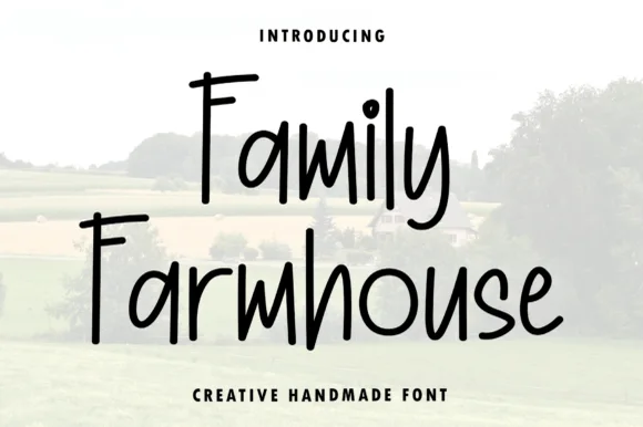
Family Farmhouse
Family Farmhouse is a tall, narrow hand-printed marker typeface with long vertical stems, gently bounced baselines, and clean print legibility.
Family Farmhouse is a tall condensed hand-printed farmhouse marker face: narrow upright stems with a dry marker edge, blunt ends, a level baseline and small lift gaps at the joins, drawn to pack a long greeting into a narrow board. The dry edge is the design and it turns to dirt when the face is reversed or printed small on coated stock. It needs roughly 20 mm for the dry edge and the condensed stem to read, and it is best in one warm ink on kraft and uncoated stock.
Recommended project & layout
Vertical porch welcome plank, pantry jar & family command board — Set pantry labels or family rules in mixed-case at 1.2–2.5 in height, pairing one bold cursive accent word if desired.
Before you cut or print
Clean, non-overlapping marker strokes make this exceptionally easy to weed on Oracal 651, stencil vinyl, and HTV.
Best paired with
Get fontPaid link
 #18
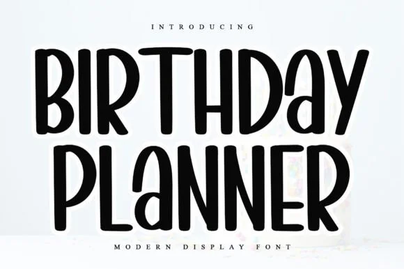
Birthday Planner
Birthday Planner is a tidy, tall hand-lettered marker display font with softly rounded stem tips and friendly vertical rhythm.
Birthday Planner is a tall rounded marker all-caps planner face: narrow upright caps with fully rounded ends, an even medium stroke, wide even spacing and a height that fits a single line inside a planner box. The rounded ends are the only warmth and the caps keep a label shouty but readable. It needs roughly 20 mm for the rounded end and the counter to read, and it is best in one bright ink on white paper, or a single dark colour on pastel card.
Recommended project & layout
Kids' party itinerary sign, milestone chalkboard & invite — Stack centered uppercase headers at 36–54 pt and use smaller 18 pt lines for time-slot bullet items.
Before you cut or print
Smooth, even marker strokes with zero thin serifs weed quickly and cleanly on Cricut vinyl, HTV, and acrylic signs down to 0.6 in.
Best paired with
Get fontPaid link
 #19
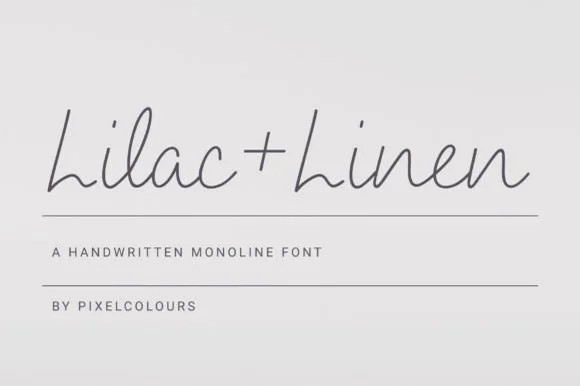
Lilac and Linen
Lilac and Linen is an ultra-clean, slender monoline handwritten font blending tall open capitals with airy semi-connected pen lowercase.
Lilac and Linen is an airy fine-pen architectural monoline handwritten face: a very light even stroke, wide open counters, tall ascenders and letters drawn as if by a fine technical pen with small lift gaps at the joins. The thin line is the whole character and it is the first thing to break on textured stock or at small sizes. It needs roughly 22 mm for the fine stroke and the lift gap to read, and it is best in one dark ink on smooth or coated paper, or a single ink on tracing-weight stock where the line stays continuous.
Recommended project & layout
Linen home-fragrance label, ceramic stamp & apothecary box — Center 'Brand + Scent' in charcoal ink on textured white cotton labels above 1 px hairline divider rules.
Before you cut or print
Fine hairline stroke weight is built for flat printing, Foil Quill, and Cricut Pen drawing—avoid tiny blade-cut vinyl.
Best paired with
Get fontPaid link
 #20
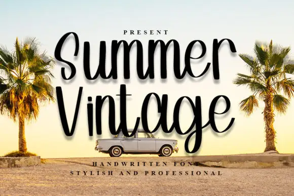
Summer Vintage
Summer Vintage is tall narrow handwriting in which the loops climb high above the smaller letters, the strokes stay even and the word is set with a soft shadow so it reads as a printed sticker rather than as flat lettering.
The capital S opens as a tall narrow loop and the rest of the word keeps the same slim proportion: the u closes a narrow bowl, the double m holds four even arches, the e loops back high and the r keeps a short arm. Weight is an even medium with slightly varying width, which keeps the line looking written rather than drafted, and the loops are the only ornament. The shadow in the sample separates the lettering from a photographic ground, which is how the face is meant to be used on collage and travel artwork. Because the letters are narrow, two long words stack in a modest format at 30 pt. The sky, the palms, the car and the two caption lines are presentation; the handwriting is the two words.
Recommended project & layout
A travel memoir cover — Use two short title lines in a solid panel rather than over the busiest part of a road photo.
Before you cut or print
Check narrow counters and g clearance at paperback scale.
Best paired with
Get fontPaid link
 #21
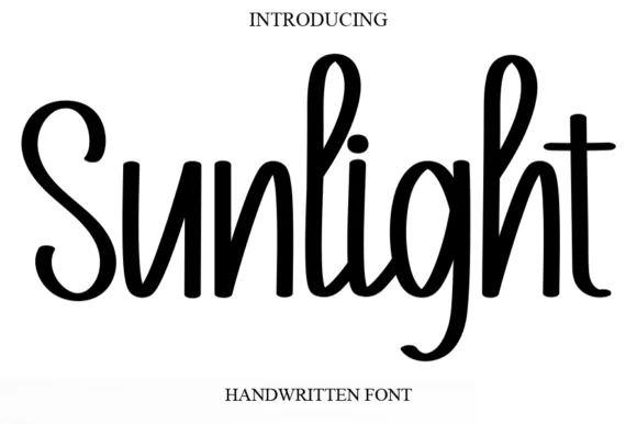
Sunlight
Sunlight is a tall, clean upright marker handwritten font with rounded loops and semi-connected farmhouse bounce.
Sunlight is a tall condensed upright marker font with rounded loops, semi-connected forms and a farmhouse bounce, so a name reads as lettering written on a card by hand rather than as a brush script. The semi-connected forms stay legible at 10 mm, and the tall ascenders give a short word height on a narrow format. It needs roughly 20 mm for the marker edge to read, and it is best in crisp black on white or in one warm ink on kraft.
Recommended project & layout
Rae-Dunn-inspired mug decal, kitchen canister & porch sign — Center single tall words ('Sunlight', 'Morning', 'Lemonade') at 2.5–4 inches tall on white ceramic or wood.
Before you cut or print
Smooth solid strokes with zero fragile hairlines cut cleanly down to 0.7 inches—weld any touching letters ('l-i', 'g-h') first.
Best paired with
Get fontPaid link
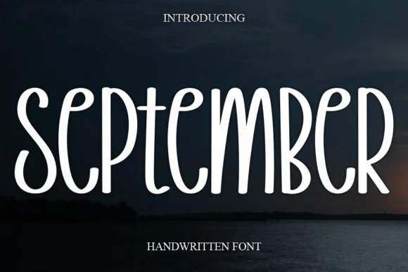 #22
September
September is a tall, narrow disconnected marker print font (not a connected cursive script) built with smooth, uniform rounded strokes.
September is a tall narrow marker display of disconnected rounded capitals: each letter stands alone with an even marker weight, soft rounded terminals and a level baseline, drawn upright for vertical signs. The narrow proportion fits a long word down a slim board, and the rounded terminal is the only soft detail. It needs roughly 24 mm for the rounded terminal and the counter to read, and it is best in one deep ink on cream and kraft, or white paint on a dark board where the rounded ends read as lights.
Recommended project & layout
Calendar header board, fall mug wrap & pantry canister — Set 1 uppercase month or label word at 48–88 pt with +8 tracking centered over dark or neutral backgrounds.
Before you cut or print
Uniform medium monoline weight cuts and weeds fast on permanent vinyl, HTV, and acrylic signs down to 0.55 inches!
Best paired with
Get fontPaid link
Scripts & Calligraphy
5 fonts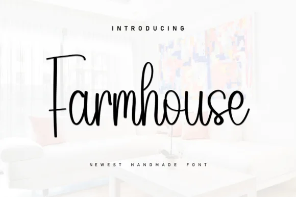 #23
Farmhouse
Farmhouse (by KC Production) is a tall, slender monoline-brush farmhouse script pairing a towering straight 'F' stem with airy upright loops.
Farmhouse is a tall slender monoline-brush script with an extra-tall T-barred F, narrow h ascenders and upright rounded lowercase, drawn light enough that the connectors stay open at small sizes. The stance is upright rather than slanted, which keeps a long word inside a narrow panel, and the even stroke means it transfers and plots without the joins thinning. It needs roughly 16 mm before the tall stem reads as intentional rather than stretched, and it is a card, sign and label face, best in one soft dark on a warm ground.
Recommended project & layout
Framed living-room wall sign, linen pillow & mug decal — Center 1 focal word at 56–100 pt on white wood or canvas framed by wide-tracked uppercase sans micro-lines.
Before you cut or print
Weld all touching cursive connectors before cutting permanent vinyl or Oramask wood stencils; cuts cleanly at 1.1 in+.
Best paired with
Get fontPaid link
 #24
Farmhouse
Farmhouse is a bouncing tail script in which the letters sit at different heights, the strokes swell on the downstroke and long swashes enter and leave the word, so a name reads as hand lettering on a painted board.
The f rises into a tall loop, the a closes a round bowl, the r finishes a light arm, the m keeps three even shoulders, the h climbs a tall stem and the e turns a light eye, all at a brush contrast with a bouncing baseline and swashes drawn at both ends of the word. The bounce is the character: the letters shift up and down around a nominal line, which is why the sample sets one name across a wide board with room for the swashes. Because the downstrokes are heavy, the face holds from 24 pt and prints on most stocks; the swash tails need margin on both sides. The white board, the arch of small caps above and the credit below are presentation; the black script name is the face.
Recommended project & layout
A farm-shop welcome strip — Place the phrase across a wide strip and put opening hours in a plain block below the lowest f loop, with no wood texture behind the letters.
Before you cut or print
Check actual tail variants and visibility at the intended distance.
Best paired with
Get fontPaid link
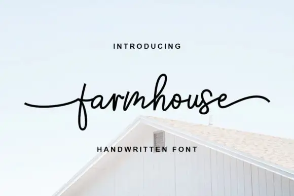 #25
Farmhouse Font
Farmhouse is light flowing handwriting whose word is framed by a very long flat entry and an exit that lifts at the tip, with small even letters in between on a level baseline.
The entry stroke runs in from the left as a fine horizontal line at x-height before the f rises into a tall plain stem, and the letters after it stay small and even: the a and the r close their bowls, the m keeps two narrow arches, the h rises without a loop and the o and the s finish tightly. The exit runs out flat again and lifts slightly at the tip, so the word is bookended by two horizontal gestures. Weight is light and constant, the joins cross at a consistent height, and nothing tapers to a point except the very ends. The white gable of the house, the pale ground and the tracked captions are presentation; the script is the word.
Recommended project & layout
A farm-produce insert — Keep the phrase in a wide top band and storage details in plain type below the f.
Before you cut or print
Proof the thin f loop and confirm actual tail variants.
Best paired with
Get fontPaid link
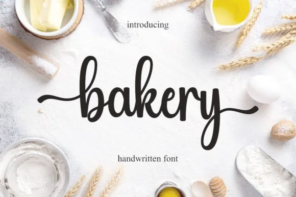 #26
Bakery
Bakery is a warm, bouncy handwritten brush script with tall looped ascenders ('b', 'k') and smooth horizontal beginning and ending tails.
Bakery is a bouncy medium-weight farmhouse brush script with side tails: a loaded stroke with visible dry edges, joined letters, a rising baseline and long tails that flick off the first and last letters. The tails need side clearance and are the first thing trimmed, and the brush edge is the finest element. It needs roughly 24 mm for the tail and the brush edge to read, and it is best in one warm ink on kraft and cream, or a single dark colour on a pale board where the brush edge prints as texture.
Recommended project & layout
Cottage-bakery cake box, sourdough bag & apron HTV — Set a lowercase focal word ('bakery', 'homemade', 'cookies') at 4–8 inches wide with the entry and exit tails turned on.
Before you cut or print
Medium brush stroke weight is one of the easiest script styles to cut and weed on Cricut HTV and adhesive vinyl—remember to weld.
Best paired with
Get fontPaid link
 #27
Welcome
Welcome features relaxed lowercase cursive with long level beginning and ending swash tails, tailored for round wood signs and entryways, where the smooth monoline-leaning strokes and open letter spacing keep words calm while the extended w and e tails span a circular blank.
The stroke stays one width, the spacing opens, the tails run level and the word sits calm. That level tail is the character: the greeting stretches to the width of a round board without a bigger point size, which is why the sample targets door signs. Plan the tails against the blank's curve, keep the stroke at 3 mm for cutting, and check the exits in your own word before committing the sign. The wide tail is also the weak point on a shaped blank: it has to end inside the panel, so a 12 mm tail on a 300 mm round board is safe and anything longer gets trimmed at the edge.
Recommended project & layout
Round wood welcome sign or nursery plaque — Centre the tailed lowercase word across the middle third and tuck family names below in small caps.
Before you cut or print
PUA-encoded tails weld cleanly in Cricut/Silhouette; verify thin tail tips before weeding small decals.
Best paired with
Get fontPaid link
Practical buyer checklist
Frequently asked questions.
Key cutting, printing and pairing answers before choosing a modern farmhouse & wood signs typeface.
Which font carries the main word on a farmhouse sign?
Usually the script, because it reads from a distance and carries the sentiment. Use the tall sans for the secondary line, the family name or the date, and keep it at least 30 percent smaller so the hierarchy is obvious.
How large should lettering be on a 24 inch wood round?
A two line design works well with the script at 3.5 to 4.5 inches and the sans at 1.5 to 2 inches, leaving a 2 inch border. Measure the round's flat usable width rather than its diameter, since the circle cuts into the corners.
Can I cut these fonts in vinyl for a painted sign instead of painting?
Yes. Cut the design in a matching vinyl, use it as a mask, and remove the letters to paint through the negative space. That gives crisper edges on textured wood than trying to transfer individual thin letters.
Do farmhouse duos include the numbers and ampersands I need?
Most include digits and a basic ampersand, but not always punctuation in both styles. If the design needs a date or an address, test the exact glyphs in both faces before committing to the layout.
Keep exploring
Related collections & guides.
Explore adjacent maker roundups or check our practical pre-production checklists.

01 / Cricut & Craft
Vinyl & Cricut cutting
38 curated fonts · Previews & pairings
02 / Branding & Print
Font duos & pairings
32 curated fonts · Previews & pairings
03 / Holidays & Seasons
Christmas
38 curated fonts · Previews & pairings
04 / Holidays & Seasons
Thanksgiving & harvest
19 curated fonts · Previews & pairings
Guides: Invitation font checklist · Vinyl & cutting checklist · How to pair script & sans fonts