 #1 · Best Overall
Disclosure: MakerFileHub may earn a commission from qualifying purchases via paid links on this page. How our links work.
Holiday scripts, snow blocks & seasonal display
38 Best Christmas Fonts for Cards & Crafts
December work is deadline work, so Christmas lettering has to cut, print and ship without surprises. Santaheart and Christmas Family carry the heart-connected and flourished script registers, Christmas Farmhouse and Wonderful Christmas soften it, and Christmas Snow, Snowie and Jollybe supply the snow-capped display side. Christmas Continues and Christmas Luster add the ornamental serif that suits cards.
Quick verdict
Santaheart is the most reliable holiday script, Christmas Snow is the strongest snow display, and Christmas Continues is the best ornamental serif for cards. Jollybe covers the handmade craft-fair look.
Quick answer
Top 3 Christmas picks right now.
Short on time? Start with our three highest-rated Christmas standouts before scrolling the full breakdown.
#1 · Best Overall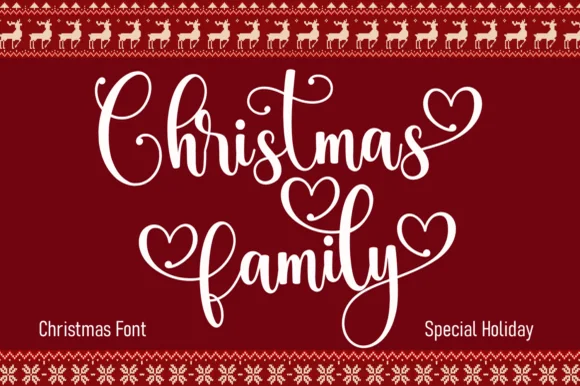 #2 · Runner-Up Pick
Christmas Family
Festive script with heart terminals and looped swashes
Get fontPaid link
Read review ↓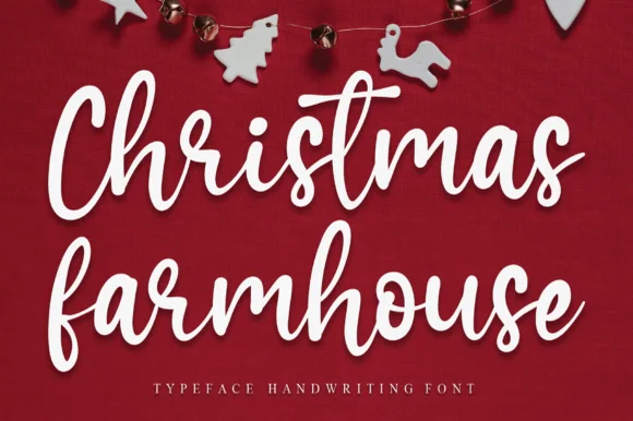 #3 · Editor's Choice
How we tested & selected these 38 fonts
We kept 38 of 348 holiday candidates after checking each at 2 inch sign scale and 16 pt card size. Weighted script connector strength, whether snow or ornament details remain legible after weeding, and how the face behaves when printed in one colour.
Side-by-side summary
Top 5 Christmas picks at a glance.
Compare specimens, OpenType/PUA traits and primary project roles side by side.
| Rank & Font | Style & File Specs | Best Project Fit | Store Listing |
|---|---|---|---|
| ScriptAlternates & swashes · File formats | Kids' cocoa mug, ornament or holiday pajama shirt | Get fontPaid link | |
| ScriptLigatures · Alternates & swashes | Matching family Christmas shirt or ornament set | Get fontPaid link | |
| ScriptJoyful | Throw-pillow HTV transfer or rustic wood sign | Get fontPaid link | |
| ScriptPUA encoded · Alternates & swashes | Foil-stamped family photo card overlay | Get fontPaid link | |
| ScriptMinimal-monoline | Scandinavian minimalist holiday card, ribbon & ceramic tag | Get fontPaid link |
Scripts & Calligraphy
12 fonts#1 · Best OverallSantaheart
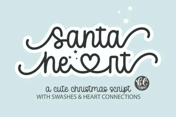
Santaheart weaves inline heart connectors and curled beginning and ending tails into a smooth monoline cursive for holiday mugs and children's gifts, where the thick even tubing keeps both standard cursive words and the heart-connected swash alternates durable for vinyl weeding.
The stroke stays one even width, the hearts sit inside the connectors, the tails curl out and the alternates are separate characters. That inline heart is the character: the greeting carries its own decoration, which is why the sample targets vinyl and mugs. The alternates need the character map, so check they open in your software, keep the tubing above 3 mm for weeding, and test a small curvy word first since closed counters are the hardest part to cut.
Recommended project & layout
Kids' cocoa mug, ornament or holiday pajama shirt — Use lowercase throughout to activate smooth baseline connections and heart ligatures.
Before you cut or print
PUA encoded; always Weld connected letters and swashes before cutting vinyl.
Best paired with
Get fontPaid link
#2 · Runner-Up PickChristmas Family
Christmas Family is a festive script in which the ascenders loop high, several terminals swell into hearts and the joins stay even, so a two-word greeting reads as something written on a holiday card.
The C opens a tall loop, the h rises on a slanted stem, the r finishes a curled arm, the s wobbles a shallow spine, the t raises a high bar and the y drops a wide tail, all at an even weight with heart-shaped terminals on a few letters and generous looping ascenders. The heart terminals are the character: they sit at the ends of strokes rather than as added decoration, which is why the sample sets two stacked words in white on deep red. Because the stroke is even, the face needs 26 pt upward and prints on smooth card; the loops need leading. The deep red panel, the reindeer border, the snowflake frames and the small labels are presentation; the white script words are the face.
Recommended project & layout
Matching family Christmas shirt or ornament set — Set family surname beneath in a clean tracked slab or sans.
Before you cut or print
Weld overlapping cursive strokes and check thin heart loops at small decal sizes.
Best paired with
Get fontPaid link
#3 · Editor's ChoiceChristmas Farmhouse
Christmas Farmhouse is an upright handwritten cursive in which the baseline dances, the ascenders rise tall and the brush-pen weight stays sturdy, so a porch sign reads across a yard without the formality of a connected script.
The C and h lift tall ascenders, the f and h repeat that height through the second word, the baseline shifts up and down by design and the brush-pen weight keeps a consistent thickset stroke with light joins. The dancing baseline is the character: it makes a painted sign feel hand-lettered rather than printed, which is why the sample suits a rustic board. Because the letters bounce, keep 18 mm between rows from 30 pt and check that the tallest ascender stays inside the panel. The farmhouse props are presentation; the cursive line is the face.
Recommended project & layout
Throw-pillow HTV transfer or rustic wood sign — Stack two words centrally with generous vertical clearance for tall ascenders.
Before you cut or print
Weld connected letters before cutting HTV or stencil film.
Best paired with
Get fontPaid link
 #4 · Top Maker Utility
Wonderful Christmas
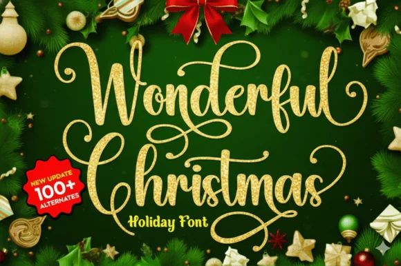
Wonderful Christmas builds tall looping calligraphy flourishes with spiral loops that crown the capitals and descenders across a two-line specimen, pairing fine hairlines with medium calligraphic downstrokes.
The downstrokes hold a medium weight, the hairlines thin away, the capitals open spiral crowns and the extra characters are encoded beyond a hundred alternates. The crowned capital is the character: the word begins with a drawn flourish that sets a formal tone, which is why the sample sets two lines for foil cards. Because the spirals are hairlines, keep 30 pt as the floor on coated stock and give the loops 20 mm above the line. The spiral crowns are hairlines: they snap in foil and silt below about 30 pt, so the crowned capitals belong on a coated card with 20 mm above the loop rather than on a curved tag.
Recommended project & layout
Foil-stamped family photo card overlay — Place the script over a quiet dark or cream area of the photo and keep family names in small caps.
Before you cut or print
Delicate hairline loops shine in print, digital cards and foil transfer; avoid cutting tiny decals below 2.5 inches.
Best paired with
Get fontPaid link
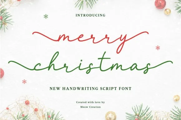 #5 · Standout Silhouette
Merry Christmas
Merry Christmas (by Meow Creation) is a serene, wide-winged lowercase monoline script stretching graceful horizontal entry and exit tails.
Merry Christmas by Meow Creation is a minimalist lowercase monoline script with wide winged entry and exit tails and calm, even curve weight, so a greeting reads as written in one unhurried stroke rather than as calligraphy. The tails stretch horizontally beyond the word, which the layout must allow for, and the monoline weight makes it printable, plottable and foil-friendly. It needs roughly 18 mm for the wings to read as deliberate, and it is best in cranberry or pine on snow white, or a fine foil on matte board.
Recommended project & layout
Scandinavian minimalist holiday card, ribbon & ceramic tag — Set all-lowercase words at 56–110 pt centered horizontally with generous white margins.
Before you cut or print
Draws single-weight strokes beautifully with Cricut Pens & Foil Quill, and cuts on 1.35 in+ welded Oracal 651!
Best paired with
Get fontPaid link
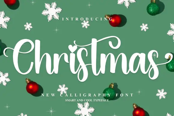 #6
Christmas
Christmas shows a broad C, rounded joined letters, a long curled t bar and descending s loops, where the i carries a heart-shaped dot and baubles, snowflakes and small sparkles fill the sample around the word.
The script stands upright rather than slanting, the joins stay rounded, one bar curls long and a dot turns into a heart. That upright stance is the character: the word reads as a friendly seasonal signature rather than a formal hand, which is why the sample adds baubles. The ornaments are separate artwork, so check how the heart dot is typed, keep 28 pt for the joins and allow 20 mm beneath the s loops. The heart dot is the small piece that fails: it is a separate glyph, so it lifts during weeding and fills at foil, and the joins silt below about 28 pt.
Recommended project & layout
A Christmas invitation cover — Give Christmas its own wide line with together beneath in plain type; put time and address below the lowest curl.
Before you cut or print
Check the chosen alternates and avoid crossing practical details with swashes.
Best paired with
Get fontPaid link
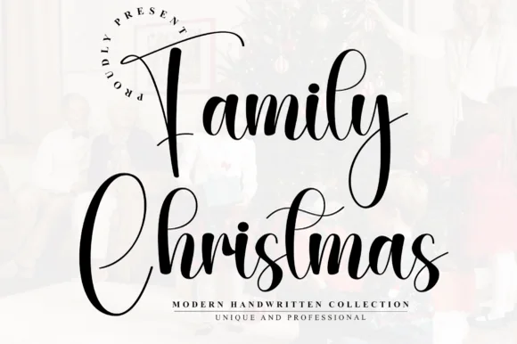 #7
Family Christmas
Family Christmas is a tall, narrow modern calligraphy script with high-arching 'F' and 'C' capitals and rhythmic bouncing lowercase loops.
Family Christmas is a tall narrow bouncy holiday calligraphy script: a loaded brush stroke on a nearly vertical axis, high ascenders that loop once, joined letters and a bounce that lifts the middle of a word. The narrow width fits a long greeting in a tag, and the bounce grows the word vertically. It needs roughly 24 mm for the loop and the brush edge to read, and it is best in one deep ink on smooth card, or a fine gold on a dark ground where the loops print as bright lines.
Recommended project & layout
Family photo holiday card, stocking tag & ornament — Stack 'The [Surname]' and 'Christmas' in two centered rows at 42 pt with 1.05 leading over bright white photo mats.
Before you cut or print
Weld all cursive joins before vinyl cutting, and keep lowercase x-height above 0.65 in so fine hairline upstrokes stay intact.
Best paired with
Get fontPaid link
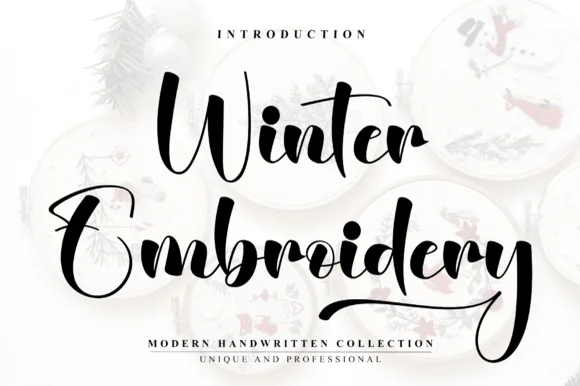 #8
Winter Embroidery
Winter Embroidery is a bouncy modern calligraphy brush script—despite its name, it features smooth solid ink strokes rather than stitch textures.
Winter Embroidery is a thick-thin bouncy modern brush script: a high-contrast stroke with a swollen thick and a hairline-thin, letters that rise and fall along the baseline and joins that loop back into the word. It is the look of a machine-embroidered name, so it suits a patch or a knit more than a leaflet. The hairlines are the finest element and they break first, on thread and in print. It needs roughly 34 mm for the thick-thin contrast to read, and it is best one colour on a soft ground where the hairline holds.
Recommended project & layout
Holiday mug decal, gift sack & ornament lettering — Stack a two-word winter phrase with tight leading so the upper capital sits neatly above the wider lowercase second word.
Before you cut or print
Weld all cursive joins before vinyl cutting and keep x-height above 0.65 in so the thin upward connectors do not lift during weeding.
Best paired with
Get fontPaid link
 #9
Winter
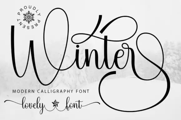
Winter surrounds its small joined middle with a tall W loop, a high t sweep and a very large lower terminal, where the final stroke returns in a wide loop beneath and beside the word and fills almost half of the square field around it.
The letters stay connected and medium weight, the initial loop rises high, the t sweeps wide and the closing stroke falls into a vast loop that wraps under the word. That terminal is the character: the silhouette is nearly square rather than a narrow strip, which is why the sample cannot be cropped into a banner. Snow imagery around the field is context. Keep 30 pt for the hairlines, plan a square or very wide area for the word and check the loop against your trim before committing.
Recommended project & layout
A winter concert programme cover — Give the title most of a square cover and set performers and venue on a plain inside page. Leave the lower terminal clear of the cover edge.
Before you cut or print
Try the real words before reserving a loop; the preview’s terminal may depend on a specific alternate.
Best paired with
Get fontPaid link
 #10
Signature Christmas
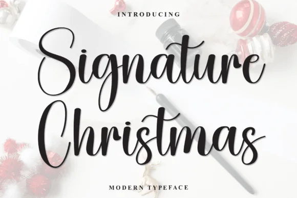
Signature Christmas is a lively, medium-weight modern calligraphy script with tall oval capitals ('S', 'C') and dancing lowercase bounce.
Signature Christmas is a medium-weight modern calligraphy script with tall oval capitals, a dancing lowercase bounce and a flying t-bar that lifts the eye along the line. The connections are smooth and the contrast moderate, so it holds at 15 mm on a card while still reading as brush calligraphy at 60 mm on a sign. The bouncy baseline means a phrase needs room above and below, and the face is at its best in one deep colour on a warm cream ground rather than in multi-colour seasonal graphics.
Recommended project & layout
Holiday photo card, family ornament & gift-wrap ribbon — Stack 2 title-case words centered at 48–76 pt with 1.02 leading above tracked sans family names.
Before you cut or print
Weld all touching cursive connectors before cutting Cricut HTV or ornament vinyl; weeds reliably at 1 in+.
Best paired with
Get fontPaid link
 #11
Christmas
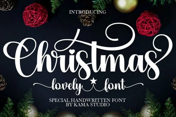
Christmas (by Kama Studio) is a thick, joyful holiday calligraphy script featuring sweeping spiral swashes, a heart i-dot, and star word-connectors.
Christmas is a bold festive brush script with a wet, loaded stroke, connected letters, a low bounce and small heart and star accents that replace the dot on the i and trail from the final letter. The accents extend past the word and the wet edge is the texture that carries at large sizes. It needs roughly 26 mm for the brush edge and the accents to read, and it is best in one deep red or green on cream, or white paint on kraft where the brush edge prints as texture.
Recommended project & layout
Family Christmas pajama chest HTV, round wood porch sign & sack — Center 1 big flourished holiday word at 8–10 inches wide above a smaller star-connected script subline.
Before you cut or print
Weld all overlapping lowercase joins in Design Space before cutting HTV or permanent ornament vinyl.
Best paired with
Get fontPaid link
 #12
Santa Catalina
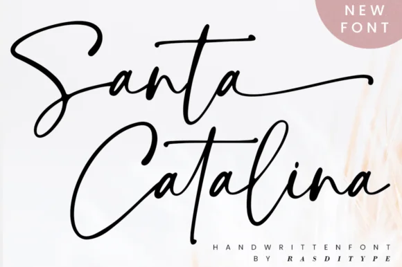
Santa Catalina is an expressive signature script in which the strokes carry a dry-pen edge, the capitals open into wide loops and the crossbars run long and flat past the letters.
The capital S draws as a tall loop that closes on itself before the pen moves on, and the lowercase that follows stays loose: the a closes an open bowl, the n keeps a wide shoulder, the t crosses with a stroke that runs well past the stem and the l rises into a narrow loop. Weight varies within each letter — heavier on the downstrokes, thinning where the pen lifts — and the edges are slightly dry, which is what makes the face read as written with a felt pen rather than drawn with a brush. Descenders on the second word run low and finish in a flat tail. Because the strokes are wide, the face holds at 24 pt on a card. The white ground, the black ink, the soft blush in the corner and the two caption lines are presentation; the script is the two words.
Recommended project & layout
Photography watermark or boutique hangtag — Pair the large signature name with tiny tracked sans-serif capitals underneath.
Before you cut or print
PUA-encoded alternates let you swap repeated letters; best for print and digital logos.
Best paired with
Get fontPaid link
Display & Decorative Headlines
14 fonts #13
Christmas Snow
Christmas Snow is a rounded capital alphabet in which the counters are punched with small snow dots, the strokes stay fat and a heavy outline wraps the word, so a greeting reads as lettering cut into a wooden sign and lit from behind.
The C curls a fat crescent, the H sets two stems with a snow dot in the bar, the R opens a wide bowl, the I drops a small dot and the S holds a soft spine, all at a festive weight with rounded corners, a contour drawn around the outside and dots cut inside the counters. The punched dots are the character: they replace plain counters, which is why the sample sets two stacked words in white on a dark board. Because the dots are small, the face needs 34 pt before they stay open, and it prints best in one light colour. The snowy forest, the wooden sign, the lantern, the snowman and the fairy lights are presentation; the white dotted words are the face.
Recommended project & layout
Winter cocoa mug, holiday pajama print or classroom door sign — Print/press on light or mid-tone backgrounds or add a white offset border on dark blanks.
Before you cut or print
Tiny snowfall dots and interior flakes favour sublimation, DTF and Print-Then-Cut over small vinyl.
Best paired with
Get fontPaid link
 #14
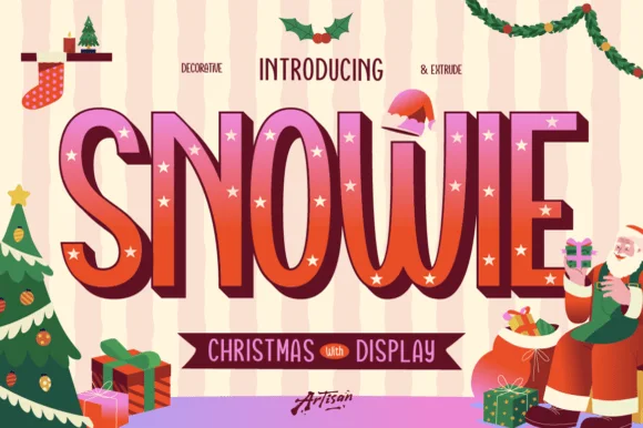
Snowie
Snowie is a cheerful 3-style tall Christmas display family ('Regular, Decorative & Extrude') letting you layer 3D shadows and twinkle-star inlays!
Snowie is a three-style Christmas display family: a tall quirky regular with cream twinkle stars set inside the stems, a decorative star-inlay build and a separate extrude layer, so a word can be layered as a flat mark, a starred panel or a 3D block. The tall narrow caps carry the star inlay only where the stem is wide enough, which means the family needs size for the stars to read. It needs roughly 30 mm for the inlay to hold, and it is best in berry red with cream stars on a warm ground.
Recommended project & layout
Vintage Santa wood sign, holiday cookie box & sweatshirt — Align Snowie Decorative + Snowie Extrude at identical X/Y coordinates (84–165 pt) in berry red + chocolate/gold.
Before you cut or print
Use Regular + Extrude for fast multi-layer Cricut HTV & cardstock cutting; use star-inlaid Decorative for DTF, sublimation & print!
Best paired with
Get fontPaid link
 #15
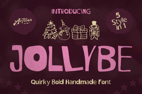
Jollybe
Jollybe is a quirky, bold cut-paper handmade font family packing '5 Style in 1' (including charming sketched holiday doodles) for cozy craft projects!
Jollybe is a handmade block display built from five related sets: a chunky solid, an inline, a shadow, a doodle and a holiday ornament variant, all drawn on the same wonky block skeleton. The five styles stack into one assembled word, which means each layer needs identical metrics and clear vertical room. It needs roughly 30 mm for the inline and shadow layers to separate, and it is best in two inks on cream or one festive palette on white.
Recommended project & layout
Handmade gift tag, holiday baking apron & Advent card — Set 1 bold uppercase word at 68–130 pt below a row of 3–4 matching sketched holiday icons.
Before you cut or print
Main solid block letters cut and weed fast on Cricut cardstock, HTV, and Oracal 651 down to 0.6 inches!
Best paired with
Get fontPaid link
 #16
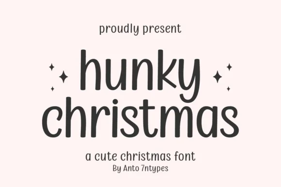
Hunky Christmas
Hunky Christmas is a neat upright monoline print face in which the h and k climb tall, the k closes a curled loop inside its arm, the bowls stay open and round, and no letters join, so a short holiday phrase reads as tidy hand printing.
The strokes hold one even monoline width, the ascenders rise well above the bowls, the k carries a curled internal loop and the letters stand separately with clear spacing. The monoline print is the character: it reads as careful handwriting rather than a script, which is why the sample sets a phrase in one tidy row. Because the stroke is even and light, keep 20 pt as the floor on smooth card, and give the tall ascenders 14 mm of clearance in a heading block. The sample lists swashes among the extras, so any flourish is a separate access step.
Recommended project & layout
Minimalist holiday card front — Set the greeting in lowercase with generous line spacing and place a small year line underneath.
Before you cut or print
Even stroke weight weeds smoothly on adhesive vinyl; four-point stars on the cover are separate accents.
Best paired with
Get fontPaid link
 #17
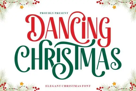
Dancing Christmas
Dancing Christmas shows narrow high-contrast letters with oversized spiral terminals, red on the upper word and green on the lower, where the D curls inward at both ends and the C, s and final extensions sweep across the vertical stems next to them.
The stems stay tall and narrow, the contrast swings wide, the hairlines thin out and the terminals spiral large. That overlap is the character: the sweeping terminals cross neighbouring letters, so the sample only works with the letters tightly set. Pine branches and berries in the corners are separate artwork. Keep 40 pt for the hairlines, leave 18 mm above and 20 mm below for the crossings, and check the s and C against your own wording before committing to a tight set.
Recommended project & layout
A Christmas dance programme — Give the title two spacious lines and put the dance schedule below the lowest spiral.
Before you cut or print
Confirm the decorative D and C variants and their actual widths.
Best paired with
Get fontPaid link
 #18
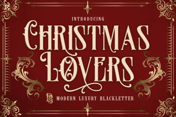
Christmas Lovers
Christmas Lovers is a stately PUA-encoded Victorian blackletter blending readable flared Roman capitals with sweeping calligraphic swashes.
Christmas Lovers is a Victorian blackletter and Roman hybrid with tall notched capitals, flared stems and sweeping calligraphic swashes, PUA encoded, so a word reads as an engraved bookplate rather than a gothic poster. The readability comes from keeping the Roman bones under the blackletter treatment, which is why it works at 14 pt in a card. It needs roughly 26 mm for the swash to read as a flourish and 12 pt for the notched stems, and it is best in gold on deep burgundy or one ink on cream.
Recommended project & layout
Dickensian holiday card, spiced-wine bottle & velvet ribbon — Stack 2 centered words at 60–115 pt in cream or gold foil on deep oxblood, forest green, or navy.
Before you cut or print
PUA encoding lets you copy-paste swash alternates from Character Map/Font Book—cuts cleanly on 1.3 in+ HTV and Foil Quill!
Best paired with
Get fontPaid link
 #19
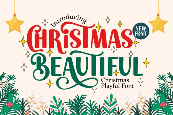
Christmas Beautiful
Christmas Beautiful mixes rounded upright lettering with curling terminals, where large C and B initials turn into spirals, long strokes sweep beneath neighbouring letters and the most elaborate flourish reaches below the lower row on a pale ground framed by fir branches and stars.
The bodies stay rounded and heavy, the initials curl large, the connecting strokes sweep sideways and one flourish drops well under the second row. That drop is the character: the sample reads as hand-arranged rather than set, which is why the two rows feel stacked and slightly staggered. The fir branches, the stars and the corner badge are separate decoration. Keep 40 pt so the curls stay open, plan 25 mm beneath the lower row for the flourish and keep supporting copy well outside the sweep.
Recommended project & layout
A Christmas market invitation — Keep the main title high and leave an empty band below for swashes before the date.
Before you cut or print
Test the actual wording and alternate selection; do not copy unsupported letter combinations.
Best paired with
Get fontPaid link
 #20
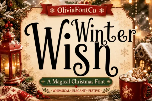
Winter Wish
Winter Wish shows a very large narrow W beside lighter rounded forms, where the s coils inward at its foot and the final h closes on a low curled extension rather than a straight stem.
The first letter grows beyond the rest, the bodies stay narrow, the coils turn inward and the last stroke reaches below the line. That single oversized initial is the character: the lockup interlocks a short seasonal phrase without a second typeface, which is why the sample sits inside a pale title panel among Christmas objects. The panel and props are artwork, and the arrangement demonstrates one fitted lockup rather than automatic shaping, so set your own phrase and keep 30 pt before the curls close.
Recommended project & layout
A quiet Christmas card title — Reserve an open lower margin for curls and put the note inside.
Before you cut or print
Verify the plural ending and required alternates.
Best paired with
Get fontPaid link
 #21
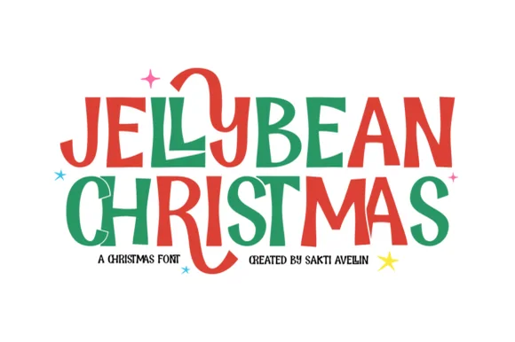
Jellybean Christmas
Jellybean Christmas is a heavy hand-drawn capital alphabet in which the strokes stay fat and slightly uneven, the corners soften and one letter in each line is allowed to fall out of the baseline, so a greeting reads as cut paper.
The J hooks a long tail below the baseline, the E holds three short arms at uneven lengths, the L turns a blunt corner, the Y splays two thick diagonals and the S keeps a shallow spine, all at a poster weight with rounded, slightly wobbly contours. What makes the set feel handmade is the tiny variation in stroke width and the way the letters sit nearly, but not exactly, on one line. Two colours are used in the sample only to separate the words, not as a built-in style. Because the shapes are solid, the face cuts cleanly and holds at 40 mm; below 14 pt the wobble turns into noise at the edges. The white ground, the small stars and the credit lines are presentation; the two display words are the face.
Recommended project & layout
Kids' holiday mug or gift-sack title — Stack two short all-caps words at centre and keep names below in a simple rounded sans.
Before you cut or print
Solid medium-thick strokes cut cleanly on HTV; separate the tiny decorative stars if cutting under 1 inch.
Best paired with
Get fontPaid link
 #22
Frosty Christmas
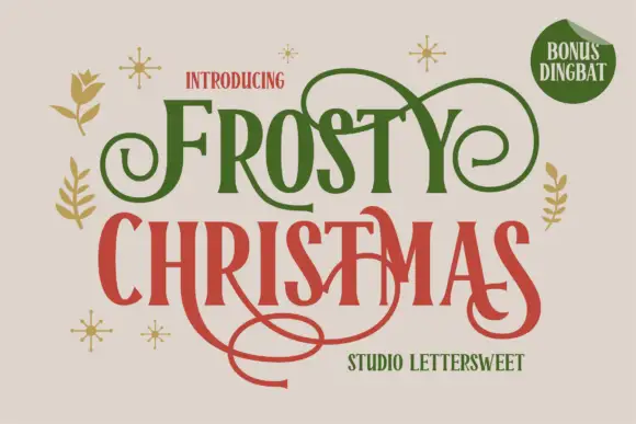
Frosty Christmas shows tall contrast-rich letters with sharp flared ends and expansive curls in green and red on cream, where thin extensions loop above the upper row and one long swash sweeps far beneath the lower title while small botanical marks and sparkles sit around the block.
The stems stay tall, the contrast swings, the ends flare and the curls travel far outside the words in both directions. That vertical spread is the character: the sample reads as a hand-lettered greeting with a flourish spine, which is why the two rows sit close and the space above and below belongs to the strokes. The corner badge advertises bonus dingbats that are not shown. Keep 40 pt for the hairlines, reserve 30 mm above and 35 mm below and check the swash against your trim.
Recommended project & layout
A formal Christmas invitation — Keep generous top and bottom margins with plain event details.
Before you cut or print
Verify selected swashes and avoid collisions between rows.
Best paired with
Get fontPaid link
 #23
Frosty Dream
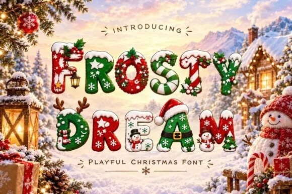
Frosty Dream decorates chunky holiday capitals with candy-cane stripes, holly sprigs and Santa hats, and the cover presents the set for sublimation mugs, sweaters and cards rather than for single-colour printing.
Each letter stays thick enough to hold its ornament, the stripes run along the strokes, the holly and hats sit on or beside the shapes and the palette carries several bright colours in one glyph. The full-colour ornament is the character: the letter is a small illustration, which is why the sample targets sublimation and print-then-cut work. Because the detail is fine, keep 40 pt before a sprig or hat survives, and treat the listed craft uses as an intention rather than a tested process result.
Recommended project & layout
Sublimation Christmas tumbler, kids' holiday sweatshirt or party card — Use via Sublimation, DTF or Print-Then-Cut to preserve all festive interior details.
Before you cut or print
Too detailed for single-colour blade vinyl weeding — ideal for sublimation and print.
Best paired with
Get fontPaid link
 #24
Jingle Wish
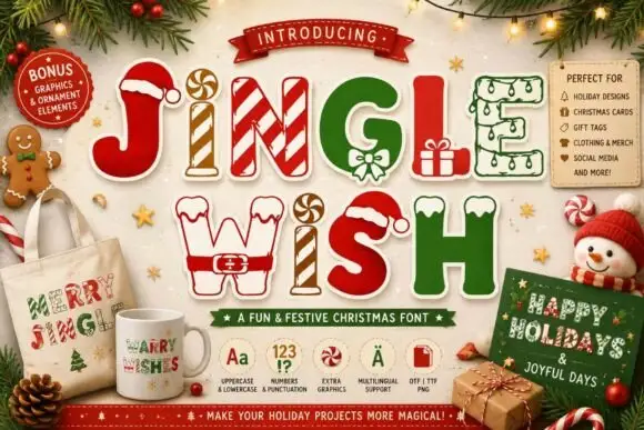
Jingle Wish shows chunky capitals decorated with candy stripes, hats, gifts and winter-clothing details: some characters arrive as outlines while others are solid filled shapes, so one word mixes two finishes.
The letters stay thick enough to carry a picture, the stripes run inside the strokes, hats and small gifts sit on or beside the characters and the fill alternates between outline and solid. The object-dressed capital is the character: the word reads as a decorated row rather than an alphabet, which is why the sample mixes finishes in one line. Because the interior detail is fine, keep 40 pt before a stripe or hat survives, and treat the mockups and file-format badges on the cover as advertising.
Recommended project & layout
A children’s craft-table heading — Use a large title above a plain list of activities; avoid placing textures behind the decorations.
Before you cut or print
Verify decorated glyphs and any separately required colour layers in the actual files.
Best paired with
Get fontPaid link
 #25
Holiday Lights
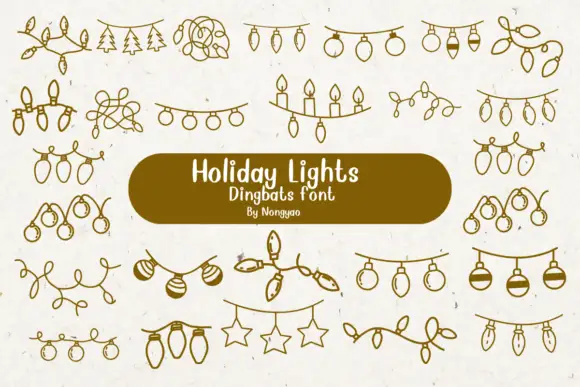
Holiday Lights is a dingbat font that draws Christmas light garlands in one even line: bulb strings, loops of wire, rows of candles, hanging stars and sprigs of pine, all ready to be dropped between two pieces of type.
The preview shows about twenty garlands arranged in rows on a speckled cream ground, each drawn with the same thin olive line: a simple string of pear-shaped bulbs, a looped tangle of wire, a row of candles with flames, a string of round baubles, a line of fir branches, stars hanging from a cord and a garland of leaves. The drawings are flat and even, with no shading and no perspective, so they behave like ornaments in a book rather than as illustrations, and they can be tinted in one colour without losing anything. A single label sits at the centre of the card on a dark pill, and the credit line beneath it names the designer. The strength of a set like this is repetition: a row of bulbs can be stretched along a margin, stacked to make a border, or scattered under a heading, and the consistency of the line weight is what keeps a page tidy.
Recommended project & layout
A holiday gathering invitation top border — Place a verified light-string motif above a plain dark green title on white and keep the date and address below a wide empty gap.
Before you cut or print
Check glyph mapping and line contrast; no actual glow or automatic smooth border is verified.
Best paired with
Get fontPaid link
 #26
Chasing Christmas
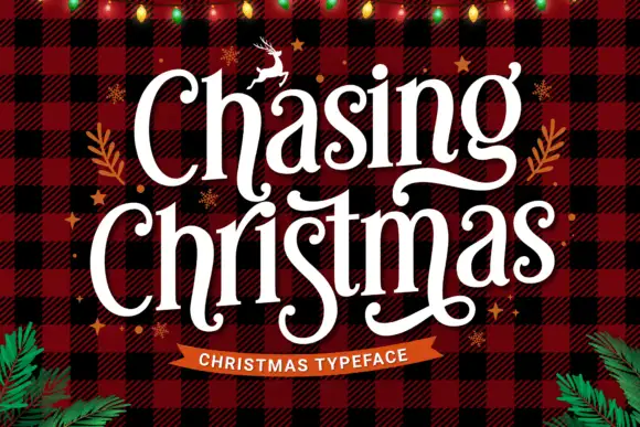
Chasing Christmas shows white mixed-case letters with narrow upright stems and broad curved ends on a red and black check, where loops curl inside several lowercase forms and long descenders sweep between and beneath the two rows.
The stems stay narrow, the ends flare, the inner loops curl inside the bowls and the descenders travel far below the baseline between the words. Those descenders are the character: the two rows interlock through the stems rather than sitting apart, which is why the sample needs a square field. The plaid ground, the string lights, the foliage and the flying deer are separate artwork. Keep 40 pt so the inner curls stay open, reserve 24 mm beneath the lower row and check each descender against your trim.
Recommended project & layout
A Christmas greeting-card title — Use a plain contrasting title panel rather than busy checks.
Before you cut or print
Verify exact letters and rights to separate seasonal art.
Best paired with
Get fontPaid link
Serifs & Slab Serifs
10 fonts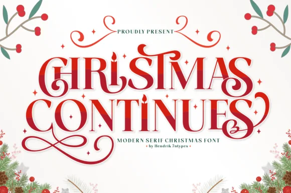 #27
Christmas Continues
Christmas Continues is a whimsical holiday display serif (not a cursive script) featuring curled spiral hooks, ligatures, and a candle-flame 'I'.
Christmas Continues is an ornamental holiday display serif with candle-flame details: high-contrast stems, split bracketed serifs, a candle flame replacing the i dot and spiral curls that turn off the descenders. The flame and the spirals are the finest elements and both close first when the face shrinks. It needs roughly 32 mm for the flame and the spiral to read, and it is best in one deep ink on cream, or a fine gold on a dark ground where the spiral prints as a bright line.
Recommended project & layout
Christmas Eve candle label, carol program & holiday card — Stack 2 centered uppercase words at 48–76 pt in berry red or forest green surrounded by tiny four-point stars.
Before you cut or print
Thin serif hairlines and spiral curls shine in holiday card printing, sublimation, and foil rather than small cut vinyl.
Best paired with
Get fontPaid link
 #28
Christmas Luster
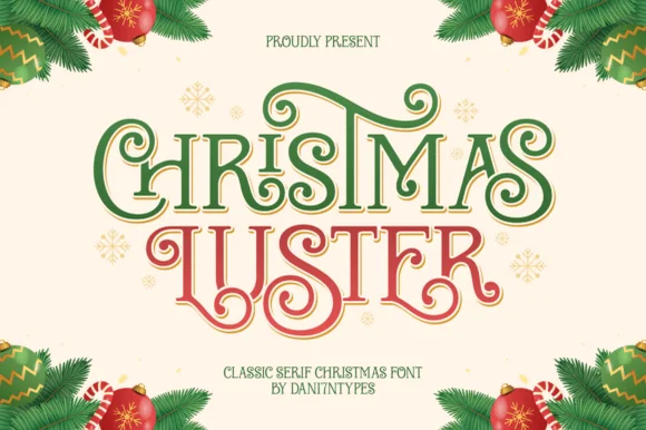
Christmas Luster is actually a lush, swash-curled classic display serif (NOT a connected script!) weaving storybook loops through red-and-green capitals!
Christmas Luster is an ornamental display serif in which the Roman capitals unfurl interlocking spiral curls on the C, H, R and S, giving a word a ribbon-like silhouette while keeping the interior letterforms classical. The curls sit inside and outside the stem, so the setting needs space around each capital, and the contrast is high enough that the hairlines want 20 mm before they hold. Small caps or lowercase would be a natural support but are not implied. It is a card, tin and cover face, best in one metallic or deep crimson ink on cream.
Recommended project & layout
Heirloom cookie tin, Nutcracker print & family card — Color row 1 evergreen and row 2 holly red at 68–135 pt on warm butter-cream cardstock.
Before you cut or print
Solid flared stems + smooth curls foil-stamp and print gorgeously, and cut on 1.3 in+ Cricut sign vinyl!
Best paired with
Get fontPaid link
 #29
Enchanted Chritmas
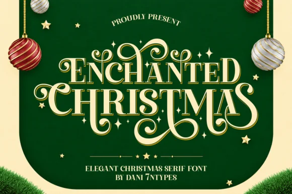
Enchanted Chritmas ('Enchanted Christmas') is an opulent display serif weaving fairytale spiral flourishes across high-contrast Roman capitals.
Enchanted Chritmas is a luxurious ornamental serif with heavy swashes: the caps carry sweeping curls that run above and below the line, the serifs finish in fine points and the contrast between stems and hairlines is extreme. The swashes overlap neighbouring letters, so a word is one drawn unit and cannot be tracked apart. It needs roughly 38 mm for the swash and the fine point to read, and it is best in one metallic or deep ink on cream, or a fine foil above 50 pt where the curls stay sharp.
Recommended project & layout
Foil-pressed Christmas card, Nutcracker program & velvet bag — Stack 2 centered uppercase words at 64–125 pt, activating swash alternates on outer and descending letters.
Before you cut or print
Delicate swash hairlines shine in gold foil stamping, flat print, DTF, and sublimation—size above 1.6 in if blade-cutting vinyl!
Best paired with
Get fontPaid link
 #30
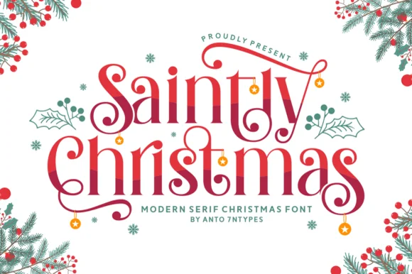
Saintly Christmas
Saintly Christmas is a festive display serif in which the capitals throw long swashes, the serifs are fine and small ornaments hang from the ends, so a greeting reads as a decorated holiday plate.
The capital S opens into a wide swash that travels above the following letters, the C on the second word repeats a similar gesture downward, and the small letters keep a moderate contrast with fine bracketed serifs. Weight sits in the stems, and the swashes are drawn as fine ribbons rather than heavy strokes, which is what keeps the composition light at 40 pt. The dangling ornaments in the sample are separate glyphs, and they are the practical detail: they need to be placed rather than typed, or they land on the wrong letter. Because the swashes cross the line, the face wants generous leading when stacked. The pale ground, the red ink, the fir and berries, the small snowflakes and the two caption lines are presentation; the serif is the two words.
Recommended project & layout
Christmas dinner menu or party invitation — Reserve swash alternates for outer letters only and set menu dishes in an unswashed serif.
Before you cut or print
Thin serif hairlines and spiral terminals suit print and foil best; thicken slightly with a subtle offset if cutting small vinyl.
Best paired with
Get fontPaid link
 #31
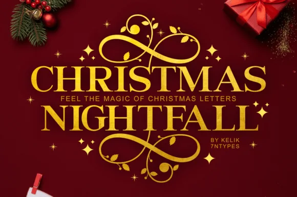
Christmas Nightfall
Christmas Nightfall is a classic, high-contrast ornamental holiday serif crowned with elaborate top-and-bottom gold scrollwork flourishes.
Christmas Nightfall is an opulent holiday display serif with symmetrical filigree swashes: heavy bracketed stems, high thin-thick contrast and a pair of mirrored flourishes that curl off both sides of the word like an engraved frame. The filigree is the design and it closes into a blot as soon as the face is reduced, and the symmetry fixes the block's width. It needs roughly 34 mm for the filigree and the hairline to read, and it is best in one fine gold on a deep ground, or a dense ink on cream with a spot varnish.
Recommended project & layout
Foil holiday gala invite, Christmas Eve menu & velvet box — Insert a narrow tracked sans subline ('FEEL THE MAGIC' or family year) cleanly between the two stacked serif rows.
Before you cut or print
Delicate spiral tendrils and tiny star accents shine in gold foil stamping, print, and sublimation rather than small cut vinyl.
Best paired with
Get fontPaid link
 #32
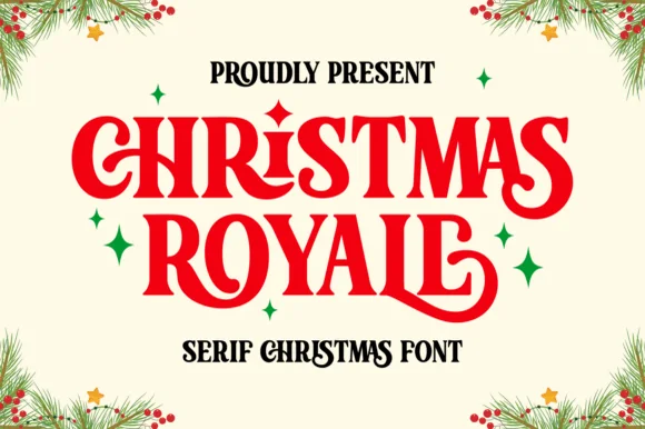
Christmas Royale
Christmas Royale is an ornate serif display in which the stems curl at the foot, a few letters carry a dropped swash and the bars hold drawn diamonds, so a two-word greeting reads as engraved seasonal stationery.
The C rolls both terminals into curls, the H sets two stems with a diamond on the bar, the R turns a swash leg, the S holds a curled spine, the M carries two curved stems and the final S finishes a hooked tail, all at a moderate contrast with fine serifs and ornaments set inside the letters. The curls are the character: they hang below the baseline, which is why the sample sets two stacked words with wide leading and small sparkles around them. Because the strokes are moderate, the face holds from 24 pt and prints in one ink per word, and the ornaments need a smooth sheet. The cream ground, the pine sprigs, the stars and the small line beneath are presentation; the red and black display words are the face.
Recommended project & layout
Holiday cookie tin lid or gift box label — Stack two centered all-caps lines and keep secondary text in a plain sans below.
Before you cut or print
Check tight kerning around swashed capitals R and Y before cutting vinyl decals.
Best paired with
Get fontPaid link
 #33
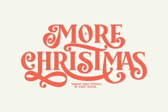
More Christmas
More Christmas is a showstopping modern-retro display serif weaving lavish, ribbon-smooth swash curls and custom ligatures across stacked titles!
More Christmas is a lavish retro display serif in which the swashes of adjacent letters interlock, so the exit stroke of one glyph passes through the entry of the next and the word reads as one ornamented band. The interlocking means the letters cannot be respaced or tracked apart without breaking the joins, and the swashes extend above and below the line. It needs roughly 36 mm for the interlock to read, and it is best in one metallic or deep ink on cream, with foil only at large sizes.
Recommended project & layout
Editorial holiday card, Nutcracker poster & cookie tin — Stack 2 uppercase words tight at 68–135 pt in vermilion red, forest green, or gold foil on warm cotton cream.
Before you cut or print
Smooth, ribbon-thick swash loops (much sturdier than spidery calligraphy!) actually cut on 1.3 in+ Cricut vinyl/HTV and foil-stamp gorgeously!
Best paired with
Get fontPaid link
 #34
Marry Christmas
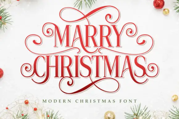
Marry Christmas is a narrow festive serif in which the letters run tall and lean, the capitals carry extended loops and the descenders curl into long tails, so a greeting reads as an engraved seasonal plate.
The capital M is drawn with narrow splayed stems and a raised vertex, and each capital in the phrase carries a hairline loop that extends beyond the letter body, which is what gives the composition its ornamental frame. The lowercase stays narrow with a moderate contrast and fine serifs, so the words read at 30 pt while the loops supply the decoration. Weight sits in the vertical stems and thins at the joins, and the descenders on the second word drop into long curls that overlap the line beneath, which is how the two words interlock in the sample. Counters are narrow but open enough to hold. The pale ground, the red inks, the pine and baubles in the corners and the small caption are presentation; the typeface is the two words.
Recommended project & layout
A Christmas dinner invitation — Place the practical details outside the looped frame.
Before you cut or print
Confirm the exact spelling and accessible alternates.
Best paired with
Get fontPaid link
 #35
Praise
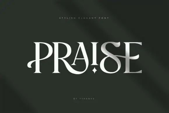
Praise is an elegant display serif in which the stems narrow to blades, the feet flatten into hairline serifs and one counter opens as a small star, so a single word reads as a fashion masthead with one deliberate interruption.
The P opens a blade-like bowl on a thin stem, the R turns a hairline leg, the A pinches to a pointed apex, the I carries a star in place of a dot, the S holds a fine spine and the E sets three thin arms, all at a high contrast with flat unbracketed serifs. The star counter is the character: it is the only ornament in the set, which is why the face carries one word and nothing else. Because the stems are thin, the face needs 40 pt upward and a coated stock, and it reads best as white on a dark ground. The dark green field, the small letter-spaced line above and the credit beneath are presentation; the light display word is the face.
Recommended project & layout
A formal studio-name study — Preserve a clear band below the looping leg.
Before you cut or print
Check name rights and exact alternate access.
Best paired with
Get fontPaid link
 #36
Christmas Family
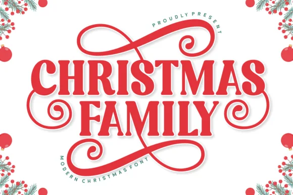
Christmas Family is a sturdy, festive display serif (not a script) crowned and underlined by thick figure-eight gift-ribbon flourishes.
Christmas Family is a bold holiday display slab serif with ribbon swashes: heavy unbracketed slabs, a small notch where the stem meets the slab, and swashes that curl off the caps like a folded ribbon with a visible fold line. The swashes widen a word and the notch is the finest element. It needs roughly 30 mm for the ribbon fold and the notch to read, and it is best in one deep ink plus a spot red on cream, or a fine gold on a dark ground where the ribbon prints as a bright line.
Recommended project & layout
Matching family holiday tee, Santa sack & porch welcome sign — Stack 'CHRISTMAS / FAMILY' (or 'THE [SURNAME] / FAMILY') centered so the top bow and bottom figure-eight loop frame the lockup.
Before you cut or print
Sturdy solid strokes cut cleanly on HTV and vinyl at 1.25 inches+ tall—weld any touching swash ribbons first.
Best paired with
Get fontPaid link
Matched Font Duos & Packs
2 fonts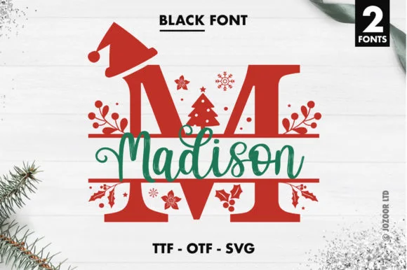 #37
Madison Christmas Split Monogram
Madison Christmas Split Monogram is a two-font holiday set pairing split-bar festive capitals (topped with Santa hats, holly, and trees) with a smooth name script.
Madison Christmas Split Monogram is a festive duo of a Santa-hat split-monogram serif and a script, supplied as font files plus vector cuts: the serif is a bold panel letter split down the middle so a name or an initial sits inside the gap, and the script supplies the second word. The hat and the split are the design, so the panel needs height and the gap must stay open. The split kerf is the finest element and it closes when the face is reduced. It needs roughly 40 mm for the split and the hat to read, and it is best one flat ink or one vinyl colour.
Recommended project & layout
Personalized family pajama crest, ornament & porch flag — Cut or print the split capital at 4.5–7 inches tall in holiday red and center the green or gold script name inside the split gap.
Before you cut or print
On vinyl or HTV, size the split monogram to at least 4.5 inches tall so the small snowflakes and holly berry cutouts weed cleanly.
Best paired with
Get fontPaid link
 #38
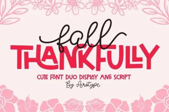
Fall Thankfully
Fall Thankfully pairs a looping monoline cursive script with a heavy, interlocking all-caps sans display face.
Fall Thankfully is a duo of a monoline tail script and a bouncy all-caps sans: the script runs an even stroke that finishes every word with a long lifted tail, while the sans is a chunky capital set whose baseline hops so a short line looks hand-set. The pair is built for autumn market goods, where one line is written and one is printed. The script tail is the finest element and it closes into a dot when reduced. The script needs roughly 28 mm and the sans 24 mm for their detail to read.
Recommended project & layout
Thanksgiving host apron & kitchen tea towel — Set the main family or harvest word in the heavy sans at 2.5 in cap height, then tuck a 1-word script lead-in slightly overlapping the upper-left letters.
Before you cut or print
Weld the overlapping script loops before cutting HTV, and peel away from the narrow 'f' and 'l' ascender counters slowly.
Best paired with
Get fontPaid link
Practical buyer checklist
Frequently asked questions.
Key cutting, printing and pairing answers before choosing a Christmas typeface.
Which Christmas fonts cut cleanly from vinyl?
Scripts with thick connectors and blocks without detached snow or holly details. Anything with separate ornaments, thin swirls or speckled texture should be printed, because those pieces cannot survive weeding.
How small can Christmas script lettering go on a card?
About 14 pt for a holiday script, and 18 pt if it has heart or star details. Below that the connectors close and the flourish turns into a dot that reads as a printing error.
Do Christmas fonts include numbers for dates and years?
Most include 0 to 9, but the quality varies. If a design hinges on a year such as 2026, set those four digits first and check the spacing before building the rest of the layout.
Which Christmas fonts work for foil?
Mid-weight serifs and solid display faces. Hairline scripts and fine ornament fill in under foil pressure, so choose a heavier weight and reduce the foil temperature slightly on textured card.
Keep exploring
Related collections & guides.
Explore adjacent maker roundups or check our practical pre-production checklists.
01 / Holidays & Seasons
Christmas scripts & calligraphy
21 curated fonts · Previews & pairings
02 / Holidays & Seasons
Christmas display, snow & monograms
19 curated fonts · Previews & pairings
03 / Holidays & Seasons
Winter
18 curated fonts · Previews & pairings

04 / Cricut & Craft
Modern farmhouse & wood signs
27 curated fonts · Previews & pairings
Guides: Invitation font checklist · Vinyl & cutting checklist · How to pair script & sans fonts