Neutral Sans Workhorse

Naughty Monster + Monure
Lets Naughty Monster own the focal silhouette while handling secondary copy, sizing and subheads cleanly.
Inspect Monure specimenDisclosure: MakerFileHub may earn a commission from qualifying purchases via paid links on this page. How our links work.
Tall eccentric cartoon capitals
Naughty Monster stretches cartoon letterforms into tall narrow capitals whose cross-strokes run out past their neighbouring letters and whose tops refuse to line up.
Paid link
Get this fontProject & layout blueprintsAt-a-glance maker compatibility
Sturdy stroke walls and open counters weed cleanly on adhesive vinyl, HTV apparel film, and cut cardstock.
Visual anatomy & craft review
The proportions are deliberately awkward: letters are far taller than wide, curves are broad and slightly lopsided, and the cross-strokes on T and E extend across the following letter, which is what makes the sample look drawn by a child on purpose. Spacing is uneven by design, so a centred lockup needs manual adjustment rather than trusting the default fit. Two versions are listed, a clean and a rough cut: the rough one carries a broken contour while the clean one holds a solid edge. The blue horned character on the poster is mascot artwork rather than a glyph, and the starburst behind the word is a separate shape. Below one inch the tall proportions collapse into a picket fence.
Eccentric · Tall · Cartoonish
Two-font hierarchy recipes
Tested contrast partners — pairing Naughty Monster with grounded secondary typography.
Naughty Monster + Monure
Lets Naughty Monster own the focal silhouette while handling secondary copy, sizing and subheads cleanly.
Inspect Monure specimen
Naughty Monster + Papillon Serif – Elegant Modern Luxury
Grounds bold display lettering with classic typographic authority on posters, badges and apparel.
Inspect Papillon Serif – Elegant Modern Luxury specimenPractical applications
Concrete hierarchy, scale and production guidance tailored to Naughty Monster’s stroke geometry.
The eccentric proportions are the party theme in themselves, so the type can carry the mood without a supporting illustration.
Hierarchy & layout recipe
Set the headline at 60 pt on A3, keep the two words on separate lines with manual spacing, and put the time and address in a plain sans at 14 pt in the lower left.
Pre-production check
Confirm which of the two cuts produces the long cross-strokes shown on the cover, because the clean version may keep them shorter.
Tall odd shapes engage children at the top of a worksheet while still being legible from a desk away, which a thinner novelty face would not be.
Hierarchy & layout recipe
Keep the heading at 36 pt across the page top, allow 10 mm below the descending curves, and put every instruction in a plain face so the display alphabet stays decorative.
Pre-production check
Long cross-strokes can enter the instruction column at narrow widths, so check the widest letter against the text block first.
Uneven spacing gives a small seasonal sticker the hand-made feel that a clean display face would lose entirely on a cheap candy bucket.
Hierarchy & layout recipe
Print at 1.5-inch cap height on a 3-inch round label, centre the word manually rather than optically, and leave a 6 mm border inside the cut line all the way round.
Pre-production check
Below one inch the tall narrow shapes become unreadable, so keep this label at the stated size or larger.
Technical & licence verification
Confirm included OTF/TTF/WOFF formats, full glyph tables and licence coverage on the live store page before batch production.
Closest visual alternatives
Matched across letterform anatomy, stroke behaviour and craft applications.

Inflated graffiti letters with hanging drips
Mila is an inflated graffiti display face in black on a dark wall: fat rounded letters with a glossy highlight, a neon green and pink outline, and paint drips hanging from the bottom of each stroke, with a crown splat and a spray can at the edges.
Ideas for this font
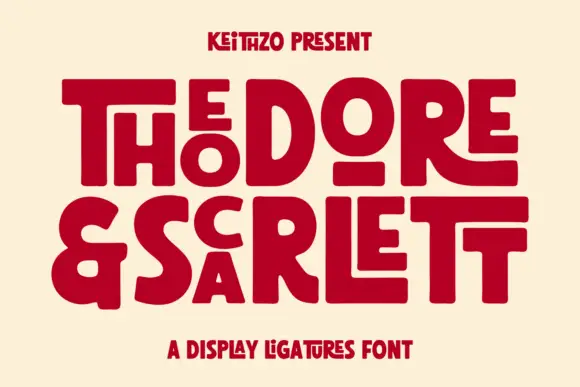
Fat geometric ligature display with nested letters
Theodore and Scarlett is a display ligature face in deep red on cream: fat geometric letters where small letters nest inside the counters of large ones, the two words interlocking so the block reads as one shape with two lines inside it.
Ideas for this font
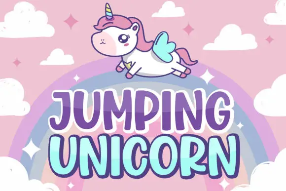
Tall rounded fantasy capitals with a two-tone fill and offset outline
Jumping Unicorn is a tall rounded capital alphabet in which the strokes swell, the counters stay small and a two-tone fill sits inside an offset outline, so a word reads as a storybook title.
Ideas for this font
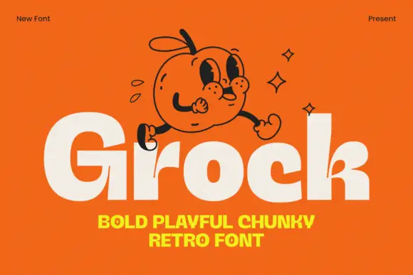
Chunky mixed case with tiny counters and a small branching k junction
Grock is a chunky mixed-case display in which the letter faces stay broad, the o and c openings shrink, the capital stands much taller than the lowercase and the k carries a small branching split, so a name reads as a friendly cartoon wordmark.
Ideas for this font
Allow optional Google Analytics to measure visits and catalogue actions. Your search words and notes are not included. Privacy & storage