High-Contrast Display Serif

Jennies House + The Bilstein Editorial
Pairs sculptural editorial warmth with Jennies House's clean modern geometry.
Inspect The Bilstein Editorial specimenDisclosure: MakerFileHub may earn a commission from qualifying purchases via paid links on this page. How our links work.
Playful duo pairing outlined chunky caps with a monoline script
Jennie's House is a two-cut family in which chunky pastel capitals wear a heavy outline and a monoline script writes a second line, so a short phrase reads as stacked paper stickers.
Paid link
Get this fontProject & layout blueprintsAt-a-glance maker compatibility
Weld or Unite overlapping script joins into one continuous vector path before sending to the blade.
Visual anatomy & craft review
The J hooks a wide foot, the E stacks three short arms, the N keeps two fat stems, the I stands as a plain bar and the S holds a soft spine, all at a chunky weight with rounded corners and a thick contour; the script cut draws a connected line with a tall loop on the W and a hooked h. The layering is the character: the outlined caps sit behind the script in the sample, which gives depth without a shadow effect. Both cuts hold from 26 pt upward and cut cleanly in card. The blue ground, the hot-air balloon, the clouds, the flowers and the small badges are presentation; the outlined caps and brown script are the family.
Duo · Outlined · Playful
Two-font hierarchy recipes
Tested contrast partners — pairing Jennies House with grounded secondary typography.
Jennies House + The Bilstein Editorial
Pairs sculptural editorial warmth with Jennies House's clean modern geometry.
Inspect The Bilstein Editorial specimen
Jennies House + I Heart You
Introduces organic movement on pull-quotes, signatures and gift tags.
Inspect I Heart You specimenPractical applications
Concrete hierarchy, scale and production guidance tailored to Jennies House’s stroke geometry.
The outlined caps read as cut paper, and the script adds a second line without a second material at 60 mm and 34 mm of print.
Hierarchy & layout recipe
Print an A2 banner: set the caps at 60 mm, set the script at 34 mm overlapping the cap feet by 5 mm, and keep 25 mm of border so the outline stays whole.
Pre-production check
An outline that crosses a script line loses its edge; check the banner and keep a clear tonal gap between script and caps.
The chunky outline gives a cutting file its own margin, and the fat strokes stay rigid at 45 mm in card standing on a cake.
Hierarchy & layout recipe
Cut a 180 mm topper: set the caps at 45 mm, keep every stroke at 6 mm of material, and add a 20 mm stem behind a straight letter so the support is hidden.
Pre-production check
A stem behind a curved letter shows through the card; check the topper and place the support behind the flattest stroke.
The friendly caps suit a classroom door, and the outlined letters read at 45 mm from down the corridor on a printed sign.
Hierarchy & layout recipe
Print an A4 sign: set the room name at 45 mm, set the class in a 14 pt rounded sans beneath, and keep 15 mm of margin so the outline clears the door plate.
Pre-production check
A door plate crops the sheet corners; check the plate opening and keep every stroke inside 90 percent of the paper.
Technical & licence verification
Confirm included OTF/TTF/WOFF formats, full glyph tables and licence coverage on the live store page before batch production.
Closest visual alternatives
Matched across letterform anatomy, stroke behaviour and craft applications.
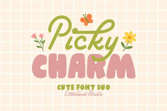
Cute duo pairing a monoline script with puffy lowercase shapes
Picky Charm is a two-cut family in which a monoline script writes the first word and puffy lowercase shapes stack the second, so a two-line design gets a written voice and a soft block from one purchase.
Ideas for this font
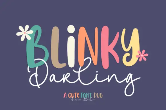
Duo
Blinky Darling Duo shows tall uneven printed forms with rounded ends, each capital in a different pastel tone across a plum ground, above a fine white script line whose D and g carry large open loops and whose tails extend well past the caps.
Ideas for this font
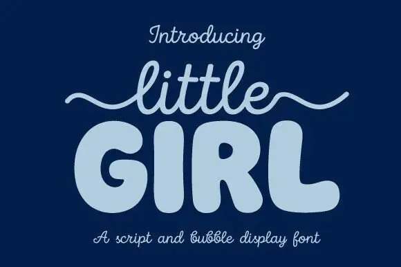
Script and bubble display pair
Little Girl is a duo in pale blue on navy: a light monoline script with a long wavy swash carrying the first word, and a very fat rounded bubble face with fully closed counters for the second, with a caption beneath naming both parts of the pair.
Ideas for this font
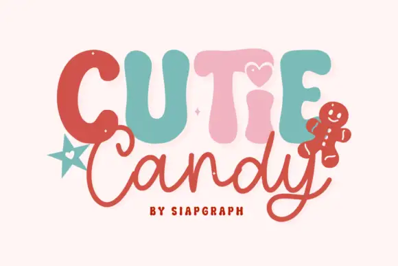
Playful duo pairing puffy candy capitals with a loose monoline script
Cutie Candy is a two-cut family in which puffy pastel capitals bounce along a wavy baseline and a loose monoline script writes the second word, so a short greeting reads as something decorated on a gingerbread tile.
Ideas for this font
Same independent foundry
Allow optional Google Analytics to measure visits and catalogue actions. Your search words and notes are not included. Privacy & storage