Neutral Sans Workhorse

Witches Children + Bielchon
Lets Witches Children own the focal silhouette while handling secondary copy, sizing and subheads cleanly.
Inspect Bielchon specimenDisclosure: MakerFileHub may earn a commission from qualifying purchases via paid links on this page. How our links work.
Tall uneven narrow comic capitals
Witches Children shows tall narrow capitals with rounded curves and slightly leaning stems, where the W opens a deep narrow middle, the C and D use long oval bowls and the R stays compact beside them.
Paid link
Get this fontProject & layout blueprintsAt-a-glance maker compatibility
Sturdy stroke walls and open counters weed cleanly on adhesive vinyl, HTV apparel film, and cut cardstock.
Visual anatomy & craft review
The letters stay narrow and tall, the widths vary, the stems lean a few degrees and the bowls stretch into ovals. That uneven set is the character: the word reads as hand-lettered comic titling rather than a drawn display face, which is why the sample keeps a short title with a seasonal flavour. Because the heights vary, leave room for the tallest letter and the widest W, and keep 34 pt before the narrow bowls pinch shut. The narrow bowls pinch shut first: at 24 pt the o and the e close into slits and the word reads as a picket fence. Keep the title at 34 pt and above, allow room for the tallest letter, and set long words in two rows rather than tracking them tight.
Tall · Uneven · Comic caps
Two-font hierarchy recipes
Tested contrast partners — pairing Witches Children with grounded secondary typography.
Witches Children + Bielchon
Lets Witches Children own the focal silhouette while handling secondary copy, sizing and subheads cleanly.
Inspect Bielchon specimen
Witches Children + Auretha
Grounds bold display lettering with classic typographic authority on posters, badges and apparel.
Inspect Auretha specimenPractical applications
Concrete hierarchy, scale and production guidance tailored to Witches Children’s stroke geometry.
The uneven comic caps suit a seasonal children's poster, and the narrow forms hold a short title at 52 pt on an A3 sheet, where the leaning stems add motion.
Hierarchy & layout recipe
Print an A3 poster: set the title at 52 pt on one row, keep 22 mm beneath before the times at 14 pt, and keep 22 mm of margin so the wide W stays inside.
Pre-production check
Narrow bowls printed at 28 pt close into bars; check the proof and hold the title at 44 pt or above.
The comic caps give a party card energy, and the varied widths hold a name at 32 pt on an A6 sheet, where the oval bowls keep it friendly.
Hierarchy & layout recipe
Print an A6 card: set the name at 32 pt on one row, keep 18 mm of clear ground beneath before the details at 11 pt, and keep 14 mm of margin all round.
Pre-production check
Two uneven rows stacked look misaligned; check the card and keep the second line in a plain sans.
The hand-lettered caps suit a club sign, and the tall stems hold a short name at 46 pt on a printed sheet, where the leaning letters read as playful.
Hierarchy & layout recipe
Print an A4 sign: set the club name at 46 pt on one row, keep 20 mm of clear ground beneath before the times at 12 pt, and keep 18 mm of margin on all four sides.
Pre-production check
A leaning row beside a straight rule looks crooked; check the sheet and keep the rule 6 mm lower.
Technical & licence verification
Confirm included OTF/TTF/WOFF formats, full glyph tables and licence coverage on the live store page before batch production.
Closest visual alternatives
Matched across letterform anatomy, stroke behaviour and craft applications.
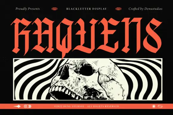
Angular blackletter display
Raquens is a tall angular blackletter in coral red on black: capitals with sharp joins, diamond-like ends on the strokes and narrow bodies, set as one large word above a framed black-and-white illustration of a skull, with a thin orange band along the foot that carries the credit.
Ideas for this font
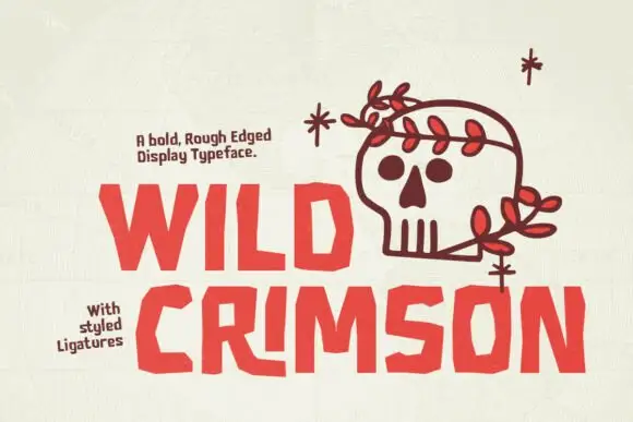
Rough angular display with ligatures
Wild Crimson is a bold rough-edged display in crimson on a textured white sheet: chunky capitals with chopped corners and off-square bowls, some letters replaced by drawn ligature shapes, with a small note above and a ledged note at the left naming the ligatures.
Ideas for this font
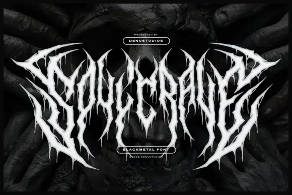
Thorn-spiked black-metal display
Soulcrave is a white black-metal display over a dark mirrored photograph: thorn-like letterforms with long spikes at the terminals, ragged drips below the shapes, mirrored halves and near-symmetrical composition, set as one word with a small presenting line above and two badges at the foot.
Ideas for this font

Narrow pointed blackletter with a long straight p descender
Darkspire is a gothic blackletter display face with sharp calligraphic strokes, splattered edges and a rough texture, built for dark posters and tattoo-inspired lettering.
Ideas for this font
Same independent foundry
Allow optional Google Analytics to measure visits and catalogue actions. Your search words and notes are not included. Privacy & storage