 #1 · Best Overall
Luxury Romantic
Heart-swash formal calligraphy with heavy stems and wide open loops
Get fontPaid link
Read review ↓Disclosure: MakerFileHub may earn a commission from qualifying purchases via paid links on this page. How our links work.
Copperplate swashes & PUA script alternates
Calligraphy for weddings lives on contrast: thick downstrokes, hairline upstrokes and loops that lean with intention. Luxury Romantic and Isabella Monroe hold that structure, Heavytimes and Romantic Touch keep it fine enough for letterpress, and August Wedding and Elegant Wedding add deep swash sets for long names. Nadya brings a 713-glyph upright calligraphy with far more alternates than most.
Quick verdict
Luxury Romantic is the strongest formal calligraphy for an invitation suite, August Wedding handles long names with PUA swashes, and Heavytimes keeps it delicate for small cards. Nadya is the pick when you need a deep alternate set.
Quick answer
Short on time? Start with our three highest-rated bridal calligraphy & swash scripts standouts before scrolling the full breakdown.
#1 · Best OverallHeart-swash formal calligraphy with heavy stems and wide open loops
 #2 · Runner-Up Pick
Fluid slanted ink-pen script with fine joins and a soft even flow
 #3 · Editor's Choice
Delicate heart-tail fine calligraphy with tall loops and open spacing
We kept 27 of 957 candidates after checking the swash and alternate sets rather than just the header letters. Weighted upstroke thickness at 10 pt, loop openness, and whether the alternates are reachable through standard keys or a documented map.
Side-by-side summary
Compare specimens, OpenType/PUA traits and primary project roles side by side.
| Rank & Font | Style & File Specs | Best Project Fit | Store Listing |
|---|---|---|---|
| ScriptAlternates & swashes | Anniversary gift box, acrylic sign or wedding hanger | Get fontPaid link | |
| ScriptOrganic | Classic invitation suite, author signature or boutique tag | Get fontPaid link | |
| ScriptAlternates & swashes | Vow book cover, place card or jewelry backing card | Get fontPaid link | |
| ScriptContinuous | Plotter-drawn place cards or foil vow cover | Get fontPaid link | |
| ScriptPUA encoded · Ligatures · Alternates & swashes | Save-the-date or thank-you card headline | Get fontPaid link |
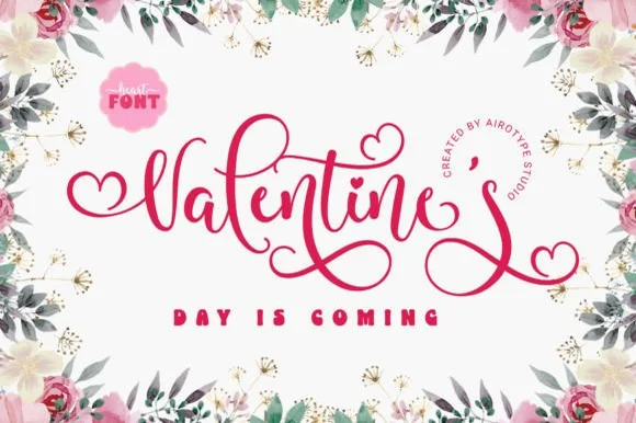
#1 · Best OverallLuxury Romantic is a formal calligraphy script in which the heavy stems alternate with fine hairlines, the capitals open into wide heart-shaped swashes and the loops run far beyond the letter body.
The capital L opens with a broad looped stem that crosses itself and finishes in a heart-shaped swash, and the capital R repeats the gesture on the second word, which is what gives the composition its symmetry. The lowercase keeps a strong contrast: thick downstrokes, hairline upstrokes, small loops on the l and the d and a long curved descender on the y that sweeps under the line. Because the loops leave the letter body, the pair fills a wide format without extra ornament. The hairlines are the fragile part — they need a coated stock and a generous size, and at 30 pt the counters still open cleanly. The dark rose ground, the pink ink and the small arched caption are presentation; the script is the two words.
Anniversary gift box, acrylic sign or wedding hanger — Apply heart tails only on the outer start and end letters of a line.
Fine copperplate hairlines suit print, foil and laser engraving; add a slight offset for vinyl.
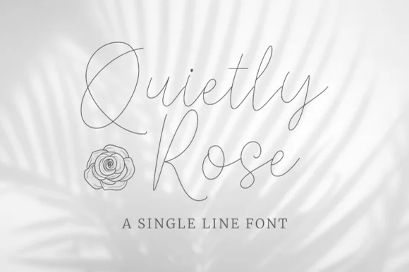
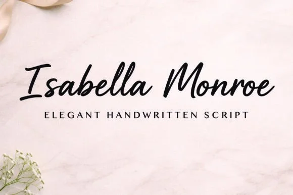
#2 · Runner-Up PickIsabella Monroe is a fluid slanted script in which the strokes flow with a light ink-pen weight, the joins stay fine and the letters lean together as one line of handwriting.
The capital I opens with a narrow looped stem and the letters after it run in an unbroken rhythm: the s reverses through two soft curves, the a closes a small bowl, the b rises into a plain stem, the l loops high and the second capital follows with a wide sweep. Weight varies only slightly between downstrokes and joins, which keeps the line light and even rather than calligraphic. The slant is consistent, so a two-word name reads as one continuous piece of writing at 26 pt and holds at 12 pt on a label. Because the joins are fine, the face needs a smoother stock and a decent print size to stay clean. The marble surface, the black ink, the small botanical element in the corner and the tracked caption are presentation; the script is the two words.
Classic invitation suite, author signature or boutique tag — Pair with classic Garamond/Didone small caps on textured cotton paper.
Medium-fine strokes excel in print, letterpress and digital branding.
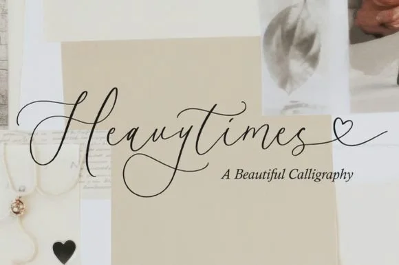
#3 · Editor's ChoiceHeavytimes is delicate fine calligraphy in which the tall loops stay open, the letters are spaced generously and the exit tail runs into a small open heart before finishing.
The capital H opens with a fine entry that curls above the cap line and then two slim stems, and the letters after it keep that delicacy: the e and the a close small bowls, the weak joins stay hairline, the t is crossed with a long thin bar and the y drops a narrow loop. Weight is fine and even, contrast is slight, and the ascenders rise to almost twice the x-height, which is what gives the word its airy height. The phrase finishes with a long exit that draws a small heart just above the baseline before tapering away, and that heart is the only closed decorative shape in the composition. Spacing is generous, so a single word holds a wide panel without tracking. The pale neutrals, the photographic fragments and the small serif caption are presentation; the calligraphy is the word.
Vow book cover, place card or jewelry backing card — Give wide left/right margins so the slender end tail extends freely.
Ultra-fine hairlines are crafted for print, foil and digital stationery rather than vinyl cutting.
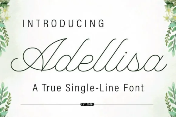 #4 · Top Maker Utility
Adellisa is a true single-line formal calligraphy in which every stroke is the same weight, the loops stay open and the joins cross cleanly on a level baseline.
The capital A opens with a loop that rises above the cap line and closes into a narrow bowl, and the letters after it hold a formal rhythm: the d and the l rise into tall open loops, the e loops back through its own bowl, the s reverses tightly and the i carries a small round dot. Because the line is a true single weight, there is no contrast at all: the joins, the stems and the loops are all drawn at one thickness, which is what makes the face suitable for engraving, monoline plotting and foil where a shaded script would fill in. The loops stay open enough to read at 18 pt, and the ends taper slightly. The botanical corners, the pale ground and the two caption lines are presentation; the calligraphy is the word.
Plotter-drawn place cards or foil vow cover — Set Operation to Draw/Foil and test pen pressure on a spare envelope first.
True single-line font: may look open/unclosed in standard word processors until rendered as a stroke path.
 #5 · Standout Silhouette
Bunglon is a modern copperplate script in which the downstrokes carry weight, the hairlines stay fine and generous swashes arch above the x-height and below the baseline, so a single name reads as formal calligraphy.
The B opens a wide upper loop, the bowls swell on the downstroke and thin on the join, the ascenders carry tall loops and the swash set adds long arcs that clear the word above and below. The overhead swashes are the character: they frame a name without a border, which is why the sample sets one couple's name on a plain card. Because the swashes are long, a line needs 20 mm of clearance at both ends, and the joins must be welded before cutting from 1.1 inches of x-height. The pale ground, the fine rules and the small caps line are presentation; the dark calligraphic name is the face.
Save-the-date or thank-you card headline — Use swashed forms sparingly on first and last letters and keep event logistics in a clean serif.
Fine hairlines suit print and foil; thicken with a small offset path if adapting for large vinyl signs.
 #6
Lovely sets a fine signature script in a single dark weight over a pale city photograph, where a wide entry curve opens low at the left, the letters rise into tall slender loops through the middle and a large descending y plus an extended closing sweep make the lower right part of the footprint.
The stroke stays thin and even, the loops stay tall, the entry runs wide and the exit sweeps out. That asymmetry is the character: the word is wider at the right than the left, which is why the sample sits on a generous square field rather than a strip. The building behind it is scenery, not part of the type. Keep 26 pt as the floor, allow 25 mm of clear space at the right for the exit sweep and check the y loop against any line placed beneath.
A quiet wedding invitation heading — Use a single script heading above the names. Keep a clear band beneath its lowest strokes, then set the venue and time in plain text.
Print at invitation size and check contrast on the chosen paper. Do not use the fine script for the address or RSVP instructions.
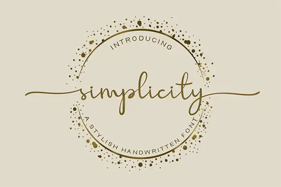 #7
Simplicity sets a fine lowercase word across an ornamental ring, with long swashes extending beyond the circle on either side. The l rises above a low lowercase body, the p drops below it, the final y carries a narrow descending loop and the long end strokes supply much of the width.
The body stays low and fine, the ascender rises, the descender loops and the end strokes travel far out. Those long exits are the character: the word reaches past its own bounding box, which is why the sample lets it cross a decorative ring. The ring is separate artwork rather than an included ornament, so plan the exits in your layout, keep 26 pt for the fine joins and give at least 24 mm of clear space at each end.
A botanical maker’s round seal — Keep the words across the circle’s centre. Break the ring where the letters or swashes cross it instead of running a line through the text.
Check the real phrase and ring clearance at seal size; the gold border is artwork, not a promised glyph.
 #8
Hailey is a beauty script in which the strokes stay medium in weight, the ascenders loop high and long swashes enter and leave the word, so a single name reads as a written logo on a soft ground.
The h climbs a tall loop, the a closes a round bowl, the i carries a light dot, the l rises into a second loop, the e turns a light eye and the y drops a wide tail, all at a medium brush weight with generous entry and exit swashes and a gentle slope. The swashes are the character: they sit outside the word and take as much width as the letters, which is why the sample sets one name across a circular panel. Because the downstrokes are medium, the face holds from 26 pt and prints on smooth stock. The blush circle, the botanical sprig, the arched lettering above and the small caps beneath are presentation; the dark script name is the face.
A floral guest-book name cover — Keep the name alone in the centre, with a small plain date well below its lowest loop; put floral art in one distant corner.
Confirm the exact swash variants and leave ample vertical space.
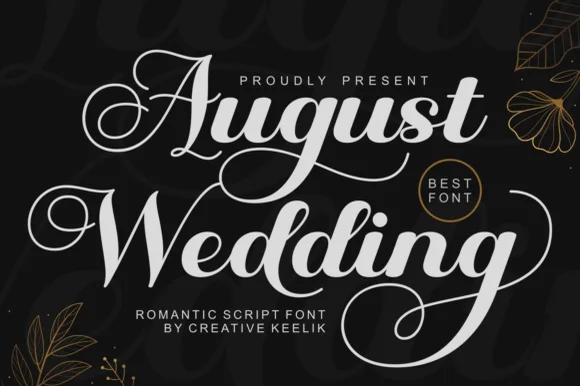 #9
August Wedding is a PUA-encoded modern bridal calligraphy script pairing thick, vinyl-sturdy downstrokes with sweeping 'A/W/g' swash loops!
August Wedding is a lush bridal calligraphy script with thick vinyl-sturdy downstrokes, tall swash loops on the A, W and g and a PUA alternate set, so a name reads as engraved stationery rather than a casual hand. The heavy downstroke survives a cutting machine and a foil, while the swashes extend the word at both ends and need clearance. It needs roughly 24 mm for the swashes to read, and it is best in white on matte black or a fine gold foil on ivory.
Frosted-acrylic wedding welcome sign, mirror decal & invite — Stack 2 title-case words at 68–135 pt in white or champagne-gold vinyl on dark smoked or frosted acrylic.
Copy PUA swash alternates via Character Map/Font Book, then Weld overlapping cursive joins before cutting Oracal 651!
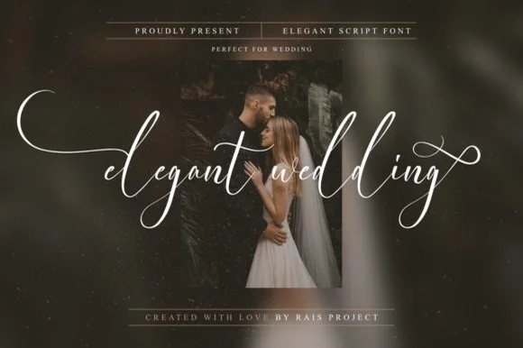 #10
Elegant Wedding is a PUA-encoded wispy fine-art calligraphy script stretching dramatic horizontal wing swashes from lowercase initial and final letters.
An ultra-delicate bridal script floating in crisp white across a moody couple portrait: airy upright cursive with sweeping fine-line flourishes that extend left and right, PUA-encoded so the swashes are reachable in any application rather than through a glyph panel. The hairlines are the whole character of the face, which sets a high size floor, and the upright axis keeps a long word readable across a photograph where a slanted script would fight the composition. The portrait is staging. Uses are save-the-dates, foil invitations, album covers and boutique packaging where a delicate line is affordable to print or plot.
Save-the-date photo overlay, foil invitation & gallery album — Set all-lowercase words at 56–110 pt centered horizontally across dark moody portraits.
PUA-encoded swashes work in all apps; ultra-thin hairline weight is best for flat print, foil press, Cricut Pens, and 1.8 in+ large sign vinyl.
 #11
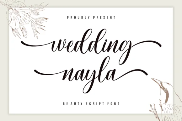
Wedding Nayla is a romantic modern bridal script featuring long, graceful horizontal entry and exit tails built for signs, hangers, and invitations.
Wedding Nayla is a modern wedding calligraphy script with sweeping lead-in and end tails: a light-to-medium contrast, a wide oval axis, a modest slant and tails that extend well past the word on both sides. The tails mean a centred layout needs side clearance, and the hairlines are the first thing to break on textured stock. It needs roughly 24 mm for the lead-in and the tail to read, and it is best in one warm ink on smooth ivory, or a foil impression above 38 pt where the tail can still carry.
Acrylic wedding welcome sign, bridesmaid box & table name — Set lowercase names at 60–115 pt with sweeping left/right end tails above ultra-wide-tracked (+450) serif micro-caps.
Weld overlapping cursive joins in Cricut Design Space before cutting permanent Oracal 651 or HTV, and size above 1.2 in!
 #12
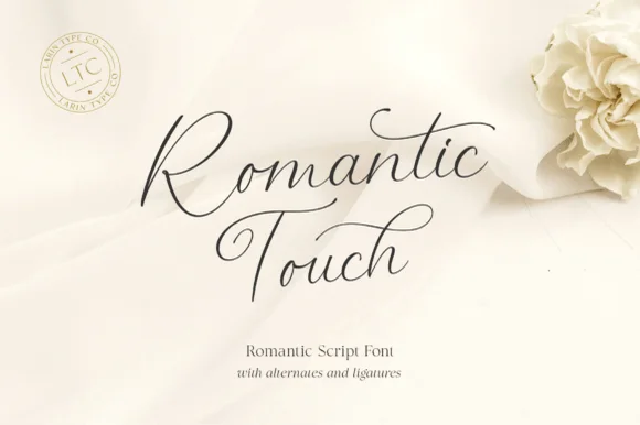
Romantic Touch is a feather-light, fluid handwritten script featuring wide looped capitals, flying t-crossbars, and delicate nib movement.
Romantic Touch is an ultra-fine fountain-pen script with wide looped capitals, flying t crossbars and delicate nib movement, so a name reads as written with a light hand on good paper rather than as engraved calligraphy. The hairlines are the design, which means the face needs size and a smooth stock, and the flying crossbar extends past the letter. It needs roughly 24 mm for the hairlines to hold and 10 mm in a card, and it is best in one fine dark ink on ivory or as a light foil on matte board.
Vellum invitation wrap, silk-ribbon print & vow booklet — Center 2 stacked words at 42–64 pt with 1.15 line spacing and wide 1.25-inch margins.
Hairline fountain-pen strokes belong in flat print, letterpress, Foil Quill, or Cricut Pen addressing—not cut vinyl.
 #13
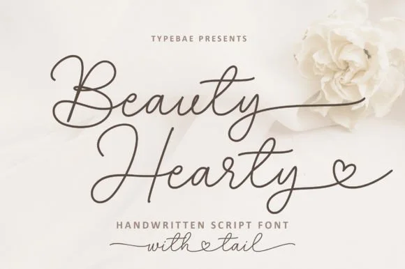
Beauty Hearty is a slender, wide-looped handwritten calligraphy script featuring dramatic crossbars and dainty heart-tipped terminal tails.
Beauty Hearty is an airy calligraphy script with expansive wide looped capitals on the B and H, flying t crossbars and terminal tails that resolve into delicate open hearts. The contrast runs from a shaded downstroke to a hairline exit, and the rhythm is unhurried, which keeps the face romantic rather than hurried. Heart tails extend past the word, so the layout must reserve space to the right of the final letter; hairline exits need roughly 16 mm before they hold in print. It is a keepsake face, best on ribbon, stationery and small printed tokens.
Bridal bouquet ribbon, invitation belly-band & vow book — Stack 2 title-case words at 48–80 pt and echo the heart-connected style in smaller lowercase ('with ♡ tail') below.
Ultra-fine strokes are engineered for flat printing, foil stamping, and Foil Quill—not small blade-cut vinyl.
 #14
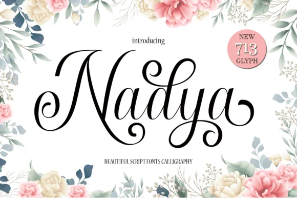
Nadya is an expressive upright calligraphy script packed with 713 glyphs, spiraled terminal droplets, and soaring looped ascenders.
Nadya is a romantic upright calligraphy script with more than seven hundred glyphs and curls: a moderate contrast stroke on a nearly vertical axis, wide oval bowls, joined letters and curled entries that turn back over the word. The glyph count means a phrase can be tuned with alternates so no two joins repeat, and the curls need side clearance. It needs roughly 26 mm for the curl and the join to read, and it is best in one fine ink on smooth card, or a foil impression above 38 pt where the curls still turn.
Floral bridal shower sign, invitation suite & menu title — Spotlight first names at 48–68 pt centered inside botanical borders, paired with 9 pt tracked serif dates underneath.
Hairline upstrokes and delicate spiral droplets reproduce best via flat printing, foil, or large 2.5 in+ acrylic sign decals.
 #15
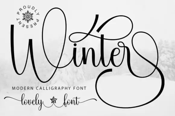
Winter surrounds its small joined middle with a tall W loop, a high t sweep and a very large lower terminal, where the final stroke returns in a wide loop beneath and beside the word and fills almost half of the square field around it.
The letters stay connected and medium weight, the initial loop rises high, the t sweeps wide and the closing stroke falls into a vast loop that wraps under the word. That terminal is the character: the silhouette is nearly square rather than a narrow strip, which is why the sample cannot be cropped into a banner. Snow imagery around the field is context. Keep 30 pt for the hairlines, plan a square or very wide area for the word and check the loop against your trim before committing.
A winter concert programme cover — Give the title most of a square cover and set performers and venue on a plain inside page. Leave the lower terminal clear of the cover edge.
Try the real words before reserving a loop; the preview’s terminal may depend on a specific alternate.
 #16
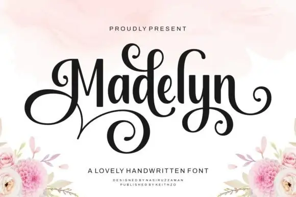
Madelyn uses upright dark stems with a large looping M and curled d, y and terminal strokes, where a broad lower spiral extends beneath the left half of the name and floral corner illustrations sit around it as separate artwork.
The stems stand upright, the contrast swings from thick to hairline, the initial spirals and one descender curls wide. That upright stance is the character: the name reads as a signed inscription rather than a slanted hand, which is why the sample keeps one word centred. The floral corners are separate artwork, so plan 24 mm beneath the spiral, keep 30 pt for the hairlines and check the M loop against the margin. The initial spiral is the stroke that breaks: it is drawn on the hairline, so it snaps in foil and closes into a blob below about 30 pt, which is why one word on a card is the honest use.
A guest-book name cover — Centre the name in the upper half and place the plain guest-book label well below the spiral, leaving flowers at the bottom corners.
Check the exact initial and available curls.
 #17
Hello Honey is fine lowercase script in which the two words are joined by a heart drawn into the connector, with long flat tails on both sides and a small even x-height.
The phrase begins with a flat entry that comes in well to the left, then the h rises into a tall plain stem, and the lowercase that follows stays small and fine: the e loops back through its bowl, the two l letters stand as narrow stems, the o closes a round counter and the n holds an even shoulder. In the middle of the line the pen rises into an open heart before joining the second word, and the line ends with a long flat tail that mirrors the entry. Weight is fine and even with slight contrast at the turns, and the ends taper to points. The heart is the only closed decorative shape, which keeps the line from reading as ornament. The cream ground, the pink ink and the two tracked captions are presentation; the script is the two words.
A heart-centred personal greeting — Keep both words on one wide line with a plain sender line below the y; avoid a second border or competing heart motif.
Verify the exact heart-linked alternate and fine-line output.
 #18
Welcome features relaxed lowercase cursive with long level beginning and ending swash tails, tailored for round wood signs and entryways, where the smooth monoline-leaning strokes and open letter spacing keep words calm while the extended w and e tails span a circular blank.
The stroke stays one width, the spacing opens, the tails run level and the word sits calm. That level tail is the character: the greeting stretches to the width of a round board without a bigger point size, which is why the sample targets door signs. Plan the tails against the blank's curve, keep the stroke at 3 mm for cutting, and check the exits in your own word before committing the sign. The wide tail is also the weak point on a shaped blank: it has to end inside the panel, so a 12 mm tail on a 300 mm round board is safe and anything longer gets trimmed at the edge.
Round wood welcome sign or nursery plaque — Centre the tailed lowercase word across the middle third and tuck family names below in small caps.
PUA-encoded tails weld cleanly in Cricut/Silhouette; verify thin tail tips before weeding small decals.
 #19
I Heart You runs a fine connected phrase along one long baseline, where a heart replaces the dot on the opening i and two more hearts rise above the joins between words, with long entrance and exit strokes widening the phrase on both sides.
The stroke stays one even monoline weight, the letters stay connected, the hearts sit on the joins rather than beside them and the ends run long. Those heart joins are the character, because the phrase is drawn as a single ribbon with three interruptions. The small typeface label beneath is cover text. Check how the heart is reached in your file, keep 26 pt so the monoline stays unbroken and remember that a cutting machine will need the hearts joined to the letters.
A single-line Valentine front — Centre the phrase on a wide card with generous end margins. Put the recipient name on the reverse rather than squeezing it between the heart loops.
Confirm the required heart alternates; single-line machine behaviour is not tested.
 #20
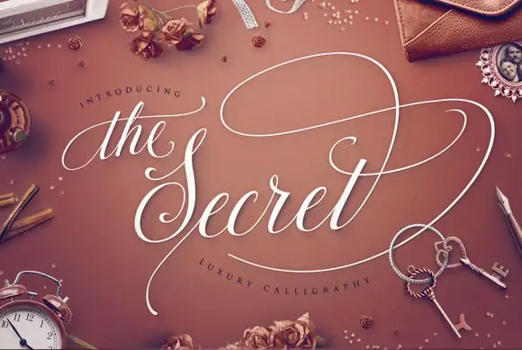
The Secret is luxury calligraphy in which a broad swash carries across the whole phrase, the stems are shaded and thin and the ornament is drawn at the same weight as the joins.
The opening article is set small and fine above the word, and the capital S below it opens with a heavy shaded stem before the letters settle into a formal rhythm: the e and the c close tight bowls, the r keeps a fine arm, the t is crossed lightly and the final t lifts into a swash that climbs and curls away. The organising gesture is the long loop that leaves the top of the phrase and travels above the words before returning, which is what gives the composition its luxury feel at 40 pt and above. Contrast is high, the ends taper to points and the joins are hairline, so the face needs a coated stock and a decent size to hold. The warm ground, the white ink, the small objects scattered around and the two tracked captions are presentation; the calligraphy is the words.
A formal name-and-vow folio — Reserve most of the cover for script and put names/date in a plain footer below the lowest sweep.
Verify the precise swash alternates and hairline reproduction.
 #21
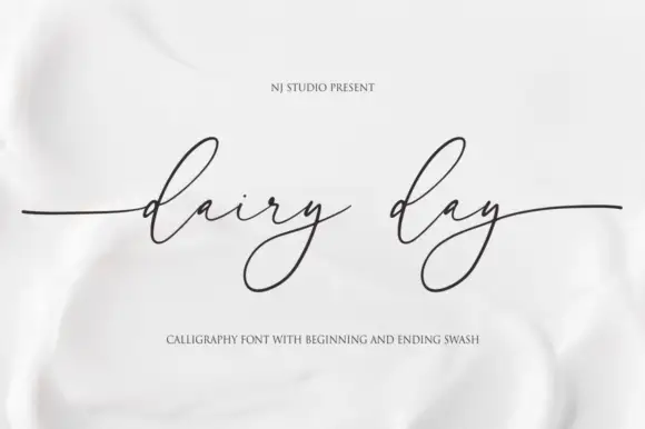
Dairy Day shows a tiny connected lowercase body with long narrow d ascender loops, where each y falls into a large angled lower loop and long horizontal side strokes extend well beyond the phrase.
The x-height stays low, the ascenders run tall and narrow, the y loops angle down and the entry and exit strokes stretch sideways past the last letter. That contrast between a tiny body and huge loops is the character: the line reads as a fine inscription rather than everyday handwriting, which is why the sample keeps the phrase short. Because the side strokes travel, keep 22 mm at each end from 28 pt, and check the fine joins on the actual stock rather than trusting a screen preview.
A small dairy-range heading — Use a large clean front-panel title with weight/ingredients below the deep y loops in plain type.
Proof hairlines on the actual label stock.
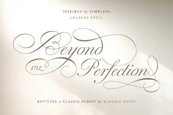 #22
Beyond Perfection is a delicate calligraphic script in which the capitals open into wide enclosing loops, the hairlines stay fine, the joins run unbroken and the final letter returns a stroke beneath the line, so a name reads as copperplate on an invitation.
The B wraps a broad left loop around its stem, the lowercase keeps a narrow body with fine ascending loops, the connectors hold one weight from letter to letter and the closing n sends a return stroke that travels under the whole word. The enclosing loop is the character: it wraps the first letter, which is why the sample sets one name and a second short line. The family ships over four hundred alternates, swashes and ligatures, so a maker can swap a terminal per project rather than accept the default. Because the hairlines are fine, the face wants 20 pt in print and welds before cutting from 1.1 inches of x-height. The pale field and the fine rules are presentation.
A ceremonial programme cover — Leave broad outside margins around the title and put the running order on a plain interior page.
Check the selected alternates in the actual programme title.
 #23
Farmhouse is a bouncing tail script in which the letters sit at different heights, the strokes swell on the downstroke and long swashes enter and leave the word, so a name reads as hand lettering on a painted board.
The f rises into a tall loop, the a closes a round bowl, the r finishes a light arm, the m keeps three even shoulders, the h climbs a tall stem and the e turns a light eye, all at a brush contrast with a bouncing baseline and swashes drawn at both ends of the word. The bounce is the character: the letters shift up and down around a nominal line, which is why the sample sets one name across a wide board with room for the swashes. Because the downstrokes are heavy, the face holds from 24 pt and prints on most stocks; the swash tails need margin on both sides. The white board, the arch of small caps above and the credit below are presentation; the black script name is the face.
A farm-shop welcome strip — Place the phrase across a wide strip and put opening hours in a plain block below the lowest f loop, with no wood texture behind the letters.
Check actual tail variants and visibility at the intended distance.
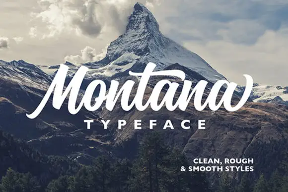 #24
Montana is a heavy slanted brush script in which the stems carry dark weight, the M rises tall and angular, the t bar runs broad and the closing letter lifts into a high terminal, so a short headline reads as painted signage.
The M builds two tall slanted peaks under a wide bridge, the t carries a crossbar longer than the letter needs, the a closes a dark bowl and lifts its exit stroke, and the final letters push their terminals high above the x-height line. The slant is the character: every stem leans at the same angle, which is why the sample sets one line of thick script under a thin rule. Because the joins are heavy and continuous, the face welds into one path and cuts from 2.2 inches of x-height in vinyl; below that the brush edge frays. The cream ground, the torn paper edge and the small caps credit beneath are presentation; the dark painted word is the face. The maker supplies clean, rough and smooth versions, so a project can pick the texture before cutting rather than adding it later.
An outdoor-club event title — Keep the title in a clear central band above a plain meeting point and schedule, with the landscape below rather than through the letters.
Check the supplied style variants and the actual title.
 #25
Autography sets a narrow handwritten word framed by a large heart at the right and a smaller heart above the opening letters, where the capital A carries a long thin diagonal and a looping lower stroke, a broad cross stroke runs across the upper middle and the final y descends deeply beside the large heart.
The strokes stay hairline and monoline, the letters stay narrow, the crossbar stretches wide and the y drops deep. That framing is the character: the two hearts bracket the word rather than sit around it, which is why the composition runs much taller than a signature line. The hearts may be drawn graphics rather than glyphs. Keep 30 pt for the hairlines, plan 25 mm to the right for the large heart and check the file before promising the hearts inside a name.
A guest-book cover with a name pair — Centre the names with generous space above for a single heart. Place “Our guest book” in plain type beneath the lowest descending stroke.
Verify the heart alternates and actual name arrangement; this single-word preview does not show an automatic name-pair feature.
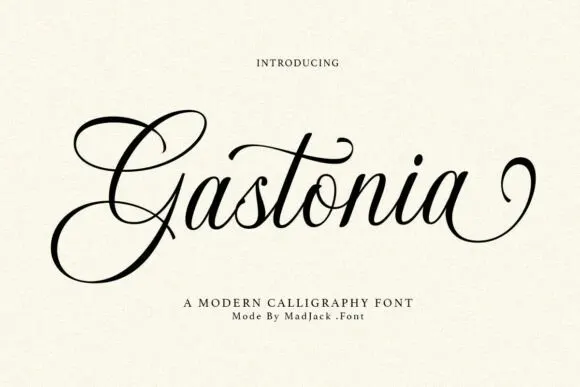 #26
Gastonia Script leads with a large double-looped G that extends far above and below the lowercase body, a long crossbar arcs across the central t and the final stroke climbs into a separate loop on the right.
The downstrokes stay dark and thick, the joins thin to hairlines, the capital opens two loops and one crossbar reaches across the middle of the word. The oversized capital is the character: the word begins with a drawn shape that sets the height for everything after it, which is why the sample sets a single name. Because the capital travels up and down and the last stroke loops away, keep 22 mm above and 20 mm below from 28 pt. The extra characters are encoded, so any added flourish is a deliberate step.
A reception menu title — Place the heading above a generous gap, then list courses in plain type. Keep the lower G loop out of the first course line.
Proof the two-word phrase and check whether the final flourish can be shortened on a narrow menu.
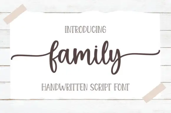 #27
Family is a low connected script in which the body sits close to the baseline, the stroke stays even and both ends run out as wide flat tails, so a short word reads as a caption signed across a card.
The f rises into a narrow loop before the body, the a holds a small bowl, the m keeps three even arches, the i carries a light dot and the l rises into a plain stem, all at an even medium weight with short joins. The low body and the long tails are the character: the word occupies little height but plenty of width, which is what makes the face useful where a photo or a fold needs space above and below. Because the stroke is even, it holds at 18 pt on a printed card, and the tails can be trimmed without breaking the word. The white card taped to a wall, the dark ink, the two caps lines are presentation; the script is the word shown.
A family celebration heading — Set one line above plain recipient and date details with clear space below y.
Preview exact wording and side-tail bounds.
Practical buyer checklist
Key cutting, printing and pairing answers before choosing a bridal calligraphy & swash scripts typeface.
They are stored on alternate and private-use keys rather than on the standard letters. Use Character Map or Font Book to copy the glyph, or enable stylistic alternates in a design app that supports OpenType features.
Rarely at small sizes. The hairline upstrokes are thinner than a blade kerf, so the connectors break during weeding. If a cut sign is required, choose a monoline script or scale the design so the upstroke clears 0.5 mm.
Medium-contrast scripts with open loops. Very fine hairline calligraphy fills in under the plate pressure, while a heavy brush script loses the delicacy people expect from letterpress. Proof the exact combination on the exact paper.
Use the swash alternates on the first and last letter only, reduce the point size in small increments, and check that the exit swash still fits inside the margin. Stretching a script horizontally always looks wrong.
Keep exploring
Explore adjacent maker roundups or check our practical pre-production checklists.
36 curated fonts · Previews & pairings
23 curated fonts · Previews & pairings
19 curated fonts · Previews & pairings
15 curated fonts · Previews & pairings
Guides: Invitation font checklist · Vinyl & cutting checklist · How to pair script & sans fonts
Allow optional Google Analytics to measure visits and catalogue actions. Your search words and notes are not included. Privacy & storage