 #1 · Best Overall
Disclosure: MakerFileHub may earn a commission from qualifying purchases via paid links on this page. How our links work.
Script plus sans pairs in one download
32 Best Font Duos & Pairing Families
A duo removes the hardest part of pairing: someone drew both faces to sit together. Vintage Postman and Picky Charm pair a vintage stamp sans with a monoline script, Jennies House and Rustic Pantry keep the rounded block plus script formula, and Boho Wedding Duo adds a condensed Deco serif with an ultra-light sans. Camila Ashton and Home Lemonade show how far a duo can stretch into a whole brand.
Quick verdict
Vintage Postman is the most versatile duo for print and craft, Jennies House works for nursery and gift ranges, and Boho Wedding Duo is the pick for an editorial wedding look. Home Lemonade covers the full farmhouse system.
Quick answer
Top 3 font duos & pairings picks right now.
Short on time? Start with our three highest-rated font duos & pairings standouts before scrolling the full breakdown.
#1 · Best Overall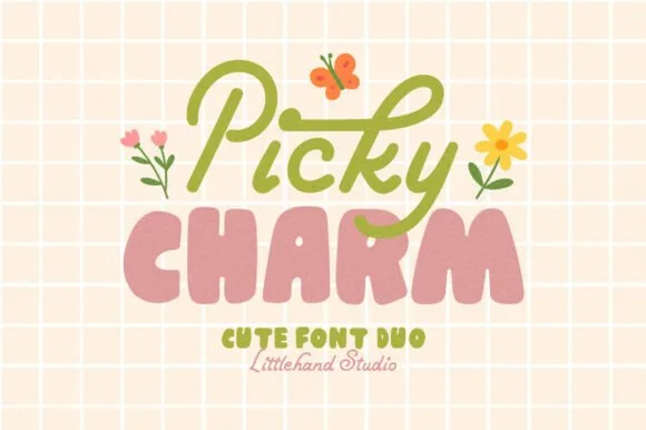 #2 · Runner-Up Pick
Picky Charm
Cute duo pairing a monoline script with puffy lowercase shapes
Get fontPaid link
Read review ↓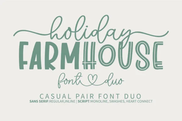 #3 · Editor's Choice
How we tested & selected these 32 fonts
We kept 32 duos out of 282, verifying that the two faces actually share x-height, contrast and stroke logic rather than being two unrelated fonts bundled together. Weighted whether a third accent weight exists, and whether both halves work alone.
Side-by-side summary
Top 5 font duos & pairings picks at a glance.
Compare specimens, OpenType/PUA traits and primary project roles side by side.
| Rank & Font | Style & File Specs | Best Project Fit | Store Listing |
|---|---|---|---|
| DuoLigatures · Alternates & swashes | Coffee bag label, travel poster or surf-shop tee | Get fontPaid link | |
| DisplaySweet | Bakery sticker seal, party invite or nursery print | Get fontPaid link | |
| DuoCozy | Farmhouse wood sign, tiered-tray plaque or kitchen towel | Get fontPaid link | |
| DisplayWhimsical | Nursery door plaque, baby shower welcome sign or kids' room print | Get fontPaid link | |
| DuoAlternates & swashes | Custom notepad header, teacher gift tag or binder cover | Get fontPaid link |
Matched Font Duos & Packs
32 fonts#1 · Best OverallVintage Postman
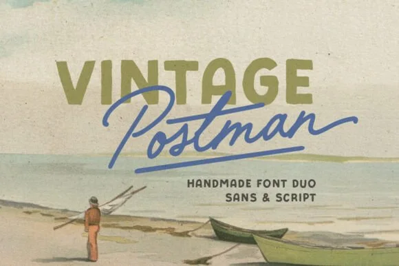
Vintage Postman pairs a sturdy retro sans with the look of a soft rubber stamp and a brisk monoline brush script: the olive sans holds a solid horizontal line while the angled script cuts across the baseline with a hand-signed slant.
The sans cut keeps even stems, softly rounded corners and a slightly uneven impression, and the script cut draws a monoline stroke at a steady width with a sharp slant and quick connectors. The pairing of a grounded row and an angled line is the character: one gives structure and the other gives motion, which is why the sample sets the olive words above the blue signature. Because the script slants, keep 18 mm between the rows and 20 mm at the right for the exit; the sans stays readable from 0.35 inches of pen height.
Recommended project & layout
Coffee bag label, travel poster or surf-shop tee — Set the geographical or brand noun in all-caps sans and overlap the descriptor in angled script.
Before you cut or print
Check light organic edge texture on the sans if cutting decals under 1.5 inches.
Best paired with
Get fontPaid link
#2 · Runner-Up PickPicky Charm
Picky Charm is a two-cut family in which a monoline script writes the first word and puffy lowercase shapes stack the second, so a two-line design gets a written voice and a soft block from one purchase.
The script draws a tall P with a hooked bowl, a light i, a curly c and a looped k; the puffy cut builds fat lowercase shapes with tiny counters and rounded joins. The pairing is the character: the script is thin and loopy and the puffy cut is heavy and blunt, which is why the sample sets them on two lines at very different sizes. The script holds at 20 pt and the puffy cut fills a card at 60 pt, and both print in one flat colour each. The pale grid ground, the butterfly, the daisies and the studio line are presentation; the green script and pink puffy words are the family.
Recommended project & layout
Bakery sticker seal, party invite or nursery print — Stack the monoline script slightly tucked into the top of the chunky all-caps word.
Before you cut or print
Both fonts feature clean smooth outlines that cut and weed easily on craft vinyl.
Best paired with
Get fontPaid link
#3 · Editor's ChoiceHoliday Farmhouse
Holiday Farmhouse pairs a tall hand-drawn inline farmhouse sans with an airy heart-connected monoline script, so a rustic sign can carry a structured capital line above a soft written phrase.
The sans cut stays tall with an inline channel running down each stem, the script stays monoline and light and its connectors meet at a small heart, and the two differ enough in weight to read as separate voices. The inline channel is the character: it lets the capital line look painted with a liner brush, which is why the sample suits tiered tray decor. Because the inline is narrow, keep 30 pt before it closes, and keep 18 mm at the end of the script for the heart join.
Recommended project & layout
Farmhouse wood sign, tiered-tray plaque or kitchen towel — Centre the tall all-caps noun and drape the monoline script lightly above and below.
Before you cut or print
Use the Regular (solid) sans file for small vinyl decals; save the Inline version for signs 3"+ tall.
Best paired with
Get fontPaid link
 #4 · Top Maker Utility
Jennies House
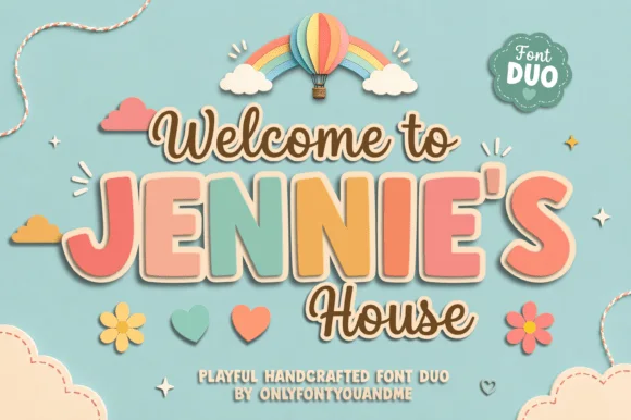
Jennie's House is a two-cut family in which chunky pastel capitals wear a heavy outline and a monoline script writes a second line, so a short phrase reads as stacked paper stickers.
The J hooks a wide foot, the E stacks three short arms, the N keeps two fat stems, the I stands as a plain bar and the S holds a soft spine, all at a chunky weight with rounded corners and a thick contour; the script cut draws a connected line with a tall loop on the W and a hooked h. The layering is the character: the outlined caps sit behind the script in the sample, which gives depth without a shadow effect. Both cuts hold from 26 pt upward and cut cleanly in card. The blue ground, the hot-air balloon, the clouds, the flowers and the small badges are presentation; the outlined caps and brown script are the family.
Recommended project & layout
Nursery door plaque, baby shower welcome sign or kids' room print — Set the child's name in large coral/sage block caps framed by smaller script lines.
Before you cut or print
Both fonts use smooth vector shapes that cut cleanly on vinyl and wood/acrylic.
Best paired with
Get fontPaid link
 #5 · Standout Silhouette
Sticky Planner
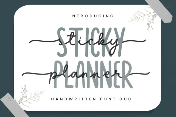
Sticky Planner pairs a tall narrow organiser sans with a horizontal-tailed script and encodes the extra characters, so a planner cover can stack two matched weights into one header without hunting for a second face.
The sans cut stays narrow and upright with even stems, the script runs a light body with a tail that extends horizontally and carries a small heart at the end, and the two share a similar x-height when stacked. The matched pair is the character: one line organises and the other signs off, which is why the sample layers them on stationery. Because the script tail travels, keep 18 mm at the right from 24 pt, and check the encoded alternates before relying on the heart.
Recommended project & layout
Custom notepad header, teacher gift tag or binder cover — Set the tall sans in muted grey/sage and layer dark script slightly offset.
Before you cut or print
PUA encoded; weld cursive joins if cutting vinyl binder decals.
Best paired with
Get fontPaid link
 #6
Rustic Pantry
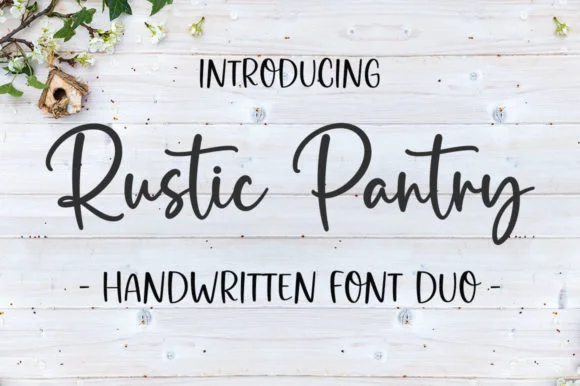
Rustic Pantry is a coordinated farmhouse font duo pairing a lively bouncy cursive script with a tall, narrow hand-drawn uppercase sans.
Rustic Pantry is a duo of a bouncy farmhouse brush script and a tall skinny marker sans: the script runs a loaded stroke with small flicks, a rising baseline and joined letters, while the sans is narrow with blunt marker ends for prices and lists. The two voices share one palette, so a jar label can carry a name and a list in the same hand. The script's bounce grows the word vertically and the marker sans stacks a long line in a narrow label. The script needs roughly 22 mm and the sans 18 mm for their detail to read.
Recommended project & layout
Glass pantry canister decal, spice-jar set & kitchen sign — Center the script word at 2–3.5 inches wide above a 0.5-inch tracked skinny sans descriptor line.
Before you cut or print
Weld all touching cursive connectors before cutting Oracal 651 permanent jar vinyl; medium stroke weight weeds cleanly.
Best paired with
Get fontPaid link
 #7
Camila Ashton
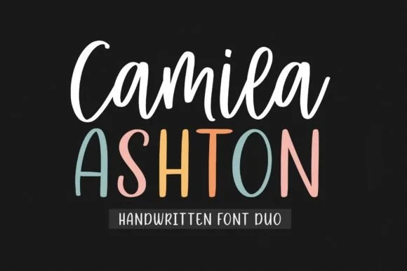
Camila Ashton is a clean, crafter-ready handwritten font duo pairing a thick, smooth upright brush script with a tall rounded print sans!
Camila Ashton is a crafter duo: a thick smooth upright brush script with even pressure, paired with a tall rounded print sans in caps, designed so the script can be cut and the sans can be read. The script's even weight makes it safe on vinyl, and the tall sans fits a long place name in a narrow column. It needs roughly 22 mm for the script and 16 mm for the cap, and it is best in white on a chalkboard ground or in one warm ink on cream.
Recommended project & layout
First-and-middle-name nursery sign, backpack tag & tumbler — Center title-case Script (76 pt) above +6 tracked uppercase Sans (72 pt) in alternating nursery pastels.
Before you cut or print
ZERO thin hairlines in either font—both cut and weed like butter on Cricut HTV, Oracal 651, and laser birch down to 0.75 in!
Best paired with
Get fontPaid link
 #8
Little Farmhouse
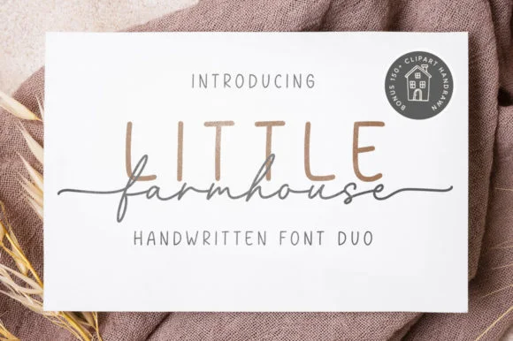
Little Farmhouse pairs a tall, narrow rounded sans-serif with a delicate, wide-tracked monoline cursive.
On the framed white card mockup, warm taupe capitals 'LITTLE' stand tall and widely spaced behind dark charcoal script 'farmhouse', whose long entry and exit tails extend past both edges of the sans word while the lowercase 'f' drops a deep narrow loop. PUA encoding provides easy access to the extended end swashes. The layering is the fragile part: the script is cut as a separate vinyl layer across the sans, so the long entry and exit tails thin out at the overlap and lift first on a textured board. Keep the script x-height at 1.5 in or above, press the sans layer down first, and test one plaque before painting a set.
Recommended project & layout
Framed shiplap entryway or kitchen pantry sign — Track the sans capitals out to +120 in muted tan or gray at 2.8 in height, then center the dark script word across their lower stems.
Before you cut or print
When cutting stencil film for wood painting, keep the fine script above 1.5 in x-height so narrow 'f' and 'a' bridges hold firm against bleed.
Best paired with
Get fontPaid link
 #9
Home Lemonade
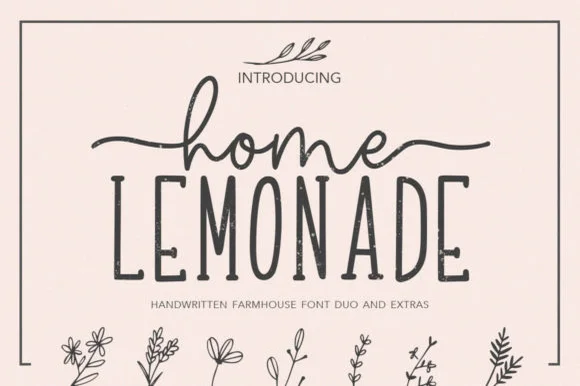
Home Lemonade is a coordinated farmhouse font duo pairing a wide-tailed monoline cursive script, a tall skinny uppercase sans, and floral doodles.
Home Lemonade is a farmhouse family of a monoline script, a tall narrow sans and a set of botanical extras: the script runs an even light stroke with wide loops for names, the sans is narrow with blunt ends for lists and prices, and the extras supply drawn lemons, leaves and jars at the same weight. All three share one palette so a stand can be built from one purchase. The script needs roughly 24 mm and the extras 20 mm for their detail to read.
Recommended project & layout
Lemonade-stand wood sign, beverage dispenser & pitcher tag — Center 1 lowercase script word with side tails directly above a wider uppercase sans word, accented by 1 botanical sprig.
Before you cut or print
Both the monoline script and skinny sans cut cleanly on Oracal 651 glass/wood vinyl at 1 inch+ scale—weld script joins first.
Best paired with
Get fontPaid link
 #10
Boho Wedding Duo
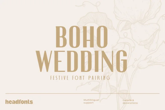
Boho Wedding Duo pairs a tall, sculptural Art-Deco high-contrast display serif with a whisper-light geometric sans plus decorative extras.
Boho Wedding Duo pairs a tall sculptural Art Deco high-contrast serif with a whisper-light geometric sans and decorative botanical extras, so a name can be a Deco panel and the details a hairline column in one family. The serif needs size for its high waist to read, and the light sans needs a smooth stock to stay open at 8 pt. It needs roughly 26 mm for the serif and 10 pt for the sans, and the pair is best in champagne sand on cream or one ink on ivory.
Recommended project & layout
Bohemian arch invitation suite, seating chart & bar menu — Stack 2 centered serif title rows (60 pt, +8 tracking) directly above wide-spaced sans subheaders (+200 tracking).
Before you cut or print
Solid display serif headers cut on 1.4 in+ acrylic sign vinyl, while the hairline sans partner favors print and Foil Quill.
Best paired with
Get fontPaid link
 #11
Wedding Handwritten
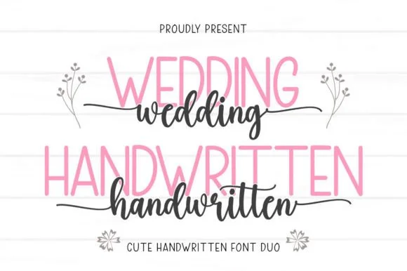
Wedding Handwritten pairs a tall, narrow rounded sans-serif with a lively thick-thin calligraphy script sporting symmetrical side tails.
Wedding Handwritten pairs a tall slender sans with a tailed calligraphy script: the sans is a narrow even-width capital set for details and directions, while the script runs a high-contrast stroke with long ascenders and a tail that lifts off the last letter. The pair is a stationery set, so both cuts have to survive one ink and a matte stock. The script tail is the finest element and it breaks first. The sans needs roughly 20 mm and the script 30 mm for their detail to read.
Recommended project & layout
Save-the-date card, acrylic table sign & seating chart — Set table numbers or 'SAVE THE DATE' in 1.8 in blush or gold sans and center couple names across the lower half in charcoal script.
Before you cut or print
Weld the script letters before cutting vinyl for acrylic wedding signs, and handle the fine horizontal outer tails gently on transfer tape.
Best paired with
Get fontPaid link
 #12
BrideChalk
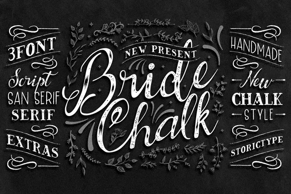
BrideChalk is a comprehensive hand-lettered chalkboard system bundling a shaded calligraphy Script, tall Sans Serif, classic Serif, and chalk Extras.
BrideChalk is a four-part wedding chalkboard family of a script, a sans, a serif and a set of drawn extras: the script is a chalk-textured calligraphy, the sans is a narrow caps face for headings, the serif carries the small print and the extras supply wreaths, arrows and laurels. All four share one dusty texture so a board reads as one surface. The chalk grain fills first on textured panels and the extras need room. The script needs roughly 24 mm and the extras 30 mm for their detail to read.
Recommended project & layout
Printed wedding chalkboard sign, bar menu & photo-booth board — Mix small tracked Sans ('NEW PRESENT'), huge BrideChalk Script ('Bride Chalk'), and Serif details inside the bundled leaf borders.
Before you cut or print
Internal chalk shading texture means you should print onto matte black foam board or poster stock—do not blade-cut vinyl.
Best paired with
Get fontPaid link
 #13
Brown Carolina Duo
Brown Carolina Duo contrasts broad high-contrast capitals with a much finer narrow slanted script, set dark on a plain cream field, where the capital R legs sweep below the neighbouring letters and the script carries long tails that run past the ends of both words.
The caps keep thin cross strokes and heavy uprights, the script keeps one fine weight, and the two voices sit in a strict stack: script, two cap rows, script. That alternating order is the character, because the fine lines frame the heavy block like a rule above and below. Both treatments appear on a plain light field, so the cover gives no clue about texture or shadow. Keep 34 pt for the caps before the thin strokes break up, keep 20 pt as the floor for the script and check the R leg before setting a line of capitals.
Recommended project & layout
A boutique stationery front — Use the capital name centrally and a small script descriptor below, leaving the R sweep clear of contact information in a plain footer.
Before you cut or print
Confirm both styles and the actual capital alternates.
Best paired with
Get fontPaid link
 #14
Chiffoncake Duo
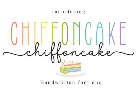
Chiffoncake Duo pairs very tall narrow capitals, each in a different pastel tone, with a low connected script whose deep f loops drop below the baseline, and long tails extend from both sides of the lower word above a small cake illustration.
The caps stay tall and thin, the script stays fine and continuous, the loops drop deep and the entry and exit tails run wide. That height contrast is the character: the pair is built on the gap between a condensed cap row and a light handwritten line, which is why the sample keeps both centred. The rainbow colours and the cake drawing are presentation. Keep 28 pt for the script, leave 20 mm beneath for the f loops and check whether both styles install from one file before planning a two-line lockup.
Recommended project & layout
A cake-menu category heading — Keep the two lines separate rather than overlapping and put flavours and prices in a plain list below the f loops.
Before you cut or print
Confirm the exact included pair and any alternate-access claim.
Best paired with
Get fontPaid link
 #15
Cupcake Handmade Duo
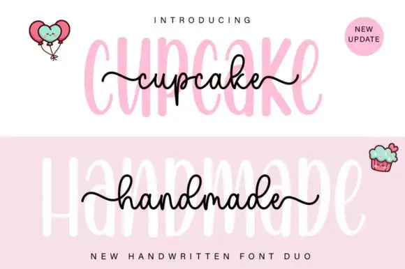
Cupcake Handmade Duo places tall narrow rounded letters in pale pink behind a smaller connected script line in black, twice on one cover, where the script carries long outer tails and looped k and h forms while a balloon pair, a cupcake drawing and an update badge sit in the corners.
The caps stay tall and narrow, the script stays compact and continuous, the loops open large and the tails run wide past the caps on both sides. That size gap is the character, because the script sits inside the cap row rather than under it. The balloons, the cupcake and the badge are separate sample elements, so do not count them as part of the type. Keep 34 pt for the caps and 16 pt for the script, and check the k and h loops against your margins before locking the lockup.
Recommended project & layout
A cupcake-table heading — Place the capital title above, not behind, the script; put flavours and dietary information in a plain panel below.
Before you cut or print
Check both supplied styles and essential food information separately.
Best paired with
Get fontPaid link
 #16
Tingler Duo
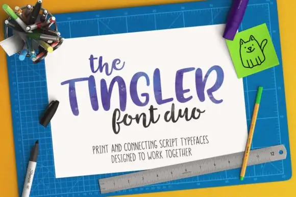
Tingler Duo is a two-cut pair in which heavy print capitals with uneven shoulders set the plain word and a connected lowercase script with tall t stems carries the written one, so a project holds two registers in one warm tone.
The print cut keeps round ends, uneven shoulders and short stems, while the script cut joins a compact lowercase body through tall t stems and light connectors, with swashes and ligatures among a large glyph set. The contrast between separate and joined letters is the character: one member reads as stamped, the other as written, which is why the sample sets the two side by side. Set the print at 34 pt and the script at 28 pt, and keep 16 mm between rows so the connectors do not touch the capitals. The pale ground and the small caption are presentation; the two lettered cuts are the duo.
Recommended project & layout
A craft-stall name and descriptor — Put the print name on the first line and a smaller script descriptor below, leaving generous space before practical contact details.
Before you cut or print
Preview each member and the real letter pairings separately; the source's connecting-tail claim is not a tested automatic composition.
Best paired with
Get fontPaid link
 #17
Romantic Aura Duo
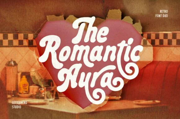
Romantic Aura Duo pairs a thick, velvety 1970s swash script with a clean companion voice for nostalgic love notes and merch.
Romantic Aura Duo pairs a nineteen-seventies swashed retro script with a rounded sans: the script runs a high-contrast stroke with wide swelling swashes that lift above and below the line, while the sans is a soft rounded block for details and lists. The pair is a period look, so it works best in two warm flat inks on a light ground rather than in photographic tints. The swash thins are the finest element and they break first. The script needs roughly 32 mm and the sans 20 mm for their detail to read.
Recommended project & layout
Retro Valentine sweatshirt, mug wrap & galentine card — Stack 2 to 3 centered words tightly inside a heart or arch silhouette so rising ascenders nest into the gaps of the line above.
Before you cut or print
Weld all overlapping script letters before cutting HTV, and keep total lockup width at 3.5 in+ so tight inner 'e' and 'a' counters weed cleanly.
Best paired with
Get fontPaid link
 #18
Pink Vibes Duo
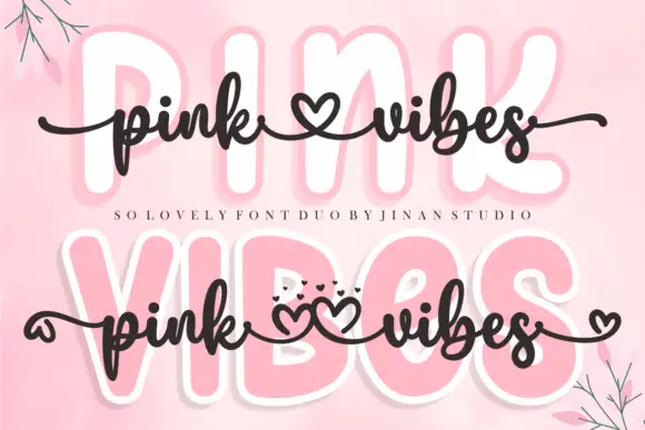
Pink Vibes Duo pairs two fat rounded capital rows, drawn in white with a soft pink glow, with a small dark connected script that runs across them, and in the lower sample the script joins the words with heart shapes instead of a plain connector stroke.
The caps stay broad and inflated, the script stays thin and dark, the contrast between the two weights carries the pair and the hearts sit where a ligature would normally go. The upper sample sets the script over the caps without hearts, the lower inserts one heart between the words and a second heart cluster on the final s, so the decorative join is an option rather than the default. Branches in the corners are cover artwork. Check which connector glyphs your file carries before planning the heart link, keep 30 pt for the script strokes and set the caps in one colour so the pink glow does not come from the type.
Recommended project & layout
A two-level greeting — Keep capitals above script rather than overlapping; leave heart tails in open space.
Before you cut or print
Check connector variants and actual duo contents.
Best paired with
Get fontPaid link
 #19
Hey Babe
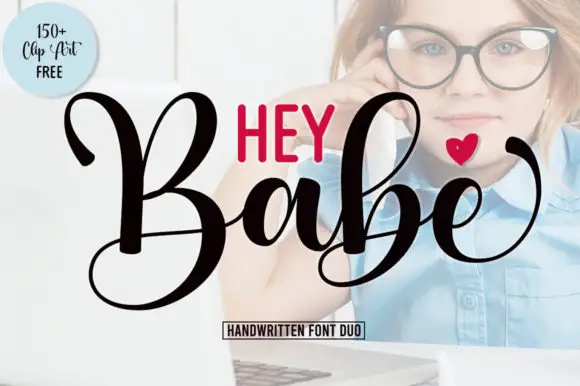
Hey Babe is a duo of a heavy looping script with tall capitals and a smaller rounded sans, arranged so a bold script line carries the design and the sans supplies the second voice.
The script half opens with a large B whose loop rises above the cap line and crosses its own stem, and the letters after it keep that weight: the a closes a round bowl, the b repeats the tall loop, the e curls its exit and the final e lifts away with a flourish. Weight is heavy and constant, joins stay as thick as the stems and the ends curl rather than taper, which gives the phrase its confident tone. The second half is a compact rounded sans in capitals with even strokes, and in the sample it sits above the script as a short label, which is how the pair is usually layered. The photograph behind, the black and red inks, the small heart and the boxed caption are presentation; the duo is the two lines.
Recommended project & layout
A short affectionate cover — Place small print above the script and sender below its lowest loop.
Before you cut or print
Verify heart availability and included extras separately.
Best paired with
Get fontPaid link
 #20
Beautiful Wildflower Duo
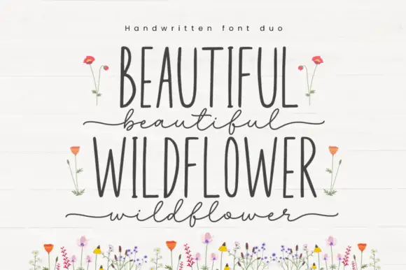
Beautiful Wildflower Duo is a two-cut pair in which very narrow upright capitals set the plain line and a fine lowercase script runs beneath with long outer strokes, so a card can hold two registers in one soft tone.
The capital cut compresses to narrow stems with even terminals, while the script cut keeps a light body, long entries at the first letter and a long exit at the last, with swashes encoded for variation. The width contrast is the character: a narrow cap row answers a loose script, which is why the sample stacks them with floral artwork around. Set the caps at 34 pt and the script at 28 pt, and keep 16 mm between the rows so the outer strokes do not touch. The flower illustrations are separate artwork rather than font accessories; the two lettered rows are the duo.
Recommended project & layout
A garden ceremony programme cover — Use the upright capitals for the programme title and one short script line below. Move the date and location into a plain bottom block rather than a third decorative style.
Before you cut or print
Confirm both styles and the actual phrase in the current listing; floral artwork is not assumed included.
Best paired with
Get fontPaid link
 #21
Positive Mindset
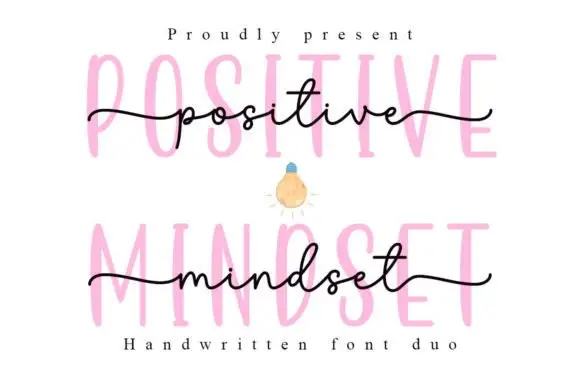
Positive Mindset is a duo in which tall narrow separate capitals stand behind a fine lowercase script line, with the script carrying long side tails and small t and d loops while the print keeps tiny terminal projections.
The print cut stays tall and narrow with separations between letters, the script cut joins a light lowercase body, the d and t close small loops and the entry and exit tails run long at each end. The scale contrast is the character: an upright structure behind a written line, which is why the sample layers the two. Because the script tails travel, set the print at 36 pt and the script at 26 pt with 18 mm between them, and let the tails own the outer margins. The extra characters are PUA-encoded; the two lettered cuts are the duo.
Recommended project & layout
A reflection-journal cover — Use print on the first line and script below it rather than overlaying, with a plain owner footer.
Before you cut or print
Resolve source naming inconsistency and verify both members.
Best paired with
Get fontPaid link
 #22
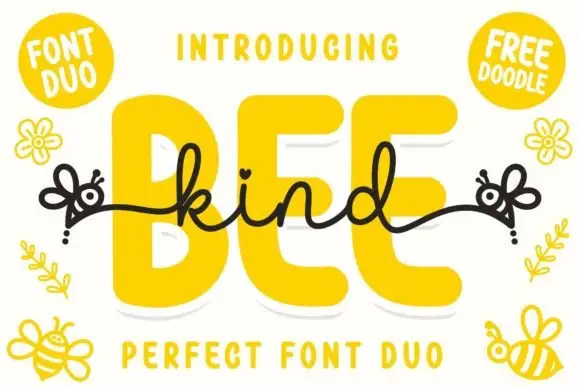
Bee Kind Duo
Bee Kind is a two-part family in which a very fat rounded capital sans carries the weight and a monoline script answers it, so a design gets a headline voice and a written line from one purchase.
The B builds two even bowls on a straight stem, the E shortens its arms, the K opens a wide junction and the D closes a fat bowl, all at the heaviest rounded weight with flat-sided terminals; the second cut draws a continuous monoline script whose letters join without a break. The pairing is the character: the sans has almost closed counters and the script is as light as the sans is heavy, which is why the sample sets one inside the other. The script holds at 20 pt and the sans fills a poster at 100 pt, so the two cuts are used at very different sizes. The cream ground, the bees, the daisies and the word above are presentation; the fat caps and the written line are the family.
Recommended project & layout
A kindness-note cover — Use the heavy word above one small script line with plain personal text inside the card.
Before you cut or print
Verify the bee-tail glyphs and their licence.
Best paired with
Get fontPaid link
 #23
Marney Holland
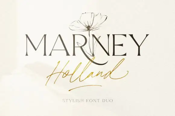
Marney Holland pairs a tall high-contrast serif capital cut with a loose thin script: the R curls its leg below the serif line, the script runs light through its joins and a long low exit stroke closes the written line.
The serif cut keeps slender stems with fine joins and a leg that drops below the baseline, while the script cut joins a thin lowercase body and finishes with a low exit stroke that trails away from the word. The contrast between the two is the character: an engraved name over a signed phrase, which is why the sample stacks the pair. Because the script exit travels, keep 20 mm at the right and 16 mm between the rows from 26 pt, and the serif hairlines want a coated stock. Both cuts list PUA access, so any extra swash is a deliberate choice.
Recommended project & layout
A ceremony title hierarchy — Put a short serif title above the couple names in script, then a plain date below both tails.
Before you cut or print
Verify both members and actual name spacing.
Best paired with
Get fontPaid link
 #24
Le Mores Signature
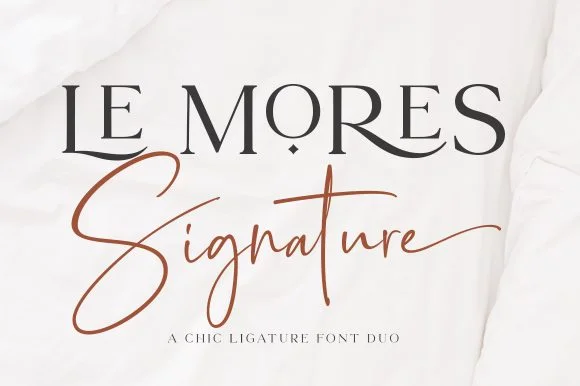
Le Mores Signature pairs an editorial ligature serif—highlighted by cradled base loops—with a brisk copper-toned signature cursive.
Le Mores Signature pairs a ligature-rich editorial serif with a slanted signature script: the serif is a moderate-contrast face with true ligatures and oldstyle figures for running text, while the script is a fast slanted signature with a looping capital and a heavy exit stroke. The pair is how a printed magazine signs a page, so the serif carries the body and the signature carries the name. The signature's thin connectors are the finest element and they break first. The serif needs roughly 20 mm and the signature 30 mm for their detail to read.
Recommended project & layout
Boutique fashion hangtag, perfume box & atelier logo — Set the primary brand name in tracked-open serif capitals at 36 pt and overlap a single script subword across the lower-left stem.
Before you cut or print
Keep the slender signature script in print, hot foil, or larger 2.5 in+ decals rather than tiny blade-cut vinyl.
Best paired with
Get fontPaid link
 #25
Perfect Love Perfect World
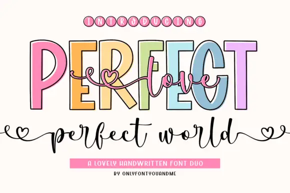
Perfect Love Perfect World places fine script across tall outlined capitals, where small hearts extend the script ends and the lower world line carries deep p and d strokes.
The caps stay tall and open, the outline runs thin, the script threads across them and the ends finish in small hearts. That layering is the character: one line sits over another instead of beside it, which is why the sample reads as a single romantic composition. Small hearts may be artwork rather than glyphs, and overlapping two members invites collisions, so test your own phrase and keep 18 mm of clear ground below from 26 pt. The overlap is the only real risk: the script has to cross the outline without touching it, so keep 20 mm of clear ground between the layers and test one phrase before a run of cards.
Recommended project & layout
A welcome-sign direction — Place a short script line in the gap, then keep names on a separate baseline.
Before you cut or print
Check overlap at the capital counters.
Best paired with
Get fontPaid link
 #26
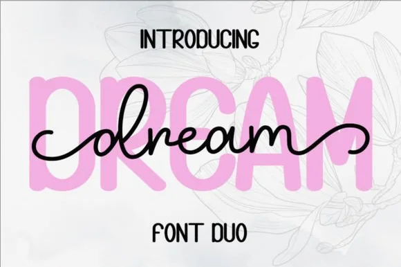
Dream Duo
Dream Duo combines a plump, soft-cornered uppercase sans-serif with a fluid monoline script that threads cleanly across wide titles.
Dream Duo pairs a chunky pastel rounded sans with a smooth monoline cursive: the sans is a fat even-width block with fully rounded corners and tight spacing for headlines, while the cursive is a soft even stroke with open loops and a gentle slant. The pair is built for a soft palette, so it loses its character when printed in a single harsh black. The monoline hairline is the finest element and it breaks first. The sans needs roughly 26 mm and the cursive 28 mm for their detail to read.
Recommended project & layout
Nursery wall name sign & sweet-sixteen acrylic backdrop — Scale the background sans to 3.5 inches tall in soft pastel and center the dark monoline script across the middle 60% height.
Before you cut or print
Weld all cursive joins before cutting vinyl, and use Cricut's Slice or a 0.07 in offset knockout if avoiding two-layer vinyl overlap.
Best paired with
Get fontPaid link
 #27
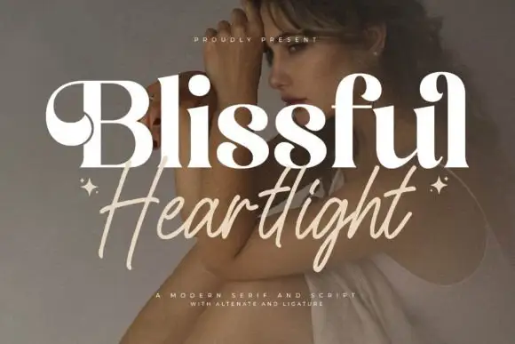
Blissful Heartlight
Blissful Heartlight shows a pale heavy Blissful line with round bowls and curled upper entries over a portrait, where the serifs swell into bulges at the joins and a thinner right-leaning Heartlight script sits beneath with long loose strokes and extended ascenders and descenders plus two small stars at the outer edges.
The serif stays heavy and soft, the script stays thin and leaning, the ascenders rise high and the descenders drop low while the two rows overlap slightly at the centre. That swelling serif is the character: the caps look inflated at the joins rather than cut, which is why the sample relies on a photographic ground for contrast. The stars are styling, and the cover notes alternates and ligatures without showing them. Keep 44 pt for the serif and 26 pt for the script, and check the overlap for contrast before printing.
Recommended project & layout
A serif-and-handwritten invitation pairing — Keep the handwritten line clear of the practical invitation text.
Before you cut or print
Verify both members and exact joins.
Best paired with
Get fontPaid link
 #28
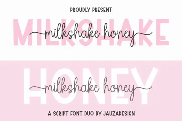
Milkshakehoney
Milkshakehoney pairs a crisp, wide-stance uppercase sans-serif with a tall, narrow-looped monoline cursive accented by straight side tails.
Milkshakehoney pairs a clean geometric uppercase sans with a tall-looped monoline script: the sans is a wide, even-width capital set for signage and labels, while the script is a thin monoline with high loops that rise well above the x-height and joins that stay open. The pair gives one card a printed voice and a hand-written line and works from a single ink. The monoline hairline is the finest element and it breaks first. The sans needs roughly 20 mm and the script 30 mm for their detail to read.
Recommended project & layout
Bridesmaid proposal box lid & satin robe chest print — Track the uppercase sans role title ('BRIDESMAID') wide in pale pink or gold behind the recipient's cursive first name.
Before you cut or print
Size HTV chest names at 4 inches wide or larger so the tall narrow 'k' and 'h' loops weed cleanly without stretching.
Best paired with
Get fontPaid link
 #29
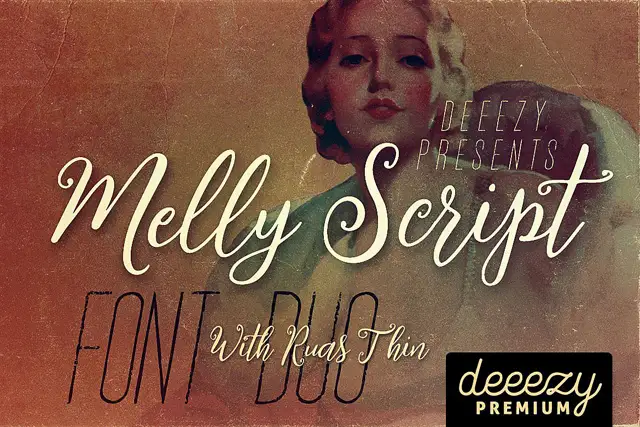
Melly Script Font Duo
Melly Script Font Duo pairs a slanted rounded script with an extremely narrow capital display face, so a design can carry a soft headline and a tall thin second line from one purchase.
The script half is a rounded hand with a steady lean and open counters: the capital M opens with a broad first arch, the e and the l stay light, the double l rises into two plain loops and the y finishes with a curved tail. Weight is medium and even, joins are open rather than tight, and the ends taper slightly. The second half is the opposite extreme: a condensed capital face with hairline-thin stems, very narrow counters and tall proportions, which reads as a drawn rule rather than as text at body size. Together they let one poster carry a warm headline and a skeletal subhead, which is the pairing the sample demonstrates. The washed vintage photograph, the cream inks and the small premium badge are presentation; the two faces are the words.
Recommended project & layout
A vintage-film programme — Place script above a narrow-capital section label, then keep listings plain.
Before you cut or print
Check distressed strokes on the final programme size.
Best paired with
Get fontPaid link
 #30
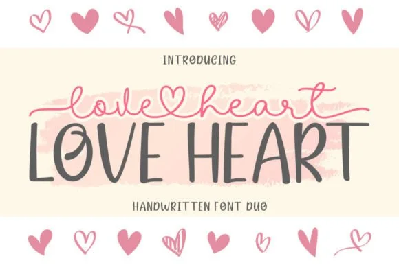
Love Heart Duo
Love Heart Duo matches a tall, slightly textured uppercase brush-sans with a fine monoline cursive featuring a built-in center heart swash.
Love Heart Duo pairs a hand-brushed tall sans with a heart-connected monoline script: the sans is narrow with a dry brush edge and open counters for headlines and lists, while the script runs an even thin stroke where the joins between two words swell into a small drawn heart. The pair gives one card a hand-linked line and a legible second voice from a single family and a single palette, so an invitation, a tag and a seal can be built together. The hearts are the finest element and they close into dots as soon as the face shrinks, and the dry brush edge fills when the sans is reversed or printed small. The sans needs roughly 24 mm and the script 26 mm for their detail to read.
Recommended project & layout
Couple anniversary mug, pillow sham & Valentine card — Match the outer tip-to-tip width of the tailed script to the full width of the uppercase sans row underneath.
Before you cut or print
The fine monoline script cuts best above 1.75 in tall on vinyl; for smaller mugs, use sublimation or Print-Then-Cut.
Best paired with
Get fontPaid link
 #31
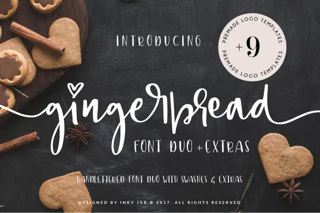
Gingerbread Duo
Gingerbread Duo sets a broad, low-contrast signpaint script beneath tall letterspaced slab capitals on the same dark cover, with heart-shaped tittles and one long exit stroke.
The script word sits low and wide, with shallow ascenders, open round bowls and a deep looped g pushing well below the baseline. Both tittles on the cover are drawn as solid hearts rather than points, and the final d exits into a long stroke that sweeps right and slightly upward before it stops. The companion line is a narrow capital alphabet with flat square serifs, near-even widths and about a quarter-em of tracking, so it reads as a painted credit line rather than a second display voice. The gingerbread shapes and heart cut-outs at the edges are separate artwork, and the circular sticker in the top corner is a promotional overlay rather than part of the typeface.
Recommended project & layout
A biscuit-box label — Keep the product name large and ingredients on a separate panel.
Before you cut or print
Verify heart dots and swash access for the chosen words.
Best paired with
Get fontPaid link
 #32
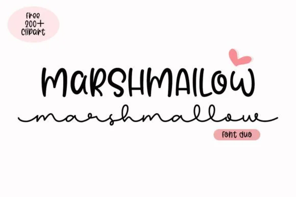
Marshmallow Duo
Marshmallow Duo matches a quirky condensed uppercase marker sans with a low, wide-looped monoline script.
Marshmallow Duo pairs a tall narrow marker sans with a wide monoline cursive: the sans is a squeezed felt-tip block with soft ends for a stacked headline, while the cursive is a broad even stroke with open bowls that stays legible at small sizes. The pair is built for a two-line title where the narrow cut holds the top row and the wide cut holds the second. The marker edge is the finest element and it softens first under a coarse screen. The sans needs roughly 24 mm and the cursive 26 mm for their detail to read.
Recommended project & layout
Hot-cocoa bar jar labels & party favor tags — Stack the ingredient title in 1.1 in marker caps on top and run a short flavor note in the wide monoline script across the base.
Before you cut or print
On matte sticker paper, print-then-cut with a 0.08 in white offset contour rather than weeding the thin lowercase connectors individually.
Best paired with
Get fontPaid link
Practical buyer checklist
Frequently asked questions.
Key cutting, printing and pairing answers before choosing a font duos & pairings typeface.
What makes a font duo better than pairing two separate fonts?
The designer matched x-height, contrast and stroke logic, so the two faces relate without manual adjustment. If you pair two unrelated fonts yourself, you will spend longer tuning sizes and spacing than the download saves.
Should I always use both halves of a duo?
No. Most duos work because each face can stand alone, which is what makes them useful across a whole brand. Using both on every surface flattens the contrast the pair was built to provide.
How do duos behave in Cricut projects?
The script half usually needs welding, and thin connector strokes tear below about 0.75 inch. The block or sans half cuts cleanly. Assign the intricate face to the largest word so the size protects the detail.
Do font duos include matching numbers and symbols?
Usually the sans half does, and the script half might not. If a design needs a date in both styles, test the numerals first. A missing script 4 is a common surprise in otherwise complete sets.
Keep exploring
Related collections & guides.
Explore adjacent maker roundups or check our practical pre-production checklists.


01 / Branding & Print
Brand & packaging
39 curated fonts · Previews & pairings
02 / Occasions & Milestones
Wedding
36 curated fonts · Previews & pairings

03 / Cricut & Craft
Modern farmhouse & wood signs
27 curated fonts · Previews & pairings


04 / Occasions & Milestones
Mama shirts, Dad gifts & family
20 curated fonts · Previews & pairings
Guides: Invitation font checklist · Vinyl & cutting checklist · How to pair script & sans fonts