 #1 · Best Overall
Maple Mingle
Casual cursive marker lettering with a heavy sticker outline
Get fontPaid link
Read review ↓Disclosure: MakerFileHub may earn a commission from qualifying purchases via paid links on this page. How our links work.
Maple cutouts, harvest scripts & woodland detail
Fall lettering works from colour and texture as much as from shape, which is why the faces here lean warm and slightly heavy. Maple Mingle and Sweet Pumpkin carry a chunky sticker and brush-pen weight, Groovy Autumn and Jody build maple and woodland silhouettes into the glyphs, and Pumpkin Embroidery and Autumn Embroidery supply the tall looped script. Vintage Melinda adds a retro-romance brush.
Quick verdict
Maple Mingle is the most versatile fall script for signs and shirts, Groovy Autumn carries the display role, and Pumpkin Embroidery is the pick for a tall looped script. Jody suits woodland nursery and classroom work.
Quick answer
Short on time? Start with our three highest-rated autumn standouts before scrolling the full breakdown.
#1 · Best OverallCasual cursive marker lettering with a heavy sticker outline
 #2 · Runner-Up Pick
Chunky upright brush-pen script with a heavy even stroke and open counters
 #3 · Editor's Choice
We kept 26 of 465 candidates after removing winter and Christmas crossover faces. Judged on warmth at 2 inch scale, whether leaf and woodland silhouettes are attached, and how the face reads against rust, mustard and kraft.
Side-by-side summary
Compare specimens, OpenType/PUA traits and primary project roles side by side.
| Rank & Font | Style & File Specs | Best Project Fit | Store Listing |
|---|---|---|---|
| ScriptBouncy | Friendsgiving tumbler, fall doormat or sticker pack | Get fontPaid link | |
| ScriptCozy | Fall market mug, tumbler or tote transfer | Get fontPaid link | |
| ScriptPUA encoded | Hand-embroidery transfer pattern, fall card & gift tag | Get fontPaid link | |
| ScriptAutumn-grace | Fall porch pillow, pumpkin-patch tote & Thanksgiving menu | Get fontPaid link | |
| ScriptCozy-harvest | Friendsgiving invitation, pumpkin-pie box & wooden porch sign | Get fontPaid link |
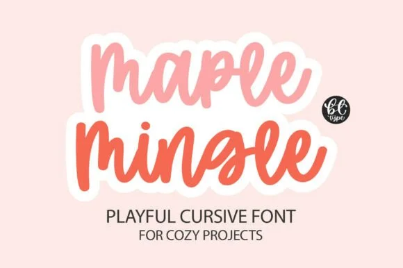
#1 · Best OverallMaple Mingle is a playful cursive face in which the letters run together in a marker hand and a heavy white outline wraps each word, so a short phrase reads as a cut sticker rather than as handwriting.
The m keeps three uneven arches, the a closes a round bowl, the p drops a wide bowl, the l rises on a slanted stem, the e turns a light eye and the n repeats the arch, all at a marker weight with rounded ends, a bouncy baseline and a contour drawn around the whole word. The contour is the character: it treats the phrase as one object, which is why the sample sets two stacked words in two colours with a cut edge. Because the shapes are solid, the face holds from 26 pt and cuts cleanly in card. The pink ground, the small monogram badge and the two caption lines are presentation; the two coloured phrases are the face.
Friendsgiving tumbler, fall doormat or sticker pack — Add an offset white sticker contour for print-then-cut planner and laptop decals.
Weld cursive joins before cutting — one of the easiest scripts to weed.
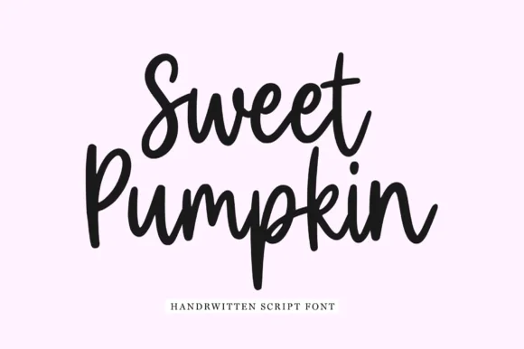
#2 · Runner-Up PickSweet Pumpkin is a chunky upright brush-pen script in which the letters stay vertical, the stroke is heavy and even, and the counters remain open enough to read at small sizes.
The capital S opens as a broad crescent and the second word's capital P rises into a short stem, and the letters between them keep a fat, upright construction: the w and the e close loose bowls, the t is crossed low with a short bar, the p drops a straight descender and the u and the m hold wide even arches. Unlike a slanted brush script, nothing leans, which makes the phrase read as written on a card rather than painted on a board. Weight is heavy and constant with rounded ends, and the counters stay open because the letters are drawn wide rather than crowded. The pale ground and the single serif caption are presentation; the script is the two words.
Fall market mug, tumbler or tote transfer — Stack two short Title Case words tightly at centre for punchy apparel or mug layouts.
Ideal for Cricut and Silhouette vinyl — remember to Weld overlapping script connections before cutting.
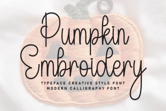
#3 · Editor's ChoicePumpkin Embroidery is a tall, slender monoline handwritten script—rendered as smooth pen lines over a felt patch photo rather than stitched thread.
Pumpkin Embroidery is a slender tall-looped handwritten autumn cursive: a fine even pen stroke, very high ascenders that loop twice, a shallow slant and long tapered descenders that drop well below the baseline. The loops grow the word tall and the descenders close the line below, so stacked text needs extra leading. It needs roughly 26 mm for the double loop and the fine stroke to read, and it is best in one warm ink on smooth card, or a single dark colour on kraft where the thin stroke still carries.
Hand-embroidery transfer pattern, fall card & gift tag — Print or pen-draw two stacked words at 4 inches wide onto water-soluble stabilizer for fall sweaters or hoops.
Because the stroke is fairly fine, prefer Cricut Pen drawing, embroidery tracing, or print over small blade-cut vinyl.
 #4 · Top Maker Utility
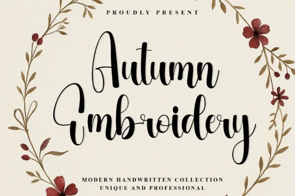
Autumn Embroidery is a tall, expressive modern calligraphy script featuring soaring narrow A/E/b/d loops and cozy fall bounce.
Autumn Embroidery is a tall modern calligraphy script with soaring ascending loops on the E, b and d, a pointed arch A and a pronounced bouncy baseline that rises and falls within a single word. Stems are shaded thick on the downstroke and hairline on the exit, so the face needs a size that can hold contrast, roughly 18 mm and up in print. The tall proportions stack a party title into a narrow column, and the loose connections let a short greeting look written by hand rather than assembled letter by letter.
Fall porch pillow, pumpkin-patch tote & Thanksgiving menu — Stack 2 centered title-case words at 54–92 pt with 1.00 leading above wide-tracked serif subcopy.
Weld all touching cursive connectors before cutting HTV or stencil vinyl; medium brush strokes weed cleanly at 1 in+.
 #5 · Standout Silhouette
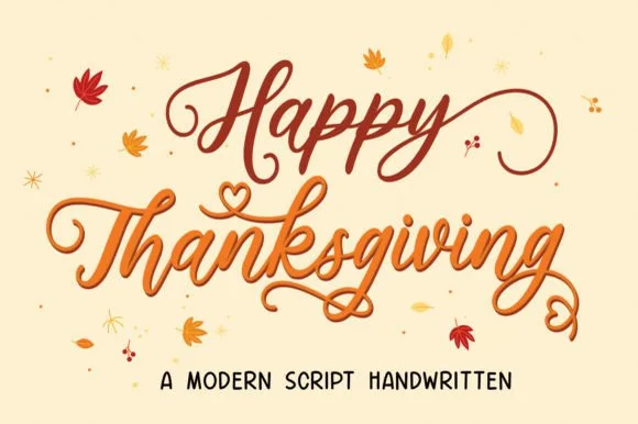
Happy Thanksgiving (by Mozatype) is a flowing, shaded autumn calligraphy script adorned with coiled spiral tails and sweet overhead heart curls.
Happy Thanksgiving is a warm calligraphy script with shaded thick-and-thin strokes, tall bouncy loops and small heart-shaped curls that sit above the x-height, plus coiled spiral tails. The shading is genuine, so the hairlines need about 20 mm before they hold in print, and the overhead hearts add height that a layout has to reserve. It reads as a handwritten harvest greeting rather than a formal script, and it is best in a warm sienna or gold on a cream ground, at heading size on cards, menus and labels.
Friendsgiving invitation, pumpkin-pie box & wooden porch sign — Stack 2 title-case words centered at 54–92 pt in burnt sienna or espresso over cream cardstock.
Main brush strokes cut on 1.3 in+ vinyl/HTV (weld joins!), while fine spiral tail tips shine sharpest in print and sublimation.
 #6
Vintage Melinda is a creamy, thick-stroke retro brush script with dramatic curled swash capitals and sweeping baseline loops.
Vintage Melinda is a bold retro-romance brush script with curled swashes: a heavy loaded stroke, a shallow slant, connected letters and swashes that curl off the caps and descenders into a tight spiral. The spirals widen the word and are the finest element, and the loaded weight closes the loops early. It needs roughly 30 mm for the spiral and the brush edge to read, and it is best in one warm ink on cream, or a fine gold on a dark ground where the curls print as bright lines.
Harvest market apparel, retro diner mug & fall tote — Stack a two-word vintage slogan at 4–8 inches wide, choosing one lower underline swash to anchor the bottom edge of the lockup.
Always weld connected letters before cutting, and check clearance between row one descenders ('g', 'y') and row two swash capitals.
 #7
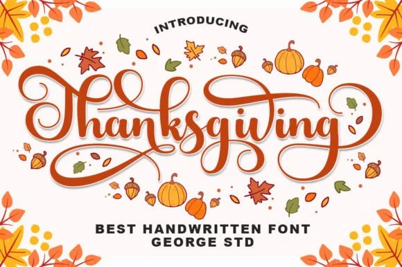
Thanksgiving (by George Studio) is a medium-bold, bouncy brush calligraphy script accented by spiraled terminal curls and sweeping crossbar loops.
Thanksgiving is a warm bouncy brush calligraphy with spiralled terminal curls: a loaded brush stroke on a shallow slant, joined letters, a soft bounce and exits that spiral into a tight curl at the end of a line. The spirals are the design and they close first at small sizes, and the bounce grows the word vertically. It needs roughly 26 mm for the spiral and the brush edge to read, and it is best in one warm ink on cream and kraft, or a fine gold on a dark ground where the curls print as bright lines.
Thanksgiving host platter, pie box sticker & kitchen towel — Center 'Thanksgiving' or 'Gather & Give Thanks' at 5–8 inches wide, framing the outer spiral curls with small leaf accents.
Weld all cursive joins before cutting HTV or permanent vinyl, and peel slowly around the fine inner spiral curl tips.
 #8
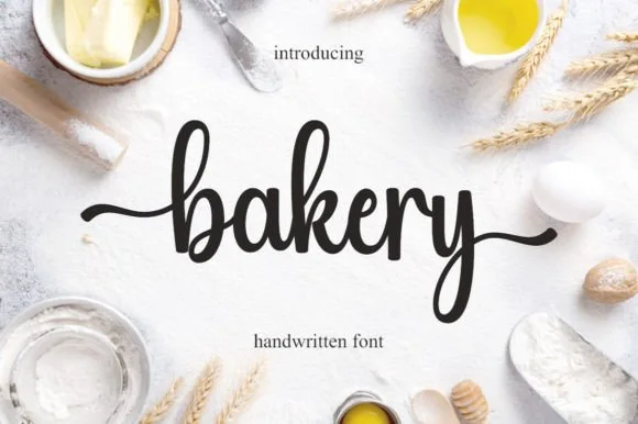
Bakery is a warm, bouncy handwritten brush script with tall looped ascenders ('b', 'k') and smooth horizontal beginning and ending tails.
Bakery is a bouncy medium-weight farmhouse brush script with side tails: a loaded stroke with visible dry edges, joined letters, a rising baseline and long tails that flick off the first and last letters. The tails need side clearance and are the first thing trimmed, and the brush edge is the finest element. It needs roughly 24 mm for the tail and the brush edge to read, and it is best in one warm ink on kraft and cream, or a single dark colour on a pale board where the brush edge prints as texture.
Cottage-bakery cake box, sourdough bag & apron HTV — Set a lowercase focal word ('bakery', 'homemade', 'cookies') at 4–8 inches wide with the entry and exit tails turned on.
Medium brush stroke weight is one of the easiest script styles to cut and weed on Cricut HTV and adhesive vinyl—remember to weld.
 #9
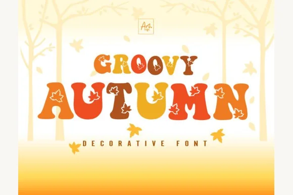
Groovy Autumn blends plump 1970s retro letterforms with crisp maple-leaf cutouts set into the counters, so a fall banner reads as seasonal without a separate illustration beside it.
The bodies stay plump and round, the leaf shapes cut cleanly through the middle of the letters and the curves carry the bell-bottom weight of the period. The inlaid leaf is the character: the season lives inside the letterform rather than behind it, which is why the sample needs no other artwork. Cutouts this fine need room, so check every leaf at the intended size and keep 34 pt before the vein details close up. The leaf veins are finer than the outline, so they close first: below about 34 pt the leaf reads as a plain blob, and on vinyl the inlay needs a 3 mm bridge to survive weeding.
Fall festival banner, pumpkin-patch tee or harvest mug — Set in warm burnt orange, mustard and espresso palettes.
Cut at 2"+ height on HTV so interior maple-leaf edges weed cleanly, or use sublimation/DTF.
 #10
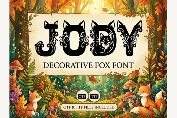
Jody embeds woodland fox silhouettes, bushy tails and foliate cutouts inside chunky capitals, so a short name reads as a forest storybook illustration while the bold outer silhouette keeps each letter recognisable.
The outer shapes stay bold and simple, the interiors carry a fox with its tail, leaves and small cutouts, and the counters double as picture space. The interior cutout is the character: the letter is a frame for the animal, which is why the sample sets a short name for a nursery print. Because the cutouts are intricate, keep 30 mm of letter height before they survive, and check how the fox maps to each glyph instead of assuming every letter carries one. The busy interiors also mean the name should stay short.
Woodland nursery name print or autumn storybook title — Print large (60pt+) in deep forest green, rust or charcoal on warm cream paper.
Intricate interior cutouts are intended for print, sublimation and nursery wall art — not small vinyl cuts.
 #11
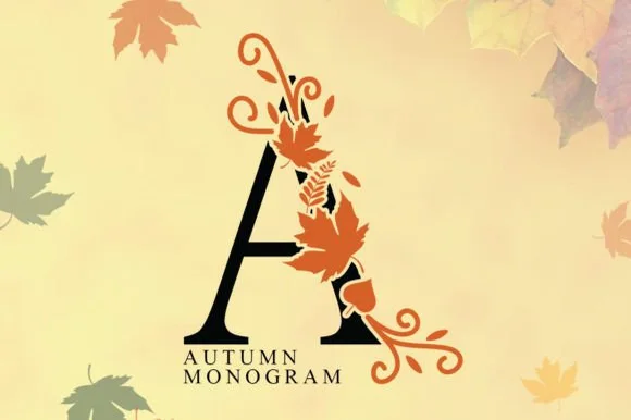
Autumn Monogram entwines classic serif capitals with swirling harvest vines, acorns, and maple leaves.
Autumn Monogram entwines classic Roman serif capitals with swirling harvest vines, acorns and maple leaves, so the monogram is an illustrated mark rather than a letter with a decoration attached. Each letter is composed with its ornament balanced on the right leg, which means a single initial reads complete on its own and two initials need spacing to avoid collision. Line weight is even, so the mark engraves and cuts predictably, and it needs roughly 35 mm for the leaves to read as leaves.
Thanksgiving linen napkin (sublimation), doormat & porch flag — Set 1 large 5-inch family initial ('H', 'M', 'S') in black + burnt orange above wide-tracked Roman surname caps.
If cutting two-color HTV/vinyl, scale to 3.5 in+ tall; for mugs, towels, and flags, sublimation and DTF are super fast!
 #12
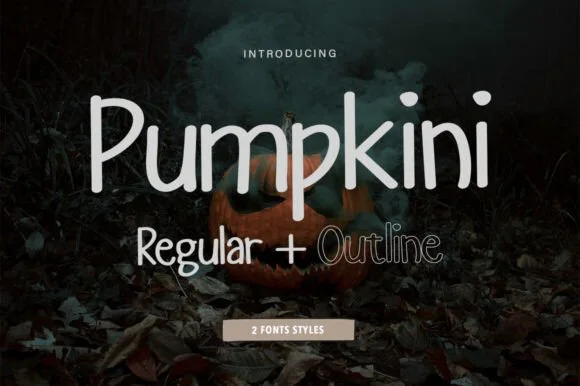
Pumpkini is a neat, rounded 2-style handwritten print family ('Regular + Outline') with zero pumpkin clipart attached—usable for autumn AND year-round!
Pumpkini is a two-cut rounded upright print sans: a regular hand-printed cut and a matching outline cut on the same plump skeleton, with an even stroke, generous round bowls and small lift gaps at the joins. The pair lets a word be layered, and the outline is what closes first at small sizes. It needs roughly 22 mm for the rounded bowl and the lift gap to read, and it is best in one bright ink on white, or a two-colour build where the outline takes the second colour.
'Pumpkin Spice Season' glass-can wrap, mug & teacher tee — Set main words in solid Pumpkini Regular (72 pt) and highlight 1 accent word in Pumpkini Outline!
Solid Regular cuts and weeds in seconds on Cricut Oracal 651 and HTV down to 0.55 in; Outline draws crisply with Cricut Pens!
 #13
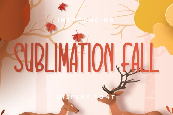
Sublimation Fall is a tall, slender farmhouse handwritten print font (zero leaves attached—usable all year!) channeling classic pottery-mug minimalism.
Sublimation Fall is a tall skinny farmhouse handwritten print sans: narrow upright stems with a light hand-made wobble, small lift gaps at the joins, blunt pen ends and a level baseline that keeps a long list readable. The skinny stroke is the weakest element in print and the wobble is what makes it read as written. It needs roughly 20 mm for the wobble and the lift gap to read, and it is best in one warm ink on kraft and cream, or a single dark colour where the thin stroke still carries.
'PUMPKIN SPICE' ceramic mug, fall tiered-tray sign & towel — Set 2 tall uppercase words at 64–120 pt with +6 tracking in burnt sienna, espresso, or matte black.
Standard solid vector font—cuts and weeds in seconds on Cricut Oracal 651, HTV, and Cricut Pens as well as sublimation mugs!
 #14
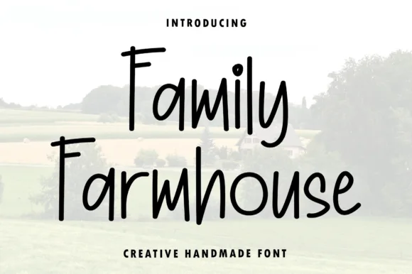
Family Farmhouse is a tall, narrow hand-printed marker typeface with long vertical stems, gently bounced baselines, and clean print legibility.
Family Farmhouse is a tall condensed hand-printed farmhouse marker face: narrow upright stems with a dry marker edge, blunt ends, a level baseline and small lift gaps at the joins, drawn to pack a long greeting into a narrow board. The dry edge is the design and it turns to dirt when the face is reversed or printed small on coated stock. It needs roughly 20 mm for the dry edge and the condensed stem to read, and it is best in one warm ink on kraft and uncoated stock.
Vertical porch welcome plank, pantry jar & family command board — Set pantry labels or family rules in mixed-case at 1.2–2.5 in height, pairing one bold cursive accent word if desired.
Clean, non-overlapping marker strokes make this exceptionally easy to weed on Oracal 651, stencil vinyl, and HTV.
 #15
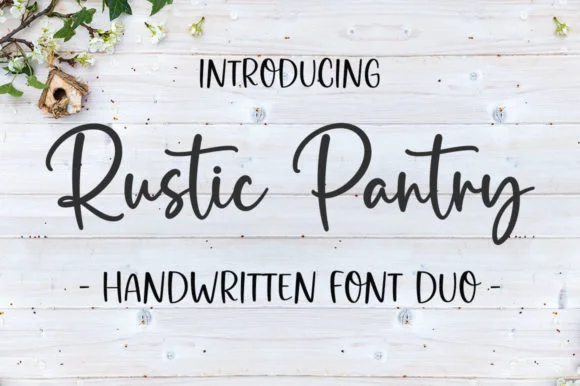
Rustic Pantry is a coordinated farmhouse font duo pairing a lively bouncy cursive script with a tall, narrow hand-drawn uppercase sans.
Rustic Pantry is a duo of a bouncy farmhouse brush script and a tall skinny marker sans: the script runs a loaded stroke with small flicks, a rising baseline and joined letters, while the sans is narrow with blunt marker ends for prices and lists. The two voices share one palette, so a jar label can carry a name and a list in the same hand. The script's bounce grows the word vertically and the marker sans stacks a long line in a narrow label. The script needs roughly 22 mm and the sans 18 mm for their detail to read.
Glass pantry canister decal, spice-jar set & kitchen sign — Center the script word at 2–3.5 inches wide above a 0.5-inch tracked skinny sans descriptor line.
Weld all touching cursive connectors before cutting Oracal 651 permanent jar vinyl; medium stroke weight weeds cleanly.
 #16
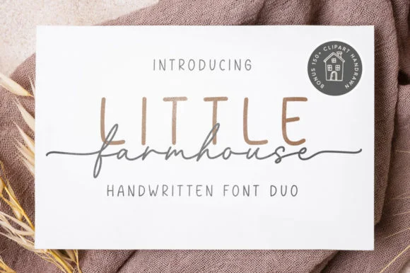
Little Farmhouse pairs a tall, narrow rounded sans-serif with a delicate, wide-tracked monoline cursive.
On the framed white card mockup, warm taupe capitals 'LITTLE' stand tall and widely spaced behind dark charcoal script 'farmhouse', whose long entry and exit tails extend past both edges of the sans word while the lowercase 'f' drops a deep narrow loop. PUA encoding provides easy access to the extended end swashes. The layering is the fragile part: the script is cut as a separate vinyl layer across the sans, so the long entry and exit tails thin out at the overlap and lift first on a textured board. Keep the script x-height at 1.5 in or above, press the sans layer down first, and test one plaque before painting a set.
Framed shiplap entryway or kitchen pantry sign — Track the sans capitals out to +120 in muted tan or gray at 2.8 in height, then center the dark script word across their lower stems.
When cutting stencil film for wood painting, keep the fine script above 1.5 in x-height so narrow 'f' and 'a' bridges hold firm against bleed.
 #17
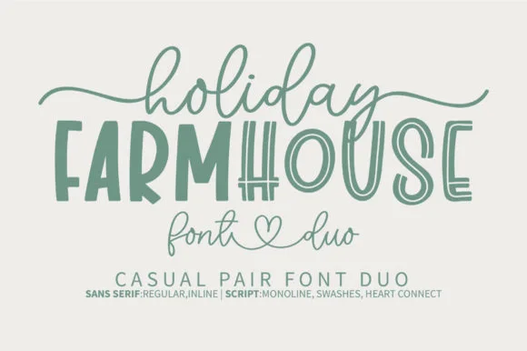
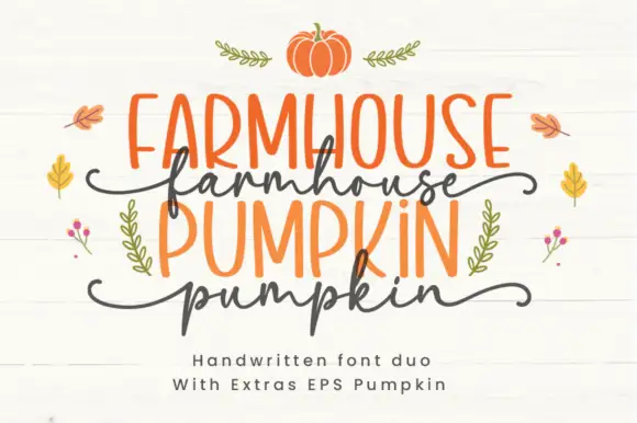
Farmhouse Pumpkin is a two-cut family in which tall irregular marker capitals sit above a wavy script line, so a two-line design reads as a hand-painted autumn sign rather than as typeset text.
The caps build an F with uneven arms, an A with a low bar, an M with wandering stems and a P with a soft bowl, all at a marker weight with irregular heights; the script cut waves a connected line with a hooked p. The pairing is the character: the caps are upright and slightly crooked and the script is loose, which is why the sample alternates the two cuts line by line. The caps hold at 30 pt and the script at 26 pt, and both print in one flat colour each. The white boards, the pumpkins, the leaves and the small sprigs are presentation; the orange caps and dark script are the family.
An autumn produce-stall sign — Keep the capital produce name above the script word rather than overlapping them; set prices and opening times in plain type below.
Check the supplied pair and confirm any pumpkin artwork separately.
 #18
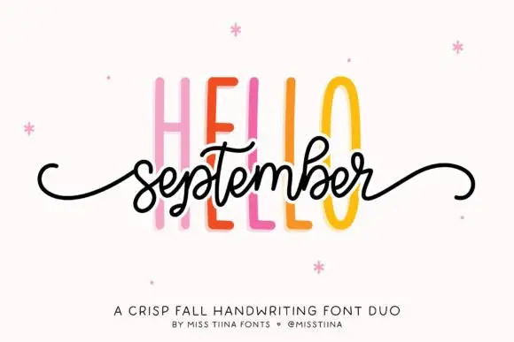
Hello September Duo shows very tall narrow sans capitals behind a small connected script line, where the script carries looped b and t ascenders and long curled side tails and the cover names it as a fall pairing.
The caps rise tall and narrow, the script stays compact underneath, the ascenders loop and the tails curl out past the phrase. That scale gap is the character: a quiet cap wall supports a small written line, which is why the sample stacks them tightly. The cover is an explicit seasonal pairing rather than a test of the members together, so set your own phrase, keep 20 mm between the rows and check that the tails clear the capitals above.
An autumn workshop invitation — Set HELLO above the script phrase rather than crossing the members; add plain date/place below.
Verify the script swashes and keep the tall caps from crowding them.
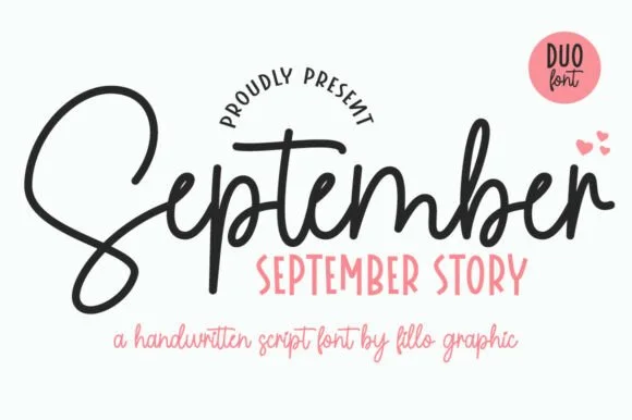 #19
September Story is a sweet handwritten font duo pairing a thick, looped monoline cord script (with swash alternates) and a tall narrow uppercase sans!
September Story is a duo of a bouncy monoline cord script and a tall skinny farmhouse sans, both with alternates: the script carries a light even stroke with joined letters and a soft bounce, and the sans is narrow with blunt terminals for the information. The pairing lets a card use two voices from one family, and the script's bounce grows the word vertically. The script needs roughly 22 mm and the sans 18 mm for their detail to read.
Teacher planner cover, back-to-school shirt & classroom bin — Tuck a row of tall uppercase Sans (36 pt) snugly into the pocket beneath the hero Script word (88 pt)!
Weld overlapping cursive joins on the Script—cuts and weeds smoothly on Oracal 651 and HTV down to 0.85 inches!
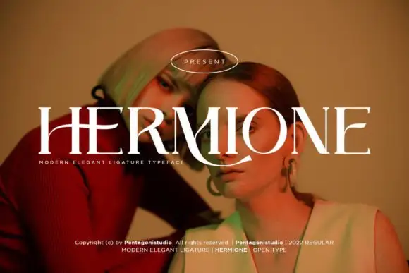 #20
Hermione is a modern elegant serif in caps with very fine hairlines, tall proportions and a set of display ligatures, shown over an editorial portrait and set with a slight arch.
HERMIONE spans the card in white over a close portrait in warm light, and the letters are tall and narrow with hairlines at the joins and sharp wedge serifs; the I and the O are drawn to touch, and the custom ligatures give the word a rhythm that a standard setting would not have. The baseline lifts slightly across the centre, which is a display treatment rather than a feature of the font, and a caption at the foot names the family and credits the foundry. The sample is a fashion layout: type over a photograph, wide spacing in small caps, one ornament. What it tells a buyer is that the face is for titles and mastheads at a large size, and that the hairlines need a good press or a screen, never a cheap photocopy.
A portrait-series opener — Place the capitals across a pale full-width panel with the subject's name and byline in plain small text below the left edge.
Verify the actual phrase, ligatures and rights; the specimen does not prove automatic decorative joins.
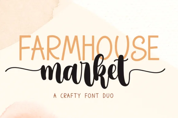 #21
Farmhouse Market teams a tall, organic uppercase sans with a bold, bouncy brush script finished by sweeping side tails.
Farmhouse Market pairs a condensed hand-drawn sans with a thick brush-pen script: the sans is a narrow uneven block with a wobbling stem for signs and price cards, while the script is a heavy brush stroke with dry ends and a visible pen turn at each join. The pair is built for a market stall, so it wants kraft paper and one dark ink rather than a coated ground. The dry brush ends are the finest element and they silt first. The sans needs roughly 22 mm and the script 30 mm for their detail to read.
Farmers-market canvas tote & produce crate stencil — Span the uppercase sans across the top width of the script's core letters, letting the script's left and right tails extend 1 inch wider on each side.
Weld all brush script letters into a single compound path before cutting HTV, and double-check the small upper loop inside 'e' and 'k'.
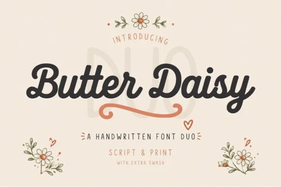 #22
Butter Daisy is a warm cottagecore font duo pairing a thick, rounded monoline brush script (with extra swashes) and a tall narrow print font.
Butter Daisy is a duo of a chunky retro-cottage script and a tall narrow print, with a swash set: the script is a fat loaded stroke with soft curled entries, and the print is a narrow hand face with blunt ends for the supporting lines. The pairing gives a card one hand-made voice and one legible one, and the swashes widen the script word. The script needs roughly 24 mm and the print 18 mm for their detail to read.
Sourdough bakery bag, wildflower tote & cottage mug — Set the brand name in chunky Butter Daisy Script (64 pt), add the terracotta underline swash, and stack tall print below.
Plump uniform script weight cuts and weeds like a dream on Cricut HTV and permanent vinyl down to 0.8 in—weld script joins!
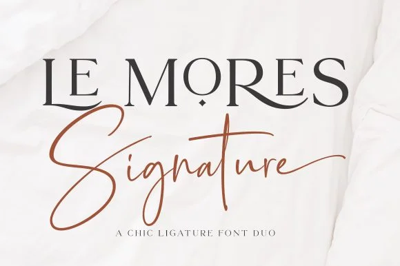 #23
Le Mores Signature pairs an editorial ligature serif—highlighted by cradled base loops—with a brisk copper-toned signature cursive.
Le Mores Signature pairs a ligature-rich editorial serif with a slanted signature script: the serif is a moderate-contrast face with true ligatures and oldstyle figures for running text, while the script is a fast slanted signature with a looping capital and a heavy exit stroke. The pair is how a printed magazine signs a page, so the serif carries the body and the signature carries the name. The signature's thin connectors are the finest element and they break first. The serif needs roughly 20 mm and the signature 30 mm for their detail to read.
Boutique fashion hangtag, perfume box & atelier logo — Set the primary brand name in tracked-open serif capitals at 36 pt and overlap a single script subword across the lower-left stem.
Keep the slender signature script in print, hot foil, or larger 2.5 in+ decals rather than tiny blade-cut vinyl.
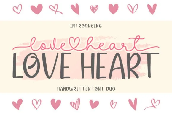 #24
Love Heart Duo matches a tall, slightly textured uppercase brush-sans with a fine monoline cursive featuring a built-in center heart swash.
Love Heart Duo pairs a hand-brushed tall sans with a heart-connected monoline script: the sans is narrow with a dry brush edge and open counters for headlines and lists, while the script runs an even thin stroke where the joins between two words swell into a small drawn heart. The pair gives one card a hand-linked line and a legible second voice from a single family and a single palette, so an invitation, a tag and a seal can be built together. The hearts are the finest element and they close into dots as soon as the face shrinks, and the dry brush edge fills when the sans is reversed or printed small. The sans needs roughly 24 mm and the script 26 mm for their detail to read.
Couple anniversary mug, pillow sham & Valentine card — Match the outer tip-to-tip width of the tailed script to the full width of the uppercase sans row underneath.
The fine monoline script cuts best above 1.75 in tall on vinyl; for smaller mugs, use sublimation or Print-Then-Cut.
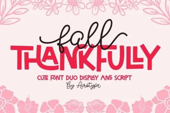 #25
Fall Thankfully pairs a looping monoline cursive script with a heavy, interlocking all-caps sans display face.
Fall Thankfully is a duo of a monoline tail script and a bouncy all-caps sans: the script runs an even stroke that finishes every word with a long lifted tail, while the sans is a chunky capital set whose baseline hops so a short line looks hand-set. The pair is built for autumn market goods, where one line is written and one is printed. The script tail is the finest element and it closes into a dot when reduced. The script needs roughly 28 mm and the sans 24 mm for their detail to read.
Thanksgiving host apron & kitchen tea towel — Set the main family or harvest word in the heavy sans at 2.5 in cap height, then tuck a 1-word script lead-in slightly overlapping the upper-left letters.
Weld the overlapping script loops before cutting HTV, and peel away from the narrow 'f' and 'l' ascender counters slowly.
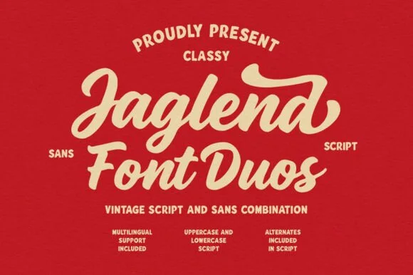 #26
Jaglend Font Duo pairs a thick, creamy vintage sign-painter brush script with a sturdy, hand-drawn condensed uppercase sans companion.
Jaglend Font Duo pairs a retro sign-painter brush script with a rugged condensed sans: the script carries a loaded stroke with small flicks and connected letters on a firm slant and a shallow bounce, while the sans is narrow with uneven edges that read as a sanded board for lists and prices. The two voices share one palette, so a window, a price list and a card can be built from one family without a third face. The script's flicks are the finest element and they close first at small sizes, while the condensed sans stacks a long service list in a narrow panel without wrapping. The script needs roughly 24 mm and the condensed sans 18 mm for their detail to read.
BBQ rub tin, craft soda label & barbershop window sign — Arch the sans uppercase header over a large slanted Jaglend Script centerpiece and anchor with tracked sans footers.
Broad solid brush strokes cut cleanly on HTV, sticker vinyl, and wood-sign stencils—weld script connections before cutting.
Practical buyer checklist
Key cutting, printing and pairing answers before choosing a autumn typeface.
Chunky scripts and rounded display faces at 3 inches or more. A 20 inch round gives about 14 inches of flat width, so a two-word design at 4 inches tall fits comfortably with a border left for a wreath.
Only when the leaf is fused to the letter outline and larger than 1 mm at its narrowest point. Detached leaves and floating acorns must be printed or cut as separate shapes and placed by hand.
Keep a value gap: deep rust text on cream, or cream text on deep rust. Two mid-tone autumn colours together usually fail, especially in the warm indoor light where most fall decor is photographed.
The scripts and print faces work year-round, since many are simply warm handwriting. The maple, pumpkin and fox lettering is seasonal by construction and will look out of place in April.
Keep exploring
Explore adjacent maker roundups or check our practical pre-production checklists.
19 curated fonts · Previews & pairings
31 curated fonts · Previews & pairings
29 curated fonts · Previews & pairings
27 curated fonts · Previews & pairings
Guides: Invitation font checklist · Vinyl & cutting checklist · How to pair script & sans fonts
Allow optional Google Analytics to measure visits and catalogue actions. Your search words and notes are not included. Privacy & storage