 #1 · Best Overall
Disclosure: MakerFileHub may earn a commission from qualifying purchases via paid links on this page. How our links work.
Cut-paper blocks, balloons & cake toppers
35 Best Birthday Party & Cake Fonts
Birthday typography is read from across a room, at an angle, often behind a table covered in food. Merry Twinkle and Chunky Dinosaur carry cut-paper and outlined pastel forms, Bouncy Block Deluxe and Bubble Mood hold a plump weight that survives a 3 inch topper, and Sprinkle Honey and Children Brooklyn cover the softer and cleaner kid registers. Super adds the faceted number-friendly block.
Quick verdict
Merry Twinkle is the most celebratory cut-paper face for banners, Bouncy Block Deluxe is the sturdiest cake topper, and Children Brooklyn keeps a clean rounded look for classroom parties. Super is the pick for big number toppers.
Quick answer
Top 3 birthday picks right now.
Short on time? Start with our three highest-rated birthday standouts before scrolling the full breakdown.
#1 · Best Overall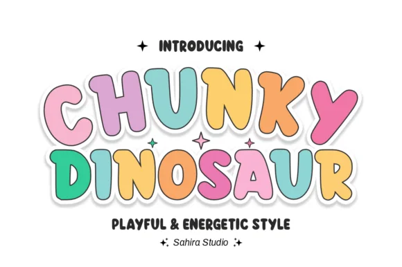 #2 · Runner-Up Pick
 #3 · Editor's Choice
How we tested & selected these 35 fonts
We kept 35 of 1,236 candidates after removing seasonal holiday faces that share the construction. Judged on stability as a standing topper, how the silhouette reads at 3 inches, and whether the face includes the numerals a birthday design needs.
Side-by-side summary
Top 5 birthday picks at a glance.
Compare specimens, OpenType/PUA traits and primary project roles side by side.
| Rank & Font | Style & File Specs | Best Project Fit | Store Listing |
|---|---|---|---|
| DisplayJoyful | Kids' birthday shirt, sticker sheet or classroom bulletin header | Get fontPaid link | |
| DisplayPlayful | 'Three-Rex' dinosaur birthday shirt, banner & cupcake pick | Get fontPaid link | |
| DisplayPUA encoded · Language support · File formats | Back-to-school tote, water-bottle sticker & kids' tee | Get fontPaid link | |
| DisplayPUA encoded · File formats | Die-cut laptop sticker, planner cover & iced-latte cup | Get fontPaid link | |
| DisplayHeart-dot-i | Ice-cream / donut party banner, bakery sticker & kid tee | Get fontPaid link |
Display & Decorative Headlines
19 fonts#1 · Best OverallMerry Twinkle
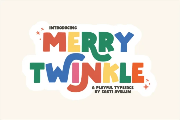
Merry Twinkle bounces cheerful uneven paper-cut block capitals: the forms stay solid and chunky with no fragile hairlines, and the baseline shifts so a short title reads as if cut from coloured paper.
The blocks stay thick and simple, the edges look cut rather than drawn, the letters vary in height and the baseline moves from letter to letter. The paper-cut bounce is the character: the title reads as a classroom decoration, which is why the sample suits boards and stickers. Because the forms are solid, the face cuts and weeds cleanly from 20 mm of cap height, and the uneven baseline needs 16 mm between rows at heading size. The varying baseline is the risk in a two-row heading: the tall letter of the lower row meets the descender above, so keep 16 mm between rows and 20 mm of cap height before a vinyl cut.
Recommended project & layout
Kids' birthday shirt, sticker sheet or classroom bulletin header — Alternate coral, royal blue, emerald and gold across letters inside a white sticker border.
Before you cut or print
100% vinyl & HTV cut-ready — thick solid shapes weed in seconds.
Best paired with
Get fontPaid link
#2 · Runner-Up PickChunky Dinosaur
Chunky Dinosaur is an energetic, bouncy rounded bubble display font with dancing tilted capitals and clean cartoon proportions.
Chunky Dinosaur is a bouncy outlined kids display in pastel: fat rounded letters with a thick soft outline, a tilt that rises and falls across the word and a small spike or plate on some caps that hints at a back ridge. The tilt grows the word vertically and the outline doubles its footprint, closing the counters early. It needs roughly 30 mm for the outline and the ridge to read, and it is best in two pastel inks on white, or one ink plus a knocked-out outline on coloured card.
Recommended project & layout
'Three-Rex' dinosaur birthday shirt, banner & cupcake pick — Color each letter in alternating soft pastels (or dino greens/oranges) wrapped in a unified white Print-Then-Cut sticker cloud.
Before you cut or print
Zero fragile serifs or distress holes—super easy to cut and weed on HTV, cardstock, and glossy vinyl at any kid-craft size.
Best paired with
Get fontPaid link
#3 · Editor's ChoiceBouncy Block Deluxe
Bouncy Block Deluxe is a thick, solid-filled bubble display font with pillowy rounded terminals, playful tilt, and tiny counter pinholes.
Bouncy Block Deluxe is a heavy rounded chunky bubble display: fat even-width letters with fully rounded corners, tight counters that almost close and a baseline that lifts a few letters so the word looks stacked and bouncing. It is a signage face, so it wants size and a single flat colour rather than fine detail. The counters are the finest element and they plug as soon as the face is reduced or cut in vinyl. It needs roughly 30 mm for the counter and the corner radius to read, and it is best as one flat ink on a light ground.
Recommended project & layout
Back-to-school tote, water-bottle sticker & kids' tee — Stack 2 or 3 short punchy words ('STAY COOL', 'DREAM BIG') at tight 0.88 line-height inside a contoured die-cut sticker shape.
Before you cut or print
When weeding small decals under 1 inch, use a fine pin pen solely to pop out the tiny teardrop counters inside 'B', 'o', 'a', and 'e'.
Best paired with
Get fontPaid link
 #4 · Top Maker Utility
Bubble Mood
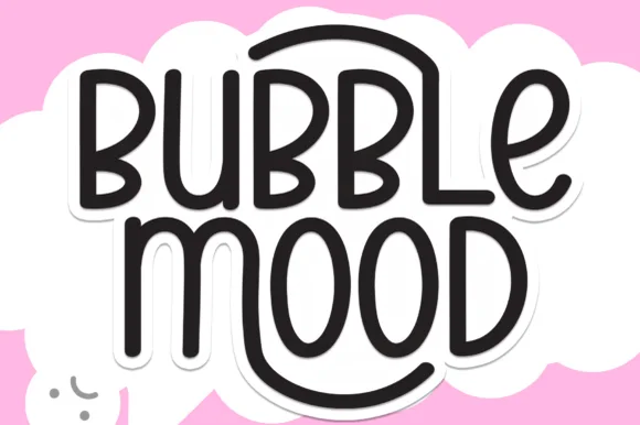
Bubble Mood is a tall, medium-weight rounded marker display font where curved outer stems wrap playfully around neighboring vowels.
Bubble Mood is a tall rounded monoline marker display with nesting arches: narrow upright letters drawn with an even round-tipped stroke, where each word sits under a shallow arch that nests inside the next line's arch. The arch grows the word vertically and the monoline keeps it honest at small sizes. It needs roughly 22 mm for the arch and the rounded end to read, and it is best in one bright ink on white, or a single dark colour on a pale board.
Recommended project & layout
Die-cut laptop sticker, planner cover & iced-latte cup — Stack two short words centered and add a 0.12 in white offset contour in Cricut Design Space for an instant die-cut sticker silhouette.
Before you cut or print
Clean medium-weight strokes and wide open 'O' and 'D' counters make adhesive vinyl weeding quick even at 0.75 in height.
Best paired with
Get fontPaid link
 #5 · Standout Silhouette
Sprinkle Honey
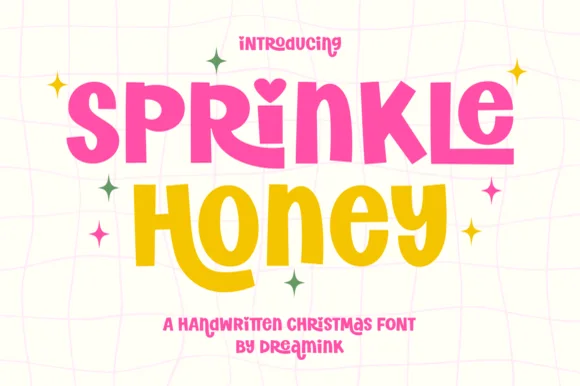
Sprinkle Honey is a chunky, playful cut-paper display font with a sweet heart-dotted 'i'—zero Christmas icons attached so it shines all 12 months!
Sprinkle Honey is a chunky cut-paper display that mixes uppercase with a heart-dotted lowercase i and scatters four-point sparkles, so a word reads as letters cut from coloured paper and glued down. The cut-paper contour is slightly uneven, which keeps it warm at 90 mm, and the heart dot needs size to read. It needs roughly 24 mm for the heart and the cut edge to hold, and it is best in hot magenta and honey gold on a pale ground or in one ink on kraft.
Recommended project & layout
Ice-cream / donut party banner, bakery sticker & kid tee — Stack 2 chunky words at 64–120 pt in hot pink and honey yellow on white or mint.
Before you cut or print
100% smooth, thick solid shapes cut and weed in seconds on Cricut HTV, 3D puff vinyl, and Oracal 651 down to 0.65 in!
Best paired with
Get fontPaid link
 #6
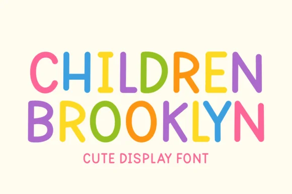
Children Brooklyn
Children Brooklyn is a tidy, outline-free rounded marker display font with tall friendly capitals and calm Nordic-playroom clarity.
Children Brooklyn is a clean rounded monoline marker caps display built for children's design: an even medium stroke, fully rounded ends, wide even spacing and all-capital letters that stay separate so young readers do not run a word together. The monoline keeps it crisp at small sizes, and the rounded ends are the only warmth. It needs roughly 20 mm for the rounded end and the counter to read, and it is best in one bright ink on white, or a single dark colour on pastel paper.
Recommended project & layout
Montessori shelf label, wooden name puzzle & classroom bin — Set uppercase words at 36–64 pt in muted earthy or bright rainbow hues with +10 letter spacing on birch or cream.
Before you cut or print
Zero thin serifs or double outlines—cuts and weeds fast on matte wall vinyl, bottle decals, and HTV down to 0.5 inches.
Best paired with
Get fontPaid link
 #7
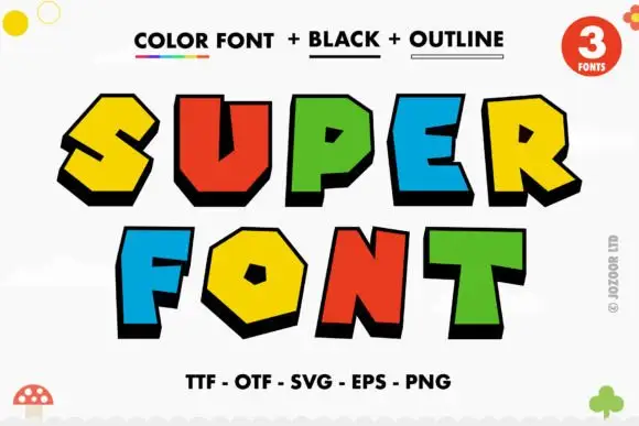
Super
Super is a comic display face of fat angular caps, supplied three ways: a colour version with hard offset shadows, a solid black version and an outline version, all with sharp bevels and pointed corners.
SUPER over FONT fills the card, and each letter is a chunky angular shape with a bevel cut on one corner and a hard black shadow stepped to the lower left. The colours rotate through yellow, red, green and blue, and the shadow is identical on every letter, which is what holds a multi-coloured word together. A caption at the top names the three versions and a line at the foot lists the formats, while small doodles sit at the corners. The three-version construction is the practical part: the colour version is for posters and covers, the black version for one-colour print and cutting, and the outline version for colouring pages and overlays, so one purchase covers a poster, a shirt and a children's activity sheet.
Recommended project & layout
A block-colour party heading — Set BIG above DAY on white, keeping the name and date in a plain black strip underneath.
Before you cut or print
Check colour and shadow rendering in the intended software, without implying licensed game branding.
Best paired with
Get fontPaid link
 #8
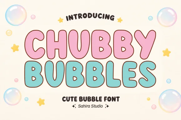
Chubby Bubbles
Chubby Bubbles is a bubble capital alphabet in which the letters are fat and round, the contour is thick and open and the inner space is left hollow, so a word reads as a set of pastel letter stickers for a nursery.
The C opens a wide crescent, the H keeps two fat stems and a low bar, the U holds a deep bowl and the B closes two even lobes, all at a maximal weight with fully rounded ends and a contour drawn as a separate line rather than a shadow. Because the letters are hollow, they can carry a pastel fill inside a dark contour, which is how the sample builds two colourways on one sheet. The rounded ends and the wide fit make the face read as foam letters at 30 mm, and the hollow construction keeps it legible on a busy nursery wall. Counters close below 20 pt. The cream ground, the pink and mint fills, the bubbles and the two caption lines are presentation; the display face is the two words.
Recommended project & layout
First-birthday highchair banner, bath-bomb label or party cup — Fill with pastel pink, mint or sky blue inside a dark brown or navy outline.
Before you cut or print
Smooth outer contours cut cleanly on cardstock, HTV and permanent vinyl.
Best paired with
Get fontPaid link
 #9
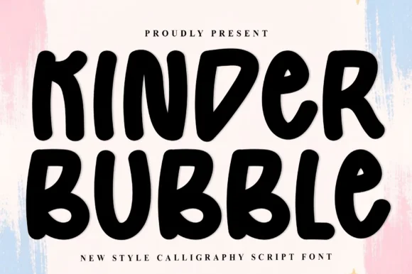
Kinder Bubble
Kinder Bubble is a bold, solid-black hand-drawn block display font with soft organic edges and playful mixed-case letterforms.
Kinder Bubble is a heavy hand-cut playroom block display: fat squared letters with visible scissor-cut edges, slightly mismatched heights and blunt corners, drawn to look as if cut from coloured card and pinned to a playroom wall. The cut edges are the design and they silt when the face is reduced. It needs roughly 26 mm for the cut edge and the height mismatch to read, and it is best as a one-colour vinyl or paper cut on a light ground, or one ink print where the cut edge reads as a shadow.
Recommended project & layout
Daycare cubby nameplates, teacher shirts & backpack tags — Center a child's name or grade level in 1.5–2.5 in solid letters, pairing classroom room numbers in the same bold face.
Before you cut or print
Weeds cleanly on both permanent vinyl and puff HTV; just watch the compact double counters inside 'B' below 0.8 inches.
Best paired with
Get fontPaid link
 #10
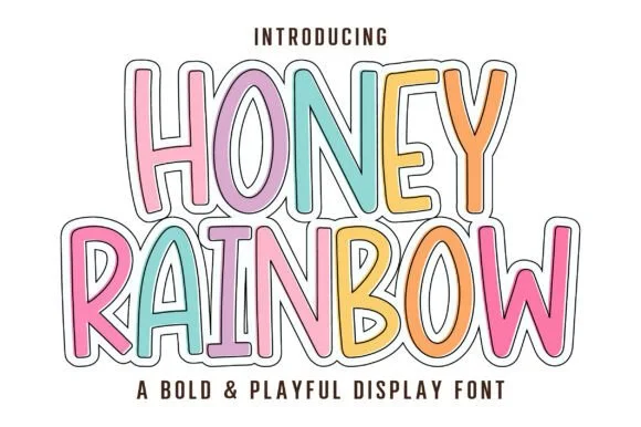
Honey Rainbow
Honey Rainbow is a tall, upbeat cartoon display font built for multi-colored pastel fills and crisp double-line sticker framing!
Honey Rainbow is a tall cartoon display in which every letter wears a rainbow-sticker treatment: a fat rounded shape with a white keyline, a second coloured outline behind it and a small highlight dash inside the stroke, with solid and outlined variants. The keyline and the coloured outline share the silhouette, so the word box grows on all sides. It needs roughly 30 mm for the keyline and the highlight to read, and it is best in three bright inks on white, or one ink plus bare paper for the keyline on coloured card.
Recommended project & layout
'IN OUR KINDERGARTEN ERA' teacher tee, door banner & tote — Stack 2 centered uppercase lines at 68–130 pt, coloring each letter in soft rainbow pastels inside a thin dark outline.
Before you cut or print
Prints vividly via DTF, sublimation, and Print-Then-Cut stickers—and solid cores cut cleanly on Cricut cardstock and HTV!
Best paired with
Get fontPaid link
 #11
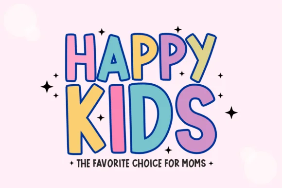
Happy Kids
Happy Kids is a bold, comic-outlined children's display font with oversized playful capitals and energetic baseline tilt.
Happy Kids is a chunky comic-outlined kids display with dancing baselines: fat rounded letters, a thick keyline with a white gap behind the fill, and letters that hop above and below the line so a word looks like it is moving. The hop grows the word vertically and the gap closes first when the face shrinks. It needs roughly 30 mm for the keyline and the hop to read, and it is best in three flat inks on white, or two inks where the gap is the paper itself.
Recommended project & layout
Toddler birthday tee, bounce-house sign & party cup — Set a smaller introductory word at 55% scale directly above a giant 4-letter focal word ('KIDS', 'FOUR', 'COOL').
Before you cut or print
Great for DTF transfers, sublimation, and Print-Then-Cut stickers; for single-color HTV, cut at 1.1 in+ so the comic outline weeds cleanly.
Best paired with
Get fontPaid link
 #12
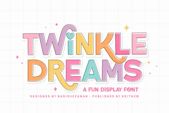
Twinkle Dreams
Twinkle Dreams combines firm block capitals with a heart-shaped dot above the i and curling extensions on selected letters, where the R and K tails swing below the main rows, each letter takes a pastel fill with a fine dark edge and the whole block sits on a faint grid.
The bodies stay blocky and even, the edges stay fine, the fills change per letter and two letters drop long tails under the baseline. That heart dot is the character: a plain display face gains one playful substitution, which is why the sample keeps a short title. The grid and the sparkles are cover treatment. Keep 40 pt so the fine edges stay separate from the fills, verify the heart form in your file and check the swinging tails against the line beneath.
Recommended project & layout
A wish-themed party invitation — Keep the phrase large with clear room below any R tail; place details in plain text.
Before you cut or print
Check the actual letters and do not assume a heart appears in words without i.
Best paired with
Get fontPaid link
 #13
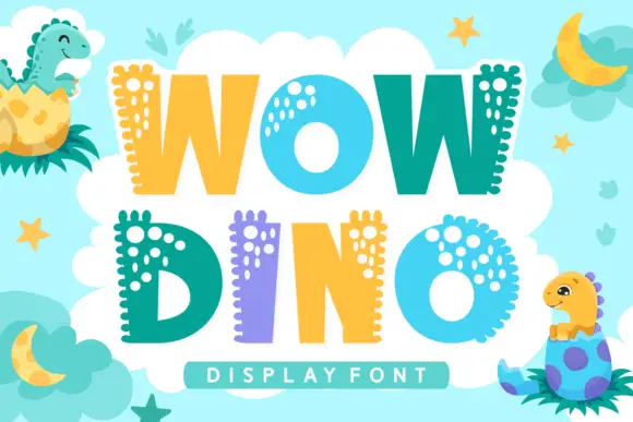
Wow Dino
Wow Dino is a playful colour font in which each capital carries a dinosaur spine: a row of rounded plates along the top edge, a dotted pattern inside the strokes and a bright fill that alternates between teal, yellow and lilac.
WOW over DINO fills the card on a pale blue ground scattered with stars, moons and leaves, and each letter is a fat rounded shape with a row of rounded plates along one edge and a cluster of pale dots inside. The colours alternate across the words — teal, yellow, lilac, teal — so the two rows read as one alternating block, and two cartoon dinosaurs sit in the corners hatching out of eggs. A bar at the foot names the style in a light caps face. The construction is simple: the spine is drawn as a repeating shape rather than a texture, which is what lets the letters stay readable at moderate sizes while still looking like dinosaurs, and the flat fills keep the set cheap to print.
Recommended project & layout
A hatching-dinosaur party title — Stack WOW over DINO in a plain cream invitation panel and set the date on a separate teal footer.
Before you cut or print
Verify letter contours and source any hatching-dinosaur illustration independently.
Best paired with
Get fontPaid link
 #14
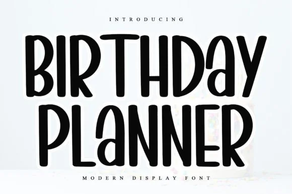
Birthday Planner
Birthday Planner is a tidy, tall hand-lettered marker display font with softly rounded stem tips and friendly vertical rhythm.
Birthday Planner is a tall rounded marker all-caps planner face: narrow upright caps with fully rounded ends, an even medium stroke, wide even spacing and a height that fits a single line inside a planner box. The rounded ends are the only warmth and the caps keep a label shouty but readable. It needs roughly 20 mm for the rounded end and the counter to read, and it is best in one bright ink on white paper, or a single dark colour on pastel card.
Recommended project & layout
Kids' party itinerary sign, milestone chalkboard & invite — Stack centered uppercase headers at 36–54 pt and use smaller 18 pt lines for time-slot bullet items.
Before you cut or print
Smooth, even marker strokes with zero thin serifs weed quickly and cleanly on Cricut vinyl, HTV, and acrylic signs down to 0.6 in.
Best paired with
Get fontPaid link
 #15
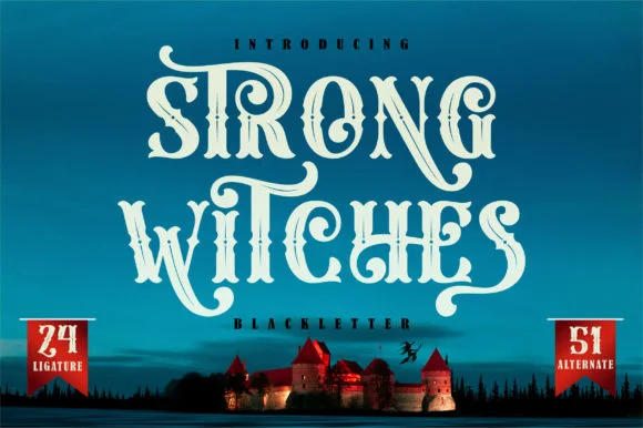
Strong Witches
Strong Witches is a lively, fairytale-gothic blackletter softened by bouncy curled swashes, 24 ligatures, and 51 stylistic alternates.
Strong Witches is a playful curly-swashed fantasy blackletter with twenty-four ligatures and fifty-one alternates: dense broken strokes with a light rhythm, curls that sprout off the shoulders and a swash set that turns a plain word into a drawn spell. The alternates only appear through specific keystrokes, and the curls are the finest element. It needs roughly 32 mm for the curl and the ligature to read, and it is best in two flat inks on cream, or one dense ink on white where the curls print as drawn lines.
Recommended project & layout
Hocus-Pocus party shirt, potion jar label & spellbook prop — Stack 2 centered words at 48–68 pt and swap in 2 or 3 of the 51 PUA alternates on outer capitals and descenders.
Before you cut or print
Sturdy main stems cut well on HTV and vinyl at 1.4 inches+ tall; take care around the narrower curled tail hooks when weeding.
Best paired with
Get fontPaid link
 #16
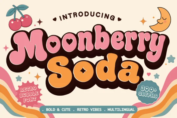
Moonberry Soda
Moonberry Soda is a plump retro bubble display in which the round bowls hide heart-shaped counters, the silhouettes stay thick and soft and the alternates add playful variants, so a short word reads as a kawaii sticker.
The B closes two round bowls with a heart cut inside one, the o keeps a small heart counter, the S swells through a soft spine and the lowercase m sits low under round shoulders, all at a bubble weight with thick sticker-ready outlines. The heart counters are the character: they sit inside the letter rather than beside it, which is why the sample sets a two-word phrase with air around it. Because the hearts are small, the face wants 34 pt before they read and the alternates should be checked for the shapes a project prefers. The pastel ground and the small caption are presentation; the dark bubble letters are the face.
Recommended project & layout
Boba cup decal, kawaii sticker shop logo or party tee — Layer a deep brown drop-shadow offset behind pastel pink and orange fills.
Before you cut or print
Keep cut height above 1.2 inches on vinyl so the tiny heart counters weed cleanly.
Best paired with
Get fontPaid link
 #17
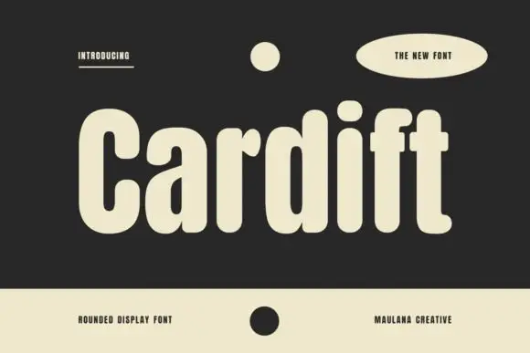
Cardift
Cardift shows pale lettering on charcoal: a high narrow C opens beside rounded a and d bowls, the heavy stems finish softly and the f and t crossbars project only a short distance past the stroke, with a large round i dot above a compact centre.
The stems stay thick with soft terminals, the bowls round into deep curves, the crossbars barely extend and the i dot sits as a full circle above the line. The short crossbar is the character: the letters feel packed and deliberate rather than airy, which is why the sample sets one word on charcoal. Because the internal spaces are tight, keep 30 pt before the counters stay open, and check a new word at final size since the ornaments around the title are layout elements rather than an icon set.
Recommended project & layout
A small-batch coffee label heading — Set Daily Roast on two lines at the left of a cream label with origin and weight in a plain right-hand column.
Before you cut or print
Check actual R and y and inspect counters after printing.
Best paired with
Get fontPaid link
 #18
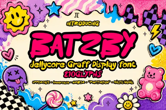
Batzby
Batzby places a hot-pink uppercase word inside a heavy black outline, where wide curved B bowls contrast with a sharp A apex and a long rising Y arm, several stroke ends curl into blunt hooks and the Z sweeps low across the baseline.
The strokes slant forward, the weights stay heavy, the ends hook over and the baseline wanders under the Y. That hooked terminal is the character: the word reads as sprayed quickly rather than drawn carefully, which is why the cover surrounds it with icons and a liquid border. Those icons and the outline belong to the composition, so try the plain silhouette first, verify any glyph or language claims in the file and keep 34 pt before the hooks merge.
Recommended project & layout
A street-art sketchbook cover — Place BATZBY across a pale unpatterned cover with the issue number in a small square clear of the Y arm.
Before you cut or print
Check the real outline and source any separate cover icons independently.
Best paired with
Get fontPaid link
 #19
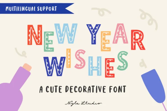
New Year Wishes
New Year Wishes is a playful decorative block font (not a traditional serif) filling bouncy uppercase letters with confetti dots, stars, and stripes.
New Year Wishes is a decorative party block in bouncy uppercase, with confetti dots, stars, zigzags and stripes filling the interior of each letter rather than sitting behind the word. The blocks are slightly irregular, which gives the face a hand-cut rhythm, and the interiors are coarse enough to survive print at 20 mm but fill below about 12 mm. It is a banner and card face: loud, festive and short-phrase only, best in two or three bright colours against a pale ground where the patterns stay separate.
Recommended project & layout
Kids' countdown-to-noon banner, party invite & cup — Color alternating letters in coral, sky blue, mint, mustard, and plum at 48–88 pt over warm cream.
Before you cut or print
Tiny interior confetti cutouts mean Print-Then-Cut, sublimation, and DTF work much cleaner than blade-weeding vinyl.
Best paired with
Get fontPaid link
Matched Font Duos & Packs
12 fonts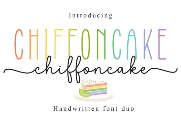 #20
Chiffoncake Duo
Chiffoncake Duo pairs very tall narrow capitals, each in a different pastel tone, with a low connected script whose deep f loops drop below the baseline, and long tails extend from both sides of the lower word above a small cake illustration.
The caps stay tall and thin, the script stays fine and continuous, the loops drop deep and the entry and exit tails run wide. That height contrast is the character: the pair is built on the gap between a condensed cap row and a light handwritten line, which is why the sample keeps both centred. The rainbow colours and the cake drawing are presentation. Keep 28 pt for the script, leave 20 mm beneath for the f loops and check whether both styles install from one file before planning a two-line lockup.
Recommended project & layout
A cake-menu category heading — Keep the two lines separate rather than overlapping and put flavours and prices in a plain list below the f loops.
Before you cut or print
Confirm the exact included pair and any alternate-access claim.
Best paired with
Get fontPaid link
 #21
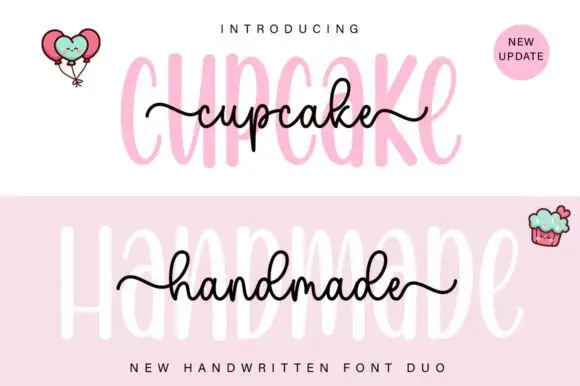
Cupcake Handmade Duo
Cupcake Handmade Duo places tall narrow rounded letters in pale pink behind a smaller connected script line in black, twice on one cover, where the script carries long outer tails and looped k and h forms while a balloon pair, a cupcake drawing and an update badge sit in the corners.
The caps stay tall and narrow, the script stays compact and continuous, the loops open large and the tails run wide past the caps on both sides. That size gap is the character, because the script sits inside the cap row rather than under it. The balloons, the cupcake and the badge are separate sample elements, so do not count them as part of the type. Keep 34 pt for the caps and 16 pt for the script, and check the k and h loops against your margins before locking the lockup.
Recommended project & layout
A cupcake-table heading — Place the capital title above, not behind, the script; put flavours and dietary information in a plain panel below.
Before you cut or print
Check both supplied styles and essential food information separately.
Best paired with
Get fontPaid link
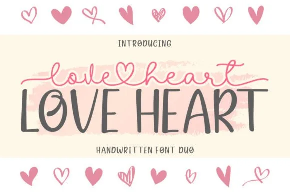 #22
Love Heart Duo
Love Heart Duo matches a tall, slightly textured uppercase brush-sans with a fine monoline cursive featuring a built-in center heart swash.
Love Heart Duo pairs a hand-brushed tall sans with a heart-connected monoline script: the sans is narrow with a dry brush edge and open counters for headlines and lists, while the script runs an even thin stroke where the joins between two words swell into a small drawn heart. The pair gives one card a hand-linked line and a legible second voice from a single family and a single palette, so an invitation, a tag and a seal can be built together. The hearts are the finest element and they close into dots as soon as the face shrinks, and the dry brush edge fills when the sans is reversed or printed small. The sans needs roughly 24 mm and the script 26 mm for their detail to read.
Recommended project & layout
Couple anniversary mug, pillow sham & Valentine card — Match the outer tip-to-tip width of the tailed script to the full width of the uppercase sans row underneath.
Before you cut or print
The fine monoline script cuts best above 1.75 in tall on vinyl; for smaller mugs, use sublimation or Print-Then-Cut.
Best paired with
Get fontPaid link
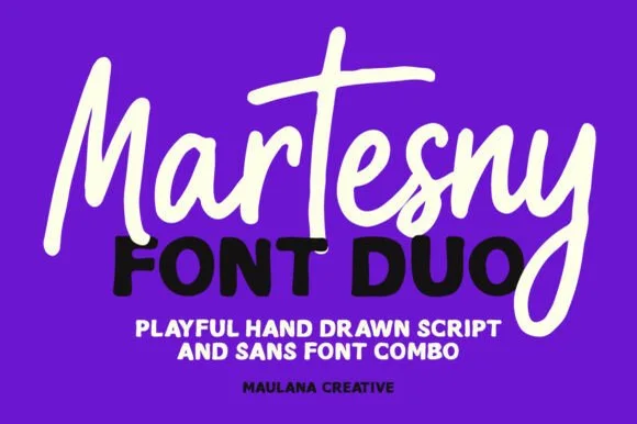 #23
Martesny
Martesny combines a lively, tall-crossed hand-drawn marker script with a solid, rounded geometric uppercase sans partner.
Martesny is a duo of an energetic marker brush script and a chunky rounded sans: the script runs a wet loaded stroke with small flicks and joined letters, while the sans is a fat rounded block with tight counters for badges and prices. The pair carries a loud card in one ink, and the marker edge is the finest element. The script needs roughly 24 mm and the chunky sans 26 mm for their detail to read, and both work in one bright ink on white.
Recommended project & layout
Podcast cover, YouTube thumbnail & custom party hoodie — Let the script's descending 'y' or 'g' overlap slightly across the corner of the bold uppercase sans line beneath it.
Before you cut or print
Both the chunky sans and medium-thick marker script weed reliably on HTV and decal vinyl at 1 inch+ scale.
Best paired with
Get fontPaid link
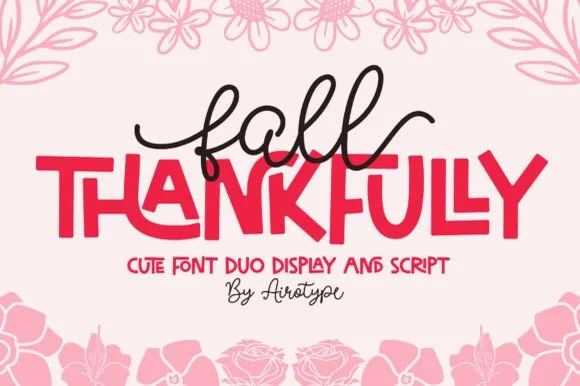 #24
Fall Thankfully
Fall Thankfully pairs a looping monoline cursive script with a heavy, interlocking all-caps sans display face.
Fall Thankfully is a duo of a monoline tail script and a bouncy all-caps sans: the script runs an even stroke that finishes every word with a long lifted tail, while the sans is a chunky capital set whose baseline hops so a short line looks hand-set. The pair is built for autumn market goods, where one line is written and one is printed. The script tail is the finest element and it closes into a dot when reduced. The script needs roughly 28 mm and the sans 24 mm for their detail to read.
Recommended project & layout
Thanksgiving host apron & kitchen tea towel — Set the main family or harvest word in the heavy sans at 2.5 in cap height, then tuck a 1-word script lead-in slightly overlapping the upper-left letters.
Before you cut or print
Weld the overlapping script loops before cutting HTV, and peel away from the narrow 'f' and 'l' ascender counters slowly.
Best paired with
Get fontPaid link
 #25
Shortcake Strawberry
Shortcake Strawberry puts a fine tall-looped script above a heavy irregular sans whose bowls are almost as wide as the letters are tall, on a soft pink ground.
In the pink specimen the script keeps thin even stems with open ascender loops and a small heart tittle, so its weight sits closer to a pointed pen than a brush. Beneath it the capital line is broad and soft, with a slightly uneven baseline and counters that shrink to narrow slits in the R and B. The two voices share almost no weight, which is exactly why the pair works as a lockup: the script supplies the tenderness and the sans supplies the punch. The underline stroke beneath the last line and the tiny speech-bubble mark are layout decoration. Both members are meant to be used together, but each also reads on its own.
Recommended project & layout
A strawberry cake sleeve — Put a small script flavour line above one bold product line and keep ingredients on another panel.
Before you cut or print
Check the script joins remain legible beside the heavy letter mass.
Best paired with
Get fontPaid link
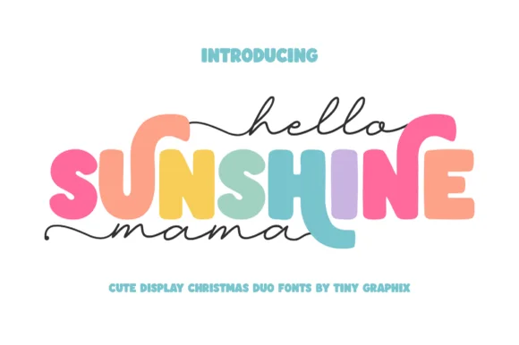 #26
Hello Sunshine Mama
Hello Sunshine Mama pairs chunky rounded caps that can each take a different colour with a fine monoline script that runs above and below the caps in long flat strokes.
The cap half is heavy and soft: the S swells through two fat curves, the U holds a deep bowl, the N keeps one thick diagonal and the E carries three even arms, all rounded and even in weight. Because each letter is a separate shape of equal weight, the sample fills them in different colours, which is how the pair is meant to be used on children's pieces. The script half is a light monoline with flat entry and exit strokes that extend well past the caps on both sides, and that sweep is what holds the composition together. Contrast comes from weight, not from style, so the two layers never fight. The white ground, the pink script, the pastel fills and the two caption lines are presentation; the duo is the lettering.
Recommended project & layout
Mother's Day sweatshirt, tote or tumbler — Set the middle keyword in rainbow/earth-tone caps and sandwich with lowercase tailed script.
Before you cut or print
Thicken the thin monoline script slightly (0.02" offset) if cutting small adhesive vinyl decals.
Best paired with
Get fontPaid link
 #27
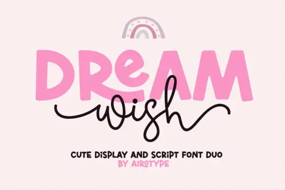
Dream Wish
Dream Wish contrasts chunky uneven capitals in a flat pink with a fine black looping script line beneath, where the script w begins in a long entry tail and the h finishes in a high sweeping exit that lifts above the cap height of the lower word.
The caps stay blocky and slightly uneven, the script stays thin and continuous, the entry and exit tails run long and the two rows overlap lightly. That overlap is the character: the script sits close enough to touch the caps, which is why the sample keeps both rows centred with nothing else competing. A rainbow arc above is cover artwork. Keep 46 pt for the caps and 20 pt for the script, leave 16 mm of clear ground between the rows and check the exit tail against your right margin.
Recommended project & layout
A birthday wish-card heading — Place a heavy first word over a short script line, keeping the personal note inside the card.
Before you cut or print
Confirm members and actual tail joins.
Best paired with
Get fontPaid link
 #28
Brown Carolina Duo
Brown Carolina Duo contrasts broad high-contrast capitals with a much finer narrow slanted script, set dark on a plain cream field, where the capital R legs sweep below the neighbouring letters and the script carries long tails that run past the ends of both words.
The caps keep thin cross strokes and heavy uprights, the script keeps one fine weight, and the two voices sit in a strict stack: script, two cap rows, script. That alternating order is the character, because the fine lines frame the heavy block like a rule above and below. Both treatments appear on a plain light field, so the cover gives no clue about texture or shadow. Keep 34 pt for the caps before the thin strokes break up, keep 20 pt as the floor for the script and check the R leg before setting a line of capitals.
Recommended project & layout
A boutique stationery front — Use the capital name centrally and a small script descriptor below, leaving the R sweep clear of contact information in a plain footer.
Before you cut or print
Confirm both styles and the actual capital alternates.
Best paired with
Get fontPaid link
 #29
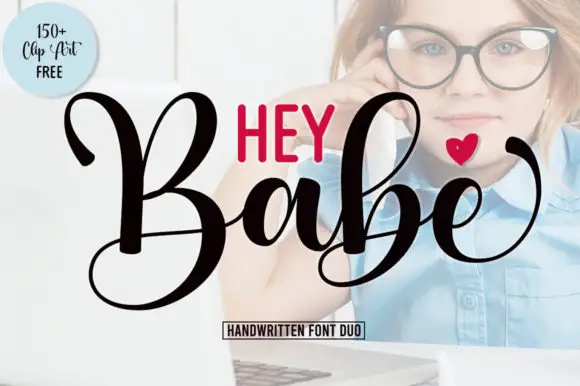
Hey Babe
Hey Babe is a duo of a heavy looping script with tall capitals and a smaller rounded sans, arranged so a bold script line carries the design and the sans supplies the second voice.
The script half opens with a large B whose loop rises above the cap line and crosses its own stem, and the letters after it keep that weight: the a closes a round bowl, the b repeats the tall loop, the e curls its exit and the final e lifts away with a flourish. Weight is heavy and constant, joins stay as thick as the stems and the ends curl rather than taper, which gives the phrase its confident tone. The second half is a compact rounded sans in capitals with even strokes, and in the sample it sits above the script as a short label, which is how the pair is usually layered. The photograph behind, the black and red inks, the small heart and the boxed caption are presentation; the duo is the two lines.
Recommended project & layout
A short affectionate cover — Place small print above the script and sender below its lowest loop.
Before you cut or print
Verify heart availability and included extras separately.
Best paired with
Get fontPaid link
 #30
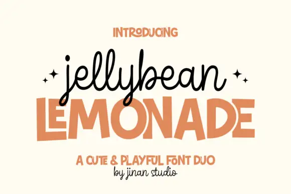
Jellybean Lemonade
Jellybean Lemonade pairs a looped monoline script with a squared playful sans, so one lockup carries a light handwritten first line and a flat block second line in the same colour.
The script half is a monoline with tall looping ascenders: the j drops a long curved descender and dots high, the e and the a close open bowls, the double l rises into narrow loops and the y finishes with a deep tail that overlaps the block line below. The sans half is a playful block alphabet in which the E carries three even arms, the M splays from a narrow centre and the A holds a low bar, all with squared corners and no contrast. Because both halves sit at the same visual weight, the pair reads as one object rather than as a headline plus decoration, which is why the sample stacks them tight. The cream ground, the orange ink, the two sparkles and the small credit line are presentation; the duo is the two lines.
Recommended project & layout
A lemonade-stand header — Place the small script name above one large block product word and keep prices in plain type elsewhere.
Before you cut or print
Check the low script loops do not collide with the block title.
Best paired with
Get fontPaid link
 #31
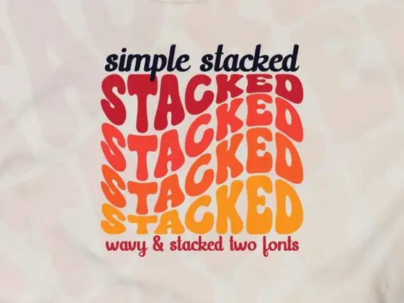
Simple Stacked
Simple Stacked is a wavy display in which rounded capitals repeat down three offset rows, each row bending and stretching the letters differently, so a short word reads as a rainbow of stacked script rather than a plain line.
The S pulls a broad curve, the A opens a narrow counter, the letters in the middle row stretch wider than the row above and the baseline of each row waves independently. The repetition is the character: it turns one word into a pattern, which is why the sample sets a single phrase three times over. Because the rows overlap, the face needs deliberate spacing between rows from 30 pt and reads best as a display block rather than as a line of text; a second word needs its own stack. The pale ground and the small caption are presentation; the wavy lettered rows are the face.
Recommended project & layout
A rhythm-themed poster — Reserve the centre for one verified stacked word and keep all event details outside the repeated rows.
Before you cut or print
Confirm how many rows one glyph or style actually generates.
Best paired with
Get fontPaid link
Scripts & Calligraphy
4 fonts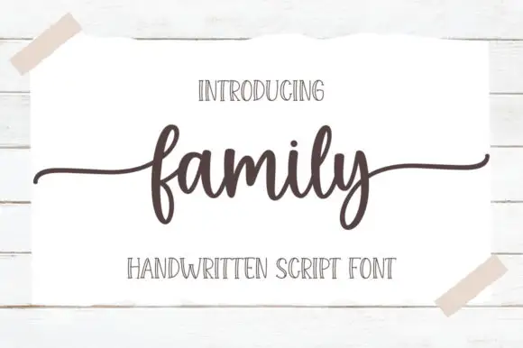 #32
Family
Family is a low connected script in which the body sits close to the baseline, the stroke stays even and both ends run out as wide flat tails, so a short word reads as a caption signed across a card.
The f rises into a narrow loop before the body, the a holds a small bowl, the m keeps three even arches, the i carries a light dot and the l rises into a plain stem, all at an even medium weight with short joins. The low body and the long tails are the character: the word occupies little height but plenty of width, which is what makes the face useful where a photo or a fold needs space above and below. Because the stroke is even, it holds at 18 pt on a printed card, and the tails can be trimmed without breaking the word. The white card taped to a wall, the dark ink, the two caps lines are presentation; the script is the word shown.
Recommended project & layout
A family celebration heading — Set one line above plain recipient and date details with clear space below y.
Before you cut or print
Preview exact wording and side-tail bounds.
Best paired with
Get fontPaid link
 #33
I Love Glitter
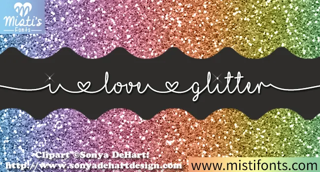
I Love Glitter draws a fine handwritten line in which small heart shapes divide the words and long entry and exit strokes stretch the phrase wider than its letters alone, so a short message runs almost edge to edge.
The stroke stays thin and continuous, the joins barely widen, the hearts sit between words as dividers and the outer strokes travel far beyond the letters. The heart divider is the character: the phrase is separated by ornament rather than by a space, which is why the sample runs across the page. Because the stroke is fine and the tails are long, keep 24 pt as the floor on smooth stock and 20 mm at each end from a short line.
Recommended project & layout
A birthday card with one long wish — Run the wish across the middle of a landscape card. Keep the recipient’s name above it in a plain face, with generous space at each side of the script.
Before you cut or print
Check the exact heart characters and joins in the actual files. Print a proof; fine lines may disappear at small sizes.
Best paired with
Get fontPaid link
 #34
Groovy
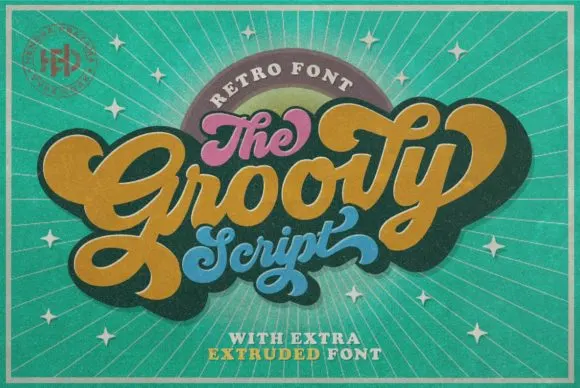
Groovy is a compact connected script drawn from late-sixties and seventies advertising, where the letters join in a rounded loop and the whole word keeps the squat, cheerful proportions of that period rather than the tall slant of a calligraphic hand.
The connectors stay visible, the x-height runs large against short ascenders and the curves close round rather than tapering into sharp exits. That squashed retro rhythm is the character: the word reads as a period advertisement rather than as a modern script, which is why the sample stays short and horizontal. Test the actual connectors in your own phrase before promising a long line, and keep 28 pt so the joins do not disappear on a small print. The connectors are the detail to test: a long phrase repeated at 28 pt turns the joins into a dotted line, so keep the sample short and check your own wording before the run.
Recommended project & layout
A seventies-themed birthday invite — Let a short retro party title rise across the upper card, with the honouree’s name below. Keep the date and address level and plain in a lower information block.
Before you cut or print
Check names, age and date together; leave essential details out of the decorative word shape.
Best paired with
Get fontPaid link
 #35
Rainbow
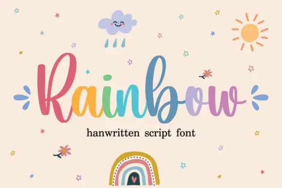
Rainbow is a rounded connected script in which a narrow looped capital opens the word, the lowercase joins broadly and the b and l rise well above the body, so a single line reads as cheerful handwriting with a lift at the start.
The R closes a narrow loop, the b climbs above the ascender line, the joins stay round and open, and the lowercase bowls keep an even stroke through the connectors. The tall loop is the character: it gives one letter the vertical accent while the rest stays calm, which is why the sample sets one word alone. Because the joins are round, words need a clear gap between them, and the face cuts from about 1.1 inches of x-height before the connectors weld on vinyl. The rainbow fill and small illustrations are preview artwork; the lettering is the face.
Recommended project & layout
A craft collection heading — Place the name on a clear horizontal band with product details below.
Before you cut or print
Verify alternate access and avoid assuming multicolour glyphs.
Best paired with
Get fontPaid link
Practical buyer checklist
Frequently asked questions.
Key cutting, printing and pairing answers before choosing a birthday typeface.
What size should a cake topper be?
Between 4 and 6 inches wide for a 6 to 8 inch cake, with lettering at least 1 inch tall. Smaller toppers look lost in the frosting, and anything wider than the cake's top tier overhangs.
Which fonts are easiest to cut for birthday banners?
Heavy bubble and cut-paper blocks with closed counters. Avoid thin scripts and outlined faces with narrow rings, since those tear or fold when threaded onto ribbon.
Is cardstock safe to put in a cake?
Not directly. Standard cardstock and glitter papers are not food safe and should be kept behind a barrier or inserted in a food-safe sleeve. Acrylic is the practical reusable option for toppers.
How do I keep a banner readable from across a party?
Keep one letter per panel, 5 to 7 inches tall, and use a high-contrast colour against the wall. Lettering below 3 inches disappears at a distance, which is the usual reason a banner looks flat in photographs.
Keep exploring
Related collections & guides.
Explore adjacent maker roundups or check our practical pre-production checklists.
01 / Type Styles
Cute bubble & kawaii
30 curated fonts · Previews & pairings
02 / Occasions & Milestones
Baby shower & nursery signs
24 curated fonts · Previews & pairings
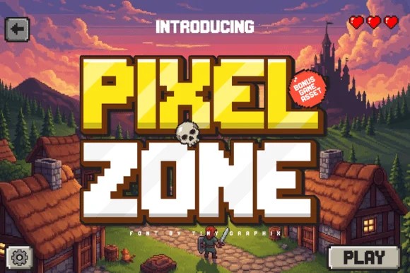
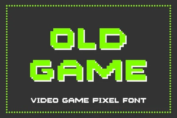
03 / Type Styles
8-bit pixel, VHS & gaming
14 curated fonts · Previews & pairings
04 / Cricut & Craft
Sublimation, sticker & Print-Then-Cut
29 curated fonts · Previews & pairings
Guides: Invitation font checklist · Vinyl & cutting checklist · How to pair script & sans fonts