Neutral Sans Workhorse

Sunday Bright + Godthem
Lets Sunday Bright own the focal silhouette while handling secondary copy, sizing and subheads cleanly.
Inspect Godthem specimenDisclosure: MakerFileHub may earn a commission from qualifying purchases via paid links on this page. How our links work.
Soft joined-looking groovy forms
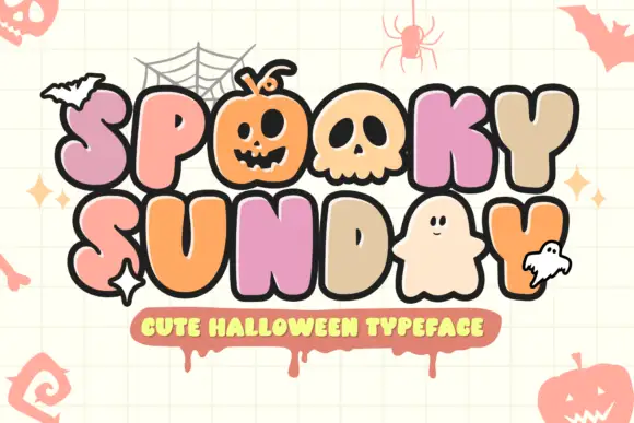
Sunday Bright is a soft groovy display in pink and cream on a pale grid: fat rounded letters that appear joined, a low waist, tall loops and a full stop drawn as a circle, presented as a pair of stacked words in two colours.
Paid link
Get this fontProject & layout blueprintsAt-a-glance maker compatibility
Sturdy stroke walls and open counters weed cleanly on adhesive vinyl, HTV apparel film, and cut cardstock.
Visual anatomy & craft review
The two words are stacked, each in its own colour, and the face is a soft display: the letters look joined because the joins are drawn as part of the letter shapes, the S and the d are fat with tall loops, the y drops a curved tail, the B of Bright carries wide bowls and the word ends with a drawn full stop, while the strokes are rounded everywhere and there is no contrast at all. That joined construction is what gives the face its groovy period feel, and the two-colour setting shows how a designer can build a stacked title without a second purchase. Small drawn daisies, a striped arc and a pale grid ground fill the margins, and a small line in a rounded hand beneath names the style. Sunday Bright is a display face for posters, packaging and party goods, and it needs two short words at a large size.
A groovy pair of stacked words in two colours
Two-font hierarchy recipes
Tested contrast partners — pairing Sunday Bright with grounded secondary typography.
Sunday Bright + Godthem
Lets Sunday Bright own the focal silhouette while handling secondary copy, sizing and subheads cleanly.
Inspect Godthem specimen
Sunday Bright + Medvilea Editorial
Grounds bold display lettering with classic typographic authority on posters, badges and apparel.
Inspect Medvilea Editorial specimenPractical applications
Concrete hierarchy, scale and production guidance tailored to Sunday Bright’s stroke geometry.
A groovy two-colour display makes a small card look designed, and the joined shapes read at a glance without any illustration.
Hierarchy & layout recipe
Print a 120 by 120 mm square card: set the greeting at 32 pt over two lines, keep 14 mm of clear ground beneath before the details at 9 pt, and hold 13 mm of margin on all four sides of the card.
Pre-production check
Two colours on one small card can muddy; print one at the finished size and check the contrast before the batch.
The face suits a drink sold on a bright mood, and the joined shapes hold on a narrow label where a script would break into pieces.
Hierarchy & layout recipe
Print a 50 by 85 mm label: set the brand at 15 pt on two lines, keep 6 mm of clear ground beneath before the volume at 4.5 pt, and hold 4 mm of margin on all four sides of the label.
Pre-production check
Joined shapes can merge into a block at small sizes; print one on the real stock and check the counters before the order.
A soft groovy display reads from right across a street, and the period tone suits a market that sells things made by hand.
Hierarchy & layout recipe
Print an A2 poster: set the title at 120 pt over two lines, keep 28 mm of clear ground beneath before the times at 22 pt, and hold 24 mm of margin on all four sides of the sheet.
Pre-production check
A light display face on a pale ground can disappear; print one proof at the final size and check the contrast before the run.
Technical & licence verification
Confirm included OTF/TTF/WOFF formats, full glyph tables and licence coverage on the live store page before batch production.
Closest visual alternatives
Matched across letterform anatomy, stroke behaviour and craft applications.
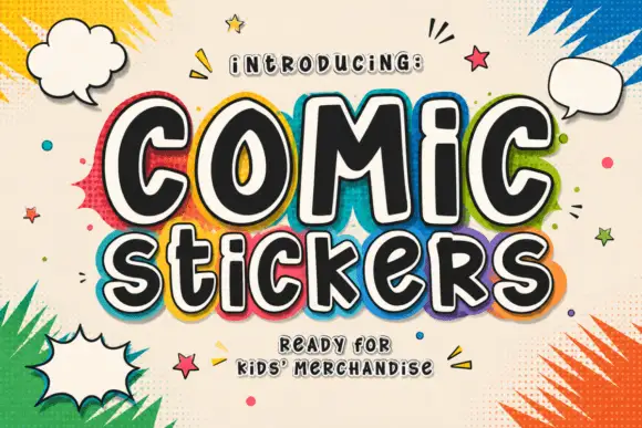
Soft irregular mixed-case lettering with thick faces and layered sticker-like edging
Comic Stickers combines tall COMiC forms with a lower mixed-case Stickers line, where rounded black faces with uneven widths and softly bent terminals are separated from bright offset borders by pale edging.
Ideas for this font
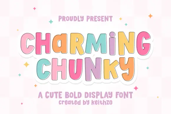
Playful upright forms with uneven mixed-case proportions and a stitched outline
Charming Chunky is a playful display face in which the letters mix capital and lowercase proportions, the heights shift and a stitched outline runs around the whole lockup, so a word reads as a cut felt shape.
Ideas for this font
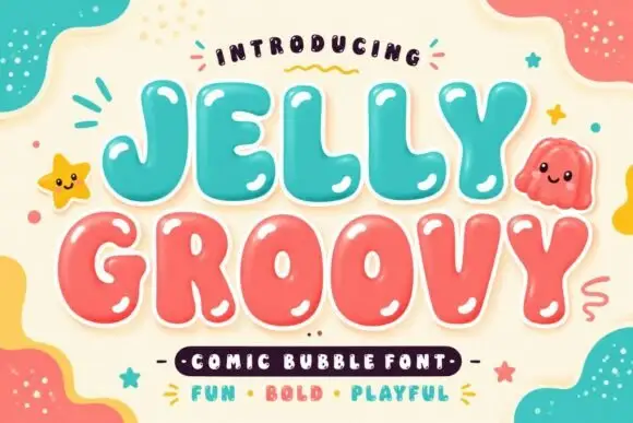
Soft irregular bubble capitals with heavy rounded interiors and small counters
Jelly Groovy is a soft irregular bubble capital alphabet in which the strokes swell unevenly, the counters stay small and the letters lean slightly, so a phrase reads as a comic-book bubble rather than a geometric display face.
Ideas for this font
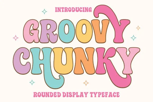
Soft pastel seventies groovy display with swollen bowls and rounded terminals
Groovy Chunky is a seventies display face in which the bowls swell, the terminals round off and the letters lean into each other, so a word reads as a shop sign from a decade that trusted curves.
Ideas for this font
Same independent foundry
Allow optional Google Analytics to measure visits and catalogue actions. Your search words and notes are not included. Privacy & storage