Modern Grotesque Body

Witchy Sprinkle + Memoir Slang
Creates crisp high-hierarchy contrast beneath Witchy Sprinkle headlines across menus, websites and labels.
Inspect Memoir Slang specimenDisclosure: MakerFileHub may earn a commission from qualifying purchases via paid links on this page. How our links work.
Magical display serif with elongated spurs and pointed curls
Witchy Sprinkle is a magical display serif in which the stems rise into elongated spurs, the terminals curl into points and the contrast stays high, so a two-word title reads as a hand-drawn storybook sign.
Paid link
Get this fontProject & layout blueprintsAt-a-glance maker compatibility
Sturdy stroke walls and open counters weed cleanly on adhesive vinyl, HTV apparel film, and cut cardstock.
Visual anatomy & craft review
The W splays four pointed strokes, the I rises into a tall spur, the T spreads a thin arm with a curl, the C turns a hooked crescent and the S holds a curving spine, all at a high contrast with drawn terminal curls and stretched finials. The pointed finials are the character: they sit above the cap line and hang below the baseline, which is why the sample sets two stacked words with a wide gap and stars around them. Because the spurs are thin, the face needs 40 pt before they read, and it prints best in one light colour on a dark ground. The night sky, the moon, the cottage, the ornamented corner frame and the heart at the foot are presentation; the cream display words are the face.
Magical · Pointed · Display
Two-font hierarchy recipes
Tested contrast partners — pairing Witchy Sprinkle with grounded secondary typography.
Witchy Sprinkle + Memoir Slang
Creates crisp high-hierarchy contrast beneath Witchy Sprinkle headlines across menus, websites and labels.
Inspect Memoir Slang specimen
Witchy Sprinkle + Handmade Calligraphy
Adds a warm human signature touch for 1-to-3-word callouts without competing against structured serif capitals.
Inspect Handmade Calligraphy specimenPractical applications
Concrete hierarchy, scale and production guidance tailored to Witchy Sprinkle’s stroke geometry.
The pointed finials set a storybook mood on their own, and the tall spurs give a poster its silhouette at 90 mm in one light ink.
Hierarchy & layout recipe
Print an A2 poster: set the title at 90 mm on two lines, keep 35 mm of clear space around the finials, and set the time in a 14 pt caps sans in the lower band with 25 mm of clearance.
Pre-production check
A finial printed close to a second line reads as a collision; check the poster and open the gap between the lines to 40 mm.
The curls suit an October invitation, and the high contrast keeps a short greeting readable at 32 pt on a dark card printed in one light colour.
Hierarchy & layout recipe
Print an A6 card: set the greeting at 32 pt, set the address line in a 9 pt sans beneath, and keep 12 mm of margin so the curled terminals sit inside the trim.
Pre-production check
A curled terminal trimmed by the card edge looks cut; check the imposed card and pull the word inward by 5 mm.
The magical register gives a candle a small mark, and the pointed spurs hold a brand name at 22 pt on a coated label in one ink.
Hierarchy & layout recipe
Print a 60 by 45 mm candle label: set the brand name at 22 pt, set the scent in a 7 pt serif beneath, and keep 5 mm from the die so the finials stay whole.
Pre-production check
A thin finial cut by a die loses its point; check the imposed label and raise the word 2 mm.
Technical & licence verification
Confirm included OTF/TTF/WOFF formats, full glyph tables and licence coverage on the live store page before batch production.
Closest visual alternatives
Matched across letterform anatomy, stroke behaviour and craft applications.
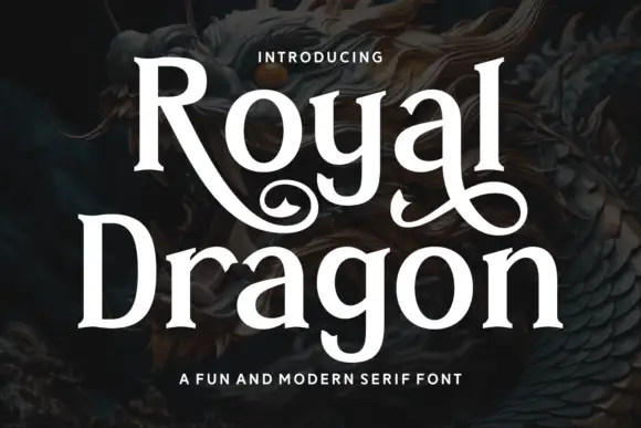
Modern serif with playful flourishes
Royal Dragon is a modern serif in cream on a dark dragon painting: moderate contrast, sturdy serifs, and flourishes that curl from the g and the l, so the word reads as a friendly editorial face with one decorative move.
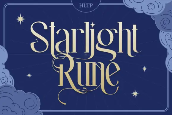
Tall fantasy serif with a long swash
Starlight Rune is a tall fantasy serif in gold on navy: elongated letters with hairline joins, a long swash that runs through the middle of the block, and a drawn night sky of clouds and stars behind it.
Ideas for this font
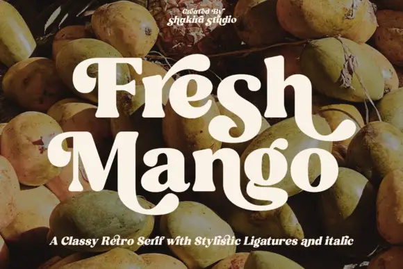
Heavy rounded retro serif with broad curling descenders
Fresh Mango shows cream mixed-case letters with thick soft strokes and narrow internal counters over a fruit photograph, where the initial F curls at its upper left, the h ends in an outward hook and the M sweeps into a large low curve that runs under the following letters.
Ideas for this font
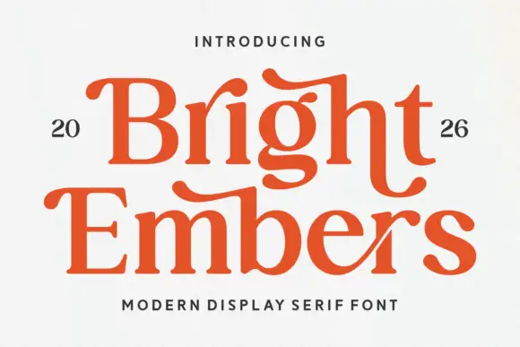
Substantial serif with wavy upper bars and curled lower terminals
Bright Embers is a substantial serif in which the bowls stay broad, the stems hold firm, selected upper bars wave and the t and final s turn into low outward curves, so a two-row heading reads as warm editorial lettering.
Ideas for this font
Same independent foundry
Allow optional Google Analytics to measure visits and catalogue actions. Your search words and notes are not included. Privacy & storage