Neutral Sans Workhorse

Mila + Base Edge
Lets Mila own the focal silhouette while handling secondary copy, sizing and subheads cleanly.
Inspect Base Edge specimenDisclosure: MakerFileHub may earn a commission from qualifying purchases via paid links on this page. How our links work.
Inflated graffiti letters with hanging drips
Mila is an inflated graffiti display face in black on a dark wall: fat rounded letters with a glossy highlight, a neon green and pink outline, and paint drips hanging from the bottom of each stroke, with a crown splat and a spray can at the edges.
Paid link
Get this fontProject & layout blueprintsAt-a-glance maker compatibility
Sturdy stroke walls and open counters weed cleanly on adhesive vinyl, HTV apparel film, and cut cardstock.
Visual anatomy & craft review
The name fills the frame on one line, and the lettering is graffiti rather than typography in the strict sense: every stroke is a fat rounded tube, the highlight runs along the top of each tube, a bright outline separates the letter from the wall, and the bottoms of the stems run into drips that hang below the baseline at different lengths. The M is a pair of arches, the i keeps a dot that reads as a bead, the l is a single tall tube and the a closes into a swollen bowl, while the letters touch or nearly touch so the word reads as one object. Around it the ground is a dark brick wall with scribbles in neon paint, a crown splat at the upper right, a spray can at the lower left, and two lines of textured capitals naming the style. Mila is a display face for posters, apparel, album art and event graphics, and it needs one short word at a large size on a dark ground.
Inflated, glossy, dripping
Two-font hierarchy recipes
Tested contrast partners — pairing Mila with grounded secondary typography.
Mila + Base Edge
Lets Mila own the focal silhouette while handling secondary copy, sizing and subheads cleanly.
Inspect Base Edge specimen
Mila + Brenco
Grounds bold display lettering with classic typographic authority on posters, badges and apparel.
Inspect Brenco specimenPractical applications
Concrete hierarchy, scale and production guidance tailored to Mila’s stroke geometry.
A dripping facade says what the exhibition is about before the title is read, and the glossy forms hold up against a dark printed wall.
Hierarchy & layout recipe
Print a 420 by 594 mm poster: set the title at 120 pt on one line, keep 40 mm of clear ground beneath before the dates at 20 pt, and hold 26 mm of margin on all four sides.
Pre-production check
Drips can merge with the line below at small sizes; keep the lowest drip well above the next text block and proof the sheet.
An inflated dripping face reads as street style rather than party décor, which is what an older child wants on the wall.
Hierarchy & layout recipe
Print a 900 by 400 mm banner: set the greeting at 150 pt over two lines, keep 32 mm of clear ground beneath before the date at 34 pt, and hold 24 mm of border on all four sides.
Pre-production check
A heavy gloss on vinyl can look flat; print one section at the final size and check the highlights under the room lights.
A dripping sticker is the kind of mark that ends up on a board or a laptop, and the fat lettering stays readable at the size of a deck graphic.
Hierarchy & layout recipe
Print a 90 by 60 mm sticker: set the word at 26 pt on one line, keep 8 mm of clear ground to the die line, and hold 6 mm of margin on all four sides of the artwork.
Pre-production check
A die cut close to the drips will trim them off; keep the cut line clear of the lowest drip and print one sheet first.
Technical & licence verification
Confirm included OTF/TTF/WOFF formats, full glyph tables and licence coverage on the live store page before batch production.
Closest visual alternatives
Matched across letterform anatomy, stroke behaviour and craft applications.
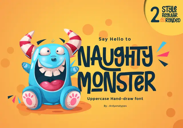
Tall eccentric cartoon capitals
Naughty Monster stretches cartoon letterforms into tall narrow capitals whose cross-strokes run out past their neighbouring letters and whose tops refuse to line up.
Ideas for this font
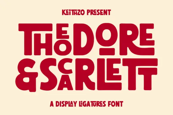
Fat geometric ligature display with nested letters
Theodore and Scarlett is a display ligature face in deep red on cream: fat geometric letters where small letters nest inside the counters of large ones, the two words interlocking so the block reads as one shape with two lines inside it.
Ideas for this font
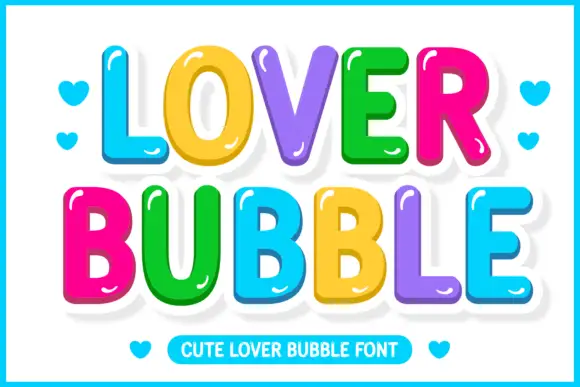
Glossy multicolour bubble display
Lover Bubble is a glossy multicolour bubble display on white: fat rounded caps and lowercase in six colours, each letter carrying a white outline and a small highlight, a bouncy baseline, hearts in the margins and a ruled caption strip at the foot.
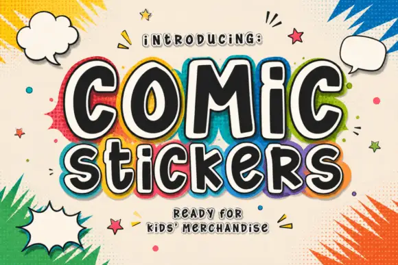
Soft irregular mixed-case lettering with thick faces and layered sticker-like edging
Comic Stickers combines tall COMiC forms with a lower mixed-case Stickers line, where rounded black faces with uneven widths and softly bent terminals are separated from bright offset borders by pale edging.
Ideas for this font
Same independent foundry
Allow optional Google Analytics to measure visits and catalogue actions. Your search words and notes are not included. Privacy & storage