Neutral Sans Workhorse

Bloomsy + Swaraga
Lets Bloomsy own the focal silhouette while handling secondary copy, sizing and subheads cleanly.
Inspect Swaraga specimenDisclosure: MakerFileHub may earn a commission from qualifying purchases via paid links on this page. How our links work.
Rounded retro display with heavy bowls and a long descending swash
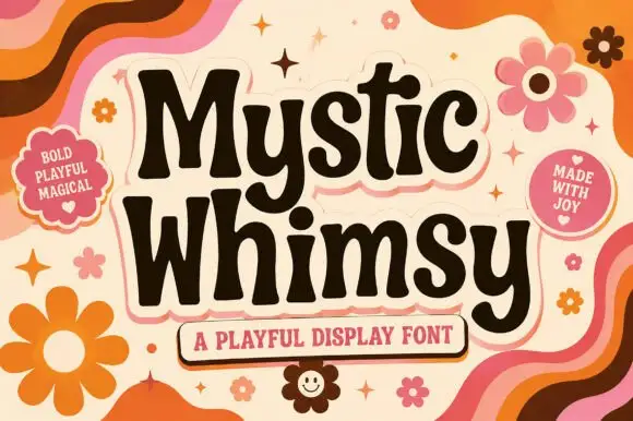
Bloomsy is a rounded retro display face with very heavy bowls, short ascenders and a final letter that drops into a long swash beneath the word.
Paid link
Get this fontProject & layout blueprintsAt-a-glance maker compatibility
Sturdy stroke walls and open counters weed cleanly on adhesive vinyl, HTV apparel film, and cut cardstock.
Visual anatomy & craft review
The letters are wide and soft: the B closes two nearly circular bowls, the l and the m keep thick even stems, the o is a full circle and the s reverses cleanly between two heavy curves. Weight is heavy and constant, the terminals are fully rounded, and the corners where stems meet bowls are smoothed rather than sharp, which is what gives the face its mid-century softness. The y is the exception in construction: its tail drops below the baseline and sweeps far to the right, becoming the widest element in the word and the only part that leaves the body of the text. Counters are large and circular, so the word stays legible when reduced. The pastel ground, the flowers, the hearts and the small banner captions are presentation; the lettering is the word.
Rounded · Retro · Heavy
Two-font hierarchy recipes
Tested contrast partners — pairing Bloomsy with grounded secondary typography.
Bloomsy + Swaraga
Lets Bloomsy own the focal silhouette while handling secondary copy, sizing and subheads cleanly.
Inspect Swaraga specimen
Bloomsy + Rosemode
Grounds bold display lettering with classic typographic authority on posters, badges and apparel.
Inspect Rosemode specimenPractical applications
Concrete hierarchy, scale and production guidance tailored to Bloomsy’s stroke geometry.
The heavy rounded forms read at a child's height and the long swash gives a short name presence on a small card without extra illustration.
Hierarchy & layout recipe
Set the name at 54 pt on a 148 by 105 mm card, keep the age and date in a 9 pt sans, and leave 14 mm below the swash so nothing collides with the printed details.
Pre-production check
A long swash near the trim looks cut; check the proof at final size and inset the name by 8 mm before approving the run.
The rounded weight reads from the far side of a room and the descending swash gives a simple banner a designed shape rather than a flat line.
Hierarchy & layout recipe
Set the greeting at 70 mm on a 1.2 m fabric banner, keep the name at 45 mm beneath it, and leave 35 mm at each end so the swash finishes inside the hem.
Pre-production check
Fabric printing softens rounded edges further; check the proof at final size and confirm the counters are still open before the run.
The retro softness suits a neighbourhood bakery, and the heavy weight holds at 12 pt on a bag where a lighter script would vanish.
Hierarchy & layout recipe
Set the brand at 12 pt on a 70 by 45 mm bag label, keep the product in a 6 pt caps sans, and leave 5 mm so the swash of the final letter stays on the label.
Pre-production check
A heavy face printed on kraft fills its counters; print one label on the real stock and open the o and e slightly if the ink spreads.
Technical & licence verification
Confirm included OTF/TTF/WOFF formats, full glyph tables and licence coverage on the live store page before batch production.
Closest visual alternatives
Matched across letterform anatomy, stroke behaviour and craft applications.
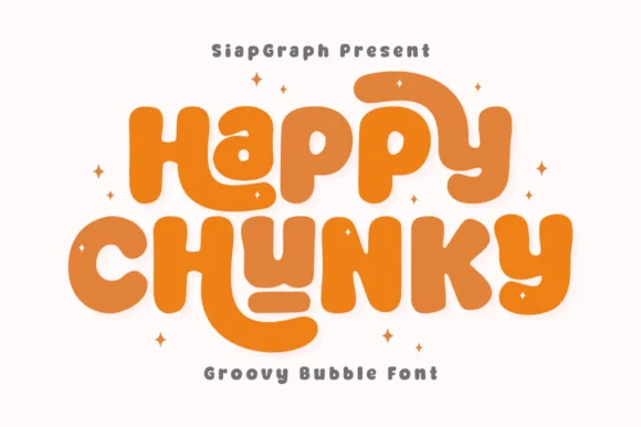
Extra-plump groovy bubble letters with tucked curl terminals
Happy Chunky is an extra-plump bubble display in which the stems balloon, the counters shrink to small openings, the terminals tuck into curls and the letters almost touch, so a short phrase reads as one sticker-ready block.
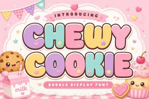
Squat bubble capitals packed tightly with heart accents between letters
Chewy Cookie is a squat bubble capital alphabet packed so tightly that the letters touch, with small hearts scattered into the gaps and a soft outline around the whole phrase.
Ideas for this font
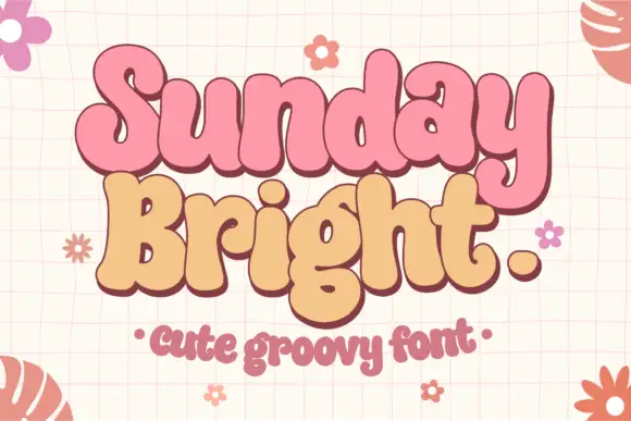
Soft joined-looking groovy forms
Sunday Bright is a soft groovy display in pink and cream on a pale grid: fat rounded letters that appear joined, a low waist, tall loops and a full stop drawn as a circle, presented as a pair of stacked words in two colours.
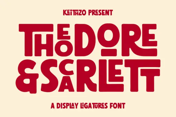
Fat geometric ligature display with nested letters
Theodore and Scarlett is a display ligature face in deep red on cream: fat geometric letters where small letters nest inside the counters of large ones, the two words interlocking so the block reads as one shape with two lines inside it.
Ideas for this font
Same independent foundry
Allow optional Google Analytics to measure visits and catalogue actions. Your search words and notes are not included. Privacy & storage