 #1 · Best Overall
Bubble Pinks
Outlined bubble letters with soft uniform contours in solid and hollow cuts
Get fontPaid link
Read review ↓Disclosure: MakerFileHub may earn a commission from qualifying purchases via paid links on this page. How our links work.
Plump bubbles, pastel outlines & kawaii faces
Kawaii lettering works from softness in the silhouette: no sharp corner anywhere, counters that stay round, and a weight that reads as squishy rather than heavy. Bubble Pinks and Chubby Bubbles deliver the pastel outline look, Bouncy Block Deluxe and Kinder Bubble carry a heavier plump weight, and Sweet Corner and Honey Rainbow add the sticker-sheet variety that keeps a range from looking repetitive.
Quick verdict
Bubble Pinks is the most reliable outline bubble for print-then-cut, Chubby Bubbles suits nursery ranges, and Bouncy Block Deluxe carries heavier merch. Honey Rainbow adds a useful second voice for a sticker pack.
Quick answer
Short on time? Start with our three highest-rated cute bubble & kawaii standouts before scrolling the full breakdown.
#1 · Best OverallOutlined bubble letters with soft uniform contours in solid and hollow cuts
 #2 · Runner-Up Pick
Outlined pastel nursery bubble capitals with a thick rounded contour
 #3 · Editor's Choice
We kept 30 of 668 candidates with genuinely convex outlines and open counters. Judged on how an offset border behaves around the silhouette, whether the shapes hold below 1.5 inches, and how many distinct styles exist for building a coherent pack.
Side-by-side summary
Compare specimens, OpenType/PUA traits and primary project roles side by side.
| Rank & Font | Style & File Specs | Best Project Fit | Store Listing |
|---|---|---|---|
| DisplayBubbly | Digital planner header, binder sticker or birthday banner | Get fontPaid link | |
| DisplayBubbly | First-birthday highchair banner, bath-bomb label or party cup | Get fontPaid link | |
| DisplayPUA encoded · Language support · File formats | Back-to-school tote, water-bottle sticker & kids' tee | Get fontPaid link | |
| DisplayPUA encoded · File formats | Die-cut laptop sticker, planner cover & iced-latte cup | Get fontPaid link | |
| DisplayPUA encoded · Ligatures | Daycare cubby nameplates, teacher shirts & backpack tags | Get fontPaid link |
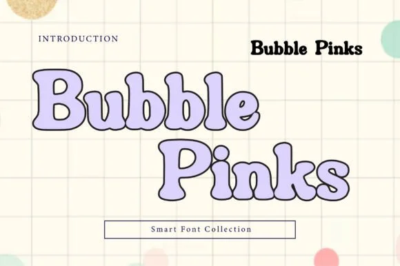
#1 · Best OverallBubble Pinks is a bubble display in both solid and hollow cuts in which the counters stay generous, the contours run smooth and the outline keeps an even weight, so a multi-word title stays light and legible rather than turning into a solid mass.
The B stacks two round bowls, the p opens a large counter, the k splays two rounded arms and the S holds a soft spine, all at a heavy bubble weight with a uniform outline and fully rounded ends. The even outline is the character: it lets a hollow cut hold a long phrase where a filled bubble face would clot, which is why the sample sets letters in outline with a pale shadow. Because the outline is one weight throughout, the hollow cut needs 40 pt before the contour reads as intended and the solid cut holds from 30 pt. The pastel ground, the shadow layer and the small caption are presentation; the outlined letters are the face.
Digital planner header, binder sticker or birthday banner — Layer pastel colour behind the outline style or cut the solid style in vinyl.
Smooth rounded vector contours cut and weed easily on craft vinyl.
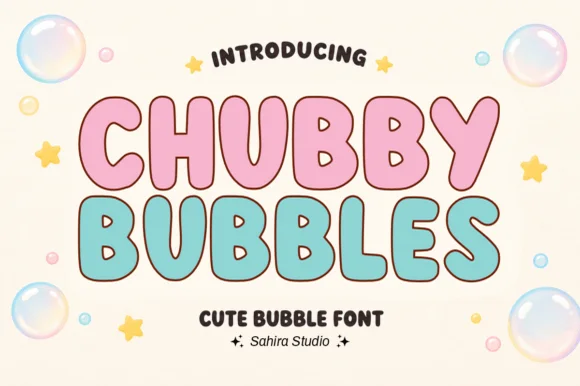
#2 · Runner-Up PickChubby Bubbles is a bubble capital alphabet in which the letters are fat and round, the contour is thick and open and the inner space is left hollow, so a word reads as a set of pastel letter stickers for a nursery.
The C opens a wide crescent, the H keeps two fat stems and a low bar, the U holds a deep bowl and the B closes two even lobes, all at a maximal weight with fully rounded ends and a contour drawn as a separate line rather than a shadow. Because the letters are hollow, they can carry a pastel fill inside a dark contour, which is how the sample builds two colourways on one sheet. The rounded ends and the wide fit make the face read as foam letters at 30 mm, and the hollow construction keeps it legible on a busy nursery wall. Counters close below 20 pt. The cream ground, the pink and mint fills, the bubbles and the two caption lines are presentation; the display face is the two words.
First-birthday highchair banner, bath-bomb label or party cup — Fill with pastel pink, mint or sky blue inside a dark brown or navy outline.
Smooth outer contours cut cleanly on cardstock, HTV and permanent vinyl.
#3 · Editor's ChoiceBouncy Block Deluxe is a thick, solid-filled bubble display font with pillowy rounded terminals, playful tilt, and tiny counter pinholes.
Bouncy Block Deluxe is a heavy rounded chunky bubble display: fat even-width letters with fully rounded corners, tight counters that almost close and a baseline that lifts a few letters so the word looks stacked and bouncing. It is a signage face, so it wants size and a single flat colour rather than fine detail. The counters are the finest element and they plug as soon as the face is reduced or cut in vinyl. It needs roughly 30 mm for the counter and the corner radius to read, and it is best as one flat ink on a light ground.
Back-to-school tote, water-bottle sticker & kids' tee — Stack 2 or 3 short punchy words ('STAY COOL', 'DREAM BIG') at tight 0.88 line-height inside a contoured die-cut sticker shape.
When weeding small decals under 1 inch, use a fine pin pen solely to pop out the tiny teardrop counters inside 'B', 'o', 'a', and 'e'.
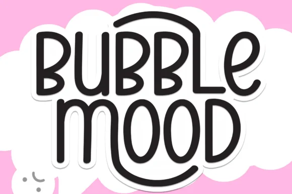 #4 · Top Maker Utility
Bubble Mood is a tall, medium-weight rounded marker display font where curved outer stems wrap playfully around neighboring vowels.
Bubble Mood is a tall rounded monoline marker display with nesting arches: narrow upright letters drawn with an even round-tipped stroke, where each word sits under a shallow arch that nests inside the next line's arch. The arch grows the word vertically and the monoline keeps it honest at small sizes. It needs roughly 22 mm for the arch and the rounded end to read, and it is best in one bright ink on white, or a single dark colour on a pale board.
Die-cut laptop sticker, planner cover & iced-latte cup — Stack two short words centered and add a 0.12 in white offset contour in Cricut Design Space for an instant die-cut sticker silhouette.
Clean medium-weight strokes and wide open 'O' and 'D' counters make adhesive vinyl weeding quick even at 0.75 in height.
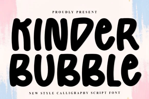 #5 · Standout Silhouette
Kinder Bubble is a bold, solid-black hand-drawn block display font with soft organic edges and playful mixed-case letterforms.
Kinder Bubble is a heavy hand-cut playroom block display: fat squared letters with visible scissor-cut edges, slightly mismatched heights and blunt corners, drawn to look as if cut from coloured card and pinned to a playroom wall. The cut edges are the design and they silt when the face is reduced. It needs roughly 26 mm for the cut edge and the height mismatch to read, and it is best as a one-colour vinyl or paper cut on a light ground, or one ink print where the cut edge reads as a shadow.
Daycare cubby nameplates, teacher shirts & backpack tags — Center a child's name or grade level in 1.5–2.5 in solid letters, pairing classroom room numbers in the same bold face.
Weeds cleanly on both permanent vinyl and puff HTV; just watch the compact double counters inside 'B' below 0.8 inches.
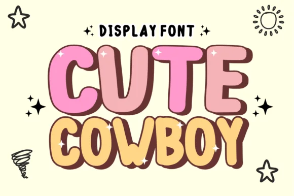 #6
Cute Cowboy is actually a plump, cheerful cartoon bubble display font (zero slab serifs or spurs!) wrapped in hand-drawn comic outlines.
Cute Cowboy is a plump cartoon bubble display with hand-drawn comic outlines, glossy highlight curves baked into the caps and a chocolate-brown keyline around every letter, so a word reads as a sticker peeled off a sweet wrapper rather than as a Western face. The highlight is part of the glyph and always sits on the upper-left of the stroke, which means the word needs size for the gloss to read as light rather than as a speck. It needs roughly 30 mm for that highlight to hold, and it is best in bubblegum pink or butter yellow on cream.
Toddler 'MY FIRST RODEO' shirt, sticker & favor bag — Color row one dusty pink and row two warm butter-gold at 64–120 pt flanked by simple sheriff-star doodles.
Clean, chubby solid shapes cut and weed fast on Cricut HTV, cardstock, and Print-Then-Cut stickers down to 0.65 in!
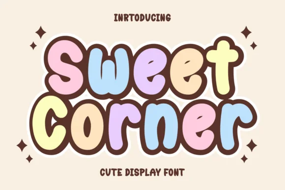 #7
Sweet Corner is a cozy, ultra-plump cartoon bubble font pairing wide open counters with soft marshmallow-pastel comic appeal.
Sweet Corner is an ultra-plump cartoon bubble display with wide open counters, chocolate-brown outlines and a pastel marshmallow palette across the specimen, so a word reads as a wrapped sweet rather than a sign. The counters are generous for such a heavy face, which is what keeps it legible at 25 mm on a small label, and the outline holds the soft shapes together in print. It needs roughly 25 mm for the chocolate keyline to stay even, and it is best in blush, lilac or butter on vanilla cream.
Boba / crepe / mochi-donut menu, box seal & tote bag — Stack 2 mixed-case bubble words tight (72–140 pt) so thick brown outlines merge into one cozy sticker block.
Smooth, fat bubble cores cut and layer cleanly on Cricut HTV, cardstock, and Print-Then-Cut stickers down to 0.65 in!
 #8
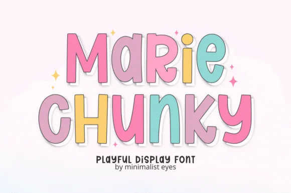
Marie Chunky is a tall, lively cartoon display font mixing uppercase and lowercase bubble shapes inside crisp outline borders!
Marie Chunky is a tall cartoon display that mixes uppercase and lowercase bubble shapes inside thin dark outlines with a white die-cut sticker shadow behind each letter, so a word reads as a sticker sheet rather than as type. The mixed case is what keeps it lively, and the sticker shadow means the letters should not be re-exported on a coloured ground without it. It needs roughly 26 mm for the die-cut edge to read, and it is best in pastel fills with a white border on a soft grey or cream ground.
Die-cut name sticker, kid's notebook cover & party favor — Stack 2 centered words at 64–120 pt in soft pastel hues wrapped in one unified 0.14 in white sticker offset.
100% smooth solid cores cut and weed in seconds on Cricut cardstock, HTV, and Print-Then-Cut sticker vinyl down to 0.65 in!
 #9
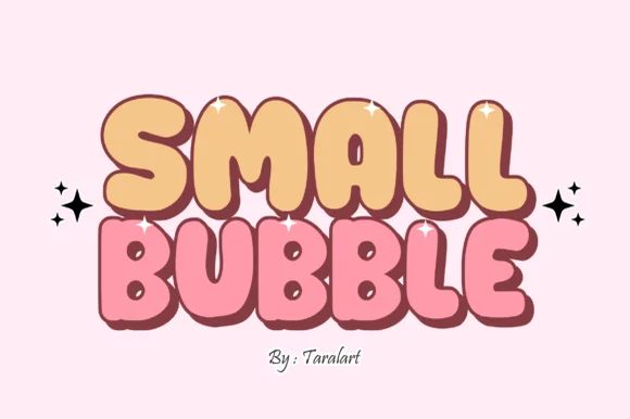
Small Bubble is a cozy, hand-drawn cartoon bubble display font with chubby rounded capitals and sweet comic-sticker personality.
Small Bubble is a hand-outlined comic display face: each chubby capital is drawn with a warm, slightly irregular contour and a heavier outline than fill, so the letters read as stickers peeled off a sheet. Bowls are nearly circular and counters stay open, which keeps small sizes friendly rather than muddy. Because the outline is part of the glyph rather than a stroke applied in software, it reproduces predictably on a cutting machine and on a heat transfer, and the face carries short phrases at tag scale without the visual noise of a distressed texture.
Kawaii sticker-shop logo, crochet tag & mailer seal — Stack 2 short uppercase words centered at 60–110 pt flanked by sparkle stars.
Clean solid bubble shapes cut and weed in seconds on Cricut HTV, permanent vinyl, and Print-Then-Cut stickers down to 0.65 in!
 #10
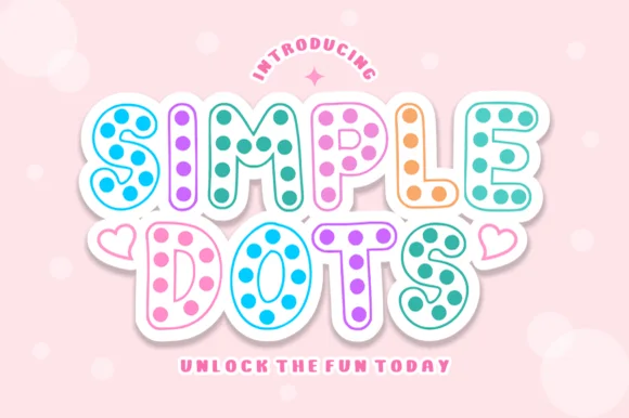
Simple Dots fills crisp double-outlined cartoon bubble letters with cheerful polka-dot confetti for sweet stationery and party prints!
Simple Dots is a cartoon bubble display drawn as a hollow outline: each letter is a fat rounded shape with no fill, and a row of uniform polka dots sits inside the outline at regular spacing. Because the letter is an outline, the interior dots are the only thing giving it weight, and the outline is thin enough to break if the face is reversed or overprinted. It needs roughly 30 mm for the dots to read as a pattern, and it is best in one ink on white, or two inks where the dots take the second colour.
Pastel sticker-sheet header, slumber-party invite & bag — Stack 2 uppercase words tight, wrap in one 0.16 in white cloud contour, and flank with tiny outline hearts.
Built for Print-Then-Cut stickers, printable party stationery, sublimation mugs, and DTF—not blade-cut HTV!
 #11
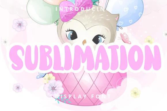
Sublimation (by Planetz studio) is a cheerful, plump cartoon bubble display font built for cute nursery, birthday, and kids' shirt graphics!
Sublimation is a cute pastel cartoon display: fat rounded letters with a thick white sticker outline, a comic highlight slash on each stem and a pastel gradient built into the forms rather than added behind them. The highlight is the smallest element and the gradient bands close first when the face is reduced. It needs roughly 30 mm for the highlight and the outline to read, and it is best in a soft four-colour process build on white vinyl, or one pastel ink plus a knocked-out highlight on coloured card.
1st-birthday owl/woodland onesie, milestone blanket & cup — Center 1 uppercase name at 64–120 pt wrapped in a 0.12 in white cloud border over cute character clipart.
100% clean solid vector font—works for BOTH sublimation prints AND fast single-layer Cricut HTV / cardstock cutting down to 0.65 in!
 #12
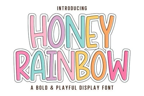
Honey Rainbow is a tall, upbeat cartoon display font built for multi-colored pastel fills and crisp double-line sticker framing!
Honey Rainbow is a tall cartoon display in which every letter wears a rainbow-sticker treatment: a fat rounded shape with a white keyline, a second coloured outline behind it and a small highlight dash inside the stroke, with solid and outlined variants. The keyline and the coloured outline share the silhouette, so the word box grows on all sides. It needs roughly 30 mm for the keyline and the highlight to read, and it is best in three bright inks on white, or one ink plus bare paper for the keyline on coloured card.
'IN OUR KINDERGARTEN ERA' teacher tee, door banner & tote — Stack 2 centered uppercase lines at 68–130 pt, coloring each letter in soft rainbow pastels inside a thin dark outline.
Prints vividly via DTF, sublimation, and Print-Then-Cut stickers—and solid cores cut cleanly on Cricut cardstock and HTV!
 #13
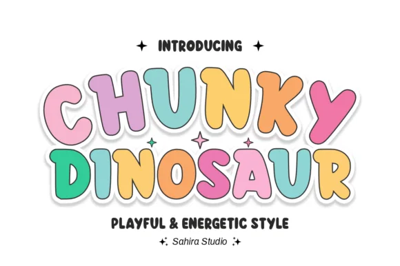
Chunky Dinosaur is an energetic, bouncy rounded bubble display font with dancing tilted capitals and clean cartoon proportions.
Chunky Dinosaur is a bouncy outlined kids display in pastel: fat rounded letters with a thick soft outline, a tilt that rises and falls across the word and a small spike or plate on some caps that hints at a back ridge. The tilt grows the word vertically and the outline doubles its footprint, closing the counters early. It needs roughly 30 mm for the outline and the ridge to read, and it is best in two pastel inks on white, or one ink plus a knocked-out outline on coloured card.
'Three-Rex' dinosaur birthday shirt, banner & cupcake pick — Color each letter in alternating soft pastels (or dino greens/oranges) wrapped in a unified white Print-Then-Cut sticker cloud.
Zero fragile serifs or distress holes—super easy to cut and weed on HTV, cardstock, and glossy vinyl at any kid-craft size.
 #14
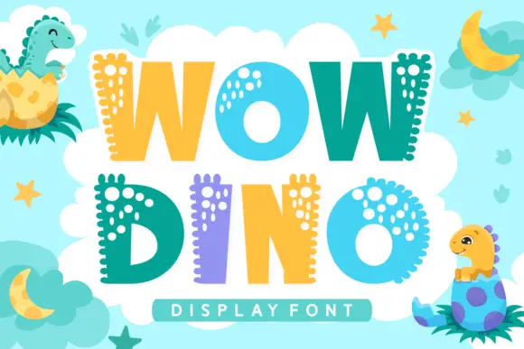
Wow Dino is a playful colour font in which each capital carries a dinosaur spine: a row of rounded plates along the top edge, a dotted pattern inside the strokes and a bright fill that alternates between teal, yellow and lilac.
WOW over DINO fills the card on a pale blue ground scattered with stars, moons and leaves, and each letter is a fat rounded shape with a row of rounded plates along one edge and a cluster of pale dots inside. The colours alternate across the words — teal, yellow, lilac, teal — so the two rows read as one alternating block, and two cartoon dinosaurs sit in the corners hatching out of eggs. A bar at the foot names the style in a light caps face. The construction is simple: the spine is drawn as a repeating shape rather than a texture, which is what lets the letters stay readable at moderate sizes while still looking like dinosaurs, and the flat fills keep the set cheap to print.
A hatching-dinosaur party title — Stack WOW over DINO in a plain cream invitation panel and set the date on a separate teal footer.
Verify letter contours and source any hatching-dinosaur illustration independently.
 #15
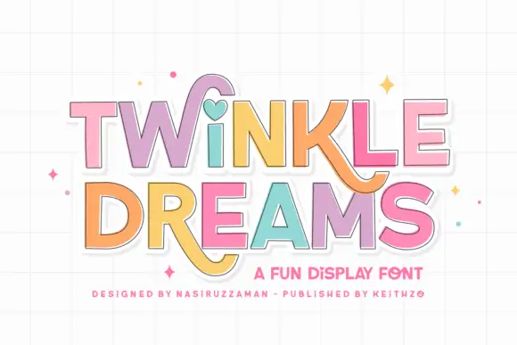
Twinkle Dreams combines firm block capitals with a heart-shaped dot above the i and curling extensions on selected letters, where the R and K tails swing below the main rows, each letter takes a pastel fill with a fine dark edge and the whole block sits on a faint grid.
The bodies stay blocky and even, the edges stay fine, the fills change per letter and two letters drop long tails under the baseline. That heart dot is the character: a plain display face gains one playful substitution, which is why the sample keeps a short title. The grid and the sparkles are cover treatment. Keep 40 pt so the fine edges stay separate from the fills, verify the heart form in your file and check the swinging tails against the line beneath.
A wish-themed party invitation — Keep the phrase large with clear room below any R tail; place details in plain text.
Check the actual letters and do not assume a heart appears in words without i.
 #16
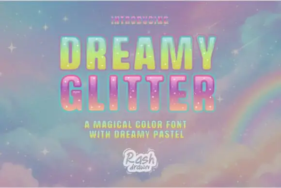
Dreamy Glitter sets fat rounded caps with a pastel gradient fill, a soft inner highlight and a fine sparkle texture, shown on a sky of clouds and a rainbow.
DREAMY over GLITTER fills the card in soft rounded letters, each one filled with a gradient that shifts through mint, lemon, peach and lilac, sprinkled with small white sparkles and edged with a thin light contour that gives a glassy highlight. The ground is a painted sky in the same pastels with a rainbow arc at the right and small stars scattered across it, and two captions frame the word in spaced caps. A small logo stamp sits at the foot. The construction is a decorative colour font for titles on invitations, prints and thumbnails, and the honest limit is contrast: these pastels sit well on a dark or a mid ground and disappear on white, so the face is usually paired with a coloured background rather than set in black on paper.
A pastel dream-party invitation — Place the phrase on two white rows with a plain dark-purple name line below and no cloud photograph behind it.
Check contrast after export and do not promise reflective glitter output.
 #17
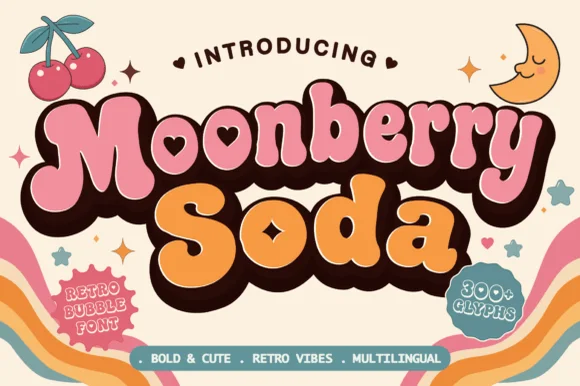
Moonberry Soda is a plump retro bubble display in which the round bowls hide heart-shaped counters, the silhouettes stay thick and soft and the alternates add playful variants, so a short word reads as a kawaii sticker.
The B closes two round bowls with a heart cut inside one, the o keeps a small heart counter, the S swells through a soft spine and the lowercase m sits low under round shoulders, all at a bubble weight with thick sticker-ready outlines. The heart counters are the character: they sit inside the letter rather than beside it, which is why the sample sets a two-word phrase with air around it. Because the hearts are small, the face wants 34 pt before they read and the alternates should be checked for the shapes a project prefers. The pastel ground and the small caption are presentation; the dark bubble letters are the face.
Boba cup decal, kawaii sticker shop logo or party tee — Layer a deep brown drop-shadow offset behind pastel pink and orange fills.
Keep cut height above 1.2 inches on vinyl so the tiny heart counters weed cleanly.
 #18
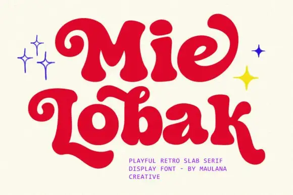
Mie Lobak sets a fat retro slab in deep red, its stems swollen, its serifs rounded into bulbs and several letters finishing in a curl, so the word looks hand-painted on a shopfront.
Mie over Lobak fills the card, the M built from two heavy arches, the L ending in a curled foot and the k throwing a curved leg. Strokes swell and taper slightly, which keeps the line from looking mechanical, and the spacing stays tight enough that the rows read as one colourful object. Small four-point stars in blue and yellow sit at the sides, and a tracked caption names the style and the studio. It is a display face with real warmth, and it needs size: at small settings the swollen stems fill the counters and the curls turn into blots.
A playful noodle-shop card — Place Mie moments in red on a cream card front, with menu details in a plain purple column on the reverse.
Verify the actual curls and do not assume any sparkle artwork is supplied.
 #19
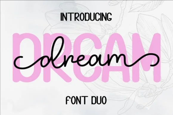
Dream Duo combines a plump, soft-cornered uppercase sans-serif with a fluid monoline script that threads cleanly across wide titles.
Dream Duo pairs a chunky pastel rounded sans with a smooth monoline cursive: the sans is a fat even-width block with fully rounded corners and tight spacing for headlines, while the cursive is a soft even stroke with open loops and a gentle slant. The pair is built for a soft palette, so it loses its character when printed in a single harsh black. The monoline hairline is the finest element and it breaks first. The sans needs roughly 26 mm and the cursive 28 mm for their detail to read.
Nursery wall name sign & sweet-sixteen acrylic backdrop — Scale the background sans to 3.5 inches tall in soft pastel and center the dark monoline script across the middle 60% height.
Weld all cursive joins before cutting vinyl, and use Cricut's Slice or a 0.07 in offset knockout if avoiding two-layer vinyl overlap.
 #20
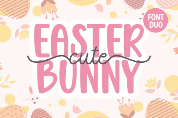
Cute Easter Bunny combines a tall, chunky hand-cut uppercase sans with a sweet monoline cursive accented by long side tails.
Cute Easter Bunny is a playful pair of a tall pastel sans with a tailed monoline script: the sans is a soft narrow block whose counters stay open, while the script finishes every word with a small bunny tail that lifts off the baseline. The pair is built for a soft spring palette, so it loses its charm in a single harsh ink. The tail is the finest element and it closes into a dot once the face is reduced. The sans needs roughly 22 mm and the script 26 mm for their detail to read.
Personalized Easter basket tag & egg-hunt tote — Place two stacked uppercase words in pastel vinyl and overlay the dark tailed script across the seam between rows.
Use Print-Then-Cut with an offset white sticker border for multi-color tags, or layer smooth HTV pressing the chunky sans base first.
 #21
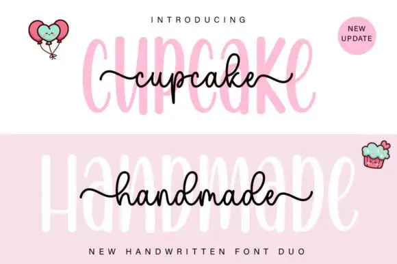
Cupcake Handmade Duo places tall narrow rounded letters in pale pink behind a smaller connected script line in black, twice on one cover, where the script carries long outer tails and looped k and h forms while a balloon pair, a cupcake drawing and an update badge sit in the corners.
The caps stay tall and narrow, the script stays compact and continuous, the loops open large and the tails run wide past the caps on both sides. That size gap is the character, because the script sits inside the cap row rather than under it. The balloons, the cupcake and the badge are separate sample elements, so do not count them as part of the type. Keep 34 pt for the caps and 16 pt for the script, and check the k and h loops against your margins before locking the lockup.
A cupcake-table heading — Place the capital title above, not behind, the script; put flavours and dietary information in a plain panel below.
Check both supplied styles and essential food information separately.
 #22
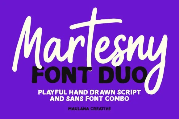
Martesny combines a lively, tall-crossed hand-drawn marker script with a solid, rounded geometric uppercase sans partner.
Martesny is a duo of an energetic marker brush script and a chunky rounded sans: the script runs a wet loaded stroke with small flicks and joined letters, while the sans is a fat rounded block with tight counters for badges and prices. The pair carries a loud card in one ink, and the marker edge is the finest element. The script needs roughly 24 mm and the chunky sans 26 mm for their detail to read, and both work in one bright ink on white.
Podcast cover, YouTube thumbnail & custom party hoodie — Let the script's descending 'y' or 'g' overlap slightly across the corner of the bold uppercase sans line beneath it.
Both the chunky sans and medium-thick marker script weed reliably on HTV and decal vinyl at 1 inch+ scale.
 #23
Shortcake Strawberry puts a fine tall-looped script above a heavy irregular sans whose bowls are almost as wide as the letters are tall, on a soft pink ground.
In the pink specimen the script keeps thin even stems with open ascender loops and a small heart tittle, so its weight sits closer to a pointed pen than a brush. Beneath it the capital line is broad and soft, with a slightly uneven baseline and counters that shrink to narrow slits in the R and B. The two voices share almost no weight, which is exactly why the pair works as a lockup: the script supplies the tenderness and the sans supplies the punch. The underline stroke beneath the last line and the tiny speech-bubble mark are layout decoration. Both members are meant to be used together, but each also reads on its own.
A strawberry cake sleeve — Put a small script flavour line above one bold product line and keep ingredients on another panel.
Check the script joins remain legible beside the heavy letter mass.
 #24
Brown Carolina Duo contrasts broad high-contrast capitals with a much finer narrow slanted script, set dark on a plain cream field, where the capital R legs sweep below the neighbouring letters and the script carries long tails that run past the ends of both words.
The caps keep thin cross strokes and heavy uprights, the script keeps one fine weight, and the two voices sit in a strict stack: script, two cap rows, script. That alternating order is the character, because the fine lines frame the heavy block like a rule above and below. Both treatments appear on a plain light field, so the cover gives no clue about texture or shadow. Keep 34 pt for the caps before the thin strokes break up, keep 20 pt as the floor for the script and check the R leg before setting a line of capitals.
A boutique stationery front — Use the capital name centrally and a small script descriptor below, leaving the R sweep clear of contact information in a plain footer.
Confirm both styles and the actual capital alternates.
 #25
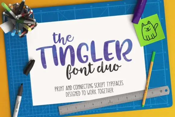
Tingler Duo is a two-cut pair in which heavy print capitals with uneven shoulders set the plain word and a connected lowercase script with tall t stems carries the written one, so a project holds two registers in one warm tone.
The print cut keeps round ends, uneven shoulders and short stems, while the script cut joins a compact lowercase body through tall t stems and light connectors, with swashes and ligatures among a large glyph set. The contrast between separate and joined letters is the character: one member reads as stamped, the other as written, which is why the sample sets the two side by side. Set the print at 34 pt and the script at 28 pt, and keep 16 mm between rows so the connectors do not touch the capitals. The pale ground and the small caption are presentation; the two lettered cuts are the duo.
A craft-stall name and descriptor — Put the print name on the first line and a smaller script descriptor below, leaving generous space before practical contact details.
Preview each member and the real letter pairings separately; the source's connecting-tail claim is not a tested automatic composition.
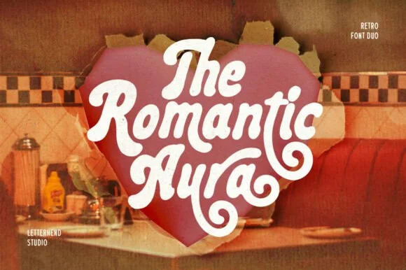 #26
Romantic Aura Duo pairs a thick, velvety 1970s swash script with a clean companion voice for nostalgic love notes and merch.
Romantic Aura Duo pairs a nineteen-seventies swashed retro script with a rounded sans: the script runs a high-contrast stroke with wide swelling swashes that lift above and below the line, while the sans is a soft rounded block for details and lists. The pair is a period look, so it works best in two warm flat inks on a light ground rather than in photographic tints. The swash thins are the finest element and they break first. The script needs roughly 32 mm and the sans 20 mm for their detail to read.
Retro Valentine sweatshirt, mug wrap & galentine card — Stack 2 to 3 centered words tightly inside a heart or arch silhouette so rising ascenders nest into the gaps of the line above.
Weld all overlapping script letters before cutting HTV, and keep total lockup width at 3.5 in+ so tight inner 'e' and 'a' counters weed cleanly.
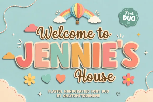 #27
Jennie's House is a two-cut family in which chunky pastel capitals wear a heavy outline and a monoline script writes a second line, so a short phrase reads as stacked paper stickers.
The J hooks a wide foot, the E stacks three short arms, the N keeps two fat stems, the I stands as a plain bar and the S holds a soft spine, all at a chunky weight with rounded corners and a thick contour; the script cut draws a connected line with a tall loop on the W and a hooked h. The layering is the character: the outlined caps sit behind the script in the sample, which gives depth without a shadow effect. Both cuts hold from 26 pt upward and cut cleanly in card. The blue ground, the hot-air balloon, the clouds, the flowers and the small badges are presentation; the outlined caps and brown script are the family.
Nursery door plaque, baby shower welcome sign or kids' room print — Set the child's name in large coral/sage block caps framed by smaller script lines.
Both fonts use smooth vector shapes that cut cleanly on vinyl and wood/acrylic.
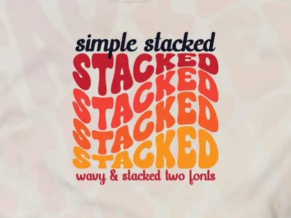 #28
Simple Stacked is a wavy display in which rounded capitals repeat down three offset rows, each row bending and stretching the letters differently, so a short word reads as a rainbow of stacked script rather than a plain line.
The S pulls a broad curve, the A opens a narrow counter, the letters in the middle row stretch wider than the row above and the baseline of each row waves independently. The repetition is the character: it turns one word into a pattern, which is why the sample sets a single phrase three times over. Because the rows overlap, the face needs deliberate spacing between rows from 30 pt and reads best as a display block rather than as a line of text; a second word needs its own stack. The pale ground and the small caption are presentation; the wavy lettered rows are the face.
A rhythm-themed poster — Reserve the centre for one verified stacked word and keep all event details outside the repeated rows.
Confirm how many rows one glyph or style actually generates.
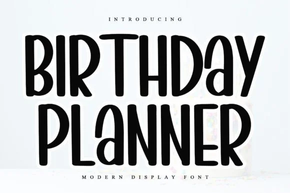 #29
Birthday Planner is a tidy, tall hand-lettered marker display font with softly rounded stem tips and friendly vertical rhythm.
Birthday Planner is a tall rounded marker all-caps planner face: narrow upright caps with fully rounded ends, an even medium stroke, wide even spacing and a height that fits a single line inside a planner box. The rounded ends are the only warmth and the caps keep a label shouty but readable. It needs roughly 20 mm for the rounded end and the counter to read, and it is best in one bright ink on white paper, or a single dark colour on pastel card.
Kids' party itinerary sign, milestone chalkboard & invite — Stack centered uppercase headers at 36–54 pt and use smaller 18 pt lines for time-slot bullet items.
Smooth, even marker strokes with zero thin serifs weed quickly and cleanly on Cricut vinyl, HTV, and acrylic signs down to 0.6 in.
 #30
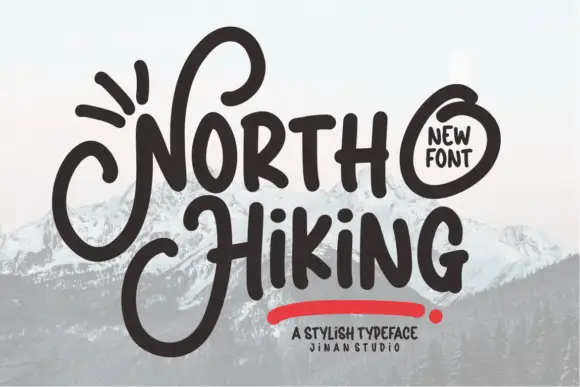
North Hiking paints its words with one heavy rounded brush line, then lets the first letters break out into wide loops that travel above and below the rest of the word.
NORTH over HiKING is drawn in a dark brown that reads as ink on a photograph of snowy ridges, the N throwing a long loop over the O and the H of Hiking curling away to the left below the line. Strokes keep a constant weight with round terminals, the i and the dots stay circular, and letter spacing is loose enough that the loops never touch. A red underline swash and a small circular badge sit around the words, with a studio credit under them. The hand is informal but confident, so the face works at large sizes where the loops are the whole point and struggles when a long phrase has to fit a narrow space.
A looping outdoor-journal heading — Align the smaller word bodies and let verified initial loops occupy a clear left margin.
Test the actual initials and keep captions outside their full loop depth.
Practical buyer checklist
Key cutting, printing and pairing answers before choosing a cute bubble & kawaii typeface.
Between 1.5 and 2 mm for a 3 inch sticker. Wider offsets push the design toward a badge shape, narrower ones leave no room for the calibration cut and the edge frays.
The bold ones are, down to about 0.5 inch, because the counters stay open. Outline variants fail earlier: below 1 inch the inner ring closes and the letter fills in.
Yes with restraint. Use one bubble word on a card, keep the palette muted, and set everything else in a plain serif. The cuteness then reads as a chosen accent rather than the entire brand.
Kawaii leans on roundness, tiny features and a soft, slightly helpless proportion, while cute in Western design is broader and includes cheeky or crude styles. The distinction matters when picking a face and a palette together.
Keep exploring
Explore adjacent maker roundups or check our practical pre-production checklists.
35 curated fonts · Previews & pairings
29 curated fonts · Previews & pairings
24 curated fonts · Previews & pairings
32 curated fonts · Previews & pairings
Guides: Invitation font checklist · Vinyl & cutting checklist · How to pair script & sans fonts
Allow optional Google Analytics to measure visits and catalogue actions. Your search words and notes are not included. Privacy & storage