Display
Weird Moment
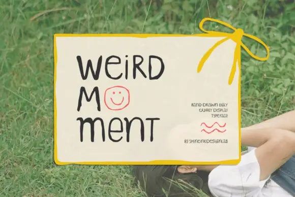
Weird Moment is a hand-drawn display face with tall thin letters, a bouncing baseline and drawn-in jokes: the O is a smiley face, some letters lean, and the whole word looks written on a card with a marker.
Ideas for this font
The full catalogue
Every preserved creator preview in one paginated catalogue, sorted by maker demand. Each profile carries the specimen, the studio, the style classification and the production notes for vinyl, HTV, sublimation and print.
4,091 fonts (sorted by maker demand)Page 25 of 171
Display
Weird Moment is a hand-drawn display face with tall thin letters, a bouncing baseline and drawn-in jokes: the O is a smiley face, some letters lean, and the whole word looks written on a card with a marker.
Ideas for this font
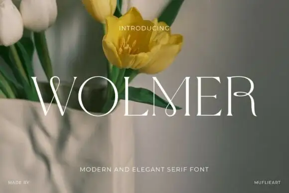
Modern serif with stretched details
Wolmer is a modern serif in white over a photograph of tulips: extreme thin-thick contrast, wide letters with stretched details, a leg that reaches past the stem on the R and an arm that runs out on the E, with a small capital line beneath.
Ideas for this font
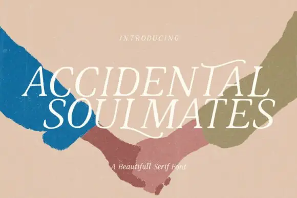
Slanted light capitals with fine serifs and selective curling extensions
Accidental Soulmates is a slanted light serif in which the capitals lean together, the serifs stay fine and two long extensions curl above the first row and sweep below the second, so a two-line title reads as a romantic editorial head.
Ideas for this font
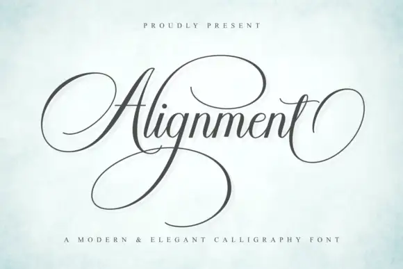
Formal calligraphic script with a large calligraphic capital
Alignment is a formal calligraphy script whose capital occupies three times the x-height and whose oval flourish sweeps out from the first letter and back under the last, so the word is framed top and bottom by one continuous gesture.
Ideas for this font
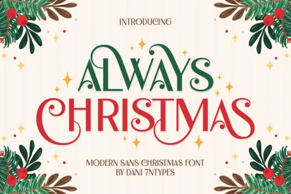
Tall capitals with curled terminals
Always Christmas combines tall mostly upright letters with curled ends on selected capitals, and large loops on the A, C and S give the restrained strokes a decorative edge across a two-row red-and-green composition.
Ideas for this font
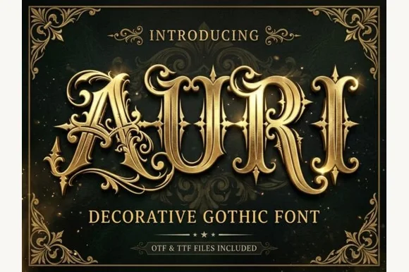
Filigree-swashed Victorian gothic capitals
Auri crowns bold Victorian gothic capitals with mid-stem spurs and scrolling filigree tendrils, built for dark-fantasy covers, emblems and luxury labels, where broad main stems anchor delicate curling side flourishes and turn three to six letter titles or single initials into ornate crests.
Ideas for this font

Tall ornamental serif with inward curls and heavy vertical stress
Billvane is a tall ornamental serif in which the stems carry heavy vertical stress, the terminals curl inward and the bowls close on small counters, so a single word reads as a Victorian playbill.
Ideas for this font
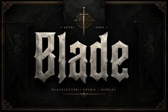
Broad faceted blackletter with deep angular counters
Blade is a heavy blackletter display face whose strokes look carved from granite: thick stems, chiselled counters, weathered edges and a fill that reads as stone rather than ink.
Ideas for this font
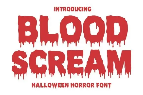
Heavy rough-edged capitals with long irregular drip shapes beneath the baseline
Blood Scream sets two uppercase rows in which the contours stay broad and rough, the counters run deep and narrow pointed drips descend unevenly from the lower edges, with small intrusions inside the O and a sharp notch inside the M.
Ideas for this font
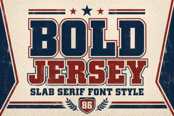
Broad solid slabs with rounded-square bowls and contrasting edging
Bold Jersey is a solid athletic slab in which the B bowls spread wide, the O closes almost rectangular with rounded corners, the slab feet hold the broad shapes together and fine contrasting edges lift the blocks off the ground.
Ideas for this font
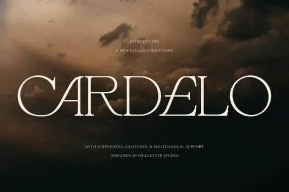
Wide elegant serif with slashed counters and fine hairlines
Cardelo is a wide elegant serif in which the capitals open generously, the hairlines stay fine and two letters carry a slashed counter, so a single word reads as a modern wordmark rather than as a title.
Ideas for this font
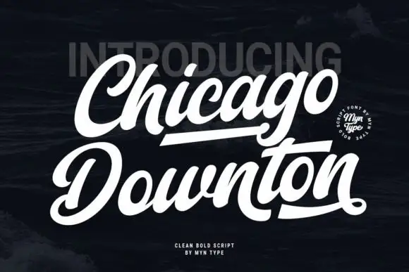
Dense slanted script with broad rounded C and D capitals
Chicago Downton is a dense slanted script in which the capital C and D open broad rounded bowls, the lowercase joins close together and straight and curved underline strokes sit beneath both sample words while the final n curls into a small terminal.
Ideas for this font
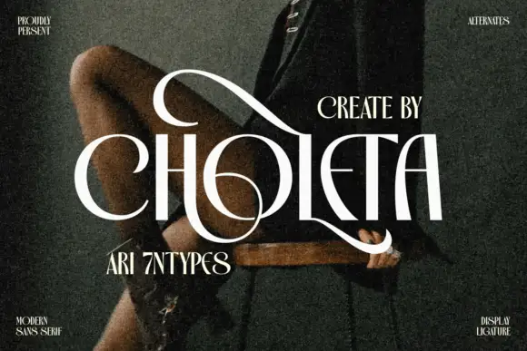
Contrasting capitals woven through a large upper loop and low circular sweep
Choleta builds tall white capitals and then lets thin strokes cross through them, so the counters open into slashes and the whole line reads as one sculpted ligature rather than six separate letters.
Ideas for this font
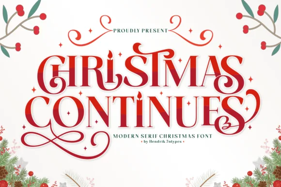
Ornamental holiday display serif with candle-flame i & spiral curls
Christmas Continues is a whimsical holiday display serif (not a cursive script) featuring curled spiral hooks, ligatures, and a candle-flame 'I'.
Ideas for this font
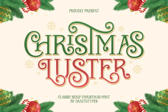
Ornamental ribbon-swashed vintage Christmas display serif
Christmas Luster is actually a lush, swash-curled classic display serif (NOT a connected script!) weaving storybook loops through red-and-green capitals!
Ideas for this font
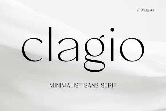
Fine contrasting lowercase with a double-storey g and round open c
Clagio shows black lowercase lettering on a pale softly folded background, where a tall plain l and i stand beside broad round bowls, the a has a thin rising join, the g drops into a wide double-storey lower loop and the c ends are slightly pointed while the o stays almost circular.
Ideas for this font
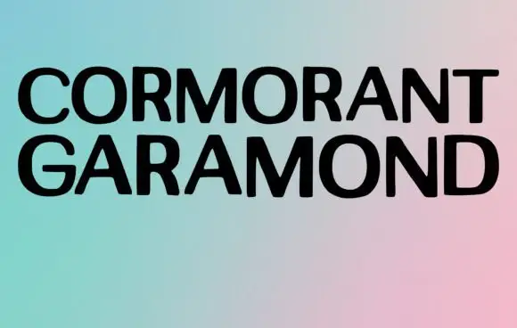
Broad plain capitals in a minimal specimen
Cormorant Garamond shows two long rows of broad black capitals over a soft gradient, where the strokes stay largely even, the joins close tightly and only faint thickenings hint at a serif at this display size rather than the fine detail the family name suggests.
Ideas for this font

Narrow pointed blackletter with a long straight p descender
Darkspire is a gothic blackletter display face with sharp calligraphic strokes, splattered edges and a rough texture, built for dark posters and tattoo-inspired lettering.
Ideas for this font
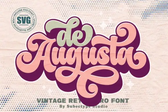
Ornate retro script with heavy joins and broad returning loops
De Augusta is an ornate retro script in which the letters stay heavy and connected, the entry strokes curl wide and a long loop leaves the word, passes beneath it and returns across, so a short name reads as a seventies badge.
Ideas for this font
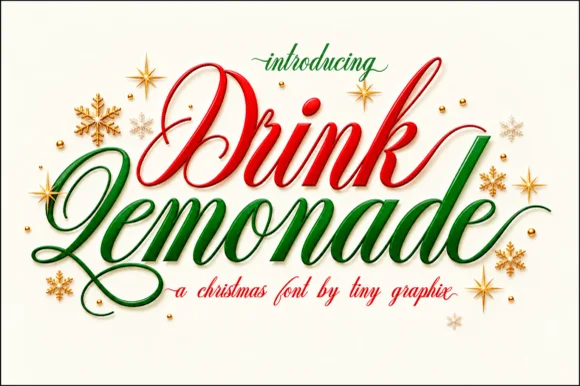
Sweeping formal copperplate-brush calligraphy script (Alternates & swashes)
Drink Lemonade is a lush, sweeping calligraphy script (NOT a blocky display!) with dramatic swashes and zero seasonal clipart—ready for summer, weddings, OR Christmas!
Ideas for this font
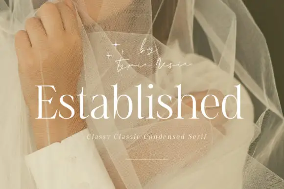
Fine condensed mixed case with long straight ascenders
Established shows light white serif letters with narrow rounded bowls and tall upright stems, where the thin horizontal strokes and small serifs keep a long word visually delicate, and the title overlays a pale portrait behind translucent fabric with a small script credit above.
Ideas for this font
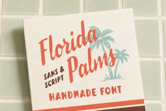
Hand-painted script paired with a sturdy all-caps sans
Florida Palms matches a relaxed hand-painted script with a sturdy all-caps sans, and ships textured versions of both so the pair can look screen-printed rather than digitally clean.
Ideas for this font
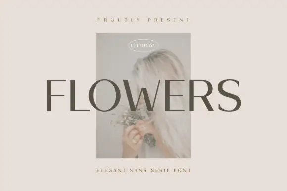
Restrained contrasting capitals with round O and fine horizontal arms
Flowers shows grey uppercase lettering across a small faded portrait on a pale beige field, where more substantial vertical and curved sections meet fine horizontal arms, the S retains a broad smooth curve and the F ends in flat unornamented arms.
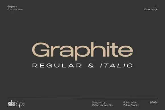
Low wide mixed case with flattened bowls and a long horizontal t bar
Graphite is a wide geometric sans with flattened bowls and a very long horizontal t bar, set here in warm beige on charcoal so the letterforms do the talking and the page stays quiet.
Ideas for this font
Allow optional Google Analytics to measure visits and catalogue actions. Your search words and notes are not included. Privacy & storage