Editorial Serif Anchor

Weird Moment + Alerigue
Anchors Weird Moment's fluid strokes with crisp Roman proportions on wedding suites, headers and packaging.
Inspect Alerigue specimenDisclosure: MakerFileHub may earn a commission from qualifying purchases via paid links on this page. How our links work.
Display
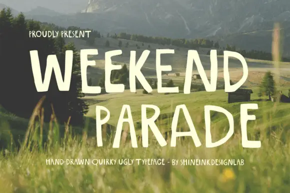
Weird Moment is a hand-drawn display face with tall thin letters, a bouncing baseline and drawn-in jokes: the O is a smiley face, some letters lean, and the whole word looks written on a card with a marker.
Paid link
Get this fontProject & layout blueprintsAt-a-glance maker compatibility
Weld or Unite overlapping script joins into one continuous vector path before sending to the blade.
Visual anatomy & craft review
WEIRD over MOMENT sits on a pale card with a yellow border and a drawn bow at the corner, taped against a photograph of grass. The letters are tall and narrow with an uneven stroke, rounded ends and a marked bounce, so the two rows wander rather than sit on a line. The O in Moment is drawn as a circle with two dot eyes and a curved smile, and the caption block at the right is set in a tiny hand-lettered alphabet with a wave underneath. The construction is deliberately informal: a marker alphabet for cards, notes and small brands, and the built-in cartoon letter means it should be used for short words where the joke is visible rather than for long lines.
A hand-drawn quirky display face with a smiley for an O
Two-font hierarchy recipes
Tested contrast partners — pairing Weird Moment with grounded secondary typography.
Weird Moment + Alerigue
Anchors Weird Moment's fluid strokes with crisp Roman proportions on wedding suites, headers and packaging.
Inspect Alerigue specimen
Weird Moment + Base Edge
Keeps small-scale dates, URLs, nutrition facts and care instructions crisp and legible below script titles.
Inspect Base Edge specimenPractical applications
Concrete hierarchy, scale and production guidance tailored to Weird Moment’s stroke geometry.
The face looks like something written on a card by hand, which is exactly the tone of a birthday message between friends, and the smiley letter does the work of an emoji.
Hierarchy & layout recipe
Print an A6 card: set the greeting at 30 pt across two rows, keep 12 mm of clear ground beneath before the message, and hold 10 mm of margin on all four sides.
Pre-production check
The bouncing baseline collides with a ruled message area; print one card and check the second row sits clear before the batch.
A quirky hand face gives a stationery label the personality a plain sans cannot, and one ink on kraft keeps a small run affordable.
Hierarchy & layout recipe
Print a 55 by 40 mm kraft label: set the brand at 13 pt on one row, keep 5 mm of clear ground beneath before the street at 4.5 pt, and hold 4 mm from the lowest loop to the die line.
Pre-production check
Kraft absorbs ink and closes the thin stroke; print one label on the real paper and check the smiley before the order.
The lettering signals that the event is informal, and a hand-drawn board is what a pop-up can actually make in an afternoon.
Hierarchy & layout recipe
Print a 400 by 300 mm board: set the name at 80 pt across two rows, keep 22 mm of clear ground beneath before the date at 14 pt, and hold 20 mm of border so no leaning letter is cut.
Pre-production check
Hand-lettered boards look cramped when scaled up; print one at the final size and check the spacing before the set.
Technical & licence verification
Confirm included OTF/TTF/WOFF formats, full glyph tables and licence coverage on the live store page before batch production.
Closest visual alternatives
Matched across letterform anatomy, stroke behaviour and craft applications.
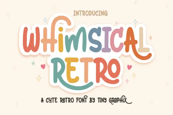
Rounded upright letters with long curled terminals
Whimsical Retro mixes soft upright letterforms with unusually long curled terminals, set over a pastel layered fill inside a thin outline on a warm paper ground.
Ideas for this font
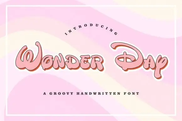
Groovy rounded hand lettering
Wonder Day is a groovy hand-lettered display in pink with a copper shadow and a thick white outline, set on a pastel wave ground: fat rounded letters with a strong forward lean and a roller-coaster bounce.
Ideas for this font
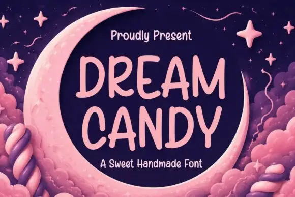
Soft irregular separate capitals with rounded uneven strokes
Dream Candy is a soft handwritten capital alphabet, drawn separate, with slightly uneven strokes and rounded ends, so a two-line phrase reads as a hand painted on paper rather than set in type.
Ideas for this font
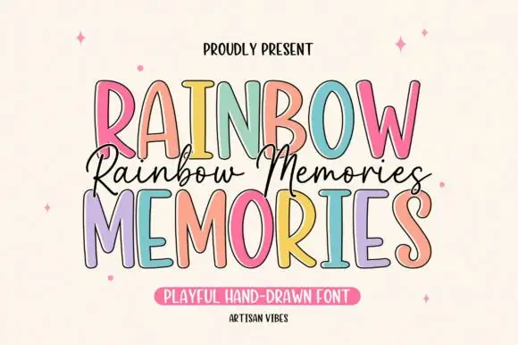
Tall irregular display capitals
Rainbow Memories is a tall irregular display capital hand in mixed pastels with a dark outline: letters of different widths and heights, a light monoline stroke and a small connected script that runs between the two capital lines.
Ideas for this font
Same independent foundry
Allow optional Google Analytics to measure visits and catalogue actions. Your search words and notes are not included. Privacy & storage