Modern Grotesque Body

Accidental Soulmates + Inkora
Creates crisp high-hierarchy contrast beneath Accidental Soulmates headlines across menus, websites and labels.
Inspect Inkora specimenDisclosure: MakerFileHub may earn a commission from qualifying purchases via paid links on this page. How our links work.
Slanted light capitals with fine serifs and selective curling extensions
Accidental Soulmates is a slanted light serif in which the capitals lean together, the serifs stay fine and two long extensions curl above the first row and sweep below the second, so a two-line title reads as a romantic editorial head.
Paid link
Get this fontProject & layout blueprintsAt-a-glance maker compatibility
Crisp hairline serifs shine on stationery, foil stamping, and packaging; add slight offset for small decals.
Visual anatomy & craft review
The T lifts a high curl above the cap line, the S sends a long curved tail under the lower row, the bowls stay open and the stems hold a light weight with italic ligatures and alternates that vary the word shape. The selective curls are the character: only two letters carry ornament, which is why the sample sets two rows across abstract paper shapes. Because the extensions travel far, a layout needs 20 mm above and below the block, and alternates should be checked in the file so the curl lands where the proof shows it. The coloured paper shapes are artwork; the pale serif rows are the face.
Italic · Light · Curled
Two-font hierarchy recipes
Tested contrast partners — pairing Accidental Soulmates with grounded secondary typography.
Accidental Soulmates + Inkora
Creates crisp high-hierarchy contrast beneath Accidental Soulmates headlines across menus, websites and labels.
Inspect Inkora specimen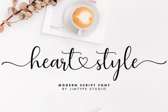
Accidental Soulmates + Heart Style
Adds a warm human signature touch for 1-to-3-word callouts without competing against structured serif capitals.
Inspect Heart Style specimenPractical applications
Concrete hierarchy, scale and production guidance tailored to Accidental Soulmates’s stroke geometry.
The selective curls give a heading movement, and the light serif keeps a couple's names readable at 26 pt on cream card stock.
Hierarchy & layout recipe
Print a 130 by 180 mm card: set the names at 26 pt on two rows, keep 20 mm above the top curl and 18 mm below the tail, and set the date at 9 pt in a serif beneath.
Pre-production check
A tail swept under the second row printed into a date line collides with it; check the proof and keep 16 mm of clear ground.
The slanted light serif suits a literary cover, and the open bowls keep a three-word title airy at 52 pt across the upper half.
Hierarchy & layout recipe
Print an A5 cover: set the title at 52 pt on two rows, keep 18 mm of clear cover between the rows for the curls, and set the author line at 10 pt in a caps at the foot.
Pre-production check
Two slanted rows set on tight leading overlap their ascenders; check the proof and open the gap by 6 mm.
The italic tone gives a range name character, and the light forms hold at 18 pt on a 45 mm printed band that wraps a paper pack.
Hierarchy & layout recipe
Print a 120 by 35 mm band: set the range name at 18 pt, keep 8 mm of clear band on either side, and set the sheet count in a 7 pt sans under the name.
Pre-production check
A light italic at 14 pt on a narrow band loses its serifs; check the proof and keep the name at 16 pt or above.
Technical & licence verification
Confirm included OTF/TTF/WOFF formats, full glyph tables and licence coverage on the live store page before batch production.
Closest visual alternatives
Matched across letterform anatomy, stroke behaviour and craft applications.
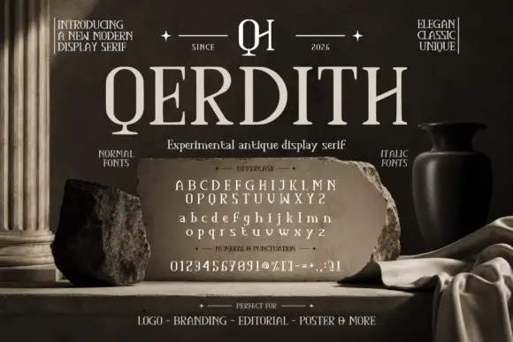
Experimental antique display serif
Qerdith is an experimental antique display serif in cream on a museum-style still life: narrow upright capitals with angular bowl joints, small ornamental serifs, a monogram at the top between dated notes, and sample rows of uppercase, lowercase, numerals and punctuation set on a stone tablet.
Ideas for this font
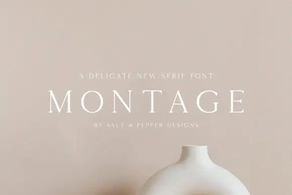
Delicate high-contrast serif
Montage is a delicate serif in white on a soft beige field: very fine hairlines, wide letterspacing, thin bracketed serifs and a high waist, set in caps on one line with a tracked line above and an attribution beneath, on a still life of a ceramic vessel.
Ideas for this font

Fine serif title with large upper and lower loops
Amilea shows pale yellow high-contrast letters with fine tapered serifs and broad rounded lowercase over a dark portrait, where a thin loop curves below the capital A and a tall upper flourish crosses the central ascender before sweeping right.
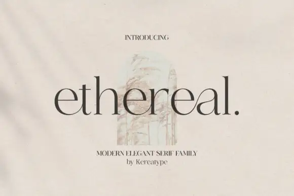
Fine lowercase serif with broad open bowls and tall ascenders
Ethereal shows dark lowercase letters with high contrast, thin joins and broad circular bowls, where tall h and l stems rise well above the rounded e forms and a small full stop ends the title.
Same independent foundry
Allow optional Google Analytics to measure visits and catalogue actions. Your search words and notes are not included. Privacy & storage