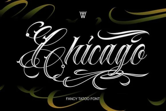
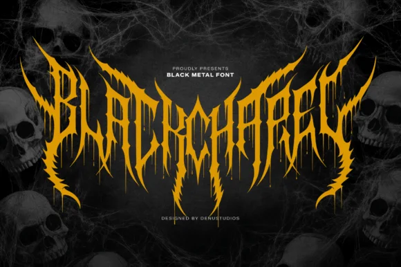
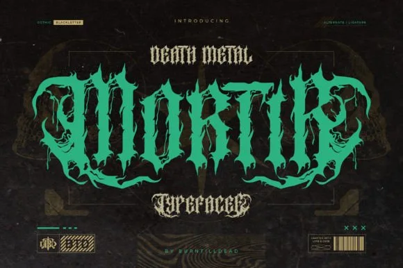
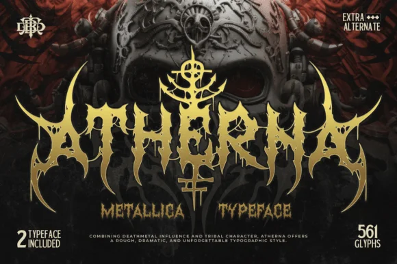
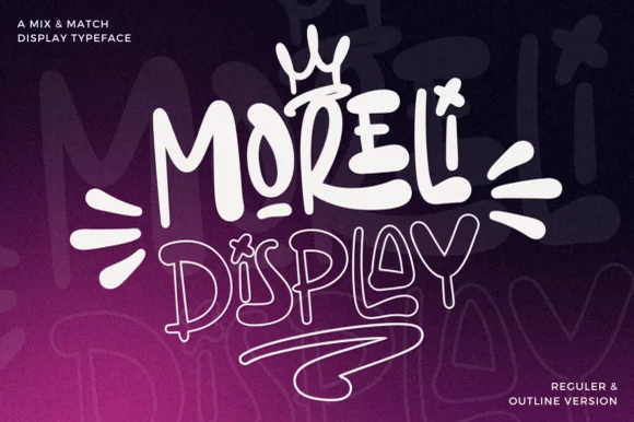
 #1 · Best Overall
Cryptborne
Crisp cathedral blackletter with flat tops and fine diamond spurs
Get fontPaid link
Read review ↓Disclosure: MakerFileHub may earn a commission from qualifying purchases via paid links on this page. How our links work.
Fraktur, textura & gothic display
Blackletter is dense by design, and density is where most projects fail. Cryptborne and Thornveil keep the cathedral structure crisp enough to read at a distance, Midnight and Drakzevor push toward a clothing-brand gothic, and Westmar and Eastern add the spurred and weathered variants that suit motorcycles, bourbon and heritage labels. Bathory and Beltino bring the ornate medieval side with large glyph sets.
Quick verdict
Cryptborne is the most legible entry point for a first blackletter project, Midnight suits apparel, and Westmar handles heritage and western work. Eastern is the pick for a weathered, printed Fraktur look.
Quick answer
Short on time? Start with our three highest-rated tattoo & blackletter standouts before scrolling the full breakdown.
#1 · Best OverallCrisp cathedral blackletter with flat tops and fine diamond spurs
 #2 · Runner-Up Pick
Bold street-gothic blackletter with compact forms and heavy verticals
 #3 · Editor's Choice
Armoured dark-fantasy gothic with pointed spurs and heavy blackletter structure
We screened 259 blackletter faces and kept 26 that remain readable at 1 inch and hold structural integrity when cut. Judged on the density of the vertical stems, whether the decorative hairlines survive single-colour output, and how the lowercase behaves in a full word rather than initials only.
Side-by-side summary
Compare specimens, OpenType/PUA traits and primary project roles side by side.
| Rank & Font | Style & File Specs | Best Project Fit | Store Listing |
|---|---|---|---|
| DecorativeFile formats | Alternative jewelry brand logo, book series or Halloween invite | Get fontPaid link | |
| DecorativeBold | Streetwear hoodie chest wordmark or snapback cap | Get fontPaid link | |
| DecorativeFile formats | Dark-fantasy book cover, game UI header or metal tee | Get fontPaid link | |
| DisplayFile formats | Western apparel label, boot-shop sign or whiskey bottle | Get fontPaid link | |
| DecorativePUA encoded · Alternates & swashes | Craft root-beer bottle, barber-parlor mirror & cigar box | Get fontPaid link |
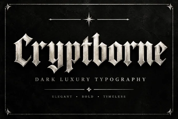
#1 · Best OverallCryptborne is a crisp cathedral blackletter in which the letters are built from flat-topped stems, fine diamond spurs and thin hairlines against heavy mass, so a short word reads as carved stonework.
The C opens with two heavy curved strokes that meet in a fine point, the r and the y carry diamond terminals, the b and the t rise into flat-topped stems and the o is drawn as two thick crescents enclosing a narrow slit. Unlike a manuscript blackletter, the counters here are almost closed and the hairlines are needle-thin, which is what gives the face its engraved-metal look rather than a pen-written one. Weight is high but the drawing is precise: every spur is a true diamond and every curve is symmetrical, so the word holds together at 80 pt on a cover and at 16 pt on a spine. The dark ground, the silver fill, the small star ornament and the three caption lines are presentation; the typeface is the word.
Alternative jewelry brand logo, book series or Halloween invite — Always set in Title Case paired with wide-tracked minimalist sans subtext.
Clean vector edges cut cleanly on larger vinyl decals and DTF apparel.
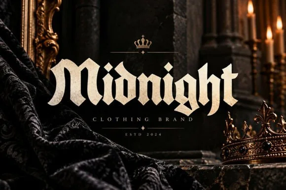
#2 · Runner-Up PickMidnight is a bold blackletter in which the letters stay compact, the verticals run heavy and the breaks bend at sharp angles, so a word reads as a clothing label rather than as a manuscript.
The capital M draws as three heavy verticals joined by angular breaks, the i keeps a diamond dot and the g closes a narrow tail, all at a heavy even weight with flat tops and sharp junctions. The construction is compact rather than calligraphic: the diamonds are small, the hairlines are thin but few, and the overall mass reads at 60 pt on a garment while staying tight enough for a single word. That compactness is what separates the face from historical blackletter and makes it usable as a streetwear mark. Counters are narrow, so the face wants 24 pt minimum and generous leading when stacked. The dark stone, the gold frame, the crown, the candlelight and the small caption lines are presentation; the typeface is the word.
Streetwear hoodie chest wordmark or snapback cap — Centre one Title Case word beneath a minimal crown or emblem mark.
Solid un-distressed strokes make this blackletter workable on HTV at 1.5"+ height.
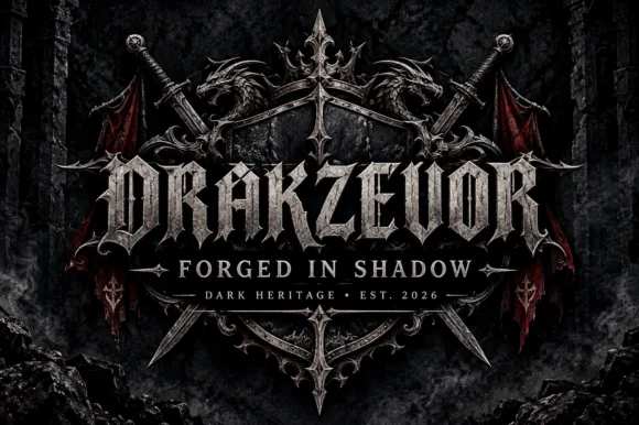
#3 · Editor's ChoiceDrakzevor is an armoured dark-fantasy gothic alphabet in which each letter grows pointed spurs and the blackletter skeleton is thickened into metal plates.
The D opens with a heavy left stem and a bowl that terminates in a spike rather than a curve, and every letter after it repeats that armour: the R carries a pointed leg, the A closes to a spike above the cap line, the K splays spurs from a single mass and the letters sit so tight that the word reads as a forged band. The underlying skeleton is blackletter, with broken strokes and narrow counters, but the strokes themselves are heavy and bevelled, which is what gives the face its fantasy-armour look rather than a manuscript one. Weight is maximal, the terminals are sharp and the counters are narrow slits. The stone ground, the shield, the swords and the small rule beneath are presentation; the typeface is the two words.
Dark-fantasy book cover, game UI header or metal tee — Pair with widely tracked roman small caps (FORGED IN SHADOW) beneath.
OTF display face; flat vector shapes inside, metallic bevel on cover is presentation styling.
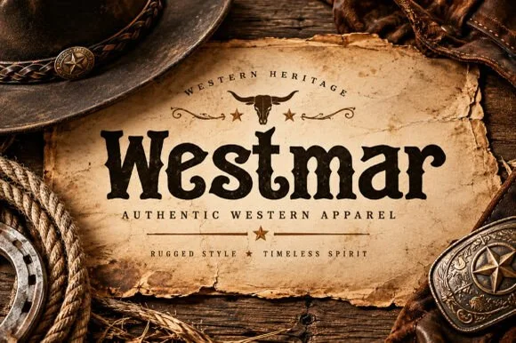 #4 · Top Maker Utility
Westmar is a western heritage slab in which the serifs grow spurs, the stems bulge and the contour breaks into a worn edge, so a name reads as a brand burned onto a wooden sign.
The W splays four heavy strokes with spurred feet, the e closes a wide eye, the s holds a thick spine with terminal spurs, the t sets a wide bar, the m keeps three even stems and the r turns a spurred arm, all at a slab weight with exaggerated serifs and a rough, broken outline. The spurs are the character: they sit on the serifs and the terminals and give the word its frontier look, which is why the sample sets one name on a torn paper label. Because the shapes are solid, the face holds from 24 pt and prints in one ink, and the worn edge reads as age rather than as damage. The leather hat, the rope, the buckle and the torn paper are presentation; the dark display name is the face.
Western apparel label, boot-shop sign or whiskey bottle — Set in Title Case below an arched uppercase heritage subline.
Sturdy strokes laser-engrave sharply on leatherettes and cut cleanly at 1.5"+ height.
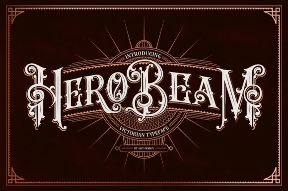 #5 · Standout Silhouette
Hero Beam is an elaborate Victorian poster typeface dressed with interior inline filigree, curled spurs, and crisp drop-contour framing.
Hero Beam is a three-dimensional Victorian saloon and tattoo blackletter: a dense gothic body with a bevel that shades the left edge, a bright highlight ridge along the stem and a drop shadow that sits under the letter. The shading is the whole character, so it needs size to read as a solid beam rather than a smudge, and the highlight is the finest element. It needs roughly 36 mm for the bevel and the highlight to read, and it is best as a paper-colour build on dark stock, or one metallic ink with the highlight left as unprinted paper at 50 mm and above.
Craft root-beer bottle, barber-parlor mirror & cigar box — Arc or center a single bold brand title at large scale (56–84 pt) over dark mahogany, navy, or black label panels.
Contains intricate interior filigree lines—produce via high-res label printing, DTF, or laser engraving rather than blade-cut vinyl.
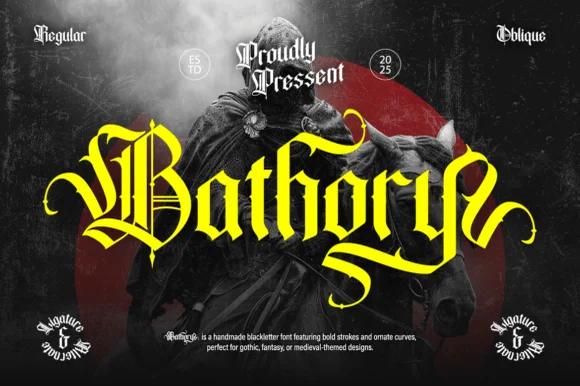 #6
Bathory is a lush, handmade medieval blackletter family (Regular & Oblique) featuring double-barred capitals and sweeping flame-curled descenders.
Bathory is an ornate medieval blackletter family with a dense texture, sharp diamond terminals, hairline connecting strokes and a Regular plus an Oblique for emphasis. The oblique slants the whole texture, which is the only italic this family offers, and the hairlines are its weakest part in print. It needs roughly 30 mm for the diamond terminals to read, and it is best in one black on cream or a single dark red on parchment tones, never reversed at small sizes.
Epic fantasy cover, heavy-metal vinyl jacket & RPG rulebook — Set single-word titles in title case at 64–110 pt in gold or crimson over dark chiaroscuro artwork.
Fine interior double-bars inside capitals call for print, foil, or DTF transfers rather than small blade-weeded vinyl.
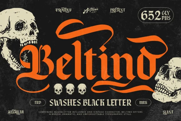 #7
Beltino is a muscular 652-glyph swashed blackletter family (Regular & Slant) crowned with sweeping flame-like banner ribbons.
Beltino is a swashed vintage gothic blackletter with a regular and a slant cut and a large glyph set: the body is dense and vertical, the ascenders open into curved swashes and the caps carry a drawn flourish that runs above the line. The swashes make a word grow tall, and the hairline connectors are the weakest element in print. It needs roughly 34 mm for the swash and the connectors to read, and it is best in one black on cream or a single dark gold on parchment, and it should never be reversed at small sizes.
Custom motorcycle club tee, craft hot-sauce & brewery can — Capitalize only the first letter with a sweeping canopy swash alternate and keep the remaining letters in sturdy lowercase.
Generous stroke thickness makes Beltino practical for large back-patch HTV, screen prints, and 1.5 in+ die-cut decals.
 #8
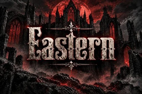
Eastern is a dramatic medieval Fraktur blackletter display font featuring bifurcated crown spurs and classic gothic lowercase (OTF).
A weathered Fraktur blackletter set in stone-textured silver over a blood-moon cathedral ruin: an ornate double-stemmed E and horned ascenders lead into diamond-footed lowercase, so the word reads as carved cathedral lettering rather than as a modern gothic. The lowercase proportions are balanced, which is why a title stays readable on a spine and at thumbnail size, and the diamond feet give the baseline its rhythm. The stone texture is a mockup fill rather than part of the glyphs, so the vector shapes underneath are clean. The ruin and moon are staging. Uses are dark fantasy, gothic music and game titling.
Dark-fantasy novel cover, gothic metal vinyl & game title — Center 1 title-case word at 64–120 pt framed above and below by symmetrical fleur-de-lis spear dividers.
Clean underlying vector blackletter shapes cut on 1.5 in+ HTV (stone texture in preview is an applied mockup fill!).
 #9
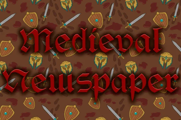
Medieval Newspaper is an authentic historical blackletter digitized from an antique Belgian abbey newspaper masthead.
An authentic Belgian-abbey style Fraktur shown over an illustrated shield-and-sword pattern: crimson broad-nib capitals with split diamonds and a crisp vertical rhythm, so the word reads as a historical gazette masthead rather than as a fantasy gothic. The broad nib gives the strokes their angled stress, and the split-diamond capitals are the detail that makes a period headline look right. The rhythm is even, which is why a long masthead stays readable in a narrow measure. The shield pattern behind is staging. Uses are historical props, tavern broadsheets, game handouts and period event programmes.
Historical gazette masthead, D&D tavern broadsheet & prop — Set 1 title-case masthead across the top of a 3-column broadsheet (64–120 pt) between double horizontal rules.
Clean, crisp broad-nib vector shapes print sharply on newsprint and cut on 1.2 in+ Cricut vinyl or laser wood!
 #10
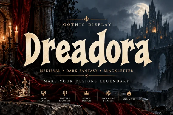
Dreadora is a stately medieval blackletter pairing classic broad-nib manuscript rhythm with smooth, highly legible lowercase bowls.
Dreadora is a stately broad-nib medieval blackletter drawn with the pen angle visible in every stroke: thick diagonal stems, hairline exits, diamond feet and a dense even texture that reads as a manuscript page rather than a display face. The hairline exits are the weakest element in print, and the diamond feet are what survive at large sizes. It needs roughly 30 mm for the diamond foot and the exit to read, and it is best in one dense black on cream and parchment tones, or a single dark red for rubrication, and it should never be reversed at small sizes.
Craft stout / imperial porter can, pub sign & mead label — Center 1 title-case brand name at 68–130 pt in parchment cream or metallic gold over dark slate.
Cleaner, less spiky contours make this one of the easiest medieval blackletters to cut and weed on Cricut vinyl at 1.1 in+!
 #11
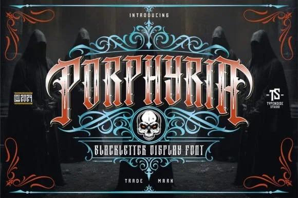
Porphyria is an aggressive, sharp-spurred tattoo blackletter display font (not a flowing cursive script) built for gothic arches and heavy merch.
Porphyria is a sharp-spurred tattoo blackletter with tall condensed gothic capitals, bronze-bevel detail and thorn spurs that grow from the shoulders rather than floating behind the word. The stems are heavy and tightly spaced, so a word reads as a carved arch, and the spurs give it the tattoo-flash silhouette without a separate ornament layer. It needs roughly 30 mm for the spurs to read as points, and it is a logo and merch device, best in one bone colour on a dark ground with a bevel or a second ink.
Dark-fantasy merch tee, metal-band poster & gothic mug — Apply an Envelope/Arch warp (+15%) to 1 all-caps word at 64–120 pt framed by baroque scroll filigree.
Best in DTF hoodie prints, screen print, and book covers; solid letters cut on 1.75 in+ HTV if peeled carefully at sharp spurs.
 #12
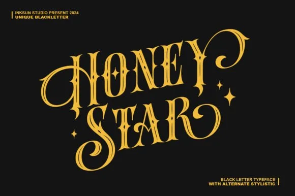
Honey Star is a whimsical, medium-bold ornamental blackletter blending diamond gothic stems with sweeping celestial spiral curls.
Honey Star is a Victorian ornamental blackletter crossed with psychedelic swashes: dense broken strokes with a heavy vertical rhythm, split serifs that curl into long spiral tails, small stars set into the counters and a warm wobble across the baseline. The spirals and the stars are the finest elements and both close first. It needs roughly 34 mm for the spiral and the star to read, and it is best in two warm inks on cream, or one dense ink on white where the spirals print as drawn lines.
Celestial tarot box, apothecary candle & spooky-season mug — Center a 2-word title in metallic gold over midnight black or deep plum, flanking outer curls with minimal star marks.
Main stems have decent body, while outer spiral tips taper fine—favor gold foil, sublimation, or 1.8 in+ vinyl decals.
 #13
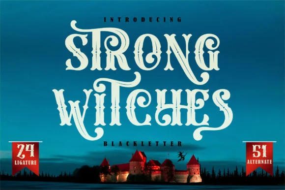
Strong Witches is a lively, fairytale-gothic blackletter softened by bouncy curled swashes, 24 ligatures, and 51 stylistic alternates.
Strong Witches is a playful curly-swashed fantasy blackletter with twenty-four ligatures and fifty-one alternates: dense broken strokes with a light rhythm, curls that sprout off the shoulders and a swash set that turns a plain word into a drawn spell. The alternates only appear through specific keystrokes, and the curls are the finest element. It needs roughly 32 mm for the curl and the ligature to read, and it is best in two flat inks on cream, or one dense ink on white where the curls print as drawn lines.
Hocus-Pocus party shirt, potion jar label & spellbook prop — Stack 2 centered words at 48–68 pt and swap in 2 or 3 of the 51 PUA alternates on outer capitals and descenders.
Sturdy main stems cut well on HTV and vinyl at 1.4 inches+ tall; take care around the narrower curled tail hooks when weeding.
 #14
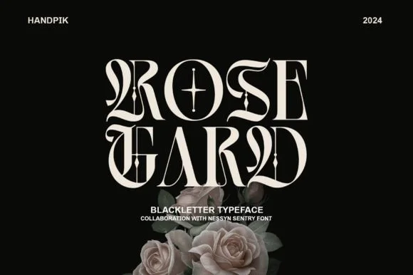
Rose Gard is a sleek, high-contrast modern blackletter featuring calligraphic hairline loops, razor-sliced stems, and a star-crossed O.
Rose Gard is a sharp high-contrast blackletter drawn for editorial use: fine hairlines against dense black stems, pointed diamond terminals, tight vertical rhythm and a clean baseline that lets it sit inside a column. The hairlines are the weakest element in print and the terminals are what survive at display size. It needs roughly 30 mm for the diamond terminal and the hairline to read, and it is best in one dense black on a smooth text stock, or a single dark red on cream, and it should never be reversed at small sizes.
Gothic romance cover, dark-academia zine & album sleeve — Stack two short 4-to-5-letter words flush-center at 64–96 pt with generous black negative space around them.
Needle-thin hairline loops and interior star crosshairs require print, foil, or digital output—do not weed small vinyl.
 #15
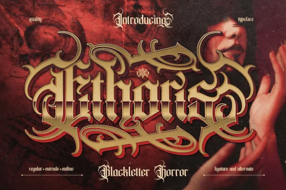
Ethoris is an opulent dark-fantasy blackletter family offering matched Regular, Extrude, and Outline styles wrapped in thorny vine flourishes.
Ethoris is a Baroque horror blackletter family in a regular, an extrude and an outline cut: dense broken strokes with a heavy vertical rhythm, ornamented shoulders that curl into a small scroll and a third cut where the word is given carved depth. The family lets one poster carry a flat name and a carved second line in the same voice, which is how a period title page is usually built, without borrowing a second face. The scrolls are the finest element and they fill into a solid edge as soon as the face is reduced, and the outline cut needs the largest size of the three to survive. The regular needs roughly 32 mm and the extrude 36 mm for their detail to read.
Dark-fantasy novel cover, metal album sleeve & game logo — Align identical text boxes in Extrude (dark burgundy/black) and Regular (gold/ivory) directly on top of each other at 72+ pt.
Intricate thorn filigree and multi-layer bevels are built for high-DPI print, book jackets, and digital key art—not cut vinyl.
 #16
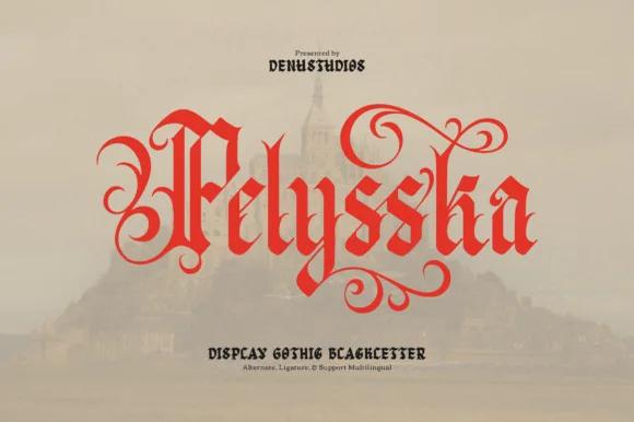
Pelysska is a dramatic gothic blackletter display typeface draped in curling calligraphy vines, looped ascenders, and regal manuscript spurs.
Pelysska is a scarlet gothic blackletter display draped in curling calligraphy vines, with looped ascenders, symmetrical S-scroll tendrils above and below the x-height and regal manuscript spurs, so a word reads as an illuminated manuscript rather than a poster. The vines extend well past the letters, which means the artwork box grows in every direction, and the stems are dense. It needs roughly 32 mm for the scrolls to read, and it is best in vermilion or gold on a deep ground or in one ink on vellum cream.
Gothic fantasy book cover, classical poster & tarot deck — Set 1 hero title word in title case at 60–96 pt in scarlet, gold, or black over muted parchment tones.
Fine tapered scroll tips reproduce cleanly in print, foil, and DTF transfers; scale vinyl decals above 2.5 inches if blade-cutting.
 #17
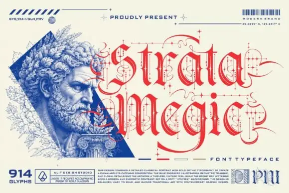
Strata Megic is a classical display serif with high contrast, sharp serifs and ornamental flourishes, shown in a technical drawing layout with glyph counts and swatch keys.
strata over megic fills the right half of the card in a deep red, the letters drawn with strong contrast and a long tail on the g that reaches under the line, plus small diamond ornaments and fine rules between the two rows. On the left a classical bust is printed in blue line work inside a triangle, and the whole sheet is annotated like a specification: a glyph count at the lower left, a colour key along the bottom, a barcode at the upper right and a paragraph of small technical text. The layout is the point of the sample: it treats the typeface as a designed object with a specification, which is how a serious retail font is presented, and the ornament in the letterforms is restrained enough that the face would work on a cover or a bottle as well as on a specimen.
A speculative-design exhibition title — Place Strata of Thought large in red on a white exhibition cover, keeping the ornament zone separate from a credited portrait on the reverse.
Verify the required alternates and all hairline details at the final size.
 #18
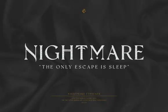
Nightmare is a refined display serif with very wide capitals, high stroke contrast and small sharp spurs at the ends of the stems, set quiet and pale on a dark ground.
NIGHTMARE spans the frame in a pale ivory on a near-black ground, and the letters are wide and elegant: thin horizontals, heavy stems, small unbracketed serifs and a flat-topped N that gives the word a cinematic feel. The contrast is high but not extreme, so the thin strokes survive at the sizes a poster is viewed from. Beneath the word a line of spaced caps in quotation marks carries a tagline, and lower still a block of tiny type names the style and credits the designer. There are no ornaments at all, which is what separates this face from the fantasy blackletters: the character comes from proportion and from the calm pale grey against the dark. It is a title cut for film posters, book covers and packaging, and it holds at a moderate size because the serifs are small and the counters are open.
A late-night film programme — Set AFTER THE LAST LIGHT across the top of a charcoal programme cover, with the film list in a generous plain column below.
Verify the complete uppercase phrase and avoid shrinking the pointed details.
 #19
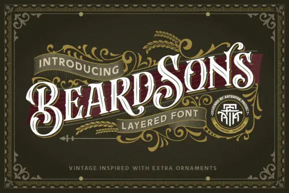
Beardsons rises diagonally across an ornate olive cover, where white capitals carry thin internal lines, narrow waists and extended curled terminals around the opening B and the central S, a dark red offset behind the letters adds depth and fine gold foliage frames the name.
The stems stay narrow at the waist and wide at the terminals, the internal hairlines cut through the bodies and the offset duplicates the contour behind. That layered offset is the character: the word reads as a carved Victorian sign rather than a flat lettering job, which is why the sample runs on a diagonal across a bordered field. The gold foliage, the border and the banners are artwork. Keep 44 pt so the thin inner lines survive, allow 12 mm for the offset and check the diagonal at the trim.
A barbershop appointment-card front — Angle BEARDSONS slightly across a dark olive card front; place BARBER in small plain capitals beneath, and booking details on the reverse.
Verify available letter variants and any layer registration in the intended application.
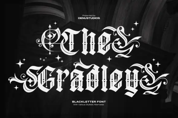 #20
The Gradley is an ornate blackletter display face: heavy letters with a fine inline running through the stems, long swashes on several capitals, and stars scattered between the words.
the over gradley sits across the card in white on a dark interior, the letters drawn in a blackletter skeleton but decorated with an inline that follows each stem and a set of flourishes that reach out at the top and the foot of the line. The T throws a swash to the left, the g and the y drop long tails below the baseline, and four-pointed stars of two sizes are scattered in the gaps between the letters. The inline is drawn at the same fine weight in every letter, which is what holds the busy word together, and the swashes are kept to the beginning and the end of each line so the middle stays readable. Two small captions in a plain sans name the style and the number of alternates. It is a display blackletter for posters, album art and merch, and it needs a dark ground and a large size.
A bookbinder's presentation sleeve — Centre The Bindery on a plain black sleeve front, leaving both side margins empty for any selected swashes; put workshop details on the back.
Verify the actual alternate controls and inspect the hairlines at sleeve size.
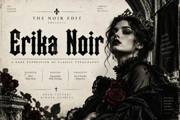 #21
Erika Noir is a wide blackletter display face with heavy stems, flat feet and a dense texture, set here in a fashion editorial where the lettering takes half the page.
Erika Noir sits across the upper third of a magazine page in solid black, and the letters are wider and heavier than a classic textura: the stems are thick bars, the shoulders square off, and the diamonds at the feet are cut flat. The word is set in mixed case with large capitals, which gives it the rhythm of a masthead rather than a book title. Beneath it a rule and a line of spaced caps carry a subtitle, and three small columns of tiny type below that describe the uses, naming fashion, design and creative projects. At the right of the page a photograph of a woman in a lace collar and dark crown fills the frame, and a vertical box of small caps runs down the right edge. The layout is the argument: the lettering is treated as a fashion object, so the face belongs on covers, lookbooks and campaign print rather than on book jackets.
A Gothic fashion zine masthead — Set NOIR NOTES above one full-width portrait on a cream zine cover; place the issue number in a small plain corner box.
Check the all-capitals result, since the cover mainly demonstrates mixed case.
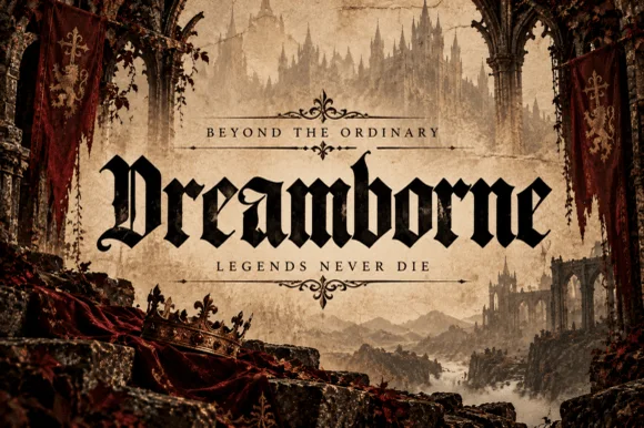 #22
Dreamborne is a bold, clean-edged medieval blackletter display typeface balancing gothic diamond spurs with high fantasy cover legibility.
Dreamborne is a clean-edged medieval blackletter display with gothic diamond spurs and an ornate open-bowled D, drawn so a fantasy cover title reads at thumbnail size without the tight texture of a traditional Textura. The stems are heavy and evenly spaced, the lowercase is knit but open enough for a 16 pt line, and the capitals carry the ornament so a word can begin with incident and continue legibly. It is a title face for books, games and themed signage, comfortable from 20 mm upward, and honest about its limits: long copy would collapse into texture.
Epic fantasy novel jacket, medieval RPG header & lore map — Center title-case headlines at 54–88 pt framed above and below by wide-tracked Roman caps ('BEYOND THE ORDINARY').
Clean solid strokes without grunge holes allow 1.25 in+ vinyl decals, foil stamping, and sharp print reproduction.
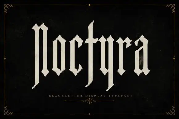 #23
Noctyra is a tall blackletter display face with narrow letters, needle-sharp spurs and thinner stems than a textura, set inside a hairline frame of corner flourishes.
Noctyra sits across the middle of a near-black card in a warm cream, and the letters are drawn in the delicate end of the blackletter range: the stems are narrow, the joins are fine, and the spurs come to points rather than diamonds, so the word reads as calligraphy on parchment rather than as a printed block. The ascenders of the l and the t rise high above the x-height, and the y and the r throw out small hooks that curve back toward the baseline. Around the composition a thin double rule forms a frame with ornamental corners, and a single hairline rule with a fleuron sits under the word beside a spaced caption naming the style. Nothing else is on the card. The face is a display blackletter for book covers, labels and invitations, and the fine strokes mean it wants a good printer and a large size.
A Gothic short-story dust jacket — Place Noctyra alone in the upper centre of a black jacket and move the author below a broad empty descender zone.
Check the actual text bounds in the layout application before cropping the cover.
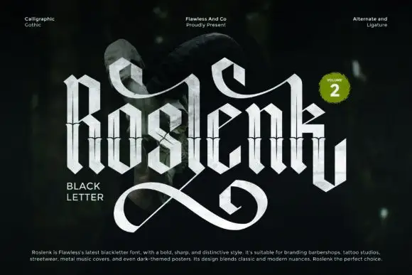 #24
Roslenk Volume 2 is a blackletter drawn without a single curve: every stroke is a straight cut, the joins are mitred, the spurs end in diamonds, and the last letter throws a long angular swash under the word.
ROSLENK fills the card in a chrome finish over a dark blurred ground, and the letters look cut from sheet metal: the R is a stack of angled bars, the O is a hexagon, the S is built from three straight segments, and the K ends in a tail that swings out below the baseline and returns in a sharp hook. Small caps captions in the corners describe the style, the studio and the features, and a round badge at the right marks the second volume. The chrome fill is a photograph-style gradient rather than flat colour, which is what makes the shapes read as metal at poster size. The face belongs to streetwear, tattoo studios, metal covers and dark editorial, and it is built for large sizes: the mitred joins and the thin diamond points lose their edge quickly when the type is set small.
A custom bookplate heading — Put Roslenk Library in the upper half of a cream bookplate, reserving the bottom for an owner name in plain text beyond the swash zone.
Confirm alternate access and proof the bookplate at its actual width.
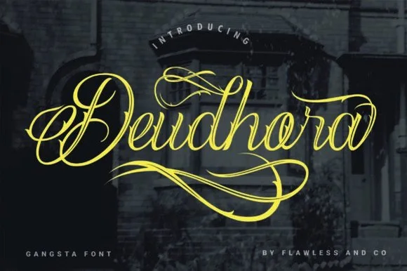 #25
Deudhora is an expressive Chicano-inspired calligraphy script draped in sweeping gold canopy loops and double-backed underline flourishes.
Deudhora is a flourished Chicano and tattoo fine-line calligraphy script: a hairline stroke with almost no contrast, tall looped capitals that curl back over the word, long underline swashes that run beneath the phrase and small arrow or diamond accents at the swash ends. The hairline is the design and it breaks first on textured stock, and the underlines add a fixed width to any block of text. It needs roughly 30 mm for the hairline and the underline to read, and it is best in one fine ink on smooth card, or a single dark tone on coated stock.
Chicano streetwear chest script, tattoo flash & album art — Center a single focal name or title across a black tee chest at 9–11 inches wide, letting the upper and lower loops frame the word.
Fine hairline whips require DTF, screen printing, embroidery, or large-scale sign vinyl—avoid tiny blade-weeded decals.
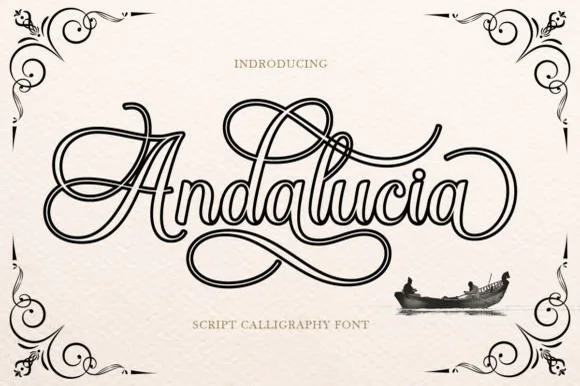 #26
Andalucia Outline is an elaborate, hollow-contoured calligraphic script wrapped in multi-looped copperplate canopy and underline flourishes.
Andalucia Outline is a hollow-outlined copperplate flourish calligraphy script: a steep slope, hairline-thin strokes drawn only as an open outline, capitals that loop twice and flourishes that curl off both ends of a line. The hollow stroke needs a light ground, and the hairline outline silts into a grey edge once the face is reduced. It needs roughly 32 mm for the outline and the flourish to read, and it is best as a one-colour vinyl or foil job on a light ground, or a single ink print on smooth stock.
Tattoo flash sheet, lowrider club tee & music poster — Center a single focal name or city title at large poster scale (60–110 pt) with wide breathing room above and below the loops.
Because every stroke is a fine double-line outline, print via screen print, DTF, or high-res paper rather than weeding small vinyl.
Practical buyer checklist
Key cutting, printing and pairing answers before choosing a tattoo & blackletter typeface.
For most readers, no. The letter shapes share so many stems that word recognition slows sharply. Use it for headlines, band names, banners and single phrases, then switch to a textura-inspired roman or a plain serif for anything over two lines.
They descend from different scribal hands: textura is upright and dense, fraktur is more angular with broken curves, and rotunda is rounder and more open. The style name in the listing is often loose, so judge by the letterforms in the specimen.
Heavy display blackletter yes, at 2 inches or more. Ornate variants with fine internal filigree will fail, because those details become separate islands that lift off during weeding.
A neutral grotesque at 30 to 40 percent of the blackletter's size, set with generous leading. The contrast between dense historical lettering and plain modern text is what keeps the poster readable while the blackletter stays decorative.
Keep exploring
Explore adjacent maker roundups or check our practical pre-production checklists.
11 curated fonts · Previews & pairings
17 curated fonts · Previews & pairings
21 curated fonts · Previews & pairings
27 curated fonts · Previews & pairings
Guides: Invitation font checklist · Vinyl & cutting checklist · How to pair script & sans fonts
Allow optional Google Analytics to measure visits and catalogue actions. Your search words and notes are not included. Privacy & storage