 #1 · Best Overall
La Rumba
Fine-pointed copperplate wedding calligraphy with hundreds of alternates
Get fontPaid link
Read review ↓Disclosure: MakerFileHub may earn a commission from qualifying purchases via paid links on this page. How our links work.
Hairline pen scripts & airy signature lettering
Fine-line tattoo script is a scale problem: the stroke has to be thin enough to look drawn and thick enough to heal evenly. La Rumba and Ravel keep an architectural pen line, Romantic Touch and Sorel stay airy, and Amsterdam Signature and Lovely extend the lettering without losing weight. Oriel and Monoline Boho open the loops so the script does not smudge at 3 inches.
Quick verdict
La Rumba is the most dependable fine-line copperplate, Ravel is the cleanest architectural pen script, and Romantic Touch suits ultra-delicate placement. Oriel is the pick when the script has to stay open at small sizes.
Quick answer
Short on time? Start with our three highest-rated fine-line & minimalist tattoo script standouts before scrolling the full breakdown.
#1 · Best OverallFine-pointed copperplate wedding calligraphy with hundreds of alternates
 #2 · Runner-Up Pick
 #3 · Editor's Choice
We kept 18 of 396 candidates after measuring the thinnest stroke at a 3 inch design width. Judged on loop openness, connector consistency, and how the script behaves when engraved rather than inked.
Side-by-side summary
Compare specimens, OpenType/PUA traits and primary project roles side by side.
| Rank & Font | Style & File Specs | Best Project Fit | Store Listing |
|---|---|---|---|
| ScriptSoulful | Letterpress wedding invitation, vow booklet & calligraphy menu | Get fontPaid link | |
| ScriptRefined | Luxury watch/jewelry certificate, perfume box & architect mark | Get fontPaid link | |
| ScriptAlternates & swashes | Vellum invitation wrap, silk-ribbon print & vow booklet | Get fontPaid link | |
| ScriptLyrical | Atelier fashion wordmark, wine-estate signature & art book | Get fontPaid link | |
| ScriptPUA encoded · Alternates & swashes | Photography watermark & studio business card | Get fontPaid link |
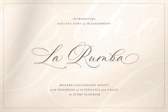
#1 · Best OverallLa Rumba is a delicate, slanted copperplate calligraphy script featuring sweeping hairline entry loops, shaded downstrokes, and hundreds of alternates.
La Rumba is a fine-pointed copperplate wedding calligraphy script with a large alternate set: a deep oval axis, a heavy shaded downstroke against a hairline exit, pointed entry strokes and several hundred alternates for the caps and final letters. The hairlines are the weakest element in print, and the alternates widen the word when a long tail is chosen. It needs roughly 24 mm for the pointed entry and the hairline exit to read, and it is best in one dark ink on smooth card, or foil above 40 pt where the hairline can still carry.
Letterpress wedding invitation, vow booklet & calligraphy menu — Center focal names at 42–64 pt with generous white cotton margins above 8.5 pt tracked Roman caps.
Whisper-thin hairlines belong in letterpress, foil stamping, flat print, or Foil Quill pen paths—never small blade-cut vinyl.
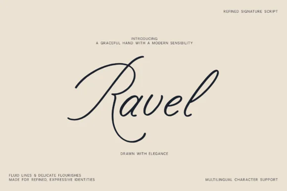
#2 · Runner-Up PickRavel is a slender, sweeping signature script featuring an oversized calligraphic canopy R-loop and delicate modern pen lines.
Ravel is a slender dip-pen signature script with an oversized calligraphic canopy R-loop that arches over the word, delicate modern pen lines and a descending leg curve. The stroke is uniform and light, so it plots and foils predictably and holds at 14 mm on a card, while the canopy adds height that a layout must reserve. The looser connections mean a long phrase should be broken into lines rather than strung out, and it is at its best in one dark ink on a warm neutral ground.
Luxury watch/jewelry certificate, perfume box & architect mark — Center 1 word at 54–84 pt with wide empty margins above a 7 pt tracked sans descriptor.
Fine hairline pen strokes are engineered for print, foil stamping, and digital watermarks—not blade-cut vinyl.
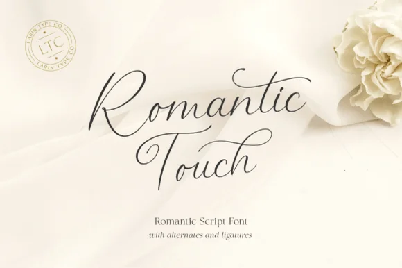
#3 · Editor's ChoiceRomantic Touch is a feather-light, fluid handwritten script featuring wide looped capitals, flying t-crossbars, and delicate nib movement.
Romantic Touch is an ultra-fine fountain-pen script with wide looped capitals, flying t crossbars and delicate nib movement, so a name reads as written with a light hand on good paper rather than as engraved calligraphy. The hairlines are the design, which means the face needs size and a smooth stock, and the flying crossbar extends past the letter. It needs roughly 24 mm for the hairlines to hold and 10 mm in a card, and it is best in one fine dark ink on ivory or as a light foil on matte board.
Vellum invitation wrap, silk-ribbon print & vow booklet — Center 2 stacked words at 42–64 pt with 1.15 line spacing and wide 1.25-inch margins.
Hairline fountain-pen strokes belong in flat print, letterpress, Foil Quill, or Cricut Pen addressing—not cut vinyl.
 #4 · Top Maker Utility
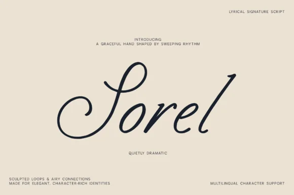
Sorel is a poised, slanted lyrical signature script defined by an expansive double-curled S-loop and crisp high-rising ascenders.
Sorel is a slanted lyrical signature script with an expansive double-curled S loop, high-rising ascenders and clean monoline-shaded cursive that glides between letters. The loops extend above and below the word, so the layout needs head and foot room, and the even weight lets it foil and plot predictably. It needs roughly 20 mm for the S loop to read as a spiral rather than a blob, and it is a stationery and label face, best in one midnight ink on a warm gallery cream.
Atelier fashion wordmark, wine-estate signature & art book — Float a single title-case word at 56–90 pt in the center of generous cream cardstock with micro corner credits.
Medium-slender strokes reproduce best via print, embossing, foil, or 1.75 in+ retail window vinyl (weld overlaps).
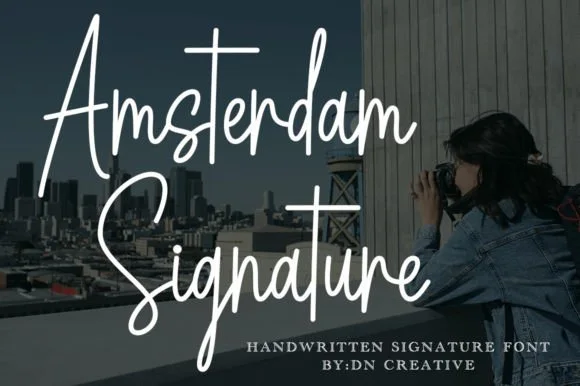 #5 · Standout Silhouette
Amsterdam Signature is a slender, upright monoline cursive with dramatic peaked capitals and sweeping t-crossbars.
Amsterdam Signature is a tall monoline signature script: an even hairline stroke with long ascenders, letters joined low and fast, a slight forward slant and a single release stroke that carries the eye off the end of the word. It reads as a signed name rather than a set line, so it belongs on a card, a thank-you slip or a decal. The hairline is the finest element and it breaks first in print, on textured stock and in vinyl. It needs roughly 28 mm for the hairline and the ascender to read, and it is best one dark ink on a smooth coated stock.
Photography watermark & studio business card — Place the two-word signature at 18–24 pt in high-contrast white or foil, pairing contact details below in a tracked-out 7 pt geometric sans.
Avoid adhesive blade cutting under 2 inches tall; use 300 DPI print, hot foil stamping, or Foil Quill drawing instead.
 #6
Lovely sets a fine signature script in a single dark weight over a pale city photograph, where a wide entry curve opens low at the left, the letters rise into tall slender loops through the middle and a large descending y plus an extended closing sweep make the lower right part of the footprint.
The stroke stays thin and even, the loops stay tall, the entry runs wide and the exit sweeps out. That asymmetry is the character: the word is wider at the right than the left, which is why the sample sits on a generous square field rather than a strip. The building behind it is scenery, not part of the type. Keep 26 pt as the floor, allow 25 mm of clear space at the right for the exit sweep and check the y loop against any line placed beneath.
A quiet wedding invitation heading — Use a single script heading above the names. Keep a clear band beneath its lowest strokes, then set the venue and time in plain text.
Print at invitation size and check contrast on the chosen paper. Do not use the fine script for the address or RSVP instructions.
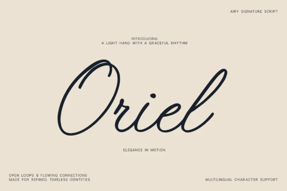 #7
Oriel is an airy, minimalist monoline signature script featuring wide open oval 'O' loops, unhurried rhythm, and full multilingual support.
Oriel is an airy monoline signature script with wide open oval O loops, an unhurried even rhythm and a very light optical weight, drawn to sit quietly on editorial stock rather than to shout. Because the stroke never thickens, it plots, foils and prints predictably, and because the loops stay open, the face reads at 14 mm even when printed in a pale ink. It carries multilingual character support, so a name in another script keeps the same airy construction. It suits quiet branding, place cards and watermarks, and it looks wrong at poster scale where its lightness becomes timid.
Minimalist linen clothing tag, ceramic studio & watermark — Center 1 title-case word huge (76–155 pt) surrounded by generous warm-sand negative space and micro-sans corner notes.
Draws in crisp single-weight lines with Cricut Pens/Foil Quill and cuts cleanly on 1.25 in+ Oracal 651 (Weld joins!).
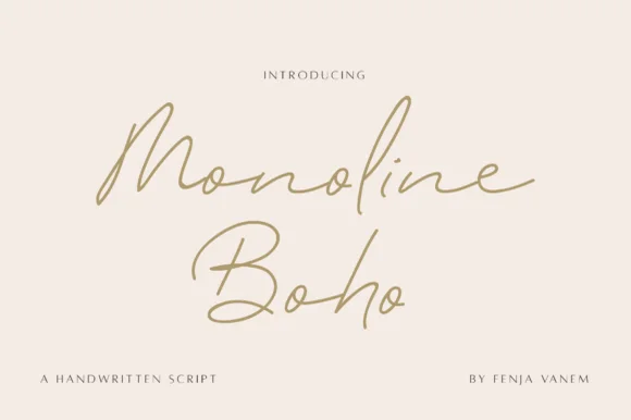 #8
Monoline Boho is a fine, forward-slanted handwritten script featuring sweeping multi-peak capitals and airy looped ascenders.
Monoline Boho is a fine slanted monoline signature script with knotted loops: an even hairline stroke on a strong slant, letters joined low, and ascenders that tie themselves into small open knots before they release. It reads as a hand-signed name rather than a set line, which is why it belongs on a card, a tag or a decal. The knots are the finest element and they close into a smudge once the face is reduced or cut small. It needs roughly 30 mm for the knot and the hairline to read, and it is best one dark ink on a smooth stock.
Botanical skincare bottle & ceramic studio logo — Give a two-word studio name generous whitespace at 24–30 pt, paired with widely tracked 7.5 pt uppercase sans ingredient lines.
Fine monoline strokes belong in print, foil stamping, or Foil Quill drawing rather than small cut-and-weed adhesive decals.
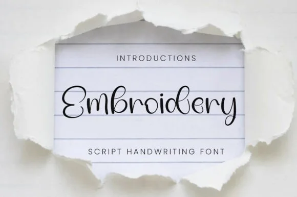 #9
Embroidery (by YanStudio) is a whisper-fine monoline script mimicking a single continuous strand of black sewing thread across ruled paper.
A hairline monoline script shown inside torn white paper that reveals blue-lined notebook stock: a fine black thread weaves an open curled E, spiralled bowls on the b and d, and continuous ultra-thin connectors, so the word reads as single-strand stitching rather than as calligraphy with a nib. The stroke weight is uniform and very light, which is what makes it usable for hand-embroidery templates and pen plotting, and it is what rules out blade cutting. The torn paper and lined stock are staging. Uses are craft patterns, delicate stationery and plotted work where a fine line is the point.
Single-strand backstitch embroidery pattern, card & Foil Quill — Center 1 title-case word at 38–68 pt across lined notebook or linen backgrounds.
Hairline thread weight is strictly for hand-stitching templates, Cricut Pen/Foil Quill drawing, and print—never blade-cut vinyl!
 #10
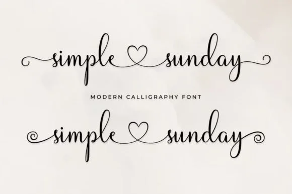
Simple Sunday is a sweet monoline calligraphy script featuring built-in center heart connectors ('simple ♡ sunday') plus straight and spiral end tails!
Simple Sunday is a fine monoline calligraphy script in lowercase that links words through an inline heart loop and finishes with straight or spiral end tails. The stroke is a single even line, so the face plots and foils predictably, and the inline heart sits inside the connection rather than floating between words, which keeps the phrase a single piece of lettering. It needs roughly 14 mm for the heart to read as a heart, and it belongs on keepsakes — tumblers, cards, tags — set in one colour against a soft ground.
Couple-name tumbler ('sarah ♡ james'), mug & sweatshirt sleeve — Type 'name1 + heart-connector + name2' horizontally across mugs, ornaments, or embroidered sweatshirt chests.
Weld overlapping cursive joins in Design Space; size above 1.2 in for vinyl weeding—or draw smoothly with Cricut Pens & Foil Quill!
 #11
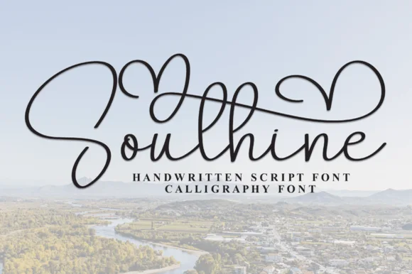
Southine (Soulshine) is a slender handwritten calligraphy script crowned with tall overarching heart-looped ascender swashes.
Southine is a slender handwritten calligraphy script crowned by tall heart-shaped canopy swashes that arch over the word, so a name reads as a written declaration with a valentine built into its ascenders. The canopy rises well above the cap line, which means the layout must reserve headroom, and the fine stroke needs size on a card. It needs roughly 26 mm for the canopy to read, and it is best in charcoal on a soft ground or as a fine foil on ivory.
Wedding welcome sign, vow-book cover & anniversary print — Center 1 title-case word at 56–96 pt, activating 1 or 2 overhead heart-swash alternates above the wordline.
Slender hairline ribbons are best for print, foil, laser engraving, or large 2.5 in+ acrylic signs (weld overlaps).
 #12
Hailey is a beauty script in which the strokes stay medium in weight, the ascenders loop high and long swashes enter and leave the word, so a single name reads as a written logo on a soft ground.
The h climbs a tall loop, the a closes a round bowl, the i carries a light dot, the l rises into a second loop, the e turns a light eye and the y drops a wide tail, all at a medium brush weight with generous entry and exit swashes and a gentle slope. The swashes are the character: they sit outside the word and take as much width as the letters, which is why the sample sets one name across a circular panel. Because the downstrokes are medium, the face holds from 26 pt and prints on smooth stock. The blush circle, the botanical sprig, the arched lettering above and the small caps beneath are presentation; the dark script name is the face.
A floral guest-book name cover — Keep the name alone in the centre, with a small plain date well below its lowest loop; put floral art in one distant corner.
Confirm the exact swash variants and leave ample vertical space.
 #13
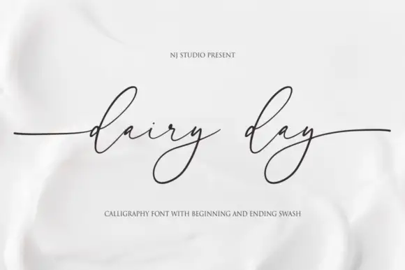
Dairy Day shows a tiny connected lowercase body with long narrow d ascender loops, where each y falls into a large angled lower loop and long horizontal side strokes extend well beyond the phrase.
The x-height stays low, the ascenders run tall and narrow, the y loops angle down and the entry and exit strokes stretch sideways past the last letter. That contrast between a tiny body and huge loops is the character: the line reads as a fine inscription rather than everyday handwriting, which is why the sample keeps the phrase short. Because the side strokes travel, keep 22 mm at each end from 28 pt, and check the fine joins on the actual stock rather than trusting a screen preview.
A small dairy-range heading — Use a large clean front-panel title with weight/ingredients below the deep y loops in plain type.
Proof hairlines on the actual label stock.
 #14
William Jameson is a lively monoline signature script with broad looping capitals and a bold underline swash tail.
William Jameson is a slanted signature cursive with a sweeping underline swash: a fast forward-leaning stroke, letters joined at the baseline, and a long flat swash that draws under the whole name and lifts at the end. The swash is the design, so the face needs a wide measure rather than a square panel. The swash thins are the finest element and they break first in print and in foil. It needs roughly 30 mm for the swash and the slant to read, and it is best one dark ink on a smooth stock.
Apparel neck label, hangtag & founder sign-off — Stack the first name slightly left of the surname so the descending 'J' or capital loop balances the underline swash across a 3-inch width.
For HTV hoodies or t-shirts, size the lockup at least 3.5 inches wide so compact 'e' and 's' loops weed without lifting.
 #15
Autography sets a narrow handwritten word framed by a large heart at the right and a smaller heart above the opening letters, where the capital A carries a long thin diagonal and a looping lower stroke, a broad cross stroke runs across the upper middle and the final y descends deeply beside the large heart.
The strokes stay hairline and monoline, the letters stay narrow, the crossbar stretches wide and the y drops deep. That framing is the character: the two hearts bracket the word rather than sit around it, which is why the composition runs much taller than a signature line. The hearts may be drawn graphics rather than glyphs. Keep 30 pt for the hairlines, plan 25 mm to the right for the large heart and check the file before promising the hearts inside a name.
A guest-book cover with a name pair — Centre the names with generous space above for a single heart. Place “Our guest book” in plain type beneath the lowest descending stroke.
Verify the heart alternates and actual name arrangement; this single-word preview does not show an automatic name-pair feature.
 #16
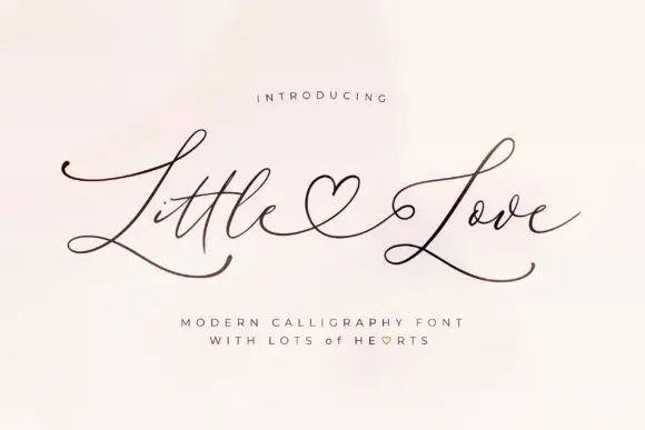
Little Love uses very fine strokes, broad L capitals and long lower sweeps across both words, where a heart-shaped connecting flourish sits between the two words and the exits travel well past the letters on either side.
The strokes stay hairline-fine, the capitals broaden, the sweeps run low and the heart joins the words. That connecting heart is the character: two short words read as one drawn phrase, which is why the sample sets them on a plain field. The flourish is part of the pairing, so check how your own words join, keep 28 pt for the hairlines, print on smooth stock and allow 26 mm at each end. The connecting heart is the join that fails first: it is drawn on a hairline, so it snaps in foil and closes into a comma below about 28 pt, which is why the phrase belongs on a card rather than a tag.
A heart-linked two-word greeting — Keep both words on one wide line with no extra border; put the sender below the lowest L sweep in plain type.
Verify the specific heart connection for the chosen words.
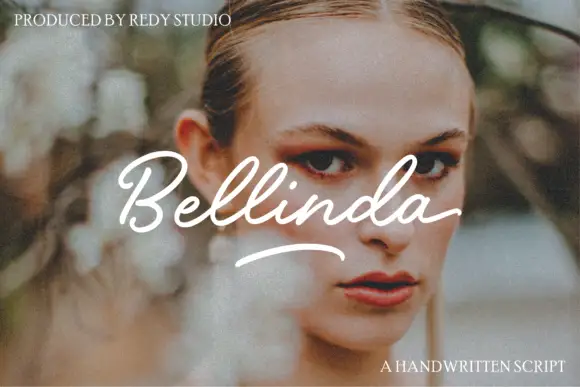 #17
Bellinda flows from an open capital B through paired tall l loops, and a separate curved underline sits beneath the word so the sample reads as a signed line over a portrait.
The capital opens wide, the loops rise in pairs above the body, the joins stay light and the underline is drawn as its own stroke rather than attached to a letter. The paired loops are the character: two matching ascenders give the word a rhythm, which is why the sample sets one name. Because the loops and the underline both travel, keep 20 mm above and 18 mm beneath from 26 pt, and treat the underline as a drawn element.
A portrait-session enclosure — Use a quiet heading band above a plain session summary, not across a face.
Confirm whether the underline is an available glyph.
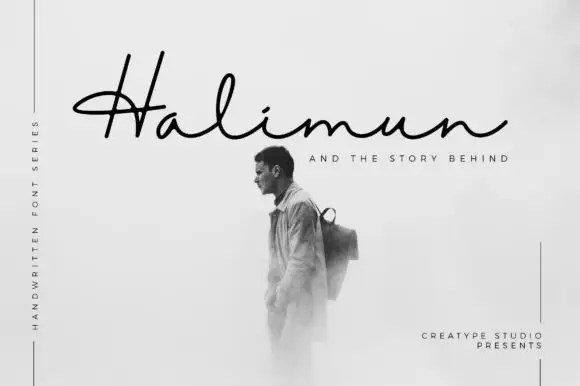 #18
Halimun is a fine signature script in which the capital crosses its own stem, the body stays low and the joins stay thin, so a name reads as something written on a photograph with a fine pen.
The capital H draws as a long diagonal that crosses back through its own stroke before the body begins, the a closes a small bowl, the l rises into a narrow loop, the i carries a light dot and the n keeps a low shoulder, all at one even light weight with a flat baseline. The crossing stem is the character: it makes the first letter taller and wider than the rest, which is what gives the word its signed quality on a wide plate. Because the body is low, the face leaves room above and below for a caption, as the sample does. The fine stroke wants a smooth stock at 18 pt. The monochrome photograph, the black ink, the rules and the small credits are presentation; the script is the word shown.
A photographer correspondence heading — Keep it above a separate image panel with plain contact text below.
Proof at card size rather than relying on the source readability claim.
Practical buyer checklist
Key cutting, printing and pairing answers before choosing a fine-line & minimalist tattoo script typeface.
Around 2.5 to 3 inches wide for a two-word phrase with loops. Smaller than that and the thinnest strokes merge or fade during healing, which is why artists often redraw with slightly thicker connectors.
Yes, and engraving holds the detail better than skin because there is no ink spread. Confirm the engraver's minimum stroke width first, since some laser systems cannot reproduce a hairline thinner than 0.2 mm.
They are excellent for minimal stationery, provided the print stock is smooth. On textured paper the hairlines break up, so choose a smooth or coated stock, or scale the lettering up.
Ink spread closes parts of a 0.1 mm stroke and leaves the rest open, so the line appears to vary in weight. Increase the size, choose a smoother stock, or use a slightly heavier weight of the same family.
Keep exploring
Explore adjacent maker roundups or check our practical pre-production checklists.
11 curated fonts · Previews & pairings
26 curated fonts · Previews & pairings
28 curated fonts · Previews & pairings
15 curated fonts · Previews & pairings
Guides: Invitation font checklist · Vinyl & cutting checklist · How to pair script & sans fonts
Allow optional Google Analytics to measure visits and catalogue actions. Your search words and notes are not included. Privacy & storage