High-Contrast Display Serif

Florida Palms + Amor Hadena
Pairs sculptural editorial warmth with Florida Palms's clean modern geometry.
Inspect Amor Hadena specimenDisclosure: MakerFileHub may earn a commission from qualifying purchases via paid links on this page. How our links work.
Hand-painted script paired with a sturdy all-caps sans
Florida Palms matches a relaxed hand-painted script with a sturdy all-caps sans, and ships textured versions of both so the pair can look screen-printed rather than digitally clean.
Paid link
Get this fontProject & layout blueprintsAt-a-glance maker compatibility
Weld or Unite overlapping script joins into one continuous vector path before sending to the blade.
Visual anatomy & craft review
The specimen is a tilted card photographed on a tiled wall: Florida runs in an orange script with a broad brush entry on the F and swelling strokes at every turn, Palms follows in red and drops lower and further right, and a green palm illustration fills the gap between the two lines. A rotated SANS & SCRIPT note sits at the left and a tracked HANDMADE FONT line at the foot, so the card itself demonstrates the pairing rule the family is built on: the script carries the name, the caps carry the details. Strokes in the script widen where the brush turns and thin at the exits, and the caps are even and heavy with flat terminals and a slightly squared curve, which is what makes them read as painted signage rather than as a text face.
Resort · Painted · Paired
Two-font hierarchy recipes
Tested contrast partners — pairing Florida Palms with grounded secondary typography.
Florida Palms + Amor Hadena
Pairs sculptural editorial warmth with Florida Palms's clean modern geometry.
Inspect Amor Hadena specimen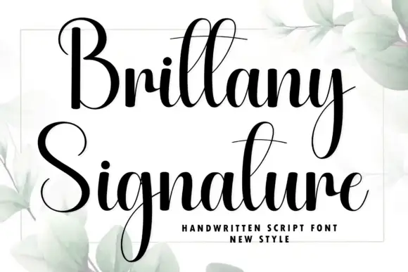
Florida Palms + Brittany Signature
Introduces organic movement on pull-quotes, signatures and gift tags.
Inspect Brittany Signature specimenPractical applications
Concrete hierarchy, scale and production guidance tailored to Florida Palms’s stroke geometry.
The pairing covers both jobs a motel sign has to do: the script gives the property a hand-painted character and the caps carry the number that a guest has to find at night from a car park.
Hierarchy & layout recipe
Set the property name in the script at 40 mm on the door plaque, put the room number in the caps at 55 mm beside it, and keep the textured cut for outdoor use where a worn edge reads as age rather than as damage.
Pre-production check
Reflective vinyl and a textured edge do not mix; use the clean cut for numbers that must be legible from a distance in the dark.
Two faces from one family give a café a menu board, a window decal and a cup stamp that all look painted by the same hand, which is what small hospitality brands struggle to achieve with found fonts.
Hierarchy & layout recipe
Set the café name in the script at 28 pt on the menu header, keep the prices in the caps at 10 pt, and reserve the textured cut for the window and the cup stamp so the interior print stays crisp.
Pre-production check
The caps are heavy enough to fill in at 8 pt; proof the price column before it goes on a laminated board viewed from a metre away.
A script and a caps face in the same painted idiom let a poster page work at two distances, with the name readable across a room and the detail legible in the hand.
Hierarchy & layout recipe
Run the destination in the script at 90 pt, set the dates and the strapline in the caps at 16 pt and 12 pt, and keep a 20 mm margin at the foot for the caption in a plain face.
Pre-production check
Posters are printed large from small proofs; check the brush swells at 90 pt on the proof, because a turn that looks smooth at 20 pt can show a kink at full size.
Technical & licence verification
Confirm included OTF/TTF/WOFF formats, full glyph tables and licence coverage on the live store page before batch production.
Closest visual alternatives
Matched across letterform anatomy, stroke behaviour and craft applications.
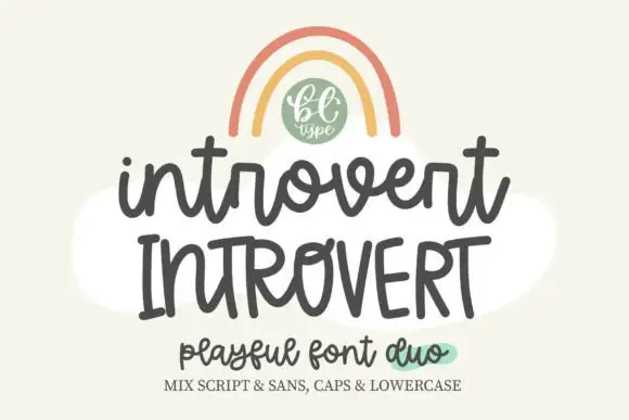
Bouncy rounded script with a separate tall print companion
Introvert is a duo: a bouncy rounded script and a separate print file drawn to the same height, so capitals and lowercase can be swapped across the two without a change of tone.
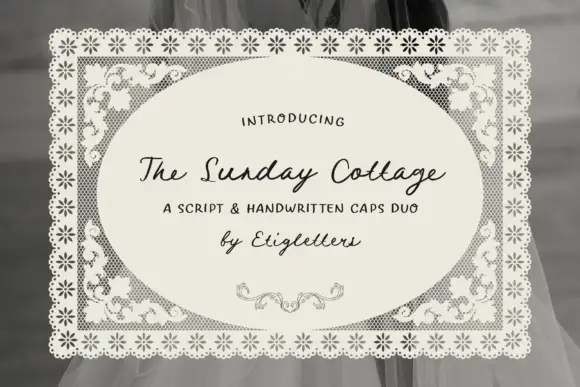
Script with handwritten caps
The Sunday Cottage is a duo on a lace-bordered label: a slanted connected script for the name and a loose handwritten capital set for the supporting line, with a small drawn flourish beneath.
Ideas for this font
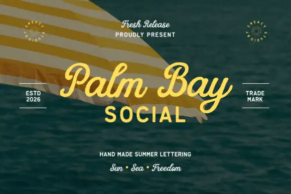
Summer script with an upright block companion
Palm Bay Social is a duo on a sunlit water photograph: a casual looped script in golden yellow for the place name and a plain uppercase block line beneath it, with small tracked proofs and stamps around the edges.
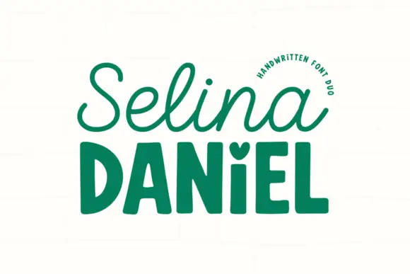
Handwritten script paired with a chunky sans
Selina Daniel is a handwritten duo in green on off-white: a monoline script with open loops on the first word, and a chunky rounded sans in caps for the second, with a small heart set into the counter of one letter, so the pair covers a name and a label in one voice.
Ideas for this font
Same independent foundry
Allow optional Google Analytics to measure visits and catalogue actions. Your search words and notes are not included. Privacy & storage