 #1 · Best Overall
Disclosure: MakerFileHub may earn a commission from qualifying purchases via paid links on this page. How our links work.
Family names, gift mugs & personalised apparel
20 Best Fonts for Mama Shirts, Dad Gifts & Family
Family gift typography is a personalisation business, which means the same layout has to work for four different names without breaking. Mama and Mama Beautiful carry the heavy brush script, Whiskey and Vintage Story keep a sign-painter and archival feel for dad gifts, and Family and Welcome supply the wide-tailed scripts that suit a surname across a shirt back. Sailors and Jaglend Font Duo add the heritage sans and brush pairings.
Quick verdict
Mama is the strongest script for a family shirt, Whiskey suits dad gifts and barware, and Family handles a surname across a back panel. Sailors covers the heritage sans role in a matching set.
Quick answer
Top 3 Mama shirts, Dad gifts & family picks right now.
Short on time? Start with our three highest-rated Mama shirts, Dad gifts & family standouts before scrolling the full breakdown.
#1 · Best Overall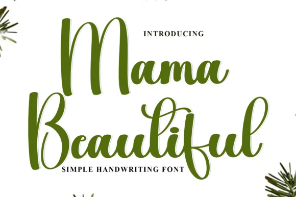 #2 · Runner-Up Pick
Mama Beautiful
Tall looping brush script with expressive vertical ascenders
Get fontPaid link
Read review ↓ #3 · Editor's Choice
How we tested & selected these 20 fonts
We kept 20 of 342 candidates after checking that each face holds up with names of different lengths. Weighted letter-join strength on HTV, how the script behaves in a short three-letter name and a long surname, and whether the design still centres optically.
Side-by-side summary
Top 5 Mama shirts, Dad gifts & family picks at a glance.
Compare specimens, OpenType/PUA traits and primary project roles side by side.
| Rank & Font | Style & File Specs | Best Project Fit | Store Listing |
|---|---|---|---|
| ScriptChunky | Mother's Day crewneck sweatshirt, tote bag or tumbler | Get fontPaid link | |
| ScriptLigatures | Mother's Day card front, flower-bouquet tag or framed print | Get fontPaid link | |
| ScriptBold | Etched whiskey glass stencil, BBQ rub label or leather patch | Get fontPaid link | |
| ScriptLigatures · Alternates & swashes | Historical romance cover, travel journal & museum postcard | Get fontPaid link | |
| ScriptPUA encoded · Ligatures · Alternates & swashes | A family celebration heading | Get fontPaid link |
Scripts & Calligraphy
9 fonts#1 · Best OverallMama
Mama is a heavy smooth brush-calligraphy script drawn for bold single-word apparel transfers, where broad cushioned downstrokes and smooth rounded joins give chest graphics rich coverage on sweatshirts and totes.
The downstrokes carry the weight, the joins stay round and smooth, the counters close tight and the word holds its shape at just one or two terms. That cushion is the character: the lettering reads warm and hand-brushed while staying solid enough to weed cleanly from a vinyl sheet, which is why the sample keeps a single short word. The 'vinyl-ready' claim comes from the source rather than a test here, so proof your own word, keep 30 pt for print and check the weeding on a scrap before the run.
Recommended project & layout
Mother's Day crewneck sweatshirt, tote bag or tumbler — Centre lowercase across the chest at 8–10 inches wide and Weld before cutting.
Before you cut or print
Top choice for puff HTV, flock HTV and permanent mug vinyl.
Best paired with
Get fontPaid link
#2 · Runner-Up PickMama Beautiful
Mama Beautiful is a tall looping brush script in which the ascenders stretch far above the x-height, the downstrokes carry ink weight and the entries curl wide, so a two-word greeting reads as written with a brush pen.
The M lifts a tall first loop, the b and l rise high above a compact body, the e turns a small eye and the exit strokes thin before they lift into the next loop, all at a brush weight with visible thick-to-thin movement. The vertical stretch is the character: the loops take height rather than width, which is why the sample sets a greeting in two stacked rows. Because the loops are long, the face needs 20 mm between baselines from 30 pt and the joins must be welded before cutting from 1.1 inches of x-height. The pale ground, the faint botanical sprigs and the small caption are presentation; the dark brush greeting is the face.
Recommended project & layout
Mother's Day card front, flower-bouquet tag or framed print — Give generous line spacing if stacking two lines so tall loops stay clear.
Before you cut or print
Weld connected strokes before vinyl cutting.
Best paired with
Get fontPaid link
#3 · Editor's ChoiceWhiskey
Whiskey delivers heavy mid-century sign-painter brush script, where thick retro strokes and compact loops carry a bold sweeping underline tail built for barware, sauce labels, hats and gifts rather than a formal invitation.
The strokes stay heavy and brushy, the loops close compact, the connectors thicken and the final tail sweeps under the whole word. That underline tail is the character: the word arrives already signed off, which is why the sample sets one short spirit name on a dark ground. Because the tail travels below and beyond the letters, keep 22 mm of clearance at the outer end from 28 pt and confirm whether the swash is a separate character before promising it on a curved surface.
Recommended project & layout
Etched whiskey glass stencil, BBQ rub label or leather patch — Use sandblast resist stencil vinyl on rocks glasses or laser-engrave on leather coasters.
Before you cut or print
Weld cursive joins; thick strokes cut cleanly for glass-etching stencils and HTV.
Best paired with
Get fontPaid link
 #4 · Top Maker Utility
Vintage Story
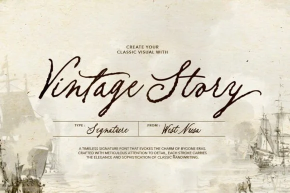
Vintage Story is an expressive, slanted dip-pen signature script evoking 19th-century ship logs, heirloom postcards, and handwritten letters.
Vintage Story is a slanted archival dip-pen signature script: a steep slant, a high-contrast stroke with a swollen downstroke and a hairline exit, and capitals that loop back over the word. The dip pen leaves occasional thick entries, and the hairline exits are the weakest part in print. It needs roughly 24 mm for the entry swell and the hairline to read, and it is best in one brown-black on buff stock, or a single faded blue on cream to mimic an old letter.
Recommended project & layout
Historical romance cover, travel journal & museum postcard — Set 2-word titles at 48–72 pt over aged parchment, paired with a neat boxed spec grid underneath.
Before you cut or print
Fine tapered pen strokes are built for print, book jackets, and Foil Quill—keep vinyl decals above 2 inches if cutting.
Best paired with
Get fontPaid link
 #5 · Standout Silhouette
Family
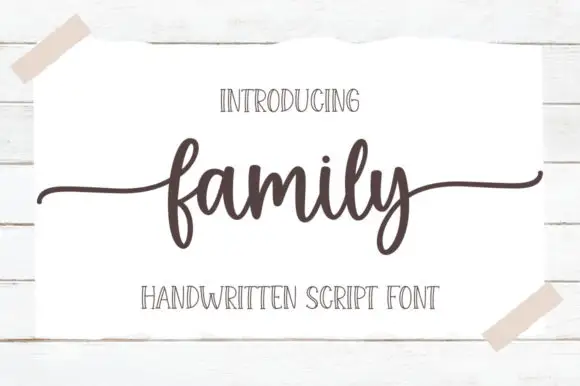
Family is a low connected script in which the body sits close to the baseline, the stroke stays even and both ends run out as wide flat tails, so a short word reads as a caption signed across a card.
The f rises into a narrow loop before the body, the a holds a small bowl, the m keeps three even arches, the i carries a light dot and the l rises into a plain stem, all at an even medium weight with short joins. The low body and the long tails are the character: the word occupies little height but plenty of width, which is what makes the face useful where a photo or a fold needs space above and below. Because the stroke is even, it holds at 18 pt on a printed card, and the tails can be trimmed without breaking the word. The white card taped to a wall, the dark ink, the two caps lines are presentation; the script is the word shown.
Recommended project & layout
A family celebration heading — Set one line above plain recipient and date details with clear space below y.
Before you cut or print
Preview exact wording and side-tail bounds.
Best paired with
Get fontPaid link
 #6
Welcome
Welcome features relaxed lowercase cursive with long level beginning and ending swash tails, tailored for round wood signs and entryways, where the smooth monoline-leaning strokes and open letter spacing keep words calm while the extended w and e tails span a circular blank.
The stroke stays one width, the spacing opens, the tails run level and the word sits calm. That level tail is the character: the greeting stretches to the width of a round board without a bigger point size, which is why the sample targets door signs. Plan the tails against the blank's curve, keep the stroke at 3 mm for cutting, and check the exits in your own word before committing the sign. The wide tail is also the weak point on a shaped blank: it has to end inside the panel, so a 12 mm tail on a 300 mm round board is safe and anything longer gets trimmed at the edge.
Recommended project & layout
Round wood welcome sign or nursery plaque — Centre the tailed lowercase word across the middle third and tuck family names below in small caps.
Before you cut or print
PUA-encoded tails weld cleanly in Cricut/Silhouette; verify thin tail tips before weeding small decals.
Best paired with
Get fontPaid link
 #7
Amatic
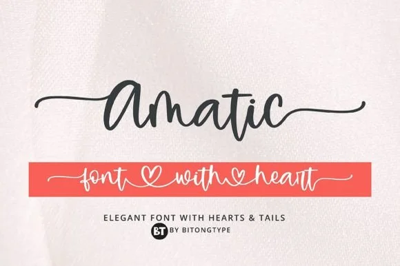
Amatic is a lively handwritten monoline script equipped with sweeping horizontal side tails and playful open-heart word connectors.
Amatic is a bouncy monoline cursive with long tails and connecting hearts: an even light stroke, joined letters, a soft bounce and tails that run under the word and link to the next with a small heart at the join. The hearts and the tails are the design and both close first at small sizes, and the long tails fix a block's width. It needs roughly 26 mm for the heart and the tail to read, and it is best in one warm ink on smooth card, or a pastel plus paper where the hearts print as knockouts.
Recommended project & layout
Personalized tumbler name decal & bridesmaid tote — Run a single first name with left and right tails at 4.5 inches long, or link two names through the heart swash.
Before you cut or print
Weld all cursive connectors in Design Space before cutting permanent vinyl, and keep x-height at 0.55 in or taller.
Best paired with
Get fontPaid link
 #8
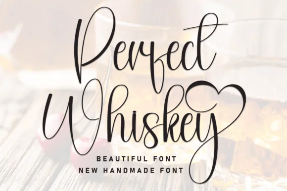
Perfect Whiskey
Perfect Whiskey is a tall, narrow modern calligraphy script with towering upper loops, deep descenders, and a heart-swashed ending.
Perfect Whiskey is a tall slender calligraphy script with a heart-looped terminal: a narrow high-contrast stroke with long ascenders, joins that pull the word into a vertical column, and a finishing loop that closes into a small heart. It is a bottle-label face, so it wants height and a single ink rather than a busy ground. The heart loop is the finest element and it closes into a dot as soon as the face is reduced. It needs roughly 34 mm for the loop and the hairline to read, and it is best one dark ink on cream or kraft.
Recommended project & layout
Anniversary whiskey glass etching or gift box lid — Keep wording to two capitalized words stacked tightly so the tall 'P/W' ascenders interlock cleanly without wide horizontal sprawl.
Before you cut or print
Upstrokes are quite thin; scale glass etching stencils above 1.75 in tall or print directly onto gift boxes and cards.
Best paired with
Get fontPaid link
 #9
Lovely
Lovely sets a fine signature script in a single dark weight over a pale city photograph, where a wide entry curve opens low at the left, the letters rise into tall slender loops through the middle and a large descending y plus an extended closing sweep make the lower right part of the footprint.
The stroke stays thin and even, the loops stay tall, the entry runs wide and the exit sweeps out. That asymmetry is the character: the word is wider at the right than the left, which is why the sample sits on a generous square field rather than a strip. The building behind it is scenery, not part of the type. Keep 26 pt as the floor, allow 25 mm of clear space at the right for the exit sweep and check the y loop against any line placed beneath.
Recommended project & layout
A quiet wedding invitation heading — Use a single script heading above the names. Keep a clear band beneath its lowest strokes, then set the venue and time in plain text.
Before you cut or print
Print at invitation size and check contrast on the chosen paper. Do not use the fine script for the address or RSVP instructions.
Best paired with
Get fontPaid link
Matched Font Duos & Packs
11 fonts #10
Sailors
Sailors is a proven 5-style vintage sans family ('Regular, Rough, Condensed, Slant & Condensed Slant') built for maritime badges, breweries, and rugged merch!
Sailors is a five-style heritage grotesk family drawn from nautical signage: a regular with flat terminals and a tall x-height, a rough version with a chipped contour, a condensed cut, and two slanted styles. The rough and condensed cuts share the skeleton, so a word can combine a rough headline with a clean condensed caption on the same sign. It needs roughly 20 mm for the flat terminal and the chip to read, and it is best in one dense navy on white and cream, or white on a dark hull colour.
Recommended project & layout
Craft-brewery badge, boat-transom name, Marina tee & mug — Build a multi-ring emblem mixing Regular hero caps (72 pt), Condensed arched eyebrows, and Slant banner ribbons.
Before you cut or print
Use Regular, Condensed, or Slant for super-clean Cricut Oracal 651 & HTV cuts; save the Rough style for DTF, sublimation & print!
Best paired with
Get fontPaid link
 #11
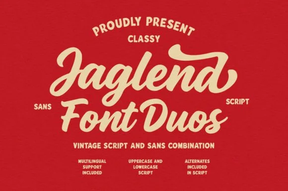
Jaglend Font Duo
Jaglend Font Duo pairs a thick, creamy vintage sign-painter brush script with a sturdy, hand-drawn condensed uppercase sans companion.
Jaglend Font Duo pairs a retro sign-painter brush script with a rugged condensed sans: the script carries a loaded stroke with small flicks and connected letters on a firm slant and a shallow bounce, while the sans is narrow with uneven edges that read as a sanded board for lists and prices. The two voices share one palette, so a window, a price list and a card can be built from one family without a third face. The script's flicks are the finest element and they close first at small sizes, while the condensed sans stacks a long service list in a narrow panel without wrapping. The script needs roughly 24 mm and the condensed sans 18 mm for their detail to read.
Recommended project & layout
BBQ rub tin, craft soda label & barbershop window sign — Arch the sans uppercase header over a large slanted Jaglend Script centerpiece and anchor with tracked sans footers.
Before you cut or print
Broad solid brush strokes cut cleanly on HTV, sticker vinyl, and wood-sign stencils—weld script connections before cutting.
Best paired with
Get fontPaid link
 #12
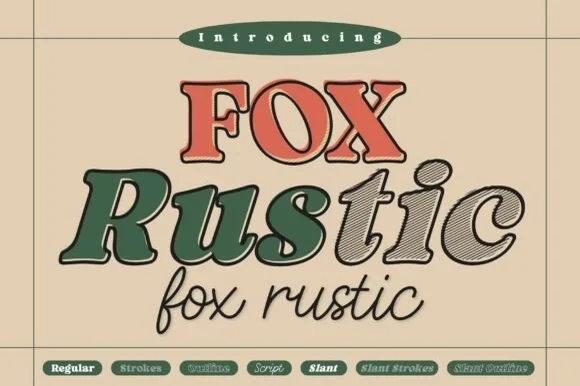
Fox Rustic
Fox Rustic is a powerhouse 7-style vintage sign-painter superfamily ('Regular | Strokes | Outline | Script | Slant | Slant Strokes | Slant Outline')!
Fox Rustic is a seven-style vintage sign-painter superfamily with a regular, a strokes version, an outline, a script and slanted cuts: all seven share one skeleton, so a fascia, a card and a bag can be built with different layers of the same voice. The size of the family means the layers must be chosen deliberately or a panel turns into a stack of outlines. The script needs roughly 24 mm and the regular 20 mm for their detail to read, and two inks cover most of the family.
Recommended project & layout
Complete vintage coffee/brewery badge, merch line & window — Stack Solid Regular caps on row 1 (68 pt), Slant Strokes mixed-case on row 2 (88 pt), and monoline Script on row 3 (48 pt)!
Before you cut or print
Use Regular, Slant, and Script (Weld!) for clean Cricut vinyl & HTV cuts; save the fine diagonal-hatched 'Strokes' styles for print, DTF & sublimation!
Best paired with
Get fontPaid link
 #13
Country Kitchen
Country Kitchen is a two-cut duo in which narrow upright capitals set the plain line and a darker connected script carries the warm one, so a kitchen sign can separate a heading from a phrase without a third family.
The capital cut stands narrow and unjoined with even strokes and tight counters, while the script cut connects through tall k and h loops and long low entry and exit strokes at a heavier weight. The contrast in join is the character: one member is printed, one is written, which is why the sample pairs a thin cap line with a dark script beneath it. Set the caps at 16 pt and the script at 22 pt for a balanced pair, and weld the script before cutting from 1.1 inches of x-height. The photographed interior, the boards and the props are presentation; the lettered sign is the duo.
Recommended project & layout
A farm-kitchen menu header — Place the capitals above the script with a clear gap, then start dishes and prices in plain type below both tails.
Before you cut or print
Check the actual pair and leave menu details undecorated.
Best paired with
Get fontPaid link
 #14
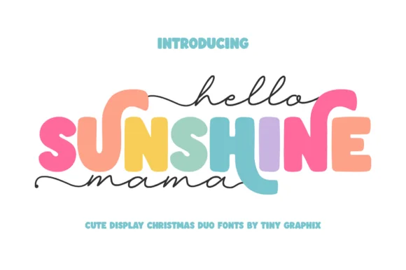
Hello Sunshine Mama
Hello Sunshine Mama pairs chunky rounded caps that can each take a different colour with a fine monoline script that runs above and below the caps in long flat strokes.
The cap half is heavy and soft: the S swells through two fat curves, the U holds a deep bowl, the N keeps one thick diagonal and the E carries three even arms, all rounded and even in weight. Because each letter is a separate shape of equal weight, the sample fills them in different colours, which is how the pair is meant to be used on children's pieces. The script half is a light monoline with flat entry and exit strokes that extend well past the caps on both sides, and that sweep is what holds the composition together. Contrast comes from weight, not from style, so the two layers never fight. The white ground, the pink script, the pastel fills and the two caption lines are presentation; the duo is the lettering.
Recommended project & layout
Mother's Day sweatshirt, tote or tumbler — Set the middle keyword in rainbow/earth-tone caps and sandwich with lowercase tailed script.
Before you cut or print
Thicken the thin monoline script slightly (0.02" offset) if cutting small adhesive vinyl decals.
Best paired with
Get fontPaid link
 #15
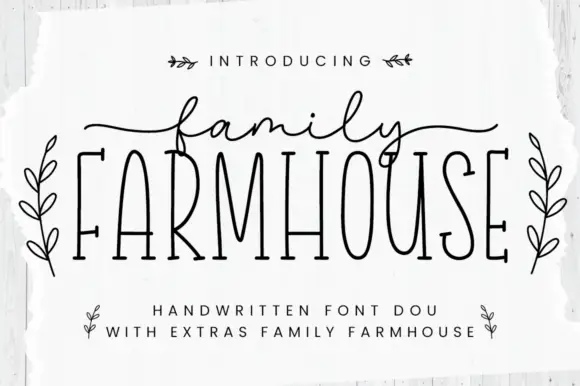
Family Farmhouse
Family Farmhouse pairs very tall condensed serif capitals with a fine connected script, long side tails and a set of leaf-sprig ornaments sold as extras.
The capital line is drawn thin and extremely narrow, with flat unbracketed serifs and even stem weight, so it reads as a farmhouse stencil rather than a classical roman. Above it the script is fine and fully connected, with long tails leaving both sides of the word, which is why the specimen stacks the two members instead of setting them on one line. The sprigs and small leaves are extras rather than glyphs, and they sit in the gaps without changing letter spacing. Height is doing most of the work here: the capitals reach unusually high for their width, which is what makes the pair feel hand-painted rather than typed, and it also means the face needs vertical room rather than horizontal.
Recommended project & layout
A farm-shop collection sign — Stack the members without overlap and place opening hours in plain type below.
Before you cut or print
Check thin serifs at sign distance.
Best paired with
Get fontPaid link
 #16
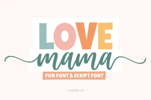
Love Mama
Love Mama pairs a bold, slightly tapered block sans with a smooth horizontal-tailed script, presented for custom mom shirts, mugs and baby gifts where the block line sits above a tailed lowercase script line.
The block letters stay bold and tapered, the script stays smooth, the join runs continuous and the tail sweeps horizontally under the word. That role split is the character: a statement line and a soft signature share one layout, which is why the sample keeps the block above and the script below. Confirm both files and their metrics, check how the tail interacts with the line above, and keep the script at 20 pt or more so the joins do not collapse.
Recommended project & layout
Custom Mama & Mini shirt set, mug wrap or tote bag — Colour each uppercase letter in muted earth/pastel tones above a solid script line.
Before you cut or print
Both members have sturdy stroke widths that cut and weed cleanly on HTV.
Best paired with
Get fontPaid link
 #17
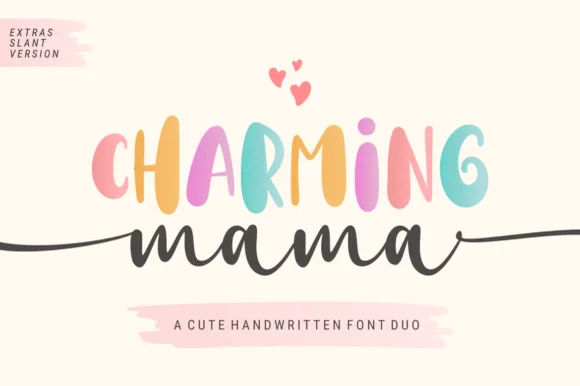
Charming Mama
Charming Mama combines a bouncy tall handwritten sans, supplied with a slant version, and a long-tailed cursive script for mugs, shirts and nursery signs, where the PUA-encoded beginning and ending horizontal tails stretch across wide sweatshirt chests and round signs.
The sans stays tall and bouncy, the script stays cursive, the tails run horizontally out of the first and last letter and the two voices sit in clear roles. That side tail is the character: the script can claim a whole chest width without a bigger point size, which is why the sample targets wide garments. Confirm both files and the PUA access for the tails, plan 20 mm at each end of the script line and keep the sans for the words that must be read at a glance.
Recommended project & layout
Personalized mom mug, baby shower sign or gift box — Keep side tails clear of mug handles and Weld cursive joins before cutting.
Before you cut or print
Includes slant version and PUA ligatures.
Best paired with
Get fontPaid link
 #18
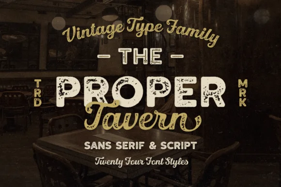
Proper Tavern
Proper Tavern is a massive 24-style vintage signboard collection pairing ornate inline/textured slabs & sans cuts with a classic brush script.
Proper Tavern is a vintage pub signboard family with twenty-four styles built from a sans, a slab and a script: each style shares one skeleton, so a fascia, a chalkboard and a card can be set from one voice with different weights, inlines and shadow layers. The size of the family means the layers must be chosen deliberately or a panel turns into a stack of outlines. The script needs roughly 24 mm and the slab 20 mm for their detail to read, and two inks cover most of the family.
Recommended project & layout
Craft-brewery tap list, gastropub sign & whiskey box — Arch the vintage script at top, set the hero pub name in wide Proper Tavern inline caps flanked by vertical 'TRD/MRK', and tuck script below.
Before you cut or print
Pick the clean solid styles from the 24-pack for Cricut vinyl/HTV, and use the inline/textured cuts for printed bottles and laser wood plaques!
Best paired with
Get fontPaid link
 #19
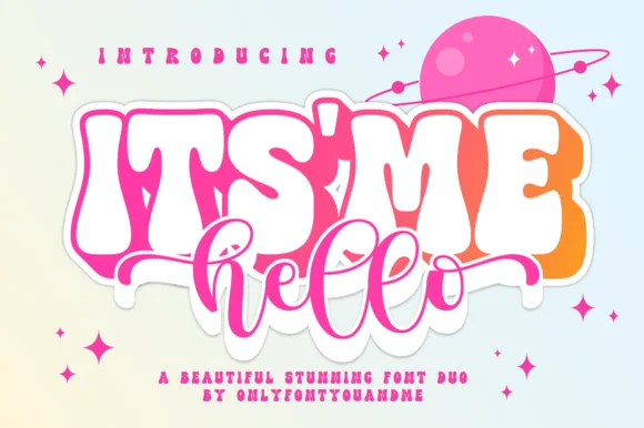
Itsmehello Regular
Itsmehello Regular pairs a fat rounded seventies display face with a smooth monoline script, where the wide white caps sit as a background block with a soft outline and the connected cursive threads across their lower half in a flat pink.
The display row stays wide and inflated, the script stays one thin weight, the script crosses the caps rather than sitting below them, and the outline lifts the block off the pale ground. That crossing is the character, because the two voices occupy the same space and the eye reads one shape rather than two rows. The pink planet and the sparkles are cover artwork. Keep 46 pt for the caps, keep 22 pt for the script, and check that the script colour holds enough contrast over the pale caps.
Recommended project & layout
Small-shop thank-you card or sticker duo — Set the main punchword in chunky caps and overlap a short lowercase script accent below.
Before you cut or print
If layering HTV, slice/knockout the script shadow from the base bubble layer.
Best paired with
Get fontPaid link
 #20
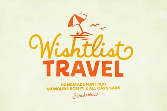
Wishlist Travel
Wishlist Travel pairs a lively, curl-tipped monoline cursive script with a sturdy, slightly bouncy uppercase rounded sans.
Wishlist Travel is a duo of a swashed retro monoline script and a bold rounded sans: the script runs an even stroke with joined letters and long swashes that curl off the first and last characters, while the sans is a heavy rounded block for badges and prices. The swashes need side clearance and are the first thing to be trimmed, and the monoline is the weaker element in print. The script needs roughly 24 mm and the bold sans 26 mm for their detail to read.
Recommended project & layout
Family vacation tee, beach-bag HTV & luggage tag — Top with a simple line-art palm or umbrella icon, set row one in curled script, and anchor row two in bold sans.
Before you cut or print
Medium-thick strokes on both fonts weed cleanly on HTV and tumbler vinyl down to 0.8 in—weld script joins first.
Best paired with
Get fontPaid link
Practical buyer checklist
Frequently asked questions.
Key cutting, printing and pairing answers before choosing a Mama shirts, Dad gifts & family typeface.
What size should a mama shirt design be?
Between 9 and 11 inches wide on adult shirts, with the word at 2 to 3 inches tall. On kids' sizes, scale the whole design down by roughly 30 percent so the letters stay in proportion to the garment.
Why does personalised lettering crack after washing?
Thin connector strokes on stretch fabric take the movement. Use a stretch-capable HTV, avoid placing the design across the highest stretch point, and press a second pass through a cover sheet to bond the joins fully.
Can I use the same font for a shirt and a mug in one gift set?
Yes, and consistency is part of the appeal. Change the layout rather than the typeface: shorter lines and thicker strokes for the mug, and a wider design with an arch for the shirt.
How do I centre a name that is only three letters long?
Centre it optically, not mathematically. A script with an entry stroke looks off-centre when the bounding box is centred, so nudge the design a fraction toward the heavier side until the visual weight sits in the middle.
Keep exploring
Related collections & guides.
Explore adjacent maker roundups or check our practical pre-production checklists.


01 / Cricut & Craft
T-shirts, hoodies & HTV apparel
33 curated fonts · Previews & pairings
02 / Cricut & Craft
Cricut fonts with tails
21 curated fonts · Previews & pairings
03 / Occasions & Milestones
Thank you
29 curated fonts · Previews & pairings

04 / Cricut & Craft
Coffee mugs, glass cans & barware
25 curated fonts · Previews & pairings
Guides: Invitation font checklist · Vinyl & cutting checklist · How to pair script & sans fonts