Neutral Sans Workhorse

Blood Scream + Hermano
Lets Blood Scream own the focal silhouette while handling secondary copy, sizing and subheads cleanly.
Inspect Hermano specimenDisclosure: MakerFileHub may earn a commission from qualifying purchases via paid links on this page. How our links work.
Heavy rough-edged capitals with long irregular drip shapes beneath the baseline
Blood Scream sets two uppercase rows in which the contours stay broad and rough, the counters run deep and narrow pointed drips descend unevenly from the lower edges, with small intrusions inside the O and a sharp notch inside the M.
Paid link
Get this fontProject & layout blueprintsAt-a-glance maker compatibility
Sturdy stroke walls and open counters weed cleanly on adhesive vinyl, HTV apparel film, and cut cardstock.
Visual anatomy & craft review
The O counters take small downward intrusions, the M compresses a pointed notch between wide sides, the lower edges grow narrow drips of different lengths and the whole contour stays rough rather than clean. The drip is the character: it hangs from the letterform instead of being added as artwork, which is why the sample stacks two red rows on white. Because the drips are narrow, keep 34 pt before they read as liquid, and set the phrase short so the descending shapes do not collide with the line below. The red colour suggests horror; the drip shapes are drawn into the contour and their behaviour in every glyph is untested.
Horror · Dripping · Rough
Two-font hierarchy recipes
Tested contrast partners — pairing Blood Scream with grounded secondary typography.
Blood Scream + Hermano
Lets Blood Scream own the focal silhouette while handling secondary copy, sizing and subheads cleanly.
Inspect Hermano specimen
Blood Scream + Grandeur – Elegant Classic Serif
Grounds bold display lettering with classic typographic authority on posters, badges and apparel.
Inspect Grandeur – Elegant Classic Serif specimenPractical applications
Concrete hierarchy, scale and production guidance tailored to Blood Scream’s stroke geometry.
The drips carry a horror poster, and the heavy contours hold a two-word title at 65 pt on an A3 sheet in one colour. The heavy contour also keeps the rough edge visible at poster size.
Hierarchy & layout recipe
Print an A3 poster: set the upper row at 65 pt and the lower at 52 pt, keep 30 mm between the rows so the longest drips hang free, and set the times at 12 pt in a condensed sans at the foot.
Pre-production check
A drip set closer than 8 mm to the row below looks joined; check the poster and open the row gap to 34 mm. Keep the times clear of the drips.
A single dripping word reads on a topper, and the rough contour survives a 60 mm cut without a second colour. The rough contour also survives a small round cut better than fine detail.
Hierarchy & layout recipe
Print a 60 mm round topper: set one word at 26 pt with its drips inside a 6 mm border, keep the longest drip 10 mm clear of the disc edge, and cut outside the contour so no drip is clipped.
Pre-production check
A long drip cut by the disc edge loses its point; check the layout and move the word up 6 mm rather than shortening the drip.
The heavy dripping caps give a bottle attitude, and the broad forms stay solid at 20 pt on a 55 mm label. The heavy contour keeps the label legible on a busy shelf.
Hierarchy & layout recipe
Print a 55 by 40 mm label: set the brand at 20 pt, keep 6 mm beneath for the drips, and set the heat level in a 6 pt condensed caps with 4 mm of clear ground. Keep the drips 4 mm clear of the die.
Pre-production check
Drips printed at 14 pt fill into a solid edge; check the plate proof and keep the brand at 18 pt or above. Ask for a plate proof before the run.
Technical & licence verification
Confirm included OTF/TTF/WOFF formats, full glyph tables and licence coverage on the live store page before batch production.
Closest visual alternatives
Matched across letterform anatomy, stroke behaviour and craft applications.
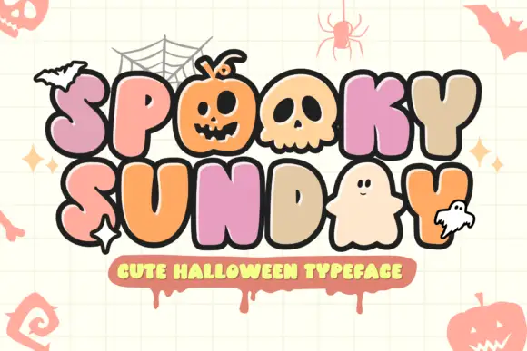
Bubble letters with pictorial counters
Spooky Sunday is a decorative bubble alphabet in pastel colours with a heavy outline: fat rounded letters whose counters are replaced by drawn pumpkins, skulls, ghosts and bats, presented on a grid ground.
Ideas for this font
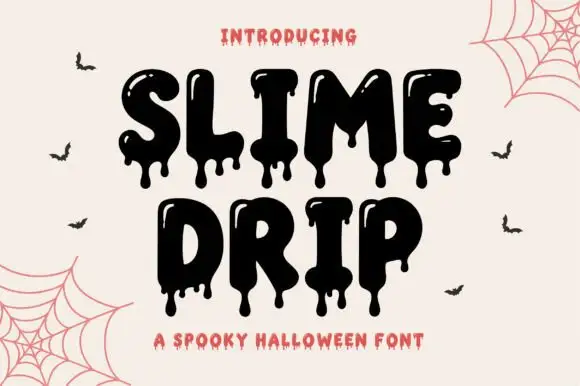
Dripping slime display
Slime Drip is a dripping display in black on a cream ground: fat rounded letters with long viscous drips running from the baseline and from inside the counters, a bouncy baseline, and a tracked caption beneath in a rough sans, with bats and cobwebs in the corners.
Ideas for this font
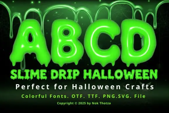
Glossy slime bubble display
Slime Drip Halloween is a colour display on a dark green ground: glossy lime bubble capitals that end in hanging drips, shown first as a short alphabet row at the top and then as a title line and a smaller line beneath, with a copyright line along the foot and drips falling from the top edge of the frame.
Ideas for this font
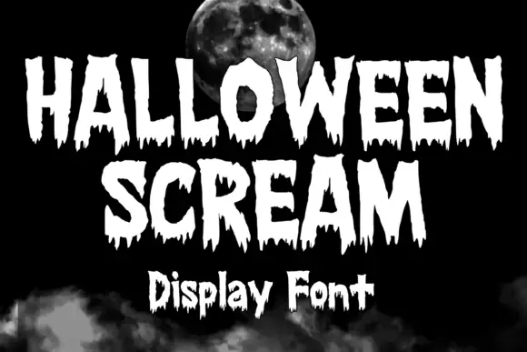
Ragged horror capitals with torn edges and long uneven drips
Halloween Scream is a heavy horror display in which the capitals carry torn edges, narrow triangular counters and long drips that hang at uneven lengths below the baseline, so a short word reads as lettering bleeding down a page.
Ideas for this font
Same independent foundry
Allow optional Google Analytics to measure visits and catalogue actions. Your search words and notes are not included. Privacy & storage