High-Contrast Display Serif

Graphite + Vanielst Elegant Serif Display Stylistic
Pairs sculptural editorial warmth with Graphite's clean modern geometry.
Inspect Vanielst Elegant Serif Display Stylistic specimenDisclosure: MakerFileHub may earn a commission from qualifying purchases via paid links on this page. How our links work.
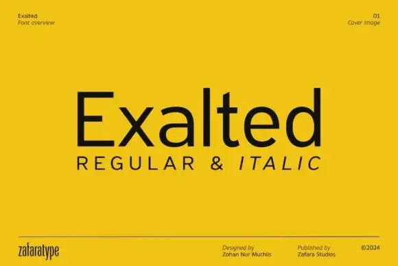
Low wide mixed case with flattened bowls and a long horizontal t bar
Graphite is a wide geometric sans with flattened bowls and a very long horizontal t bar, set here in warm beige on charcoal so the letterforms do the talking and the page stays quiet.
Paid link
Get this fontProject & layout blueprintsAt-a-glance maker compatibility
Sturdy stroke walls and open counters weed cleanly on adhesive vinyl, HTV apparel film, and cut cardstock.
Visual anatomy & craft review
The name is set in one line of mixed case, the counters almost circular, the joints flattened where a curve meets a stem and the t carrying its bar far out to the right. Strokes stay even with no contrast, terminals cut horizontally, and the lowercase rises to a tall x-height so a word looks wide and calm rather than heavy. Under it the words REGULAR AND ITALIC sit in widely tracked capitals, and fine corner notes credit the designer, the publisher and the year. The sample is a type specimen cover rather than a poster, and it shows the face working the way a modern sans has to work: quietly, at a range of sizes, with the italic slanting far enough to read as a separate voice.
Low wide mixed case with flattened bowls and a long horizontal t bar
Two-font hierarchy recipes
Tested contrast partners — pairing Graphite with grounded secondary typography.
Graphite + Vanielst Elegant Serif Display Stylistic
Pairs sculptural editorial warmth with Graphite's clean modern geometry.
Inspect Vanielst Elegant Serif Display Stylistic specimen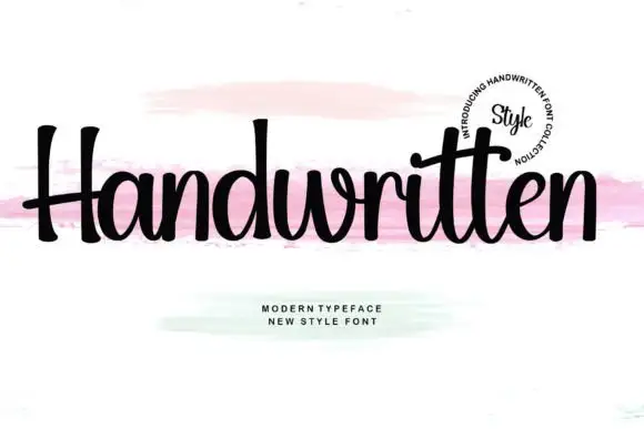
Graphite + Handwritten
Introduces organic movement on pull-quotes, signatures and gift tags.
Inspect Handwritten specimenPractical applications
Concrete hierarchy, scale and production guidance tailored to Graphite’s stroke geometry.
The even strokes read cleanly at a small size on stationery, and the wide proportions give a two-word practice name a calm, modern mark.
Hierarchy & layout recipe
Print a 55 by 90 mm business card: set the name at 14 pt on one row, keep 7 mm of clear ground beneath before the contact line at 6 pt, and keep 6 mm of margin so the wide bowls are not clipped.
Pre-production check
The long t bar crowds the next letter; check the tracking in your own wording before the card run.
A quiet wide sans sits under a feature title without competing, and the flat terminals hold up in the small size a running head is printed at.
Hierarchy & layout recipe
Print a 148 by 210 mm page: set the running head at 10 pt with 3 mm of space above the text block, keep 12 mm of clear ground beneath the head before the first line at 9 pt, and keep 14 mm of margin at the outer edge.
Pre-production check
The italic slants hard; check the pairings before italicising a whole contents line of the magazine.
A neutral geometric sans keeps a long handbook title tidy, and the wide caps stay legible on a cover read across a table.
Hierarchy & layout recipe
Print an A4 handbook cover: set the heading at 40 pt across two rows, keep 16 mm of clear ground beneath before the term at 12 pt, and keep 18 mm of margin from the trim edge.
Pre-production check
Wide settings eat line length; check the longest course title at final size before the print run.
Technical & licence verification
Confirm included OTF/TTF/WOFF formats, full glyph tables and licence coverage on the live store page before batch production.
Closest visual alternatives
Matched across letterform anatomy, stroke behaviour and craft applications.
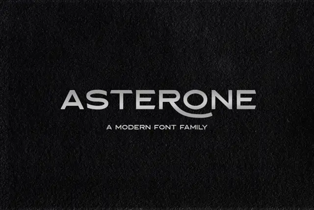
Wide low capitals with flat arms and a sweeping curved R leg
Asterone centres a pale uppercase name on a dark textured field, where wide A and O shapes, long horizontal E arms and near-even strokes make a low extended line and the R leg continues into a curved flourish.
Ideas for this font

Open rounded mixed case with a tall t and broad circular bowls
Cultivo shows a large black title-case name across the lower part of a pale beige cover, where light to moderate nearly even strokes form an open C, a broad u and near-circular bowls, the t finishes with a rounded lower turn and the v opens a clean diagonal.
Ideas for this font
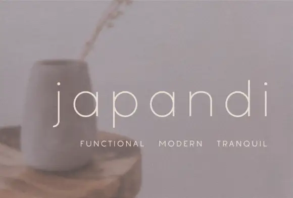
Widely spaced thin lowercase with circular bowls and a hooked j descender
Japandi draws its lowercase in a hairline geometric line, keeps the bowls almost circular and sets the words far apart on a soft photographic ground so the type feels like a room rather than a label.
Ideas for this font
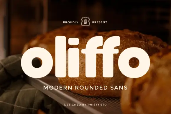
Modern rounded geometric sans
Oliffo is a modern rounded sans in cream over a photograph of bread: lowercase letterforms with almost circular bowls, a dot-less i, a shortened f, and soft terminals, so the word reads as a bakery brand mark rather than as a neutral text face.
Ideas for this font
Same independent foundry
Allow optional Google Analytics to measure visits and catalogue actions. Your search words and notes are not included. Privacy & storage