Neutral Sans Workhorse

Blade + Mansory
Lets Blade own the focal silhouette while handling secondary copy, sizing and subheads cleanly.
Inspect Mansory specimenDisclosure: MakerFileHub may earn a commission from qualifying purchases via paid links on this page. How our links work.
Broad faceted blackletter with deep angular counters
Blade is a heavy blackletter display face whose strokes look carved from granite: thick stems, chiselled counters, weathered edges and a fill that reads as stone rather than ink.
Paid link
Get this fontProject & layout blueprintsAt-a-glance maker compatibility
Sturdy stroke walls and open counters weed cleanly on adhesive vinyl, HTV apparel film, and cut cardstock.
Visual anatomy & craft review
Blade fills the middle of the card in a pale stone grey against a dark interior of tiled walls, with a sword hanging in a small roundel above the word and a credit line flanking it. The letters are much heavier than a textura: the stems are wide, the shoulders square off, and the spurs end in flat chiselled cuts instead of points, which is what gives the word the look of an inscription rather than of calligraphy. The fill carries a grain and a few darker patches, so the surface reads as weathered stone under a hard light. Two small rules with a diamond sit beneath the word above a spaced caption that names the three words describing the cut. The face is a title cut for fantasy, games and horror, and it needs a large size: at 24 pt the grain becomes noise and the chiselled spurs read as rough edges.
Broad faceted blackletter with deep angular counters
Two-font hierarchy recipes
Tested contrast partners — pairing Blade with grounded secondary typography.
Blade + Mansory
Lets Blade own the focal silhouette while handling secondary copy, sizing and subheads cleanly.
Inspect Mansory specimen
Blade + Aureline
Grounds bold display lettering with classic typographic authority on posters, badges and apparel.
Inspect Aureline specimenPractical applications
Concrete hierarchy, scale and production guidance tailored to Blade’s stroke geometry.
The carved weight matches the setting of a stone venue, and the pale letters hold across a dark courtyard where a lighter gothic face would fade into the walls.
Hierarchy & layout recipe
Print a 600 by 900 mm poster: set the event name at 140 pt across two rows, keep 36 mm of clear ground beneath before the gate time at 15 pt, and hold 34 mm of margin so the chiselled feet stay whole.
Pre-production check
Grain disappears on porous stock; print one poster on the intended paper and check the surface before the order.
The stone letters sit naturally on a painted cover, and the heavy strokes stay readable at the thumbnail size a rulebook is first seen at.
Hierarchy & layout recipe
Print a 210 by 280 mm cover: set the title at 70 pt across two rows, keep 26 mm of clear ground beneath before the studio line at 10 pt, and hold 20 mm from the widest stem to the trim.
Pre-production check
Heavy fills need a matte finish on coated stock; print one cover and check for glare where the grain is lightest.
The weathered surface suits a beer brewed for cold weather, and the heavy letters stay legible on a dark label at arm's length in a bar.
Hierarchy & layout recipe
Print a 65 by 100 mm label: set the ale name at 24 pt on one row, keep 8 mm of clear ground beneath before the strength at 5 pt, and hold 6 mm from the lowest foot to the die line.
Pre-production check
Metallic inks fill the counters on a small label; print one label in the intended finish and check the letter shapes first.
Technical & licence verification
Confirm included OTF/TTF/WOFF formats, full glyph tables and licence coverage on the live store page before batch production.
Closest visual alternatives
Matched across letterform anatomy, stroke behaviour and craft applications.
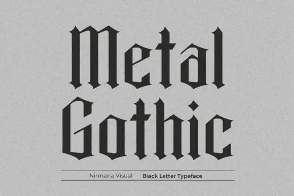
Spare geometric blackletter
Metal Gothic is a spare blackletter in black on a pale textured paper: narrow angular counters, straight shoulders, diamond-shaped terminals and tight fitting, set in two stacked words with a fine rule and a plain credit line beneath.
Ideas for this font
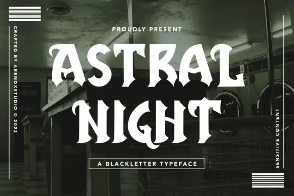
Open high-contrast capitals with curled tips and angular interruptions
Astral Night is a blackletter display face drawn with rounded joins and softened corners: the broken strokes are there, but the angles are sanded down, so the word looks hand-brushed rather than cut.
Ideas for this font
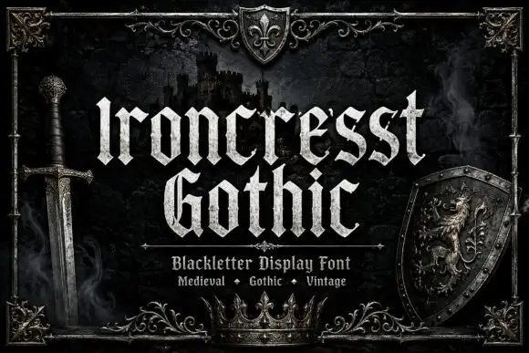
Dense angular blackletter with forked tops and textured fill
Ironcrest Gothic is a medieval display blackletter with a strong vertical stress, diamond feet and a slightly worn fill, framed by heraldic pieces: a shield, a crown, a sword and a lion.
Ideas for this font
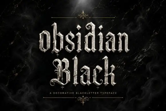
Slender outlined blackletter
Obsidian Black is a slender outlined blackletter in silver on a black marble ground: mixed case with small spirals at the terminals, long fine tips, doubled edges and a scaled texture on the fill, set in two lines with a small tracked line beneath between two hairline rules and drawn fleurons.
Ideas for this font
Same independent foundry
Allow optional Google Analytics to measure visits and catalogue actions. Your search words and notes are not included. Privacy & storage



