 #1 · Best Overall
Disclosure: MakerFileHub may earn a commission from qualifying purchases via paid links on this page. How our links work.
Dry-brush scripts, farmhouse print & wood signs
23 Best Rustic Barn & Country Wedding Fonts
Country wedding lettering has to look hand-made without looking unfinished, and the difference is usually in the stroke edge. Rustic Wedding and Ahmedy carry a dry-brush texture, Rustic Dreams and Rustic Crush push the chunky brush-pen weight, and Rustic Pantry and Little Farmhouse supply the tall print half of the layout. Farmhouse Market covers the hand-drawn duo formula.
Quick verdict
Rustic Wedding is the most reliable script for a barn venue, Rustic Pantry gives the best tall print pairing, and Rustic Dreams handles the chunky brush look. Farmhouse Market covers a hand-drawn board.
Quick answer
Top 3 rustic barn & country weddings picks right now.
Short on time? Start with our three highest-rated rustic barn & country weddings standouts before scrolling the full breakdown.
#1 · Best Overall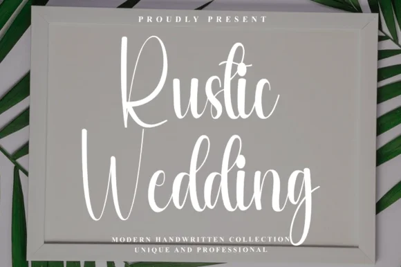 #2 · Runner-Up Pick
 #3 · Editor's Choice
How we tested & selected these 23 fonts
We kept 23 of 36 candidates, a genuinely small pool. Judged on how the dry-brush edge reads at 3 inch sign scale, whether the texture repeats on every letter, and how the script sits next to a tall farmhouse print.
Side-by-side summary
Top 5 rustic barn & country weddings picks at a glance.
Compare specimens, OpenType/PUA traits and primary project roles side by side.
| Rank & Font | Style & File Specs | Best Project Fit | Store Listing |
|---|---|---|---|
| ScriptWarm | Wooden barn-wedding welcome sign, acrylic seating header & mug | Get fontPaid link | |
| ScriptFarmhouse | Framed wood welcome sign, vertical porch leaner & mug | Get fontPaid link | |
| ScriptChunky | Tote-bag HTV graphic, camp mug & farmers-market apron | Get fontPaid link | |
| ScriptExpressive | Cosmetics pouch HTV, boutique thank-you card & lip-balm box | Get fontPaid link | |
| ScriptAlternates & swashes | Barn-wedding cake topper, guestbook cover & welcome board | Get fontPaid link |
Scripts & Calligraphy
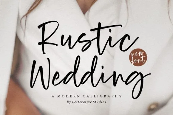
11 fonts#1 · Best OverallRustic Wedding
Rustic Wedding (by letterativestudio) is an approachable, medium-weight modern brush script with dancing baselines and sturdy cutter-friendly strokes.
Rustic Wedding is a bouncy upright modern brush calligraphy: a loaded brush stroke with a nearly vertical axis, visible dry edges at the ends, joined letters and a soft bounce that lifts the middle of the word. The upright axis reads as formal and the bounce keeps it hand-made, while the dry edge is the finest element. It needs roughly 26 mm for the brush edge and the bounce to read, and it is best in one deep ink on smooth card, or a foil impression above 36 pt where the dry edge still holds.
Recommended project & layout
Wooden barn-wedding welcome sign, acrylic seating header & mug — Stack 2 title-case words at 5–9 inches wide on stained wood or frosted acrylic above clean sans dates.
Before you cut or print
Weld all overlapping cursive connectors ('u-s-t-i-c', 'e-d-d-i-n-g') in Design Space before cutting permanent vinyl.
Best paired with
Get fontPaid link
#2 · Runner-Up PickRustic Wedding
Rustic Wedding (by Preketek texs) is a tall, narrow bouncy farmhouse script built to fill framed wood signs and vertical chalkboard easels.
Rustic Wedding is a tall condensed bouncy farmhouse script: narrow letters that connect in one stroke, a low bounce that lifts some joins off the baseline and blunt pen terminals that look cut rather than swelled. The condensation fits a long couple's name down a narrow board, and the lift gaps are what tell it from a smooth monoline. It needs roughly 24 mm for the bounce and the blunt terminal to read, and it is best in one deep ink on cream and kraft, or white paint on a dark board.
Recommended project & layout
Framed wood welcome sign, vertical porch leaner & mug — Stack 2 centered words at 54–88 pt with tight 0.98 leading inside a wood-framed sign.
Before you cut or print
Medium monoline-brush thickness cuts reliably on matte Oracal 631/651 sign vinyl and stencil film—weld joins first!
Best paired with
Get fontPaid link
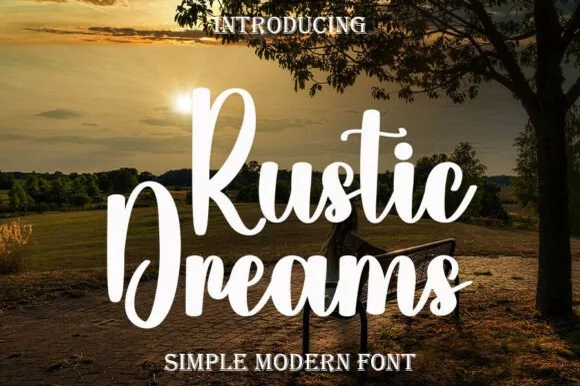
#3 · Editor's ChoiceRustic Dreams
Rustic Dreams is a thick, upright marker-brush script with oversized rounded capitals and heavy, super-clean strokes built for fast, dependable crafting.
Rustic Dreams is a bold chunky upright brush-marker script: connected letters with a very heavy loaded stroke, a vertical axis and short blunt entries that look pressed rather than swept. The weight closes the loops early, and the upright stance keeps a word compact for a stamp or a small card. It needs roughly 26 mm for the pressed entry and the loop to read, and it is best in one deep ink on kraft and cream, or a single white on a dark ground where the heavy stroke prints as a solid ridge.
Recommended project & layout
Tote-bag HTV graphic, camp mug & farmers-market apron — Stack 2 title-case words centered at 5–9 inches wide above a clean rounded serif or sans tagline.
Before you cut or print
Weld overlapping lowercase connectors in Cricut Design Space; cuts cleanly down to 0.7 in lowercase height.
Best paired with
Get fontPaid link
 #4 · Top Maker Utility
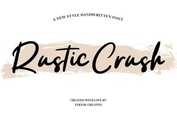
Rustic Crush
Rustic Crush is a lively, medium-bold brush-pen script combining brisk angled upstrokes, shaded downstrokes, and natural hand-lettered snap.
Rustic Crush is a brush-pen signature script with an energetic forward lean: upstrokes stay thin and angled, downstrokes are shaded and slightly bowed, and the connections carry a visible snap where the pen left the paper. Capitals open rather than curl shut, and the flying t-bar on the t is a signature detail rather than a ligature. The weight is medium-bold, so the face holds at about 12 mm on a small pouch and grows into a confident heading at 40 mm, and it prints convincingly in a single ink colour where the pen texture does the decorative work.
Recommended project & layout
Cosmetics pouch HTV, boutique thank-you card & lip-balm box — Place black script lettering horizontally across a pale blush, sage, or sand brush-stroke graphic.
Before you cut or print
Medium-bold brush weight cuts cleanly on 1.1 in+ cosmetic-bag HTV and glossy sticker vinyl once welded.
Best paired with
Get fontPaid link
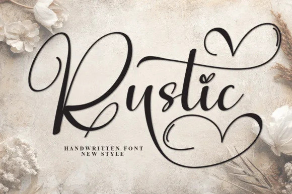 #5 · Standout Silhouette
Rustic
Rustic (by Strongkeng Old) is a bouncy handwritten calligraphy script distinguished by sweeping top-and-bottom heart swashes and heart i-dots.
Rustic is a romantic calligraphy script with oversized heart-loop swashes: a moderate contrast stroke, a shallow slant, and swashes that curl into a large heart shape at the start and end of a line. The hearts are the design and they grow the word in both directions, so any centred layout needs side clearance, and the hairlines break first on textured stock. It needs roughly 30 mm for the heart loop and the join to read, and it is best in one warm ink on smooth card, or a foil impression above 40 pt where the heart loop still turns.
Recommended project & layout
Barn-wedding cake topper, guestbook cover & welcome board — Set 1 hero word centered at 6–10 inches wide with one upper-right heart swash and one lower-right heart swash active.
Before you cut or print
Weld all touching cursive joints and heart ribbons before cutting wood, acrylic, or vinyl decals above 1.5 inches.
Best paired with
Get fontPaid link
 #6
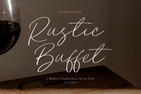
Rustic Buffet
Rustic Buffet is a whisper-thin, airy monoline dip-pen script with wide looped capitals and graceful hand-written restaurant menu poise.
Rustic Buffet is an ultra-fine wispy dip-pen script with hairline strokes, tall loops and a light, dry pen texture along the edges, so a line reads as written with a nib that is nearly out of ink. The hairlines are the point, which makes it a print and menu face rather than a signage one, and the wisps mean the face needs size and smooth stock. It needs roughly 26 mm for the wisps to hold, and it is best in a warm sepia on cream or as a fine foil on matte board.
Recommended project & layout
Rehearsal-dinner menu header, wine-tasting card & place tent — Set course titles ('Rustic Buffet', 'Dessert Table', 'Cellar Wines') at 38–56 pt in ivory over charcoal or espresso in cream.
Before you cut or print
Ultra-thin hairline weight is strictly for flat printing, foil stamping, and Foil Quill—never blade-weeded vinyl.
Best paired with
Get fontPaid link
 #7
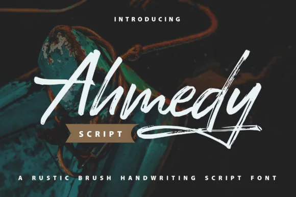
Ahmedy | Rustic Brush Handwriting Script
Ahmedy is a bold, slanted dry-brush handwritten script carrying subtle bristle grain along expressive, energetic strokes.
Ahmedy is a dry-brush rustic script with a tall tented A, a sweeping crossbar, connected brisk loops and visible bristle grain along the stroke edges, so a man's name reads as painted on a board rather than written with a pen. The dry edge is baked into the glyph, which means the face needs size for the grain to read, and the connected loops make it a decor rather than a text face. It needs roughly 26 mm for the bristle grain to hold, and it is best in chalk white on dark timber or in one dark ink on cream.
Recommended project & layout
Surf/outdoor apparel graphic, bbq sauce label & craft beer — Set 1 focal name at 60–96 pt above a small ribbon badge ('SCRIPT') and wide-tracked sans tagline.
Before you cut or print
Fine dry-brush edge grain reproduces sharpest in print, DTF, screen print, and sublimation rather than tiny blade-cut vinyl.
Best paired with
Get fontPaid link
 #8
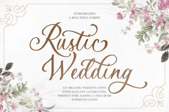
Rustic Wedding
Rustic Wedding is a formal script in which the capitals open into broad swashes, the returns sweep back under the word and the stroke contrast stays moderate, so a phrase reads as engraved stationery.
The capital R opens with a wide looped stem and the second capital W repeats a similar gesture, which is what gives the pair its symmetry on a card. The lowercase keeps an even contrast with fine joins: the u and the s close small bowls, the t crosses high and the d rises into a plain stem, while the final g drops a heavy looped descender. The broad returns are the signature — each capital sends a stroke back under the following letters, so a short phrase occupies a wide format on its own. Because the contrast is moderate rather than extreme, the face holds at 20 pt on uncoated stock. The printed frame, the watercolour roses, the brown ink and the three caption lines are presentation; the script is the two words.
Recommended project & layout
A wedding announcement heading — Reserve a wide heading area above plain names, date and venue, leaving the lower g-like loop clear.
Before you cut or print
Preview the exact phrase and any AND alternate.
Best paired with
Get fontPaid link
 #9
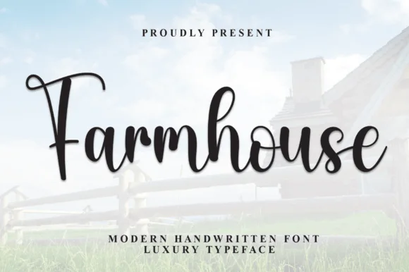
Farmhouse Font
Farmhouse Font (by andikastudio) is a thick, welcoming brush-calligraphy script with shaded downstrokes and lively baseline bounce.
Farmhouse Font is a bold brush-calligraphy script with shaded downstrokes, tall loops on the h and l, and a lively baseline bounce that lifts and drops the letters across a word. The pressure shading is built into the glyph rather than added, so the script keeps its warmth when printed in a single flat colour, and the thick connectors survive a vinyl cut and a garment transfer. It needs roughly 25 mm before the shading reads as brush pressure, and it is best in a warm dark ink on cream or reversed out of a deep green.
Recommended project & layout
Over-the-mantel wood sign, porch board & burlap tote — Center 1 or 2 words at 60–110 pt above clean wide-tracked Roman serif subheaders ('MODERN HANDWRITTEN').
Before you cut or print
Always Weld overlapping cursive joins before cutting Cricut vinyl, HTV, or Oramask stencils; cuts cleanly down to 0.85 in!
Best paired with
Get fontPaid link
 #10
Vintage Melinda
Vintage Melinda is a creamy, thick-stroke retro brush script with dramatic curled swash capitals and sweeping baseline loops.
Vintage Melinda is a bold retro-romance brush script with curled swashes: a heavy loaded stroke, a shallow slant, connected letters and swashes that curl off the caps and descenders into a tight spiral. The spirals widen the word and are the finest element, and the loaded weight closes the loops early. It needs roughly 30 mm for the spiral and the brush edge to read, and it is best in one warm ink on cream, or a fine gold on a dark ground where the curls print as bright lines.
Recommended project & layout
Harvest market apparel, retro diner mug & fall tote — Stack a two-word vintage slogan at 4–8 inches wide, choosing one lower underline swash to anchor the bottom edge of the lockup.
Before you cut or print
Always weld connected letters before cutting, and check clearance between row one descenders ('g', 'y') and row two swash capitals.
Best paired with
Get fontPaid link
 #11
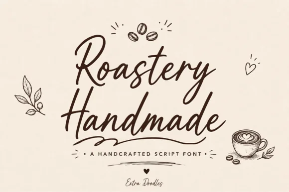
Roastery Handmade
Roastery Handmade is a lively, upright café brush script accompanied by charming hand-drawn coffee-bean, latte-cup, leaf, and heart doodles.
Roastery Handmade is a warm café marker brush script with a set of coffee doodles: a wet loaded stroke with visible marker texture, joined letters, a light slant and small flicked exits, plus drawn beans, cups and steam curls cut to the same weight. The doodles let a cup or a bag be decorated from the same file, and the marker edge is the finest element. The script needs roughly 22 mm and the doodles 20 mm for their detail to read, and both work in one warm ink on kraft.
Recommended project & layout
Small-batch coffee bag, café chalkboard & espresso mug — Stack two bouncy script words centered beneath a 3-bean doodle icon, anchored by tracked sans roast specs below.
Before you cut or print
Sturdy upright marker thickness cuts and weeds cleanly on mug vinyl, apron HTV, and café window decals—weld script joins first!
Best paired with
Get fontPaid link
Matched Font Duos & Packs
10 fonts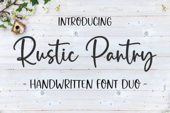 #12
Rustic Pantry
Rustic Pantry is a coordinated farmhouse font duo pairing a lively bouncy cursive script with a tall, narrow hand-drawn uppercase sans.
Rustic Pantry is a duo of a bouncy farmhouse brush script and a tall skinny marker sans: the script runs a loaded stroke with small flicks, a rising baseline and joined letters, while the sans is narrow with blunt marker ends for prices and lists. The two voices share one palette, so a jar label can carry a name and a list in the same hand. The script's bounce grows the word vertically and the marker sans stacks a long line in a narrow label. The script needs roughly 22 mm and the sans 18 mm for their detail to read.
Recommended project & layout
Glass pantry canister decal, spice-jar set & kitchen sign — Center the script word at 2–3.5 inches wide above a 0.5-inch tracked skinny sans descriptor line.
Before you cut or print
Weld all touching cursive connectors before cutting Oracal 651 permanent jar vinyl; medium stroke weight weeds cleanly.
Best paired with
Get fontPaid link
 #13
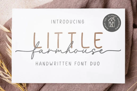
Little Farmhouse
Little Farmhouse pairs a tall, narrow rounded sans-serif with a delicate, wide-tracked monoline cursive.
On the framed white card mockup, warm taupe capitals 'LITTLE' stand tall and widely spaced behind dark charcoal script 'farmhouse', whose long entry and exit tails extend past both edges of the sans word while the lowercase 'f' drops a deep narrow loop. PUA encoding provides easy access to the extended end swashes. The layering is the fragile part: the script is cut as a separate vinyl layer across the sans, so the long entry and exit tails thin out at the overlap and lift first on a textured board. Keep the script x-height at 1.5 in or above, press the sans layer down first, and test one plaque before painting a set.
Recommended project & layout
Framed shiplap entryway or kitchen pantry sign — Track the sans capitals out to +120 in muted tan or gray at 2.8 in height, then center the dark script word across their lower stems.
Before you cut or print
When cutting stencil film for wood painting, keep the fine script above 1.5 in x-height so narrow 'f' and 'a' bridges hold firm against bleed.
Best paired with
Get fontPaid link
 #14
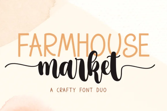
Farmhouse Market
Farmhouse Market teams a tall, organic uppercase sans with a bold, bouncy brush script finished by sweeping side tails.
Farmhouse Market pairs a condensed hand-drawn sans with a thick brush-pen script: the sans is a narrow uneven block with a wobbling stem for signs and price cards, while the script is a heavy brush stroke with dry ends and a visible pen turn at each join. The pair is built for a market stall, so it wants kraft paper and one dark ink rather than a coated ground. The dry brush ends are the finest element and they silt first. The sans needs roughly 22 mm and the script 30 mm for their detail to read.
Recommended project & layout
Farmers-market canvas tote & produce crate stencil — Span the uppercase sans across the top width of the script's core letters, letting the script's left and right tails extend 1 inch wider on each side.
Before you cut or print
Weld all brush script letters into a single compound path before cutting HTV, and double-check the small upper loop inside 'e' and 'k'.
Best paired with
Get fontPaid link
 #15
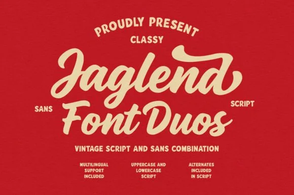
Jaglend Font Duo
Jaglend Font Duo pairs a thick, creamy vintage sign-painter brush script with a sturdy, hand-drawn condensed uppercase sans companion.
Jaglend Font Duo pairs a retro sign-painter brush script with a rugged condensed sans: the script carries a loaded stroke with small flicks and connected letters on a firm slant and a shallow bounce, while the sans is narrow with uneven edges that read as a sanded board for lists and prices. The two voices share one palette, so a window, a price list and a card can be built from one family without a third face. The script's flicks are the finest element and they close first at small sizes, while the condensed sans stacks a long service list in a narrow panel without wrapping. The script needs roughly 24 mm and the condensed sans 18 mm for their detail to read.
Recommended project & layout
BBQ rub tin, craft soda label & barbershop window sign — Arch the sans uppercase header over a large slanted Jaglend Script centerpiece and anchor with tracked sans footers.
Before you cut or print
Broad solid brush strokes cut cleanly on HTV, sticker vinyl, and wood-sign stencils—weld script connections before cutting.
Best paired with
Get fontPaid link
 #16
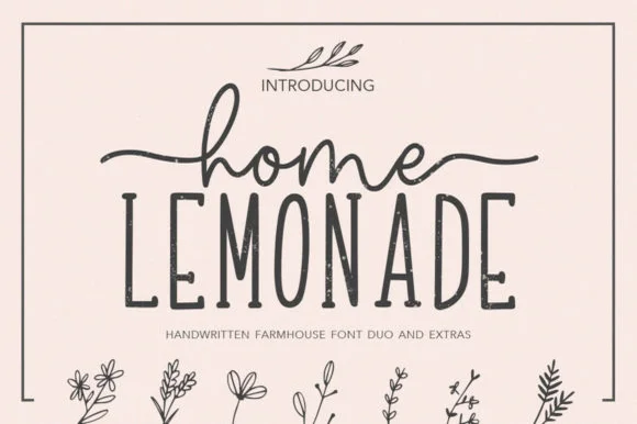
Home Lemonade
Home Lemonade is a coordinated farmhouse font duo pairing a wide-tailed monoline cursive script, a tall skinny uppercase sans, and floral doodles.
Home Lemonade is a farmhouse family of a monoline script, a tall narrow sans and a set of botanical extras: the script runs an even light stroke with wide loops for names, the sans is narrow with blunt ends for lists and prices, and the extras supply drawn lemons, leaves and jars at the same weight. All three share one palette so a stand can be built from one purchase. The script needs roughly 24 mm and the extras 20 mm for their detail to read.
Recommended project & layout
Lemonade-stand wood sign, beverage dispenser & pitcher tag — Center 1 lowercase script word with side tails directly above a wider uppercase sans word, accented by 1 botanical sprig.
Before you cut or print
Both the monoline script and skinny sans cut cleanly on Oracal 651 glass/wood vinyl at 1 inch+ scale—weld script joins first.
Best paired with
Get fontPaid link
 #17
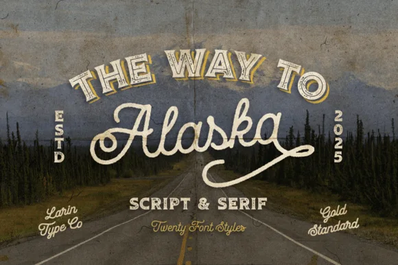
Way to Alaska
Way to Alaska is a monumental 20-font vintage signboard superfamily by Pasha Larin pairing heritage brush scripts with arched Western/signboard serifs!
Way to Alaska is a twenty-font vintage signboard superfamily built around a heritage script and a companion serif, with layered shadows, inlines, outlines and small ornaments that all share one skeleton. The size of the family means a whole shopfront can be built from one voice, but the layers must be picked deliberately or a panel turns into a stack of outlines. The script needs roughly 24 mm and the serif 20 mm for their detail to read, and two inks cover most of the family.
Recommended project & layout
Craft distillery / brewery badge, coffee roaster & apparel line — Arch the vintage Serif ('THE WAY TO', 54 pt) above sweeping 'Alaska' Script (110 pt) flanked by vertical 'ESTD / 2026' stamps!
Before you cut or print
Use the clean solid styles for crisp Cricut HTV, Oracal 651 & laser engraving; use textured/inline styles for DTF, print & labels!
Best paired with
Get fontPaid link
 #18
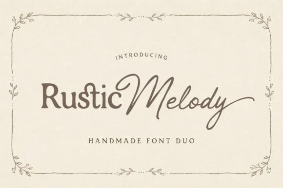
Rustic Melody
Rustic Melody is a graceful handmade font duo pairing a gently organic mixed-case serif ('Rustic') with a flowing fine-pen signature script ('Melody')!
Rustic Melody is a duo of a handcrafted organic serif and an airy signature calligraphy: the serif carries uneven edges that read as cut paper, short bracketed serifs and a warm irregular rhythm, while the calligraphy runs a light stroke with joined letters and long tapered exits for names. The pair lets one card carry a printed headline and a signed line, and the light calligraphy is the weaker element in print. The serif needs roughly 22 mm and the calligraphy 26 mm for their detail to read.
Recommended project & layout
Barn-or-garden wedding invitation, vow booklet & place card — Place mixed-case Serif (60 pt) + title-case Script (76 pt) side-by-side above wide-tracked Serif small-caps ('HANDMADE FONT DUO').
Before you cut or print
Serif cuts cleanly at 0.85 in+; delicate Signature Script shines in flat print, foil stamping, Cricut Pens, or 1.4 in+ welded vinyl.
Best paired with
Get fontPaid link
 #19
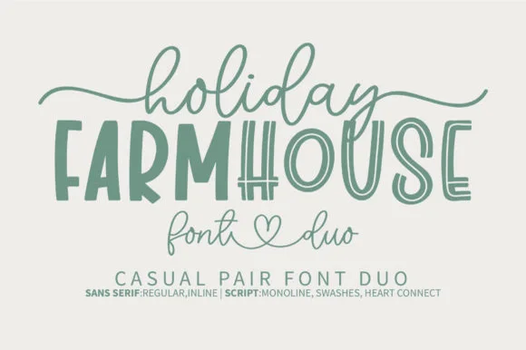
Holiday Farmhouse
Holiday Farmhouse pairs a tall hand-drawn inline farmhouse sans with an airy heart-connected monoline script, so a rustic sign can carry a structured capital line above a soft written phrase.
The sans cut stays tall with an inline channel running down each stem, the script stays monoline and light and its connectors meet at a small heart, and the two differ enough in weight to read as separate voices. The inline channel is the character: it lets the capital line look painted with a liner brush, which is why the sample suits tiered tray decor. Because the inline is narrow, keep 30 pt before it closes, and keep 18 mm at the end of the script for the heart join.
Recommended project & layout
Farmhouse wood sign, tiered-tray plaque or kitchen towel — Centre the tall all-caps noun and drape the monoline script lightly above and below.
Before you cut or print
Use the Regular (solid) sans file for small vinyl decals; save the Inline version for signs 3"+ tall.
Best paired with
Get fontPaid link
 #20
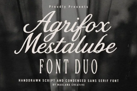
Agrifox Mestalube
Agrifox Mestalube is a high-contrast heritage font duo pairing a juicy slanted brush script with a tall, airy monoline condensed sans.
Agrifox Mestalube is a duo of a bold retro brush script and a tall skinny condensed sans, so one line is spoken in brush and the next is stated in a narrow cap column. The script has thick connectors and a slight bounce, the sans is a flat-sided column with tight sidebearings, and the pair shares a warm mid-century tone. It needs roughly 26 mm for the script and roughly 12 mm for the sans, and it is best in burnt orange or ink on cream and kraft.
Recommended project & layout
menswear / barber label, coffee-roast bag & leather apron — Stack 1–2 brush Script words (72 pt) above wide-tracked Agrifox Condensed Sans caps (44 pt).
Before you cut or print
Both fonts feature sturdy, vinyl-safe stroke weights—Weld cursive joins on the Script and cut cleanly down to 0.85 in!
Best paired with
Get fontPaid link
 #21
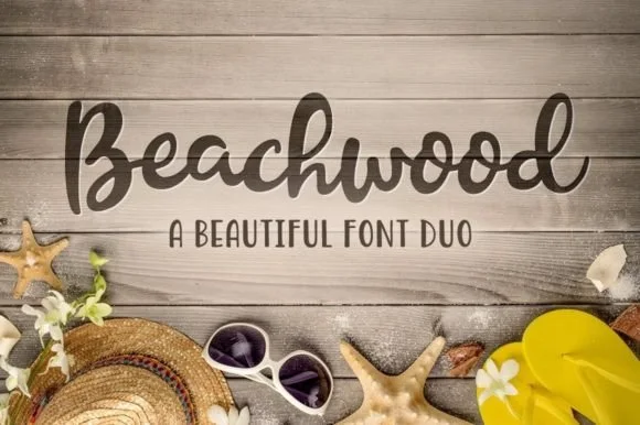
Beachwood
Beachwood is a relaxed, coastal-farmhouse font duo by Denise Chandler pairing a thick monoline script with a neat hand-drawn all-caps sans!
Beachwood is a relaxed summery duo: a soft upright serif with rounded terminals and a casual brushed sans companion, both carrying a salt-faded palette. The serif handles the name and the sans handles the details, so the pair works as one sign with two tones. The rounded terminals are drawn, not rounded by a filter, so they survive a one-colour print on uncoated stock. The serif needs roughly 24 mm and the sans 12 mm for the rounding to read.
Recommended project & layout
Lake-house / beach-cottage wood sign, towel & tumbler — Set hero title in Beachwood Script (80 pt) above +8 tracked Beachwood Sans caps (34 pt) on whitewashed wood.
Before you cut or print
Click Weld on the Script in Design Space—both fonts cut cleanly down to 0.75 inches on Oracal 651 and HTV!
Best paired with
Get fontPaid link
Serifs & Slab Serifs
2 fonts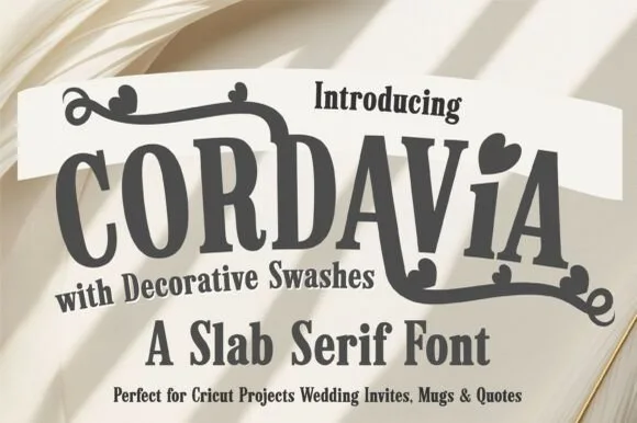 #22
Cordavia Bold Swash
Cordavia Bold Swash is a warm, slightly condensed slab serif crowned with decorative canopy swashes, baseline curls, and solid heart i-dots.
Cordavia Bold Swash is a playful slab serif with heart details: heavy unbracketed slabs, open counters, a small heart replacing the dot on the i and swashes that finish in a heart tip at the entry and exit of a word. The hearts are the design and they close into dots as soon as the face is reduced. It needs roughly 28 mm for the heart and the slab to read, and it is best in two soft inks on white, or one ink plus paper where the hearts print as knockouts.
Recommended project & layout
Cricut wedding mug, welcome wood sign & save-the-date — Set a couple surname or single word ('MR & MRS', 'ALWAYS') in uppercase, dropping in one lowercase heart-dotted 'i' for charm.
Before you cut or print
Thick slab bodies and solid swash ribbons cut reliably on Oracal 651 and HTV down to 1 inch cap height.
Best paired with
Get fontPaid link
 #23
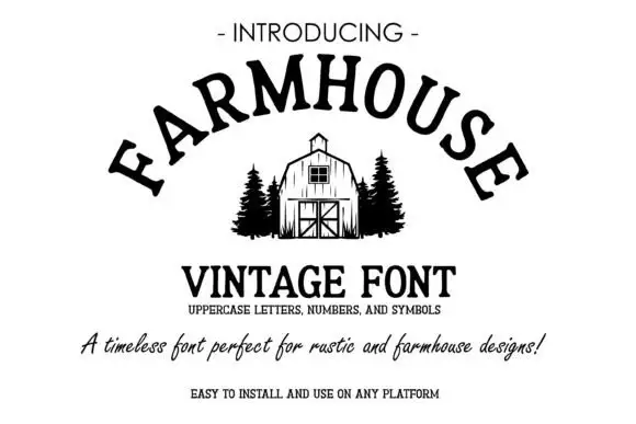
Farmhouse Vintage
Farmhouse Vintage arcs black serif capitals over a small barn illustration, where the rounded bowls, short sturdy feet and gently irregular angles give the word a rustic sign character without heavy distress, and a thin line of small caps plus a cursive sentence sits beneath on white.
The bowls stay round, the feet stay short, the angles drift slightly off true and the whole row follows a shallow arc. That arc is the character: the sample reads as a painted farm sign rather than a straight cap row, which is why the cover leaves wide white space on both sides. The barn, the pines and the cursive sentence are separate art and typography. Keep 44 pt, check whether your app can arc a line naturally and keep the line short so the curve stays even.
Recommended project & layout
A farmstand opening card — Place FARM GATE in black across the top of a cream opening card, with the produce list in a plain left-aligned column below.
Before you cut or print
Verify the unseen letters and do not assume the barn artwork is included.
Best paired with
Get fontPaid link
Practical buyer checklist
Frequently asked questions.
Key cutting, printing and pairing answers before choosing a rustic barn & country weddings typeface.
Which rustic fonts work on raw wood?
Chunky brush scripts and tall print faces, applied as stencils or vinyl masks at 3 inches or more. Fine scripts disappear into the grain, and distressed faces add their own texture that fights the wood.
Can a dry-brush script be cut from vinyl?
It can, but the ragged edge becomes a set of small notches that tear during weeding. For a cut sign, use a clean script and apply the texture with paint, or print the design on a vinyl panel instead.
What size lettering suits a barn welcome sign?
Between 4 and 6 inches on a 24 by 36 inch board, with the script at the top and the print line below. That size reads from 5 to 10 metres, which is where guests actually see it.
Do rustic duos include the ampersand needed for a couple's names?
Usually yes, and it is often the strongest glyph in the set. Check it at final size, since a phone-drawn ampersand in a script set can look like a different typeface entirely.
Keep exploring
Related collections & guides.
Explore adjacent maker roundups or check our practical pre-production checklists.
01 / Occasions & Milestones
Wedding
36 curated fonts · Previews & pairings

02 / Cricut & Craft
Modern farmhouse & wood signs
27 curated fonts · Previews & pairings
03 / Occasions & Milestones
Bridal calligraphy & swash scripts
27 curated fonts · Previews & pairings


04 / Cricut & Craft
Cricut fonts with tails
21 curated fonts · Previews & pairings
Guides: Invitation font checklist · Vinyl & cutting checklist · How to pair script & sans fonts