Neutral Sans Workhorse

Always Christmas + One More
Lets Always Christmas own the focal silhouette while handling secondary copy, sizing and subheads cleanly.
Inspect One More specimenDisclosure: MakerFileHub may earn a commission from qualifying purchases via paid links on this page. How our links work.
Tall capitals with curled terminals
Always Christmas combines tall mostly upright letters with curled ends on selected capitals, and large loops on the A, C and S give the restrained strokes a decorative edge across a two-row red-and-green composition.
Paid link
Get this fontProject & layout blueprintsAt-a-glance maker compatibility
Sturdy stroke walls and open counters weed cleanly on adhesive vinyl, HTV apparel film, and cut cardstock.
Visual anatomy & craft review
The letters stay upright and tall, the curls appear only on chosen capitals, the loops sit at the entry or exit of a stroke and the rows keep a readable centre with foliage in the corners. The selective curl is the character: most of the row stays plain while three letters carry the ornament, which is why the sample sets two colours. Because the loops extend sideways, keep 22 mm at each end from 28 pt and leave room beside any adjacent vertical stroke.
Tall caps · Curled ends · Two rows
Two-font hierarchy recipes
Tested contrast partners — pairing Always Christmas with grounded secondary typography.
Always Christmas + One More
Lets Always Christmas own the focal silhouette while handling secondary copy, sizing and subheads cleanly.
Inspect One More specimen
Always Christmas + Amor Hadena
Grounds bold display lettering with classic typographic authority on posters, badges and apparel.
Inspect Amor Hadena specimenPractical applications
Concrete hierarchy, scale and production guidance tailored to Always Christmas’s stroke geometry.
The selective curls give a greeting its ornament, and the tall upright letters keep two words readable at 28 pt on an A6 sheet. The upright letters also keep two rows readable at card size.
Hierarchy & layout recipe
Print an A6 card: set the greeting at 28 pt on two rows, keep 18 mm of clear card at each end for the loops, and set the family name at 11 pt in a serif beneath with 12 mm of clear ground.
Pre-production check
Two curled capitals on one row compete for attention; check the card and keep the curls on one word only. Ask for a proof on the chosen card.
The ornament suits a jar label, and the upright strokes stay clear at 18 pt on a 45 mm panel in one ink. The plain letters also keep a small jar label calm.
Hierarchy & layout recipe
Print a 45 by 55 mm label: set the word at 18 pt, drop the outer loops where the panel is narrow, and set the contents in a 6 pt caps at the foot with 4 mm of clear ground. Keep the contents line small.
Pre-production check
A loop printed at 14 pt closes into a dot; check the proof and keep the word at 18 pt or above. Print one label before the batch.
The two-row setting suits a stall board, and the tall letters hold a short greeting at 50 mm on a printed panel. The tall rows also read from a market path.
Hierarchy & layout recipe
Print a 500 by 260 mm board: set the greeting at 50 mm on two rows, keep 22 mm between the rows for the loops, and keep 28 mm of border all round the panel. Keep the greeting on two rows.
Pre-production check
A curled cap painted close to the frame looks clipped; check the mounted board and keep 22 mm of margin. Check the mounted board outdoors.
Technical & licence verification
Confirm included OTF/TTF/WOFF formats, full glyph tables and licence coverage on the live store page before batch production.
Closest visual alternatives
Matched across letterform anatomy, stroke behaviour and craft applications.
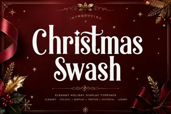
Tall festive mixed-case letters with restrained swashes
Christmas Swash shows narrow mixed-case forms with strong thick-thin contrast and rounded terminal curls, where the t extends into a long fine crossstroke and a small diamond-like dot sits over the i.
Ideas for this font
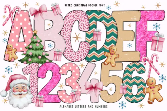
Patterned holiday block bundle
Retro Christmas Doodle is a colour bundle on a white ground: tall rounded holiday blocks in two rows, each filled with a different pattern — dots, spots, chevrons, glitter and plain cream — with small gifts, gingerbread figures, candy canes and a Santa at the sides, and a small note at the head naming the set.
Ideas for this font
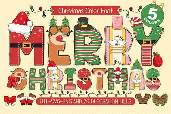
Festive dressed capitals
Merry Christmas is a festive display on a cream ground: tall capitals each dressed with a different costume — belts, hats, stripes, scarves and small faces — with a garland above and a ribbon below that lists the file formats and the count of colours.
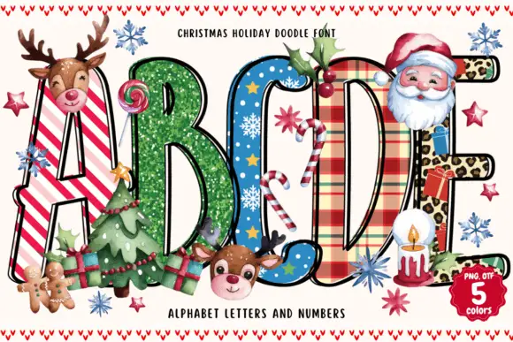
Tall narrow festive blocks with stripes, speckles, stars, plaid and spots
Christmas Holiday Doodle sets fat colour capitals in five holiday patterns — candy stripes, snow-dusted green, blue with snowflakes, tartan, leopard — and dresses the card with a Santa, reindeer, gingerbread men and decorated trees.
Ideas for this font
Same independent foundry
Allow optional Google Analytics to measure visits and catalogue actions. Your search words and notes are not included. Privacy & storage