 #1 · Best Overall
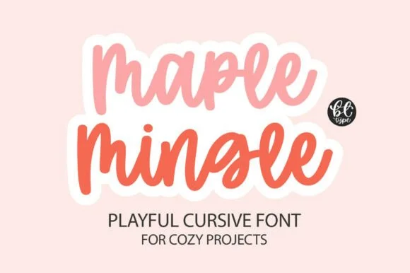
Maple Mingle
Casual cursive marker lettering with a heavy sticker outline
Get fontPaid link
Read review ↓Disclosure: MakerFileHub may earn a commission from qualifying purchases via paid links on this page. How our links work.
Heavy brush & monoline scripts for drinkware
A 20 ounce tumbler wraps roughly ten inches of circumference around a four inch canvas, and thin scripts vanish on that surface. Maple Mingle and Sweet Boho hold a wide ribbon stroke, Mama and Boho bring a heavy upright brush rhythm, and Thick Black is the extreme end for three or four letter words.
Quick verdict
Maple Mingle is the most forgiving thick script for a first tumbler, Sweet Boho softens the look, and Mama suits vertical name panels. Thick Black is the choice when a two or three letter word must carry the whole design.
Quick answer
Short on time? Start with our three highest-rated thick scripts for tumblers & decals standouts before scrolling the full breakdown.
#1 · Best OverallCasual cursive marker lettering with a heavy sticker outline
 #2 · Runner-Up Pick
Thick rounded brush script with plump loops and wide transitions
 #3 · Editor's Choice
From 297 scripts we kept 26 with stem widths over 1.2 mm at 3 inch cap height and counters that stay open after warping. Scored on weight consistency across the alphabet, how the script behaves on a 9 to 10 inch wrap, and whether the seller supplies a second weight or swash set.
Side-by-side summary
Compare specimens, OpenType/PUA traits and primary project roles side by side.
| Rank & Font | Style & File Specs | Best Project Fit | Store Listing |
|---|---|---|---|
| ScriptBouncy | Friendsgiving tumbler, fall doormat or sticker pack | Get fontPaid link | |
| ScriptCozy | Tea mug decal, bridesmaid gift box or cozy home sign | Get fontPaid link | |
| ScriptChunky | Mother's Day crewneck sweatshirt, tote bag or tumbler | Get fontPaid link | |
| ScriptWarm | Macramé shop tag, boho mug decal or nursery wall sign | Get fontPaid link | |
| ScriptPUA encoded | A coffee-blend name panel | Get fontPaid link |
#1 · Best OverallMaple Mingle is a playful cursive face in which the letters run together in a marker hand and a heavy white outline wraps each word, so a short phrase reads as a cut sticker rather than as handwriting.
The m keeps three uneven arches, the a closes a round bowl, the p drops a wide bowl, the l rises on a slanted stem, the e turns a light eye and the n repeats the arch, all at a marker weight with rounded ends, a bouncy baseline and a contour drawn around the whole word. The contour is the character: it treats the phrase as one object, which is why the sample sets two stacked words in two colours with a cut edge. Because the shapes are solid, the face holds from 26 pt and cuts cleanly in card. The pink ground, the small monogram badge and the two caption lines are presentation; the two coloured phrases are the face.
Friendsgiving tumbler, fall doormat or sticker pack — Add an offset white sticker contour for print-then-cut planner and laptop decals.
Weld cursive joins before cutting — one of the easiest scripts to weed.
#2 · Runner-Up PickSweet Boho is a thick rounded brush script in which the strokes stay plump, the joins widen into soft transitions and the loops of S, B and h open wide, so a short phrase holds a large amount of ink on a craft blank.
The S swells through two wide curves, the B closes a broad upper loop, the h lifts a rounded arch and the connectors keep almost the same weight as the stems, which leaves very little thin passage anywhere in a word. The plumpness is the character: wide strokes give adhesive surface on a mug or a wooden sign, which is why the sample sets a warm phrase on a plain ground. Because the letters are fat, a title needs generous leading from 28 pt and the joins weld into a single path before cutting from 1.1 inches of x-height. The cream ground, the small daisies and the caption are presentation; the dark brush phrase is the face.
Tea mug decal, bridesmaid gift box or cozy home sign — Stack two short words tightly and Weld overlapping connections before cutting.
Top-tier vinyl & HTV friendliness thanks to thick, smooth strokes.
#3 · Editor's ChoiceMama is a heavy smooth brush-calligraphy script drawn for bold single-word apparel transfers, where broad cushioned downstrokes and smooth rounded joins give chest graphics rich coverage on sweatshirts and totes.
The downstrokes carry the weight, the joins stay round and smooth, the counters close tight and the word holds its shape at just one or two terms. That cushion is the character: the lettering reads warm and hand-brushed while staying solid enough to weed cleanly from a vinyl sheet, which is why the sample keeps a single short word. The 'vinyl-ready' claim comes from the source rather than a test here, so proof your own word, keep 30 pt for print and check the weeding on a scrap before the run.
Mother's Day crewneck sweatshirt, tote bag or tumbler — Centre lowercase across the chest at 8–10 inches wide and Weld before cutting.
Top choice for puff HTV, flock HTV and permanent mug vinyl.
 #4 · Top Maker Utility
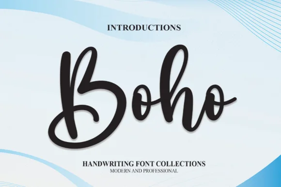
Boho by andikastudio is a thick bouncy modern brush script in which the downstrokes stay generous, the counters open wide and the letters stand nearly upright, so a short phrase reads as warm handwriting that still cuts cleanly.
The downstrokes carry most of the weight, the counters stay open enough to keep small sizes legible, the baseline bounces slightly and the upright stance keeps the line steady. The chunky stroke is the character: the word reads as a brush mark rather than a fine pen line, which is why the sample suits vinyl applications. Because the joins stay thick, keep 26 pt as the floor and cut from 1.1 inches of x-height so the connectors weld without tearing; ligature access is a separate step.
Macramé shop tag, boho mug decal or nursery wall sign — Weld connected lowercase letters before cutting in Cricut or Silhouette.
Easy cut on HTV, permanent vinyl and wood stencils.
 #5 · Standout Silhouette
Thick Black combines heavy rounded stems with large looping T, B and k forms, where two stacked words sit with tight middle counters and sweeping outer terminals, and a faint landscape runs behind the lettering as separate artwork.
The stems stay heavy, the loops grow large, the counters close tight and the terminals sweep out. That heavy loop is the character: the word reads as brush calligraphy rather than a delicate script, which is why the sample keeps two words stacked. The landscape is not part of the letters, so test the script on flat colour, keep 34 pt before the counters close and allow 22 mm at each end for the terminals. The tight counters are the risk: they plug at about 30 pt and the word greys into a black mass, so keep 34 pt and give each end 22 mm for the swept terminals.
A coffee-blend name panel — Give the name a wide front panel and move weight, ingredients and roast notes to plain type below the lowest curl.
Proof tight counters at package size.
 #6
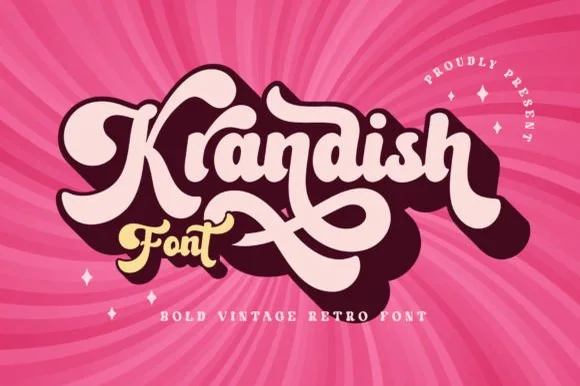
Krandish is a heavy, cream-smooth 1970s retro script featuring dramatic looping swash capitals and thick figure-eight underline tails.
Krandish is a chunky nineteen-seventies retro brush script with swash tails: a very heavy loaded stroke, a firm slant and tails that extend straight off the first and last letters before curling up at the tip. The tails widen the word and are the first thing trimmed, and the heavy weight closes the counters early. It needs roughly 30 mm for the tail and the heavy stroke to read, and it is best in two warm inks on cream, or one burnt orange on white where the tails still read as drawn lines.
Retro roller-skate tee, beach tote & iced-coffee wrap — Tilt a 1-to-2-word phrase upward 8 degrees and duplicate a dark offset layer behind it in Illustrator or Cricut for a 3D retro shadow.
Weld connected lowercase strokes into one path before cutting, and check the tight loops inside 'a', 'd', and 'o'.
 #7
Vintage Melinda is a creamy, thick-stroke retro brush script with dramatic curled swash capitals and sweeping baseline loops.
Vintage Melinda is a bold retro-romance brush script with curled swashes: a heavy loaded stroke, a shallow slant, connected letters and swashes that curl off the caps and descenders into a tight spiral. The spirals widen the word and are the finest element, and the loaded weight closes the loops early. It needs roughly 30 mm for the spiral and the brush edge to read, and it is best in one warm ink on cream, or a fine gold on a dark ground where the curls print as bright lines.
Harvest market apparel, retro diner mug & fall tote — Stack a two-word vintage slogan at 4–8 inches wide, choosing one lower underline swash to anchor the bottom edge of the lockup.
Always weld connected letters before cutting, and check clearance between row one descenders ('g', 'y') and row two swash capitals.
 #8
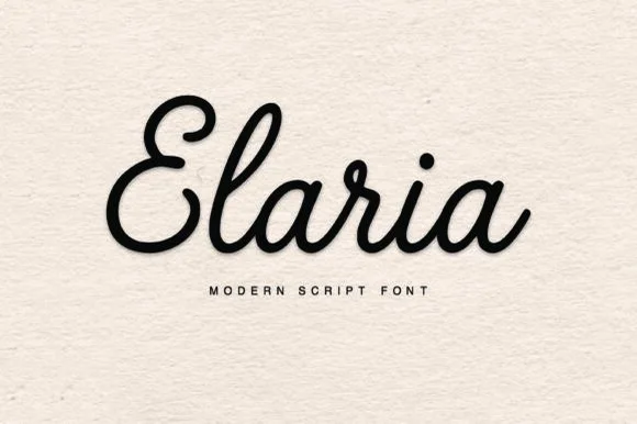
Elaria is a thick, smooth monoline-cord script with rounded pen ends and open loops—engineered to weed like a dream on Cricut vinyl and HTV!
Elaria is a plump rounded monoline-cord retro script built for vinyl: a fat even stroke with fully rounded ends, letters linked by thick cords and a small bounce that keeps the line from looking mechanical. The cords are the design and they close into one pillow when the face is reduced, and the monoline cut weeds cleanly from vinyl. It needs roughly 26 mm for the cord and the rounded end to read, and it is best as a one-colour vinyl cut, or one bright ink on white where the cord reads as a soft edge.
Small cosmetic-jar vinyl decal, embroidered crewneck & mug — Center 1 title-case name at 60–120 pt above wide-tracked geometric sans ('M O D E R N S C R I P T F O N T').
Click Weld in Cricut Design Space and weed in 5 seconds on Oracal 651, glossy HTV, or 3D puff vinyl!
 #9
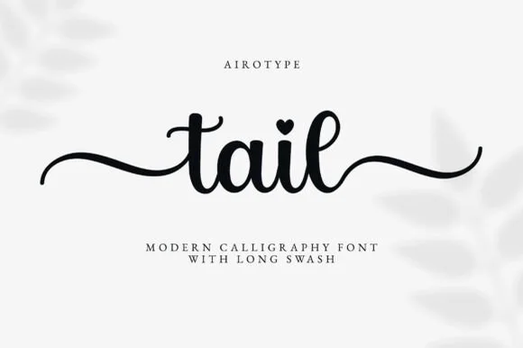
Farmhouse is a bouncing tail script in which the letters sit at different heights, the strokes swell on the downstroke and long swashes enter and leave the word, so a name reads as hand lettering on a painted board.
The f rises into a tall loop, the a closes a round bowl, the r finishes a light arm, the m keeps three even shoulders, the h climbs a tall stem and the e turns a light eye, all at a brush contrast with a bouncing baseline and swashes drawn at both ends of the word. The bounce is the character: the letters shift up and down around a nominal line, which is why the sample sets one name across a wide board with room for the swashes. Because the downstrokes are heavy, the face holds from 24 pt and prints on most stocks; the swash tails need margin on both sides. The white board, the arch of small caps above and the credit below are presentation; the black script name is the face.
A farm-shop welcome strip — Place the phrase across a wide strip and put opening hours in a plain block below the lowest f loop, with no wood texture behind the letters.
Check actual tail variants and visibility at the intended distance.
 #10
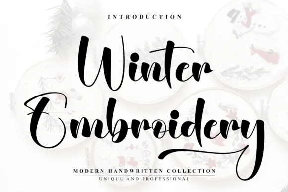
Winter Embroidery is a bouncy modern calligraphy brush script—despite its name, it features smooth solid ink strokes rather than stitch textures.
Winter Embroidery is a thick-thin bouncy modern brush script: a high-contrast stroke with a swollen thick and a hairline-thin, letters that rise and fall along the baseline and joins that loop back into the word. It is the look of a machine-embroidered name, so it suits a patch or a knit more than a leaflet. The hairlines are the finest element and they break first, on thread and in print. It needs roughly 34 mm for the thick-thin contrast to read, and it is best one colour on a soft ground where the hairline holds.
Holiday mug decal, gift sack & ornament lettering — Stack a two-word winter phrase with tight leading so the upper capital sits neatly above the wider lowercase second word.
Weld all cursive joins before vinyl cutting and keep x-height above 0.65 in so the thin upward connectors do not lift during weeding.
 #11
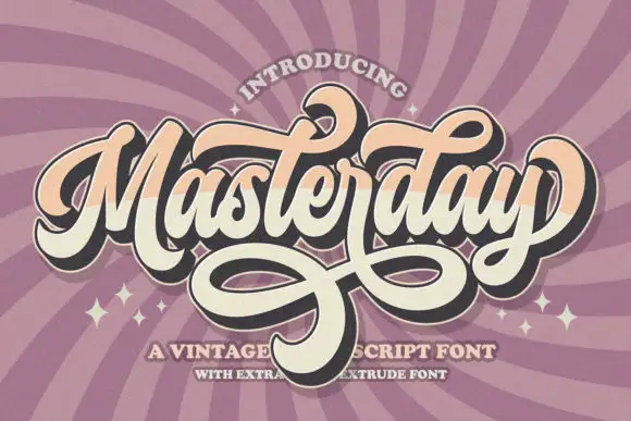
Masterday builds a dense connected title above large intertwined lower loops, where upper curls and crossing strokes demand more space than the small internal letters alone suggest and a black offset extrusion deepens the silhouette.
The body stays compact, the loops grow large, the lower strokes cross one another and the offset shadow repeats the whole word behind it. That interlacing is the character: the phrase reads as a finished badge rather than a line of type, which is why the sample keeps one title with heavy loops beneath. The extrusion belongs to the artwork, so test the plain face first, keep 26 mm between baselines and check that the crossing strokes actually exist as characters.
A retro birthday dance poster — Place the name in a generous central band. Keep a broad clear area under the loops before the date, venue and RSVP.
Verify available swashes and any extruded style in the current listing; do not copy the artwork effect as a promised feature.
 #12
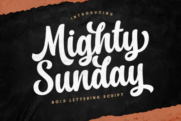
Mighty Sunday is a bold lettering script in which the capitals loop heavily, the strokes stay fat through the joins and two stacked words lock together into a single block.
The capital M opens as a heavy looped stem and the capital S of the second word repeats the gesture, and the lowercase between them keeps the same load: the i carries a solid dot, the g drops a fat loop, the h and the t carry wide shoulders and the y finishes with a curled tail. Weight never thins, joins stay as heavy as the stems and the ends curl rather than taper, which is what lets the two lines sit tightly together without losing their edges. The loops stay open at the centre so the word reads at banner size, and the tight letterfit means the stack reads as one painted panel rather than as two lines of text. The dark board, the cream ink and the small tracked caption beneath are presentation; the script is the two words.
A weekend café board — Stack the title at the top and set the actual offer details below the y tail in plain type.
Proof small counters against chalkboard-style colour choices.
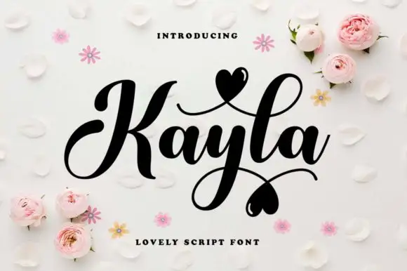 #13
Kayla is a bold cursive in which the downstrokes carry weight, the capital loops high, the connected body stays compact and the swashes finish in small hearts above and below the word, so a name reads as a warm handwritten greeting.
The K opens a tall loop, the y drops a descending loop under the centre of the word, the connectors keep one heavy weight and the swash set adds strokes that cross above and below the baseline with hearts at their ends. The heavy body is the character: it keeps a bold line legible where a fine script would thin, which is why the sample sets one word with two crossing swashes. Because the loops overlap, the face needs 20 mm between baselines from 28 pt and the joins must be welded before cutting from 1.1 inches of x-height. The pale ground, the small hearts and the caption are presentation; the dark word and its swashes are the face.
A couple's keepsake cover — Keep the phrase alone on the cover and put the date below the lowest heart in plain type.
Verify the actual heart alternates and ampersand.
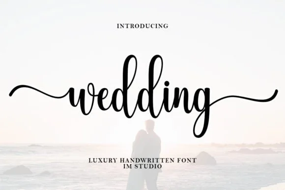 #14
Wedding (by IM Studio) is a graceful bouncy handwritten script featuring tall twin 'd-d' loops and sweeping horizontal beginning/ending tails.
Wedding is a tall-looped bouncy bridal script with long horizontal wing tails: high double ascenders, a light contrast stroke, a soft bounce and tails that run horizontally well past the word on both sides. The wings need side clearance in any centred layout and they are the first thing to be trimmed. It needs roughly 26 mm for the loop and the wing to read, and it is best in one warm ink on smooth ivory, or a foil impression above 38 pt where the wing keeps its taper.
Bridal-party hanger decal, acrylic sign & champagne flute — Set lowercase bridal titles ('wedding', 'bridesmaid', 'forever') with both PUA entry and exit tails turned on.
Always Weld all overlapping cursive joins before cutting vinyl or HTV; medium-thin strokes cut cleanly at 1.1 in+ height.
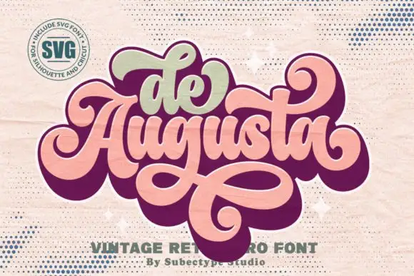 #15
De Augusta is an ornate retro script in which the letters stay heavy and connected, the entry strokes curl wide and a long loop leaves the word, passes beneath it and returns across, so a short name reads as a seventies badge.
The D opens one broad curling entry, the A lifts a heavy shoulder, the u keeps two even bowls and the g returns a low loop that travels under the whole word before it curls back over the baseline. The returning loop is the character: it frames the word from below, which is why the sample sets a two-word name in caps with clear air under the baseline. Because the loop is part of the letter, the face needs 1.25 inches of stacked height before the loop clears the descender line, and the swashes are reachable through the encoded alternates. The dark ground, the gold rules and the small caps credit are presentation; the pale script name is the face.
A decorative studio-name direction — Proof a flat name mark with wide vertical margins.
Confirm swash access and the permitted use.
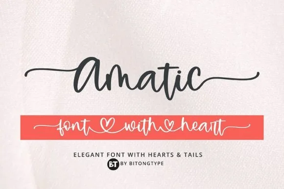 #16
Amatic is a lively handwritten monoline script equipped with sweeping horizontal side tails and playful open-heart word connectors.
Amatic is a bouncy monoline cursive with long tails and connecting hearts: an even light stroke, joined letters, a soft bounce and tails that run under the word and link to the next with a small heart at the join. The hearts and the tails are the design and both close first at small sizes, and the long tails fix a block's width. It needs roughly 26 mm for the heart and the tail to read, and it is best in one warm ink on smooth card, or a pastel plus paper where the hearts print as knockouts.
Personalized tumbler name decal & bridesmaid tote — Run a single first name with left and right tails at 4.5 inches long, or link two names through the heart swash.
Weld all cursive connectors in Design Space before cutting permanent vinyl, and keep x-height at 0.55 in or taller.
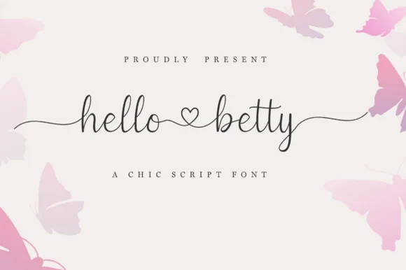 #17
Hello Betty is a fine-line bouncy script featuring symmetric beginning/ending tails and a centered heart connector swash.
Displayed on blush cream with soft butterfly corners, lowercase 'hello ♡ betty' starts with a long wave lead-in stroke on 'h', links the two words through a standalone open heart loop, and exits 'y' with an undulating tail alongside tall narrow 'l' and 'b' ascenders. PUA encoding unlocks the heart swashes and terminal tails in craft apps. The heart connector is the weakest point on a cutting mat: it is drawn as an open loop rather than a filled shape, so it weeding-fails before the tails do and it disappears entirely once the x-height drops under about 12 mm. Keep the phrase at three inches wide or above, and proof one cut before the batch.
Bridal shower champagne flute or glass can wrap — Keep the full two-word phrase within 3.25 inches wide so the left and right tails wrap gently without disappearing around the glass sides.
Because the stroke is slender, cut on premium permanent cast vinyl at slow blade speed and burnish firmly onto transfer tape before lifting.
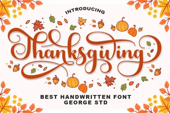 #18
Thanksgiving (by George Studio) is a medium-bold, bouncy brush calligraphy script accented by spiraled terminal curls and sweeping crossbar loops.
Thanksgiving is a warm bouncy brush calligraphy with spiralled terminal curls: a loaded brush stroke on a shallow slant, joined letters, a soft bounce and exits that spiral into a tight curl at the end of a line. The spirals are the design and they close first at small sizes, and the bounce grows the word vertically. It needs roughly 26 mm for the spiral and the brush edge to read, and it is best in one warm ink on cream and kraft, or a fine gold on a dark ground where the curls print as bright lines.
Thanksgiving host platter, pie box sticker & kitchen towel — Center 'Thanksgiving' or 'Gather & Give Thanks' at 5–8 inches wide, framing the outer spiral curls with small leaf accents.
Weld all cursive joins before cutting HTV or permanent vinyl, and peel slowly around the fine inner spiral curl tips.
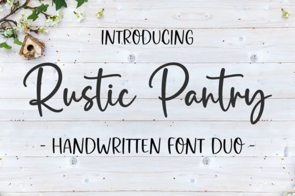 #19
Rustic Pantry is a coordinated farmhouse font duo pairing a lively bouncy cursive script with a tall, narrow hand-drawn uppercase sans.
Rustic Pantry is a duo of a bouncy farmhouse brush script and a tall skinny marker sans: the script runs a loaded stroke with small flicks, a rising baseline and joined letters, while the sans is narrow with blunt marker ends for prices and lists. The two voices share one palette, so a jar label can carry a name and a list in the same hand. The script's bounce grows the word vertically and the marker sans stacks a long line in a narrow label. The script needs roughly 22 mm and the sans 18 mm for their detail to read.
Glass pantry canister decal, spice-jar set & kitchen sign — Center the script word at 2–3.5 inches wide above a 0.5-inch tracked skinny sans descriptor line.
Weld all touching cursive connectors before cutting Oracal 651 permanent jar vinyl; medium stroke weight weeds cleanly.
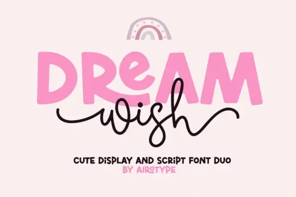 #20
Dream Wish contrasts chunky uneven capitals in a flat pink with a fine black looping script line beneath, where the script w begins in a long entry tail and the h finishes in a high sweeping exit that lifts above the cap height of the lower word.
The caps stay blocky and slightly uneven, the script stays thin and continuous, the entry and exit tails run long and the two rows overlap lightly. That overlap is the character: the script sits close enough to touch the caps, which is why the sample keeps both rows centred with nothing else competing. A rainbow arc above is cover artwork. Keep 46 pt for the caps and 20 pt for the script, leave 16 mm of clear ground between the rows and check the exit tail against your right margin.
A birthday wish-card heading — Place a heavy first word over a short script line, keeping the personal note inside the card.
Confirm members and actual tail joins.
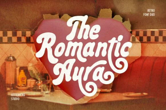 #21
Romantic Aura Duo pairs a thick, velvety 1970s swash script with a clean companion voice for nostalgic love notes and merch.
Romantic Aura Duo pairs a nineteen-seventies swashed retro script with a rounded sans: the script runs a high-contrast stroke with wide swelling swashes that lift above and below the line, while the sans is a soft rounded block for details and lists. The pair is a period look, so it works best in two warm flat inks on a light ground rather than in photographic tints. The swash thins are the finest element and they break first. The script needs roughly 32 mm and the sans 20 mm for their detail to read.
Retro Valentine sweatshirt, mug wrap & galentine card — Stack 2 to 3 centered words tightly inside a heart or arch silhouette so rising ascenders nest into the gaps of the line above.
Weld all overlapping script letters before cutting HTV, and keep total lockup width at 3.5 in+ so tight inner 'e' and 'a' counters weed cleanly.
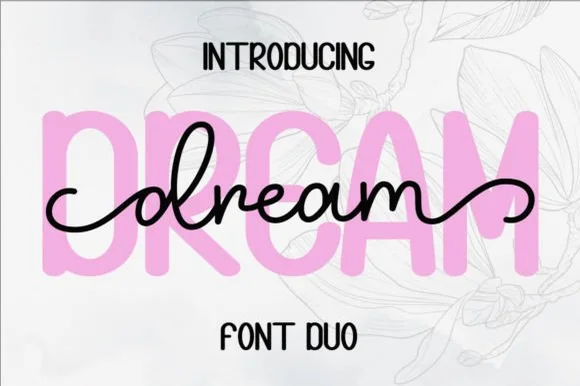 #22
Dream Duo combines a plump, soft-cornered uppercase sans-serif with a fluid monoline script that threads cleanly across wide titles.
Dream Duo pairs a chunky pastel rounded sans with a smooth monoline cursive: the sans is a fat even-width block with fully rounded corners and tight spacing for headlines, while the cursive is a soft even stroke with open loops and a gentle slant. The pair is built for a soft palette, so it loses its character when printed in a single harsh black. The monoline hairline is the finest element and it breaks first. The sans needs roughly 26 mm and the cursive 28 mm for their detail to read.
Nursery wall name sign & sweet-sixteen acrylic backdrop — Scale the background sans to 3.5 inches tall in soft pastel and center the dark monoline script across the middle 60% height.
Weld all cursive joins before cutting vinyl, and use Cricut's Slice or a 0.07 in offset knockout if avoiding two-layer vinyl overlap.
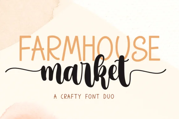 #23
Farmhouse Market teams a tall, organic uppercase sans with a bold, bouncy brush script finished by sweeping side tails.
Farmhouse Market pairs a condensed hand-drawn sans with a thick brush-pen script: the sans is a narrow uneven block with a wobbling stem for signs and price cards, while the script is a heavy brush stroke with dry ends and a visible pen turn at each join. The pair is built for a market stall, so it wants kraft paper and one dark ink rather than a coated ground. The dry brush ends are the finest element and they silt first. The sans needs roughly 22 mm and the script 30 mm for their detail to read.
Farmers-market canvas tote & produce crate stencil — Span the uppercase sans across the top width of the script's core letters, letting the script's left and right tails extend 1 inch wider on each side.
Weld all brush script letters into a single compound path before cutting HTV, and double-check the small upper loop inside 'e' and 'k'.
 #24
Tropical Sunlight is a duo of a heavy retro script with broad loops and a rounded block sans, shown stacked so the script carries the name and the sans shouts the second line.
The script half is a fat connected hand whose capitals open into wide loops, whose joins carry the same weight as the stems and whose ends curl rather than taper, giving the word a painted-sign feel at any size above 30 pt. The sans half is a rounded block with no contrast, short caps and wide letterfit, and in the sample it is set larger than the script so the two lines balance as a single badge. A smaller italic line beneath shows how the pair handles a third register. The script's loops are what let it hold a wide measure without tracking, and the sans supplies the shout. The cream ground, the navy and orange inks, the small beach drawing and the credits are presentation; the duo is the lettering.
A beach-day event heading — Place a short script line above one block title and move dates to a plain strip.
Check the top loop clears the preceding line and verify the two styles.
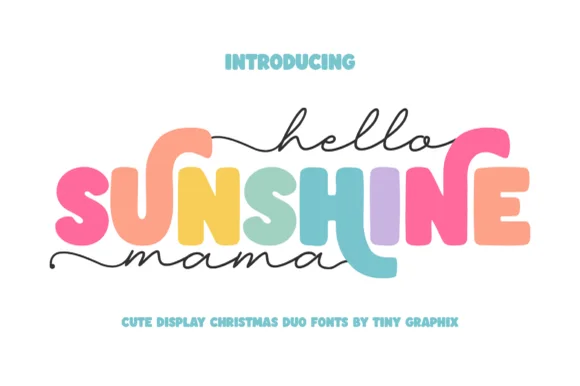 #25
Hello Sunshine Mama pairs chunky rounded caps that can each take a different colour with a fine monoline script that runs above and below the caps in long flat strokes.
The cap half is heavy and soft: the S swells through two fat curves, the U holds a deep bowl, the N keeps one thick diagonal and the E carries three even arms, all rounded and even in weight. Because each letter is a separate shape of equal weight, the sample fills them in different colours, which is how the pair is meant to be used on children's pieces. The script half is a light monoline with flat entry and exit strokes that extend well past the caps on both sides, and that sweep is what holds the composition together. Contrast comes from weight, not from style, so the two layers never fight. The white ground, the pink script, the pastel fills and the two caption lines are presentation; the duo is the lettering.
Mother's Day sweatshirt, tote or tumbler — Set the middle keyword in rainbow/earth-tone caps and sandwich with lowercase tailed script.
Thicken the thin monoline script slightly (0.02" offset) if cutting small adhesive vinyl decals.
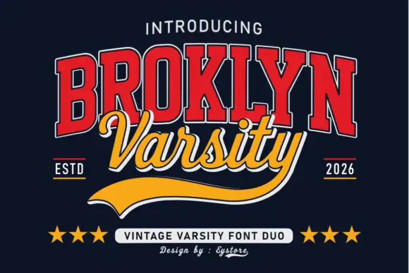 #26
Broklyn Varsity pairs tall collegiate slab capitals drawn with an inline outline against a sweeping script that sits between them and drops a heavy sport tail below the baseline.
The caps half is nested: a red face with a white inline and a dark edge, every letter narrow and tall, the B and the R carrying small bowls high on long stems and the Y ending in a sharp fork. That nesting is what gives the word its vintage athletic look at a distance. The script half is a bold slanted hand with rounded tails, set across the middle of the caps so the two halves overlap, and it finishes with a broad sport tail that sweeps out to the right beneath both words. The pairing works because the caps supply height and the script supplies motion. The navy ground, the stars, the ESTD and year markers and the small credits are presentation; the duo is the two words.
A varsity-club event header — Keep the block title above the script line and leave the underline a clear bottom margin.
Verify both supplied styles and whether the long y underline is accessible.
Practical buyer checklist
Key cutting, printing and pairing answers before choosing a thick scripts for tumblers & decals typeface.
Most designs land between 3 and 4 inches tall with the word spanning 6 to 8 inches of the wrap. Anything taller than 4.5 inches runs into the taper near the lid and the lettering distorts when applied.
Warping compresses the middle of the design and pushes letters together. Add 2 to 4 percent tracking to the script before warping, or reduce the word length, so the counters survive the curve.
Yes, and it is often the better choice: the rough coating hides small weeding imperfections that would show on glossy stainless. Clean with alcohol, apply with low-tack tape, and press the edges down with a felt squeegee.
Not necessarily. Several of these scripts ship swashes and alternates in the same file, usually mapped to private-use keys. Check the readme, then use Character Map to copy the swash rather than stretching an existing letter.
Keep exploring
Explore adjacent maker roundups or check our practical pre-production checklists.
38 curated fonts · Previews & pairings
25 curated fonts · Previews & pairings
31 curated fonts · Previews & pairings
21 curated fonts · Previews & pairings
Guides: Invitation font checklist · Vinyl & cutting checklist · How to pair script & sans fonts
Allow optional Google Analytics to measure visits and catalogue actions. Your search words and notes are not included. Privacy & storage