High-Contrast Display Serif

Clagio + The Avenue Editorial
Pairs sculptural editorial warmth with Clagio's clean modern geometry.
Inspect The Avenue Editorial specimenDisclosure: MakerFileHub may earn a commission from qualifying purchases via paid links on this page. How our links work.
Fine contrasting lowercase with a double-storey g and round open c
Clagio shows black lowercase lettering on a pale softly folded background, where a tall plain l and i stand beside broad round bowls, the a has a thin rising join, the g drops into a wide double-storey lower loop and the c ends are slightly pointed while the o stays almost circular.
Paid link
Get this fontProject & layout blueprintsAt-a-glance maker compatibility
Sturdy stroke walls and open counters weed cleanly on adhesive vinyl, HTV apparel film, and cut cardstock.
Visual anatomy & craft review
The uprights stay tall and plain, the bowls round out, the joins thin and one descender opens into a wide lower loop. That double-storey g is the character: a light lowercase set gains one complex form, which is why the sample keeps the surrounding letters simple. Thin-to-thick transitions do the work rather than ornament, so keep 26 pt on coated stock, check the g and c at your size and confirm the italic or bold you may need for a hierarchy.
Fine contrasting lowercase with a double-storey g and round open c
Two-font hierarchy recipes
Tested contrast partners — pairing Clagio with grounded secondary typography.
Clagio + The Avenue Editorial
Pairs sculptural editorial warmth with Clagio's clean modern geometry.
Inspect The Avenue Editorial specimen
Clagio + Stylish
Introduces organic movement on pull-quotes, signatures and gift tags.
Inspect Stylish specimenPractical applications
Concrete hierarchy, scale and production guidance tailored to Clagio’s stroke geometry.
The fine lowercase gives a shop a literary tone, and the round bowls hold a two-word name at 24 pt on a card, where the double-storey g reads as a printed detail.
Hierarchy & layout recipe
Print an 85 by 55 mm card: set the wordmark at 24 pt on one row, keep 16 mm of clear ground beneath for the g loop, and keep the paper coated so the thin joins stay clean.
Pre-production check
The lower loop fills in on uncoated stock; check a printed sample and keep the mark at 22 pt or above.
The light contrast sets a graceful standfirst, and the tall l and i hold a short sentence at 22 pt under a headline, where the pointed c terminals keep it crisp.
Hierarchy & layout recipe
Print a 210 mm page: set the standfirst at 22 pt over two lines, keep 12 mm of clear ground beneath before the body at 10 pt, and keep the measure narrow so the light strokes stay comfortable.
Pre-production check
Fine joins at 18 pt thin out on newsprint; check the proof and choose a smoother stock, ideally a 90 gsm coated sheet.
The quiet lowercase suits a menu, and the round bowls hold a heading at 20 pt above the courses, where the wide g loop sits clear of the first dish.
Hierarchy & layout recipe
Print a 105 by 210 mm menu: set the heading at 20 pt on one row, keep 18 mm of clear ground beneath for the g loop, and keep the courses at 10 pt in the same face at a lighter weight.
Pre-production check
A second weight may not exist in the file; check the styles before planning the hierarchy.
Technical & licence verification
Confirm included OTF/TTF/WOFF formats, full glyph tables and licence coverage on the live store page before batch production.
Closest visual alternatives
Matched across letterform anatomy, stroke behaviour and craft applications.
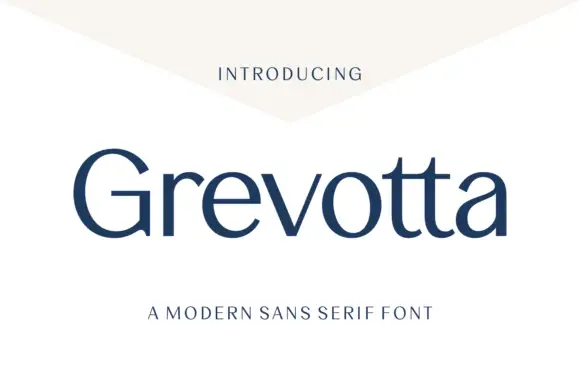
Restrained mixed case with contrasting bowls and adjacent curved t feet
Grevotta shows dark blue title-case lettering on white beneath a pale angled header shape, where broad curved sides meet finer joins and a large open G sits beside a rounded o and a sharply angled v.
Ideas for this font
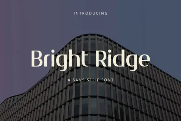
Narrow contrasting mixed case with tall ascenders and a low double-storey g
Bright Ridge sets a cream mixed-case line over a dusk photo of a curved tower, its letterforms wide with small wedge serifs, a high x-height and strokes that stay almost even from stem to join.
Ideas for this font
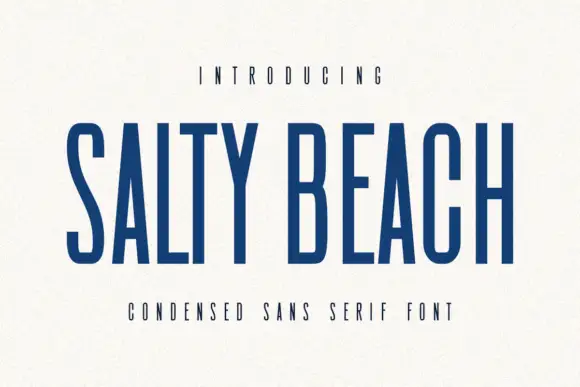
Tall narrow sans
Salty Beach is a tall narrow sans in navy on an off-white sheet: capitals with flat endings, compressed rounded bowls, a low middle bar and an even stroke, with tracked caps above and beneath that name the style.
Ideas for this font
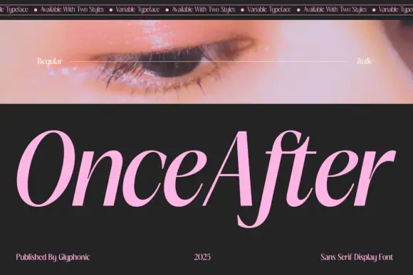
Slanted high contrast display
Once After is a slanted high contrast display in pink on black: mixed case with tall ascenders, a deep f descender, hairline joins and a forward lean, set as one word below a strip of patterned banner text and beside a photograph of an eye.
Ideas for this font
Same independent foundry
Allow optional Google Analytics to measure visits and catalogue actions. Your search words and notes are not included. Privacy & storage