Neutral Sans Workhorse

Auri + Kohilo
Lets Auri own the focal silhouette while handling secondary copy, sizing and subheads cleanly.
Inspect Kohilo specimenDisclosure: MakerFileHub may earn a commission from qualifying purchases via paid links on this page. How our links work.
Filigree-swashed Victorian gothic capitals
Auri crowns bold Victorian gothic capitals with mid-stem spurs and scrolling filigree tendrils, built for dark-fantasy covers, emblems and luxury labels, where broad main stems anchor delicate curling side flourishes and turn three to six letter titles or single initials into ornate crests.
Paid link
Get this fontProject & layout blueprintsAt-a-glance maker compatibility
Sturdy stroke walls and open counters weed cleanly on adhesive vinyl, HTV apparel film, and cut cardstock.
Visual anatomy & craft review
The stems stay broad, the spurs break the waist, the tendrils curl outward and the weight splits between a heavy body and a fine ornament. That split is the character: the word reads as an engraved crest rather than a dense gothic text face, which is why the sample works at title length only. The tendrils are the fragile part, so keep 38 pt as the floor, print on smooth stock, check whether the flourishes are separate characters and count how far they extend past the letters.
Regal · Ornamented · Cathedral
Two-font hierarchy recipes
Tested contrast partners — pairing Auri with grounded secondary typography.
Auri + Kohilo
Lets Auri own the focal silhouette while handling secondary copy, sizing and subheads cleanly.
Inspect Kohilo specimen
Auri + Amor Hadena
Grounds bold display lettering with classic typographic authority on posters, badges and apparel.
Inspect Amor Hadena specimenPractical applications
Concrete hierarchy, scale and production guidance tailored to Auri’s stroke geometry.
The filigree gothic sets a fantasy title, and the broad stems hold a three-word line at 50 pt on a jacket, where the tendrils stay separate from the following letter.
Hierarchy & layout recipe
Print a 135 by 216 mm jacket: set the title at 50 pt on one row, keep 24 mm of clear ground beneath for the descenders, and keep the artwork above the title so the tendrils are not lost in a busy sky.
Pre-production check
Tendrils touching the letter beside them read as damage; check the tracking and add 2 percent space.
The Victorian ornament gives a box presence, and the heavy stems hold a short brand at 22 pt on a 60 by 45 mm label, where the fine curls stay crisp in one metallic ink.
Hierarchy & layout recipe
Print a 60 by 45 mm label: set the brand at 22 pt on one row, keep 10 mm of clear ground beneath before the cocoa note at 6 pt, and keep the filigree inside a flat panel rather than over embossing.
Pre-production check
Metallic ink on an embossed panel breaks the curls; check a proof and keep the ornament flat.
The ornate capitals suit a themed ceremony, and a single initial fills a crest at 40 mm on a printed card, where the filigree supplies the whole decoration.
Hierarchy & layout recipe
Print a 105 by 148 mm invitation: set the initial at 40 mm inside a 60 mm panel, keep 18 mm of clear ground beneath before the names at 16 pt, and keep the tendrils 10 mm clear of the panel edge.
Pre-production check
Fine curls touching a border look clipped; check the artwork and keep 10 mm of white around the crest.
Technical & licence verification
Confirm included OTF/TTF/WOFF formats, full glyph tables and licence coverage on the live store page before batch production.
Closest visual alternatives
Matched across letterform anatomy, stroke behaviour and craft applications.
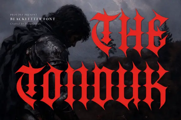
Concave-sided gothic display
The Tonduk is a solid red gothic display over a dark painted landscape: capitals with concave sides, sharp flared ends, narrow bowls and open counters, set in two lines of different sizes with a small presenting note and a credit at the upper left.
Ideas for this font
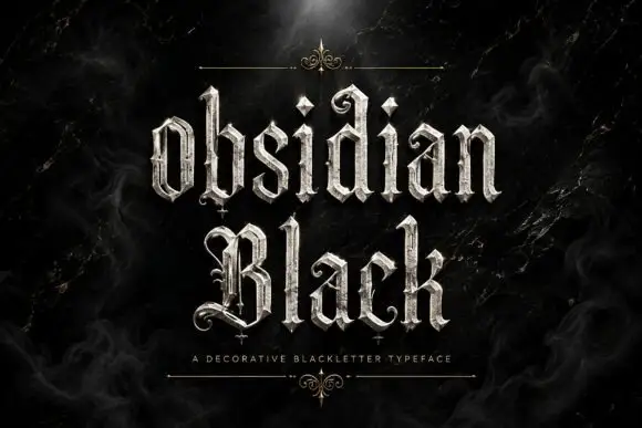
Slender outlined blackletter
Obsidian Black is a slender outlined blackletter in silver on a black marble ground: mixed case with small spirals at the terminals, long fine tips, doubled edges and a scaled texture on the fill, set in two lines with a small tracked line beneath between two hairline rules and drawn fleurons.
Ideas for this font
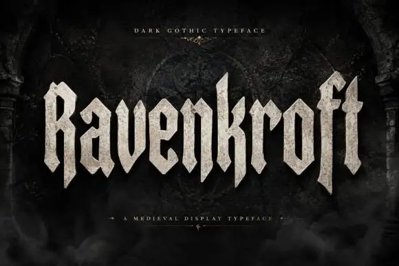
Faceted blackletter display
Ravenkroft is a faceted blackletter in bone on a dark stone ground: tall capitals with deep R and f descenders, sharp angular spurs, a stone texture on the fill and a slight forward lean, with a small line above and a plain line beneath that name the style.
Ideas for this font
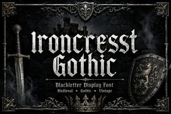
Dense angular blackletter with forked tops and textured fill
Ironcrest Gothic is a medieval display blackletter with a strong vertical stress, diamond feet and a slightly worn fill, framed by heraldic pieces: a shield, a crown, a sword and a lion.
Ideas for this font
Same independent foundry
Allow optional Google Analytics to measure visits and catalogue actions. Your search words and notes are not included. Privacy & storage