 #1 · Best Overall
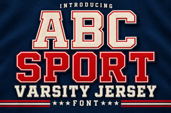
Abc Sport
Layered varsity jersey capitals with fill, keyline and offset shadow
Get fontPaid link
Read review ↓Disclosure: MakerFileHub may earn a commission from qualifying purchases via paid links on this page. How our links work.
Collegiate blocks, jersey slabs & stadium caps
Collegiate lettering is a construction, not a mood: heavy slab serifs, a clipped counter in the A, and an inline or outline weight for the second colour. Abc Sport and Jersey Sport carry the double-outline treatment, Baseball Custom and Varsity Chicago deliver the solid heavy look, and Deluxe Jersey, Sporty Block and Legend Varsity fill out a range that can cover a whole athletic department.
Quick verdict
Abc Sport is the most complete inline set for jersey work, Baseball Custom is the strongest solid for a front-of-shirt design, and Legend Varsity handles tall condensed numbers. Deluxe Jersey covers the bordered variant.
Quick answer
Short on time? Start with our three highest-rated varsity & athletic standouts before scrolling the full breakdown.
#1 · Best OverallLayered varsity jersey capitals with fill, keyline and offset shadow
 #2 · Runner-Up Pick
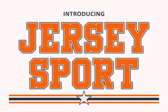
Outlined collegiate sports slab with a flat fill and a thin keyline
 #3 · Editor's Choice
We kept 25 of 350 candidates with genuine collegiate construction: slab serifs, clipped A and V counters, and inline treatments that align to the stem. Judged on numeral legibility, since jerseys depend more on numbers than on letters.
Side-by-side summary
Compare specimens, OpenType/PUA traits and primary project roles side by side.
| Rank & Font | Style & File Specs | Best Project Fit | Store Listing |
|---|---|---|---|
| DisplayAthletic | Varsity team shirt, gym banner or sports award | Get fontPaid link | |
| Slab SerifClassic | Booster club decal, senior jersey tee or water bottle | Get fontPaid link | |
| DisplayHeavy | Little League uniform back, bat-bag tag or team tee | Get fontPaid link | |
| DisplayChunky | Vintage baseball tee, pennant or sports bar sign | Get fontPaid link | |
| Slab SerifAthletic | Senior-night jersey chest, spirit hoodie & megaphone decal | Get fontPaid link |
#1 · Best OverallABC Sport is a layered varsity capital alphabet in which each letter carries a fill, a narrow keyline and an offset shadow, so a name reads as the appliqué on a college jersey.
The A pinches a pointed apex with a flat bar, the B closes two slab bowls, the C cuts an octagonal crescent, the S holds a stepped spine and the P turns a square bowl, all at a heavy slab weight with clipped corners and a second outline offset down and right. The three layers are the character: the sample builds each word from fill, keyline and shadow so one name carries a team colour without any artwork. Because the layers are separate, each one has to be a clean vector, and the shadow must be offset consistently or the word looks broken. The navy fabric, the stars, the rules and the letter-spaced lines are presentation; the layered jersey words are the face.
Varsity team shirt, gym banner or sports award — Set in school colours on dark athletic mesh or fleece backgrounds.
Cut at 2+ inches height on HTV so the thin inline border weeds cleanly.
#2 · Runner-Up PickJersey Sport is a collegiate slab alphabet drawn as an outline with a flat fill inside it, so a word reads as a printed athletic front where the keyline does the work and the fill carries the colour.
The J carries a full hook, the E holds three even arms, the R keeps a squared bowl and a straight leg and the Y forks high, all at a heavy weight with unbracketed slabs and a keyline that follows the contour at a even distance. That construction is the practical part: the keyline can be printed as one screen and the fill as another, which is how a two-colour athletic print is built at 60 mm. Because the letters are solid and equally weighted, two words stack with minimal leading. The white ground, the orange and navy inks, the rules and the star are presentation; the slab face is the two words.
Booster club decal, senior jersey tee or water bottle — Pair arched team names with bold athletic numerals below.
Verify outline channel thickness at your target HTV or sticker size.
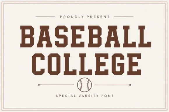
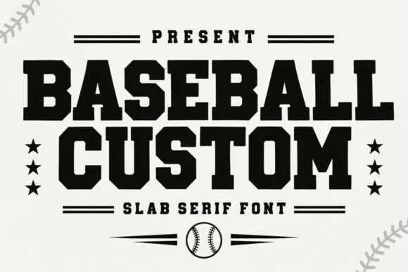
#3 · Editor's ChoiceBaseball Custom is a heavy condensed slab alphabet in which the stems stay wide, the serifs turn square and the fit runs tight, so a two-word title reads as the lettering on a team jacket.
The B stacks two square bowls, the A carries a wide bar, the S steps a heavy spine, the E sets three thick arms and the M keeps four stout stems, all at a baseball weight with square serifs and almost no contrast. The condensation with full weight is the character: the face fills a narrow band without looking squeezed, which is why the sample sets two stacked words with stars either side. Because the counters stay open, the face reads from 26 pt and cuts cleanly in vinyl or felt. The cream ground, the stars, the ball and the ball-stitch corners are presentation; the black display words are the face.
Little League uniform back, bat-bag tag or team tee — Arch slightly for chest logos or run straight across jersey shoulders.
Top pick for Cricut/Silhouette HTV and laser-cut hat patches.
 #4 · Top Maker Utility
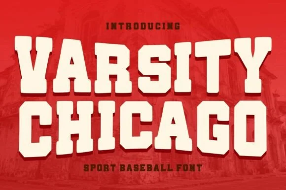
Varsity Chicago is a chunky baseball capital alphabet in which the stems are wide, the corners step in and out, and the fit is tight, so a two-word title reads as a stitched team name on a jersey.
The V cuts two thick diagonals into a flat base, the A holds a low bar, the R turns a stepped leg, the S notches its spine, the I carries wide serifs and the T spreads a heavy arm, all at a single heavy weight with stepped corners and flat terminals. The stepped corner is the character: it looks like a cut felt letter rather than a drawn one, which is why the sample sets two stacked words edge to edge. Because the shapes are solid and open, the face holds from 30 pt upward and cuts well in vinyl or felt; it needs tracking rather than kerning. The red ground, the faded brick photograph and the small lines above and below are presentation; the cream varsity words are the face.
Vintage baseball tee, pennant or sports bar sign — Set stacked all-caps in cream on crimson, navy or forest green shirts.
Smooth solid vector edges cut cleanly on HTV, vinyl and felt pennants.
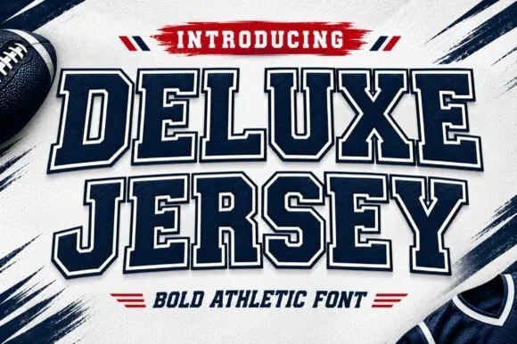 #5 · Standout Silhouette
Deluxe Jersey is a classic double-outlined collegiate varsity slab serif built for athletic chests, senior jerseys, and team banners.
Deluxe Jersey is a collegiate varsity block slab with an inline border: extended block letters with thick unbracketed slabs, a thin keyline running just inside the outer edge and a small notch on the terminals that reads as a stitched jersey patch. The inline border doubles the footprint and closes first when the face is reduced. It needs roughly 32 mm for the border and the notch to read, and it is best in two flat inks on jersey, or one thread colour on a patch where the border becomes an inner stitch line.
Senior-night jersey chest, spirit hoodie & megaphone decal — Arch the school or team name slightly across a 10.5-inch chest width above large centered player numerals.
Because the built-in outer outline creates a thin channel around every letter, scale HTV cuts to at least 1.5 inches tall or use DTF/sublimation for tiny badges.
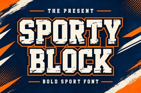 #6
Sporty Block is a classic heavy collegiate athletic slab serif built for 2- and 3-color layered jersey outlines, banners, and spirit wear.
Sporty Block is a heavy chamfered varsity block slab: thick squared stems with all four corners cut at forty-five degrees, unbracketed slabs and a nearly solid weight that leaves small counters. The chamfer is the whole character and it disappears below the size where the cut reads, and the near-solid weight closes the counters earlier still. It needs roughly 30 mm for the chamfer and the counter to read, and it is best in one dark ink on white or heather grey, or a two-colour build where the chamfer carries a highlight.
High-school homecoming hoodie, cheer megaphone & banner — Stack 2 uppercase words at 68–130 pt and add a 0.06 in dark inner stroke + 0.12 in team-color outer stroke.
100% straight-edged polygons cut and weed in seconds on athletic stretch HTV, puff vinyl, and Oracal 651 down to 0.6 in!
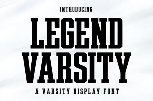 #7
Legend Varsity is a tall, commanding solid-fill collegiate slab serif with crisp chamfered athletic bowls and fast single-layer vinyl weeding.
Legend Varsity is a tall solid condensed varsity slab: narrow block letters with heavy unbracketed slabs, a mid-height crossbar on the A and a uniform weight that fills the stem completely. The condensation packs a long team name into one line across a shirt, and the slabs give the face enough body for embroidery. It needs roughly 26 mm for the slabs to read as separate, and it is best in one dark ink on white and heather grey, or a two-colour build where the slab edge carries a highlight.
Senior night banner, athletic bottle, gym wall & hoodie — Stack 2 tall uppercase lines centered at 72–145 pt in black, navy, or crimson.
Razor-straight geometric edges cut cleanly on stretch HTV, tackle twill, Oracal 651, and Mylar stencils down to 0.6 inches!
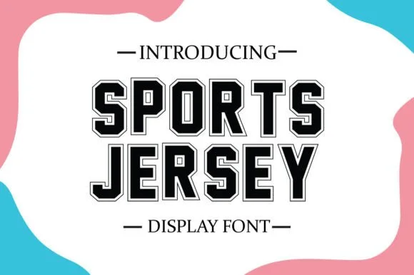 #8
Sports Jersey features a built-in crisp hairline outer contour around bold octagonal varsity slabs—giving you instant 2-layer jersey framing in one keystroke!
Sports Jersey is a collegiate jersey slab serif with a built-in inline outline: heavy extended blocks whose stems carry a groove inside a keyline, thick unbracketed slabs and a small inward notch on the terminals that reads as a stitched jersey patch. The inline is the design and it fills when the face is reversed or set small. It needs roughly 32 mm for the inline and the keyline to read, and it is best in two flat inks on jersey, or one thread colour where the inline becomes a stitch line.
Team roster poster, award certificate, mug & jersey tee — Stack 2 centered uppercase rows at 64–120 pt with +4 tracking so outer hairline borders stay crisp and separate.
Prints and presses razor-sharp via sublimation, DTF, and Print-Then-Cut; if blade-cutting HTV, size above 1.75 in for the thin outer hairline!
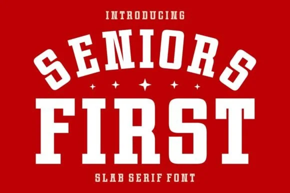 #9
Seniors First is a solid, single-layer collegiate block slab serif with stout rectangular feet, chamfered bowls, and punchy athletic balance.
Seniors First is a chunky varsity block athletic slab serif: extended block letters with thick unbracketed slabs, a small notch cut into the terminals and an even weight that reads as a stadium jersey number. The wide blocks fill a banner and the notch closes when the face is reduced. It needs roughly 30 mm for the notch and the slab to read, and it is best in two flat inks on jersey and felt, or one ink on banner mesh at gate distance.
Class-of-2027 hoodie, senior yard banner & car-window decal — Arch the top word at a 20% curve over small four-point stars and anchor the second word straight underneath.
Cuts cleanly at almost any craft scale from 0.5-inch cap badges up to 11-inch jersey backs.
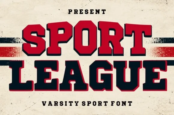 #10
Sport League is a powerhouse collegiate varsity slab serif featuring ultra-chunky octagonal letters framed in a crisp offset athletic border.
A two-tone collegiate varsity block shown on weathered cream stadium banner stock with red and black stripes: stacked words pair crimson-filled and navy-filled octagonal capitals inside clean dark or red outer outlines, so the line reads as a stadium banner rather than a decorated slab. The outline is even and follows the block exactly, which is what makes the two-colour fill sit cleanly, and the octagonal corners give the face its college proportions. The banner and the stripes are staging. Because the cores are solid and the borders are straight, the face holds at a distance and cuts cleanly.
Championship banner, football/baseball hoodie & locker sign — Color row one varsity crimson and row two deep navy at 64–120 pt flanked by horizontal jersey stripes.
Heavy solid letter cores + clean straight borders cut cleanly on 1.4 in+ athletic HTV and print boldly via DTF.
 #11
Chicago Titans pushes slab weight to its limit: thick stems, counters narrowed to slots, wide flat feet and almost no space left between the letters of a word.
Stems are extremely wide relative to the height, so the counters in a, e and g narrow to slots, while the wide T feet and flat slab terminals give the line a hard rectangular silhouette. Spacing is deliberately tight, with letters nearly touching, which is what produces the varsity-patch density rather than any added outline or stroke. Mixed case is used: the first word sits shorter and heavier, the second stretches wider across the rule beneath it. The two hairline rules and the tracked subtitle in the preview are layout elements rather than part of the alphabet. At small sizes the tightness becomes the limiting factor long before the weight does.
A student-team magazine cover — Keep the main title on two lines above a plain issue-date row with wide outer margins.
Check the g and a counters do not fill in on print.
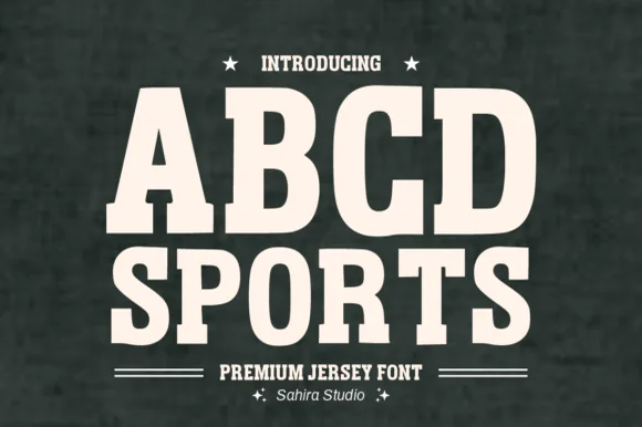 #12
Abcd Sports is a clean, softly rounded athletic slab serif channeling 1980s Russell/Champion reverse-weave sweatshirt lettering.
Abcd Sports is a softly rounded athletic slab built on the 1980s reverse-weave sweatshirt lettering that university bookstores printed for decades, with heavy block capitals, blunt slabs and outer corners rounded so the letters read as felt rather than as a hard sports block. The weight is uniform and the counters are large, which lets the face hold at 12 mm on a cap and at 200 mm on a stadium banner. It is an all-caps face, pairs with a plain sans for names and numbers, and looks wrong in sentence case.
Vintage athletic-club crewneck, pickleball tote & cap — Stack 2 centered uppercase lines at 64–120 pt (or arch +15% across a sweatshirt chest).
Rounded corners resist peeling in the wash—cuts and weeds fast on flock HTV, puff HTV, and twill down to 0.6 in!
 #13
Varsity Spirit is a layered varsity capital alphabet in which each letter carries an inline stroke, a keyline and a set of matching numerals, so a team name reads as the appliqué on a college jacket.
The V cuts two thick diagonals with an inline running between them, the S holds a stepped spine, the A pinches a flat apex, the R turns a notched leg and the numerals carry the same inline and keyline, all at a heavy slab weight with square serifs. The inline is the character: it divides each stroke into two bands, which is why the sample sets a stacked word above a full numeral line. Because the inline is narrow, the face needs 40 pt before it stays open, and each layer has to be a clean vector for a vinyl or embroidery cut. The white timber ground, the format strip and the small badge are presentation; the black and white layered words are the face.
A school-spirit event poster — Put a broad title over a separate plain schedule and keep the inner lines away from background patterns.
Check every required numeral and letter rather than assuming the sample alphabet is complete.
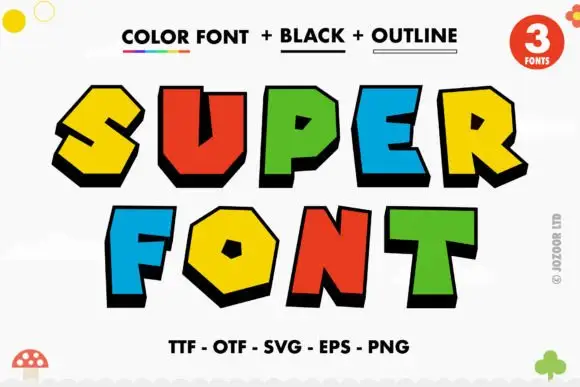 #14
Super is a comic display face of fat angular caps, supplied three ways: a colour version with hard offset shadows, a solid black version and an outline version, all with sharp bevels and pointed corners.
SUPER over FONT fills the card, and each letter is a chunky angular shape with a bevel cut on one corner and a hard black shadow stepped to the lower left. The colours rotate through yellow, red, green and blue, and the shadow is identical on every letter, which is what holds a multi-coloured word together. A caption at the top names the three versions and a line at the foot lists the formats, while small doodles sit at the corners. The three-version construction is the practical part: the colour version is for posters and covers, the black version for one-colour print and cutting, and the outline version for colouring pages and overlays, so one purchase covers a poster, a shirt and a children's activity sheet.
A block-colour party heading — Set BIG above DAY on white, keeping the name and date in a plain black strip underneath.
Check colour and shadow rendering in the intended software, without implying licensed game branding.
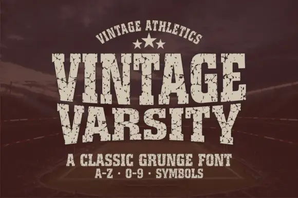 #15
Vintage Varsity is a condensed athletic capital alphabet with heavy flat slabs and a cracked wear texture, so a short word reads as a printed team jersey from decades ago.
The letters are narrow and tall: the V closes to a sharp point, the A keeps a low bar, the R carries a straight leg and the S reverses through flat terminals, with slabs at every stem and no bracketing. The wear is drawn into the letterforms rather than applied as an effect: cracks run through the slabs and a few counters show chipped edges, which is what gives the face its printed-jersey look. Weight is heavy and uniform, the fit is tight enough that a long team name holds a single line, and because the texture is coarse the face needs a decent size to stay legible. The dark ground, the cream ink, the star rule and the two small caption lines are presentation; the typeface is the two words.
A reunion match poster — Keep dates and scores in a clean companion face.
Inspect cracks in the narrowest strokes.
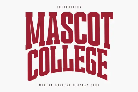 #16
Mascot College is a very condensed collegiate slab in which the stems run tall, the slabs are flat and thin and the counters close to slits, so a long name fits one line on a narrow format.
The M splays from a narrow vertex, the A carries a low crossbar, the S reverses through tight curves and the O closes an oval counter, all at a heavy weight with thinner slabs than a standard collegiate face. That thinness is the character: the feet read as cuts rather than blocks, which keeps the face from filling the counters at 40 mm on a garment. The extreme condensation is what makes it practical for long team names on a jersey, where a wider face would wrap. Because the counters are narrow, the practical floor is 30 pt on print. The white ground, the dark red ink, the small caption are presentation; the slab face is the two words.
A college society banner — Use a straight title above a plain meeting-time panel instead of forcing the cover arch.
Proof the narrow O and A counters from the expected viewing distance.
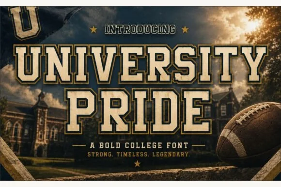 #17
University Pride is a commanding collegiate varsity slab serif featuring chamfered block stems framed by a crisp outer contour line.
University Pride is a double-outlined collegiate stadium varsity slab: extended block letters with a hard keyline inside a second keyline, thick unbracketed slabs and a small inward notch on the terminals that reads as a stadium banner. The double outline doubles the footprint and the inner line closes first. It needs roughly 32 mm for the second keyline and the notch to read, and it is best in two flat inks on jersey and banner mesh, or three inks where paper forms the second line.
Alumni sweatshirt, homecoming banner & varsity jacket — Set school or department names across a 10-inch chest arch above flanked star dividers and graduation years.
Because every letter carries a thin outer border gap, cut HTV at 1.4 inches tall or larger, or use DTF/screen print for smaller crest text.
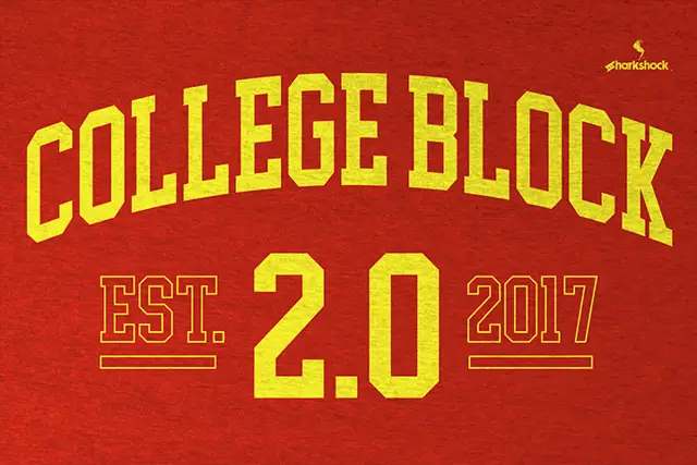 #18
College Block 2.0 displays yellow block lettering on textured red, where the main title curves upward across a shallow arc and EST. and 2017 appear as thin hollow outlines beside a much larger solid 2.0 with clipped corners.
The blocks stay square and heavy, the counters narrow to rectangles, the secondary words thin into outlines and the main row follows an arc. That three-level treatment is the character: the sample builds a date lockup from one face by changing scale and outline, which is why the texture sits in the ground rather than the letters. The arch is a composition choice, not a font feature. Keep 44 pt, build the arc in your layout tool and check the thin outlines at the size you plan.
An alumni programme cover — Arc COLLEGE gently over a straight REUNION line on a red programme cover; put the class year below with generous space.
Check the exact year and whether hollow styles are supplied or must be drawn separately.
 #19
Baseball Athlete Jersey is a broad slab capital alphabet with wedge serifs, angular bowls and a tight fit, drawn so a word reads as a sewn athletic letter rather than as a sports headline.
The B closes two squared lobes with wedge feet, the A carries a low crossbar and splayed stems, the S reverses through flat curves and the Y forks with an angular junction, all at a heavy weight with unbracketed serifs that widen at the base. The angularity is the character: corners are cut rather than rounded, which is what lets the face read as a stitched applique at 60 mm and as a headline at 20 pt. The fit is tight, so a nine-letter word holds one line across a jersey front, and the counters stay open enough for a screen print. The dim stadium photograph, the cream and red inks, the ball and the small type blocks are presentation; the display face is the three words.
A community baseball fundraiser poster — Stack two words above a plain fixture-and-location block with no texture behind the counters.
Proof the A opening and B bowls at the poster viewing distance.
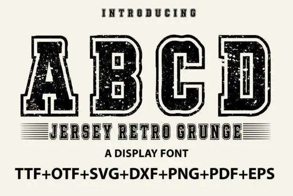 #20
Jersey Retro Grunge shows large collegiate A, B, C and D forms with broad slabs and clipped corners, where a pale inset outline separates the dark letter bodies from an outer black edge and small scratches and holes roughen both the fill and the contour.
The slabs stay broad, the corners clip, the chain of edge, pale line and body repeats on every letter and the damage sits in both areas. That three-part construction is the character: the letters read as a layered jersey print rather than a single-colour outline, which is why the sample shows only four capitals. The footer lists many file formats, which tells you nothing about the quality of each. Keep 44 pt so the inset stays open, check the smallest size you need and test the grunge on a garment transfer before ordering.
A club-year poster — Use one large title over a plain year and event line, without adding extra distressed borders.
Check the required year numerals and fine outline separation in a proof.
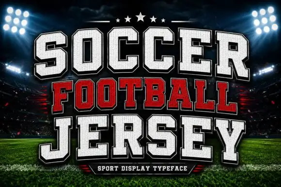 #21
Soccer Football Jersey is a layered athletic capital alphabet in which each letter carries a stitched fill, a heavy keyline and an offset shadow, so a team name reads as the appliqué on a match jersey.
The S steps a heavy spine, the O closes a tall block, the C cuts a square crescent, the F sets a wide arm and the R turns a blunt leg, all at a jersey weight with square corners, a fill drawn as fabric and a contour that runs around the whole word. The layers are the character: the sample builds each line from fill, keyline and shadow, which lets one word carry three colours without extra artwork. Because each layer is a separate vector, every edge has to be clean, and the offset must repeat exactly or the word looks broken. The floodlit stadium, the stars, the ball and the small bottom banner are presentation; the white and red jersey words are the face.
A school football-day programme — Use a straight title above a plain fixture list.
Verify numerals and school permissions.
 #22
Helina is a clean, heavy-weight condensed sans serif with flat-cut terminals, tight vertical rhythm, and bold magazine-masthead authority.
Helina is a heavy geometric condensed grotesk: very narrow stems with a uniform weight, squared shoulders, tight apertures and a level baseline that makes a column of type look like a printed rule. The condensation fits long words on a fascia, and the tight aperture is what closes first when the face is small. It needs roughly 24 mm for the aperture and the squared shoulder to read, and it is best in one dark ink on white and cream, or white on a dark ground where the narrow stems read as vertical lights.
Fashion lookbook masthead, fitness poster & reel cover — Set all-caps headlines at 72–140 pt with tight -15 tracking above wide-spaced (+250) micro subcaptions.
Straight, sharp-cornered vertical bars are super fast to weed on vinyl decals, gym wall graphics, and HTV.
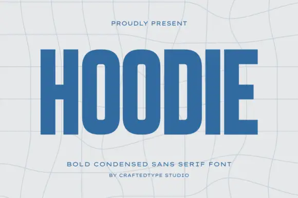 #23
Hoodie shows a large blue uppercase word on a pale warped-grid field, where heavy straight uprights and flat horizontal endings form a dense block, the O and D hold rounded rectangular counters, the H crossbar sits near the middle and the E keeps three squared arms.
The stems stay straight and heavy, the counters turn into rounded rectangles, the endings flatten and the row compresses. That compression is the character: a short word becomes a dense block, which is why the sample fills the width on a warped grid. The grid bends independently of the type, so check the counters at your final size, keep 40 pt before they close and confirm the condensed caps are what your file actually holds. The rounded rectangular counters are the failure point: they close at about 30 pt and the word reads as a dense ribbon, so keep 40 pt and do not let a curved grid carry the type.
A compact athletic-club name study — Set one flat name line above a plain independent-club descriptor.
Check counter openness at badge size and test any garment process separately.
 #24
Taught is a heavy, flat-sided condensed sans-serif with tight interior counters and commanding vertical headline presence.
Taught is a bold flat-sided condensed poster grotesk: narrow stems with completely flat sides, tight square counters, a bold weight that holds across a large format and a set of slightly odd terminals that give it a printed poster feel. The flat sides keep a word from looking hand-made, and the counters close when the face is scaled down. It needs roughly 22 mm for the counter and the flat side to read, and it is best in one dense ink on uncoated stock, or a single white on a dark ground.
YouTube thumbnail headline, fitness poster & magazine cover — Set 1-to-4-word uppercase punchlines at 72+ pt with +15 tracking and tight 0.92 line-height over high-contrast backgrounds.
Broad flat stems weed fast on sign vinyl and HTV down to 0.6 inches—zero fragile serifs or hairlines to tear.
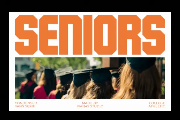 #25
Seniors fills a white poster header with tightly fitted orange capitals, where the S, O and R use strongly chamfered outer corners, thick rectangular stems surround narrow counters and the I stays a simple bar.
The stems stay thick and rectangular, the corners chamfer at forty-five degrees, the fit runs tight and the counters narrow into straight slots. That chamfer is the character: the word reads as a varsity header without an outline, which is why the sample sets a short title above a photograph. The graduation photo supplies context, not an alphabet, so test the tight fit on a real class name or year and keep 40 pt before the narrow counters close. The tight fit is the risk: the letters almost touch, so a two-digit year closes into a block and the counters of the R and the A plug, which is why class names belong at 40 pt and above.
A graduating-class poster — Set CLASS TOGETHER across a white top panel with a class photograph beneath and names in a separate plain lower grid.
Verify the actual letters and year numerals; obtain consent for any student photographs.
Practical buyer checklist
Key cutting, printing and pairing answers before choosing a varsity & athletic typeface.
Practically nothing: both describe the heavy slab with clipped counters used on American campus sportswear. Varsity is the more common retail term, while collegiate is the historical name for the style's origin in university athletics.
Yes, that is their main use. Cut the solid or outline weight at 2 inches or more per letter, weld the outline layer to avoid double cuts, and press at the film maker's temperature as twill and HTV differ substantially.
Collegiate faces are drawn for three to six characters. In longer words the heavy slabs crowd and the counters fill. Break long names into two lines or increase tracking rather than reducing the size.
Most include 0 to 9 and a basic ampersand, and some include a period and hyphen for abbreviations. Verify before laying out a roster, since a missing numeral means substituting a different face mid-project.
Keep exploring
Explore adjacent maker roundups or check our practical pre-production checklists.
17 curated fonts · Previews & pairings
18 curated fonts · Previews & pairings
33 curated fonts · Previews & pairings
32 curated fonts · Previews & pairings
Guides: Invitation font checklist · Vinyl & cutting checklist · How to pair script & sans fonts
Allow optional Google Analytics to measure visits and catalogue actions. Your search words and notes are not included. Privacy & storage