 #1 · Best Overall
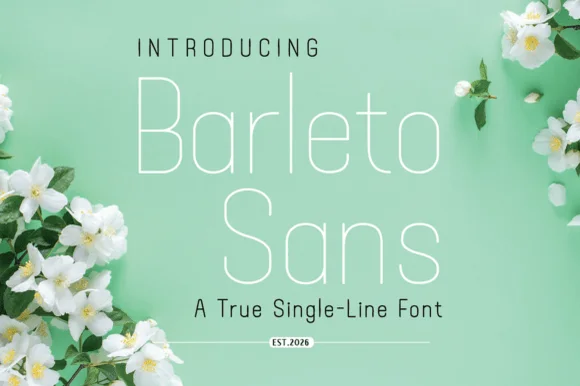
Barleto
Geometric single-line sans with tall open letters and hairline weight
Get fontPaid link
Read review ↓Disclosure: MakerFileHub may earn a commission from qualifying purchases via paid links on this page. How our links work.
Neutral grotesques & architectural geometry
Minimalism is not the absence of decisions. Barleto keeps a geometric single-weight line that stays quiet, Life Planner Duo and Embroidery Graphic hold rounded craft proportions, and Fantasy Autumn and Tiki Taka Tak push toward hairline architecture. Atomic Md and Golden Rooster cover the neo-grotesque and gallery-ligature ends of the range, where neutrality and a small signature detail do the work.
Quick verdict
Barleto is the cleanest geometric line for labels and signage, Atomic Md is the most reliable neo-grotesque for body copy, and Golden Rooster adds a distinctive bowl ligature for a gallery identity. Fantasy Autumn is the pick for a hairline headline.
Quick answer
Short on time? Start with our three highest-rated minimalist & geometric sans standouts before scrolling the full breakdown.
#1 · Best OverallGeometric single-line sans with tall open letters and hairline weight
 #2 · Runner-Up Pick
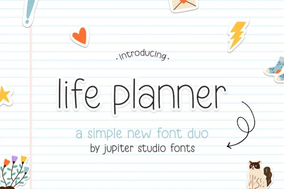
Planner duo pairing a thin rounded sans with a bolder cut
 #3 · Editor's Choice
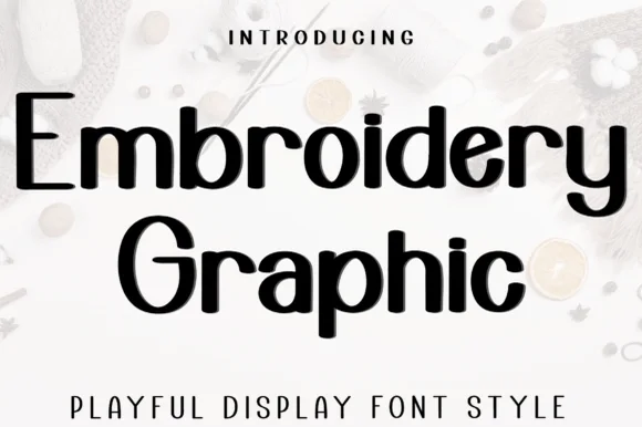
Playful geometric display with tall ascenders and open loops
We kept 31 of 1,219 candidates that stay neutral without turning bland. Weighted weight-range availability, numeral and punctuation completeness, small-size legibility at 9 pt, and whether the geometry is a construction rather than a rounded default.
Side-by-side summary
Compare specimens, OpenType/PUA traits and primary project roles side by side.
| Rank & Font | Style & File Specs | Best Project Fit | Store Listing |
|---|---|---|---|
| Sans serifGeometric | Laser-engraved metal jewelry tag or acrylic table sign | Get fontPaid link | |
| DisplayMinimal | GoodNotes digital planner template, habit tracker or minimalist label | Get fontPaid link | |
| DisplayLigatures | Appliqué pattern template, quilt label or kids' name tag | Get fontPaid link | |
| Sans serifPUA encoded · Ligatures | Modern architecture studio, roastery & lifestyle wordmark | Get fontPaid link | |
| Sans serifLigatures · Alternates & swashes · Language support | Architectural studio, skincare box & minimalist identity | Get fontPaid link |
#1 · Best OverallBarleto is a geometric sans built as a single line: the strokes never thicken, the letters run tall and open, and the whole alphabet stays at a hairline weight that reads as technical drawing.
The capital B closes two open bowls against a straight stem, the a is single storey with a light bowl, the r keeps a short arm and the t crosses with a thin bar, all at one constant weight. Because nothing is filled in, the face behaves like plotted lettering, which is why it suits captions, diagrams and architectural stationery. The x-height is tall and the spacing is generous, so a line of text stays legible at 9 pt even at this weight. The counters are wide rather than closed, which keeps the hairline from thinning visually at small sizes. At display sizes the face needs a coated stock to survive printing, and reverse-out printing is the safer route. The green ground, the white ink, the blossoms in the corners and the two caption lines are presentation; the typeface is the word.
Laser-engraved metal jewelry tag or acrylic table sign — Track all-caps sublines +40 beneath a single-line calligraphy header.
Optimized for single-stroke engraving, Foil Quill and pen plotters.
#2 · Runner-Up PickLife Planner is a two-cut family in which a thin rounded sans carries the headline and a bolder cut sets the supporting line, so a simple layout gets hierarchy from one family.
The l rises on a thin stem, the i carries a floating dot, the f turns a light arm, the e closes a round eye, the p drops a thin stem and the a stays a single-storey oval, all at a thin monoline weight with fully rounded ends and wide open counters; the bold cut thickens every stroke without changing the skeleton. The pairing is the character: the two cuts share proportions, which is why the sample sets a place-holder title in the thin cut with a subtitle in the bold beneath. Both hold from 20 pt and print cleanly on plain paper. The lined notebook ground, the small stickers and the arrow doodle are presentation; the black sans lines are the family.
GoodNotes digital planner template, habit tracker or minimalist label — Use lowercase for approachable daily headers and tracked caps for month tabs.
Best for digital planners, KDP printables and pen-plotted labels.
#3 · Editor's ChoiceEmbroidery Graphic is a playful display sans in which the strokes stay even, the ascenders run tall and a few letters open into loops, so a two-word title reads as a friendly sign rather than as a neutral grotesque.
The E sets three even arms, the m turns two flat shoulders, the b rises a tall ascender into a loop, the r keeps a straight arm, the o stays a wide circle and the G carries a low spur, all at an even monoline weight with open counters and a light change in rhythm at the loops. The tall ascender is the character: it lifts the mixed-case line and keeps the word airy, which is why the sample sets two stacked words at a generous spacing. Because the strokes are even, the face holds from 22 pt to a board and prints in one colour; the loops need a little tracking to stay open. The pale fabric ground, the spools, the small buttons and the caption below are presentation; the black display words are the face.
Appliqué pattern template, quilt label or kids' name tag — Set cleanly in Mixed Case with comfortable tracking.
Supplied as vector OTF/TTF (not PES/DST); uniform stroke width is ideal for vinyl and easy auto-digitizing.
 #4 · Top Maker Utility
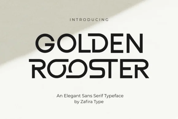
Golden Rooster is a crisp, medium-bold geometric sans-serif distinguished by circular interlocking 'OO' ligatures and sculpted leg curves.
Golden Rooster is a geometric art-gallery sans with interlocking ligature bowls: perfectly circular bowls, straight-sided stems, and a set of ligatures where two round letters share one overlapping arc so the pair reads as a single drawn form. The interlock is the design and it breaks if the pair is tracked apart, and the circular bowls close when the face shrinks. It needs roughly 26 mm for the interlock and the bowl to read, and it is best in one fine ink on a pale ground, or a single dark tone on coated stock.
Modern architecture studio, roastery & lifestyle wordmark — Set brand names in uppercase at 36–60 pt with +20 tracking on raw white cotton stock, letting one ligature pair act as the centerpiece.
Even stroke weight and wide geometric counters weed cleanly on storefront glass vinyl, acrylic signs, and matte packaging labels.
 #5 · Standout Silhouette
Bielchon is a crisp, light-to-regular modern sans-serif featuring tall x-height, circular bowls, and subtle stencil-like notched joins.
Bielchon is a slim contemporary geometric sans with architectural cuts: narrow even stems, perfectly circular bowls, sharp mitred cuts where two strokes meet instead of a curve and a level baseline that reads as gallery signage. The mitres are the design and they round off once the face is reduced or printed with a coarse screen. It needs roughly 22 mm for the mitre and the counter to read, and it is best in one fine ink on a pale ground, or a single white on a dark ground where the cuts print as sharp joints.
Architectural studio, skincare box & minimalist identity — Set brand wordmarks in mixed-case at 36–60 pt with +15 tracking, leaving generous negative space across matte white or stone stock.
At small label sizes below 12 pt, print at 300+ DPI so the delicate notch gaps at 'h' and 'n' shoulders remain crisp rather than filling in.
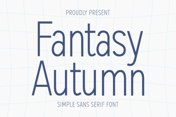 #6
Fantasy Autumn is a tall, feather-light minimalist sans serif with slender vertical stems, high waistlines, and airy modern calm (zero autumn clipart!).
Fantasy Autumn is a hairline-light minimalist sans with tall slender stems, a high waistline, a single-storey a and generous air around the letters, drawn for calm architectural layout rather than display impact. Because the stroke is very light, the face needs roughly 20 mm before it survives print, and it is at its best on smooth uncoated stocks where the line stays continuous. It is a titling and caption face for galleries, studios and editorial work, and it should never be set small on absorbent paper.
Minimalist poetry cover, wall-calendar header & Cricut Pen card — Stack 2 mixed-case lines centered at 64–130 pt in slate navy, sage, or charcoal on white linen stock.
Ideal for Cricut Pens, Foil Quill, printables, and web/editorial headers; if blade-cutting vinyl, size above 1.4 in for slender stems!
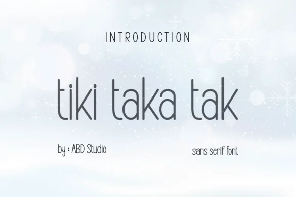 #7
Tiki Taka Tak is actually a sleek, minimalist tall geometric sans serif (zero tropical tiki motifs!) built for clean modern branding.
Tiki Taka Tak is not a tropical novelty face at all: it is a tall geometric sans with a hairline weight, straight-sided ascenders, perfectly oval bowls and a tight vertical rhythm. The proportions are narrow enough to stack a two-word heading in a narrow column, and because the strokes are uniform, the face reproduces exactly at small sizes on screens and in plotted line work. It is a quiet, architectural alphabet, best used where the shape of the letterform rather than its texture carries the page, and it needs generous tracking to stop the thin verticals from merging at a distance.
Minimalist skincare bottle, architectural studio & tag — Set lowercase titles at 42–76 pt with +4 tracking beneath wide-spaced uppercase eyebrows.
Fine slender strokes shine in flat print, Cricut 0.4 Pen plotting, Foil Quill, and 1.25 in+ decals.
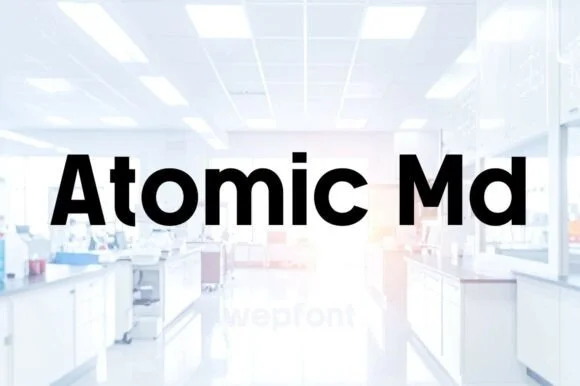 #8
Atomic Md is a crisp, high-legibility medium-bold neo-grotesk sans engineered for clean tech branding, UI dashboards, and modern signage.
Atomic Md is a clean medium-bold neo-grotesk with flat terminals, sturdy stems and a generous x-height, drawn for interface and signage work where nothing should draw attention to itself. Because the weight sits in the middle of the range, it holds a 60 pt headline and a 10 pt label without a second family, and the flat terminals print without the ragged edges that a humanist curve produces on cheap stock. It is a workhorse: the counters are open, the spacing is even, and it is judged on how quickly a reader finds the value rather than on character.
Tech startup wordmark, office glass door vinyl & product box — Set headlines at 48–120 pt with tight -1 tracking, or track uppercase subheaders to +200 beneath scripts.
100% straight, clean geometric vectors cut and weed in 3 seconds on Cricut Oracal 651 and HTV all the way down to 0.45 in!
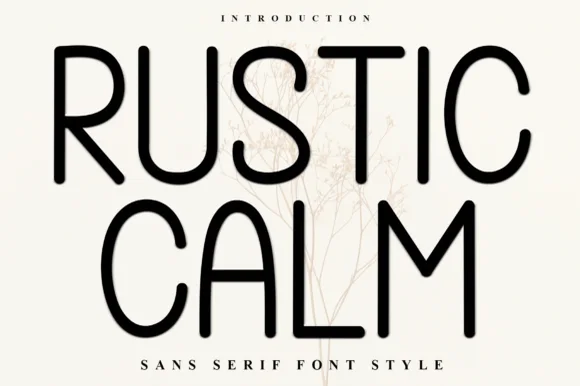 #9
Rustic Calm is a serene, 100% smooth tall monoline sans serif (zero rustic distressing!) with rounded terminals and wide open bowls.
Rustic Calm is a tall monoline geometric sans with rounded terminals, wide open bowls and perfectly even stroke weight, deliberately free of distressing, so a word reads as a quiet modern sign rather than a rustic display. The even weight keeps it legible at 9 pt, and the open bowls make it work at 200 mm without any detail loss. It needs roughly 20 mm for the rounded terminals to read, and it is best in jet black on a pale ground or in one ink on kraft.
Minimalist spa/apothecary bottle, candle jar & linen tag — Stack 2 centered uppercase words at 64–125 pt with +6 tracking above tiny wide-spaced sans subtext.
100% smooth, uniform monoline strokes cut and weed in seconds on Cricut Oracal 651 and HTV down to 0.65 in—and draw great with pens!
 #10
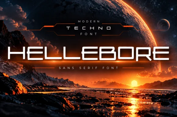
Hellebore is a wide techno sans in which the counters are squared, the junctions are chamfered and every letter sits on a broad horizontal footprint, so a word reads as a title sequence rather than as signage.
The capital H holds two thick stems and a wide bar, the E carries three flat arms, the L keeps one arm and a broad foot, and the O closes a rectangular counter with chamfered corners, all at a heavy even weight with no contrast. The width is the character: a six-letter word stretches across a wide format at a modest point size, which is how the face suits film titles and equipment panels. Chamfers at the junctions keep the shapes from looking like plain blocks, and they are the detail that fails first at small sizes, where the corners fill in. Counters stay open at 30 pt. The planet backdrop, the horizon, the orange rim light, the thin rules and the two caption lines are presentation; the typeface is the word.
Sci-fi book/film title, Twitch overlay or tech hardware mark — Track uppercase +30 to +60 across dark landscape compositions.
Clean uniform strokes cut effortlessly on automotive/PC case vinyl decals.
 #11
Helina is a clean, heavy-weight condensed sans serif with flat-cut terminals, tight vertical rhythm, and bold magazine-masthead authority.
Helina is a heavy geometric condensed grotesk: very narrow stems with a uniform weight, squared shoulders, tight apertures and a level baseline that makes a column of type look like a printed rule. The condensation fits long words on a fascia, and the tight aperture is what closes first when the face is small. It needs roughly 24 mm for the aperture and the squared shoulder to read, and it is best in one dark ink on white and cream, or white on a dark ground where the narrow stems read as vertical lights.
Fashion lookbook masthead, fitness poster & reel cover — Set all-caps headlines at 72–140 pt with tight -15 tracking above wide-spaced (+250) micro subcaptions.
Straight, sharp-cornered vertical bars are super fast to weed on vinyl decals, gym wall graphics, and HTV.
 #12
Taught is a heavy, flat-sided condensed sans-serif with tight interior counters and commanding vertical headline presence.
Taught is a bold flat-sided condensed poster grotesk: narrow stems with completely flat sides, tight square counters, a bold weight that holds across a large format and a set of slightly odd terminals that give it a printed poster feel. The flat sides keep a word from looking hand-made, and the counters close when the face is scaled down. It needs roughly 22 mm for the counter and the flat side to read, and it is best in one dense ink on uncoated stock, or a single white on a dark ground.
YouTube thumbnail headline, fitness poster & magazine cover — Set 1-to-4-word uppercase punchlines at 72+ pt with +15 tracking and tight 0.92 line-height over high-contrast backgrounds.
Broad flat stems weed fast on sign vinyl and HTV down to 0.6 inches—zero fragile serifs or hairlines to tear.
 #13
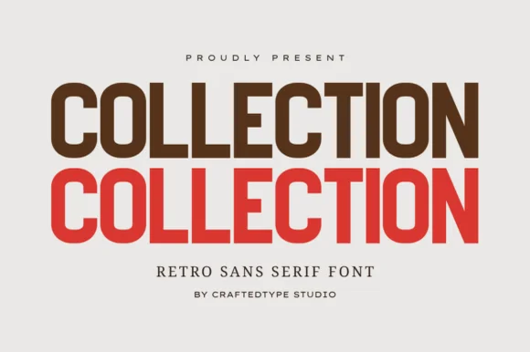
Collection is a crisp, medium-condensed retro grotesk (PUA, OTF & TTF) with clean flat terminals and balanced open counters.
Collection is a condensed grotesk drawn from nineteen-seventies athletic and editorial lettering: narrow stems, flat shoulders, a tall x-height, a slightly squared bowl and a small flare where a stem meets the curve. It ships with PUA alternates as OTF and TTF, and the alternates mostly change the flare rather than the skeleton. It needs roughly 20 mm for the flare and the squared bowl to read, and it is best in one dark ink on white or on a warm sand stock, where the narrow stems stay crisp.
Apparel capsule tag ('AUTUMN COLLECTION'), tote & lookbook — Stack the same word 2 or 3 times in espresso brown, terracotta red, and warm gold at 72–135 pt.
100% smooth, zero-grunge geometric paths cut and weed in seconds on Cricut HTV and Oracal 651 down to 0.55 inches!
 #14
Memoir Slang is a heavy, tight-set modern sans-serif distinguished by crisp neo-grotesk geometry and sharp, horned ear details.
Memoir Slang is a bold neo-grotesk display sans with a hooked double-storey g: even squared stems, tight apertures, a straight-sided g with a hooked ear and a slightly narrow width that keeps a long masthead on one line. The hook is the only detail and it closes when the face is reduced. It needs roughly 22 mm for the hook and the aperture to read, and it is best in one dense ink on uncoated stock, or a single white on a dark ground where the tight apertures still open.
Streetwear lookbook, exhibition poster & album title — Left-align 2-line mixed-case titles at 64–96 pt with tight -15 tracking and 0.94 line-height.
Heavy solid stems cut cleanly on large window vinyl and bold DTF/HTV streetwear prints down to 0.75 in.
 #15
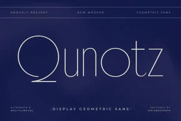
Qunotz shows pale slender lettering on navy: the Q is a large nearly circular form that opens near its lower edge and sweeps into a long flat tail, while the u and n keep simple rounded turns, the o stays circular and the t carries a light crossbar above a curved foot.
The strokes stay very fine and even, the round letters close as true circles, the ascenders stay plain and the Q departs by opening and sending its tail out. The open Q is the character: one letter breaks the geometry of the row, which is why the sample sets a single name on a dark ground. Because the strokes are hairlines, keep 26 pt as the floor on coated stock and give the flat tail 16 mm of clearance. The flat Q tail is the piece that needs its own ground: it runs out of the bowl, so 16 mm of clear space keeps it apart, and the hairlines fill on uncoated stock under 26 pt.
A geometric design consultancy card — Place Qunotz in navy on an otherwise blank white landscape card with contact information isolated on its back.
Ask readers to identify Q and inspect the tail in a small printed proof.
 #16
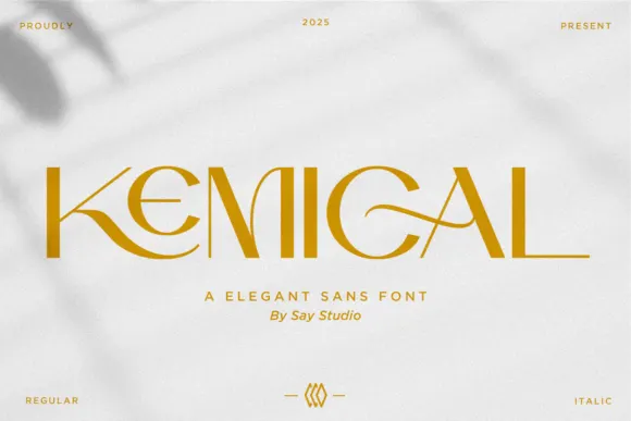
Kemical shows gold capitals across a pale shadowed field, where slender straight stems sit beside broad circular curves, a K leg sweeps under the opening letters and a fine G stroke crosses into the counter.
The strokes stay thin and even, the curves open wide, the E rounds rather than squares and one leg runs long beneath the neighbouring letter. That sweep is the character: a geometric cap row gains a single drawn gesture, which is why the sample keeps one short name with a small shadow behind it. The cover mentions regular and italic but shows one upright cut, so confirm the styles your file carries and keep 28 pt before the fine joins thin away.
A geometric skincare-name study — Set the name in flat ink above a plain formulation descriptor.
Verify the actual connections and check fine horizontals on a small label.
 #17
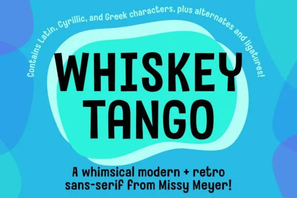
Whiskey Tango is a lively, tall-and-narrow rounded sans-serif packed with Latin, Cyrillic, and Greek support plus over 110 PUA alternates.
Whiskey Tango is a tall condensed rounded retro sans with more than a hundred and ten private-use extras: squeezed caps with soft corners and a high waist, plus swash letters, ligatures, tails and ornaments reached through alternate keystrokes. It is a packaging face, so it wants a tall panel and a single flat ink rather than a soft ground. The soft corners are the finest element and they plug first at small sizes. It needs roughly 26 mm for the corner and the condensed stem to read, and it is best one flat ink on kraft or white board.
Retro travel poster, podcast cover & cocktail menu — Stack two-word drink or episode titles in 48 pt uppercase at tight 0.95 line-height, using mixed-case Whiskey Tango or a light sans for descriptions.
Rounded stroke ends and generous counters make this one of the cleanest tall sans faces to cut on Oracal 651 or HTV even at 0.65 in.
 #18
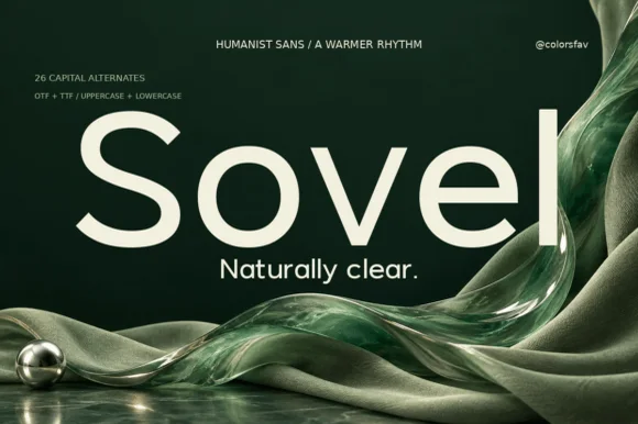
Sovel is a poised humanist sans-serif combining clean open lowercase forms with subtly flared stroke terminals and 26 capital alternates.
Sovel is a warm humanist sans with twenty-six expressive capital alternates: open apertures, a soft stroke modulation, a tall x-height and a set of capitals whose terminals curl or flare so a headline can be tuned without changing the family. The alternates only appear through specific keystrokes, and the soft modulation disappears under a coarse screen. It needs roughly 20 mm for the aperture and the alternate to read, and it is best in one dark ink on uncoated stock.
Wellness skincare tube, candle jar & studio wordmark — Set a 4-to-7-letter brand wordmark in mixed-case at 42 pt, swapping in an alternate initial cap, and use standard Sovel at 10 pt for sublines.
Clean, open bowls cut crisply on matte label vinyl, frosted glass etch stencils, and precision cardstock.
 #19
Mango Dream sets a black lowercase name on a pale paper-like ground, where thin nearly even strokes form wide circular bowls, the a stays single storey, the m arches stay low and the g opens its lower curve into a short rounded descender while the d rises above the word.
The strokes stay light and even, the bowls stay circular and wide, the arches stay low and the descender stays short. That wideness is the character: the word stretches into a calm horizontal line rather than a compact block, which is why the sample keeps one line on a speckled field. A soft plant shadow at the left is presentation. Keep 24 pt before the hairlines weaken, avoid small supporting text in this weight and check the single-storey a against your brand's tone.
A light lowercase café-name study — Set the name above a plain café descriptor on a flat light panel.
Inspect circular counters and narrow joins in the smallest intended logo.
 #20
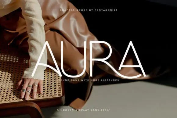
Aura shows pale thin capitals over a dark fashion photograph, where near-even rounded strokes build an open U and a broad R bowl, the first A carries a long curved cross-stroke that sweeps toward the centre and the R leg continues below the final A as a broad flowing curve.
The strokes stay uniform and thin, the curves stay circular and one cross stroke drops into a wide ligature that links two letters and runs under the word. That ligature is the character: the row reads as a drawn wordmark rather than a set line, which is why the sample keeps four letters on a photograph. The source notes PUA extras plus entry and terminal swashes, so check how the link is reached. Keep 36 pt for the thin strokes, test the ligature with your own letters and reserve 20 mm beneath.
A rounded-line skincare-name study — Test the actual name on a flat panel and keep its descriptor beneath the entire sweep.
Verify connection access and inspect fine strokes at label size.
 #21
Modern Heritage shows black capitals in two closely stacked lines on white, where thin nearly even strokes form a circular O, a broad M and N and a large triangular A, while the G keeps an open right side with a short inner bar.
The strokes stay fine and even, the rounds close as circles, the diagonals spread wide and one letter opens its right side rather than closing a bowl. That geometric calm is the character: the word reads as a modern architectural mark with no swash or texture, which is why the sample stacks two tight rows. The specimen shows no lowercase, so confirm the styles and characters your file carries and keep 28 pt before the hairlines thin on uncoated paper.
A geometric architecture-studio name — Use a two-line capital name above a plain service descriptor with wide outer margins.
Check the actual name at small sizes and adjust pairs individually.
 #22
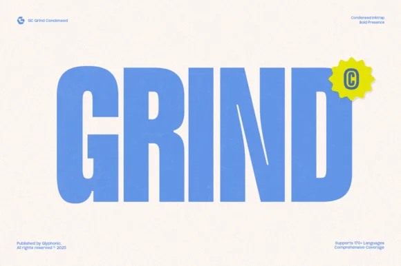
Gc Grind is a bold condensed sans-serif engineered with subtle corner inktraps and flat industrial curves across 170+ languages.
Gc Grind is a heavy condensed inktrap display sans: very narrow squared stems, small triangular traps cut into the joins where two strokes meet, a tall cap height and tight counters that read as a stencil-cut industrial headline. The traps are the design and they fill into solid corners as soon as the face is printed small. It needs roughly 24 mm for the trap and the condensed stem to read, and it is best in one dense ink on uncoated stock, or a single white on a dark ground where the traps print as cut notches.
Coffee roastery bag, energy-drink can & streetwear tag — Run bold uppercase product names vertically or across narrow 2.5-inch can panels, pairing specs in a tiny technical grotesk.
Solid vertical bars cut cleanly on matte vinyl and stencil mylar; keep height above 0.8 in so the intentional inktrap notches stay visible.
 #23
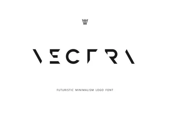
Vectra is an experimental futuristic logo font that strips each capital down to minimalist geometric strokes and negative-space angles.
Vectra is a deconstructed minimalist stencil and puzzle logo font: letters are broken into separated segments with deliberate gaps, sharp modular angles and a geometry that reads as a sliced mark rather than a drawn letter. The gaps are the design and they close under vinyl weeding if they are too narrow, and the modular build means a letter can look like two pieces. It needs roughly 26 mm for the gaps and the angles to read, and it is best as a one-colour vinyl or cut job, or a flat two-colour print on coated stock.
Tech startup wordmark, architecture studio & synth label — Track capitals wide (+250 to +400) across stark white or matte-black surfaces, paired with a conventional sans descriptor below.
Because missing stems rely on Gestalt word recognition, use Vectra strictly for short 1-word logos—never body copy or long phrases.
 #24
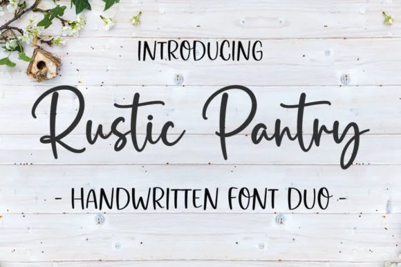
Rustic Pantry is a coordinated farmhouse font duo pairing a lively bouncy cursive script with a tall, narrow hand-drawn uppercase sans.
Rustic Pantry is a duo of a bouncy farmhouse brush script and a tall skinny marker sans: the script runs a loaded stroke with small flicks, a rising baseline and joined letters, while the sans is narrow with blunt marker ends for prices and lists. The two voices share one palette, so a jar label can carry a name and a list in the same hand. The script's bounce grows the word vertically and the marker sans stacks a long line in a narrow label. The script needs roughly 22 mm and the sans 18 mm for their detail to read.
Glass pantry canister decal, spice-jar set & kitchen sign — Center the script word at 2–3.5 inches wide above a 0.5-inch tracked skinny sans descriptor line.
Weld all touching cursive connectors before cutting Oracal 651 permanent jar vinyl; medium stroke weight weeds cleanly.
 #25
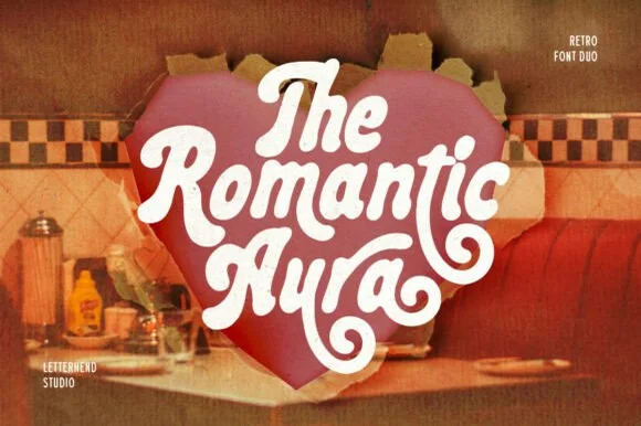
Romantic Aura Duo pairs a thick, velvety 1970s swash script with a clean companion voice for nostalgic love notes and merch.
Romantic Aura Duo pairs a nineteen-seventies swashed retro script with a rounded sans: the script runs a high-contrast stroke with wide swelling swashes that lift above and below the line, while the sans is a soft rounded block for details and lists. The pair is a period look, so it works best in two warm flat inks on a light ground rather than in photographic tints. The swash thins are the finest element and they break first. The script needs roughly 32 mm and the sans 20 mm for their detail to read.
Retro Valentine sweatshirt, mug wrap & galentine card — Stack 2 to 3 centered words tightly inside a heart or arch silhouette so rising ascenders nest into the gaps of the line above.
Weld all overlapping script letters before cutting HTV, and keep total lockup width at 3.5 in+ so tight inner 'e' and 'a' counters weed cleanly.
 #26
Brown Carolina Duo contrasts broad high-contrast capitals with a much finer narrow slanted script, set dark on a plain cream field, where the capital R legs sweep below the neighbouring letters and the script carries long tails that run past the ends of both words.
The caps keep thin cross strokes and heavy uprights, the script keeps one fine weight, and the two voices sit in a strict stack: script, two cap rows, script. That alternating order is the character, because the fine lines frame the heavy block like a rule above and below. Both treatments appear on a plain light field, so the cover gives no clue about texture or shadow. Keep 34 pt for the caps before the thin strokes break up, keep 20 pt as the floor for the script and check the R leg before setting a line of capitals.
A boutique stationery front — Use the capital name centrally and a small script descriptor below, leaving the R sweep clear of contact information in a plain footer.
Confirm both styles and the actual capital alternates.
 #27
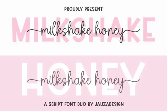
Milkshakehoney pairs a crisp, wide-stance uppercase sans-serif with a tall, narrow-looped monoline cursive accented by straight side tails.
Milkshakehoney pairs a clean geometric uppercase sans with a tall-looped monoline script: the sans is a wide, even-width capital set for signage and labels, while the script is a thin monoline with high loops that rise well above the x-height and joins that stay open. The pair gives one card a printed voice and a hand-written line and works from a single ink. The monoline hairline is the finest element and it breaks first. The sans needs roughly 20 mm and the script 30 mm for their detail to read.
Bridesmaid proposal box lid & satin robe chest print — Track the uppercase sans role title ('BRIDESMAID') wide in pale pink or gold behind the recipient's cursive first name.
Size HTV chest names at 4 inches wide or larger so the tall narrow 'k' and 'h' loops weed cleanly without stretching.
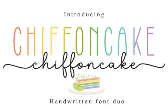 #28
Chiffoncake Duo pairs very tall narrow capitals, each in a different pastel tone, with a low connected script whose deep f loops drop below the baseline, and long tails extend from both sides of the lower word above a small cake illustration.
The caps stay tall and thin, the script stays fine and continuous, the loops drop deep and the entry and exit tails run wide. That height contrast is the character: the pair is built on the gap between a condensed cap row and a light handwritten line, which is why the sample keeps both centred. The rainbow colours and the cake drawing are presentation. Keep 28 pt for the script, leave 20 mm beneath for the f loops and check whether both styles install from one file before planning a two-line lockup.
A cake-menu category heading — Keep the two lines separate rather than overlapping and put flavours and prices in a plain list below the f loops.
Confirm the exact included pair and any alternate-access claim.
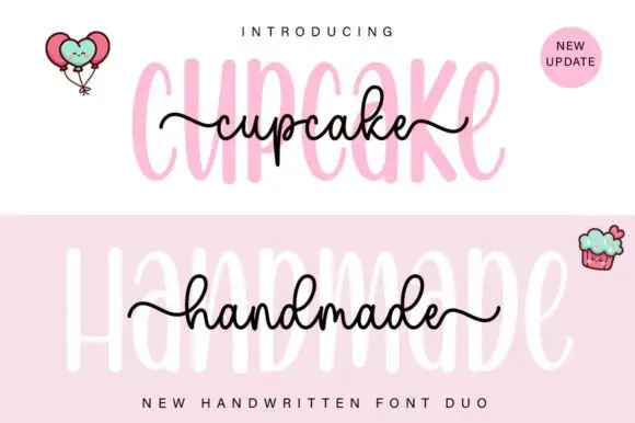 #29
Cupcake Handmade Duo places tall narrow rounded letters in pale pink behind a smaller connected script line in black, twice on one cover, where the script carries long outer tails and looped k and h forms while a balloon pair, a cupcake drawing and an update badge sit in the corners.
The caps stay tall and narrow, the script stays compact and continuous, the loops open large and the tails run wide past the caps on both sides. That size gap is the character, because the script sits inside the cap row rather than under it. The balloons, the cupcake and the badge are separate sample elements, so do not count them as part of the type. Keep 34 pt for the caps and 16 pt for the script, and check the k and h loops against your margins before locking the lockup.
A cupcake-table heading — Place the capital title above, not behind, the script; put flavours and dietary information in a plain panel below.
Check both supplied styles and essential food information separately.
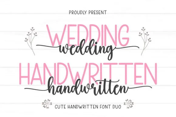 #30
Wedding Handwritten pairs a tall, narrow rounded sans-serif with a lively thick-thin calligraphy script sporting symmetrical side tails.
Wedding Handwritten pairs a tall slender sans with a tailed calligraphy script: the sans is a narrow even-width capital set for details and directions, while the script runs a high-contrast stroke with long ascenders and a tail that lifts off the last letter. The pair is a stationery set, so both cuts have to survive one ink and a matte stock. The script tail is the finest element and it breaks first. The sans needs roughly 20 mm and the script 30 mm for their detail to read.
Save-the-date card, acrylic table sign & seating chart — Set table numbers or 'SAVE THE DATE' in 1.8 in blush or gold sans and center couple names across the lower half in charcoal script.
Weld the script letters before cutting vinyl for acrylic wedding signs, and handle the fine horizontal outer tails gently on transfer tape.
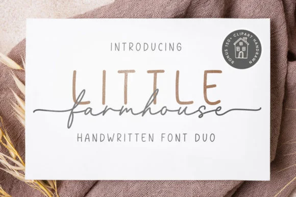 #31
Little Farmhouse pairs a tall, narrow rounded sans-serif with a delicate, wide-tracked monoline cursive.
On the framed white card mockup, warm taupe capitals 'LITTLE' stand tall and widely spaced behind dark charcoal script 'farmhouse', whose long entry and exit tails extend past both edges of the sans word while the lowercase 'f' drops a deep narrow loop. PUA encoding provides easy access to the extended end swashes. The layering is the fragile part: the script is cut as a separate vinyl layer across the sans, so the long entry and exit tails thin out at the overlap and lift first on a textured board. Keep the script x-height at 1.5 in or above, press the sans layer down first, and test one plaque before painting a set.
Framed shiplap entryway or kitchen pantry sign — Track the sans capitals out to +120 in muted tan or gray at 2.8 in height, then center the dark script word across their lower stems.
When cutting stencil film for wood painting, keep the fine script above 1.5 in x-height so narrow 'f' and 'a' bridges hold firm against bleed.
Practical buyer checklist
Key cutting, printing and pairing answers before choosing a minimalist & geometric sans typeface.
Geometric faces are built from circles and straight lines with an even stroke, while neo-grotesques have slightly condensed curves and optical corrections. Geometry reads modern and quiet; grotesques read functional and hold body text better.
Neutral letterforms provide no contrast of their own, so the hierarchy has to come from size and space. If everything is one size in a minimal sans, the poster has no focal point regardless of how well the font is drawn.
Yes, if it has a wide weight range and true italics. A single-weight geometric face forces you to fake emphasis with outlines or colour, which looks amateur at large sizes and breaks accessibility contrast rules.
Rarely for body text. Thin strokes on white fail contrast and stroke-width expectations, particularly for low-vision readers. Use them for large display only and keep functional text in a regular weight.
Keep exploring
Explore adjacent maker roundups or check our practical pre-production checklists.
39 curated fonts · Previews & pairings
19 curated fonts · Previews & pairings
25 curated fonts · Previews & pairings
32 curated fonts · Previews & pairings
Guides: Invitation font checklist · Vinyl & cutting checklist · How to pair script & sans fonts
Allow optional Google Analytics to measure visits and catalogue actions. Your search words and notes are not included. Privacy & storage