Editorial Serif Anchor

Chicago Downton + Raffined
Anchors Chicago Downton's fluid strokes with crisp Roman proportions on wedding suites, headers and packaging.
Inspect Raffined specimenDisclosure: MakerFileHub may earn a commission from qualifying purchases via paid links on this page. How our links work.
Dense slanted script with broad rounded C and D capitals
Chicago Downton is a dense slanted script in which the capital C and D open broad rounded bowls, the lowercase joins close together and straight and curved underline strokes sit beneath both sample words while the final n curls into a small terminal.
Paid link
Get this fontProject & layout blueprintsAt-a-glance maker compatibility
Weld or Unite overlapping script joins into one continuous vector path before sending to the blade.
Visual anatomy & craft review
The capitals carry wide round bowls, the bodies lean at a steady slant, the connectors run close and the underline strokes sit as separate drawn rules under each word rather than as part of the lettering. The dense slant is the character: the line reads as fast writing packed into a block, which is why the sample sets two words under drawn rules. Because the joins are tight and the swashes and ligatures are separate access, keep 26 pt as the floor and cut from 1.1 inches of x-height before a connector welds on vinyl.
Dense · Slanted · Rounded caps
Two-font hierarchy recipes
Tested contrast partners — pairing Chicago Downton with grounded secondary typography.
Chicago Downton + Raffined
Anchors Chicago Downton's fluid strokes with crisp Roman proportions on wedding suites, headers and packaging.
Inspect Raffined specimen
Chicago Downton + Limited Coffee
Keeps small-scale dates, URLs, nutrition facts and care instructions crisp and legible below script titles.
Inspect Limited Coffee specimenPractical applications
Concrete hierarchy, scale and production guidance tailored to Chicago Downton’s stroke geometry.
The dense slant gives a cafe label energy, and the broad capitals hold a two-word name at 22 pt on a 60 mm panel in one ink. The underline strokes in the sample are drawn rules rather than part of the face.
Hierarchy & layout recipe
Print a 60 by 40 mm label: set the name at 22 pt, keep 8 mm beneath for the underline stroke in the sample, and set the roast note in a 6 pt caps at the foot with 5 mm of clear ground.
Pre-production check
A tight connector printed at 18 pt fills into the next letter; check the plate proof and keep the name at 20 pt or above.
The slanted script gives a quote movement, and the even connector weight keeps a short line readable at 30 pt inside a printed column. The underline stroke keeps a long quote from floating.
Hierarchy & layout recipe
Print a 210 mm page: set the quote at 30 pt on three lines on a 70 mm measure, keep 14 mm of clear ground beside the column rule, and set the artist name at 9 pt in a sans beneath.
Pre-production check
A script set flush to a column rule touches it; check the page and keep 10 mm of space at the left edge. Keep the quote clear of the column rule.
The dense writing reads across a stall, and the rounded capitals keep a two-word sign clear at 44 pt on a printed sheet. The rounded capitals give a stall sign its speed.
Hierarchy & layout recipe
Print an A4 banner: set the sign at 44 pt, keep 18 mm of margin so no tail runs off the sheet, and set the prices at 16 pt in a condensed sans on a separate lower band. Keep the prices on a separate band.
Pre-production check
A slanted script printed at 30 pt on a sheet seen from three metres loses its joins; check the banner and keep the sign at 40 pt or above.
Technical & licence verification
Confirm included OTF/TTF/WOFF formats, full glyph tables and licence coverage on the live store page before batch production.
Closest visual alternatives
Matched across letterform anatomy, stroke behaviour and craft applications.

Substantial handwriting script
Simple Handwriting is a substantial handwritten script in deep green on white: connected lowercase with open round bowls, a firm even stroke, tall ascenders and a long entry stroke on the H, set across two lines over a soft brush swipe, with a serif caption beneath and a studio credit at the foot.
Ideas for this font
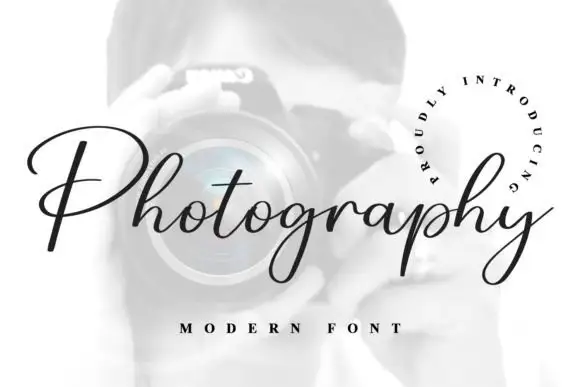
Fine connected script with a very open P
Photography is a fine slanted script in black on a pale photograph: a thin connected hand with a broad open P, hairline joins, a consistent slant and a curled tail on the y, framed by a circular line of tracked capitals.
Ideas for this font
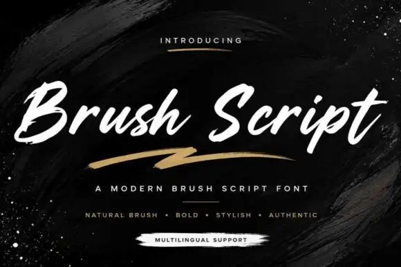
Slanted brush lettering with heavy dry strokes and a rough edge
Brush Script is slanted brush lettering in which the strokes carry a dry edge, the weight varies from thick to thin within each letter and the ends finish rough, so a word reads as paint laid on with a chisel brush.
Ideas for this font
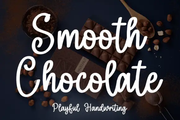
Rounded brush handwriting on a dark ground
Smooth Chocolate is a rounded brush handwriting in white over a dark photograph of chocolate: fat soft strokes with rounded ends, large open bowls, tall loops and a light bounce that keeps a long phrase moving.
Ideas for this font
Same independent foundry
Allow optional Google Analytics to measure visits and catalogue actions. Your search words and notes are not included. Privacy & storage