Modern Grotesque Body

Billvane + Cenura
Creates crisp high-hierarchy contrast beneath Billvane headlines across menus, websites and labels.
Inspect Cenura specimenDisclosure: MakerFileHub may earn a commission from qualifying purchases via paid links on this page. How our links work.
Tall ornamental serif with inward curls and heavy vertical stress
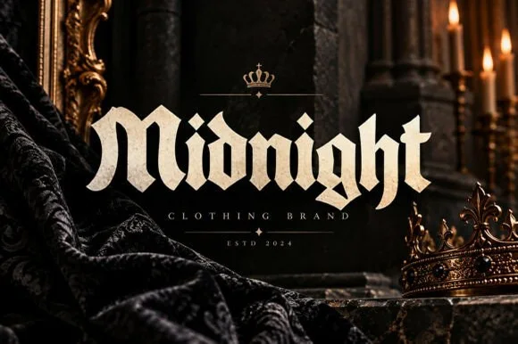
Billvane is a tall ornamental serif in which the stems carry heavy vertical stress, the terminals curl inward and the bowls close on small counters, so a single word reads as a Victorian playbill.
Paid link
Get this fontProject & layout blueprintsAt-a-glance maker compatibility
Sturdy stroke walls and open counters weed cleanly on adhesive vinyl, HTV apparel film, and cut cardstock.
Visual anatomy & craft review
The B keeps a tall frame with an inward curl on its upper terminal, the i carries a diamond dot, the double l rises into narrow stems and the v holds two heavy diagonals, all with fine bracketed serifs and a high contrast. The inward curl is the character: terminals turn back toward the letter rather than flicking outward, which gives the face its tight, carved quality at 60 pt. The counters are narrow and the fit is tight, so a single word builds a solid block that holds a poster. Because the hairlines are fine, the face wants a coated stock and a large size, and it belongs on titles rather than on supporting text. The aged paper ground, the black ink, the thin rules and the three small caption lines are presentation; the serif is the word shown.
Ornate · Tall · Curled
Two-font hierarchy recipes
Tested contrast partners — pairing Billvane with grounded secondary typography.
Billvane + Cenura
Creates crisp high-hierarchy contrast beneath Billvane headlines across menus, websites and labels.
Inspect Cenura specimen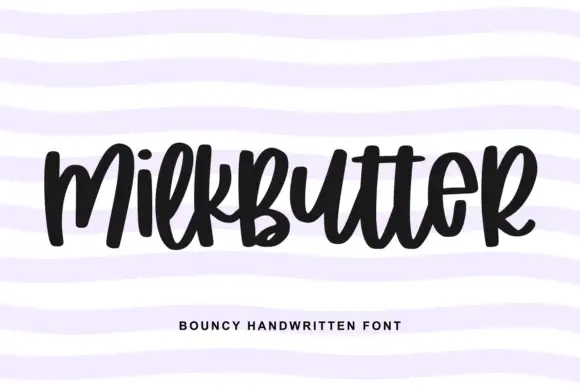
Billvane + Milkbutter
Adds a warm human signature touch for 1-to-3-word callouts without competing against structured serif capitals.
Inspect Milkbutter specimenPractical applications
Concrete hierarchy, scale and production guidance tailored to Billvane’s stroke geometry.
The inward curls give a playbill its period character, and the heavy vertical stress holds the title at 90 pt across a narrow sheet.
Hierarchy & layout recipe
Print an A3 poster: set the title at 90 pt across the upper half, set the cast and dates in a 14 pt serif below, and keep 25 mm of margin so the curled terminals stay inside the trim on all four sides.
Pre-production check
Hairlines under 0.12 mm drop out in offset; ask the printer for the minimum line and thicken the hairlines rather than the heavy stems.
The ornate serif gives a small label a heritage register, and the high contrast still reads at 15 pt when printed on a coated label.
Hierarchy & layout recipe
Print a 55 by 85 mm coated label: set the brand at 15 pt, set the strength in a 6 pt caps serif beneath, and keep 6 mm of margin so the ingress curl is not cut by the label's rounded corner.
Pre-production check
A fine hairline under foil bridges; check a foil dummy at final size and simplify the curl rather than dropping the finish.
The ornamental weight makes a title page feel printed a century ago, and the tight counters keep a long title readable at 34 pt on uncoated stock.
Hierarchy & layout recipe
Print a 129 by 198 mm title page: set the title at 34 pt across the upper third, set the author in a 10 pt caps serif beneath, and keep 20 mm of margin so the curls are clear of the page edge and the trim.
Pre-production check
Uncoated stock softens a high-contrast face; check a proof on the actual paper and keep the title on the smoother side of the sheet.
Technical & licence verification
Confirm included OTF/TTF/WOFF formats, full glyph tables and licence coverage on the live store page before batch production.
Closest visual alternatives
Matched across letterform anatomy, stroke behaviour and craft applications.

Fine narrow elegant serif
Wolles Elegant Modern Serif is a fine narrow serif in cream over a warm blurred interior: tall caps with hairline stems, a raised curve on the W and a low tail on the L, long flat serifs and wide spacing, with small tracked notes in the upper corners and a line beneath.
Retro serif with bulbous ball terminals and a swash tail
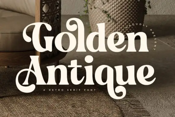
Golden Antique is a retro serif in which the stems swell, the terminals turn into balls and the final letter drops a swash, so a two-word title reads as a 1970s record sleeve rather than as a classical serif.
Ideas for this font
Bold retro serif with heavy bracketed slabs and narrow counters
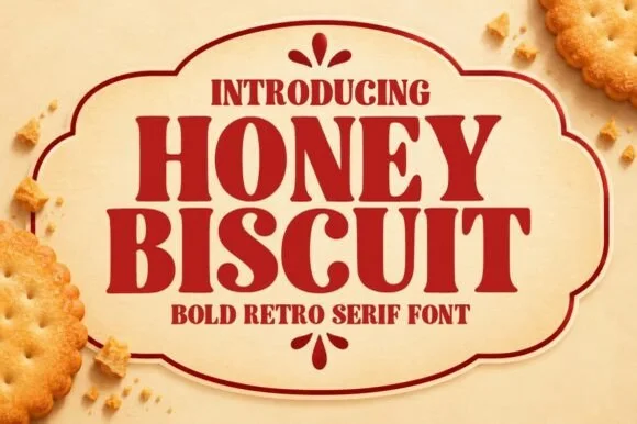
Honey Biscuit is a bold retro serif in which the bracketed slabs are heavy, the stems are fat and the counters pinch narrow, so a word reads like a printed biscuit tin rather than a book title.
Ideas for this font
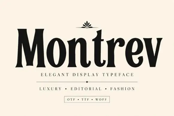
High-contrast condensed display serif
Montrev is an elegant display serif in black on cream: condensed caps and lowercase with very high contrast, narrow bracketed serifs, a tight waist on the stems and a small fleuron ornament above the word, so the name reads as a fashion masthead rather than a text serif.
Ideas for this font
Same independent foundry
Allow optional Google Analytics to measure visits and catalogue actions. Your search words and notes are not included. Privacy & storage