Neutral Sans Workhorse

Darkspire + Cultivo
Lets Darkspire own the focal silhouette while handling secondary copy, sizing and subheads cleanly.
Inspect Cultivo specimenDisclosure: MakerFileHub may earn a commission from qualifying purchases via paid links on this page. How our links work.
Narrow pointed blackletter with a long straight p descender
Darkspire is a gothic blackletter display face with sharp calligraphic strokes, splattered edges and a rough texture, built for dark posters and tattoo-inspired lettering.
Paid link
Get this fontProject & layout blueprintsAt-a-glance maker compatibility
Sturdy stroke walls and open counters weed cleanly on adhesive vinyl, HTV apparel film, and cut cardstock.
Visual anatomy & craft review
Darkspire fills the middle of the card in pale grey over a splattered black wall, and the letters look written with a broad nib that was running dry: stems have ragged edges, the diamonds at the feet break into spatter, and the counters are narrow slits. The word is drawn with tall ascenders and long descending curves, so it looks hand-lettered rather than drawn on a grid, and the spatter carries into the ground behind the type. Around the composition are the pieces of the style: a crown at the upper right, a fleur at the top centre, a hand-lettered stack of three words at the upper left, a skull with a rose at the lower right, and a sword wrapped in a ribbon at the lower left. Two lines of spaced caps name the cut and the collection. It is a poster and merch face, made for large sizes.
Narrow pointed blackletter with a long straight p descender
Two-font hierarchy recipes
Tested contrast partners — pairing Darkspire with grounded secondary typography.
Darkspire + Cultivo
Lets Darkspire own the focal silhouette while handling secondary copy, sizing and subheads cleanly.
Inspect Cultivo specimen
Darkspire + The Bilstein Editorial
Grounds bold display lettering with classic typographic authority on posters, badges and apparel.
Inspect The Bilstein Editorial specimenPractical applications
Concrete hierarchy, scale and production guidance tailored to Darkspire’s stroke geometry.
The splattered edges put the poster in the same world as the work on show, and the tall letters hold a long event name across a dark sheet.
Hierarchy & layout recipe
Print an A2 poster: set the event name at 110 pt across two rows, keep 32 mm of clear ground beneath before the dates at 14 pt, and hold 28 mm of margin so the spattered feet stay inside the trim.
Pre-production check
Spatter detail fills in on coated stock; print one poster on the intended paper and check the ragged edges before the run.
The cut sets the tone of the subject without a photograph, and the narrow letters keep a long title inside a paperback trim at thumbnail size.
Hierarchy & layout recipe
Print a 130 by 200 mm cover: set the title at 58 pt across two rows, keep 22 mm of clear ground beneath before the author at 11 pt, and hold 16 mm from the widest letter to the trim.
Pre-production check
Grunge edges print as noise at small trim; print one cover at the final size and check the letter outlines first.
The lettering matches what the studio does, and the heavy strokes stay readable on a shirt where a fine gothic face would break up in the wash.
Hierarchy & layout recipe
Print a 280 by 380 mm chest print: set the studio name at 140 pt on one row, keep 36 mm of clear ground beneath before the city at 12 pt, and hold 30 mm from the lowest descender to the print edge.
Pre-production check
Ragged edges need a high screen count; print one pull on the actual shirt and check the splatter before the run.
Technical & licence verification
Confirm included OTF/TTF/WOFF formats, full glyph tables and licence coverage on the live store page before batch production.
Closest visual alternatives
Matched across letterform anatomy, stroke behaviour and craft applications.
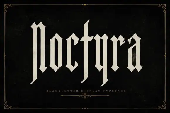
Extremely tall blackletter with blade-like lower extensions
Noctyra is a tall blackletter display face with narrow letters, needle-sharp spurs and thinner stems than a textura, set inside a hairline frame of corner flourishes.
Ideas for this font
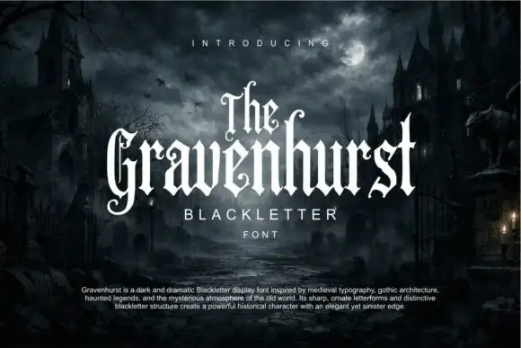
Slim blackletter with curled capital terminals and tall ascenders
Gravenhurst sets a condensed blackletter in white against a moonlit churchyard, its capitals hooked, its ascenders drawn to fine points and its counters kept narrow enough to feel carved.
Ideas for this font
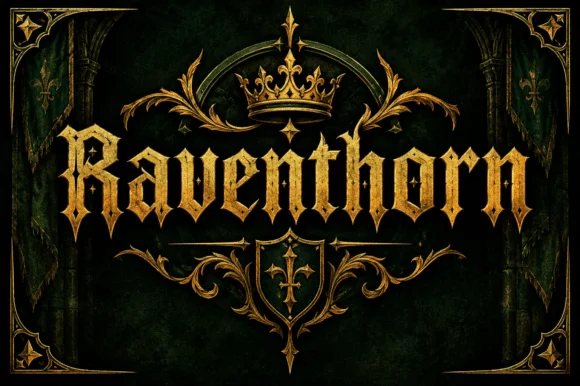
Spiked blackletter with diamond serifs
Raventhorn is a blackletter in gold on dark green: spiked capitals with diamond serifs and long hairline terminals, framed by a crown, a shield and a symmetric gold border drawn to the same weight.
Ideas for this font
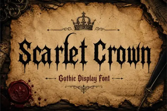
Sharp gothic display
Scarlet Crown is a sharp blackletter in black on aged parchment: narrow mixed case with spear-like feet, a high curling l and pointed terminals, framed by a drawn crown above, rules with flourishes and a wax seal at the lower left, with a plain line beneath naming the style.
Ideas for this font
Same independent foundry
Allow optional Google Analytics to measure visits and catalogue actions. Your search words and notes are not included. Privacy & storage