Invitation lettering
Start with
your real words.
A working checklist for wedding suites, milestone birthdays and event cards — built around the four decisions that actually get made at the kitchen table.
Invitation typography fails for boring reasons. Not because the script was the wrong flavour, but because the couple's names landed on two lines when the card was designed for one, because the date numerals looked thin at the printed size, or because a tail reached into the margin and the trimmer took it off. Everything below is aimed at those failures.
1. Decide the reading order before you pick a face
An invitation has a hierarchy, and it is not negotiable even when the design is playful: who and what first, when and where second, how to reply third. Give the names or the event headline a dedicated band with generous side margins, then set the logistics — date, time, street address, RSVP link — in a calm roman or a plain grotesque. A guest should never have to decode a flourish to find the postcode.
Two faces are usually enough. Three is possible when the third is doing dull work: a small caps line, a tracked label, a footer. What does not work is two decorative voices in the same band, because the eye cannot decide which one is speaking. If the suite needs a monogram as well, treat it as a graphic element rather than a third text face — our monogram and split-letter roundup is built around exactly that distinction.
2. Set your own names, initials and numerals
Promotional specimens are cast from combinations the designer chose. Your initials were not in that casting call. Before you commit, type the real thing: the actual first names, the actual venue, the actual date, including the digits 0, 1, 4 and 7, which are the numerals scripts most often get lazy about. Look at the printed size, not the on-screen zoom.
This is where the alternate questions start. Many scripts ship swash and tail variants for entry and exit strokes on specific letters, and those variants are frequently PUA-encoded — reachable through Character Map on Windows or Font Book on macOS, but not through ordinary typing. A face can be perfectly good and simply not contain the flourish variant you were imagining, so check the glyph set on the live listing before the design depends on it.
3. Leave room for the tails
Calligraphic entry and exit strokes travel further than the letterform they belong to. Inside an A7 card with a printed border, plan on roughly 0.35 to 0.5 inches of clear margin between the outer edge of the flourish and anything that trims, folds or bleeds — the safe figure moves up if the script is long-tailed or if you are adding a deckled edge. Set the line first, then draw the border around it, rather than the other way round.
Long tailed scripts also change the shape of the layout: a face with a deep descending tail on the last letter wants to sit at the end of a line or centred on its own, not mid-paragraph where the tail collides with the next word. Our fonts with tails roundup flags which of those one-line scripts stay legible once they are moved onto a card.
4. Confirm the file, the print method and the licence
Format matters less than coverage. The questions worth asking are dull and specific: does the download include the numeric and punctuation glyphs the address block needs, does it include the swash set as alternates or as separate files, and is the licence tier you are buying sufficient for the quantity you are printing? Client stationery printed for resale is a different tier from a single personal suite, and that difference belongs on the invoice, not in a discovery afterwards.
Print method then decides the weight question. Letterpress and foil stamping need open counters and reasonably thick hairlines, because a plate has to hold the shape under pressure; digital presses are far more forgiving of delicate serifs. Light-weight romans that look refined on a screen can disappear at 9pt in a letterpress impression, and heavy scripts can fill in when they are stamped. If the suite mixes methods — digital invitation, letterpress details card, vinyl signage — test the heaviest and the lightest use on their own terms.
5. Dry run with the smallest piece first
Print the smallest item in the suite at final size before the biggest. A place card or an envelope line exposes thin strokes, cramped numerals and aggressive tails faster than a large invitation does, and it costs a fraction of the paper. Envelope addressing deserves its own check: no hairlines, no texture, nothing that requires a magnifying glass at arm's length, because that line is read in poor light by someone holding a bag.
Side-by-side summary
Four profiles from this checklist.
Previews are the creators' own artwork. The middle columns describe the letterform decisions the steps above are about, not a test of your machine.
| Font | Style & file notes | Role in this workflow | Catalogue |
|---|---|---|---|
 | Long-tailed handwritten script with connected tall hearts | Names band on a card with open margins | Open profile |
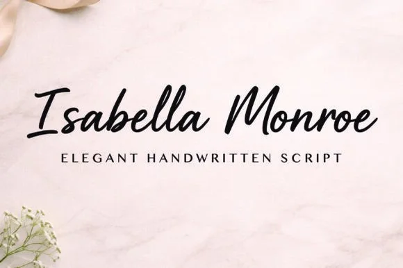 | Fine-stroke calligraphy with heart-shaped tails | Digital or foil-pressed stationery | Open profile |
 | Fine calligraphy with a broad open S, PUA-flagged | Headline or monogram using swash variants | Open profile |
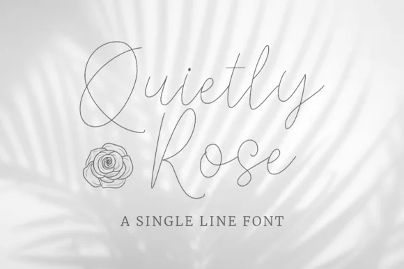 | True single-line formal calligraphy, even stroke | Envelope addressing and short notes | Open profile |
Visual specimen examples
Invitation-ready scripts & editorial romans.
Compare expressive couple-name scripts with the calmer faces that carry dates, venues and RSVP lines.




Wedding fonts Bridal calligraphy Monogram fonts Luxury serif Cutting checklist